



We received some small colour dot samples of the new Golden QoR Watercolours and sent them out to some lovely artists to give us their opinion. It wasn’t a lot of paint but they did their best!
Jan Knight
“QoR I have to say was amazing. It lifted easily from the sample. I got more colour with less paint and they flow, cover and layer well.”
“I have had a play with the sample paints and attach a picture of my dabble (QoR on the left Sennelier on the right). As promised here are my thoughts.
Whilst there seemed to be little paint on these dry samples I was surprised how far they went. My main frustration was wanting to paint more with them!
I settled for painting a simple post card. I did two, one with my existing paints (Sennelier pans) and one with the QoR paints. I tried to use the same amount of paint to water ratio and corresponding colours in each picture. I felt that this would give a like for like feel. I have always been pleased with Sennelier and felt that they had good depth of colour and produced lovely tones.
QoR I have to say was amazing. It lifted easily from the sample. I got more colour with less paint and they flow, cover and layer well. I found the cerulean blue had much more depth than the Sennelier, I needed far more Sennellier to get the same depth of colour. The QoR picture I feel is more vibrant and certainly is the one which I have had more comments on. I will be turning these pictures into birthday cards.
I am certainly looking forward to when these paints come out and will definitely be adding them to paint box especially the pyrrole red light which was lovely and vibrant and the cerulean blue which had a stronger depth of colour. I just hope it’s not too long before I can buy them!”

Judith Crown
“I was very impressed with them.”
“I had a lovely time last night experimenting with the dry sample cards. Thank you for sending me both of them as it was helpful to be able to compare the colours in the sets.
Even though the dots are dry paint, the pigments came onto the brush immediately, giving very rich colours. I was very impressed with them. I tried out a few of my Cotman dry watercolours for comparative feel and found that the QoR seem to give sharper edges to the brush strokes, as well as more intense colouring. This may be an illusion….. I have an automatic liking for Golden products anyway as their acrylics are supurb quality and very lightfast. I wonder how lightfast these colours are!
Regarding the colour choices in the sets.
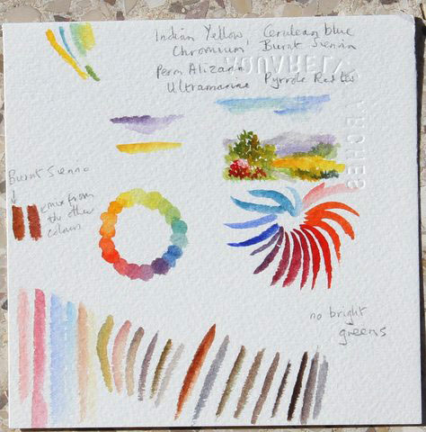
For the Introductory Colours Card
Featuring: Indian Yellow, Cerulean Blue Chromium, Permanent Alizarin Crimson, Pyrrole Red Light, Ultramarine Blue, which also has Burnt Sienna, it is possible to mix a colour similar to Burnt Sienna from the other colours, but it is not possible to make a bright green. Anything and everything else can probably be made apart from bright greens. For an introductory set I would switch the Burnt Sienna for a Lemon Yellow. With those six colours I could do anything! The Cerulean was my least favourite of the other colours as it is not as “clean” a Cerulean as some others. I used a little of it, and the Ultramarine in a very tiny landscape on the piece of paper. The Indian yellow was the smallest dot, and I could have done with a bit more of that!
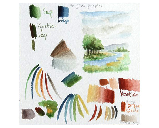
The second set was a good set for landscapes Earth Colours Card
Featuring: Naples Yellow, Transparent Brown Oxide, Ardoise Gray, Indigo, Sap Green, Venetian Red. I could get a wide range of landscape colours from the six colours. Here again all the colours are beautifully rich and intense. The Brown Oxide is similar to the Venetian red and one can reach a very close colour to the Brown Oxide by adding Naples Yellow, and touches of other colours to the Venetian Red. I think I would replace the Brown Oxide with another colour, but I am not sure which one it would be, possibly a yellow, or possibly a more purple colour such as violet oxide or taupe – if there are those colours available. I think the Ardoise grey would be useful in mountain scenes, for example, for rocks, and also for tree trunks etc in landscapes….
Ideally I think I would like a set of eight colours: the introductory set, with the addition of Sap Green and the Ardoise Grey, with Lemon Yellow instead of Burnt Sienna!”
Zuzana Mezencevova
“Nice bold colours, working perfectly in small amounts as well as layered.”
“Thanks for the dry sample of QoR colors – they seem to be fantastic. This is my little test of them. QoR colours react fantastic when painting wet on wet and make wonderful effects.”
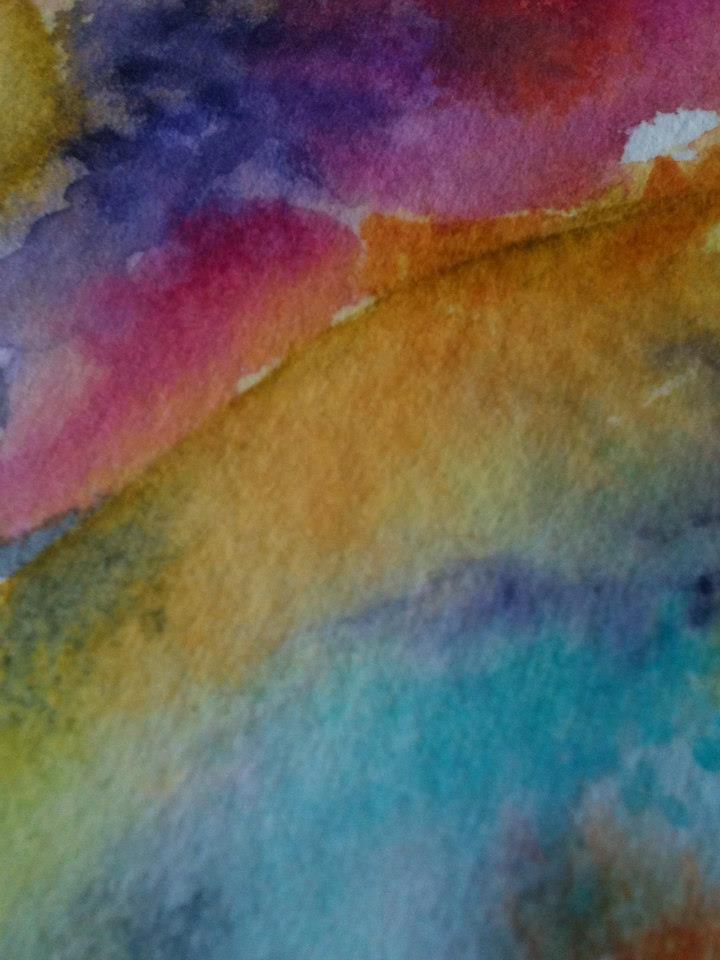
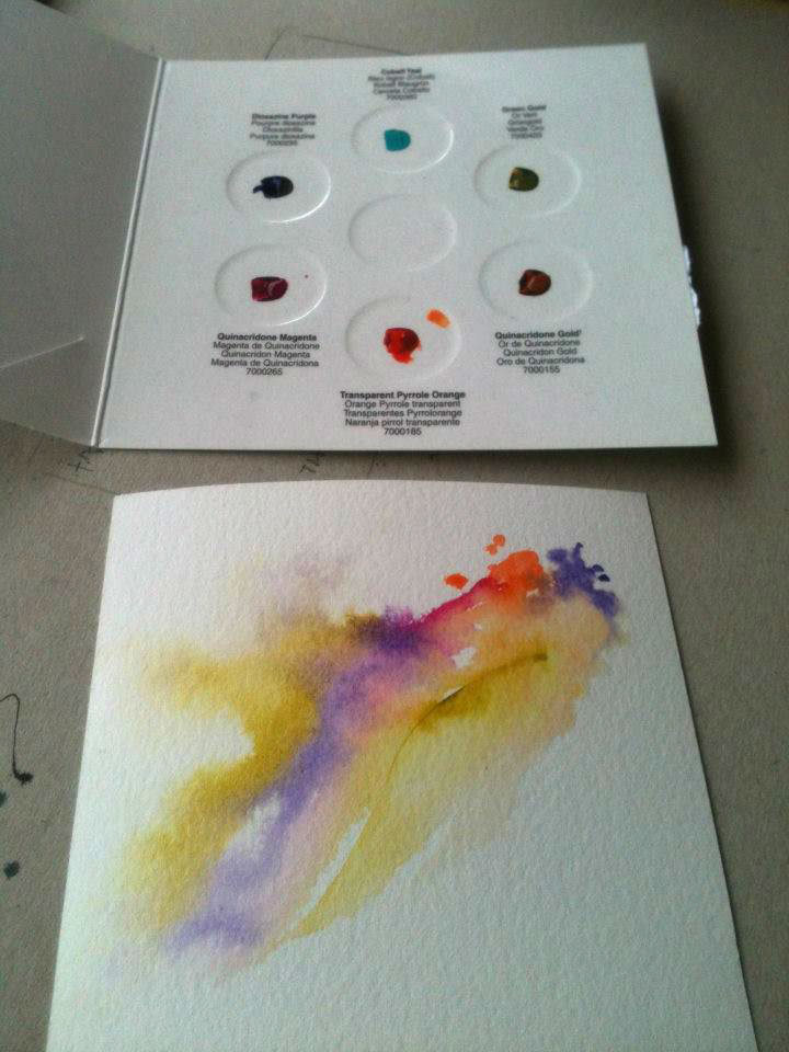
See the interaction between two colours, perfect for wet on wet.”
Jenny Hill
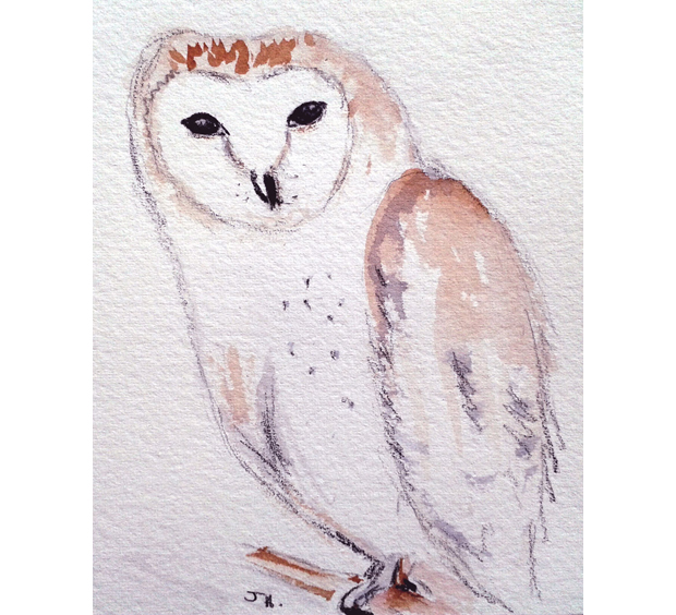
“I enjoyed using these colours and did a colour mixing test and a 10 minute sketch of a barn owl for you on the other side of the same piece of paper.”

Click on the underlined link to go to the current offer on Golden QoR Watercolours on the Jackson’s Art Supplies website.
Postage on orders shipped standard to mainland UK addresses is free for orders of £39 or more.



1 thought on “Testing the new Golden QoR Watercolours”
Pingback: New Golden QoR Watercolours - Jackson's Art BlogJackson's Art Blog
Comments are closed.