Last week the Jackson’s Art Blog interviewed the painter Roz Edwards to find out more about her flower paintings. This week Roz tells us the story of how one of her vibrant Iris flower paintings is painted.

Stage 1 is when I put the outlines on to the canvas. I like long rectangular canvases for floral work. I have drawn lightly with pencil and then gone over the top with paint. The reason for the red canvas is simply that I have reused an old painting, plus I had some red emulsion paint to spare. However, I do quite like working on this colour, so may do so again!! I have drawn 3 irises, but outlined them in different colours to see which is which. I will concentrate on the top two first, or it gets confusing.
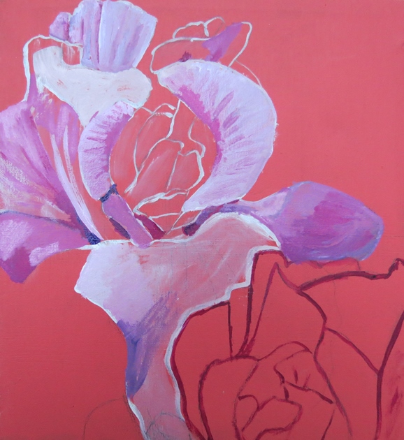
I have started to put in some basic shading on the top iris. I have identified the white highlight area and put some tones of pink and purple paint. to show individual petal shapes. I have avoided the centre area at this stage, as it is more detailed.

My chosen paints for this work are acrylic gouache by AV Vallejo, available through Jacksons. I shall use a few other paints for some details and the background. However, about 90% of the work will be with the acrylic gouache.
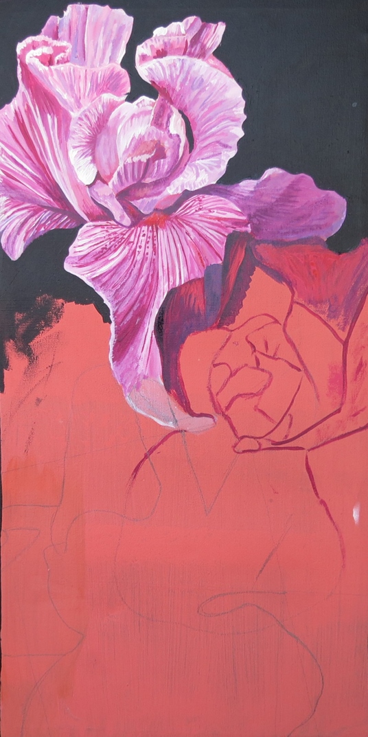
I have decided to paint the background a deep shade of Paynes Grey. This will give good contrast to the irises.I have started to work some detail in to the top iris. This is mainly lines to show the direction of the petals. I have just begun to put a few areas of colour on the middle iris.

A close up. This is about half finished. I will continue to work small dabs of paint across the surface. I need more contrast of light and shade. I also need to introduce some shades of yellow. I have only used red, white and purple so far, mostly blended as pink.
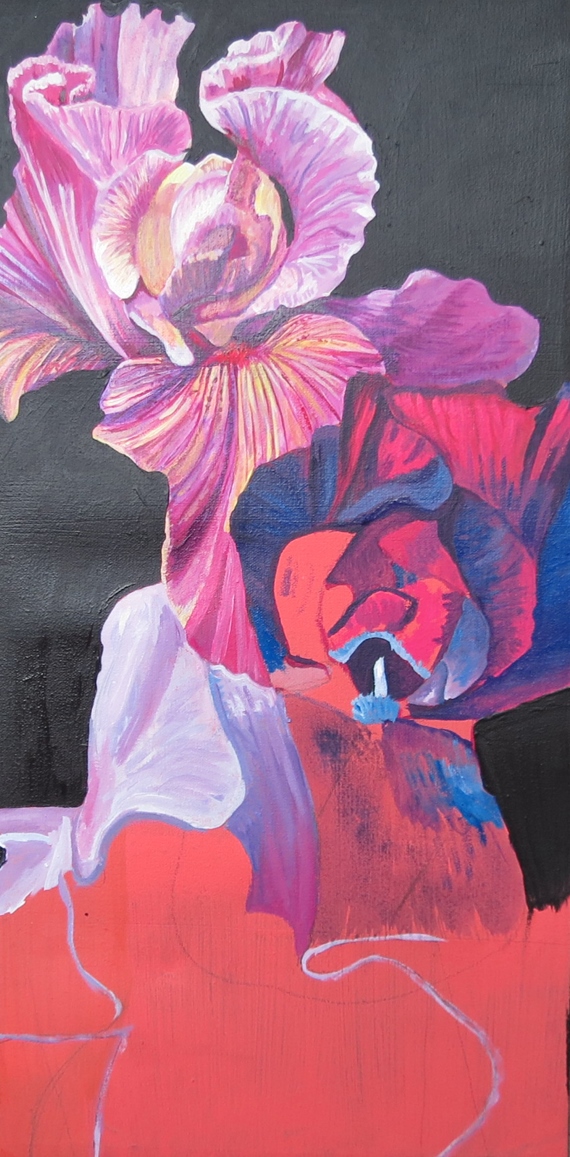
I am now concentrating on the middle iris. I have begun a rough outline of the bottom iris. So that the irises do not blur and blend in to each other they need to have distinctively different colour schemes. I have used a fair bit of artistic licence with the colours used. They are not based on reality.This is a personal interpretation of irises, not a botanical study. You can see the yellow added as an additional layer on the top iris. the middle one is high contrast with a deep pink and deep blue which optically mix to, give the feel of a purple iris.
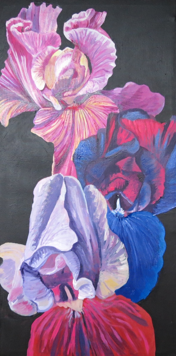
I have worked in the basic layer of colour in to the bottom iris, and completed the strong blues of the middle one. I have painted all the background now. I want to give the impression that the irises are back lit, with lots of light coming through the petals. I have started to paint some areas of detail on the bottom iris, just to show the main direction of the veins in the petals.
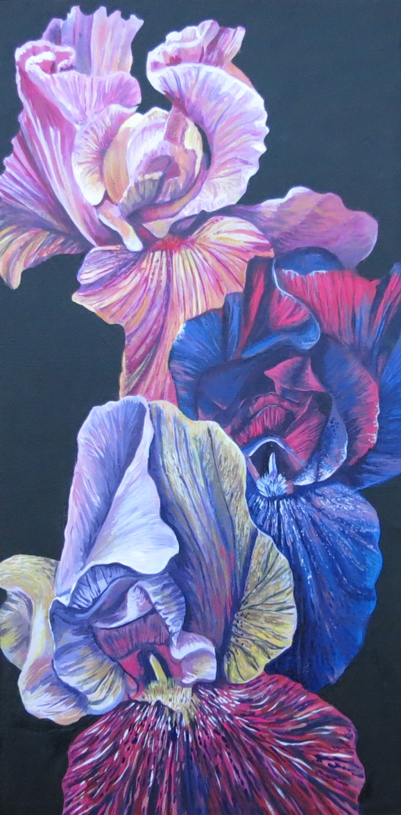
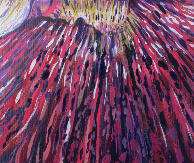
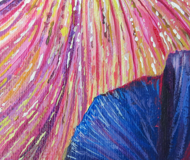
This is now getting closer to the finished result. To appreciate how I am developing this work you need to look at the 2 close ups below. I work in an impressionistic style. I add layers of paint in small dabs and dots. The overall effect gives a solid blended effect, that scatters the colours and gives a vibrancy that flat colours cannot achieve. It is important that the dabs and dots go in different directions to give form, and enhance light and shade. This is time consuming to do, and you have to stand back and assess your work regularly. It does look very different close up and from a distance. You need to keep checking!. This is one of the reasons that I work in acrylic, It dries quickly enabling me to build up my work at a reasonable pace.
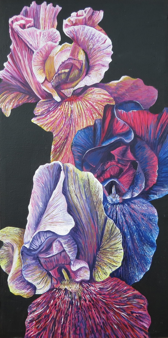
At last it is finished. Here is my final painting:
Materials
To try your hand at painting Irises following Roz Edward’s approach, we recommend the following materials:
HB Pencil (Staedtler Lumograph is a personal favourite but others are available!)
AV Vallejo Acrylic Gouache (agv35043 Cadmium Red Deep, agv35057 Blue Violet, agv35090 Titanium White, agv35031 Cadmium Yellow Dark, agv35059 Prussian Blue, agv35021 Primary Yellow, agv35052 Dark Rose Red, agv35041 Cadmium Vermillion, agv35039 Cadmium Red Light)
Daler Rowney System 3 Acrylic Paynes Grey
A selection of synthetic brushes (we would recommend Jackson’s Studio Synthetic Brushes) – size 8 for the background, size 4 for basic colour blocks then progressively down to a 2 for details , finishing with 00 and even 000 for the final tiny dabs of paint.
Stretched canvas (Roz used a canvas measuring 30cm x 60cm, like this one by Daler Rowney)
With very many thanks to Roz Edwards, member of the Society of Floral Painters.