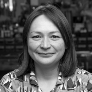
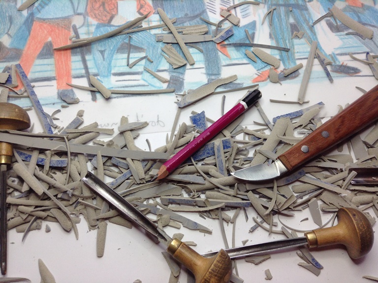
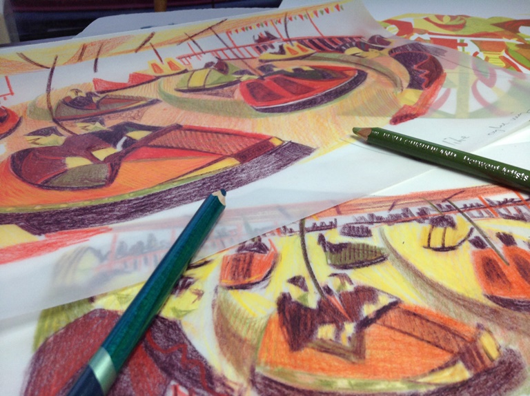
The Paupers Press in Hoxton, London, is a fine art print and publishing studio with facilities for etching, lithography, silkscreen and relief printing. The studio works under commission from galleries and publishers as well as publishing under their own name. Paupers Press has worked with a vast number of notable artists, from Damien Hirst to Paula Rego, Tracey Emin to Craigie Aitchison, and everyone in between. We interviewed Michael Taylor of Pauper’s Press to find out a little more about every printmaker’s dream workspace.
Lisa: Can you tell us a bit about Paupers Press – when was it founded and what do you specialise in doing?
Michael: The studio was founded in 1986 when we first moved into Hoxton. The studio works with etching, lithography and relief prints working directly with each artist using hand drawn, photographic and digital imagery.
Lisa: What were you doing prior to Paupers Press? Is your past rooted in printmaking?
Michael: After studying painting I first got involved with print on a postgraduate course at the Central School. After that I worked for a number of years as an artist’s assistant at various small print studios before setting up Paupers. During the first few years of the studio I also taught at a number of colleges until I was able to concentrate fully on the studios print and publishing programme.
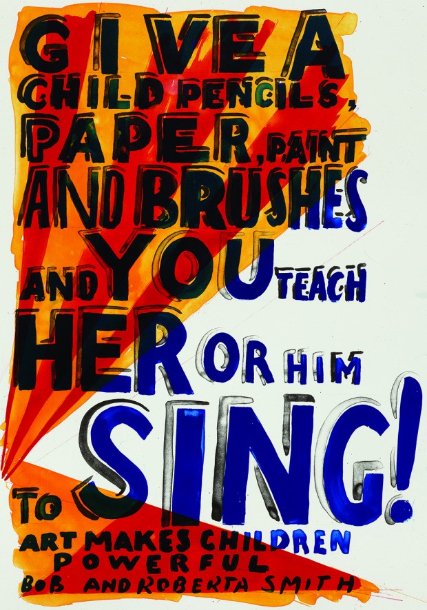
Lisa: This year for the annual Printmaking Talk about the London Original Print Fair you will be in conversation with Bob and Roberta Smith RA, who produces prints at Paupers Press. Can you shed any light on what it’s like working with Bob and Roberta Smith RA? What is his working method like?
Michael: Bob, like most of the artists we work with, has had a tenuous relationship with the processes of print, although his practice draws on many of its graphic tools and visual languages. He has talked about early the influences of commercial lithograph printing of children books, such as Babar the Elephant. I think the simple graphic designs and use of simple, flat colour can be seen in the projects that we have done with him.
A project such as ‘Feminist Icons’ is dealt with technically fairly simply, with Bob drawing out the initial line image and then using 3 or 4 layers to bring in the colour. Each layer is worked directly onto film using black Indian Ink, although it may later be printed in pinks, yellows, reds or blues. It is almost a constructed jigsaw making approach to image making.
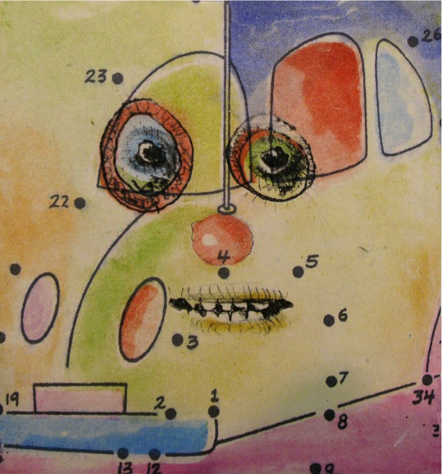
Lisa: You will also be launching a new set of prints borne out of a collaboration between the Chapman Brothers and Kate Moss…what are Kate Moss’ printmaking skills like? And what can we expect from this unusual collaboration?
Michael: The set of prints, ’The Story of the Eye’ came about from a simple drawing day using soft ground etching as a way of each adding to the others drawing by swapping plates between each other. The soft ground process is a simple extension of drawing, where the artist draws with pencil onto a sheet of paper placed onto the plate with the soft ground. The pressure of the pencil lifts the wax ground onto the paper, allowing the acid the bite the plate, so creating the image. The colour plates were added later after to build up each image. The set retains the directness of the drawing process but also has the feeling of watercoloured collage, through the use of chiné colle japanese paper sandwiched in between the image and the main printed paper.
Lisa: How much creative input do you get to contribute to helping an artist develop a print?
Michael: It very much depends on each artist, the imagery and processes being used being so variable. Our job is to help to technically realise the ideas of each artist and to allow the materials and techniques of printmaking to support the visual and conceptual ideas of each artist rather than impose a way of making that is almost a style of the studio. Each artist leads the process rather than the other way round.
Lisa: What work is currently in the pipeline at Paupers Press?
Michael: We usually have up to half a dozen projects going through the studio, each at a different stage. Some just starting discussions with the artist, others proofing plates, others being edition. Some projects can be very quick, just a couple of weeks from beginning to end, others take months, the odd occasion years.
We are currently finishing a new artists book with Andrzej Jackowski, a series of coloured etchings for a Swiss publisher by Mai-Thu Perret and new woodcut and etching projects.
For more information on Paupers Press visit http://www.pauperspublications.com/