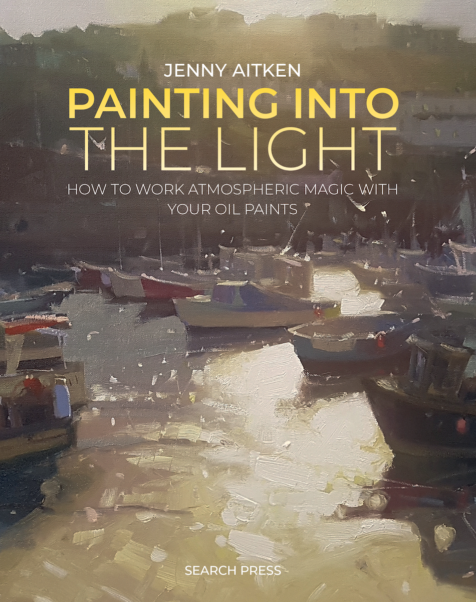
Strong composition can be the key to a successful painting, perhaps even more so than colour and contrast. So says Jenny Aitken in this chapter from her new book Painting into the Light, where she shares key tips for creating a successful composition and achieving illusory depth. Throughout the book, she also offers guidance on how to infuse your paintings with vibrant light. Aimed at intermediate artists, it includes explanations on simplifying the image, tonal control, creating atmospheric depth, working outdoors and indoors, and capturing accurate colour through step-by-step demonstrations, and illustrated techniques.
Search Press
Tips for Creating Strong Composition and Illusory Depth
by Jenny Aitken
Composition
I tell people about the ‘three Cs’: composition, colour, and contrast – and the first is the most important. For any painting to be successful it needs a good, strong composition: it is simply the bones of the whole painterly animal!
Guiding the Eye
Even if every other element is top-notch, if your structure isn’t guiding the eye in an effective way, all your fine work risks being lost.
Analyse what you like about the image, then edit out anything that detracts from the energy of the composition. It is easy to miss the obvious and get distracted by the painting as a whole – forgetting the fact that you are composing a visual story.
Good composition provides a compelling journey, or ‘eye path’, around both the surface of the canvas and through the illusory depth of the image.
Think of a focal point as the lighthouse in the ocean of your painting, drawing the eye and keeping it from drifting out of the painting. Not every painting has an obvious subject, however – so when deciding on your focal point, ask yourself these questions:
- Why am I painting this image?
- What stood out to me originally?
- How can I make that stand out best in paint?
Even if what you are painting doesn’t sport an obvious focal point or particularly strong subject, you can still use good design to make the most of what you have. Remember, capturing the essence of your photograph or scene does not mean copying it mark for mark.

Around and Around
In this painting, Agapanthus, the eye is drawn to the lightest area (behind the flowers on the right) but there is plenty to keep the eye pulled away and drawn back around the image.
Leaves, daisies, stalks, headlands, and cloud shapes all work to make that path for the eye. The brushwork helps too. The sea could have been still, flat – instead I filled it with downward brushstrokes to help the flow.
A Journey for the Eye
Have a long look at this painting. The composition is designed to zigzag your eye both two-dimensionally around the canvas, and three-dimensionally through the scene. Subjects and brushwork angle towards each other and there is a sense of constant movement. Your eye does not stop wandering around the picture. It is drawn most strongly to the lightest area on the water, but little elements pull you away again: the verticals behind the foreground boat, the seagull and sparkles, the ropes.

Jenny Aitken
Oil on canvas, 40 × 30 cm | 15.75 × 11.75 in
Compositional Tips
Avoid a central focal point. It seems to be natural for us to want to place our subject centrally, be it the setting sun or a vase of flowers. It is neat and symmetrical and our focus is given pride of place. Central subjects call the eye straight to them, like a bull’s-eye on a dartboard, and this works well in advertising design, when you have a message you need delivered very quickly.
A speedy glance, however, is precisely the opposite of what we want! Our object is to entice the eye to linger, with all elements leading it around the focal point. We want a visual story, not a marketing message.
Make things unbalanced. A horizon or vertical line too close to the centre of the canvas will split the image into two, reducing the overall impact. Your painting can be beautiful within each of those two halves, but the draw of the eye path around it is lessened by the symmetrical pull of each side.
As appealing as those two halves might be in their own right, you should aim to highlight the area that counts the most – it will be more impactful as a result. If every element is treated with the same level of importance, you overwhelm the eye and consequently create a flat painting.


Make connections. Once everything is safely off-centre, all that remains is to connect the areas of the image. This compositional connection can be accentuated subtly through colour, texture, brushwork, light, and the subject itself. The objective is always that strong path for the eye: a flow and a point of interest. If you can get good design in from the start, your work will be all the stronger.
The rule of thirds. The rule of thirds simply means to avoid central horizons or verticals, keeping the focal point off-centre. Pop a three by three grid over your image to see how the composition is working. It is just a guide, however – as evidenced in the original painting on the right, higher horizons work for when the subject demands more attention, like a big roiling sea (or lower, for dramatic skies). The idea is to strongly weight the image one way or another, so you avoid the image folding in on itself at the horizon point.
Keep the main focal point off-centre, and remember the rule of thirds – it is as simple as that.


Connect All Areas of the Painting
Scenes with obvious focal points – structures, people, trees – lend themselves well to the creation of a decent path for the eye. This is because the individual elements can be placed around the painting with one dominating the rest. It isn’t always so straightforward, however. Sometimes you have to manipulate the subject to enable the strongest painterly design.
When I paint outside, connections between elements are the most important aspects I look for. In the painting below, I increased the prominence of the pine tree and enhanced the reflection in the water, creating a strong vertical to connect the foreground, midground and background. Increasing the size of the background hill and sharpening the gradient of the land made them stronger shapes in the composition, which means they support the tree better.
We are not tied by what we see or what a photograph tells us. Exercising our knowledge for strong design will result in art, not just representation.

Jenny Aitken
Oil on canvas, 30 × 24 cm | 11.75 × 9.5 in
This plein air painting – which began contre-jour, though ended in a rather grey day – shows the river Derwent at Chatsworth.
Get Connected
This painting has a strong visual current guiding the eye. It doesn’t have a single focal point as such – instead the composition flows between each connected element.
Everything is working to guide the eye around and through. The foreground boats and ropes lead the eye in, their angles all pointing to the top left. The shapes of the blue water and warm sand stabilise the lean by pushing the eye to the right. The eye hits the background town of St Ives and moves right and down, via the highlights on the roofs and the haze of the sun above. It then reaches the people walking right, and takes our gaze and imagination beyond the harbour wall.

Text copyright © Jenny Aitken 2024
Photo credits © Jenny Aitken and Mark Davison 2024
Published by Search Press 2024
Further Reading
Tips for Landscape Painting on Location
How to Resolve a Landscape Painting Composition
Golden SoFlat Acrylic for Hard Edge Abstract Painting
The Making of ‘The Peasants’, a Painted Film
Shop Painting into the Light on jacksonsart.com