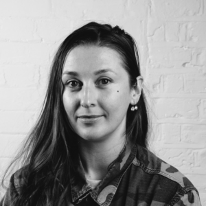
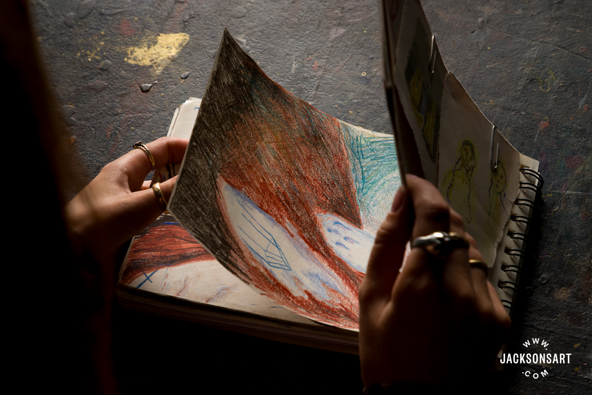
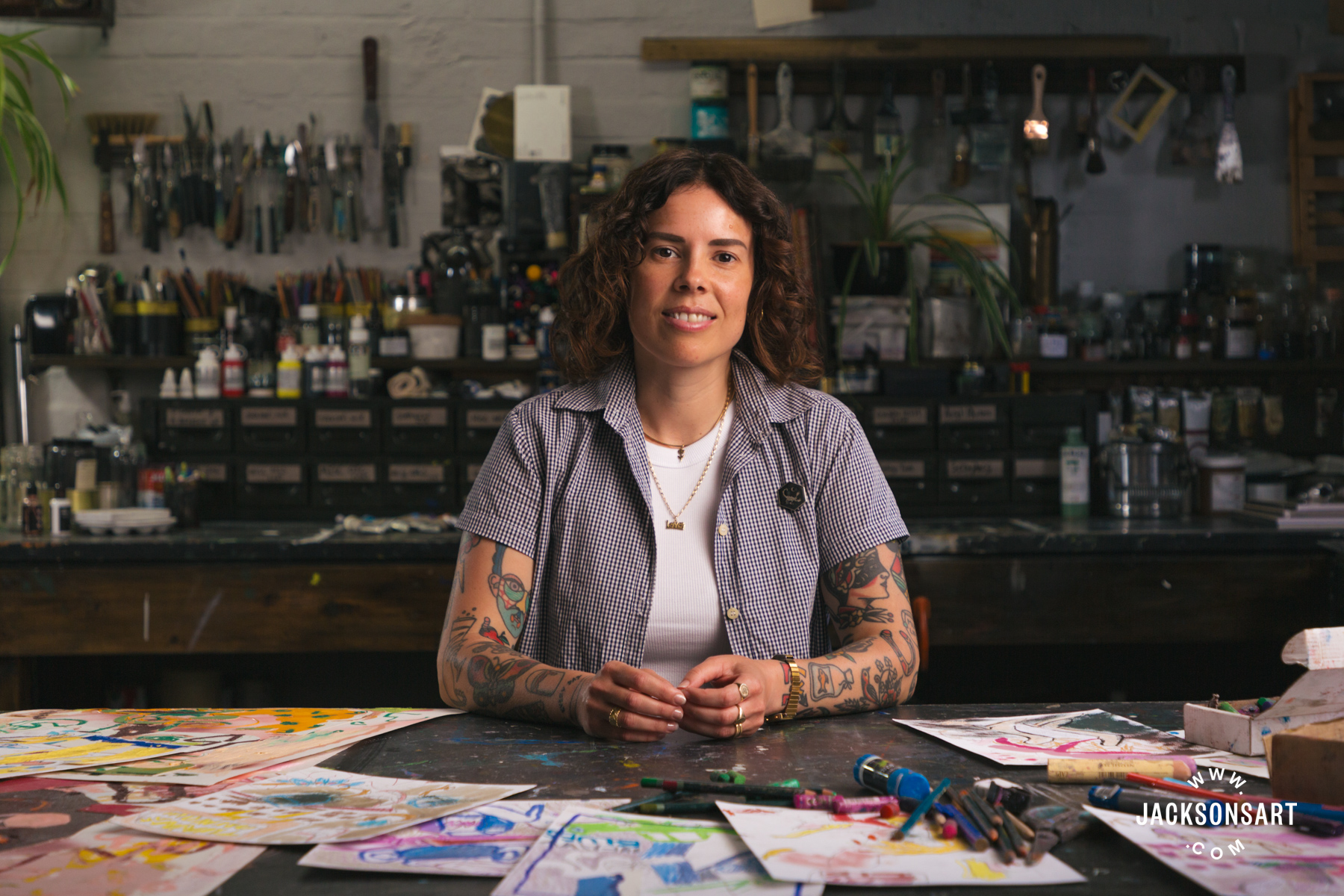
London-based Australian artist Katie Eraser is the featured artist for this month’s Inside the Sketchbook series. Here, she describes what she needs from a sketchbook, the relationship between the sketch and the painting, and what makes her sketchbooks so integral to her practice across mixed-media oil painting, installation, and sculpture.
Katie Eraser Takes Us Through Her Sketchbook Practice
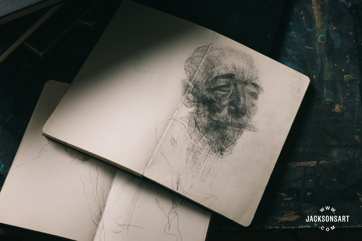
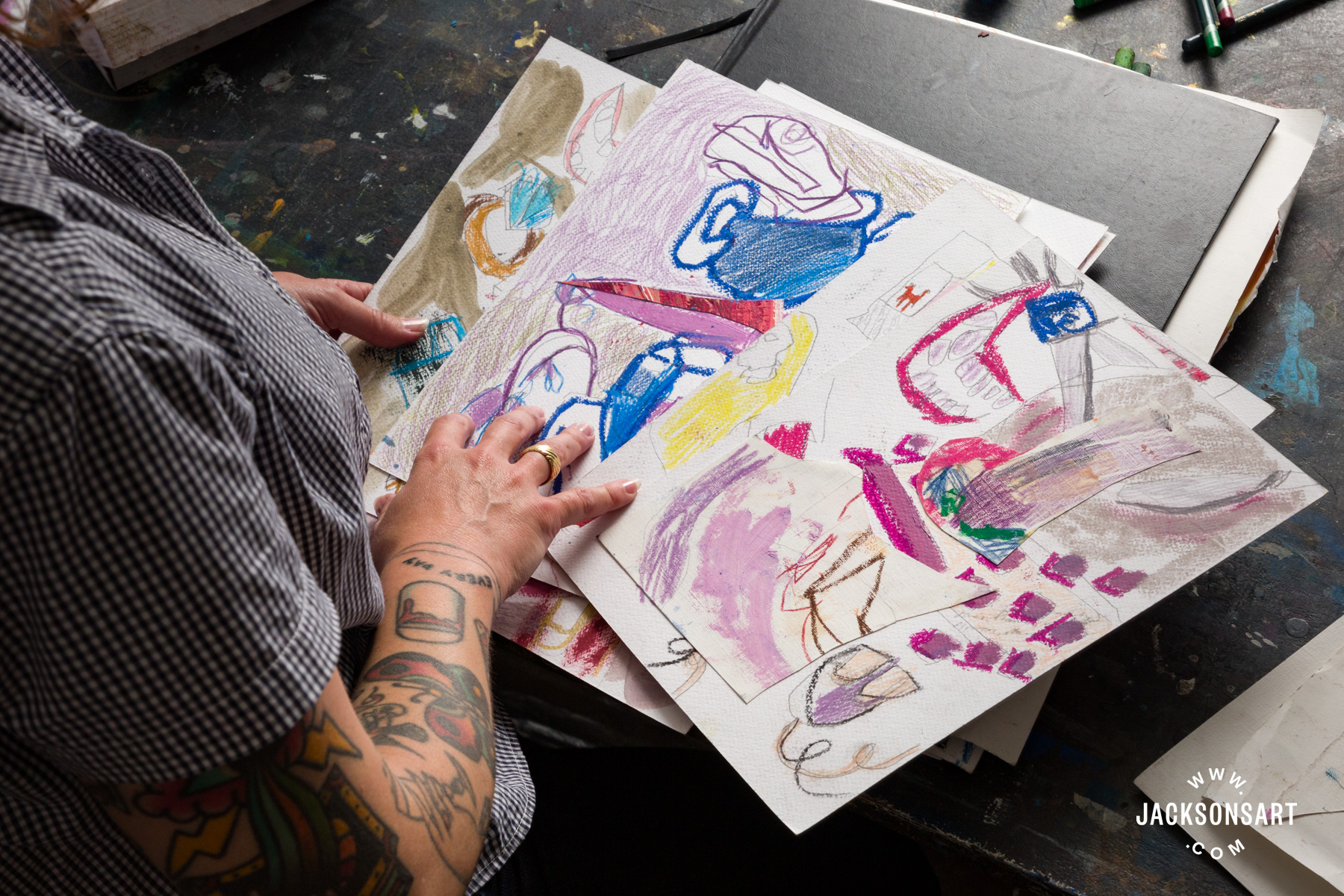
Since September last year, I have been in my studio at Turps in Elephant and Castle on the Studio Painting Programme. I have focused on using one sketchbook which is a large black leather-bound book with a thick off-white paper between A4 and A3 size. I only like working at A4 and above, as I tend to make large scrawling drawings with sharp angular marks and cover the pencil sketch with oil stick, pastels, charcoal, and leftover paint from my palette. Working any smaller leaves me feeling restricted and constricted, and I like space. The paper needs to be pretty sturdy as I add paint from my palette which is usually mixed with a medium or a solvent, so the paper needs to be able to hold the weight of this liquid. I go for a leather-bound sketchbook as I tend to be quite rough and heavy-handed with it in the studio; it gets a bit battered being plonked around and dropped on the hard floor. Ultimately, it needs to be sturdy, I don’t like being delicate with anything in the studio, the mess, and the splashing of paint and drips and footprints on work are the things I like. I like showing that I have been there, I am never trying to remove my imprint.
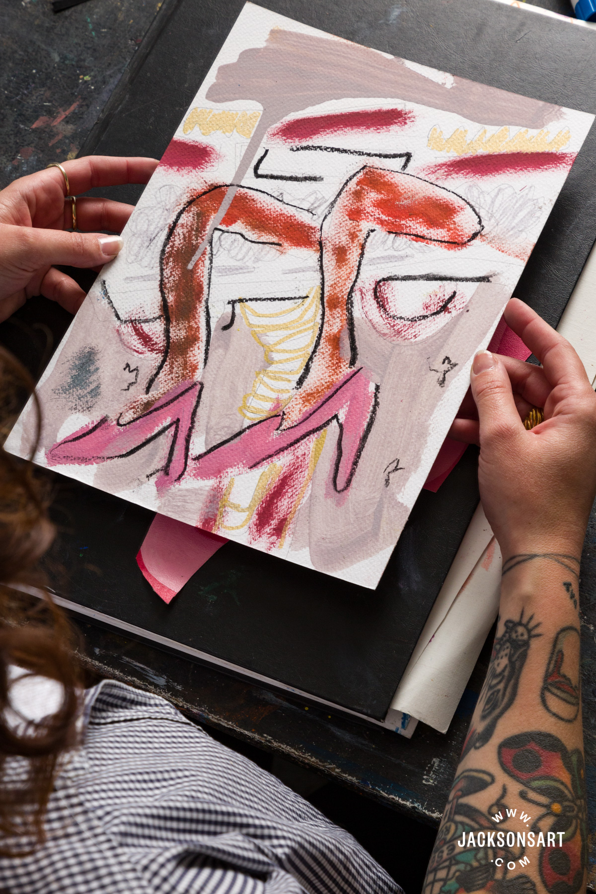
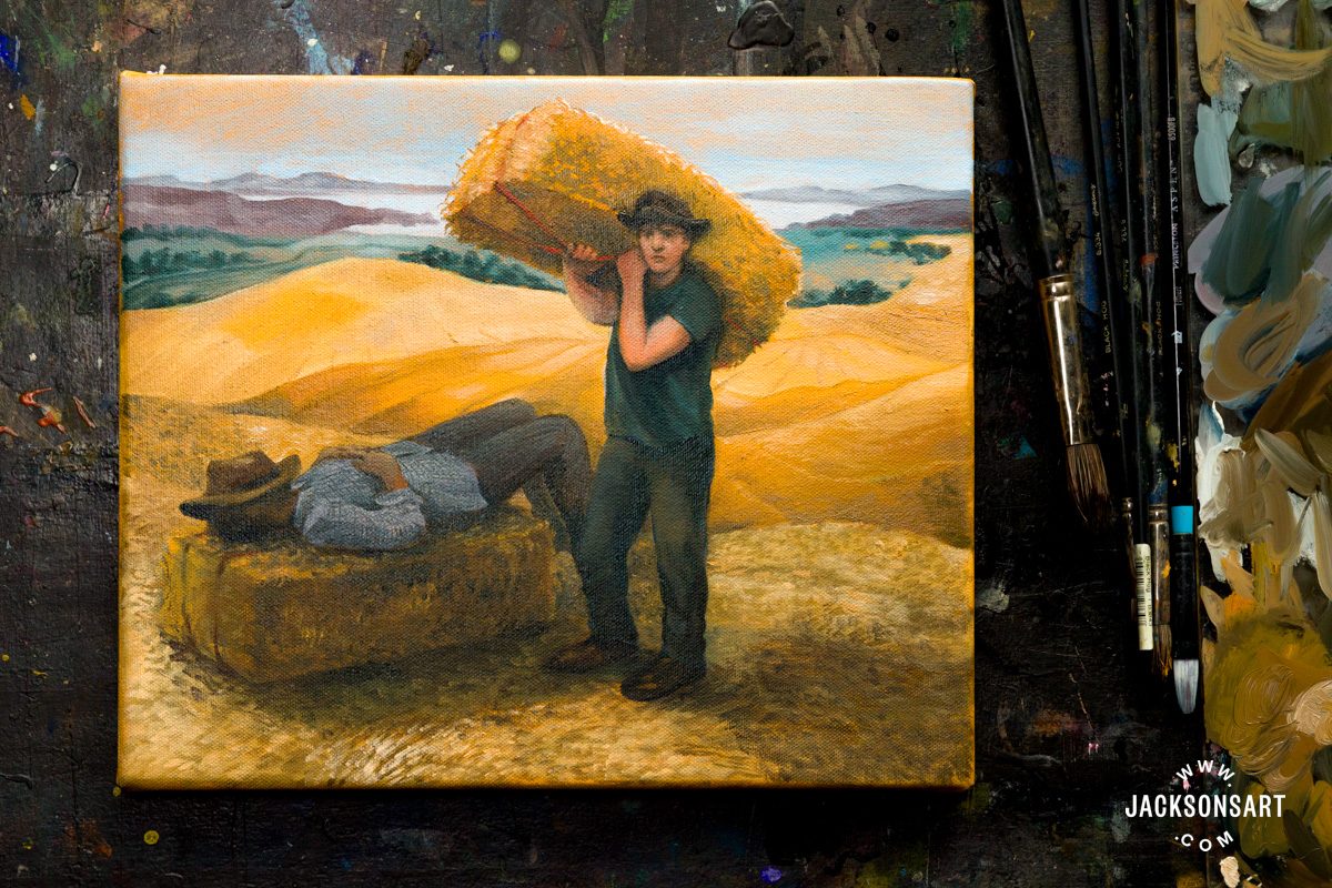
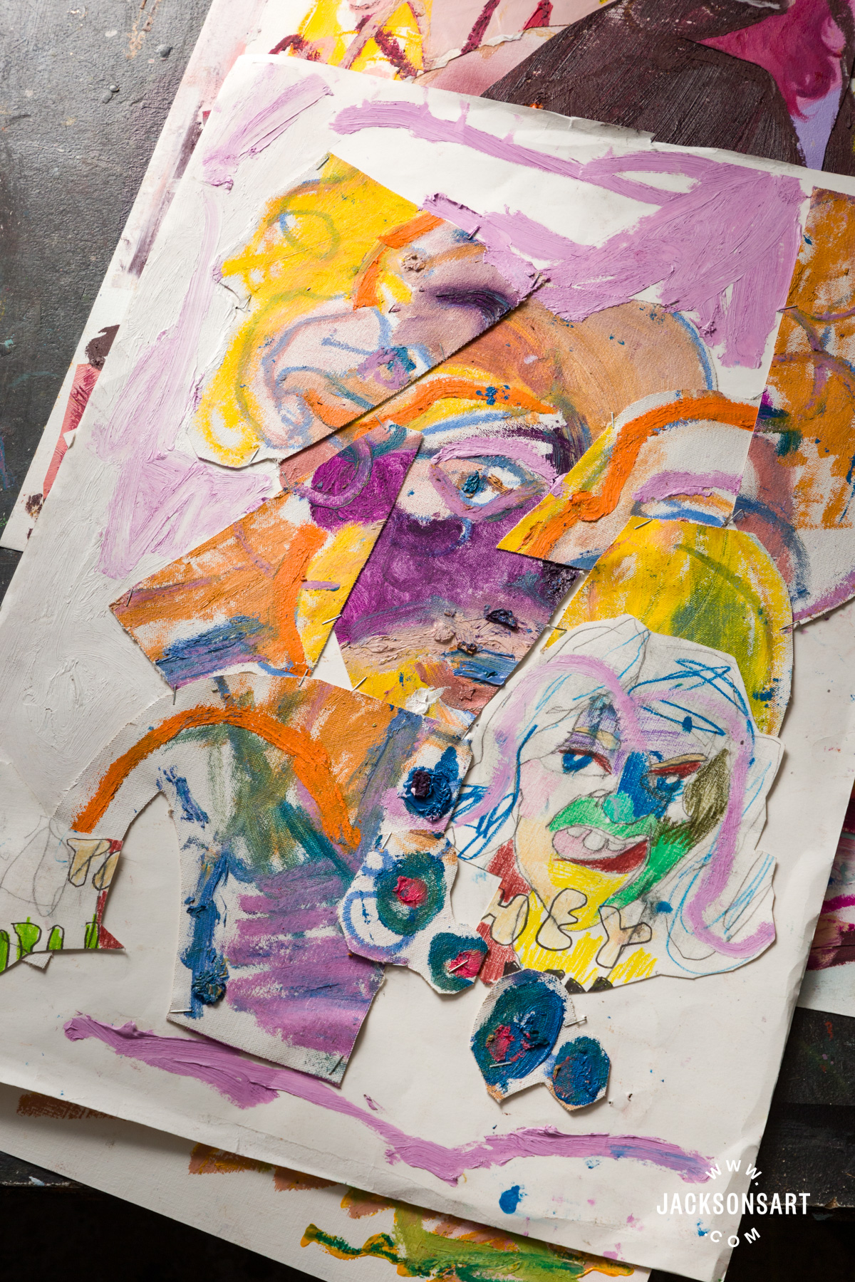
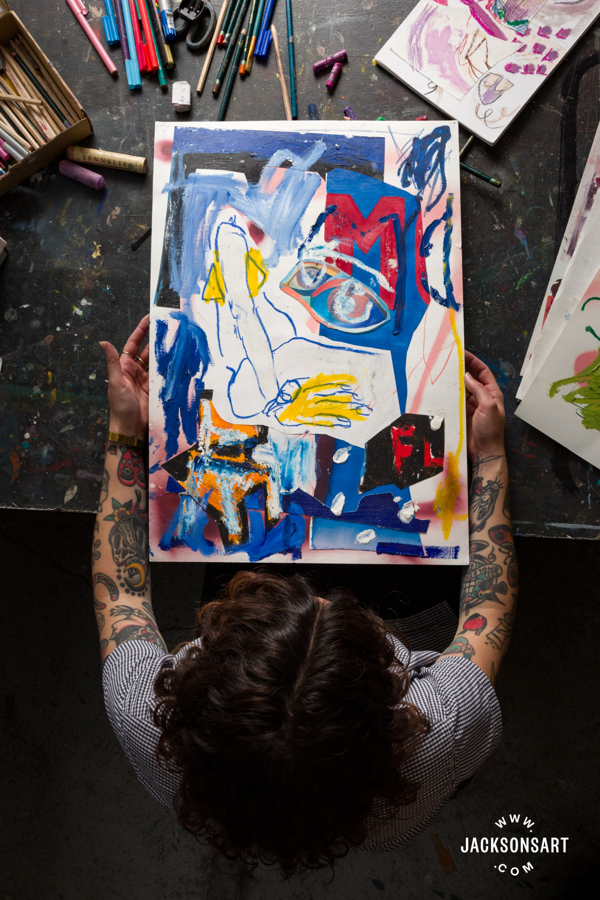
Sketchbooks have always been a core part of my process. Alongside sketchbooks, I work on loose sheets of paper for sketching out painting ideas and planning compositions. Lately, I have found it important to build these formative drawings on loose sheets as I’ve been incorporating them into the paintings they inform by affixing them to the surface of the painting. Showing the sketch that informed the painting on the painting’s surface is a way to collapse the hierarchy of sketch and painting. It also gives the same weight to the sketch which is formally a ‘preparation’ element only. I stick these sketches on paper onto the painting’s surface with oil paint and then squirt thick globs of paint onto the corners straight from the tube. This mimics how I used to pin ephemera to a corkboard with colourful oversized push pins when I was young. It’s a nod to the pop culture that I was so desperate to define myself by.
My paintings are in oil and oil stick and charcoal, so naturally these mediums float over and into my sketchbooks. At the end of a day in the studio, any residual paint on my palette will get mixed with some solvent or medium and applied to paper sketches that I have pinned to my walls or have lying on the floor, or they will be used on sketches inside my sketchbook. Most sketches in my book will have something applied to them, they may just be with pencil for a while, but I’ll soon find the right colour or inspiration to add to them. The sketchbook isn’t about making a ‘finished’ work, and colour will always find its way in at some point. I use many material modes of mark-making as that is what appeals to me best. I enjoy bumping around from one tool to another, from a stick of charcoal to a brush to a coloured pencil to a tube of paint, I don’t like any limitation, and I get uncomfortable if I stay with one medium too long.
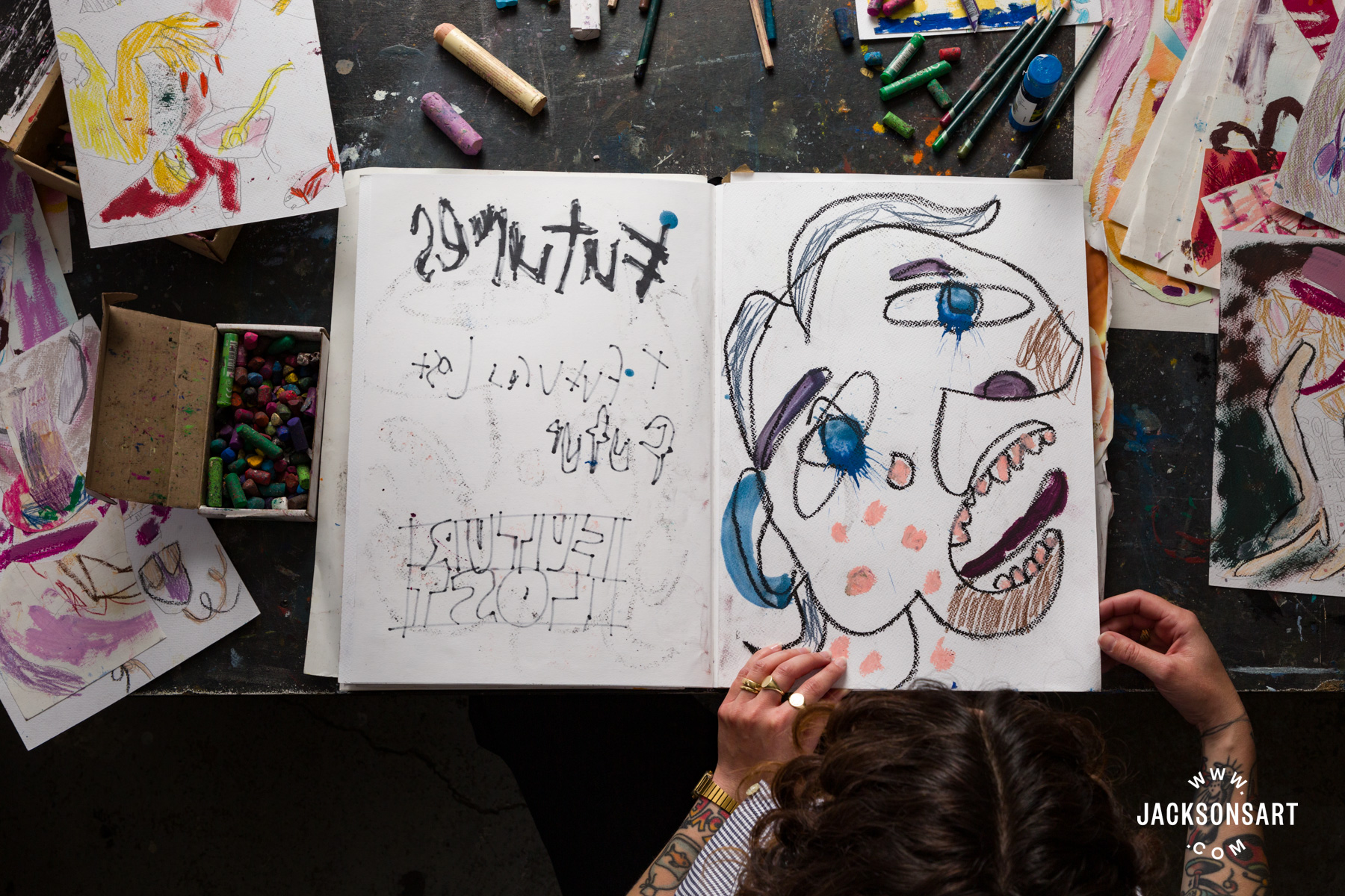
If I am focused on a painting for a while I might break away from it and create some really quick drawings on paper, that are super loose and rapid-fire to jolt myself away from the stuckness of being with one medium for too long. In this sense, spontaneity is what I am searching for, which requires a library of materials on hand. Often it is in a cardboard box on the floor, or a box of pencils on the desk, or oil sticks lying in a puddle on the studio floor, there are surfaces everywhere. I like to keep old paintings laid out on the studio floor too. I am not precious about them, they become the floor, I walk all over them, drop things on them, fling paint, use leftover palette residuals to paint on them. They’ll become parts of works when required, and are a great way to hold the energy of the studio, they signify time passing and hold all the studio clues someone might be searching for.
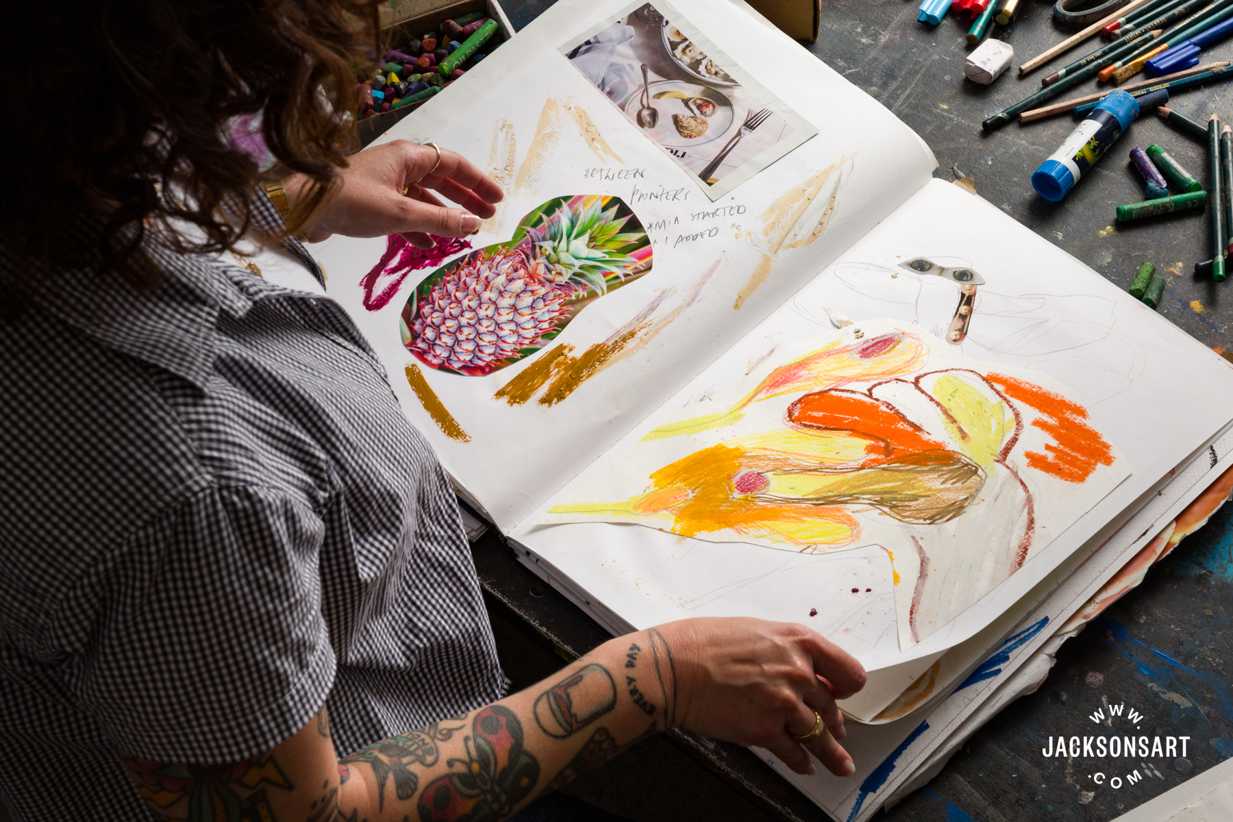
My sketchbook is also a folio for my hand-cut collage works. I make these on loose paper and then fix them into the sketchbook. I find this helps to keep a clear reflection of what I am looking at and what I’m interested in. They are another key component of working out ideas and compositions. I have an enormous collection of cut elements that I can search through when I am planning a new painting. I love the flexibility of moving elements around the page, I feel my ideas become endless when I’m playing like this. The options are infinite, and I love the freedom it brings.

In my collage practice, I make work in a series I call, ‘Cut Archive,’ it’s a way for me to look back on previous paintings and drawings and cut them up to inform new work. That way there is often an easter egg placed in my work that links to a previous body of work, a motif that recurs that takes on new meaning in its second iteration, I like to think of it as collaborating with past versions of myself or my practice. This means old work is put into the tumble dryer to be spat out to permeate new configurations. It also means everything is always in flux, ideas are always hanging in the air rather than fixed, and although all these works are embedded into my sketchbook now, they may take on new life later and be cut out and reused in the future. The sketchbook likely won’t stay intact, it is held at this moment, but a few years from now it might not even exist.
My sketchbook is always nearby, it is most often opened on a specific spread I have been referring to, on the little shelf below where I paint my work or on the studio floor. I look at it often, depending on the mood I’m in and what inspiration I am searching for. I view my sketchbook like an archive, it’s important for me to continually reference it, so I know I am continually building and exploring upon the themes that interest me. Recurring motifs have massive importance in my work and all of my motifs are located in my sketchbook and appear many times over.
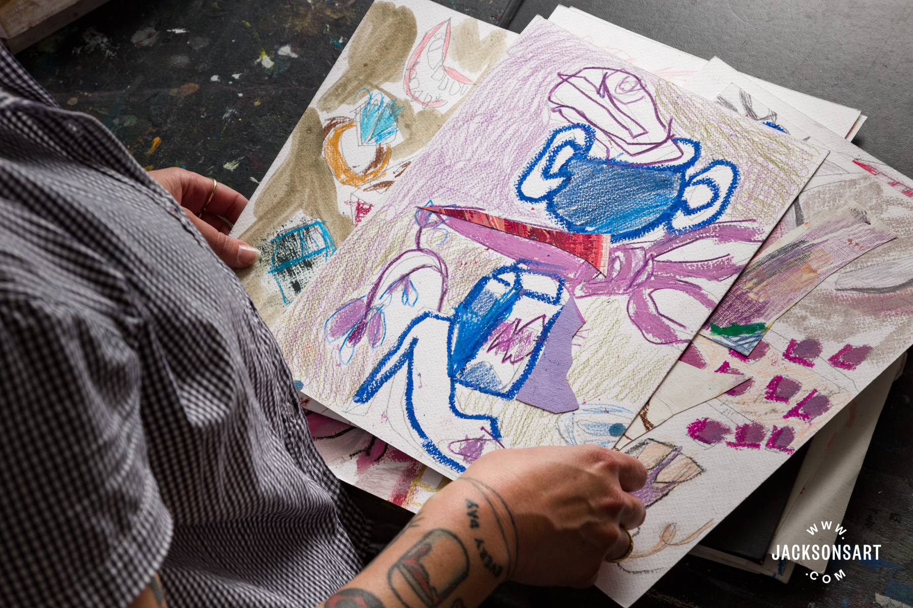
My favourite paint is Art Spectrum oil paint. They are a family-owned Australian company that makes the most perfect range of oil paints. The range of colours are so connected to Australia, sometimes when I’m using them in my cold grey London studio they make me pine for my sunny far away home. The oil paint that I have been using mostly here is Winsor & Newton, the tube I have gone through vast amounts of is their mixing white – it is the perfect 50/50 blend of Zinc and Titanium. I also love the pinks that Michael Harding makes, pink is my absolute favourite colour, it pops up in most of my works. I don’t know if I’ll ever feel its presence is not needed.
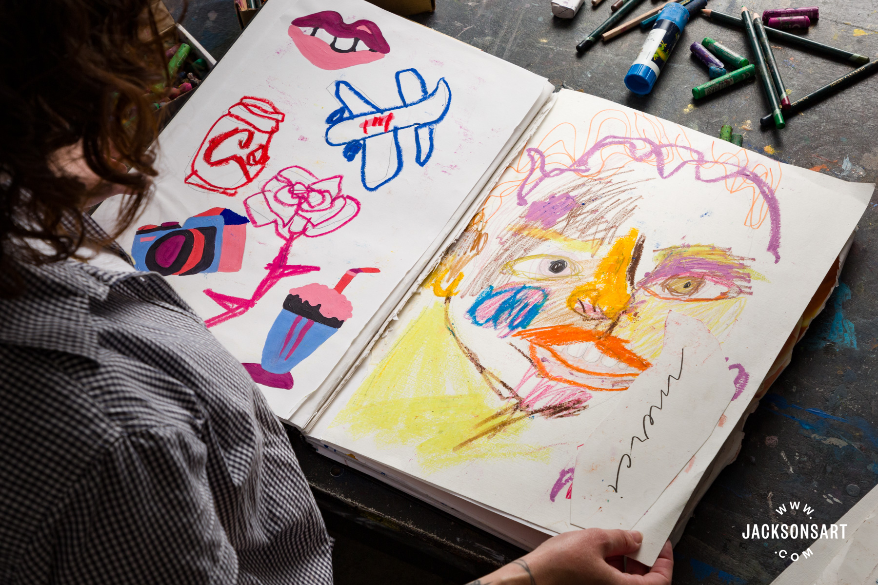
I love Sennelier oil sticks, it’s the only brand I use and I have used Sennelier for the last seven years. Their pigments, and the marks they enable me to make, are such an integral part of my practice. In amongst the expensive Senneliers lay old and busted markers and coloured pencils that I have been using forever, the cheap and cheerful newsagent stuff that children often use is perfect for me. I don’t splash out on coloured pencils just like I only ever buy the cheapest brushes, I don’t believe in expensive high quality brushes, ones from hardware stores and children’s craft sections work great for me.
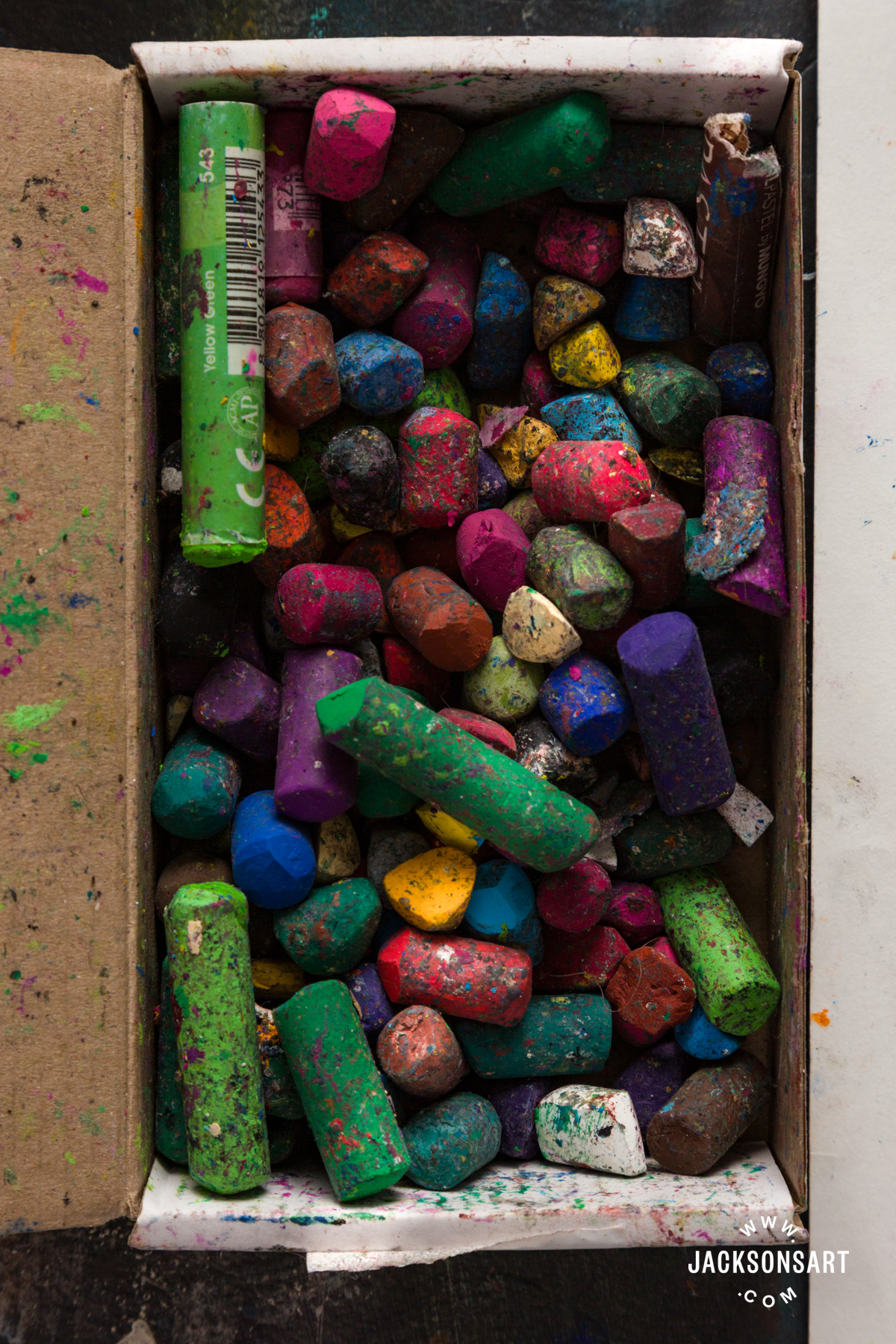
For charcoal I like the skinny super deep pigmented sticks of black Willow charcoal the best, they let me make marks like a pencil but with greater impact on the surface. I love the textures they pick up in the paint when I work on top of oil paint, they are like little revealers, spotlighting textures and timestamps.
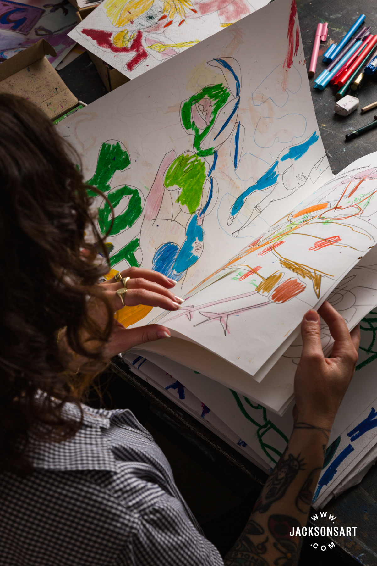
My advice would be that perfection isn’t beautiful, mess is beautiful, allow freedom and spontaneity in and leave precision and ‘rightness’ at the door. The other helpful thing for me is mixing low brow and high brow materials together – children’s pencils with high quality oil paint or hardware store brushes with Sennelier oil sticks. I think just allowing yourself space to play is number one, think through ideas, chuck some stuff at the wall and make a mark, there are no wrong ways of approaching things. And always have it on hand to refer to, or better yet, leave it open on a page so when you next come to make work there is a little note of where you left things.
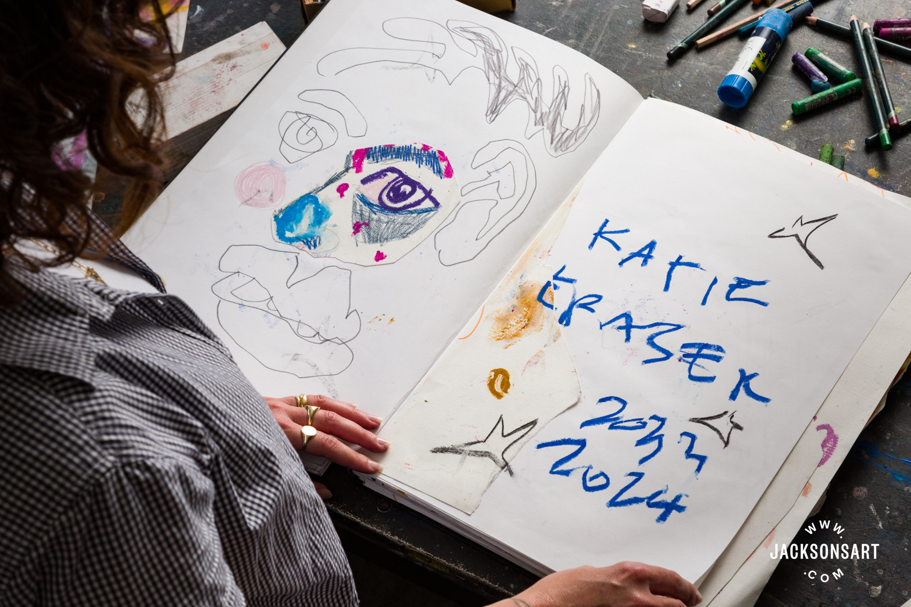
Knowing that the sketchbook is a ‘working out’ space is super important to me, it allows me to reframe that space as somewhere where the mess, mistakes, and crossing out is allowed, and nothing needs to be finished or fully realised. I can’t imagine the energy I would lose if I looked at the pages as if each needed to be a perfectly articulated rendering of my practice. The beauty of them is that one page might be a bit of a mess and the next page might hold a really great image that inspires a painting.
About Katie Eraser
Confrontations, collisions and disruptions act as co-conspirators in the visual language of London-based Australian artist Katie Eraser. Eraser examines with disquieting and disembodied voices the diverse media of large scale oil paintings, sculpture and installation. Eraser obtained a Graduate Diploma of Contemporary Art at the Victorian College of the Arts, The University of Melbourne in 2021. She has previously completed a Masters in Therapeutic Arts Practice from the Miecat Institute (2020); and holds a Bachelor of Design from Billy Blue College of Design (2007). Since 2017, she has exhibited in solo and group exhibitions across England, Australia, Italy, Germany, and Portugal.
Eraser is currently on the Turps Studio Programme in London, where her studio is based for 2023-2025. In 2022, Eraser completed artist residencies at PADA Art Residency in Lisbon and Nocefresca Art Residency in Sardinia. She was a finalist in the 2022 BBA Art Gallery Art Prize in Berlin, as well as the Women’s Abstract Art Biennial, Melbourne in 2020. In 2018, she was awarded the Fortyfive Downstairs Emerging Artist Award, Australia.
Further Reading
Recreating the Colour Palette of Winifred Nicholson
What Unbleached Titanium Can Add to Your Palette
Anna Kurkova: the Physical Process of Painting
Schmincke Norma Blue Water-Mixable Oil Colours Review
Shop Sketchbooks on jacksonsart.com