



Schmincke have kindly explained how they chose the colours they include in their sets of Horadam watercolours.
Horadam is a favourite watercolour of many painters because of the beautiful pigments and a couple of special characteristics. The optimal amount of ox gall is added to the premium Schmincke Horadam Watercolours for controlled flow even on absorbent watercolour papers. Another of the unique characteristics of Horadam is that the tube paint is fully reusable after it has dried on a palette because Horadam use the same formulation for the paint in both tubes and pans. This is unusual as many other makes have a different formula for the pans that allows them to extrude the paint like clay and cut it into pieces to put in the pans. Horadam pans are poured four times in a liquid state allowing the colour to dry for some weeks in a drying chamber to a certain degree of residual moisture and to settle between each filling.
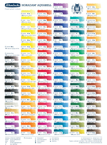
Horadam Watercolour is available in 110 colours in 5ml tubes, 15ml tubes, half pans, and full pans. It is also available in a selection of sets in metal boxes and wooden boxes.

Essential Mixing Colours in Horadam Watercolour

Top row: (six primaries) 215 Lemon Yellow, 224 Cadmium Yellow Light, 349 Cadmium Red Light, 353 Permanent Carmine, 494 Ultramarine Blue, 492 Prussian Blue
Bottom row: (six earth and green colours) 519 Phthalo Green, 534 Permanent Green Olive, 655 Yellow Ochre, 649 English Venetian Red, 663 Sepia Brown, 780 Ivory Black

Schmincke Horadam recommends these 12 basic colours as a good core group of colours for watercolour painting- six primaries and six earth and green colours. The six primaries are the three primary colours in cool and warm variants. This allows clear and clean mixing with the respective neighbour tones (224 + 349 or 353 + 494 or 492 + 215). For all general uses the combinations from mixing these 12 most important colours allows the greatest possible creative space. Pre-mixed greens are useful to have on hand. A green hue can also be obtained by mixing yellow and blue, but its availability as a clean, predictable colour facilitates painting especially outdoors.
The combination of the basic colours in Schmincke Horadam watercolour boxes for 12 colours has been conceived with particular care since this represents the basic assortment of all sets. All the colours have high and highest lightfastness (4 and 5 stars) except for lemon yellow, which has sufficient lightfastness (3 stars) and which does not exist in a more lightfast version in this colour characteristic.


• Cadmium Yellow fulfils the function of primary yellow. Mixed with a little bit of red it will glow in the warmest tones.
• Lemon Yellow mixes clear greens.
• Cadmium Red Light is almost an orange hue. This corresponds to its mixing properties. In the colour circle Permanent Carmine is most close to primary red. To achieve clear violet shades we recommend mixing with Permanent Carmine.
• There are also 2 blues, a cooler one (Prussian Blue) and a warmer variant (Ultramarine Blue). They differ considerably even though they are very close to each other in the colour circle.
• Phthalo Green is a very interesting mixing colour. It increases the range of cool green mixing possibilities. It is also well suited to painting doors, windows and the ocean in the Mediterranean.
• Permanent Green Olive is also very useful for mixing. The addition of different earth colours produces lively and natural green shades.
• The earth colours were chosen based on their position in the colour circle: Yellow Ochre is a more yellow tone – also suited for sand and walls. English Venetian Red as a reddish tone is often used for roof tiles and red brick. Sepia Brown is a blackish dark brown with a lively character which very often can replace black at least in mixtures with blue.
• Ivory Black – like white, not everyone approves of using black watercolour. In mixtures it normally dirties other shades, mixed with blue it is often used to paint bad weather situations.

Related Articles
• Schmincke Watercolour Masking Fluid came in first place in the testing done for this article:
Comparing Masking Fluids
• Using Schmincke Horadam Watercolour, Masking Fluid and Aqua Bronze


1 thought on “Essential Mixing Colours in Schmincke Horadam Watercolour”
Pingback: Summer Watercolour Landscapes & Seascapes Competition - Jackson's Art BlogJackson's Art Blog
Comments are closed.