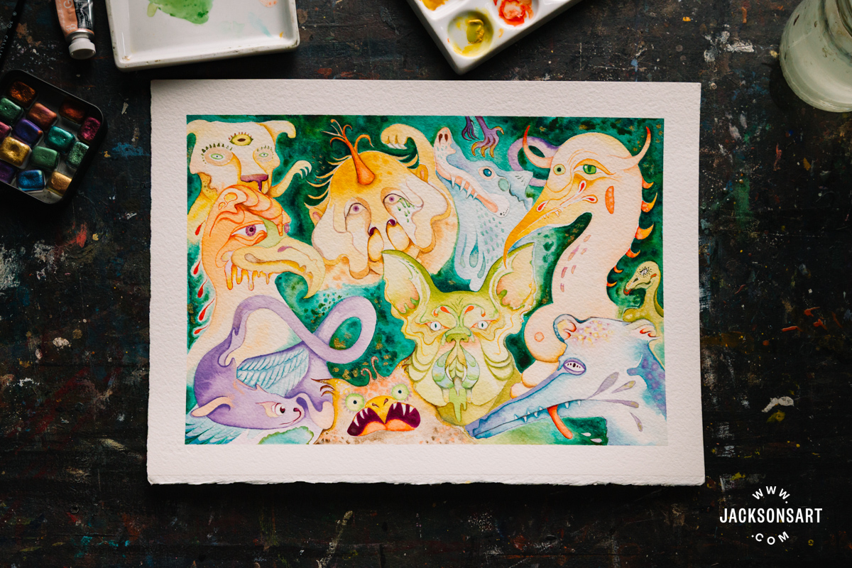
The impulse to make art is integral to the human experience, yet even the most seasoned artists can find themselves unsure how to begin when faced with a blank page. Our Art Prompts are designed to hone the hand, sharpen the eye, and offer refreshing pathways into the creative process. If you’d love to build consistency in your artmaking, overcome a period of creative stagnation, return to your practice after a break, or work outside of your comfort zone, the Jackson’s Art Prompts provide the structure and insight to help, combining practical advice with art historical context. As you work through each prompt, we encourage you to share what you create and connect with fellow artists exploring the series alongside you.
Colour Theory is the third set of prompts in the series. In this course, we invite you to expand your colour palette and explore depth, mood, and contrast through experiments with temperature, limited palettes, optical mixing, and unexpected colour combinations.

The temperature of an artwork’s palette contributes to its emotional impact by supplementing its narrative or mood. Artworks with a predominantly cool palette may gain a relaxed, silent, or still quality. When used to depict a tangible environment, a cool palette can evoke a cold atmosphere. In simple terms, cool colours are found on the ‘cool side’ of the colour wheel, including blue, green, and violet, as opposed to the ‘warm side’ – yellow, orange, and red. For the first part of this art prompt, create a painting using only blue, green, violet, and white for tinting.
On a more advanced level, defining half of the colour spectrum as ‘cool’ is too broad a generalisation, as colour temperature is relative. For example, different blues have different qualities in temperature. Blue pigments that lean towards red are considered warm, like Ultramarine Blue. And blue pigments that lean towards green are considered cool, like Cerulean Blue. Warm yellows lean towards orange, cool yellows lean towards green, warm reds lean towards orange, and cool reds lean towards violet. If you’re unsure whether the primary colours in your kit are warm or cool, refer to the Jackson’s Pigment Colour Index series.
Warm colours can also be ‘cooled down’ by mixing in a touch of their complementary colour. For instance, a warm yellow can be tempered with cool violet, which sits opposite it on the colour wheel. For the second part of this art prompt, create a painting using a limited palette of three cool primary colours and two warm paints, cooling the warmer colours with their complements.
You will need: A selection of oil, acrylic, or watercolour paints, sheets from an oil, acrylic, or watercolour paper block, a selection of brushes, a palette, and a jar for your medium.
Fact: Pierre Puvis de Chavannes’ cool, muted palette set him apart from many of his Impressionist contemporaries, who often bathed their works in highly saturated colour. He emulated the quality of faded frescoes in his blue-tinged works to evoke dreams, poetry and visions, placing him amongst the first generation of Symbolist painters.
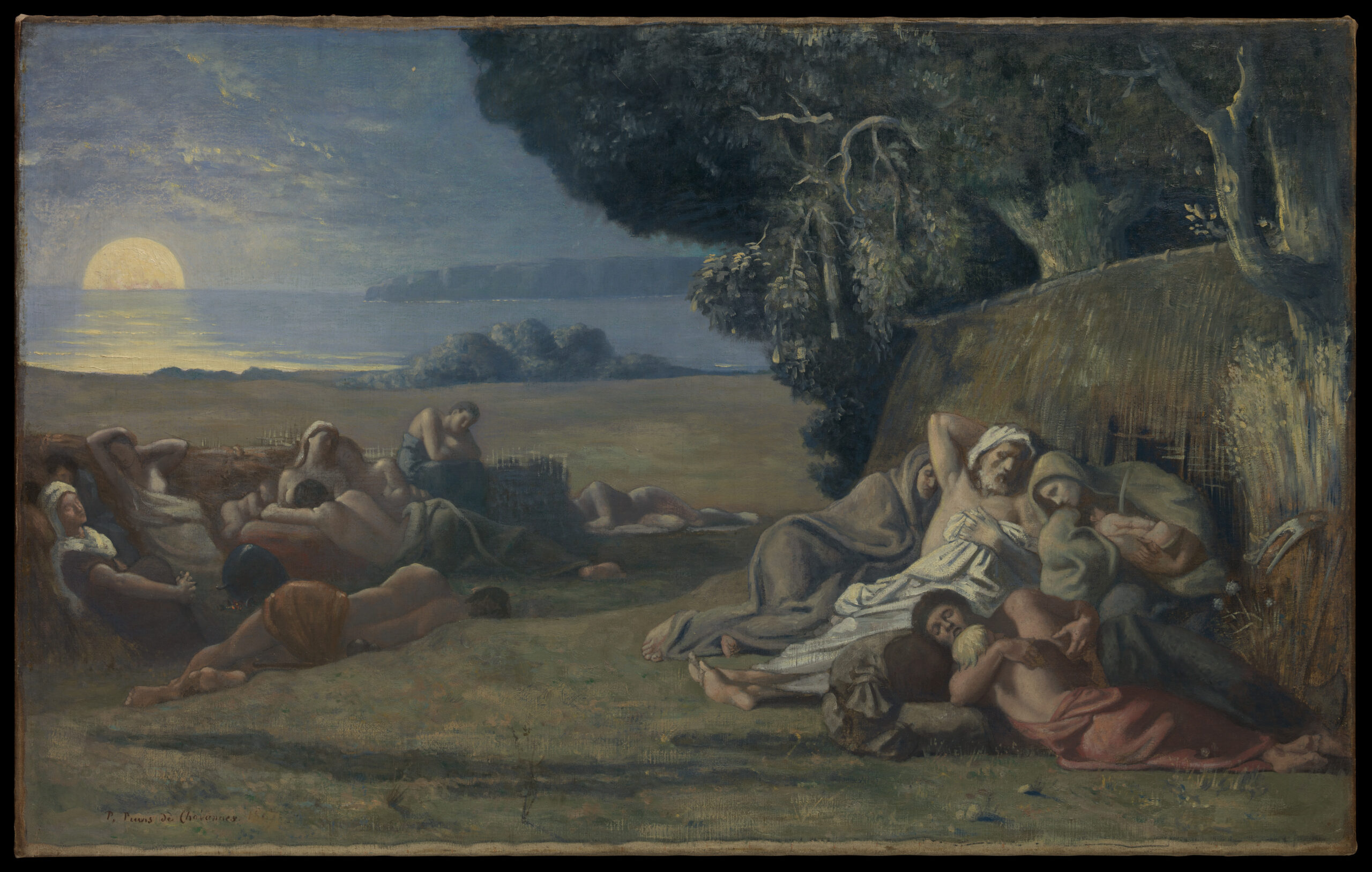
Pierre Puvis de Chavannes
Oil on canvas, 66.4 x 106 cm | 26.1 x 41.7 in
The Metropolitan Museum of Art

Painting with a limited palette creates harmony by avoiding visual overload in artworks and reducing the chance of mixing muddy colours. Using a six-colour primary palette – including two reds, two yellows, and two blues, with one warm and one cool version of each – gives artists a huge range of possibilities in colour mixing without being overwhelming to work with.
As we explored in the previous prompt, consciously identifying the temperature of each colour in your kit helps artists to establish the mood of their works. Yet this isn’t the only reason colour temperature is important – it’s also essential for creating your desired mixtures. For instance, it’s impossible to combine a cool red and a cool yellow to make a warm orange. By having a primary colour of each temperature on your palette, you are able to choose between a warm or cool orange, and combine them to create any temperature in between.
For this art prompt, choose both a warm and cool version of each primary colour – red, yellow, and blue – and combine them to create as many mixtures as possible on a sheet. Start by painting the colours as they are, then work methodically to combine them, noting down which colours you used to create each mixture as you go. Next, add white to your palette to create tints, and swatch these on another sheet. Now that you’ve explored the full range of your six primary colours, both on their own and mixed with white, you’re ready to apply the palette to a resolved artwork.
You will need: A selection of oil, acrylic, or watercolour paints, sheets from an oil, acrylic, or watercolour paper block, a selection of brushes, a palette, and a jar for your medium.
Fact: Mary Cassatt was a master colourist and the only American artist to exhibit with the Impressionists. Her works often feature both warm and cool primary colours placed beside each other to create contrast, movement, and atmosphere. For instance, in Woman with a Fan, the warm yellow of the girl’s fan is placed for movement, set beautifully against the stillness of her cool yellow dress.
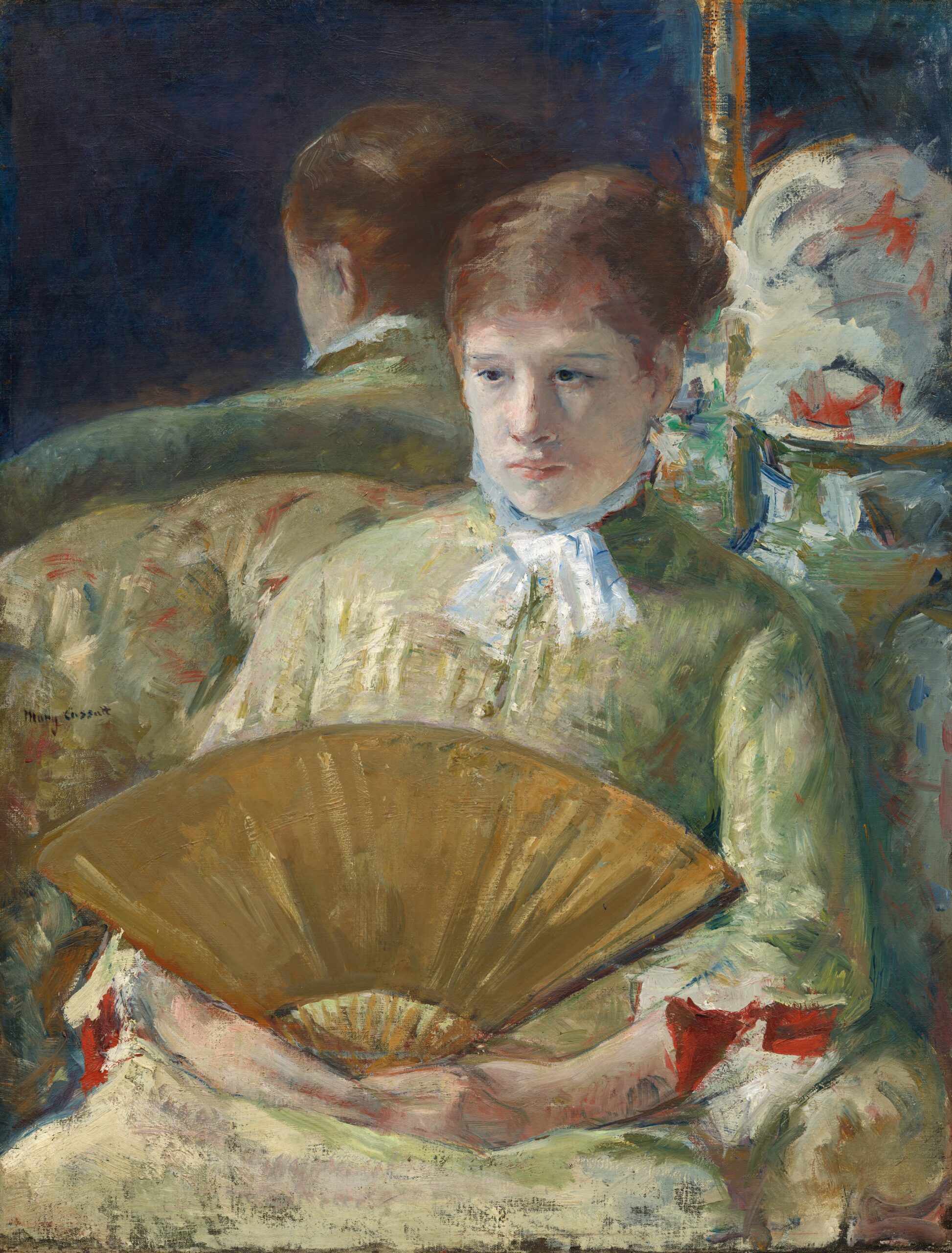
Mary Cassatt
Oil on canvas, 85.5 x 65.1 cm | 33.7 x 25.6 in
National Gallery of Art

Perhaps counterintuitively, black pigments aren’t always the darkest-looking colours in paintings. They can appear dull when painted next to a chromatic black, which may have greater visual depth. Chromatic blacks are made by mixing colours to create a near-black, rather than using a single black pigment. Some classic mixtures for creating chromatic blacks include Ultramarine Blue with Burnt Umber, Phthalo Green with Quinacridone Red, and Prussian Blue with Alizarin Crimson.
You may discover more unique mixtures for chromatic blacks using your own palette. To experiment, try mixing together and swatching the darkest hues in your palette. Note down any compelling mixtures, then dilute them with your medium and brush out swatches of the colour. Then, tint them with white to reveal the greys they can create. As you experiment, try to find cool and warm leaning chromatic blacks that complement each other when placed side by side.
Including both temperatures of black in a painting will allow you to better manipulate the depth and form of shadows. Cool blacks will recede visually, whereas warm blacks appear to advance towards the viewer. For instance, if you’re painting a portrait, warm black may be best for adding shadows to a face, whereas cool black may be best for adding the shadows in the background around the sitter.
You will need: A selection of oil, acrylic, or watercolour paints, sheets from an oil, acrylic, or watercolour paper block, a selection of brushes, a palette, and a jar for your medium.
Fact: Despite his success and access to a wide assortment of materials, Diego Velázquez intentionally painted in a limited palette. This encouraged him to find the full potential of each colour in his palette, making his works both harmonious and rich. He mixed chromatic blacks in each of his works, as seen below in his Portrait of a Man, where a warm black is used in the shadows of the face, and a contrasting cool black is used in his clothing.
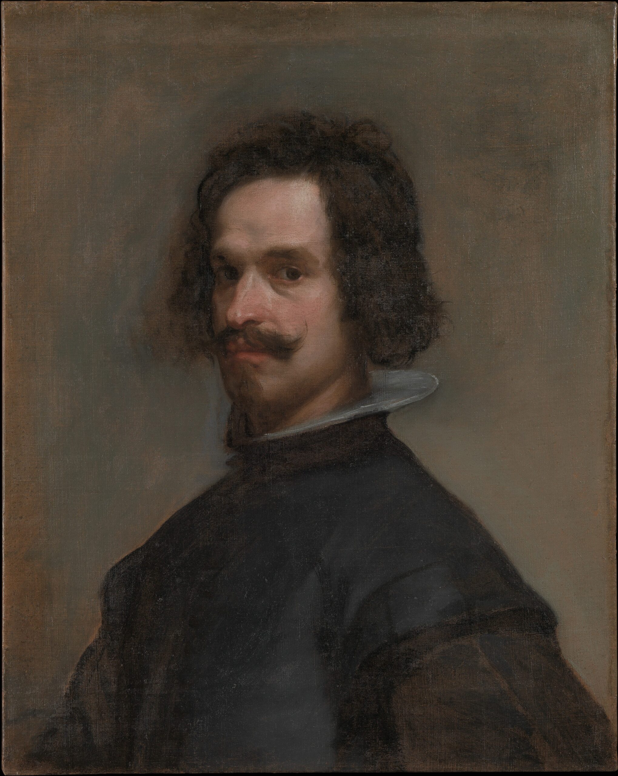
Diego Velázquez
Oil on canvas, 68.6 x 55.2 cm | 27 x 21.7 in
The Metropolitan Museum of Art

A green underpainting, also known as verdaccio, is an ideal ground for painting portraits, since it complements the red tones in skin. When artists layer transparent skin tones over green, the underlying green helps neutralise the intensity of the reds, since red and green sit opposite each other on the colour wheel. This can make portraits layered over green appear more naturalistic, while still retaining vivid saturation. When opaque browns and pinks are placed on top of green, with some areas of the underpainting allowed to show through, the contrast between complementary colours creates visual impact.
Verdaccio was traditionally applied with Terre Verte tinted with white, although other combinations of earth pigments were used. Viridian tinted with white is a more modern choice for this technique. For this art prompt, experiment with mixing your own green to use as a ground for a portrait painting. Test a variety of greens to complement the skin tone of the person you’re painting. This may encourage you to use a green that leans more towards blue or yellow, or towards a warmer or cooler temperature.
You will need: A canvas, a selection of oil paints, oil brushes, a palette and a jar for your medium.
Fact: If you’ve ever looked at a historic painting in a gallery and thought, ‘Why is everyone so green?’, there may be a simple explanation. The practice of painting over a green underpainting was established in Byzantine art and continued into the Renaissance, when artists would layer warm flesh tones over green grounds to create lifelike skin tones. Since some of the pigments used in these upper layers, particularly certain red and yellow lake pigments, were prone to fading, over time, the green below was revealed, giving the figures the sickly green pallor we see today.
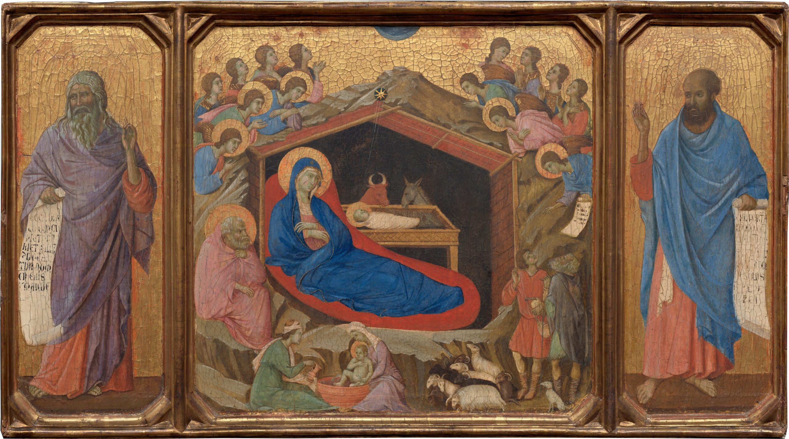
Duccio di Buoninsegna
Tempera on poplar panel, 43 x 43.9 cm | 16.9 x 17.3 in
National Gallery of Art

Sometimes the most unlikely choices produce the most interesting results. By restricting yourself to black and yellow paints, you’ll be encouraged to experiment with different transparencies, mark-making techniques, and mixtures to produce a rich painting, rather than relying on a diverse palette. When combined, black and yellow paints can produce interesting greens or browns, which differ in hue depending on the specific pigments used. Challenge yourself to create a varied palette that leans both warm and cool to capture your chosen scenery. This exercise encourages you to experiment with limited resources, removing any reliance on the perfect palette to make your painting work.
You will need: yellow paint, black paint, a set of brushes, a palette, and a jar for your medium or water.
Fact: Yellow Ochre is one of the oldest pigments used by humans, with evidence of natural yellow earth pigments found in cave paintings made by early humans. The Ancient Egyptians used it extensively for its longevity and abundance in the region. The golden hue and lasting colour embodied ideas of eternal life and the religious importance of the sun.
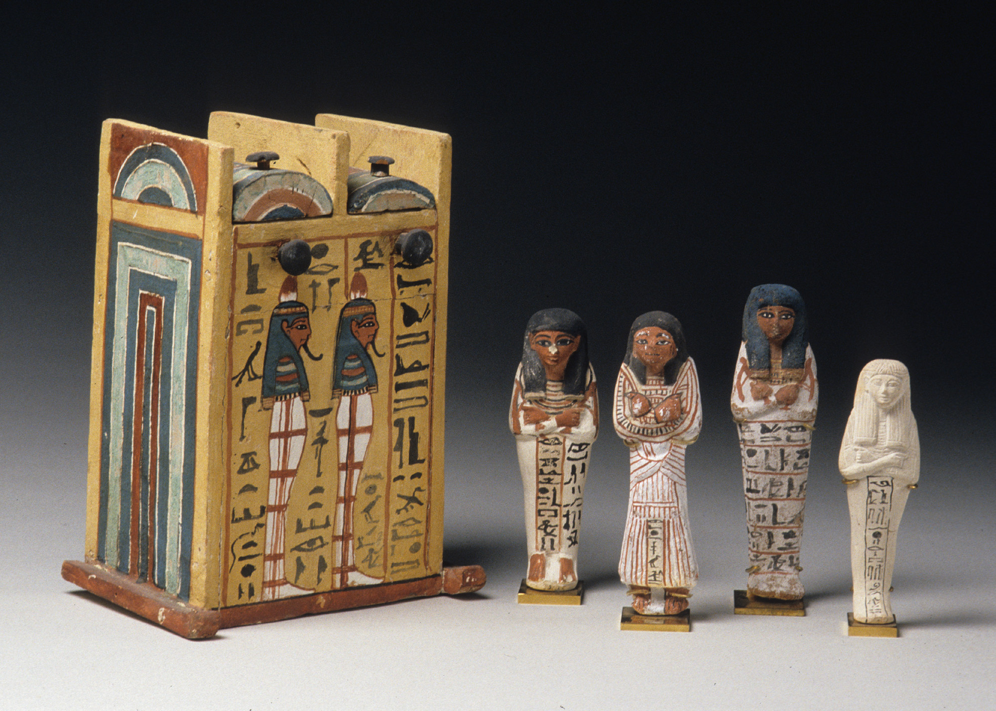
New Kingdom, Ramesside
Wood, gesso, and paint, 28.5 x 20.9 x 16 cm | 11.2 x 8.2 x 6.3 in
The Metropolitan Museum of Art

Pointillism is the application of small dots of pure colour that form a complete image when viewed from a distance. The technique relies on optical mixing, where instead of combining colours on the palette, our eyes merge the adjacent dots to reveal form, value, and space. Pointillist paintings also often appear brighter or more saturated than other paintings. This is because each dot is made of pure colour, with some of the ground showing between them. This gives the painting a sense of vitality, a shimmering quality, or even a rippling, dreamlike feeling.
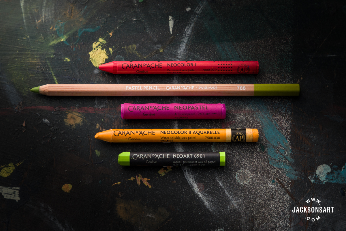
For this art prompt, make a pointillist painting or drawing by considering the placement of your dots to create form and space. This is a time-consuming process, so it may be best to work on a moderate scale. Make a light sketch of your composition first, then begin building the work through methodical dotting. Keep your colours fresh by using a different brush of the same size for each colour, and by trying not to overlap dots of different colours.
You will need: A selection of oil, acrylic, or watercolour paints, sheets from an oil, acrylic, or watercolour paper block, a selection of brushes, and a palette. Or, a set of coloured pencils, soft pastels or oil pastels, and a sheet of drawing paper.
Fact: Georges Seurat and Paul Signac created Pointillism, partially inspired by findings by the scientist Michel Eugène Chevreul, and his 1839 publication, The Principle of Harmony and Contrast of Colours and Their Application to the Arts. In it, Chevreul explored how the human eye perceives colours in relation to their neighbouring colours, describing the phenomenon known as ‘simultaneous contrast’. His findings helped inspire the Pointillists to experiment with the optical effects of placing contrasting colours side by side.
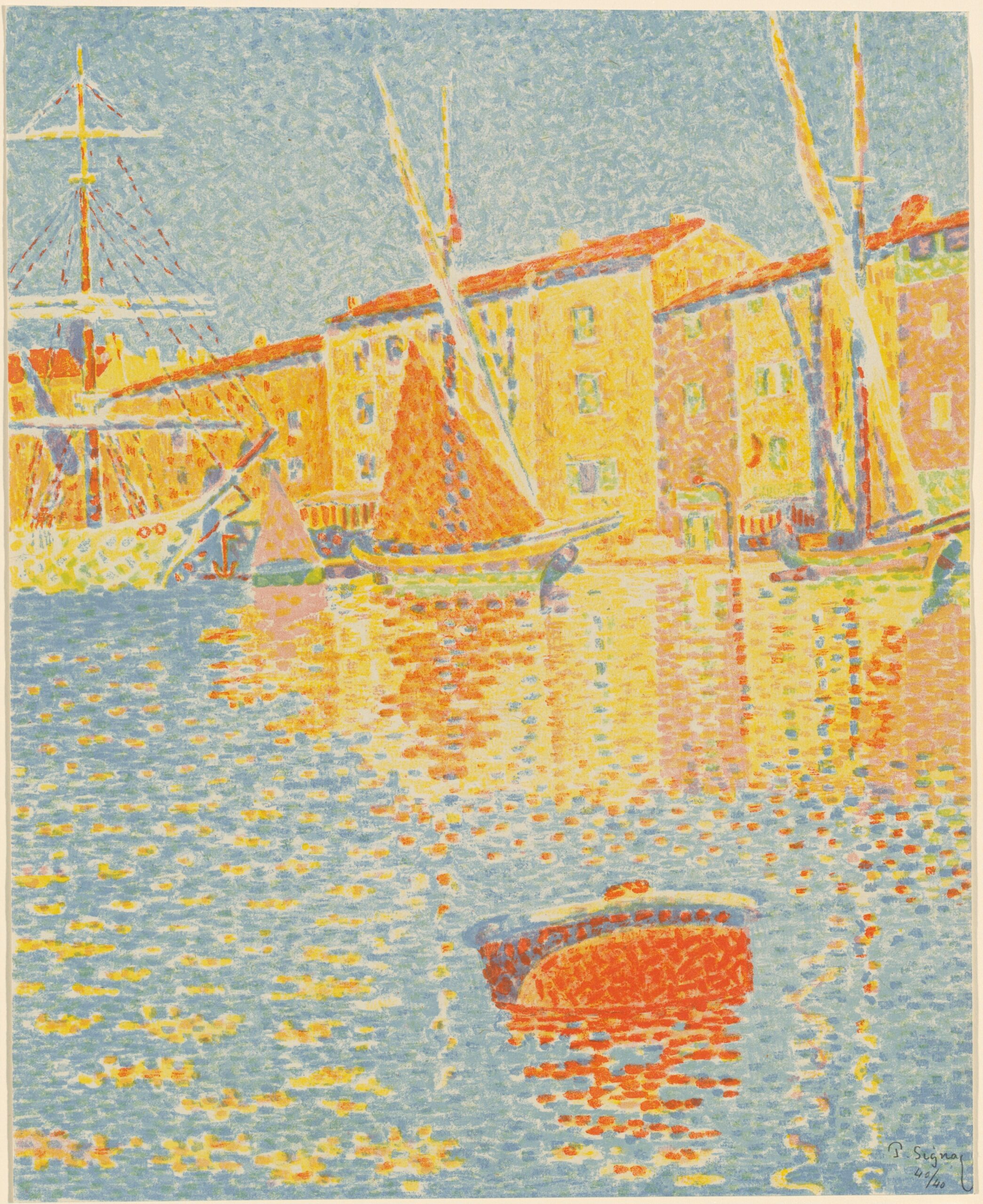
Paul Signac
Six colour lithograph, 40.1 x 32.4 cm | 15.8 x 12.8 in
National Gallery of Art

The Zorn palette refers to the four colours used in the restrictive palette of the Swedish artist Anders Zorn. Despite the limitation, his chosen colours allowed for a wide variety of nuanced colour mixing to capture a full range of flesh tones and landscape hues. Throughout his career, he did use other colours, although these appear mostly as accents to his core palette of four colours. These were Vermilion, Ivory Black, Flake White, and Yellow Ochre. Today Cadmium Red, Cadmium Red Vermilion, or Vermilion Hues are often used in place of genuine Vermilion. This is because the processing of the genuine pigment requires handling mercury and sulphur, making it expensive to buy compared to alternatives, with few brands producing it at all. Additionally, Flake White is no longer used because of its toxic lead component, so it is substituted for Titanium White or imitation lead colours like Warm White.
For this art prompt, use the Zorn palette to paint a portrait. Before you begin, it’s helpful to test mixing the full potential of this restricted palette by swatching your colour mixtures on a separate sheet. Without blue, you’ll need to adjust to using Ivory Black to create dark and cool tones.
You will need: A canvas, sheets from an oil paper block, a selection of oil paints in Yellow Ochre, Vermillion or Cadmium Red, Titanium or Warm White, and Ivory Black, oil brushes, a palette and a jar for your medium.
Fact: Anders Zorn’s extraordinarily limited palette was first described by his contemporary Birge Harrison in his 1909 book Landscape Painting, where he wrote, ‘The distinguished Swedish artist, Zorn, uses but two colours – vermilion and yellow ochre; his two other pigments black and white, being the negation of colour. With this palette, simple to the point of poverty, he nevertheless finds it possible to paint an immense variety of landscape and figure subjects.’
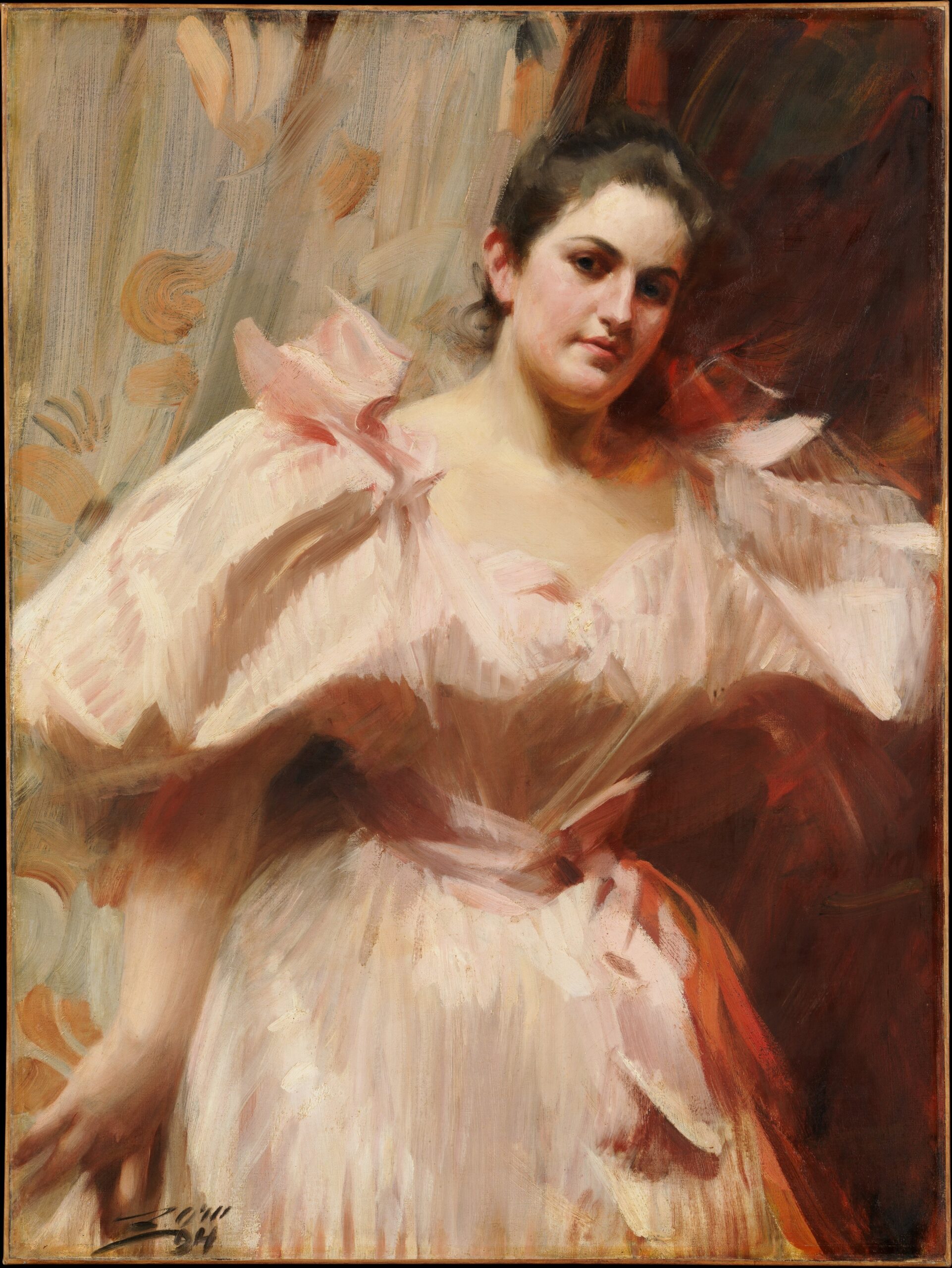
Anders Zorn
Oil on canvas, 101 x 76.2 cm | 39.8 x 30 in
The Metropolitan Museum of Art
Further Reading
Colour Mixing: Exploring the Zorn Palette
Colour Mixing: The Versatility of a Six Colour Primary Palette
Behind the Movement: Pointillism
Shop Art Materials on jacksonsart.com