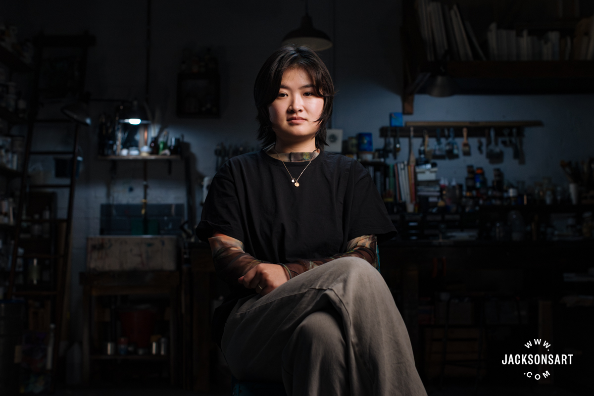
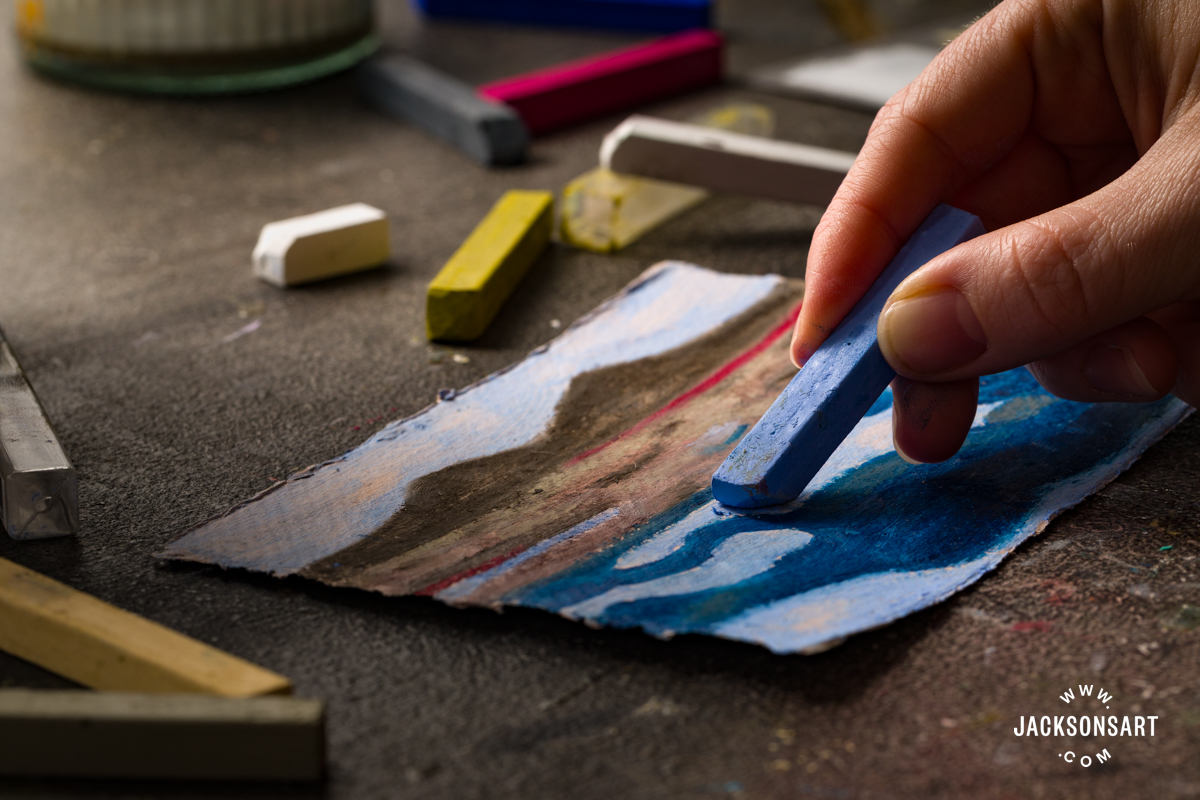
Award winning artist Catherine E Inglis SWA works predominantly in soft pastels and covers a wide variety of subject matter, but is well known for her wildlife, animal portraiture and commissioned portraits. Catherine is an active member of the Society of Women Artists and has regularly exhibited in the Mall Galleries and all across the UK in several joint and solo exhibitions. Catherine has been a tutor and demonstrator of pastels for several years. Below we share her thoughts on Sennelier Soft Pastels with a quick demonstration of the techniques and colours involved to create a lovely Hare.
 “I am delighted to have been invited to review the Sennelier Soft Pastels by Jackson’s for their blog. As a pastel artist I have used Sennelier pastels for over 2 decades now and find them invaluable to my Animal work. One of the reasons being the amazing range of dark tones that is available as I only use black for under painting at the very start of an animal portrait where my darkest tones will be.”
Examples of Catherine’s Pastel Portraits


Materials Catherine used to create her Hare:
Conti Pastel Pencil No. 32 – Tip: Do not draw in your outline with graphite as it will repel the pastel you place over it.
Conte a la Paris crayons – Black. 009 , Tile 079 and Yellow Ochre 017.
Sennelier Soft Pastels – For the background: Yellow Ochre 115, Bright Yellow 342 and Reseda Grey Green 212
For the fur: Burnt Sienna 456, Burnt Sienna 457, Burnt Sienna 458, Vermillion Brown 075, Brown Ochre 120, Flesh Ochre 016, Yellow Ochre 115, Golden Ochre 131, Van Dyke Brown 439 and Van Dyke Violet 409
For the eye and ear: Purple Grey 478, Burnt Sienna 456, Burnt Sienna 457, Burnt Sienna 458, Vermillion Brown 075, Golden Ochre 127, Cadmium Yellow light 297, Bright Yellow 342, Naples Yellow 099, White 525, Ultramarine Deep 388, Chinese Vermillion 790, Vermillion 083, Turquoise Blue 730 and Blue Grey Green 504

Step 1 – Outlining & blocking in colour

Using the UART 800 Grade Pastel Paper, which has a very good tooth for holding pastel, I draw lightly, the outline of the hare and then using Conte a la Paris crayons apply dark to mid tone values in the head. I use the side of the crayon as this gives a lighter & broader coverage of the pigment. I then rub the Conte in lightly with my fingers. This lays a good base foundation for application of the Sennelier Pastels. Sennelier need a little care in application to toothy papers as the paper can be too greedy as you can end up with too much of the pastel pigment applied which will lead to a muddiness on your work.
Tip: Different strokes are made by using the tip, the ‘heel’ of the pastel and also using the side of the pastel to give a light glaze. To do this I always remove the paper from pastels and mostly break them in half so as to use a half stick.
I use the sidestrokes –applying very lightly for the background layers, which I blend together- Sennelier are excellent for this as they are so soft & buttery.
Step 2 – Fur building and creating the eye

Using Sennelier pastels I now start to apply the darker tones of the Hare’s fur, working in the direction of which the fur is growing and following the contours of the face & head.
I do also want to have the eye in at this point as this is the most expressive feature of the face and always seems to turn the ‘live’ button on. I outline the eye carefully with Purplish-Blue-Grey 478 a pastel colour I cannot do without in animal work! The pupil is over painted Conti black with Intense Blue (463) another must for me too. Colours used for the iris from darkest to lightest in this order are : Vermillion Brown 075, Burnt Sienna 458, Golden Ochre 127, Bright Yellow 342, Naples Yellow 099 finishing with White 525 for the highlight or ’catch light ’in the eye and next to the white on the pupil Ultramarine Deep 388 to ‘round ‘the eye. The application of a little touch of red with Chinese Vermillion 790 & another smaller spot of Vermillion 083 over this in the inner corner gives a life like feel. I also apply a little touch of blues onto the lower lid to make it appear wet. To achieve this I use Ultramarine Deep 388 & Turquoise Blue 730.
I then revert back to the fur & start to introduce some of the lighter browns – Brown Ochre 120, Flesh Ochre 016 and Yellow Ochre 115.
Step 3 – Blending the ear

Using Chinese Vermillion 790 and rubbing with fingers to form a very thin layer for the inner ear then a Blue Grey Green 504, is placed alongside the red as well as on the outer left ear of the hare. This is blended softly. I tidy the background & work around the nose to give shape. The paw is very dark so I use Burnt Sienna 456 & Burnt Sienna 457 this makes a very good contrast to the nose giving separation.
To lighten the fur on the edges of the ear I apply Golden Ochre 131 & Nickel Yellow 904, which are the lightest values I have used.
I work a little more on the development of the fur also lightening above the eye and below.
Step 4 – Finishing touches

Blending the Vermillion 083 & Blue Grey Green 504 together in the ear I can then put in the longer, lighter hairs of the ear.
I tidy around the eye with my double-ended blender tool to give a more finished look.
The finer lighter fur can now be applied to the head & neck, as well as the guard hairs. Lastly the whiskers-a steady hand required for this!
I have enjoyed reviewing Sennelier Pastels having used them for many years . I love their very strong & vibrant colours in their comprehensive range. Least of all not forgetting their wonderful dark tones invaluable to an animal portrait artist like me.
They are a superb pastel in every sense. Pigments that will withstand all time. Pastel is one of the most lightfast of all mediums –we only need to be reminded of the raw pigments used in cave art!
Note: I never need to use a fixative on sanded paper and have never had a problem with pastel drop.
Happy Pasteling!
Catherine has been teaching pastels for several years and offers 1-2 day workshops, details of her 2017 workshops are below or on Catherine’s website

Click on the underlined link to view the entire range of Sennelier Soft Pastels on Jackson’s website.
Postage on orders shipped standard to mainland UK addresses is free for orders of £39.