



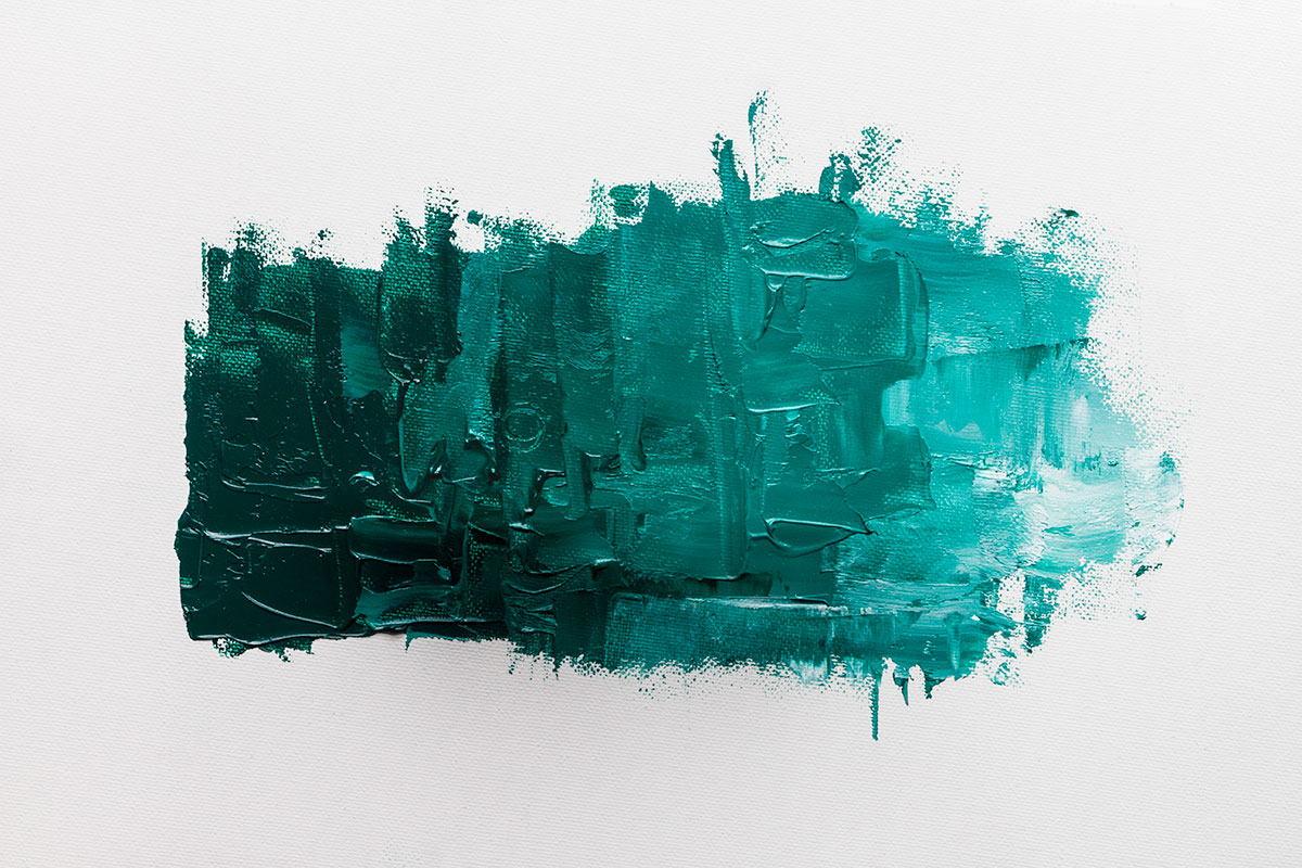
A semi-transparent, slightly milky, dark cool green – the Williamsburg Viridian is a great colour for painting foliage and seascapes. It is also a wonderful mixing colour: with yellows to create bright or autumnal greens, with blues for teals, and with reds for blacks and greys. Williamsburg Viridian tints with white to make cool green greys. Its transparency also means it is a good colour for glazes. It is a great mixer and is very adaptable – a useful colour to have in your paintbox.
Since the 1980s Williamsburg have been making their oil colour by hand in small batches. Each Williamsburg Handmade Oil Colour is ground to enhance the beauty and luminosity specific to that particular pigment, some colours will feel slightly gritty; others extremely smooth. Over 160 glorious shades to choose from, including iridescent and interference colours. Williamsburg Viridian mixes in interesting ways and many artists find it a useful colour.
Colour Mixing Charts – Williamsburg Viridian Oil Colour
For these charts I mixed the Williamsburg Viridian with a warm and cool yellow, a warm and cool red and a warm and cool blue, plus burnt umber. The mixing colours used in the charts are all Jackson’s oil colours.
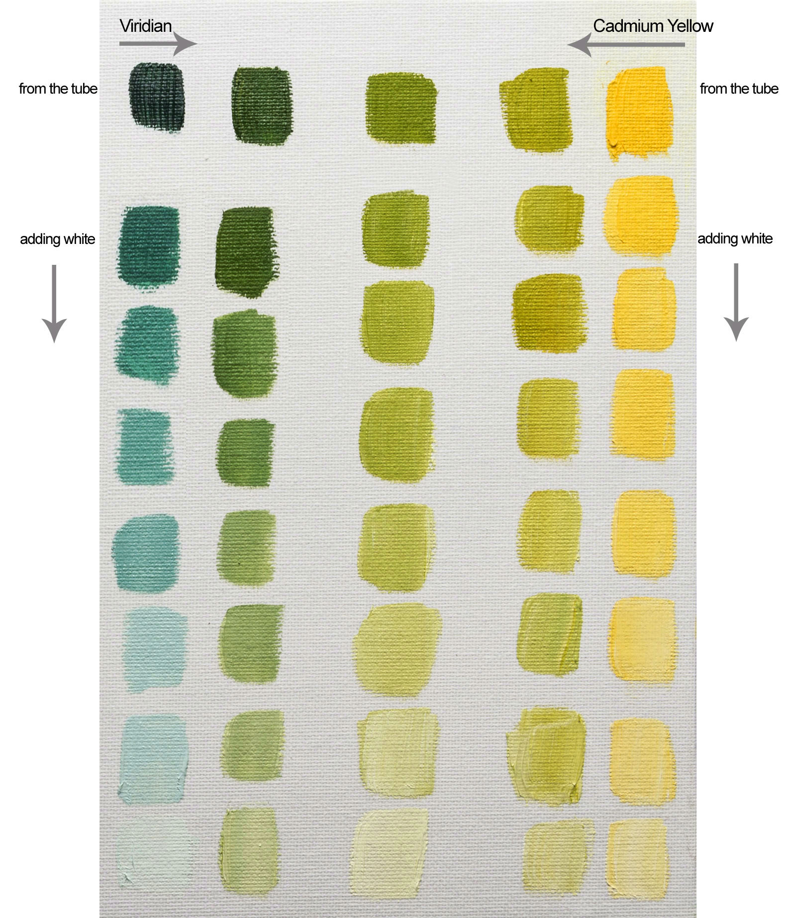
Each chart has five columns of seven tints with more white added going down. The left column is straight Viridian, the right column is the straight mixing colour. The centre column is a visual halfway point and the intermediate columns are visually midway between those. By ‘visual midpoint’ I mean that it is what looks like the halfway point between the two colours on the colour wheel. It is not a mixture of 50% + 50%, as half of the mixing colours have more tinting strength than the viridian (both reds and the Phthalo blue).
Williamsburg Viridian + Lemon Yellow

Williamsburg Viridian + Cadmium Yellow
Williamsburg Viridian + Phthalo Blue

Note: My first chart was this Phthalo Blue board and I had planned to do seven columns for all the colours but there wasn’t enough difference to warrant it so I changed to five columns after that, so that’s why this colour chart has more columns.
Williamsburg Viridian + Ultramarine Blue

Williamsburg Viridian + Alizarin Crimson

Williamsburg Viridian + Cadmium Red

Williamsburg Viridian + Burnt Umber

Williamsburg Viridian Mixing Proportions

Click on the underlined link to go to the current offers on the Williamsburg Oil Paints on the Jackson’s Art Supplies website.



10 thoughts on “Colour Mixing With Williamsburg Viridian Oil Paint”
Love these charts. Very helpful. I only started using viridian
recently by Willamsburg and immediately fell in love with the
color. So long- phalo green. Thank you for the post!
I was surprised by how useful Viridian is, too!
Glad it was helpful.
VERY HELPFUL ……..MANY WAYS TO USE VIRIDIAN
This is such valuable information. I have
been searching ‘mixing ocean colours in oil’
and this is a great help, better than
anything else I have found. Thank you for
sharing it.
Hi Barbara.
I’m so glad you found it useful. It was interesting to write!
Nice work! Thanks for posting this!
such quality invaluable work
I wish I had more of your color grids to
visually digest
Have you made any charts for Charvin’s
line of extra fine oils?
I would love to see your organization
bring some clarity to their more unique
colors
Hello.
Thank you, I’m glad you have found them useful.
We are looking into possibly stocking the Charvin oils. I haven’t tried them before, what do you like about them?
Is the red here Cadmium Red Medium?
Hi
All the colours used to mix with the Viridian were Jackson’s Artist Oils.
In that range we do Cadmium Red Genuine plus a hue and a deep. Yes, it is a cad medium.
Jackson’s Artist Oil Cadmium Red Genuine.
Comments are closed.