



You would expect that Winsor & Newton, the makers of the most popular watercolour in the world, would also make an excellent watercolour paper and you would be right! Five artists with a variety of painting styles have tried the new papers from Winsor & Newton and the results are very positive.
Winsor and Newton Watercolour Papers
Winsor & Newton make two watercolour papers: the Professional and the Classic. They are hard to distinguish by the packaging because they don’t say ‘Professional’ or ‘Classic’ on them, just the colour of cover is different: the Professional has a dark grey cover and the Classic has a light grey cover.
Winsor & Newton Professional Watercolour Paper
This luxury watercolour paper is made from 100% cotton and is naturally acid-free and archival.
It is cylinder mould made, 300gsm (140lb), acid-free, archival, contains no optical brighteners, both internally sized and externally sized.
This paper is available by the sheet, in a 5×7-inch spiral pad, and in blocks. It is available in Hot Pressed, Cold Pressed (Not) and Rough surface textures.
A block is different to a regular pad. A watercolour block is a pad of watercolour paper that has been glued on all 4 sides. The sheets of paper are bound while they are wet, which means that they dry flat, and when they are wetted with paint the binding keeps the paper flat regardless of how much fluid watercolour is applied to the surface. Watercolour blocks are therefore very practical because there is no need to stretch your paper before you work. Wait for your painting to dry before cutting the top sheet away from the block with a blunt knife such as a letter knife or a butter knife. Take care when running the knife around the edge to not slice into the paper.
Results from our five testers show that both papers take time to dry, giving the artist working time. The Classic paper dries even more slowly than the Professional (that the Professional is more absorbent than the Classic.
Winsor & Newton Classic Watercolour Paper
A more affordable yet still exceptionally high quality alternative to the Professional Watercolour Paper is the Classic Watercolour Paper which is made from premium archival grade cellulose wood pulp. The pulp has been treated to make it acid-free. It is cylinder mould made, 300gsm (140lb), acid-free, archival, contains no optical brighteners, both internally sized and externally sized.
This paper is available by the sheet, in gummed pads and spiral pads. It is available only in the most popular surface texture: Cold Pressed (Not).
Results from our testing show that the Classic paper is less absorbent than the Professional paper, this allows the watercolour paint to sit proud and bright on top of the paper.
The things both papers have in common:
- Both papers are cylinder mould made. In the mould making process, any impurities and acidity are extracted and then combined with natural spring water with neutral ph properties for a highly resilient, high performance paper that looks and feels handmade.
- Both papers are 300gsm (140lb) weight.
- Both papers are acid-free, archival and contain no optical brighteners, so will remain completely colour-stable over time if kept in the right conditions.
- They are both internally sized and externally sized to give exceptional strength, balanced absorbency, colour performance and resilience. This means that the size (a barrier layer which stops paint soaking into the surface, saturating the fibres and bleeding laterally) is added to the cotton pulp mixture before the sheets are formed in the mould, and again to the surface of the sheet. Paper which has been internally and externally sized will not warp when it is subjected to heavy washes or multiple paint layers.
- They can both be used with watercolour, gouache, ink and acrylic paints.
The things that make the two papers different:
- The paper material – the Professional is all cotton and the Classic is acid-free wood pulp.
- The formats they come in – the Professional is available in sheets, one spiral pad, and in blocks (glued on 4 sides); the Classic is available in sheets, gummed (glued) pads and spiral pads.
- The surface texture – the Professional is available in Hot Pressed, Cold Pressed (Not) and Rough surface textures; the Classic is available only in the most popular surface texture: Cold Pressed (Not).
- The amount of sizing – results from our testers show that they differ in the amount of sizing in the papers, the Professional is more absorbent than the Classic.
- The price – the Classic paper is more affordable.
Paper Testing by Artists
Peter Williams
Peter Williams is an artist and writer. In his art he specialises in intricate pencil drawings, pastels and dramatic watercolour paintings. He works from his studio on the Suffolk coast, having relocated there from Hertfordshire in 2005. Peter is inspired by his long-time interest in the natural world, a passion for wildlife, both British and the more exotic, and scenes inspired by people and places that have influenced him throughout his life. He has also produced two novels and is currently working on a third.
Peter tested the Winsor & Newton Professional Watercolour Paper Block in the Cold Pressed (Not) texture and 9×12-inch size.
“My first observation when I opened the pack was that the paper is quite a brilliant white. Not the brightest I’ve ever used but nonetheless white enough so that transparent washes are achievable and remain radiant. It also has a luxurious velvety finish to the surface, textured but not too rough. For my painting I chose a composition that involved several different techniques such as the use of masking fluid, wet-into-wet washes, intense darks, some fine detail and some lifting out.
“The first graduated wash for the sky, blue diffusing into gold, went on beautifully. I found that the paint wasn’t absorbed into the paper too quickly allowing the wash to dry slowly and evenly, giving time to add more colours or lift out areas as required. I felt instantly at home with this paper. Further into the painting the surface allowed me to pick out fine details easily even though there is enough texture to get some dry, ragged edges when wanted. In places I gave the paper a good scrubbing as I lifted out pigment but the surface was left completely undamaged. Likewise, the masking fluid was easily removed too. The block being firmly glued on all edges meant there was no warping or cockling although a very sharp blade was required to detach the sheet from the pad.
“I think this is a high quality, robust paper with good sizing and has a lovely surface to work on. In fact I think I prefer this to my usual Arches Aquarelle and will definitely be using it again in future.”

Henry Jones
Working predominantly in watercolour, Henry Jones finds inspiration for painting in everyday experiences: landscapes, cities, street scenes, people, machines, and especially images from television and the media. Sketchbooks line the shelves of his self-built studio. Since leaving Winchester School of Art in 1987 he has filled sketchbooks on his travels through the US, the Far East and Australia, returning in more recent years to London. He says: “Whenever I look at a scene I subconsciously begin to work out how I can paint it – how I might capture light, movement and atmosphere, and I’ve always made a habit of using the best materials and equipment I consider necessary.”
Henry tested the Winsor & Newton Professional Watercolour Paper Block in the rough texture and 10×14-inch size.
“Loving the paper, excellent quality.”
“I was sent by Jackson’s, a regular source for me of paper, paint and brushes, a block of the new Winsor and Newton Professional rough watercolour paper for review. Winsor & Newton watercolour paint is one of the three brands I use so I expected a high quality paper for my test. First impression was that the paper felt thick and well constructed, its rough surface firm for the preliminary pencil sketch for the painting. Wetting the surface showed that the paper took the water with ease, and held the moisture for longer than my current brand allowing the pigment to mix nicely, perfect for wet into wet work. Even after ten minutes with the ambient temperature at around 20˚C, the paper allowed for progressive brushwork to blend into subtle mixes without being overworked. Blotting to remove wet paint for clouds and faces proved easy, with little or no evidence of non-staining paint left in the blotted area, leaving the white of the paper shining through. Once dry, the rough surface was perfect for dry brush, pushing the artist to be economical with the marks and avoid fiddling – the worst thing you can do with a watercolour painting. This is a premium paper, most similar in my experience to Arches, tough enough to resist palette knife scraping back and with a texture and surface inviting the artist to get painting and enjoy it.”

on Winsor & Newton Professional Watercolour Paper
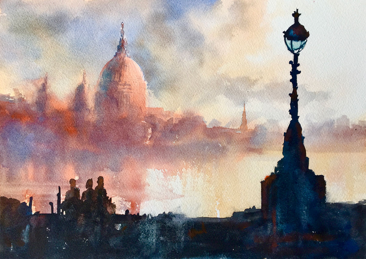
on Winsor & Newton Professional Watercolour Paper
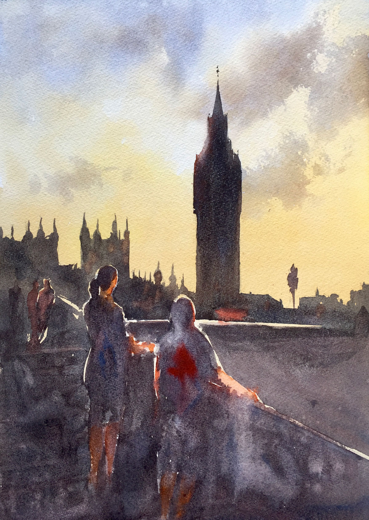
on Winsor & Newton Professional Watercolour Paper
H Locke
Illustrator H Locke compared the Winsor & Newton Classic watercolour paper to the Professional range. H was very careful to make a mark on one and then the same mark on the other, working hard to make it a like-for-like test. H usually creates illustrations on smooth papers but the Classic is only available in cold pressed/not so the comparison was between both papers in cold pressed/not texture. H tested the Winsor & Newton Professional Watercolour Paper Block in the cold pressed (Not) texture in the 7×10-inch size and the Winsor & Newton Classic watercolour paper in the cold pressed (Not) texture in a spiral pad in size A4.
“I used Uni Pin fineliner pens, Holbein gouache, a Handover synthetic round brush and a DaVinci squirrel mop brush for the comparison test of the two papers. I really liked both of the papers but found them to be very different.
“The Classic paper was in a pad and the Professional was in a block. The Classic is acid-free wood pulp (or wood-free, a technical term meaning wood pulp that has had the lignen removed so it becomes acid-free wood pulp) and the professional is all cotton.
“I don’t know if it is the difference in fibres or format that made it much easier to draw on the Classic with the Uni Pins. The delicate tip of the pen seemed to catch a bit on the Professional but it moved smoothly on the Classico. I have found the same with Fabriano Artistico, also an all-cotton paper that I also used in a block, as compared to Bockingford, another wood-free paper that I used as a pad. I don’t know if it is the pad/block format or the type of fibre, or the student/professional quality that is the issue but the fineliner works better on the less expensive paper.
“It might also have something to do with the sizing, because they seem to be sized quite differently. They each took the gouache (opaque watercolour) very differently. I used the same amount of paint and water in the stokes on each paper, one-for-one, but the results were very different. The Classic acted as expected, the Professional was very surprising. The colour on the Classic is much stronger, it matches the paint that was on the palette, like the colour all stayed on the surface of the paper sitting proud. It took a lot longer to dry than the Professional. The paint colour on the Professional is much more pale like there is less sizing and the paper soaked some of the paint under the surface, which also explains it drying so fast.
“It might also be the sizing that caused the pigment in the rock/island shape to flow differently, that shape on the Classic has a hard edge and on the Professional doesn’t. Also perhaps because of puddling on top of the sizing, the paint on the Classic paper filled in all the cold pressed/not texture whereas the faster absorption of the Professional left some white sparkle of the textured paper, as if I had used a drier brush. (Click on the image below for a closer view.)
“Overall – I think for gouache and fineliner illustrations I would recommend the Classic as the brighter colours will allow a good scan for digital work. For framed watercolour artwork the Professional gives a more painterly look to the work and the block format reduces the cockling of the paper.”


H Locke illustration using Uni Pin and Holbein gouache, painted on Winsor & Newton cold press (Not) papers. Left is Professional paper and Right is Classic.
Sally Jane Thompson
Sally Jane Thompson is a freelance comic creator and illustrator. In addition to her website, you can also find Sally on Twitter.
Sally tested Winsor & Newton Professional Watercolour Paper Block in the Hot Pressed texture and 10×14-inch size.
“A chance to do some sketching from the deck of a moored boat seemed like the perfect time to test this paper out. It was the first time I’ve used a block format, and this one worked beautifully for outdoor work in a bit of a breeze, keeping the paper solidly in place, and not showing any buckling until near the end, several layers of paint in (and even that was minor, it was just the first time I’d noticed any. It dried totally flat.)
“Colours seemed to dry very true, with little loss in vibrancy, which certainly isn’t always the case. Colour also seemed to spread quite far on damp areas, so a light touch is probably needed – the darks in that one tree rather got away from me! (Though I’m fairly new to watercolour, so that’s likely just down to my technique, or more to the point, lack thereof!)
“Probably the biggest thing I noticed, for anyone also using pen & ink, is that it absorbed enough paint that it felt like drawing on paper, rather than the slightly chalky feel you sometimes get drawing on paint. Overall, an absolute treat to use – likely to be particularly good for illustration/drawing-based work, which I’ll definitely be testing it on further!”
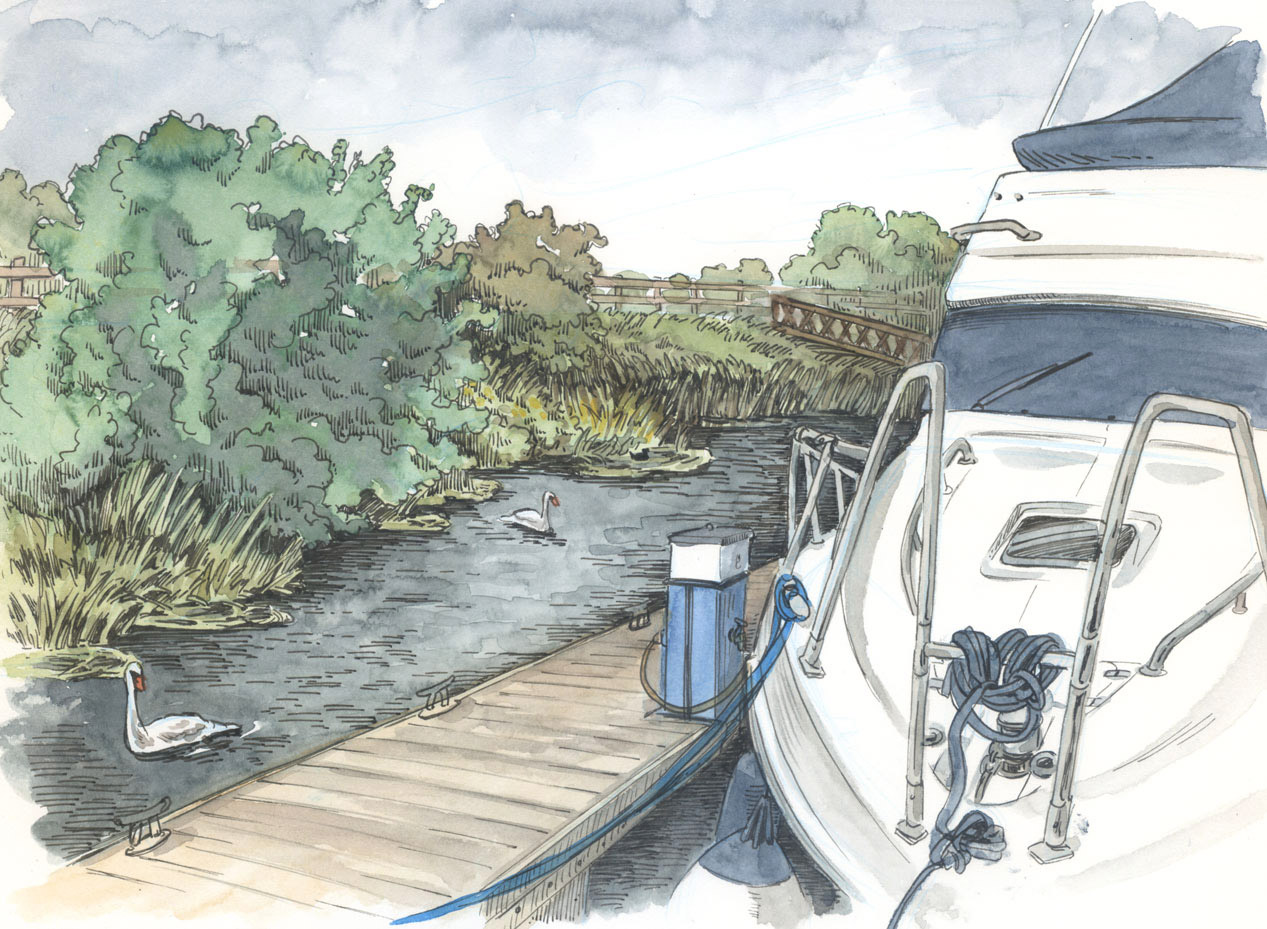
on Winsor & Newton Professional Watercolour Paper
Daniela Illing
Daniela Illing is an artist from Schwäbisch Hall, Germany. Her figurative drawings and paintings are inspired by history, science and current events.
Daniela tested the Winsor & Newton Professional Watercolour Paper Block in the Hot Pressed texture in the 10×14-inch size.
“Hot press paper has a reputation for being fickle and fragile. However, I prefer it to cold press because of its flexibility and opportunities to integrate other media. Winsor and Newton’s Professional paper doesn’t disappoint in that regard: watercolour, pencil, pens and gesso are easily combined on its smooth surface (see the ‘Marion’ painting below). It supports almost perfect blending with no visible brush strokes, if water is used modestly. The paper also suffers through quite a bit of scrubbing, more so than many cold press papers, which turned out to be a pleasant surprise.
“It’s also a great surface for wet on wet techniques, leaving enough time to push your colour around and still drying fast enough to add a second layer within an hour. This technique, however, comes at the typical price of backruns and edge darkening. Achieving large, even glazing layers is possible, but requires a bit of experience with this paper.
Personally, I often enjoy drying effects and was thrilled to see them develop quickly enough to be moulded and refined (see the ‘Impression’ painting below). Colours are as vibrant as you expect them to be on quality paper and do not appear dull after drying.
“All in all I’m more than satisfied. I actually have found my new favourite watercolour paper.”


Click on the underlined link to go to the current offers on the Winsor & Newton Watercolour Papers on the Jackson’s Art Supplies website.
Postage on orders shipped standard to mainland UK addresses is free for orders of £39.


9 thoughts on “Winsor & Newton Professional and Classic Watercolour Papers”
I’d love to know the difference between the Classic paper and the Cotman range. The
Classic costs a bit more than Cotman yet the Cotman says it uses no wood, and this uses
cellulose wood pulp. I can’t find what the Cotman is actually made from – but maybe
cellulose isn’t considered wood?
Which paper is the better quality among the two?
Hi Lucy
Apologies for my delayed reply, I was awaiting an answer from Winsor & Newton.
I have been advised the following:
“Classic watercolour paper is of a higher quality – cellulose, archival, acid free, internally sized (paper is perfectly suited to all techniques). It is robust and durable.”
They can’t tell me on what the Cotman paper is made from. It’s also acid-free.
It sounds like they are both ‘wood-free paper’ which is cellulose wood pulp with the lignin removed to make it acid-free.
Sorry I couldn’t be of more help.
I just bought a little pad of the classical paper to
test it. Actually it’s the best “non 100% cotton”
paper I painted on.
I am very surpised by the quantity of absorption is
has. I far more prefer that one to the cotman.
The great smoothness of the paper is also very
appreciated. A very, very good paper.
Best regards (from France!)
I’m a bir confused. Your review states the paint Is more
absorbent on the professional than the classic paper. One
of your reviwers states the same – going as far as stating
the classic takes longer to dry. However, all your other
reviewers imply the paint takes much longer to dry on the
professional – and can be manipluated for some time, which
means, like all good sized papers, it can’t be more
absorbent. Could you clarify, Thanks 🙂
Hello.
I see how you’re confused, I will edit the article introduction to clarify.
Only one reviewer compared the Professional to the Classic.
The Professional reviewers say it is slow drying and the comparison reviewer says the Classic is even slower than the Professional.
Totally agree, the Classic paper is still
excellent. I really want W&N to make a
sketchbook with that paper! It must be
a killer!
The Pro paper is just incredible.
The Classic paper does come in pads, and perhaps one could be used as a sketchbook.
https://www.jacksonsart.com/brands/winsor-newton/w-n-surfaces/w-n-classic-professional-watercolour-paper/sub-brand/w+n—classic-watercolour-paper
This one is my very favorite « non-cotton » paper (100% wood pulp here), the Classic from @winsorandnewton, but the previous one! (grey cover). This paper was made in France (@archespapers ? @lanapapiersspeciaux ? @cansonpaper ? @clairefontaine_officiel ? @sennelier1887 ? Another..?), and it is just a delight to paint on. It reacts very close to cotton made papers. Plus, it was pretty affordable. A MUST.
Unfortunately, @winsorandnewton just changed their manufacturer recently (@fabriano1264 ?), and the quality is not that good anymore..(specifically the sizing that looks like plastic and the texture that is unpleasant…)
>>>Here is a request @winsorandnewton : PLEASE, MAKE THAT « GREY CLASSIC »PAPER AGAIN !
I have passed your request in to Winsor and Newton.
Comments are closed.