Episode 22: In this episode our sound-man, the talented Mr B escapes from his headphones and attempts to multitask by talking about photographing flat artwork in a way that will give reasonably accurate results whilst still making sure the sound levels are OK!
Who hasn’t at some point needed a picture of their masterpiece? Whether it is to show to a client or a gallery or a submission to a competition or just to post on social media there are times when an accurate representation of your work is essential.
The following article was written by Laura and Ben in 2018 for Artists and Illustrators Magazine. We are grateful to them for permission to use the text again here.
All artists should know how to take an accurate photograph of their artwork. Photographs providing a clear and honest representation of your artwork are essential for everything from your own web pages to competition entries. This doesn’t mean owning professional kit or taking photography lessons; following these simple rules should result in photographs that will do you and your work justice.
For an accurate photograph, work should not be behind glass or framed and the photo should not include any surrounding objects. Ideally use a white wall, or improvise with white board against a wall, as a background. It is also important to be honest: never be tempted to ‘improve’ your artwork by working on your photo. You will be storing up trouble if the original is a dim version of its photograph.
Here are the four basics to address: white balance (getting colours as accurate as possible), avoiding camera shake, squaring up the camera to avoid distortions and even lighting.
In this episode…
1. White balance.
Almost all cameras have a custom white balance setting. Check your instructions to enable this option and the camera will do the rest. Just photograph a white card before your artwork to set the balance. If you are using a mobile phone, you will need to adjust the white balance yourself using a photo-editing app. All editing apps have colour balance corrections, but none are automatic so include a piece of white card in each shot as your guide for corrections.
2. Camera Shake
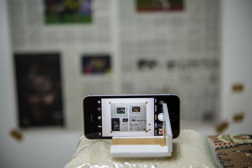
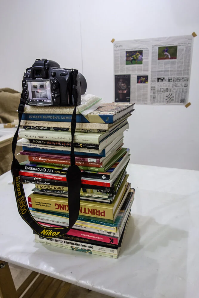
If you have a tripod and a cable release, use them. If not, improvise using whatever will support your camera at the right height. That could be a table top or books, but you may have to improvise to hold your machine steady (try a plastic bag full of rice as a beanbag). Use the time-release function to avoid shaking the camera or phone while taking the shot.
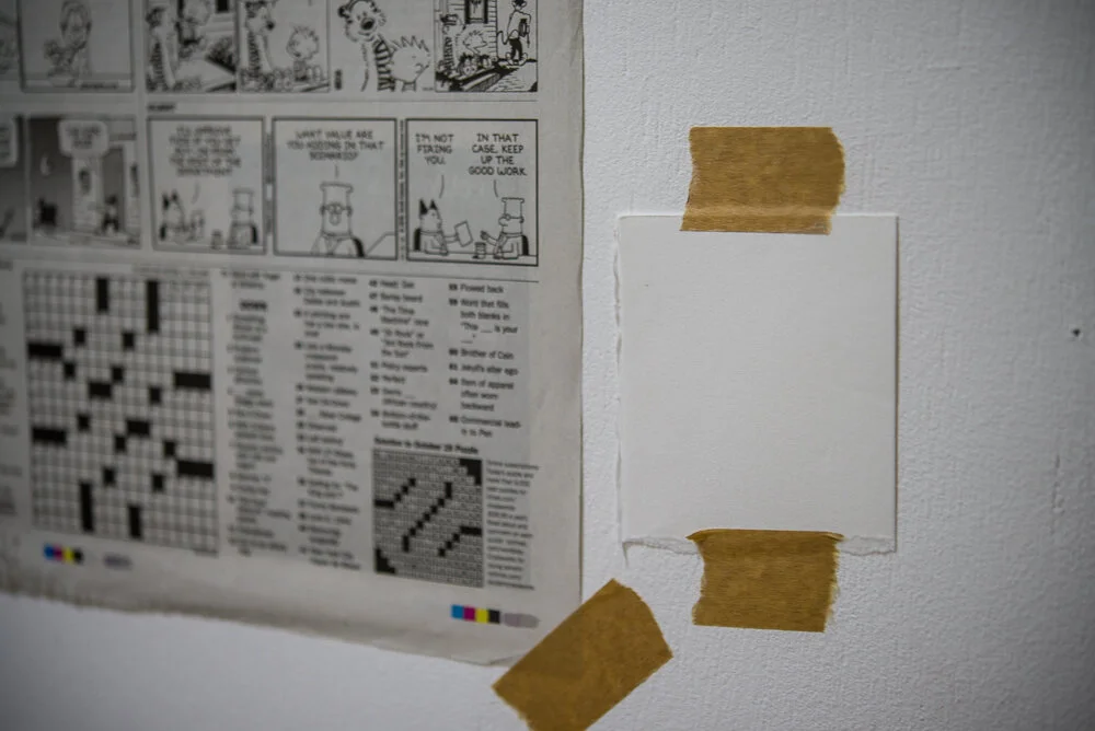
3. Getting the camera square to the wall
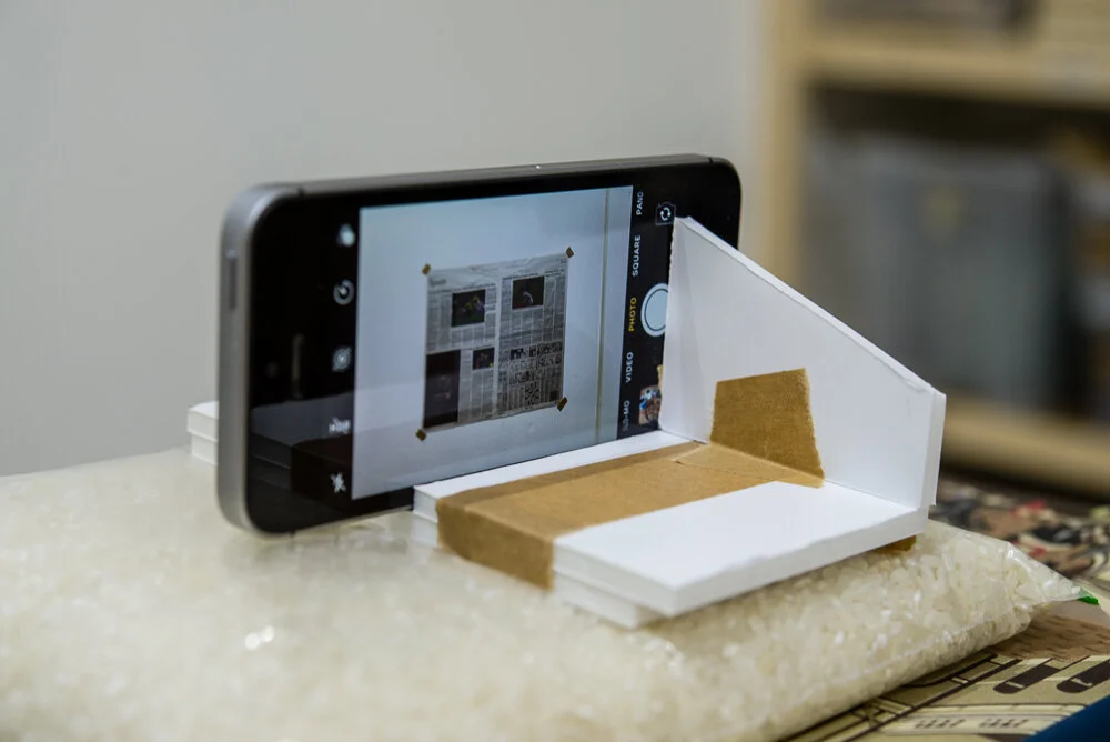
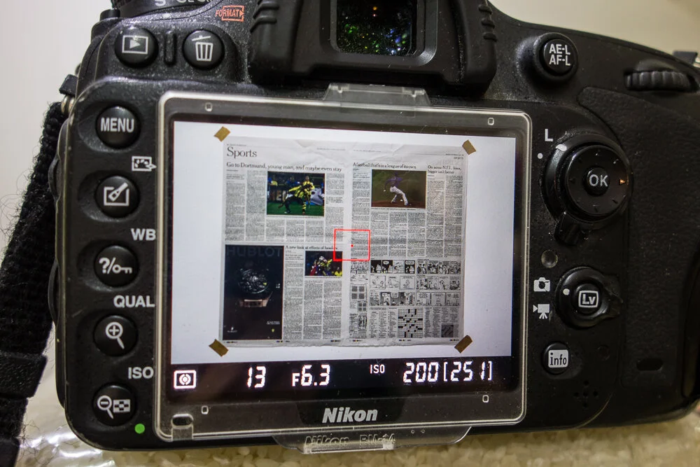
Use the edge of your work to do this. If that is not practical, tape a piece of newspaper to the wall and use the grid of the text as a guide. Once the camera is set square, tape the work up and take the shot.
4. Even Lighting
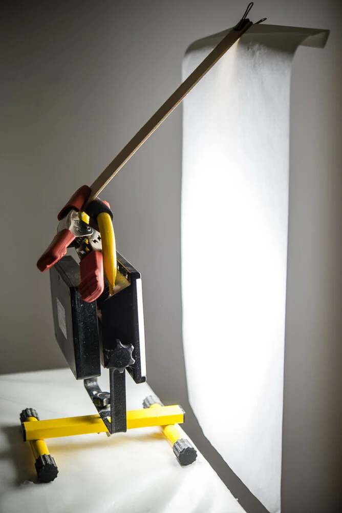
Work taped up in landscape orientation will be easier to light. You will need a pair, or ideally, four matching lights. I recommend cheap LED site lights from a DIY or building supplier. If you have two, position them level with the centre of your artwork at 45 degrees on either side. Four lights should go at approximately level with the top and bottom of the artwork at 45 degrees on either side. Diffuse (soften) the light by placing a thin sheet of material about 15cm away from the light. You’ll need to improvise holders for this or enlist help. Layout paper, tracing paper or thin white fabric all work well. If you are using four lights, you material should cover both lights to turn them into single large light sources on either side.
Finally remember to save your photos in two formats: low resolution for electronic use and high resolution for use in print. I suggest 1000 pixels across at 72DPI for low resolution and images as they come from the camera (at 300DPI) for high resolution.
Take Aways…
Remember to be critical when looking at the photos you have taken. The purpose of them is to represent your art work as truthfully and faithfully as possible. Be honest and proud of your work; you’ll be setting yourself for a fall if your photo is an altered version of art work.
For examples of Ben Boswell’s photography, please visit www.benboswell.co.uk