



The paintings of John Constable are known and seen throughout the world. Because his artwork is mass produced on table mats and as prints, some people wrongly consider that his artwork is run-of-the-mill or even pedestrian. But in actual fact his wide reach and breadth of appreciation is because of his genius and for his time, his ground-breaking techniques. He was a pioneer of landscape painting, taking his panels and canvases outside and sketching directly from life, in the landscape in oils.

The Perennial Appeal of John Constable
As a child, John Constable was often ill and spent many days at home studying and sketching the changing landscape, especially the changing skies from his bedroom window. Here his deep fascination and love of the landscape grew, and a relationship between him and nature, without the need for interaction with people.
He was born in 1776, a year after Turner. Though very different in artistic styles and using their mediums very differently, they were both radical ground-breaking painters, pushing the limits of their mediums and their styles and techniques.
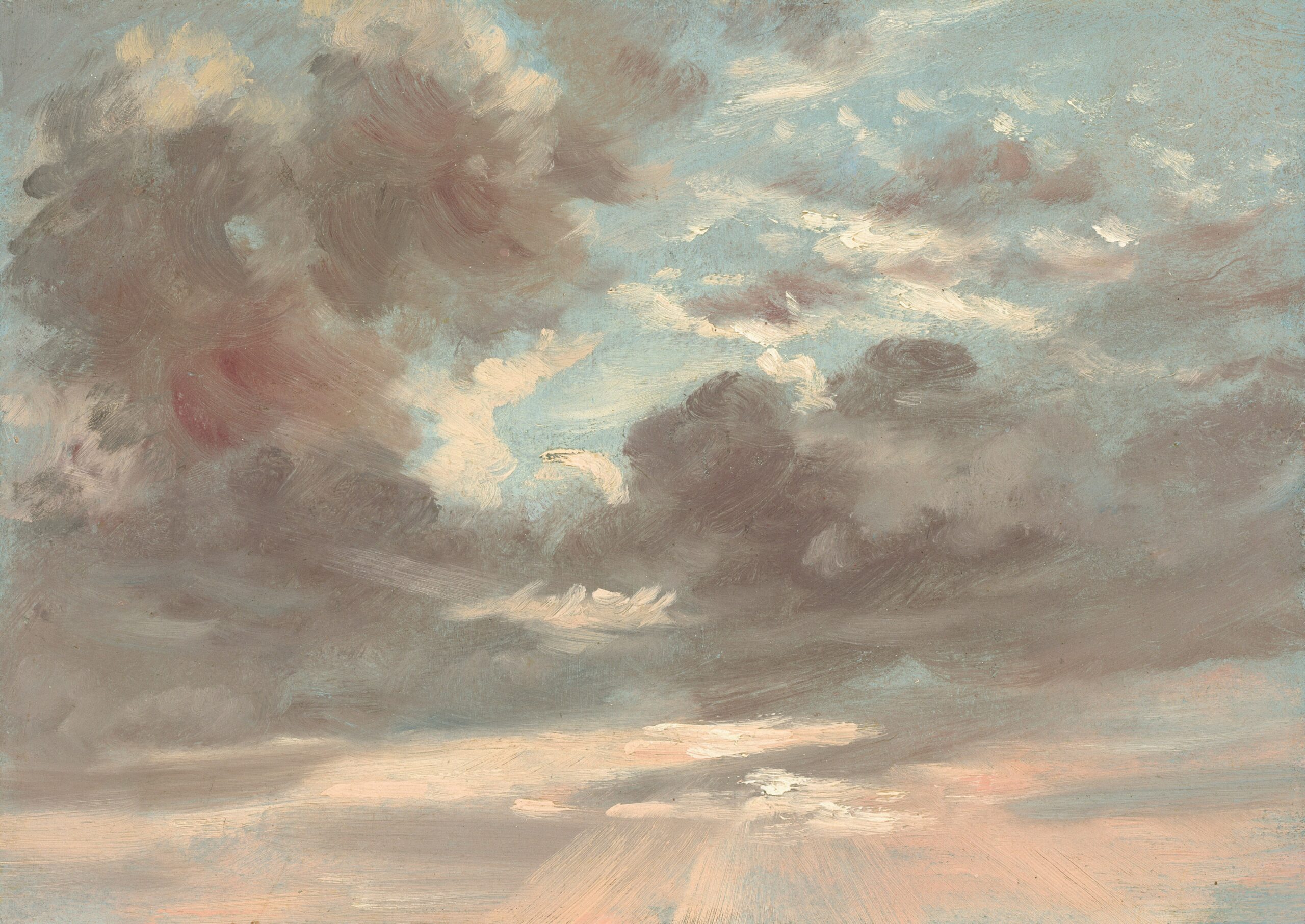
John Constable
Oil on paper on canvas, 20.3 x 27.3 cm | 8 × 10.75 in
The National Gallery of Art
The Landscape as Subject Matter
Constable worked predominantly in oils, and his main interest was in landscape painting. He brought the medium into the mainstream, both in terms of making it an art form in its own right and by revolutionising the way in which it was practised. Before Constable, many artists had painted landscapes but not as subjects in their own right. Artists such as Poussin and Claude had painted large grand landscapes but always as backdrops to their historical or allegorical narratives; figures being placed in the foreground to justify the use of the landscape. Furthermore they had only used drawing media and watercolours outdoors, as opposed to oils. Constable painted sky studies, landscapes and scenes of rural life with farmers and labourers going about their daily work.

John Constable
Oil on canvas, 56.1 x 101.2 cm | 22 x 39.8 in
National Gallery of Art
Painting Outdoors and Alla Prima
Constable painted outside directly from nature. Today we are used to paint being ready-made for us in portable tubes, and we have access to a range of pochade boxes and landscape easels. He would have had to devise ways to carry his own paints outdoors and to store his wet canvases. I have seen one of the small wooden landscape boxes which he used, where he could lay out his paints and place his small boards and papers at the back, sitting down to use it as a pochade box. In the 18th Century, artists ground their own pigments and if they needed to carry them around they would use glass vials or put the paints in pig intestines and bladders, much like how sausages are made. The metal paint tubes as we use them today, were not in practice until the 1840s, a few years after his death.

John Constable’s Painting Materials
He worked on canvas, boards, and prepared papers, including millboard, which is made from pulped paper and flax. The papers and boards would have been prepared with a layer of shellac or rabbit skin glue, much like we still do today, though there are of course now lots of synthetic alternatives. He toned his canvases a variety of different colours, depending on the subject matter, often with a touch of red and black, the warm tone would compliment all the greens and blues of the landscape.
Through his palettes and paintings we know that he worked with a variety and range of colours. Where other artists could have used a more limited palette, Constable had a variety of greens and yellows which would not be on the traditional studio palette.

He used Black, Vermilion and Lead White which is very standard and part of the limited palette. Nowadays we substitute the Vermillion (which is mercury based) for Cadmium Red Light, and the Lead White for Titanium.
He also used Chrome Yellow, Cobalt Blue and Madder. Today, artists often use Crimson instead of Madder as it has a better lightfastness. Chrome Yellow is substituted for cadmium yellow, though be careful not to make it too acidic. I prefer Naples Yellow as I find it softer, but each brand makes it so differently. The Michael Harding Naples Yellow is a good warm yellow. I used both in my colour chart. Traces of Emerald Green were also found on his palette, but I think the Emerald Green is much sharper than the one type Constable might have used. I was able to create the greens using black mixed with the yellows.

His mediums were very normal for the time and what we still use today, including linseed oil, poppy oil (which is a little slower drying) and pine resin like a dammar. It has been suggested that the use of poppy oil is proof that he would have worked on his sketches when back at the studio, but I don’t believe this is the case and is definitely not evident from the strength and handling of the paint.
The way he applied the paint is also so unique and varied. Applied with a brush, with a palette knife, scraped back, applied thickly, and in glazes. All of this the variety and energy imply an artist who was deeply instinctual as well as considered.
He painted small landscape sketches outdoors and alla prima and then brought them inside to scale up and paint his big six footers. There are so many ways in which Constable was, for his time, an exceptional artist. He painted outdoors in oils. He often made the landscape the subject. He painted the day to day life of working agricultural labourers. He did not work from his imagination, or have allegorical or a historical narrative to his paintings. The narrative of his subject matter is often the clouds and landscape itself. He actually studied clouds. His cloud studies are meteorologically accurate and correct. He advanced the way in which the viewer looked at the landscape and in doing so also advanced the painting techniques. He is to painting what Wordsworth is to poetry. Turner sought the excitement of the sea and travelled abroad. Constable found beauty in the English landscape and the day to day.
Colour Palette One
Stoke-by-Nayland, c. 1810–11

John Constable
Oil on canvas, 28.3 x 36.2 cm | 11 1/8 x 14 1/4 in
The Metropolitan Museum of Art
This wonderful sketch by John Constable is so modern. The colours are so fresh and clean. This is so clearly using alla prima techniques, and working outside and fresh. I love the balance of the mass in the clouds and the accents of lines in tree trunks. We can see the brush marks and the paint being dragged across the foreground and in the clouds, allowing base colours to come through.
Colour Palette Two
Salisbury Cathedral from the Bishop’s Grounds, c. 1825
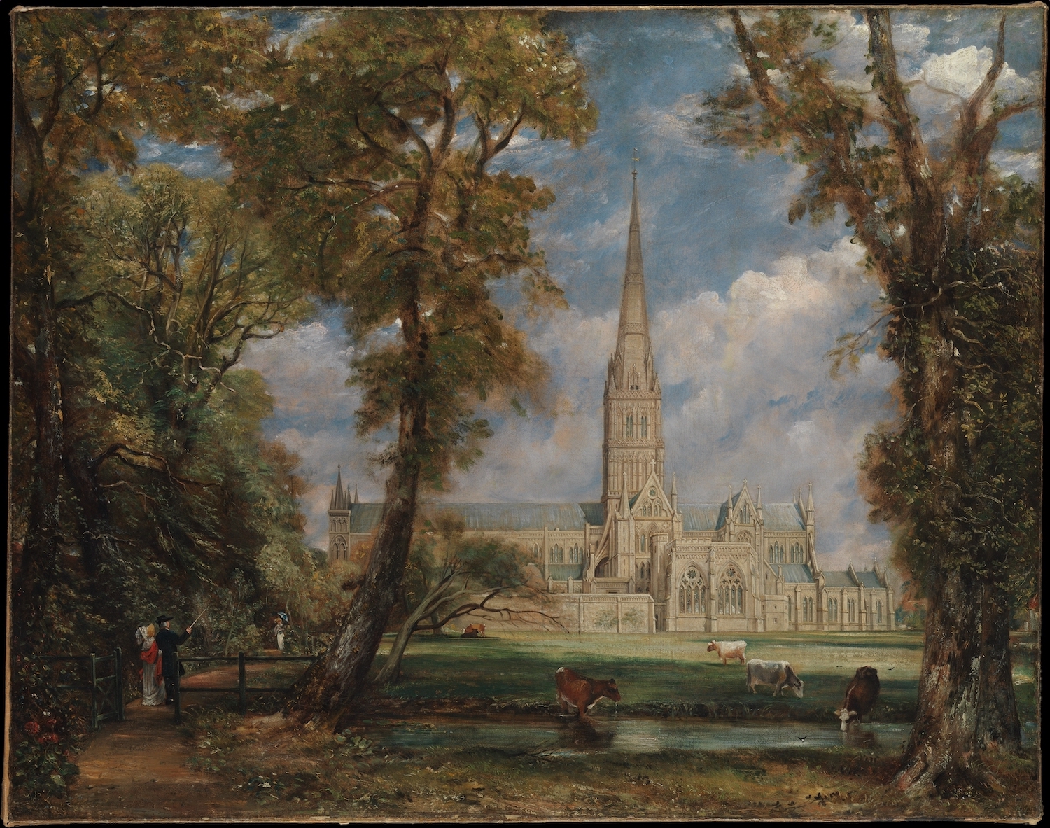
John Constable
Oil on canvas, 87.9 x 111.8 cm | 34 5/8 x 44 in
The Metropolitan Museum of Art
This painting was a large preparatory sketch made for a painting which John Constable completed of Salisbury Cathedral, which now hangs in the Frick Collection. Interestingly the sketch is roughly the same size as the completed painting, and is also highly rendered. I much prefer his sketchier work which seems more direct, than his commissioned and more completed works. As a commissioned work the Bishop of Salisbury did ask Constable to edit and change his painting. This direction from an outsider often loses the freshness and instinctiveness of a painting.

I have used the same colours for each painting. The difference in the paintings is not in the pigments used, but in the technique. It is fascinating and illuminating how a commissioned work produces such a different result to a work done by the artist without the restraints of the patron.


A small linen canvas toned with Ivory Black and Red. On the left I have toned it with Black and Rose Madder, on the right I have mixed Black with Cadmium Red. I think this slightly warmer tone would have been a more likely base which we see coming through the painting sketch of Stoke-by-Nayland.

I think it is always a good idea to do your colour charts on a base colour that you are used to painting on as it helps see the colours better, like working with a wood or grey palette.

Having done the colour chart, it is fascinating to do a quick colour note sketch of the painting. It makes it much easier and more immediate. It is also amazing how few colours are needed to recreate the colours. The base is Black with Cadmium Red Light. This is important as the sky lights look impactful against this warm tone.
The clouds are Titanium White, with a little Naples Yellow added for warmth at times. At the base of the clouds I added a little of the base black and red to give the purple tone. The blue of the sky is Cobalt Blue, white with a touch of Naples Yellow as well.
In the tree area I used Black mixed with Cadmium Yellow or Naples Yellow. I didn’t use any blue. The foreground is Naples Yellow and White. The path is red and black.
I have always loved Constable, and after my GCSEs back in the 1980s, as a treat, my father took me to Constable country to see the settings of his landscape paintings. I even wrote my A Level art dissertation on him, so I am definitely a long-standing fan. I have studied the history of art and been involved in the art world ever since, and though I have acquired knowledge and admiration for hundreds of other artists, I feel very loyal to Constable and really appreciate him as an amazing companion on my artistic journey.
Further Reading
Preparatory Drawing Methods for Painting
Naples Yellow in the Palette of Édouard Manet
How to Resolve a Landscape Painting Composition
What Makes a Long-lasting Art Paper?
Shop Oil Painting on jacksonsart.com



10 thoughts on “Recreating the Colour Palette of John Constable”
Wonderful article. I too love Constable’s
work but have a new and richer appreciation,
tthank you.
Thanks Christine, much appreciated!
Thanks for this very interesting article. I
love your ending and amazed by artistic
journey of John constable.
Thank you for your feedback Uravan!
Thank you. A very interesting read.
Thanks Angela! Glad you enjoyed it!
Thank you for this article. Constable
paintings were my introduction to
landscape art and inspired me. It’s great
to see the palette information. I wish all
artists shared their palette information
alongside their artwork.
Thanks Colin!
A very interesting article. However I have
a book that analyses Constable’s
palettes and he didn’t like chrome
yellow. In fact he thought it would
overpower a landscape and used it only
for later highlights.
His yellows were mainly yellow lake and
bright yellow lake
Thanks for your comment Jonathon. I’ve been in touch with Ann and she found that interesting and also felt Chrome Yellow was too strong, but all her sources said it was Chrome Yellow, including a conservation science journal. She was wondering if you wanted to share your source?
Comments are closed.