Case Study: Nick Archer RECENT WORKS at 60 Threadneedle Street
22nd May – 20th September 2013
by Lisa Freeman
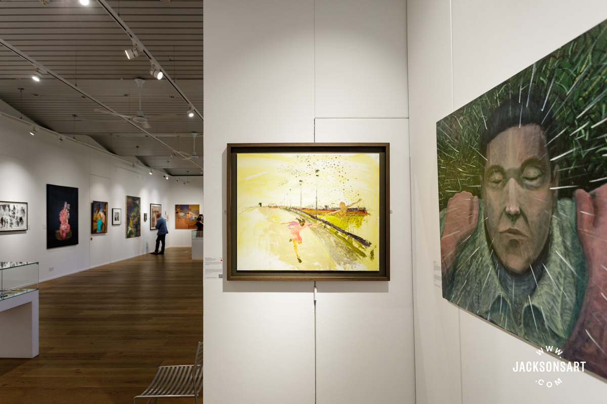
60 Threadneedle street is the foyer of a very large and very swish office block in the heart of the City of London. It also happens to be a fantastic space in which to exhibit art, and Nick Archer’s 9 huge paintings certainly look impressive in this New York MOMA-esque space. Yes, really; it may be the foyer of an office block but with the space having a huge glass fronted entrance that spans the width of the building, light floods on to white washed walls and the paintings look luminous, alive and brooding with all that is seen and unseen in the work.
The press release for this particular exhibition of paintings makes many film references (the paintings ‘possess a nocturnal, Lynchian quality that suggest a shocking, dystopian vision of the world in crisis, a journey at an end’; ‘Disney inspired landscapes’, ‘reminiscent of…Ridley Scott’s Blade Runner’), and there is certainly allusion to a suggested filmic narrative in each work. The obvious comparison to draw is with Peter Doig, another painter who seems infatuated with the filmic: both artists are past masters at painting scenes that are unsettling in their ambiguity; are there spirits or characters lurking in the woods, or is this the scene of where people used to live, but don’t now? Human presence is kept to an absolute minimum in the works; in ‘Trail’, a tiny hooded character wanders through the wood like a modern day Red Riding hood, not stopping to look at us, face hidden. In other pieces the main focus is a battered caravan or an isolated cottage; the most life-filled piece is called ‘Follow Fallow’; 2 deer stare at us with exotic butterflies dancing around their antlers. But even with this exhuberent scene Archer is able to portray it in such a way as to enhance all that is unsettling and sinister.

Nick Archer – Follow Fallow – 152cm x 152cm, Mixed Media
So how does he do this? The answers lie in the Trinity of Painting: Composition, Colour and Mark Making.
Composition: There is a lot of space in the works, and this enhances the sense of emptiness in the work, reinforced by the scale of each painting (the smallest is 97cm x 122cm; the largest 200cm x 230cm). Horizon lines tend to fall very low or very high across each composition, allowing for a huge expanse of either sky or land, and structures such as cottages or caravans are kept modest in their scale, usually taking up only about 10% of the composition. All this adds to an air of agoraphobia, loneliness and isolation.
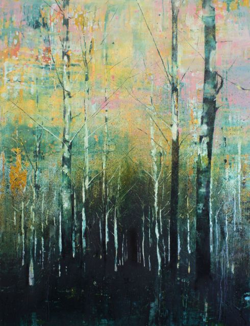
Nick Archer – Empty Forest – 179 x 130cm, oil on canvas, 2013
In ‘Empty Forest’, stark, stripped birch trees with hardly any branches tower from a ground positioned low on the large canvas; any sense of shelter that a wood might usually provide is not present here, and the viewer is left to imagine this scene, exposed to the threat of the skies, as well feeling incredibly small as the trees tower over and intimidate. In the painting ‘Microscopics’, a blood red expanse of meadow leads the eye to a small caravan positioned a little above centre of the canvas; the painting transports the viewer to this place and the unsettling thoughts emanate from a suggested quandary; this is the first sign of life seen for miles, but does one dare approach?

Nick Archer – Microscopics
Colour: Archer is very clever in his use of colour in the work. Throughout his career he has been drawn to saturated cartoon like colours, but often balances them with very dark hues, the dark areas are usually depictions of sky or deep water, or ground, and make these feel like intimidating, unknown quantities. In these paintings, Archer’s approach to colour follows a pattern whereby he selects a very strong colour to set the theme for the painting, and then uses neutral colours to reinforce the strength of the main colour. The other reason for doing this is to avoid paintings becoming too garish. The exception to this ‘one strong colour’ approach is with the painting ‘Follow Fallow’, where Archer uses a strong deep turquoise blue and a bright chrome yellow, as well as a cerulean blue and bright orange-pink, but all this is balanced with earthy umbers used to render the deer; he manages to deploy bright colour but in a balanced and considered way that stops the paintings from looking like cartoons and maintaining a sensitivity that shows the colours used at their very best.
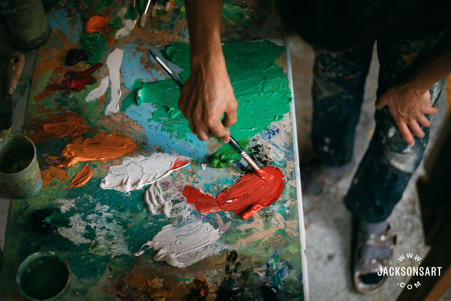
Mark-Making: Archer’s mark making is textured and varied. He says he uses Michael Harding oils for “The richness of colour. They are not too oily so the consistency feels good to me, and I have had no problem with longevity, they seem very durable”. He puts the paint on to the canvas in a wide variety of ways, often using unexpected tools such as squeegees or even draught excluders from hardware stores. More conventionally he is also known to use a brush or two; his favourites include the Pro Arte Sterling Acrylix range. Of his approach to laying the colour on, Archer says, “I usually use the square ended brushes as after initially laying colour down with a combination of large brushes, pouring and a squeegee, I then need to bring some order to the process and the square ended brush give me some precision and control”. After doing this there is some evidence of Archer reintroducing more chaotic marks, either through flicking or pouring more paint over the top in areas. His choice of oil primed Italian fine grain linen allows Archer a lot of freedom in moving the colour around and lifting it where he needs. He says of his favourite canvas: “I like to move the paint around on the surface before working into it with more control/detailed marks. The surface of the painting develops and builds up from there.” Recently Archer has enjoyed experimenting with how paint can be manipulated, and has been using a lot of Roberson’s Impasto medium to thicken the colour, add texture and give the picture surface a real sense of depth. The wide variety of mark making builds a varied textured surface on each painting, and lends the work a depth and luminosity that is very atmospheric. He revels in the materiality of the paint and one senses he loves to explore what the paint can do, and this enjoyment allows the work to succeed abstractly as well, i.e. one is seduced by the paint surface as well as the intriguing subject matter.
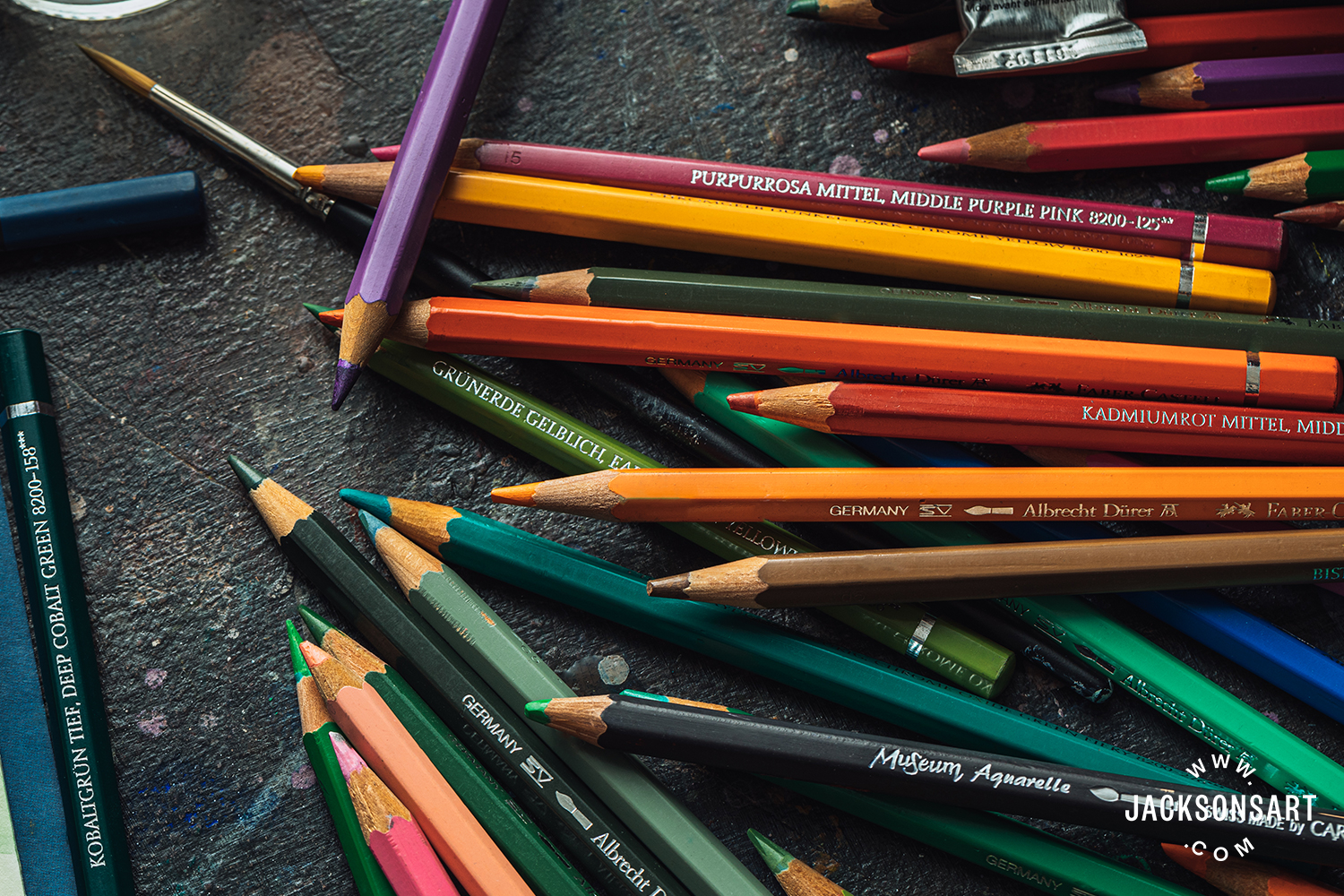
Links to Nick Archer’s Favourite Art Materials: