



To celebrate these new colours we have them on offer at 10% off the already discounted Jackson’s price.
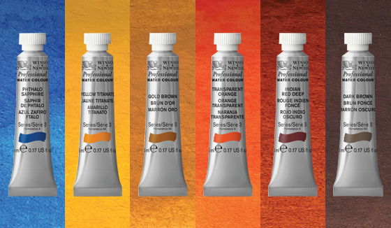
Ann Blockley Experiments with Winsor & Newton limited edition ‘Desert Collection’ Watercolours
by professional artist and tutor Ann Blockley
I feel like a kid with a new toy when it comes to new colours. I just want to play with them and experiment. I am currently trying out a range of six limited edition, single pigment colours by Winsor and Newton called ‘The Desert Collection’. They are the rich and earthy tones which you see in the Australian outback. The colours are called: Yellow Titanate, Gold Brown, Transparent Orange, Phthalo Sapphire, Indian Red Deep and Dark Brown. I wanted to see how I could use these to spice up my English palette!
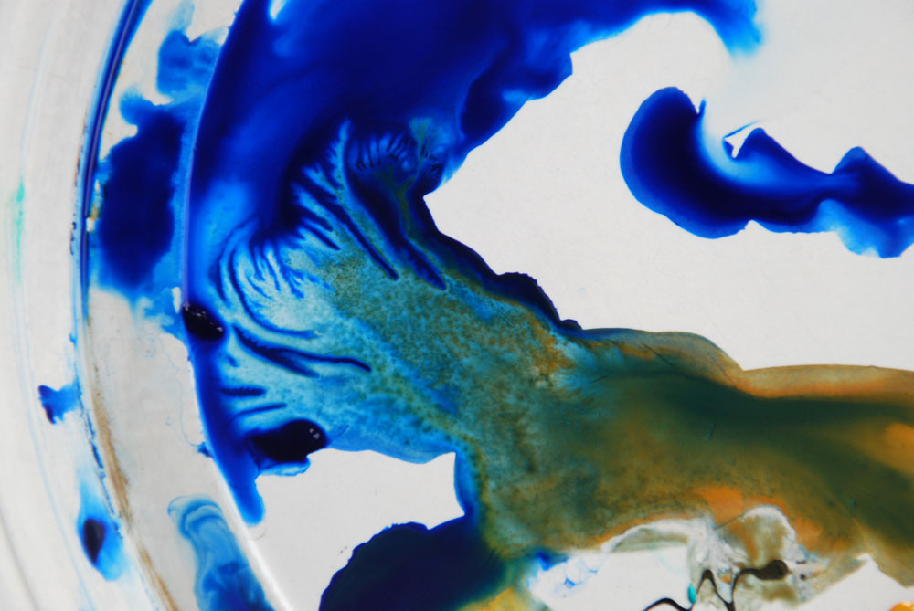
Phthalo Blue and Gold Brown in the palette
1. Rather than pick a specific subject to begin with I decided to experiment with some paint doodles, making marks and letting messy watercolour things happen in order to see how the colours reacted with each other and to have a bit of fun. I began by squeezing out some of the Phthalo Sapphire and some Gold Brown onto a plate that I was using as a palette. Immediately I reached for the camera as I loved the patterns that were made by the Gold pushing into the Blue and the granulated textures that were forming. A promising start; but what would happen on paper?!
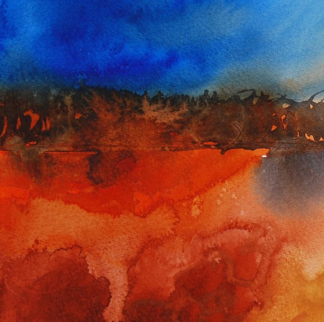
2. I made an abstract landscape using all the colours except the Dark Brown. The Transparent Orange absolutely glows especially against the jewel like Phthalo Sapphire and the Indian Red Deep mixed with the blue makes a really rich dark. I can see that combination becoming a favourite for trees and flower centres. These are really vibrant colours, great for hot subjects and adding the wow factor to your pictures.
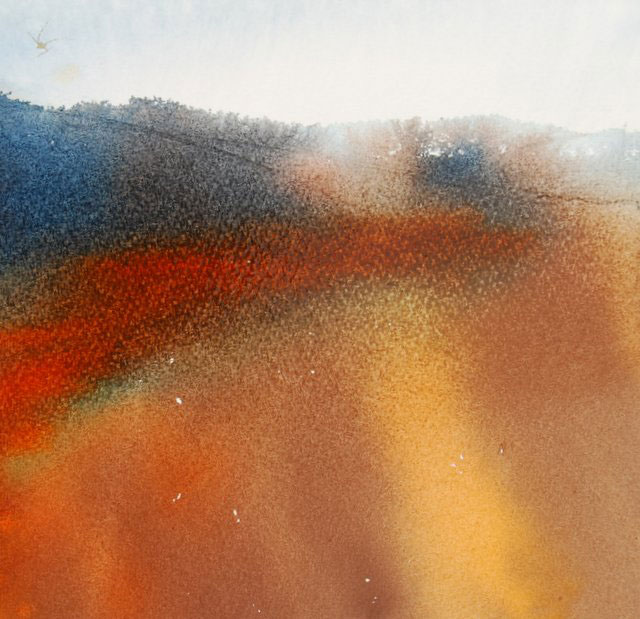
3. I decided to dilute the colours more in the next experiment, cut out the Transparent Orange and add the Dark Brown instead to see if I could achieve a more subtle palette. I am not usually a fan of ready mixed Browns and my first reaction to the squeezed out paint was that it might look muddy on paper. However, I really like the earthy warmth of this pigment and the way it granulates with the other colours making them almost shimmer; very useful for foregrounds and shadowy areas.
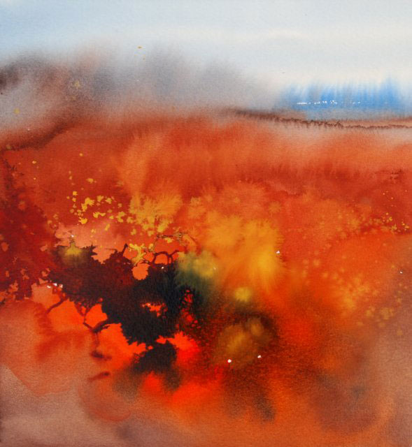
4. I moved on to a more pictorial experiment. I wanted to see how a combination of all the colours could be used to make a lively semi abstract landscape. The English countryside can be dull sometimes and a little imagination is often needed to create a more unusual colour interpretation. My loose washes came to life when I added a mixture of Phthalo Sapphire and Indian Red Deep on top of Transparent Orange leaving small shapes of the orange shining through. I splashed drops of Yellow Titanate into the wet washes for some dramatic mark making.
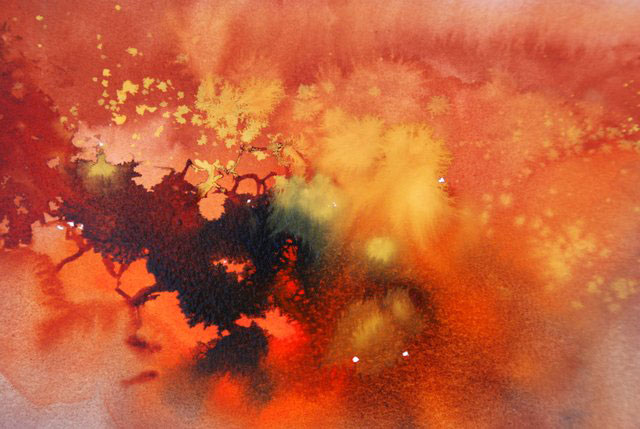
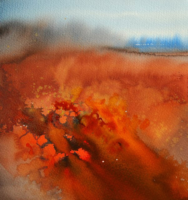
6. I dribbled some more orange in to break up the dark area and allowed it to flow diagonally through the foreground to lead the eye into the picture and create further glowing areas.

7. I added some trees in the distance and a few birds. The addition of some dots in the Transparent Orange shapes transformed them into flowers. When this was dry the fairly opaque quality of the Yellow Titanate meant I could paint pale lines and dots on top of the darker background to indicate grasses and meadow patterns.
Ann Blockley’s new book ‘Experimental Landscapes in Watercolour’ is due to be published by Anova books on April 3, 2014 and will be stocked by Jackson’s Art Supplies. All the watercolours used to make the pictures in the book were Winsor and Newton colours.
All the above exercises were painted on Saunders Waterford ‘Not’ 140lb paper.
The limited edition ‘Desert Collection’ is on offer at Jackson’s at an extra 10% discount until March 30th.
Click on the underlined links to go to the paints on the Jackson’s Art Supplies website.
Postage on orders shipped standard to mainland UK addresses is free for orders of £39.




10 thoughts on “Ann Blockley Experiments with Winsor & Newton Desert Collection”
The colours are as good as ever but the labelling is rubbish as the colour names are so difficult to read that total frustration sets in as you are trying to select the tube you require from your paint box. CLEARER LABELLING PLEASE……PLEASE…..PLEASE!
Hi Wendy
Yes, there have been quite a few complaints, a worldwide upset, about the new packaging of the Winsor Colours.
Paint tubes logically have the colour band near the opening so that over time during usage even after they get rolled up and covered in paint you can still see the colour band and the new design ignored the practical issues. Also black text on silver turns out to be impossible to read. It is a reminder that labels aren’t just about the visual branding but need to address the usability of the product as well.
I have heard rumours that they will be returning to the original tube at some point.
I have also had customers who stopped using the Winsor Oil Painting Mediums when they changed to the new bottles as the new lids are impossible to remove. So they have a number of issues with packaging going on.
I have to agree with ‘Woodart”(7.03.l4) . Your Professional watercolours are as good as ever but the labelling isn’t. The colour name on the small tubes of watercolour are difficult to read as they are so small and there are times when you need re-assurance that the colour shown on the tube is, in fact, the one you need. I look forward to the return of the old packaging or larger colour names!
Yes, Gillian, let’s hope Winsor listen to everyone about their packaging!
Wow, these colours look gorgeous! I really like the way Anne has let them work their own magic – precisely the way watercolours should be used in my opinion. Well done W&N, Anne and Jacksons!
Thank you!
Yes, Ann is great at getting the most from the medium!
How much do these paints cost?
Hi Clare,
If you click on the link you can go to the paints on the Jackson’s website where you can see the sizes and prices.
Dear Julie,
I have been away since 6 April and have only this morning found out about the new Winsor & Newton Desert Colours, which look wonderful. Have I completely missed the special 10% discount offer?
And yes, I strongly agree with the comments about W & N labelling – it is impossible to read colour names on the tubes; infuriating and a serious error of judgement in packaging design.
Hi Liz! Welcome back!
We have extended the offer to include all the Winsor Watercolours.
Please have a look: http://www.jacksonsart.com/-/c2200_1044_1196_26942_26985/index.html?utm_source=blog&utm_medium=blogpost100414&utm_campaign=blog
Comments are closed.