Illustrator H Locke takes a look at marker pens and papers, in search of the best performing combination. Some of the findings were as expected but there were some surprises.
Doing this sort of testing, comparing your materials to each other and in different combinations, is a useful exercise to learn about your materials.
Comparing Illustration Markers
Following on from my review of sketching pens and papers last year, I wanted to investigate the vast range of markers and marker papers/pads which are available out there.
The markers – 11 makes:

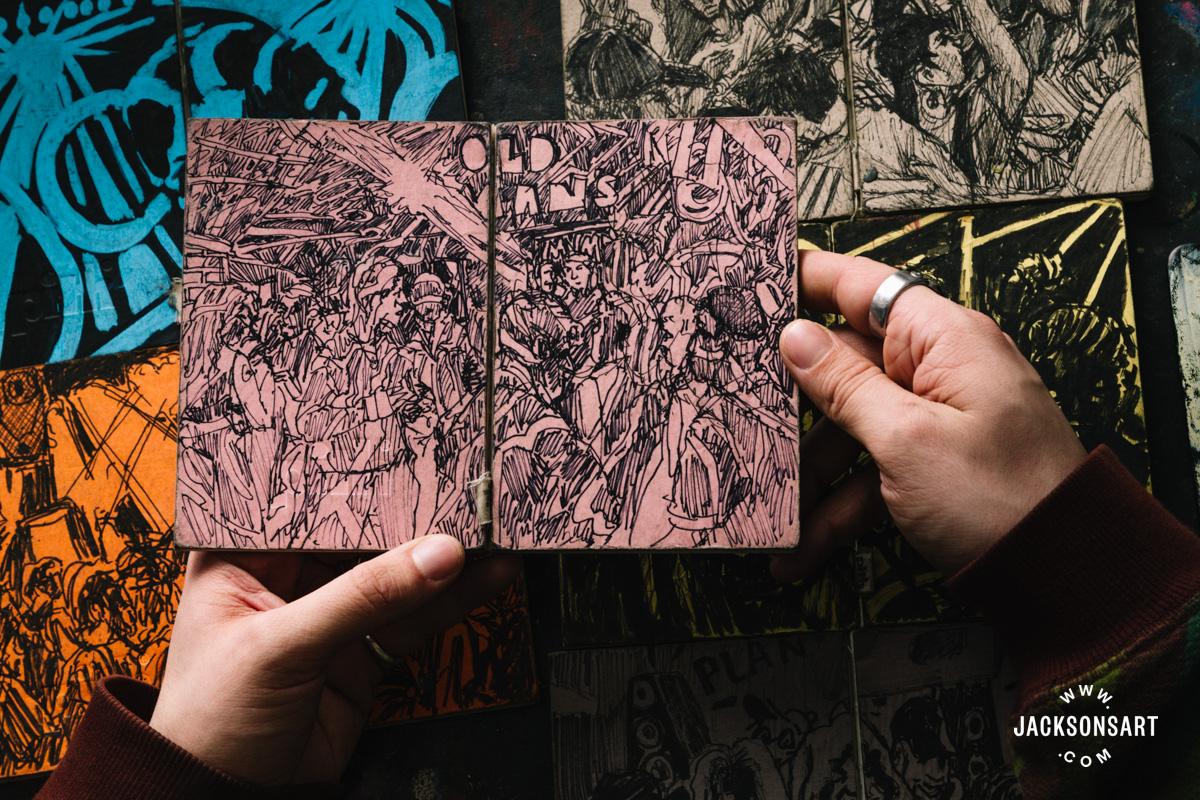
Shown in the Jacksons Marker Pen Case, with the cover folded back.
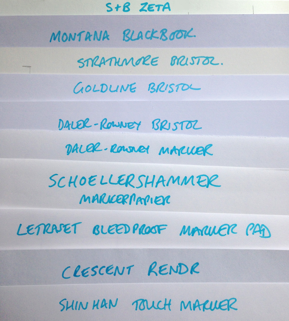
The marker papers – 10 makes:
The testing method
Similarly to the Fineliner Pens & Papers review, I tested each marker on each paper.
For papers I was considering:
- Whiteness
- Sizing/treatment (amount of ink which shows through to back of paper)
For pens I was examining:
- Blackness & quality of ink on paper
- Flow
- Nib
- In-hand feel
When combining papers and pens I tested:
- Single line
- Single line wet-test (applying water with brush over dried marker ink
- Bleed/show-through (multiple layers of marker, pushed firmly(ish) into the paper)
- A vertical and a circular mark, with a blue Kurecolor pen overlaid to test tendency to blend or bleed between inks
Analysis – Papers performance
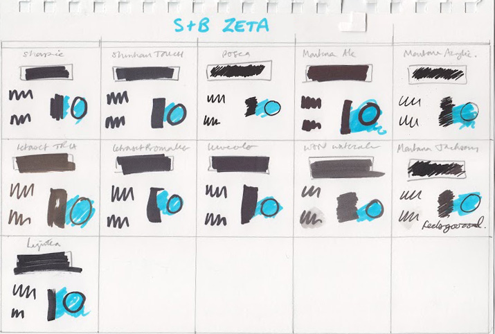
Unlike the earlier fineliner sketching pens and paper review, there was not a massive difference between the performance of the various papers; the papers were all suitable for markers, with very little unusual behaviour (although any that I noticed is documented here).
Therefore, this analysis of papers will provide a brief overview of each paper, but focus on identifying stand-out or unexpected behaviour.
Crescent RENDR*
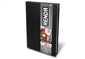
Thicker than marker paper, not stiff like Bristol Board. This paper is greyish in colour and has an unusual smell. It can be used with alcohol-based markers on both sides, without show-through. When held up to the light, a strange speckled effect can be seen. For a deeper dive into this paper including its behaviour with other types of pens, please check out my previous review.
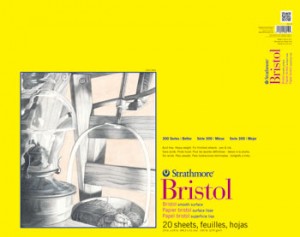
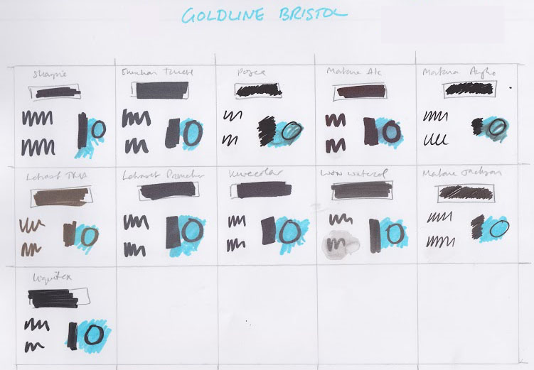
This is a standard Bristol Board style paper, a little more cream than white in colour, when compared to others in this test.
Daler-Rowney Bristol Board and Goldline Bristol Board*
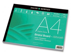
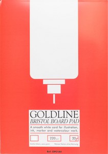
These Bristol Boards were completely identical with one exception- the ink ran more the Goldline paper than the Daler-Rowney.

click for larger image.
As you can see both blend tests and wet tests show far worse ink running on the Goldline that on the Daler Rowney. There is a price difference here, too, with the Daler-Rowney being much better value. Both papers are white in colour (rather than the cream of the Strathmore) and of a similar weight. I would assume that the sizing and smoothness were the same, if it weren’t for the wet-test results. One good thing with both of these Bristol Boards is that neither of them exhibit much show-through, even when markers are used quite heavily. I estimate that the Daler-Rowney has less show-through than the Goldline. However, I wouldn’t recommend them over the RENDR if your absolute priority is being able to use markers on both sides without interference. More on this in my conclusions below.
I’ll confess this is one of my favourite all-time papers for ink work. Like the Strathmore, it seems a little more cream than white when compared to others but I’ve never had a problems with it for example when scanning and editing. It’s only something to think about when choosing mount board colours for finished work.
One other slight difference between this paper and the others in this test, is that it has a texture to it, which for me makes it immensely versatile for ink, watercolour and marker work.
This paper can be used equally on both sides with water-based markers, however I did note some show-through with alcohol-based markers (though they don’t claim it is designed for alcohol markers). There are more conclusions on this feature of all papers below.
Daler-Rowney Marker Paper

This is one of my staple papers, though generally I use it for Unipin or Sakura Micron work. It’s a lightweight, white paper – though not as thin as layout paper for example. Because of the sizing, marker ink does not bleed through the paper, however the show-through is significant due to the paper weight. It also wrinkled the most during wet-tests and with heavy application of marker ink.
Shinhan TOUCH, Letraset bleed-proof* & Schoellershammer Marker paper*
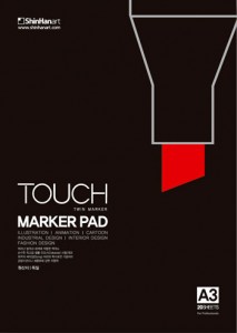
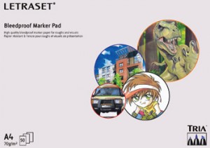
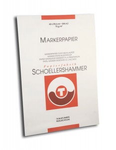
These papers were identical in all tests. All of them are lightweight marker papers, behaving exactly the same as the Daler-Rowney Marker Paper (above), yet more resistant to wrinkling with water or marker use. They are all identical in whiteness to the naked eye.
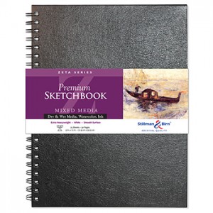
This paper comes in a beautifully-bound hard cover sketchbook, which made my brain ache a little when I had to tear out a page for this test! The paper itself feels slightly thicker than standard marker paper. It also has a little greyish tint to it, when compared to white marker paper. The biggest shame for me, especially given the hard-bound nature of the book, is that the ink show-through is quite high. This doesn’t mean (necessarily) that it will bleed onto the next page, but certainly there is enough show-through to not reliably expect to draw on both sides of the paper.
Analysis – Pens performance
The marker pens differed far more than I anticipated. Mostly, this was on the basis of blackness and performance of nib and a couple of random findings that I didn’t expect. Read on…
It’s hard for me to judge a Sharpie, as I use them in my day job, but not in my artwork.
In the context of the papers however, I would say that it has a good blackness but with every paper except the Stillman & Birn Zeta, there is a slightly purplish shine to the black. I have no idea why this is, but the Sharpie on S&B has a really nice rich matt black which I’d definitely try to replicate in future. One quick note for those who, like me, favour the fine-line – the “fine point” Sharpie is not very fine to start with from my point of view (but then I like a 0.05 Micron!) and the tip loses its point very quickly so don’t rely on them for truly fine work.
Waterproof and blends well as you’d expect.
The ShinHan Marker behaved quite normally in tests. It feels nice in the hand. The blackness seemed adequate at the time, however I noted after it was dry that it seems a little grey, particularly on Bristol Boards – though I suspect this might have been because I tested it right next to the Posca Pen. It didn’t smear, run or smudge.
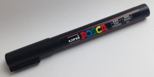
The Posca Pen (black) competed with the Montana Acrylic for the Blackest-Black award. It is consistently matt and rich across all papers and doesn’t seem to show through on the other side of any papers. However, important note – although it didn’t run on the wet-test, it did bleed into the Kurecolor blue blend-test on every single paper without exception – so we’ve learnt from this not to trust it with other markers.
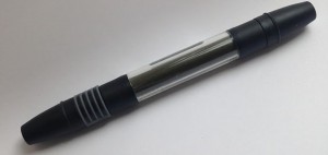
Montana Alcohol*
This was one of the markers most-likely to show through onto the other side of the paper. It’s a funny short little pen which is quite interesting to work with from an in-hand feel point-of-view however, the nib was one of the softest on the test, making it hard to get any kind of sharp line. I had no complaints in terms of blackness however on the Bristol Board and, weirdly, the Montana paper – there’s that slight purplish sheen again that we saw with the Sharpie pens (above).
Surprisingly, this pen bled when combined with my Kurecolor alcohol marker (blue) test and even ran slightly on the wet test, particularly on Daler-Rowney and Goldline papers – both marker and Bristol Board.
This pen performed identically to the Posca in terms of blackness and show-through. One interesting feature however was the nib. Although it allows a relatively fine line for drawing (for those used to drawing pens, you could imagine something like a 0.8 nib), the shape or construction of the nib results in strange ‘spitting’ effects, sprinkling little black spots across the paper. This was more in evidence on paper with a slight texture to it – so more obvious on the Stillman & Birn Zeta than the Bristol Boards for example.

click for larger image.
The acrylic Montana pen also bled and smudged the most on the wet test and blend tests across all papers.
Montana fill-able pen filled with Jackson’s brand India Ink
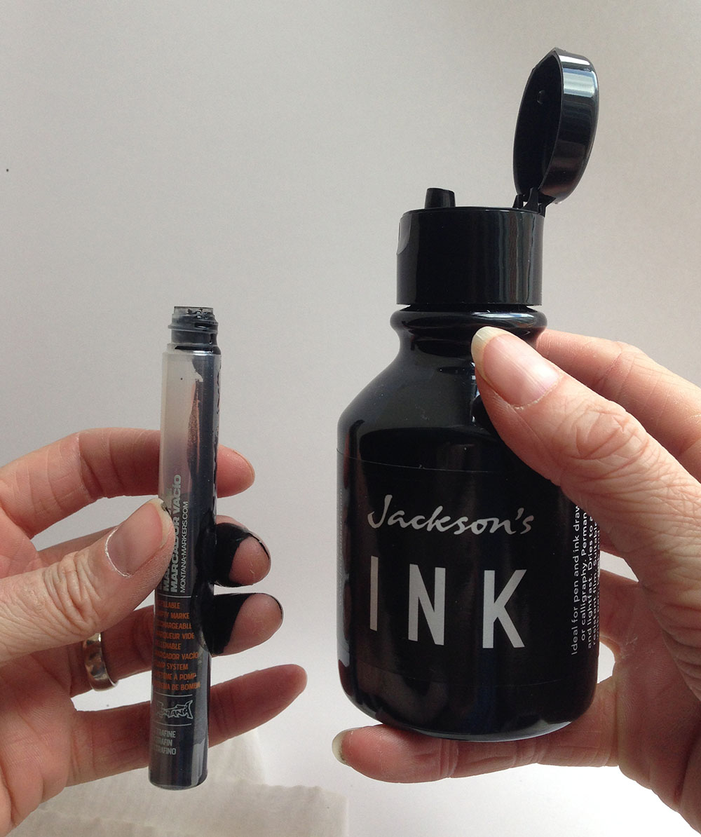
The experience of filling and using this pen casing is a blog post in itself. Needless to say, my cuticles are still stained with ink from the exercise.
This ink is not as super-black as the acrylic but boy, was it smooth to draw with on some papers. Here’s my test on the Stillman & Birn Zeta. This says it all:
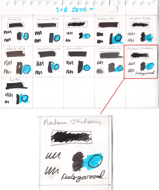
click for larger image.
Also, that strange spitting effect (of the same body, pre-filled with Montana acrylic ink) seems massively diminished – in fact, I had to work hard to replicate it all, but could see how it could happen by accident, so watch out for that and don’t let it spoil your beautiful work. Unlike the Montana alcohol and acrylic pens, it’s worth pointing out that the Jackson’s India Ink doesn’t appear to run with with water or other alcohol-based markers applied.
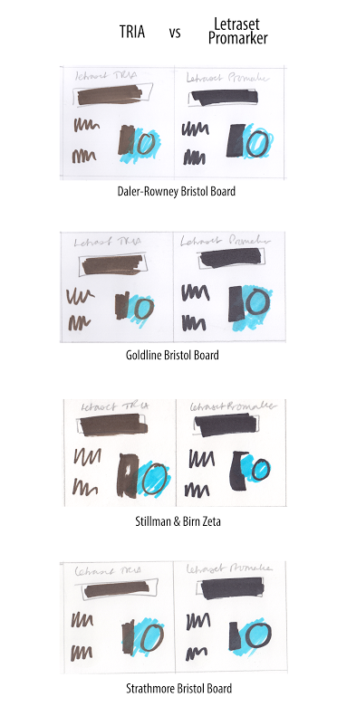
Letraset TRIA*
The TRIA surprised me the most of all the Markers. In terms of in-hand feel it’s lovely – a massive pen with 3 different nibs – one of which is a lovely big brush-style. The thing that surprised me is that the ink appears as very dark brown rather than black across every paper and where the brush strokes away from the paper (imagine a ‘swoosh’ line which lifts towards the end), there’s a definite translucency to the ink.
Here it is compared against the Promarker (which was not even the blackest competitor) across papers –
click for larger image.
Letraset Promarker*

The Promarker is one of the ones which exhibited the most show-through on the paper, however the ink is black, the nib is firm and the ink is solidly waterproof and can be used with other alcohol-based markers (based on my Kurecolor blue test) without bleeding or smudging.

The Kurecolor performed exactly the same as the Promarker – though if anything, the black is a little blacker and the nib is a little harder, allowing for some sharper edges.
Winsor & Newton Watercolour Markers
Yes I know it’s not a “real” marker, but if you read my review of them here, you’ll hopefully see why I included it.
So naturally the black is not as black on this marker (because it’s watercolour!) but the in-hand feel is amazing; it’s a lovely casing – feels like a Promarker but with a slightly better quality flow, perhaps because it’s watercolour. Naturally, the downside (or maybe that’s an upside) is that it runs with water. However having said that, it only smudged on the blend test (Kurecolor blue) with the Letraset and Schoellershammer marker papers – for the rest it held its own against the alcohol-based marker onslaught.

This was another one that surprised me. In terms of blackness, it competes with (but does not beat) the Posca and Montana acrylics. Also, it doesn’t appear to show through to the other side of the paper, even on thin marker paper.
However the thing that stood out for me was the texture of the ink on the paper. Because this is essentially paint, there were definite streaks in the marks made on the paper. This was massively emphasised on more highly-sized papers such as Bristol Board, where the hard nib (something which is great for sharp edges) actually ploughs furrows in the rich thick ink it distributes.

click for larger image.
It also felt super-scratchy on the RENDR paper but I cannot identify why that should be. But having said that, on a marker paper (such as Daler-Rowney) that super-hard nib and reduced sizing made this a great black, sharp-edged marker pen.
Conclusions – papers
Whiteness
As someone who works primarily black-on-white, the whiteness of the paper (and naturally the blackness of the pen) are crucial to my work.
All Bristol Boards were of a suitable whiteness.
As documented in the Sketching Pen & Paper review the strangest of all the papers is the RENDR, however it will be crowned “paper most likely not to bleed through to the other side”.
Bleed-through and sizing
As mentioned above, all papers prevented bleed-through (to other side of paper) due to either thickness or sizing. However, most showed enough marker ink on the other side to make them not appropriate for two-side work.
The Stillman & Birn Zeta (my personal favourite paper in almost all scenarios) is marketed as a paper which allows the artist to work equally on both sides, though they do not mention alcohol-based markers. The strongest contender in this field, as noted above, is the RENDR which allows double-side use, however one sacrifices whiteness to the feature and of course, one has to tolerate that very special smell.
In terms of show-through (or rather lack thereof), if it’s your absolute priority to be able to draw with alcohol-based markers on both sides of the paper, without interference, I recommend, in order:
RENDR (doesn’t show through at all – stinks)
Daler-Rowney Bristol Board (nice and white, thick stock)
Stillman & Birn Zeta (shows through a little, beautiful paper, doesn’t stink)
Pen Conclusions
Blackness & quality of ink on paper
For absolute blackness, I’d have to go with the Posca pen. The Sharpie on Stillman & Birn comes a close second.
Flow
The combination which had the most “wow” factor for me was the Jackson’s India Ink, in the Montana fill-able pen, on the Stillman & Birn Zeta paper. Which sounds rather like an answer in Cluedo.
Nib
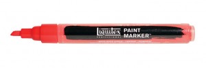
The best marker nib for sure was the Liquitex, though given the strange streaks it caused in the ink, I’d probably go for the Kurecolor (if I want a wedge shaped nib) or the Posca fine nib – to benefit from that super-blackness at the same time.
In-hand feel
You can’t beat the feel of a Winsor & Newton Watercolor marker. But I think this one is truly down to the individual, so I’ll leave it with you. As an aside, those with big hands might find the Montana Alcohol-based marker a little on the small side, especially given the lack of accuracy to edges with that strangely soft nib.
My winning combos
Ok, this is difficult. But for blackness and smoothness of drawing experience, I’m going to go with (in order of preference)
- Posca (fine nib) on Daler Rowney Bristol Board
- Jackson’s India Ink, in the Montana fill-able marker pen, on the Stillman & Birn Zeta paper
- Sharpie marker on Stillman & Birn Zeta paper
- Kurecolor marker on Strathmore Bristol Board
- Liquitex marker on Daler-Rowney Marker paper
Pen Departments on the Jackson’s website
*Please note, these products are currently unavailable for purchase at Jackson’s. We apologise for any inconvenience caused.