



The artists of the Northern Renaissance not only refined new techniques for oil painting and wood engraving to create previously impossible levels of intricacy and depth in their works, but simultaneously broadened the possibilities of subject matter for artmaking to inspire generations of artists to come. In this article, I explore the artists who defined two centuries of European art history, and demonstrate the techniques used by Masters like van Eyck, Holbein, and Dürer.
Articles in the Techniques Series define the meaning and context of art making processes and give practical tutorials on how to work with them.
Definition: The Northern Renaissance describes the intellectual, philosophical, and artistic shift in culture in European countries north of the Alps from the mid-15th to early-17th century, including Germany, Austria, the Netherlands, France, and England.
What was the Effect of the Northern Renaissance?
The Northern Renaissance brought new refinement to painting through the development of glazing with oil paint, allowing artists to build more depth and intensity of colour than before. The previously dominant mediums of fresco and egg tempera dried very quickly, so left little opportunity for careful blending. Oil paint enabled a more naturalistic style, capturing a level of realism that was previously untapped. This evolution in oil painting revolutionised artmaking for centuries to come, and the techniques of the Old Masters are still revered to this day.
The invention of the printing press and the development of woodcut and wood engraving were a vital means for the dissemination of ideas and images across the world. The impact of the Northern Renaissance on visual culture is directly linked to the ability to mass produce images for the first time.
The Northern Renaissance is also intrinsically tied to the emergence of the Protestant Reformation, during which the demand for religious subjects in art diminished in favour of secular ones. This shift liberated Northern European artists, allowing them to broaden their subject matter to include mythology, literature, history, morality, animals, everyday life, portraiture, and landscape. This shift set the ball rolling for generations of artists to come, who relished in increasing artistic freedom beyond the movement.
The masters of the Northern Renaissance made an essential impact on future art movements through their boundary-defying inventiveness. To name just two examples: Bosch’s fantastical creatures and demons, set within impossible landscapes, can be seen as an early precursor to Surrealism. Meanwhile, Pieter Bruegel the Elder’s development of genre painting planted the seed for the Dutch Realists and later the Impressionists.
The History of the Northern Renaissance
The Northern Renaissance is often mistakenly thought of as simultaneous to the Italian Renaissance in the countries outside of Italy, but it actually arrived about a century and a half later. It spanned from the mid-15th to the early-17th century – alongside the cultural shift brought by the Protestant Reformation, which began in the early-16th Century.
The Protestant Reformation followed the release of Martin Luther’s writing, which criticised the corruption in the Catholic Church. It’s impossible to separate the artistic movement from this context, since the demand for religious paintings diminished, and artists intentionally moved toward secular subjects to make a living. Catholic doctrine previously asserted that commissioning artworks for the church could help someone’s soul reach heaven – an idea which was widely abandoned as Reformation ideas took root. It was posited that faith alone should grant entry to Heaven and that money should not be a barrier to entry. Artists in this period had to appeal to a new wealthy mercantile class and the nobility, rather than the Church, which had been the main patron of the arts in Europe prior to these changes. Unfortunately, a devastating amount of Catholic art was destroyed in waves of iconoclasm throughout Europe in this period, alongside Church fittings and decorations. This included the loss of up to 97% of the UK’s religious artworks.
The alternative to Catholicism came in the form of Protestantism, and artworks were an important means of disseminating these new ideas. Woodcut print, in particular, was used to mass produce and spread Lutheran ideas after the printing press was invented in 1440.
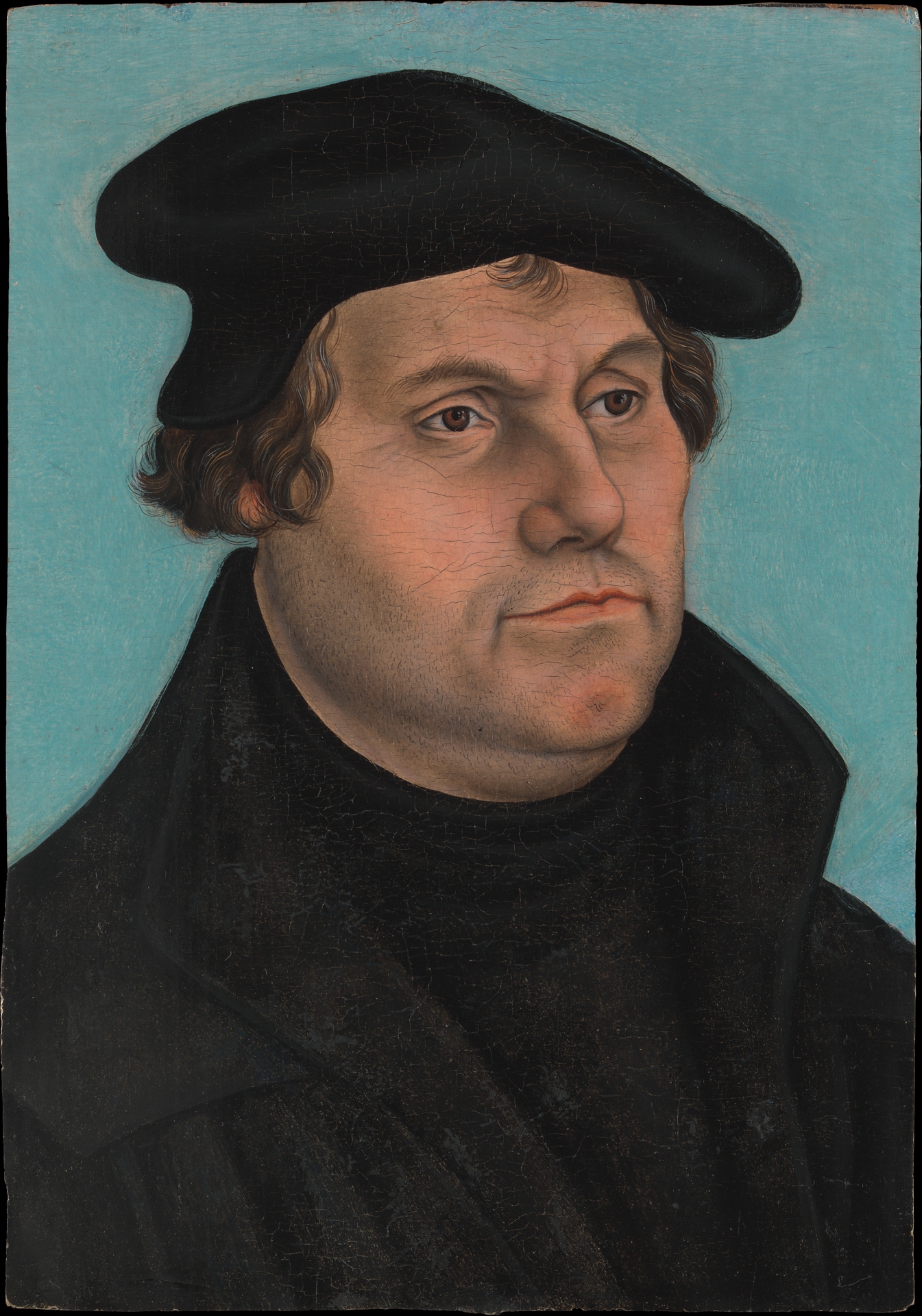
Workshop of Lucas Cranach the Elder
Oil on wood, 33.3 x 23.2 cm | 13.1 x 9.1 in
The Metropolitan Museum of Art
It’s impossible to cover all of the artists from these crucial centuries in European art history, so I’ve focused on five Masters – Jan van Eyck, Hieronymous Bosch, Albrecht Dürer, Hans Holbein the Younger, and Pieter Bruegel the Elder.
Jan van Eyck was a pioneer in the advancement of oil painting techniques – so much so that he was once mistakenly credited as the inventor of the medium. He served as a court painter and diplomat to John of Bavaria and Philip the Good, benefiting from the rare security of court salaries, rather than relying solely on commissions. This afforded him a greater degree of artistic freedom than many of his contemporaries. During this time, he developed a technique of layering glazes of oil paint combined with medium over underpaintings to gradually build rich colour and complex form. Only around 20 of his works survive today, which feature both religious and secular subjects.
His most famous painting, The Arnolfini Portrait, depicts a mysterious couple from the wealthy Arnolfini family of Italian merchants, in a room laden with expensive objects. It’s even been theorised that it could be an unusual marriage contract in the form of a painting, with van Eyck acting as their witness.
He painted The Ghent Altarpiece in collaboration with his brother Hubert van Eyck, whose 12 panels appear sombre with grisaille when closed, and fold outward to reveal a colourful theatre of Christianity. It combines scenes of the Annunciation, Jesus, Mary, John the Baptist, alongside portraits of the donors, a choir of angels and Adam and Eve.
Van Eyck is considered a bridge between Medieval visual culture and his own time, due to the heightened realism he brought to subjects inherited from previous eras. This can be seen in the painting Virgin and Child in a Niche, which portrays Mary and Jesus standing amongst Gothic architecture, in a pose popularised in Byzantine painting.
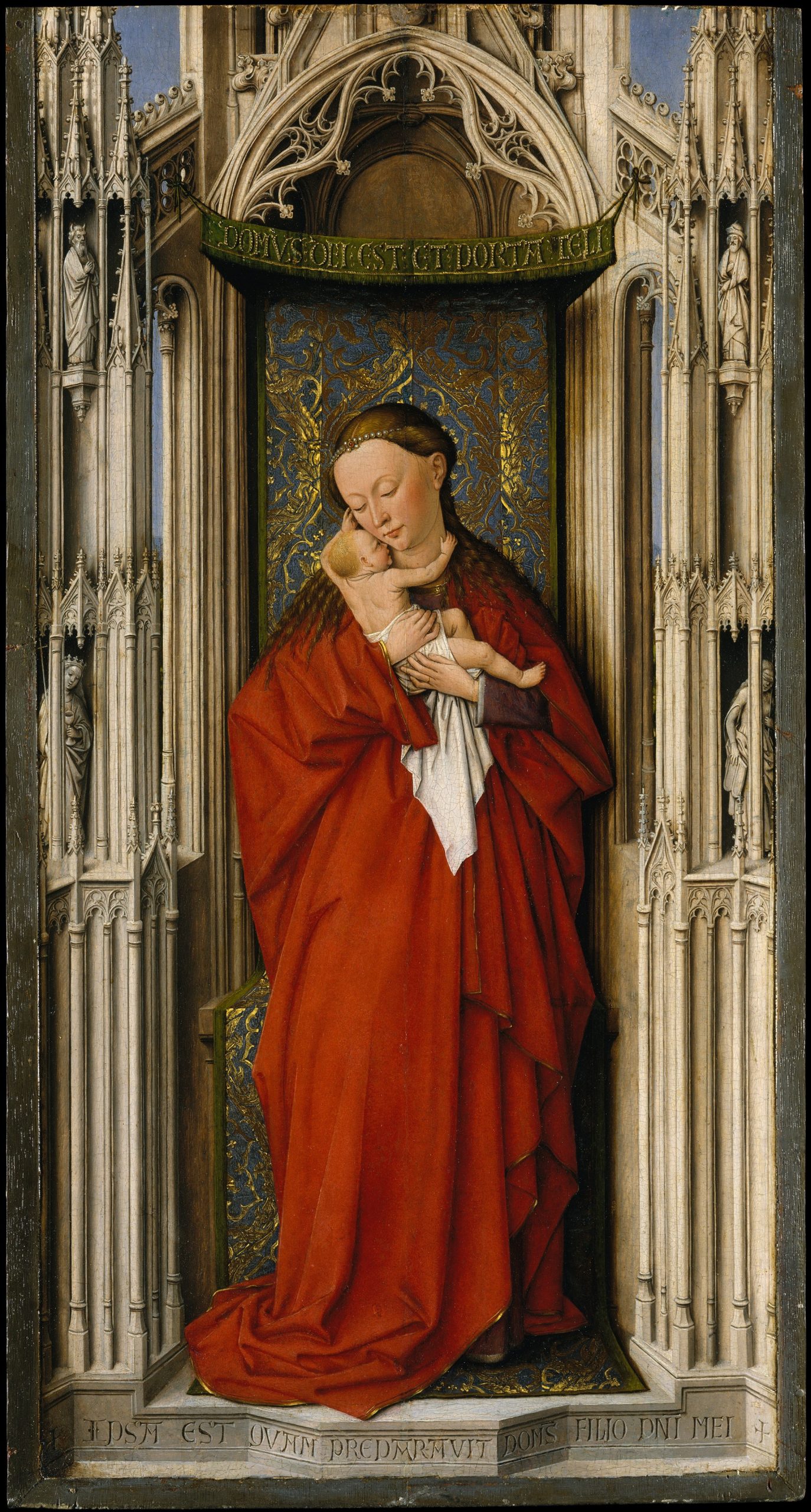
Jan van EyckOil on wood, 58.4 x 30.8 cm | 23 x 12.1 in
The Metropolitan Museum of Art
Hieronymous Bosch invoked unique nightmares and visions far beyond his time in his elaborate oil paintings. His work is considered an essential precursor to Surrealism, with its chaotic conjuration of bizarre creatures in symbolic landscapes that explore fear through the irrational. Very little is known about his personal life or creative thought process, as no letters or diaries remain; except that he was born and spent most of his life in the town of ’s-Hertogenbosch, which his own name derives from. His painting style differs from the Netherlandish tradition established by van Eyck, favouring a thicker application of paint over the careful, seamless glazing techniques of his predecessor.
His master work triptych, The Garden of Earthly Delights, sees Adam and Eve in the Garden of Eden on the left, and a bewilderingly original Hellscape on the right. The central painting conjures a false carnal paradise full of people, animals, fruits, and imaginary creatures called Grail, where the people believe they’re living in a utopia – but are actually destined for Hell as punishment for their lust.
His painting Death and the Miser shows a man in his final moments, tempted by various entities that represent both good and evil forces, encouraging him to make his choice for the afterlife. An angel kneels next to him, gesturing toward the crucifix on the window, whilst a demon peers over the bed holding Hellfire, Death creeps in the door, and a monster pushes through his bedcurtain to tempt his greed with a bag of coins.
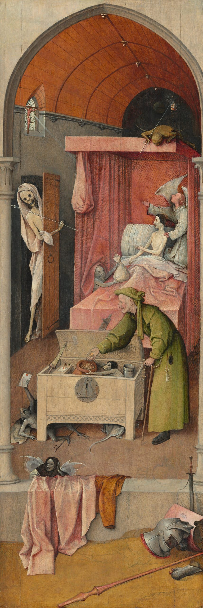
Hieronymous Bosch
Oil on panel, 93 × 31 cm | 36.6 x 12.2 in
National Gallery of Art
The polymath Albrecht Dürer is widely considered the master of the Northern Renaissance, for his brilliance across painting, draftsmanship, and writing – although his key contribution to art history was in printmaking. Before Dürer, woodcuts and wood engravings were designed for books and publications, and were often crudely made. He developed print into an artform of its own by elevating the complexity possible in the medium through the use of refined detail and an expanded tonal range. These prints were designed for the eyes of art collectors rather than as devotional objects or illustrations for text.
Melancolia I is one of his three Master engravings or Meisterstiche, alongside Knight, Death and the Devil and Saint Jerome in his Study. It’s a mysterious scene with a downtrodden angel, considered an indirect self-portrait of Dürer’s introspection on his own character. In the medieval era, Humorism was a system of medicine used to categorise people based on their four essential elements – blood (sanguine), yellow bile (choleric), black bile (melancholic), and phlegm (phlegmatic). The imbalance of any of these elements was thought to be the cause of all illnesses, and perfect health was considered the even balance of the four. In the Renaissance, the melancholic was also linked to creative genius, so here Dürer confesses that his extraordinary talent came with negative emotional consequences. She is surrounded by geometric tools which Dürer would have been familiar with in his pursuit of artistic greatness, alongside symbols of impending mortality like the sand timer and emaciated dog.
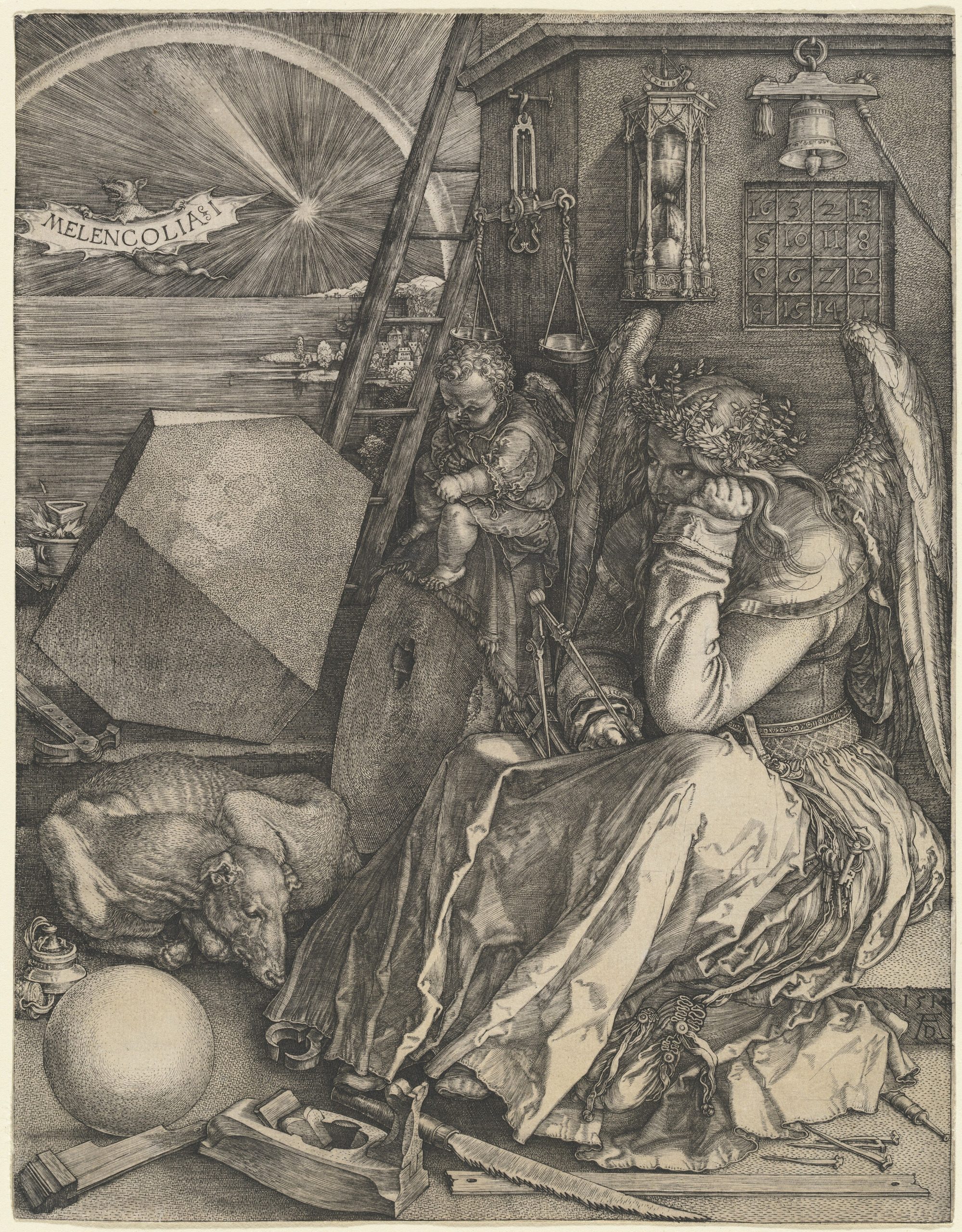
Albrecht Dürer
Engraving on laid paper, 24.2 x 18.8 cm | 9.5 x 7.4 in
National Gallery of Art
Unlike many other Northern Renaissance artists, Dürer studied directly from the works of the Italian Renaissance Masters during two visits to Italy. This influence is evidenced in his study of the human figure, which was pioneered in anatomical studies by Leonardo da Vinci. Dürer himself authored four books on human proportion, and one on geometry, which was the first in Northern Europe to cover the subject of perspective. His self-portraits are renowned for their unwavering gaze at different stages of his life, as seen in Self-Portrait at the Age of 28, alongside his acute and characterful studies of animals, such as Young Hare.
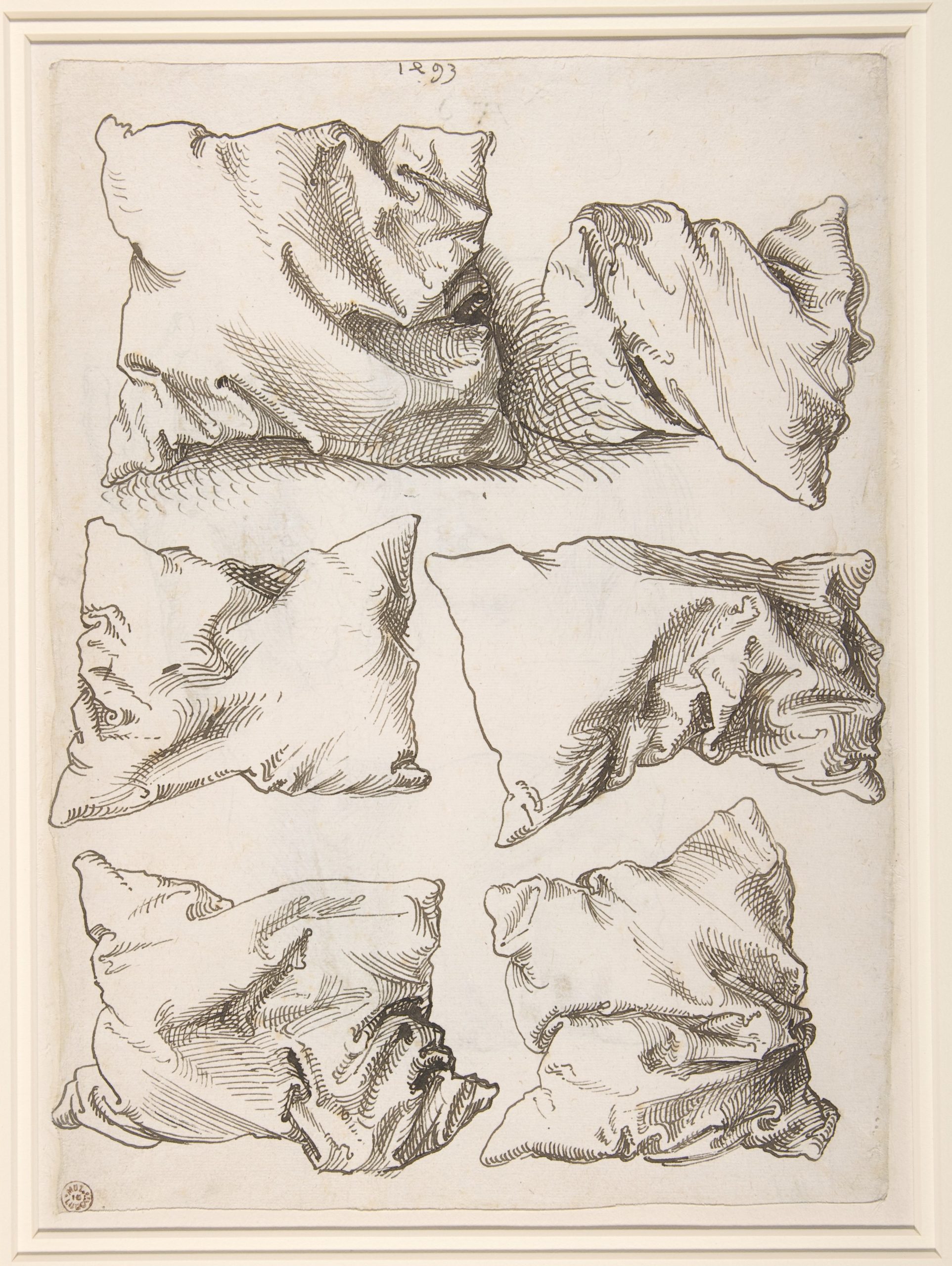
Albrecht Dürer
Pen and Brown Ink, 27.8 x 20.2 cm | 10.9 x 8 in
The Metropolitan Museum of Art
Hans Holbein the Younger is perhaps the most acclaimed portraitist of the Northern Renaissance. He was born in Germany and trained by his father, Hans Holbein the Elder, before travelling around Europe to make his paintings and prints. The shift in subject matter between father and son directly displays the effect of the Reformation on artistic practice. The Elder primarily created religious works for the Church, whereas the Younger lived through the decline in interest in religious subjects, turning instead to portraiture of the nobility and rich merchants.
Holbein the Younger travelled to England for the first time in 1526, before settling permanently in London in 1532, where he would live out the final decade of his life before dying of the plague. He brought the advanced oil painting techniques developed by Central European artists to Britain for the first time and defined the visual identity of the Tudor nobility. King Henry VIII was Holbein’s patron by 1536; during this period he produced portraits of the King, his wives and family, members of court, and a series of miniature portraits. These works provide a unique insight into the appearance and character of each figure, including the famous portrayal of French ambassadors to the English court in The Ambassadors, and of Henry’s wives, including Anne Boleyn and Anne of Cleves.
His portrait of a German judge and alderman, Hermann von Wedigh III, is prized for its clarity and its inclusion of objects that convey the sitter’s identity. The writing on the page that sticks out from the book placed in the foreground comes from writing by the Roman playwright Terence – “flattery produces friends, truth hatred.”
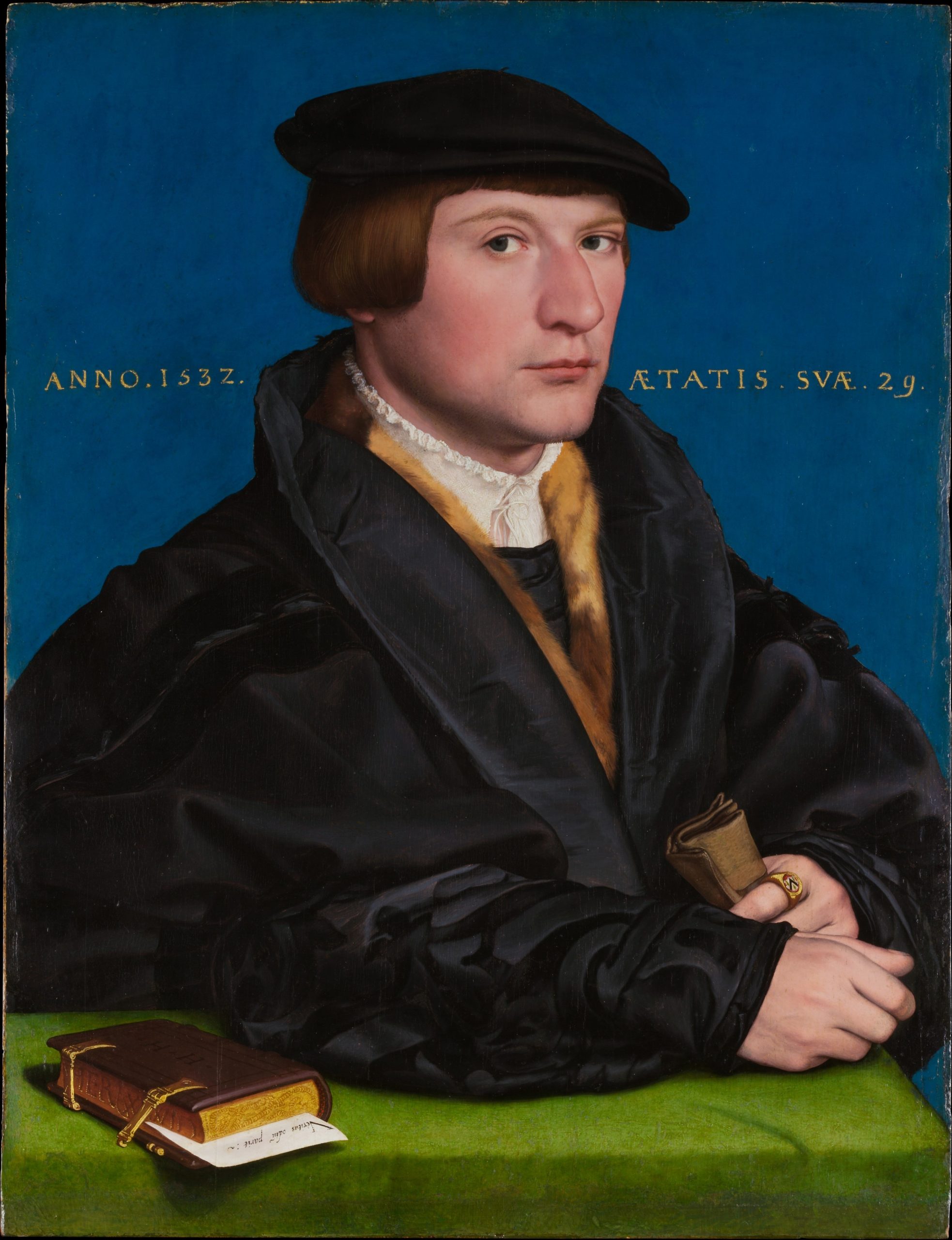
Hans Holbein the Younger
Oil and gold on oak, 42.2 x 32.4 cm | 16.6 x 12.8 in
The Metropolitan Museum of Art
Pieter Bruegel the Elder developed his signature compositional style in the form of sprawling landscape paintings populated with figures, directly inspired by Bosch’s elevated perspective. Throughout his life, he created biblical, mythical, and historical paintings – while also pioneering genre painting through his depictions of everyday life. His works are a precursor to the work of the later Dutch artists, who pursued realism through the depiction of ordinary people. Regardless of subject matter, his works are unified by a fascination with humanity as a collective.
The Tower of Babel depicts the construction of the Tower from the book of Genesis, rendered in painstaking detail. It is thought to be inspired by a visit to Rome in 1552-53, where he saw the Colosseum.
His most famous painting is perhaps Hunters in the Snow (Winter), which is part of a series representing the different seasons of the year. It shows Bruegel’s wry sense of humour, as the hunters disappointedly trudge through the snow with their gaunt dogs with just a fox to show for their work, whilst the footprints of a hare that eluded them remain visible in the snow they traverse. The Harvesters is from the same series, representing the peak of Summer, where agricultural labourers take a break from their work to eat in the cloying heat.
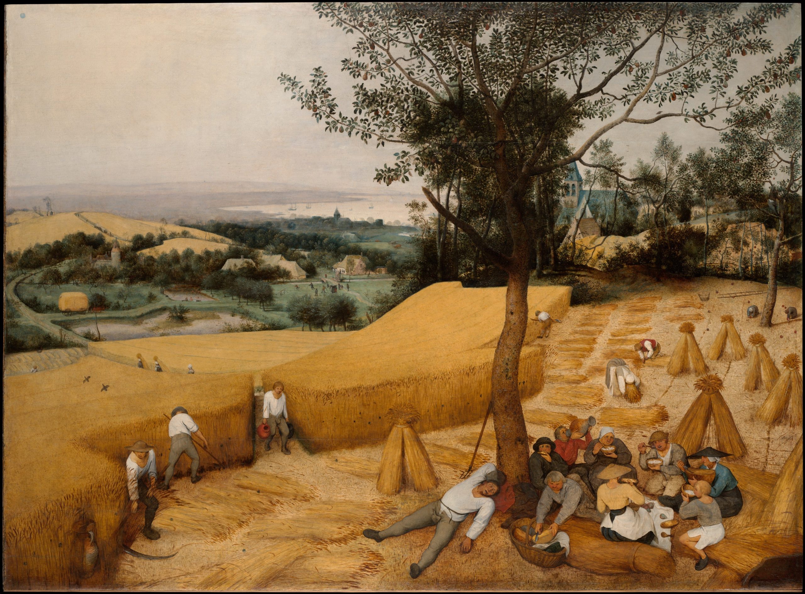
Pieter Bruegel the Elder
Oil on Wood, 116.5 x 159.5 cm | 45.9 x 62.8 in
The Metropolitan Museum of Art
Demonstrations of Northern Renaissance Techniques
Glazing Over an Underpainting
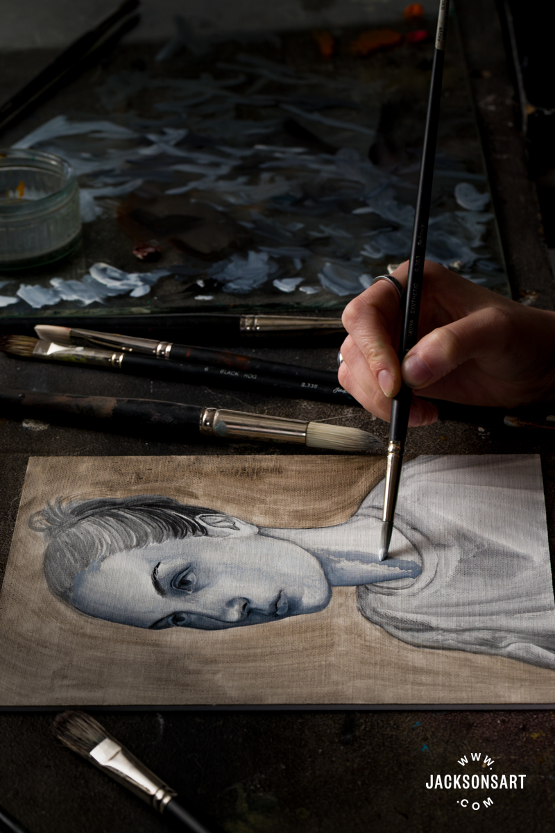
It’s well documented that Jan van Eyck set a new standard for oil painting by carefully glazing colour combined with medium over an underpainting to build rich colour and depth. These were painted over a grisaille – an underpainting rendered from white to grey and black. Van Eyck, in particular, painted on a white prepared ground where he carefully left exposed white highlights. This was then glazed over in colour to create luminous, naturalistic hues on the skin, with a broad tonal range.
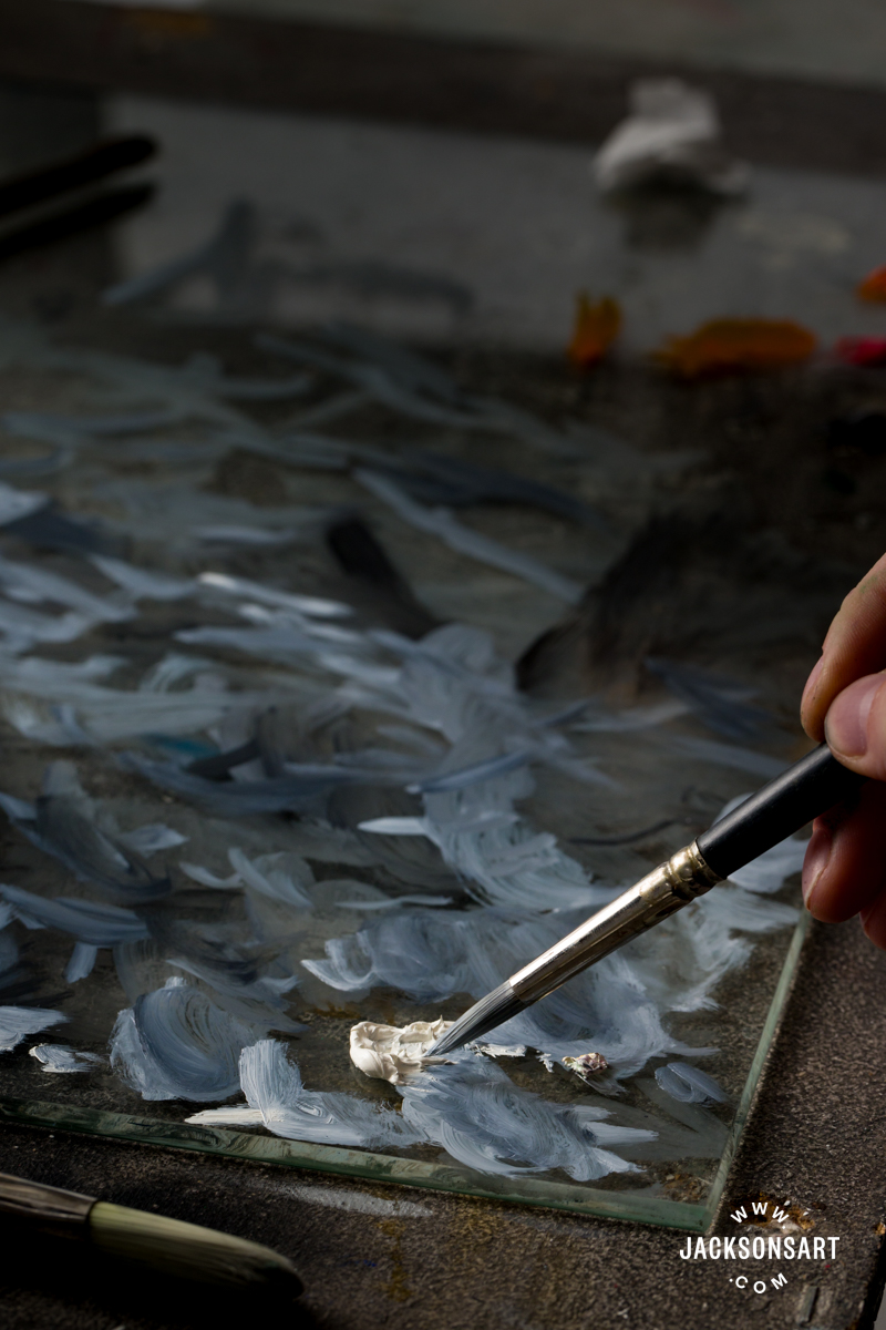
For my example, I painted on a Jackson’s Ultralite Linen Board, using a limited palette of colours inspired by the era – Warm White, Yellow Ochre, Lamp Black, Burnt Sienna, and Naphthol Vermillion. I used Jackson’s English Distilled Turpentine and Jackson’s Refined Linseed Oil to mix my mediums. I was particularly inspired by his work Portrait of a Man (Self-Portrait?), which is almost conclusively the only surviving self-portrait of the man himself.
To begin my example, I lightly painted a sketch of my sitter using Lamp Black diluted with a thin medium of turpentine and a touch of oil. I established the composition of the painting by using the paintbrush like a pencil, and was able to correct any mistakes by wiping off any misplaced paint.
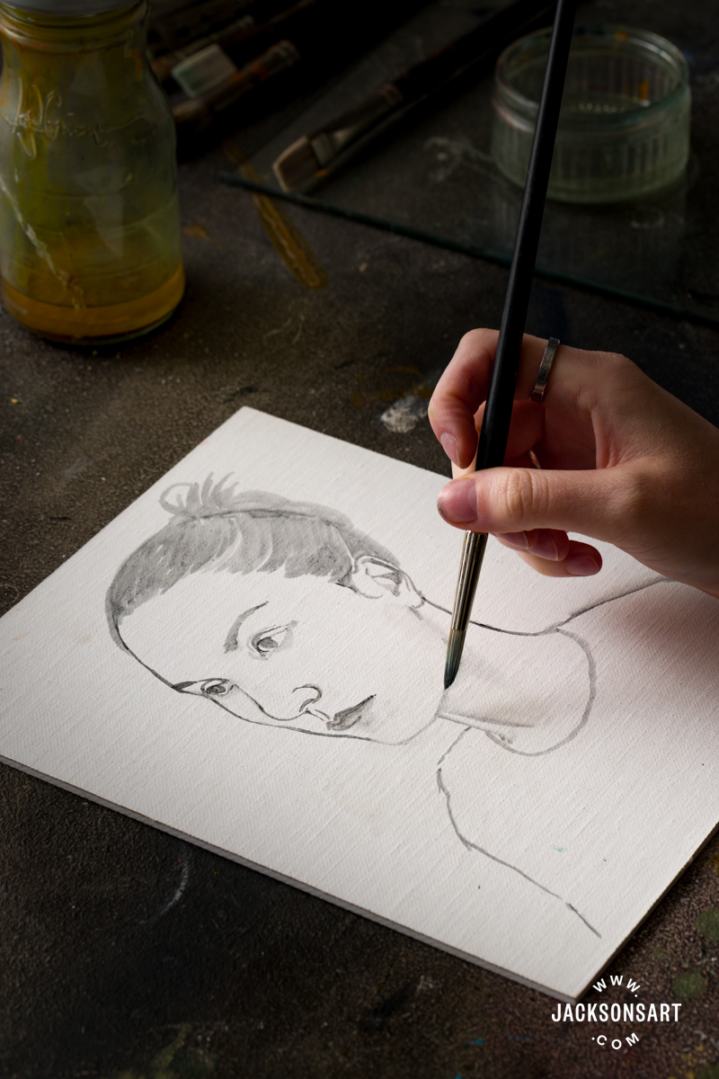
Next, I began rendering the face by mixing together Lamp Black with Warm White to create the mid-tones to establish form. Lamp Black, combined with Warm White, leans blue, which gives the portrait cool depth in the following layers. I blocked in the background colour with Lamp Black mixed with Burnt Sienna, to give it a warmer hue in the next layer and to separate it from the figure.
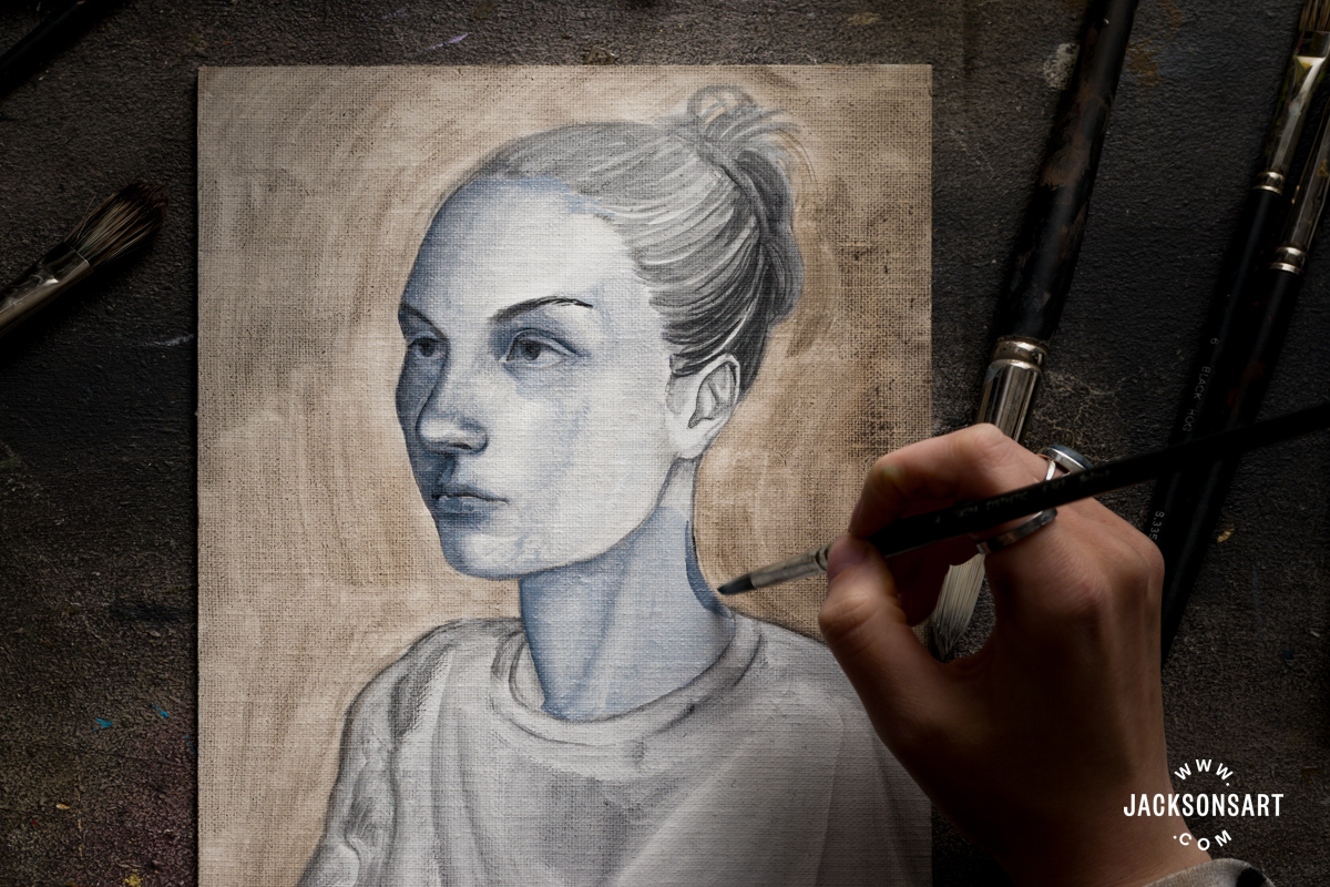
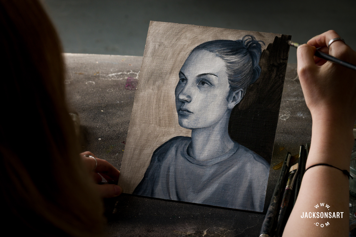
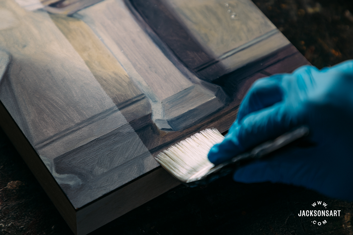
Once I completed my detailed grisaille underpainting, I allowed this layer to fully dry down. It’s important to wait before glazing over an oil underpainting, so that you don’t smudge or lift any of the colours below, which would defeat the purpose of the layering.
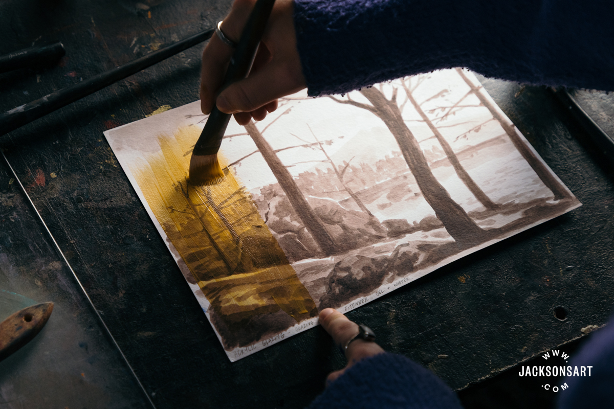
For the following glazes, I painted with a fat medium – a majority of oil combined with a small amount of turpentine.
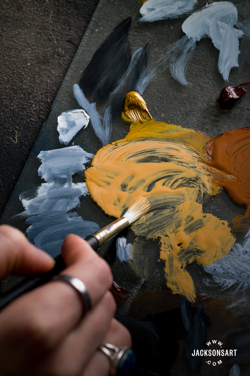
For the first glaze, I went over the entire face with a light layer of Yellow Ochre combined with a touch of Burnt Sienna, to begin to bring warmth to the face.
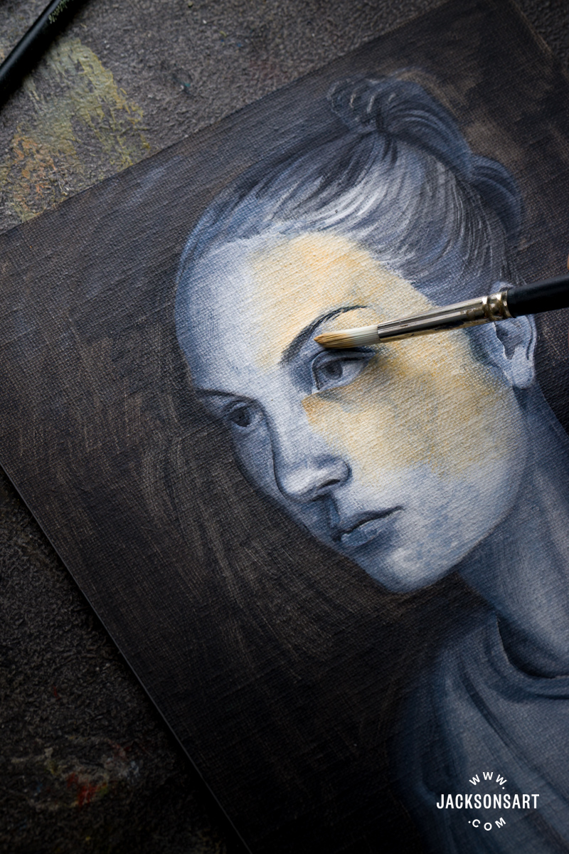
Next, I methodically added more Burnt Sienna to the portrait, bringing out the warmth of the cheeks, around the nose, and eyes.
Then I reinforced some of the shadows by glazing lightly with Burnt Sienna combined with Lamp Black on the far side of the face, under the brow, and on the hair and neck.
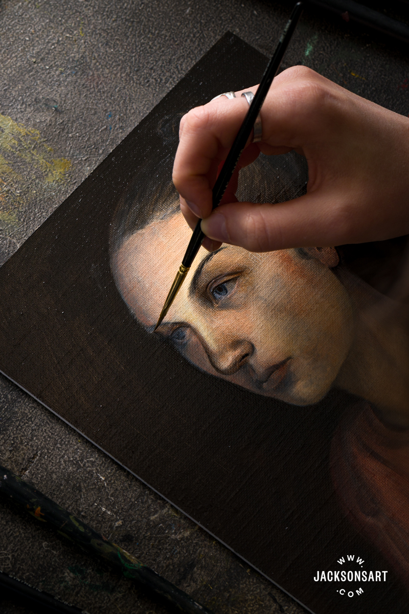
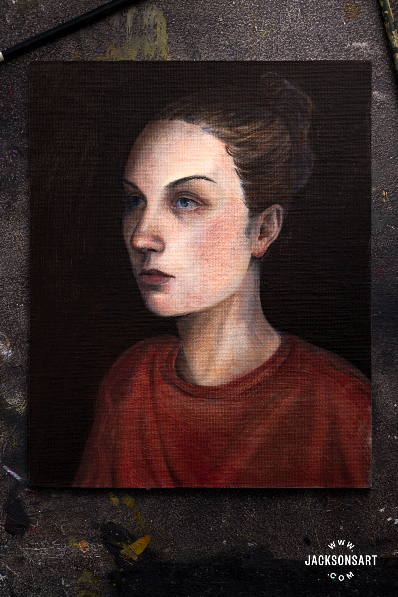
To finish my first pass at glazing the portrait, I picked out some areas with Napthol Vermillion combined with Burnt Sienna to give colour to the lips, edge of the ear, eyelid, and red shirt.
This is only the first layer of glazing on this painting. If I were to continue working on it, I’d allow this initial layer to completely dry before working back on top with the same colours to build their intensity and saturation gradually in transparent layers. I’d also make sure to continue painting fat-over-lean by keeping a high oil ratio in each successive glaze.
Tips: Getting the right consistency for a glaze in oil paint is essential for creating a seamless finish. The paint-to-medium ratio should differ depending on the colour used since some are ‘drier’ than others. Instead, you should aim to mix paint that is slick and easy to disperse with the brush, without being so wet that it can run or pool out on its own on the palette. You only need a touch of paint on the brush to begin building these thin layers.
Woodcut and Wood Engravings
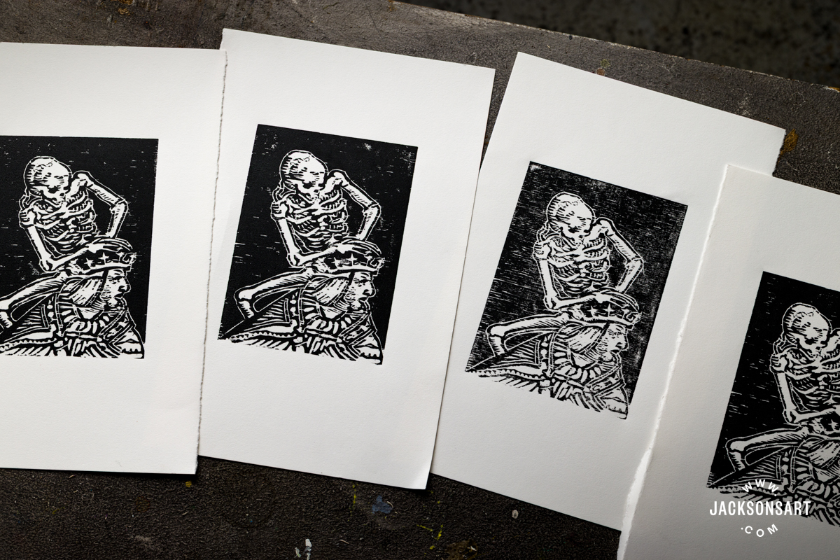
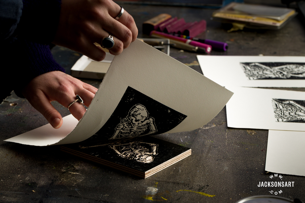
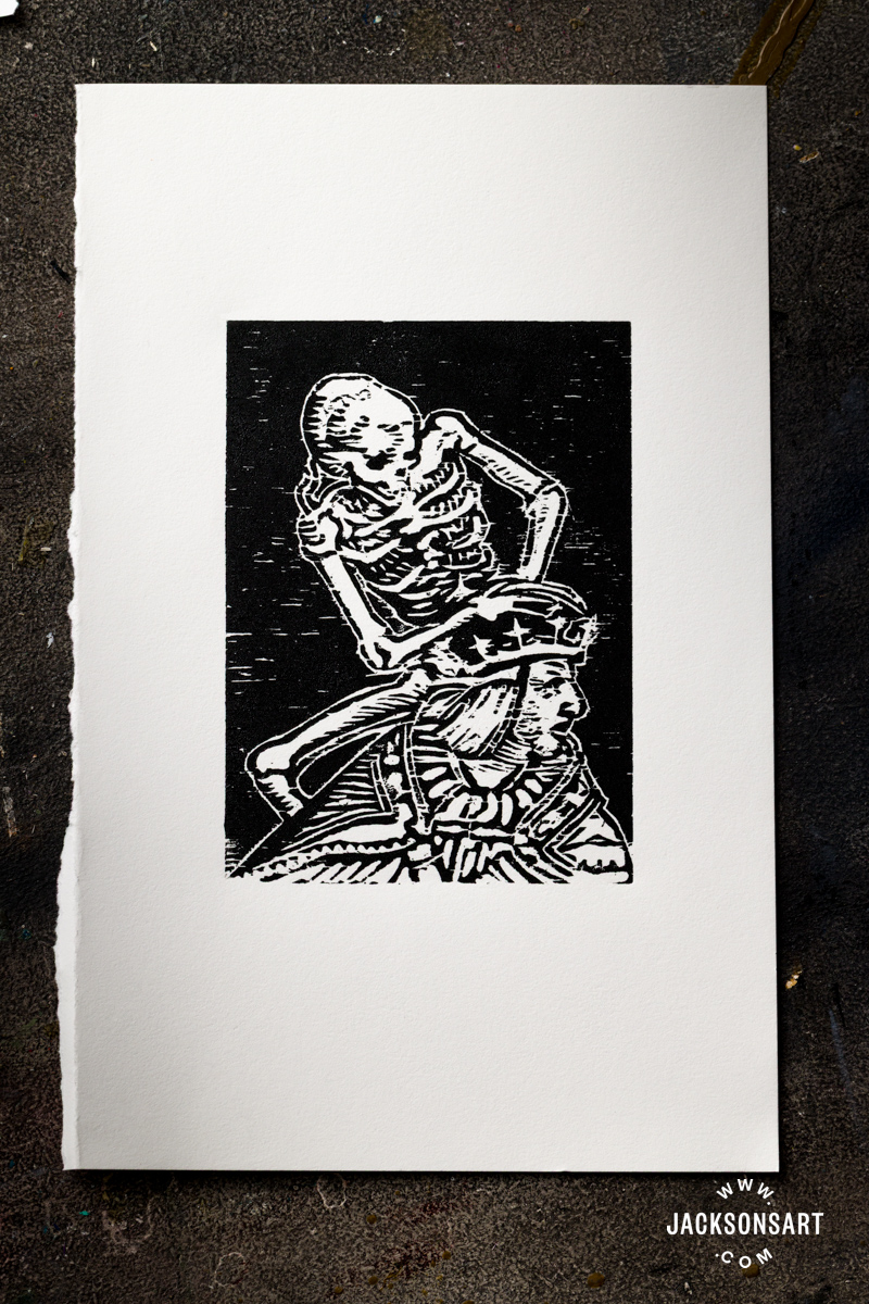
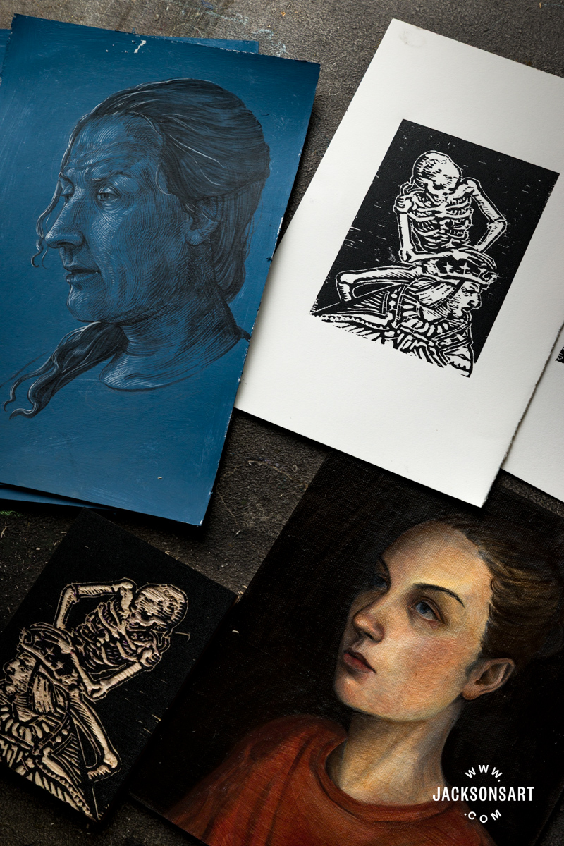
As I described previously in this article, Albrecht Dürer elevated printmaking by bringing a new level of refinement to wood engraving – his works are considered incomparable for this period, but many other artists made woodcuts and wood engravings during this era as well. One of these was Hans Holbein the Younger, whose Tudor portraiture I described in detail above. He worked on a book of 41 small woodcuts in his twenties called The Dance of Death, where stylised skeletons push and pull people toward their doom. His sinister, lurking depictions of Death assert that he comes for us all – regardless of status or wealth. For the following example, I made my own woodcut inspired by the skeleton clinging to royalty in The Emperor.
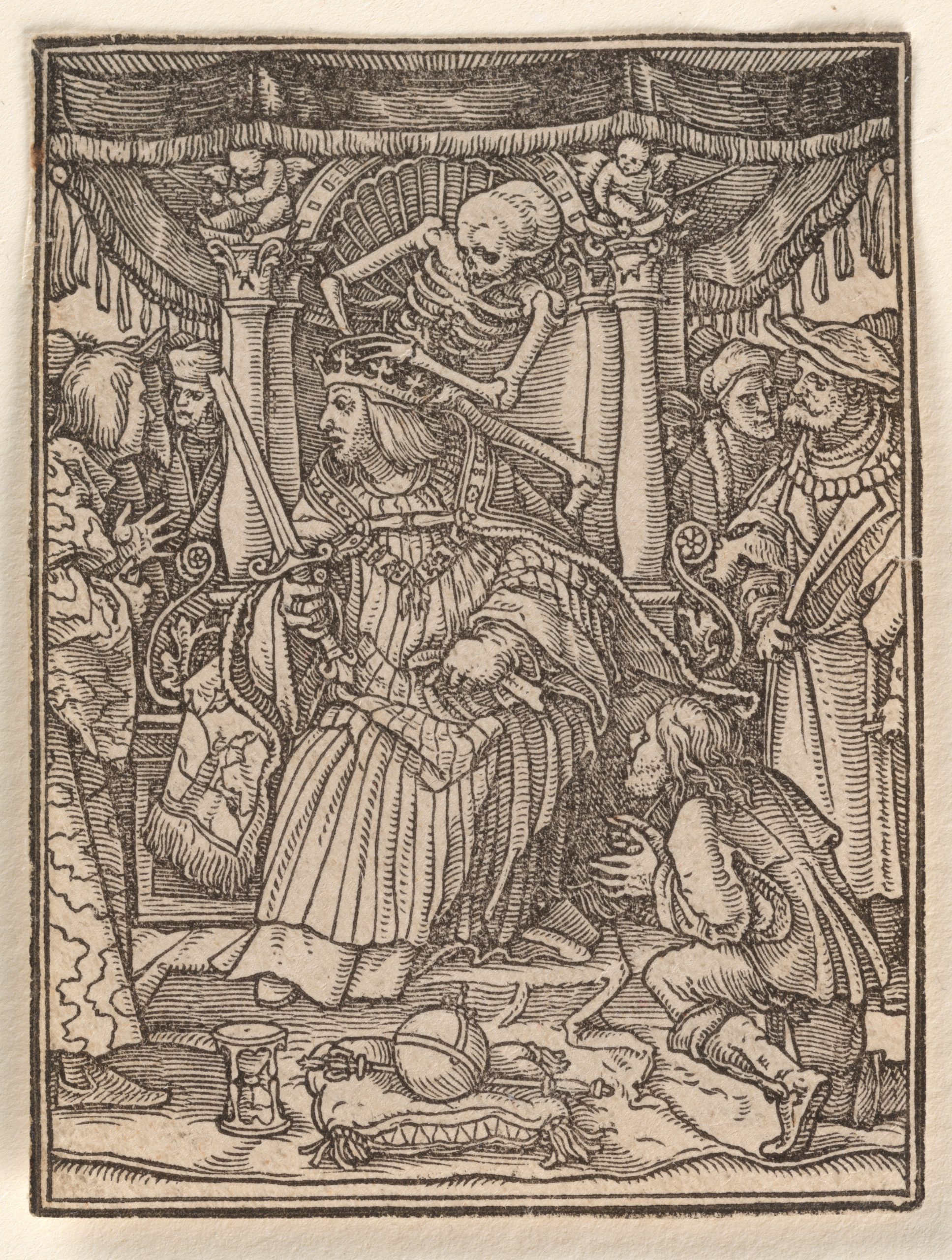
Hans Holbein the YoungerWoodcut, 6.5 x 4.9 cm | 2.6 x 1.9 in
The Metropolitan Museum of Art
For my example, I used a Jackson’s Birch Plywood Block 4×6 in which I cut using the Jackson’s Wood Cut Knife Set of 8, after sketching the design using a 2B pencil and Violet Posca pen. Then I printed the block using Speedball Professional Relief Ink in Supergraphic Black, applied with an Essdee Roller, and printed on Arnhem 1618 paper.
To begin, I lightly drew out the placement of my design with a 2B pencil directly onto the wood, so that I could correct my drawing if need be. Once I was happy with it, I decisively drew over the lines with my Posca pen to mark out all the areas I would retain from being cut.
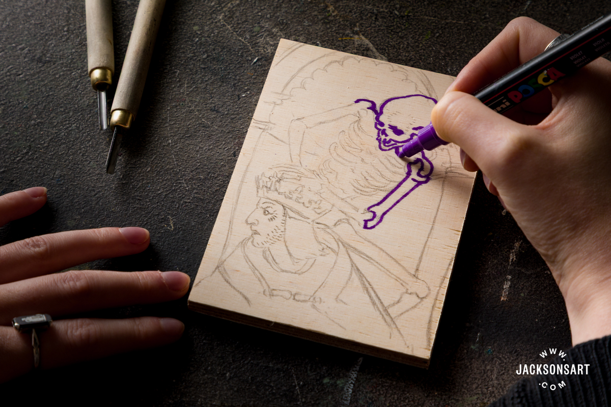
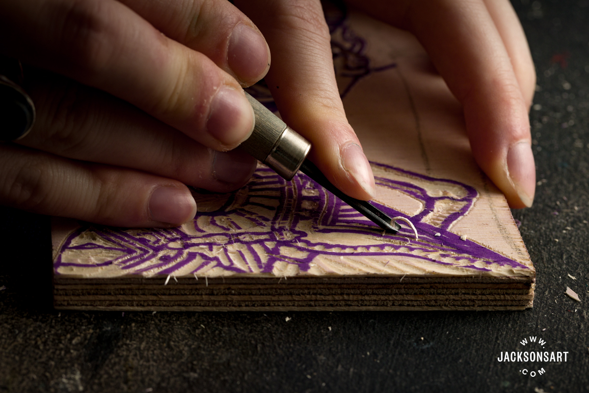
Next, I began cutting my woodcut using a variety of tools from the set. The narrow V-shaped tools were ideal for gouging out the straight hatched lines, and the angled blade was useful for cutting around the edge of more awkward shapes before lifting them out with a gouge.
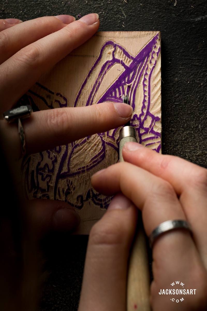
As I worked, I had to keep my tools sharp to cleanly cut through the wood, so I sharpened them as they dulled with a Slipstrop Carving Tool Sharpening Kit.
Once I’d cut my print, I inked the plate with black ink rolled out onto a glass palette. Oftentimes, the first proof of a woodcut is weak, so I had to ink it up and print a few times before seeing the true impression of the plate.
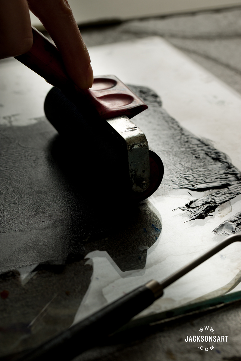
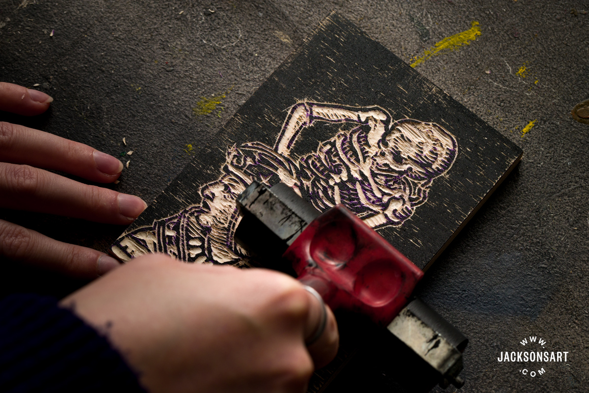
Tips: Don’t wash a woodcut plate in between prints with water, since the moisture will take a while to dry from the wood, and would interfere with any subsequent prints. This is different from lino relief printing, where you can dry the plastic off quickly before printing again.
Drawing on a Toned Ground
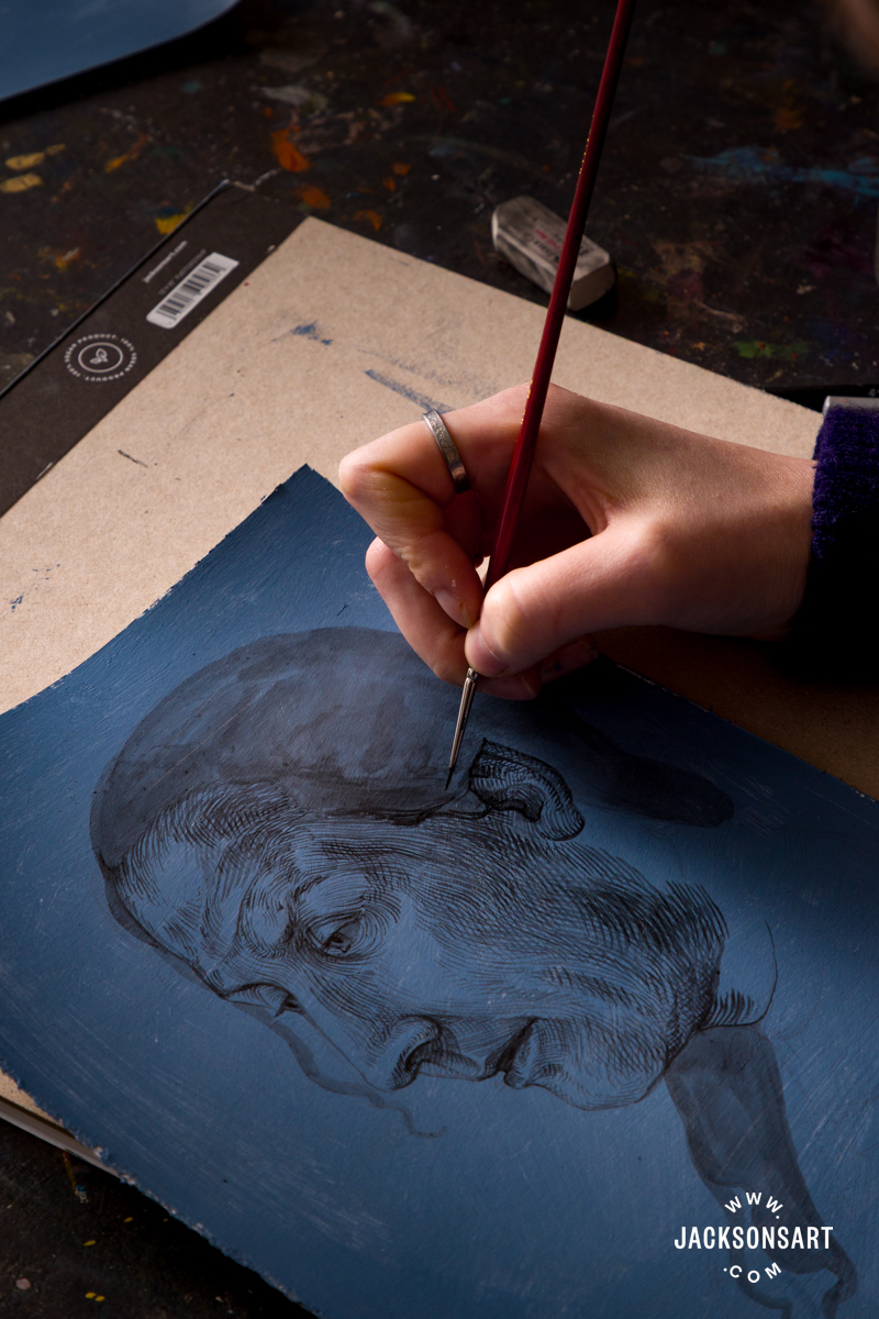
Drawing techniques for the Northern Renaissance were mostly preparatory for designing paintings, prints, and studies from life. Artists of this period didn’t make drawings which could be considered stand-alone works, apart from Albrecht Dürer, even if they weren’t thought of as such at the time. He made chiaroscuro drawings (drawing with black and white media on toned paper) in preparation for elements of his paintings, like his notable Praying Hands, which appear in The Heller Altarpiece, and Head of the Christ Child, which was a study for Christ Among the Doctors. In both instances, the drawings are more widely circulated than the paintings they were made for. Some of his toned paper drawings were made on Carta Turchina or blue-dyed rag paper made in Italy. After using this blue paper, Dürer created his own blue, grey, and green leaning grounds to work on, by toning paper himself with paint.
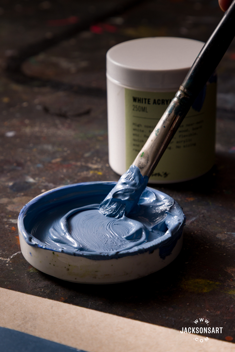
For my example of a Dürer-inspired blue-toned chiaroscuro drawing, I prepared a couple of sheets of Jackson’s Bockingford Watercolour Hot Press Paper with Jackson’s Professional Acrylic Paint mixed with Jackson’s Acrylic Gesso Primer. Then I drew with Sennelier Indian Ink and Holbein Acrylic Gouache Paint in Titanium White using fine Willow Wolfe Callia Brushes.
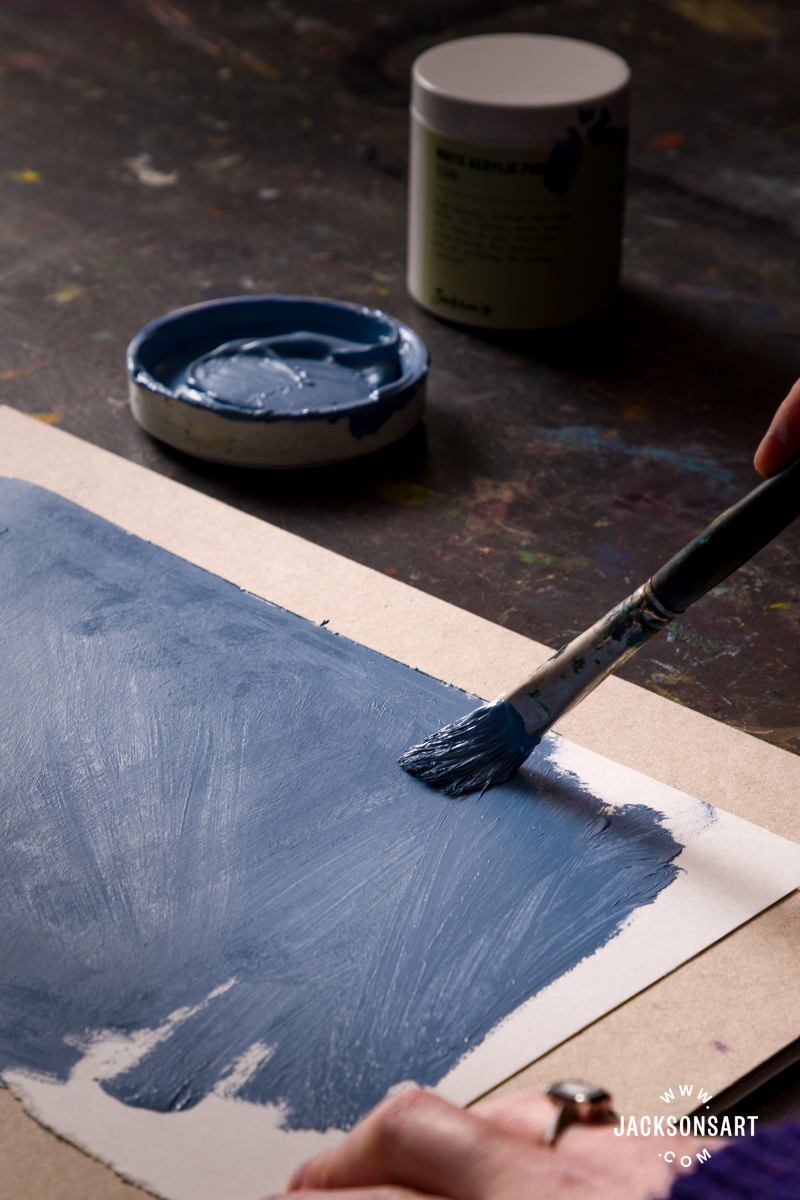
To begin, I mixed together French Ultramarine Blue with a touch of Yellow Ochre, and combined them with Jackson’s Acrylic Gesso Primer to create my prepared ground. I applied it to my paper with a broad brush and let it fully dry.
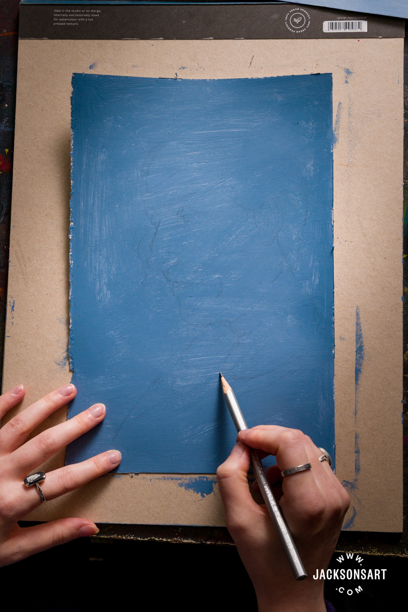
Once dry, I began my chiaroscuro drawing. I worked methodically around my portrait using the black ink first, carefully hatching the contours of the face, and selectively diluting the ink with water in lighter areas for tonal variation. I only painted with pure black ink in a few places – around the eyes, nostrils, mouth, and hair.
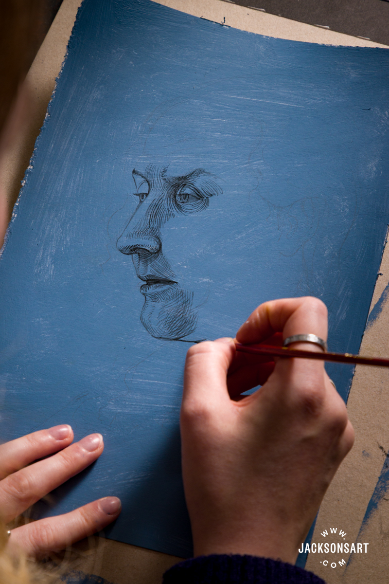
Once I’d completed my black ink drawing, I started drawing with the white gouache to pick out areas of light in the face. I hatched and crosshatched light cast across the front of the face, which gave my subject tangible form.
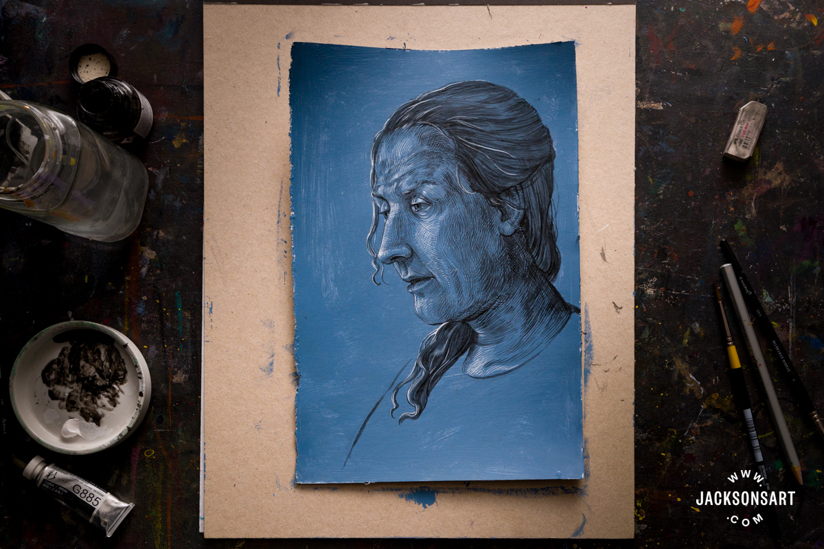
Tips: Make sure to leave the areas that will be cast in light free of black hatched lines on your first layer. The illusion of form is created by these open passages being lit by the white hatched lines – not by layering black and white on top of each other.
Further Reading
Techniques for Miniature Painting
The Art of Silverpoint Drawing: History, Materials, and Techniques
Hatching Techniques for Drawing, Painting, and Printmaking
Shop Art Supplies at jacksonsart.com
8 thoughts on “Behind the Movement: Northern Renaissance”
Hi Louise,
I really enjoyed this article! Thanks so much for the time and effort is must have taken to do the historical research and then to work on some samples of the various methods. I’ll pass the article along to some artist friends,
Sincerely,
Anne
Thanks for the lovely comment Anne! I’m so glad you enjoyed the article and appreciate you sharing it
Actually Jan van Eyck was a profoundly Catholic artist, as were his contemporaries Roger van der Weyden, et al, and just about all of the most notable painters of the early Northern Renaissance. His most famous painting isn’t the splendid Arnolfini double-portrait in the National Gallery, but the great Mystic Lamb altarpiece in Ghent. The Portinari Alterpiece by Hugo van der Goes also exemplifies the intense spirituality governing these artists’ work. Unfortunately a lot has been lost through Protestant iconoclasm, but enough has survived to show that it is concerned with very different values from those governing later Dutch & northern art. It isn’t clear that later artists had more ‘freedom’, but their new largely Protestant clients had different demands to which the artists were obliged to respond. The sheer quality of northern art of the High Middle Ages sets it apart, and it cannot be judged by the same criteria governing the output of subsequent centuries.
Hi Nigel, thanks for leaving a comment with added context! It can be difficult to include the details of every aspect of art movements in article length format – the Northern Renaissance was especially difficult to condense down with such a rich and diverse history. We were referring to broader cultural and artistic shifts during the lead up to and during the Reformation – rather than the specific faith of particular artists’. I’ve added a couple of extra notes to the post now that cover the interesting points you made.
Thanks Louise. I really enjoyed reading your blog and learned a lot. I’m in the Scottish Highlands so was pleased to know of your connection with Glasgow. Thanks again. Sarah
Thank you Sarah, really glad it was interesting! Brilliant – I visit the Highlands as often as I can for inspiration
Thank you. That was such an interesting blog.
Glad you enjoyed reading it!
Comments are closed.