



In this article, I define the chiaroscuro technique, by looking at its origins in the Renaissance and considering its lasting visual impact. I detail the process of making a chiaroscuro still life oil painting, a chiaroscuro portrait drawing on toned paper, and a multi-layered chiaroscuro reduction print, that you can try out. Articles in the Techniques Series define the meaning and context of art making processes and give practical tutorials on how to work with them.
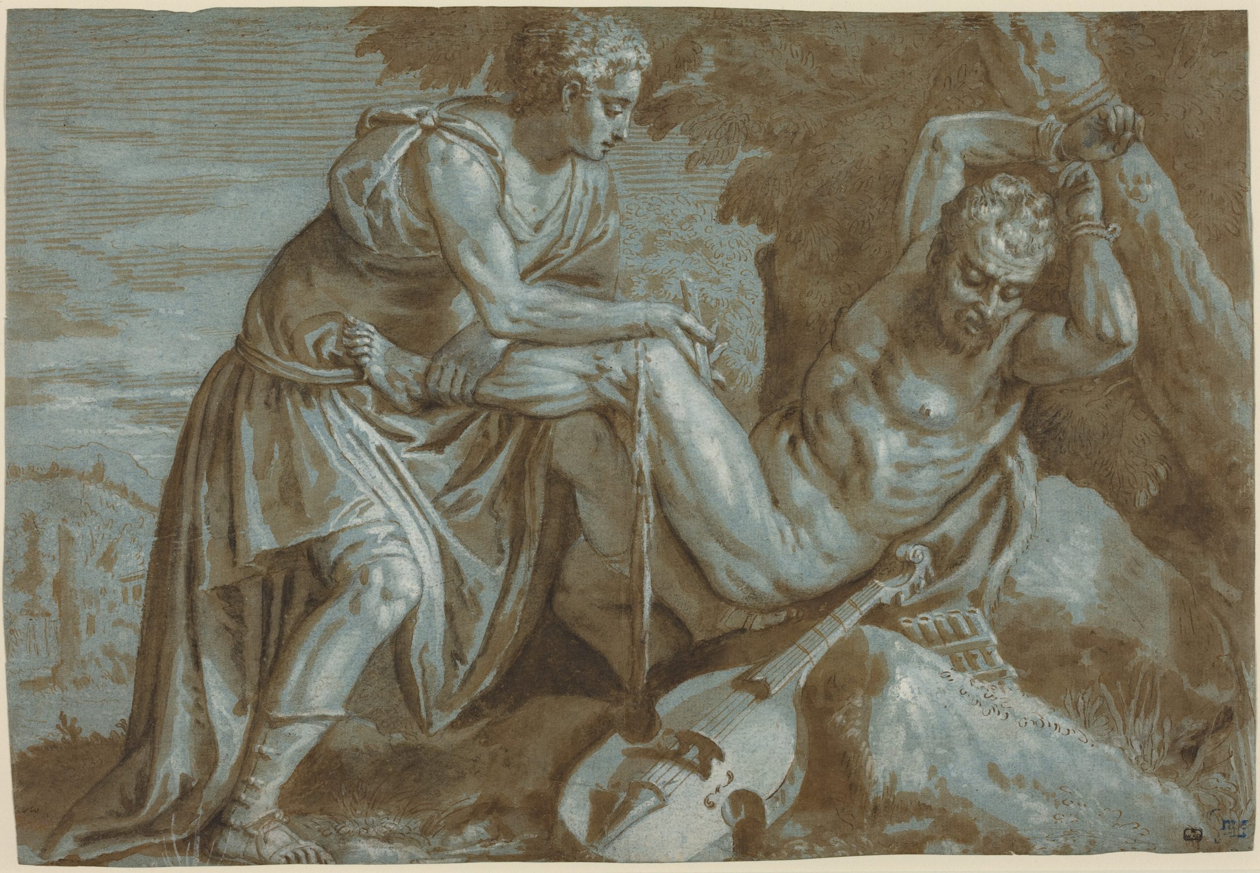
attributed to Paolo Veronese
Pen and brown ink with brown wash and white gouache over black chalk on blue laid paper, 29.5 x 43 cm | 11.6 x 16.9 in
National Gallery of Art
Definition: Chiaroscuro describes the range of tone from the darkest shadow to the brightest light to create high contrast in an artwork. It comes from the Italian for ‘clear’ or ‘bright’ – chiaro – and ‘dark’ – oscuro.
What is the Effect of Chiaroscuro?
Using a dramatic range of tone in a representational artwork creates the illusion of three-dimensionality, and pushes the subject of the work into our physical space. It gives the motif a tangible sense of volume and weight, often with a feeling of suspense like the chosen drama has been frozen. Chiaroscuro can elicit complex emotions in combination with the subject matter, such as fear, deception, hope, longing, peace and panic, depending on what emerges from the darkness, or is specifically illuminated. Therefore chiaroscuro may also enhance the narrative of an artwork, as the placement of the lighting signifies importance, or more literally ‘shines a light’ on where the artist wants to direct the eye towards a focal point.
The History of Chiaroscuro
The original use of the word chiaroscuro described drawings made on toned paper in black or brown with white highlights, often using silverpoint, ink, charcoal, or gouache. This was an essential preparatory stage for Renaissance artists, to plan the arrangement of dark and light in their compositions, and to create depth, form, and volume.
This was followed by the chiaroscuro woodcut print, a technique invented by Ugo da Carpi in 1516 who applied to the Venetian Senate to protect his method from copyists by writing that he had created a ‘new method of printing in chiaro et scuro’. By layering two to four woodblocks of graduating tones, da Carpi reproduced paintings for artists like Raphael and Parmigianino. Unfortunately for him, his patent didn’t stop the technique being used by printmakers across Europe, such as Vicentino and Goltzius.
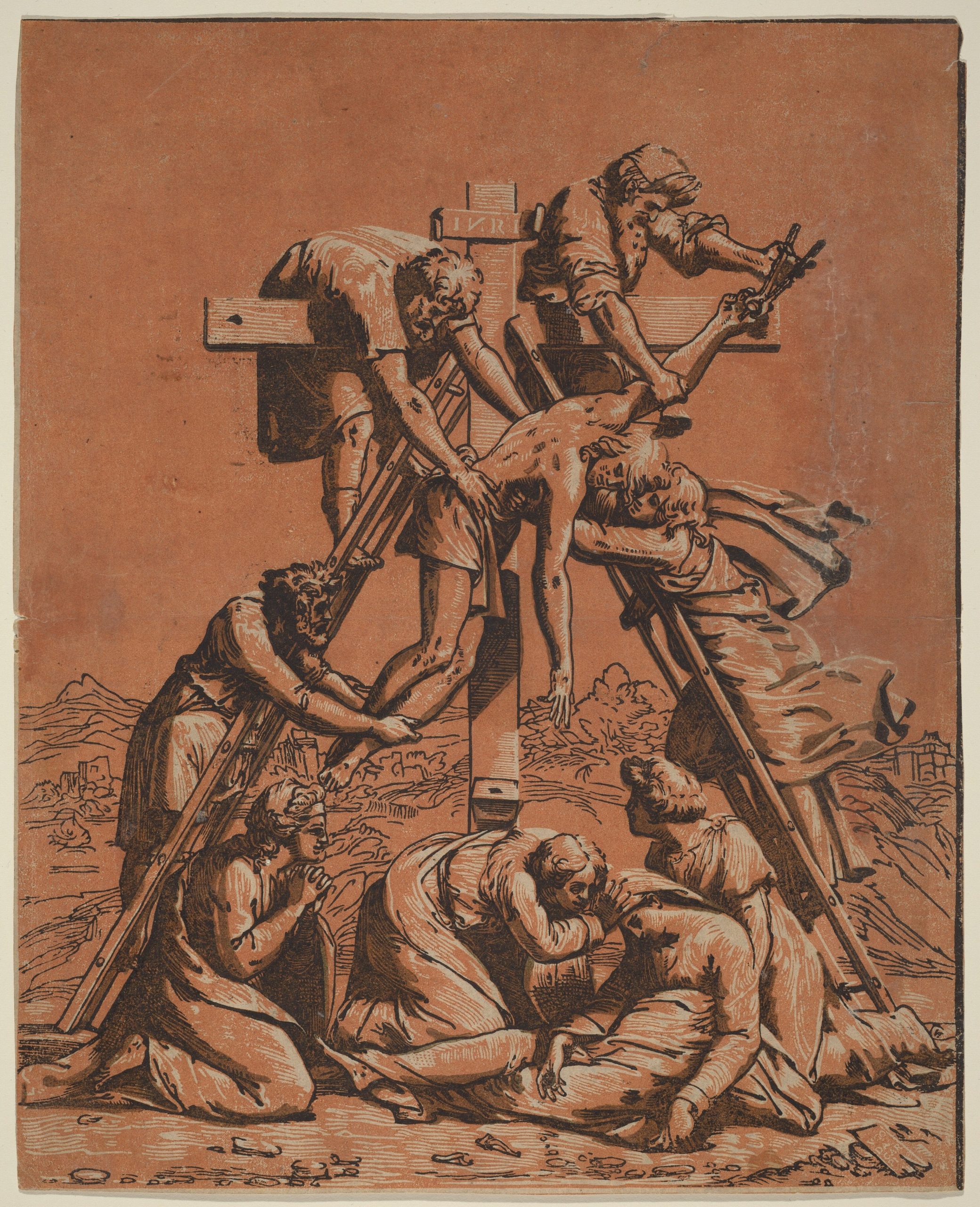
Ugo da Carpi after Raphael
Chiaroscuro woodcut in black and brown, 34.8 x 28.2 cm | 13.7 x 11.1 in
National Gallery of Art
Since then, the definition has broadened beyond drawing and printmaking, especially as it evolved through Renaissance and Baroque painting. Artists like Leonardo da Vinci and Rembrandt are celebrated for using chiaroscuro, but it was undeniably pushed to a new level of sophistication and intensity by Caravaggio, which saw him become one of the most sought-after painters in Italy.
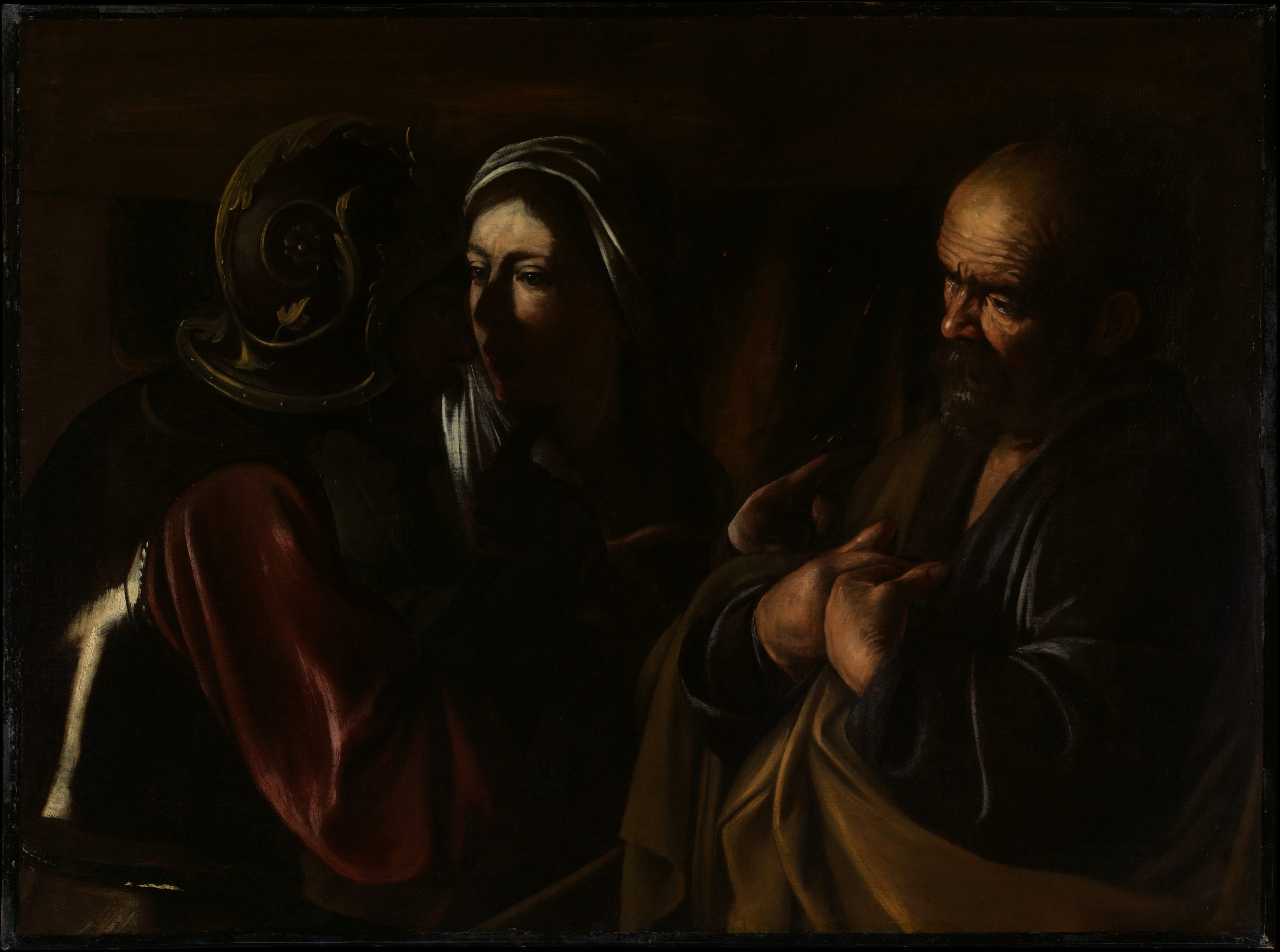
Caravaggio
Oil on canvas, 94 x 125.4 cm | 37 x 49.3 in
The Metropolitan Museum of Art
Defying convention, Caravaggio painted spontaneously from models in his studio, without preparatory drawings. This meant that the faces of everyday people became immortalised as Biblical figures, like players on his stage, with human personality and brutality. Often using a single light source, many of his works have ambiguous dark backgrounds, so his figures emerge towards us into the light. His chiaroscuro works inspired many imitators of his style, affectionately called ‘Caravaggistas’. We see echoes of his influence across art history, from Artemisia Gentileschi, Rubens, Ribera and Delacroix, to painters working today.
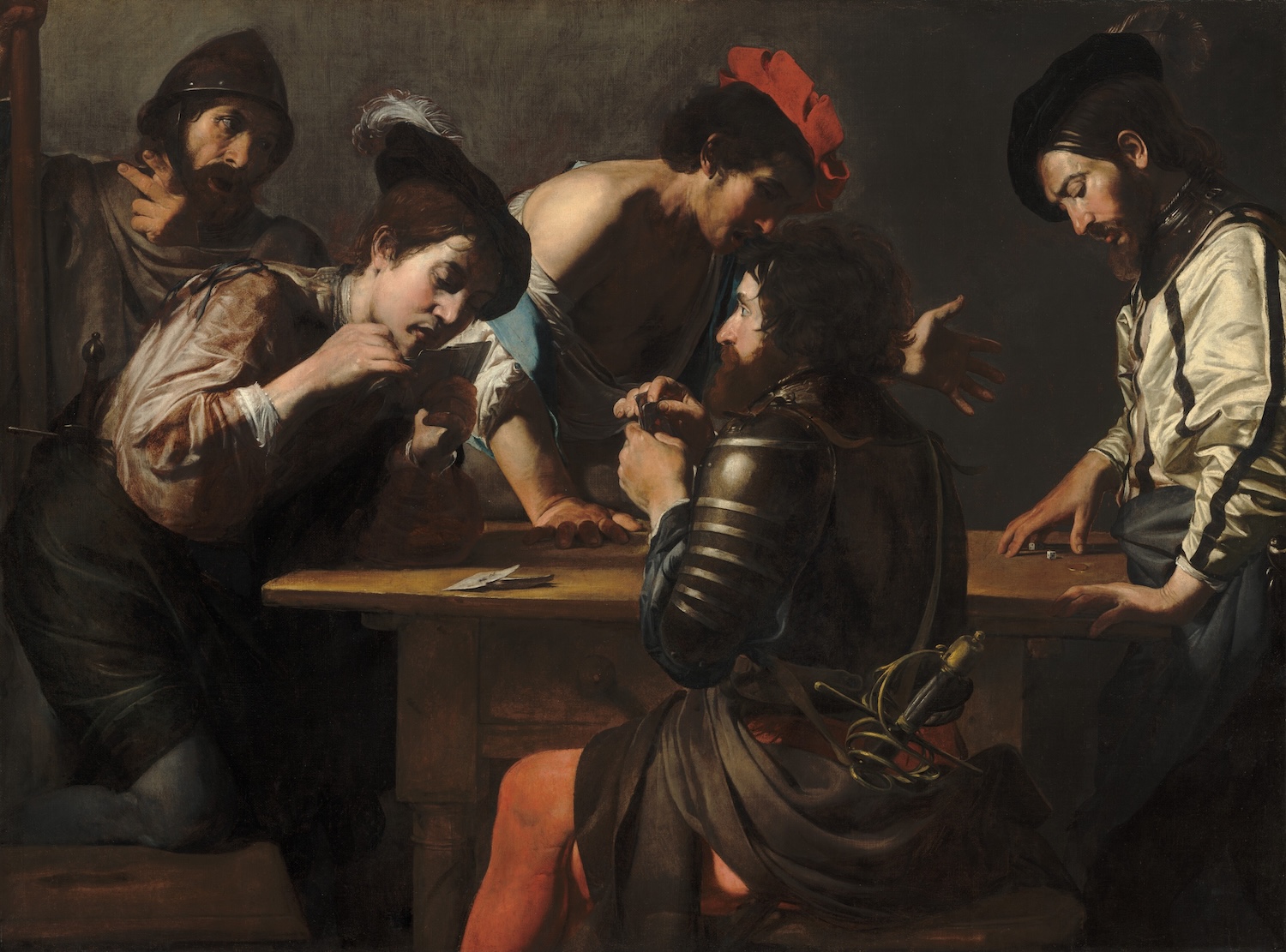
Valentin de Boulogne
Oil on canvas, 121 x 152 cm | 47.6 x 59.8 in
National Gallery of Art
Demonstration of the Chiaroscuro Technique for Oil Painting
To demonstrate how to try chiaroscuro in your paintings, I’ve created a still life set up with a plaster cast of a hand, and a selection of objects from the studio, with a strong light shining on it. Creating bold highlights and shadows is essential to this technique, so I’d recommend using a lamp instead of natural light. You can experiment with moving it around for the greatest compositional and emotive effect. I’m working on sheets from Jackson’s Oil Paper Block 12 x 16 in with Jackson’s Professional oil paints. This technique would also work for acrylics, watercolours, and pastels.
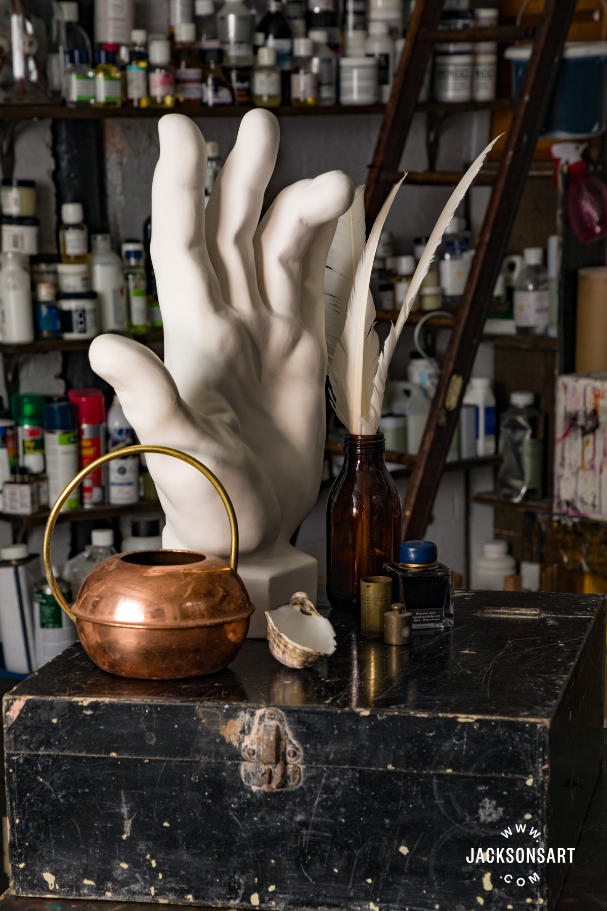
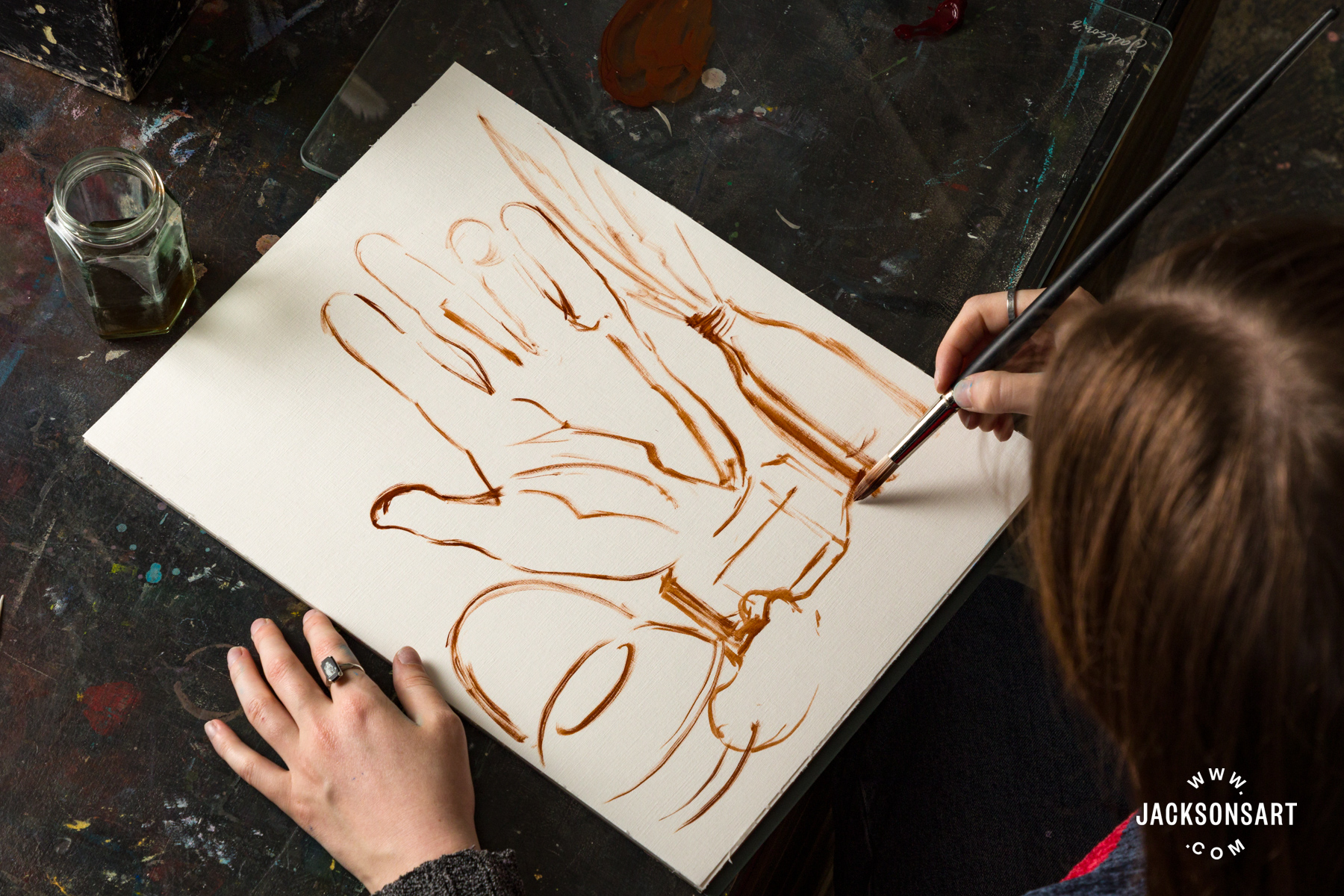
To begin, I made a light painted sketch in Burnt Sienna of my still life set up.
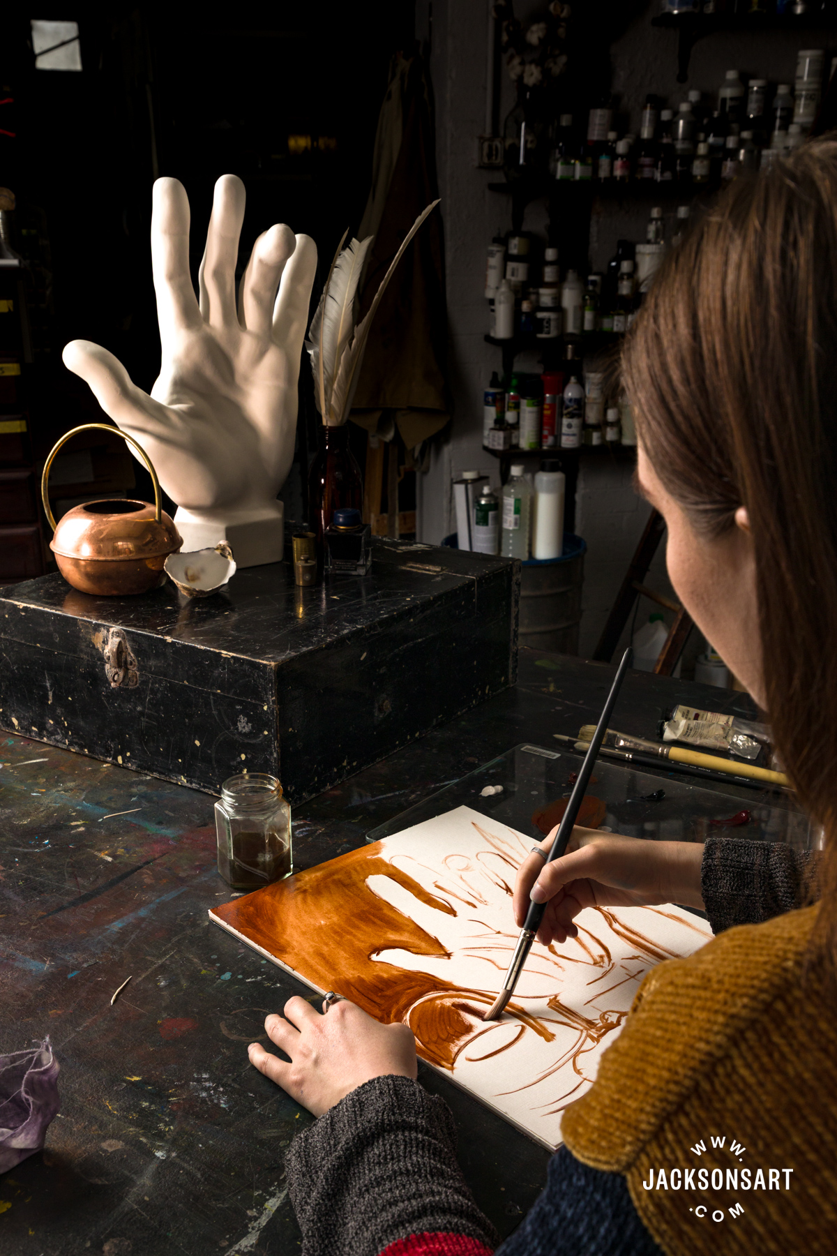
Next, I blocked in all of the areas of tone in my painting, leaving only the highlighted areas out. If you make any mistakes just wipe them away with a rag.
Next, I blocked in the darkest areas of the painting, with a combination of Alizarin Crimson and Prussian Blue.
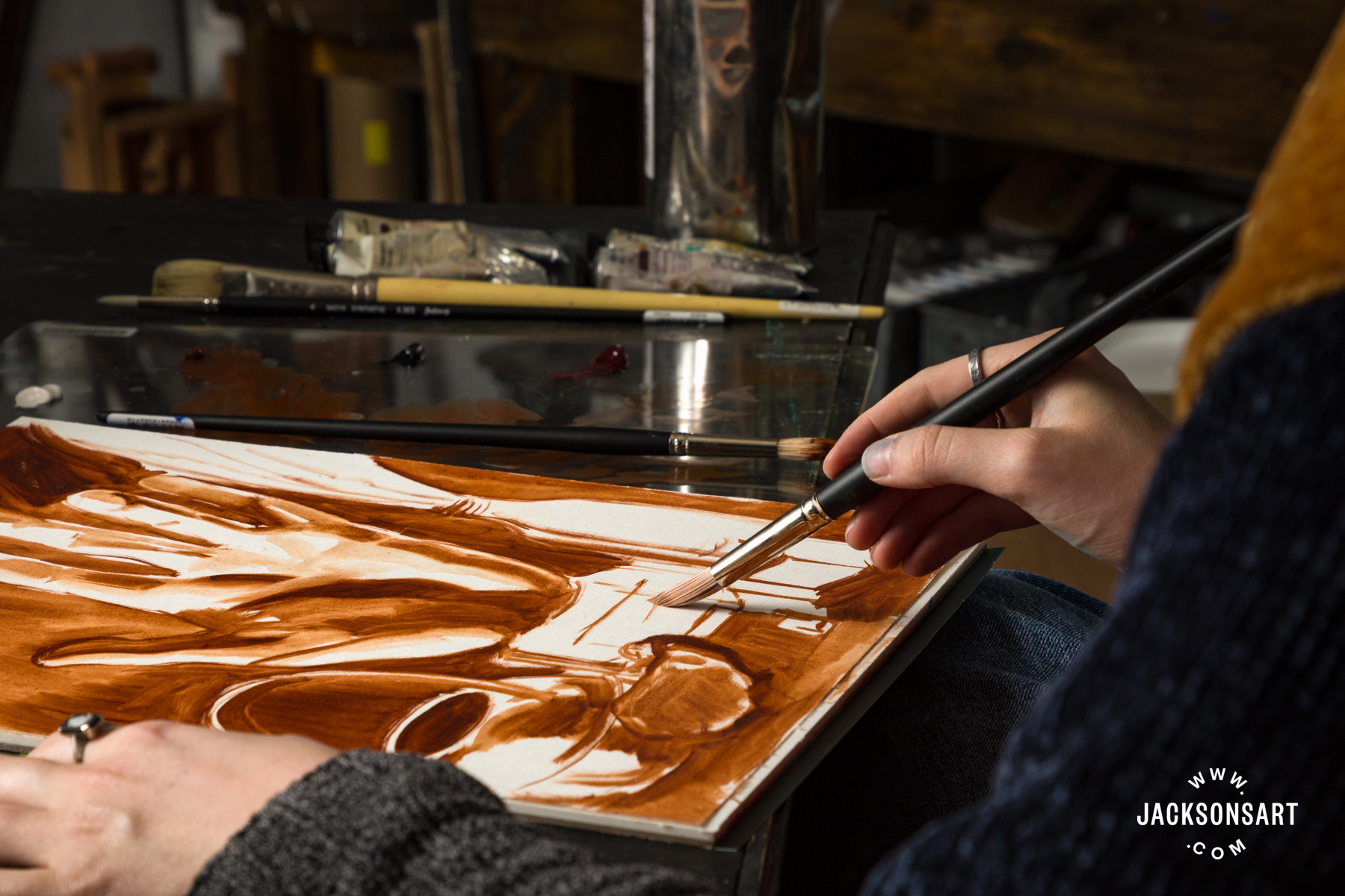
It’s important to utilise a full range of tones, so the next step is to add mid-tones that progress steadily towards the highlighted areas. I layered in more detail to make sure that the tone graduated evenly towards the areas of light.
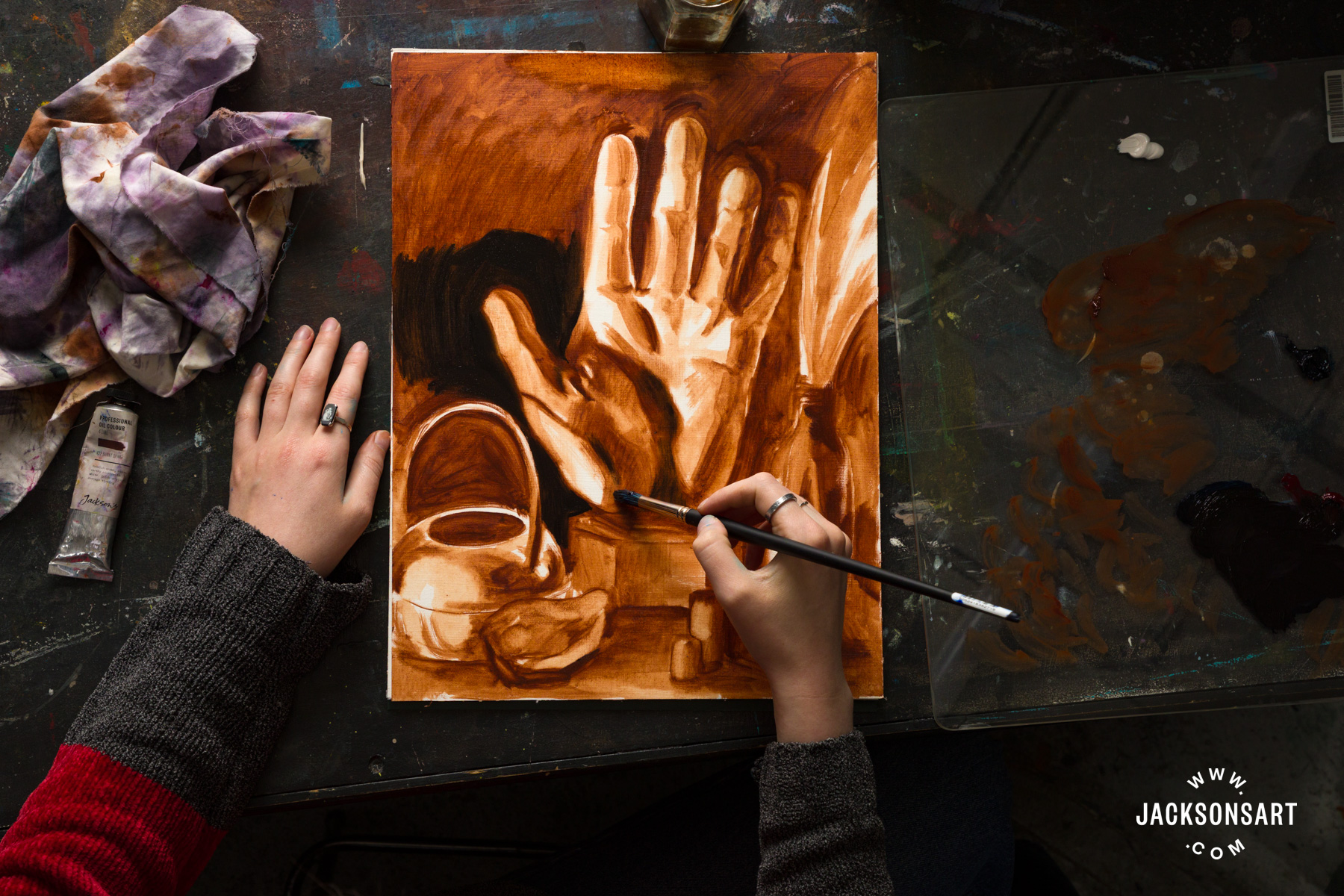
To finish my example I picked out a couple of more specific highlights, like the reflection on the glass in Titanium White.
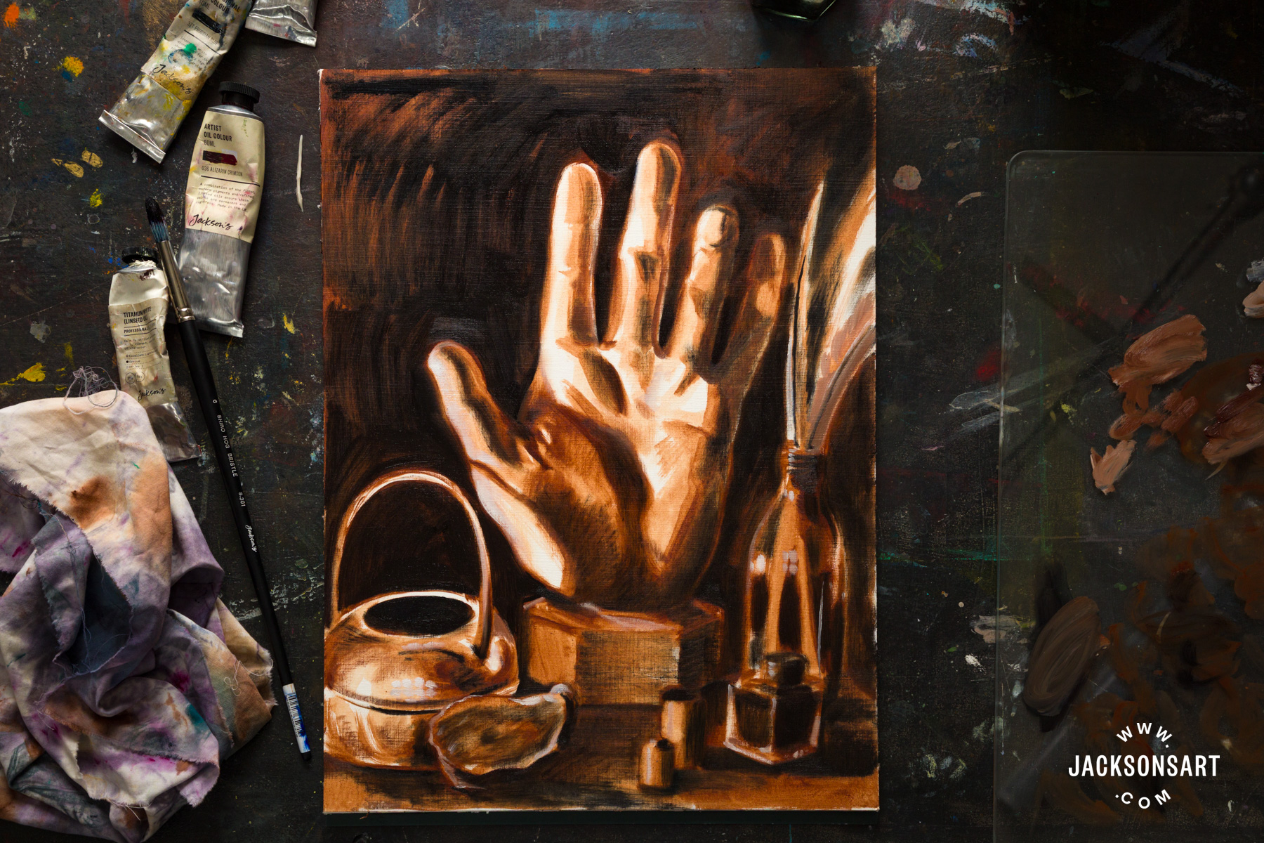
This underpainting is now ready to be worked on further with a wider palette, now that the high contrast tones have been established.
Tips:
To create chiaroscuro in your works it’s important to pick a ‘dark’ that has depth. This doesn’t mean that black is always the best colour to use – often more complex colours made up of deep browns, blues, and reds appear deeper to the eye than pure black. A classic combination for creating a rich black in paint is Prussian Blue and Alizarin Crimson, which I have used here for my example painting.
It can be interesting to choose a shadow colour that creates contrast with the predominant colour in the painting. For example, a painting with lots of reddish-orange tones may appear more dynamic with blue-toned shadows.
Demonstration of the Chiaroscuro Technique for Drawing
Just like the chiaroscuro drawings I mentioned from the 1500s, I wanted to try drawing in Renaissance fashion on toned paper with black and white. I chose to draw from a plaster cast of the eyes of David since his sharp features are perfect for hatching around. I drew on a sheet of toned paper with a Caran D’Ache Luminance 6901 Colour Pencil in black, and Derwent Tinted Charcoal pencil in white.
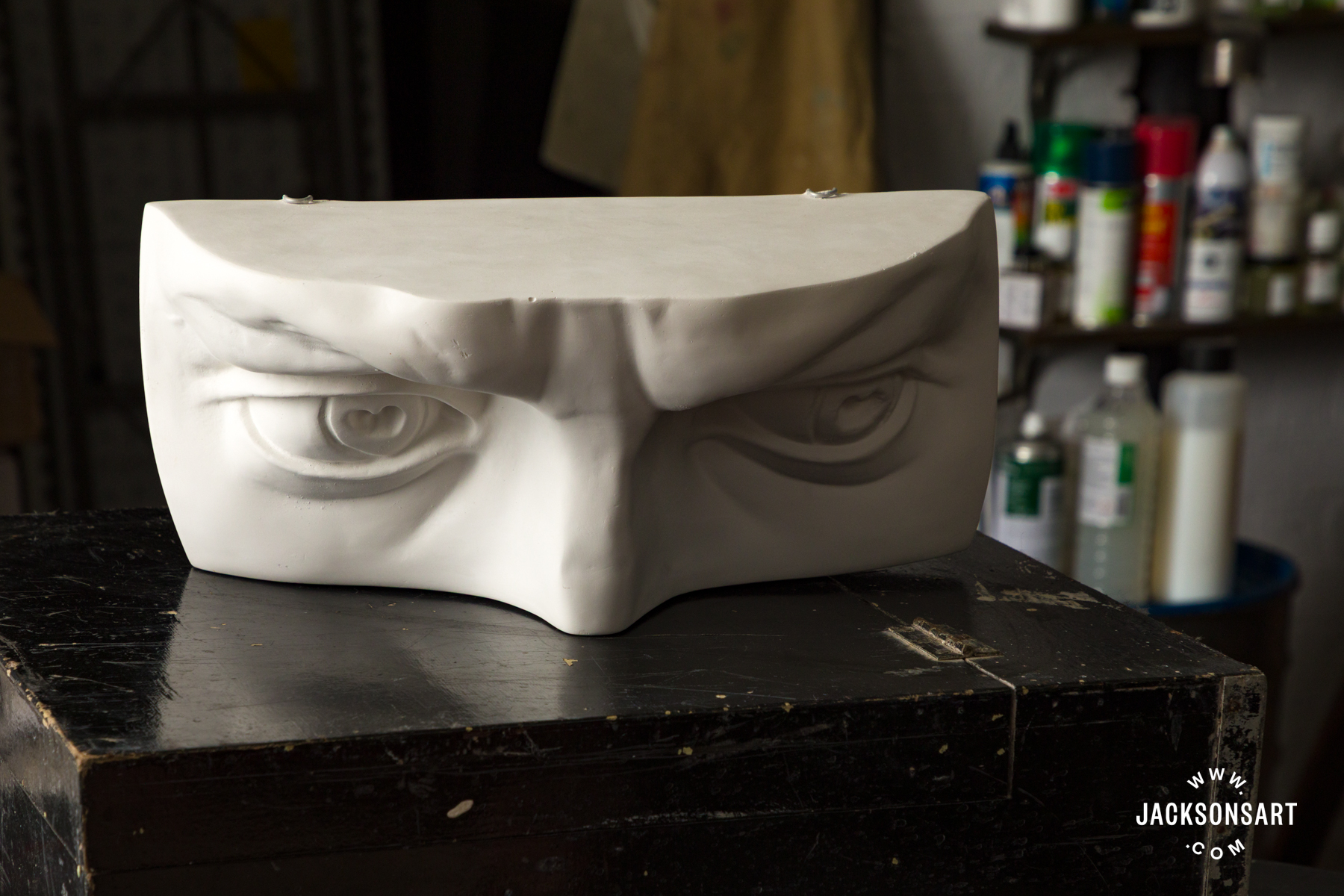
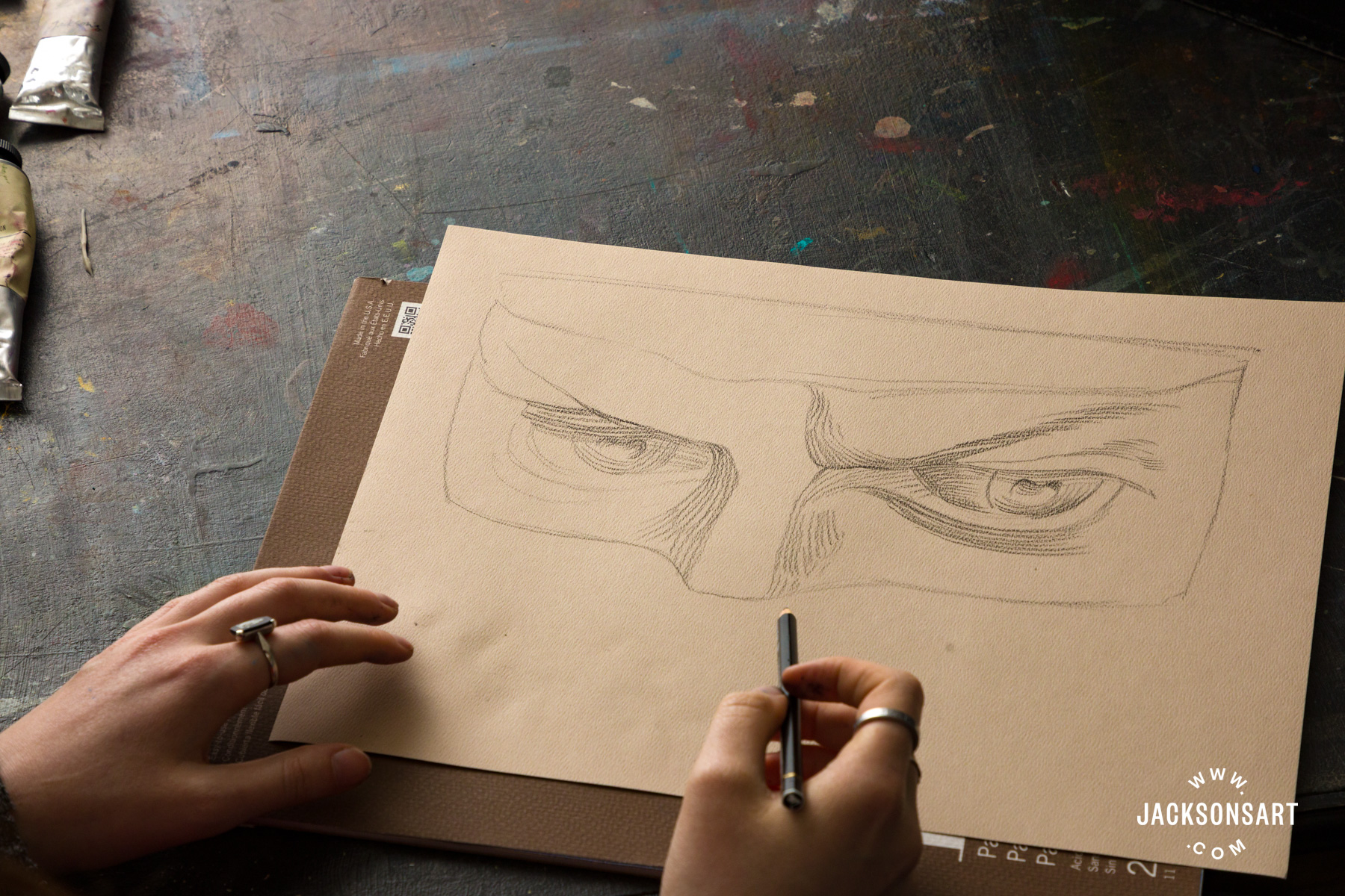
First I lightly sketched the proportions and placement of the face on my toned paper.
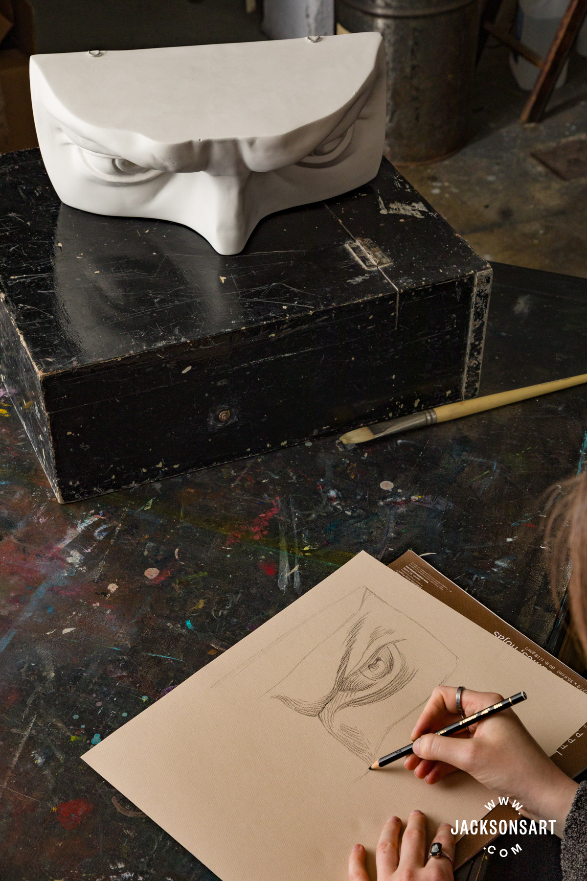
Next, I began lightly hatching in all of the areas that are in shade, leaving the white highlights exposed.
I deepened the shadows next, to add complexity and depth to the features.
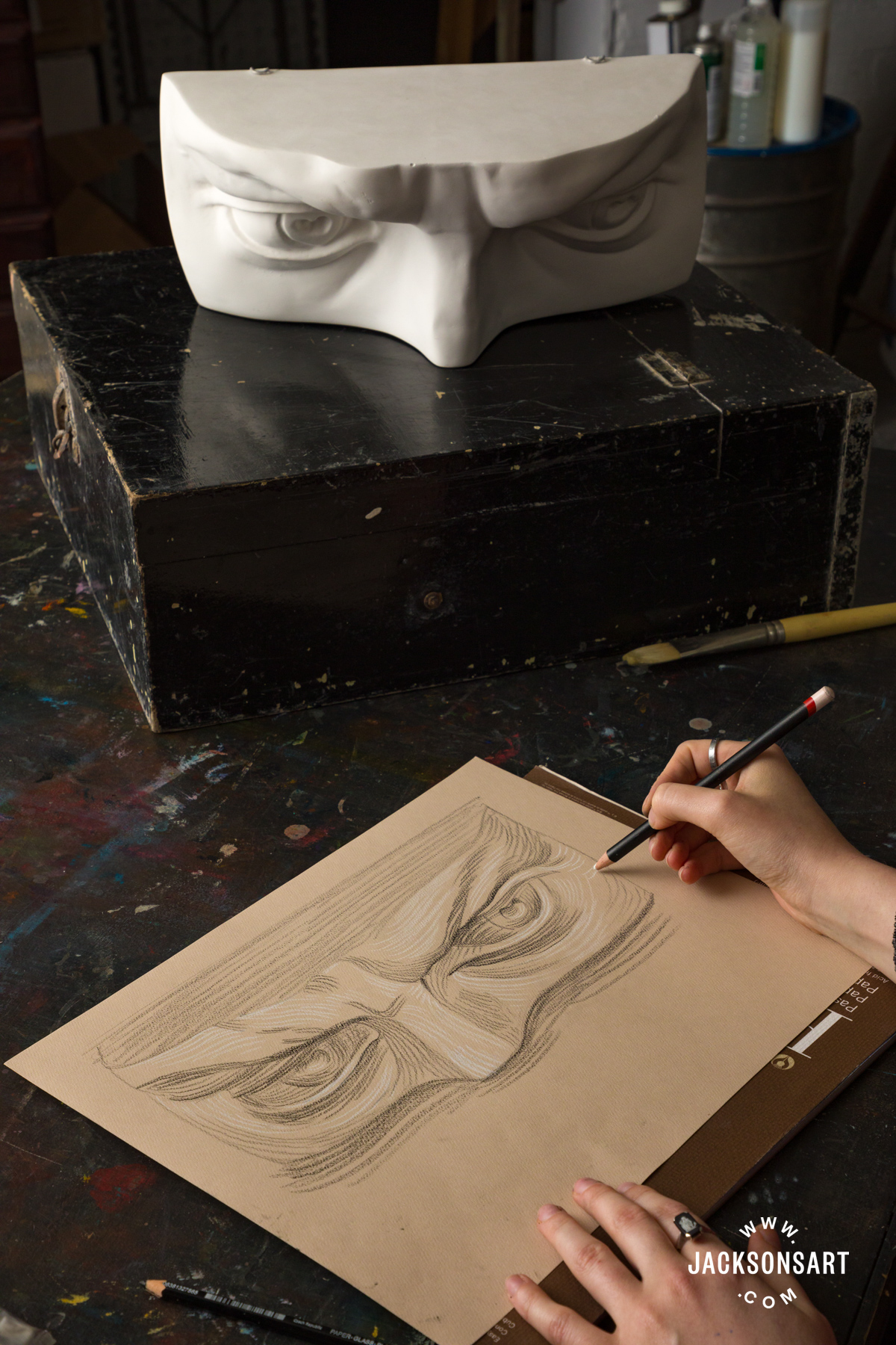
Then I added the highlights to the face in white, picking them out carefully, and making sure they don’t touch any of the black drawn lines, in Renaissance style.
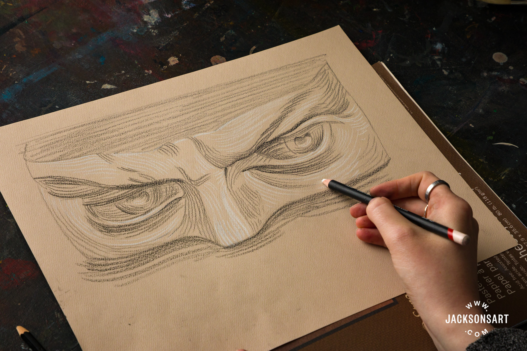
Tips:
Be careful about working too dark too quickly, since it’s harder to adjust drawn marks once they’ve been applied. Working lightly gives you more freedom to adjust any mistakes, and won’t be visible by the final outcome.
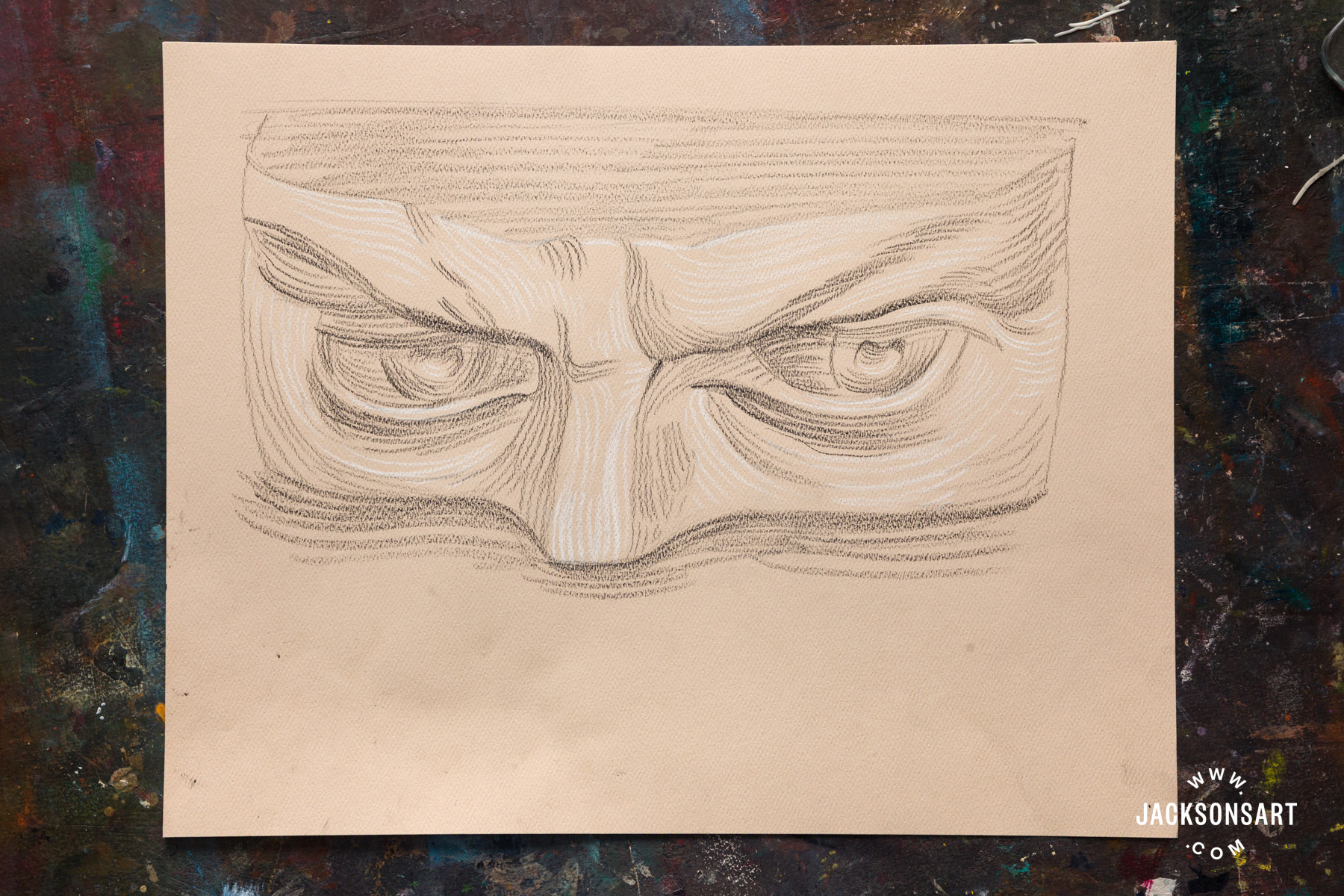
Changing the direction of hatching to match the contours of the face enhances the effect of the chiaroscuro by making it easier to graduate the tones evenly from dark to light. Working against these forms could give some harsher edges to the face.
Demonstration of the Chiaroscuro Technique for Linocut Printmaking
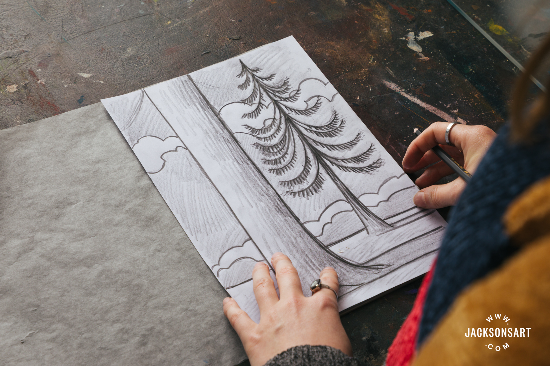
Lastly, after being inspired by the chiaroscuro woodcuts of Ugo da Carpi, I wanted to give an example of making a multi-block layered tonal relief print with lino. I printed these using two Essdee Lino Blocks, cut with Essdee Lino Carving Tools.
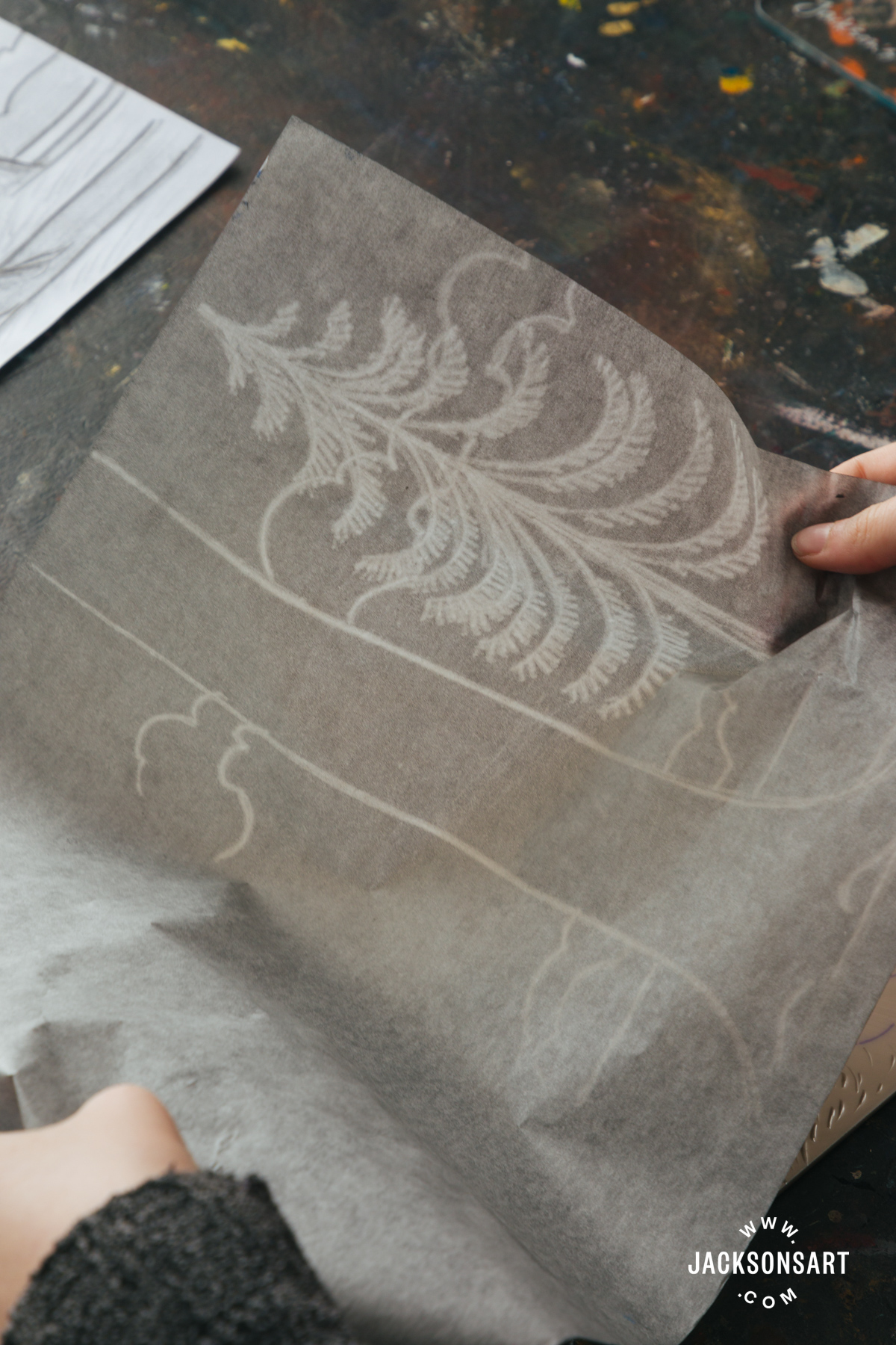
I sketched out my design onto my lino blocks using carbon transfer paper. It’s important that the placement of the drawing lines up perfectly on both sheets of lino so that the layers aren’t misaligned later.
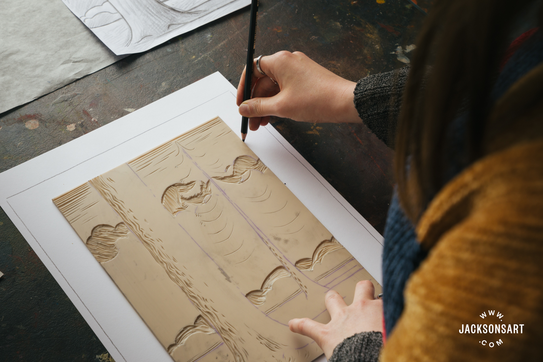
Next, I made a register sheet so that when it comes to printing, my print will be in the centre of the paper. I did this by drawing around the edge of my paper, and then the lino in the middle of it, onto a sheet of cartridge paper.
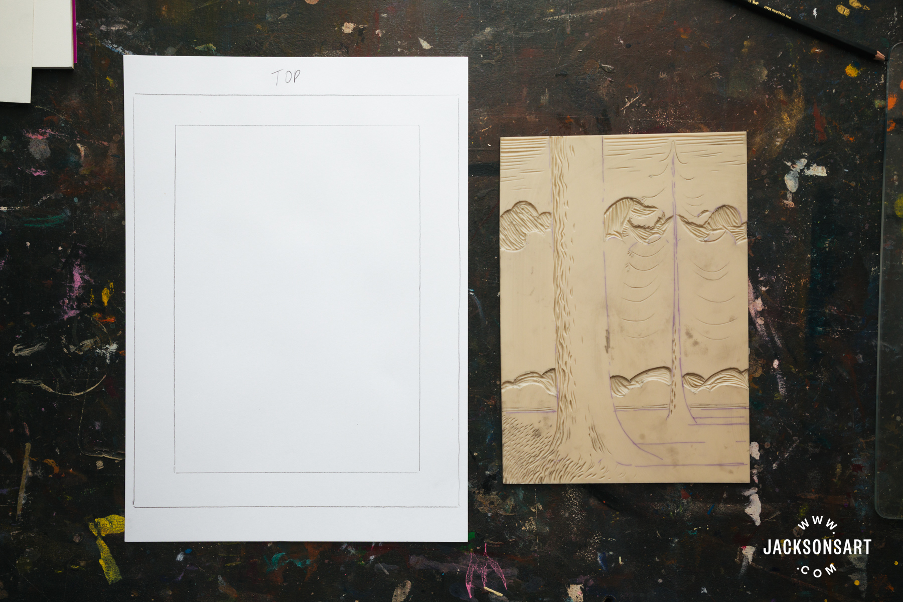
Next, I carved my block that will function as the ‘outline’ in black to the whole print, cutting away all of the mid-tone and highlight areas.
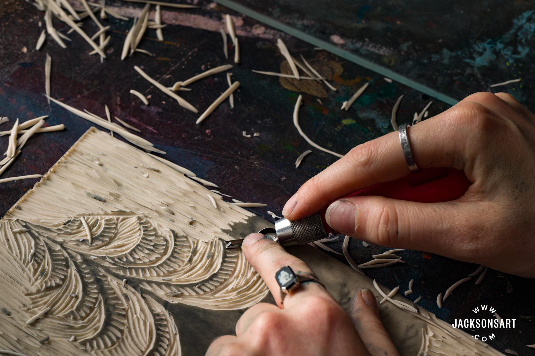
Then I moved onto the second lino sheet, to remove the areas that will appear as white on my print, leaving behind my coloured mid-tone.
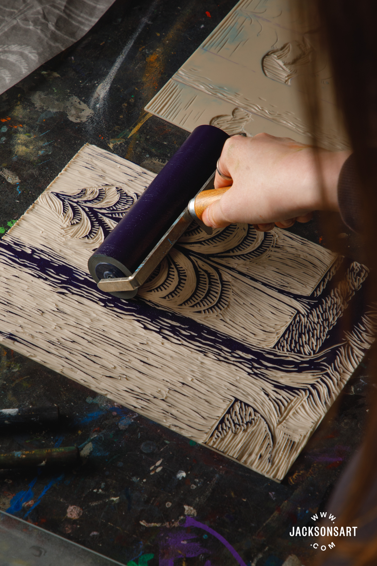
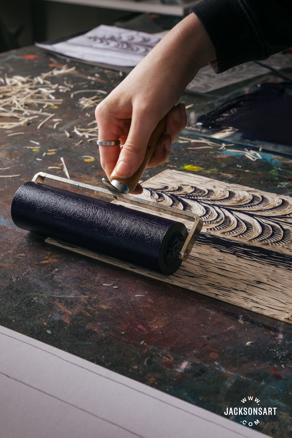
I printed the block with the highlights and mid-tone on Arnhem 1618 paper 11 x 14 in with a mixture of Speedball Professional Relief Ink in Phthalo Blue and Titanium White. I applied the ink to the block with a roller, and made sure the ink was evenly transferred to my paper with a Sláma Hand Printing Press, before leaving this layer to dry. You could also use the back of a spoon as a baren, making sure to apply even pressure across the surface.
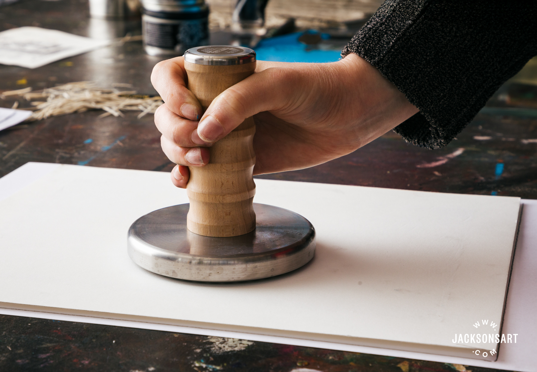
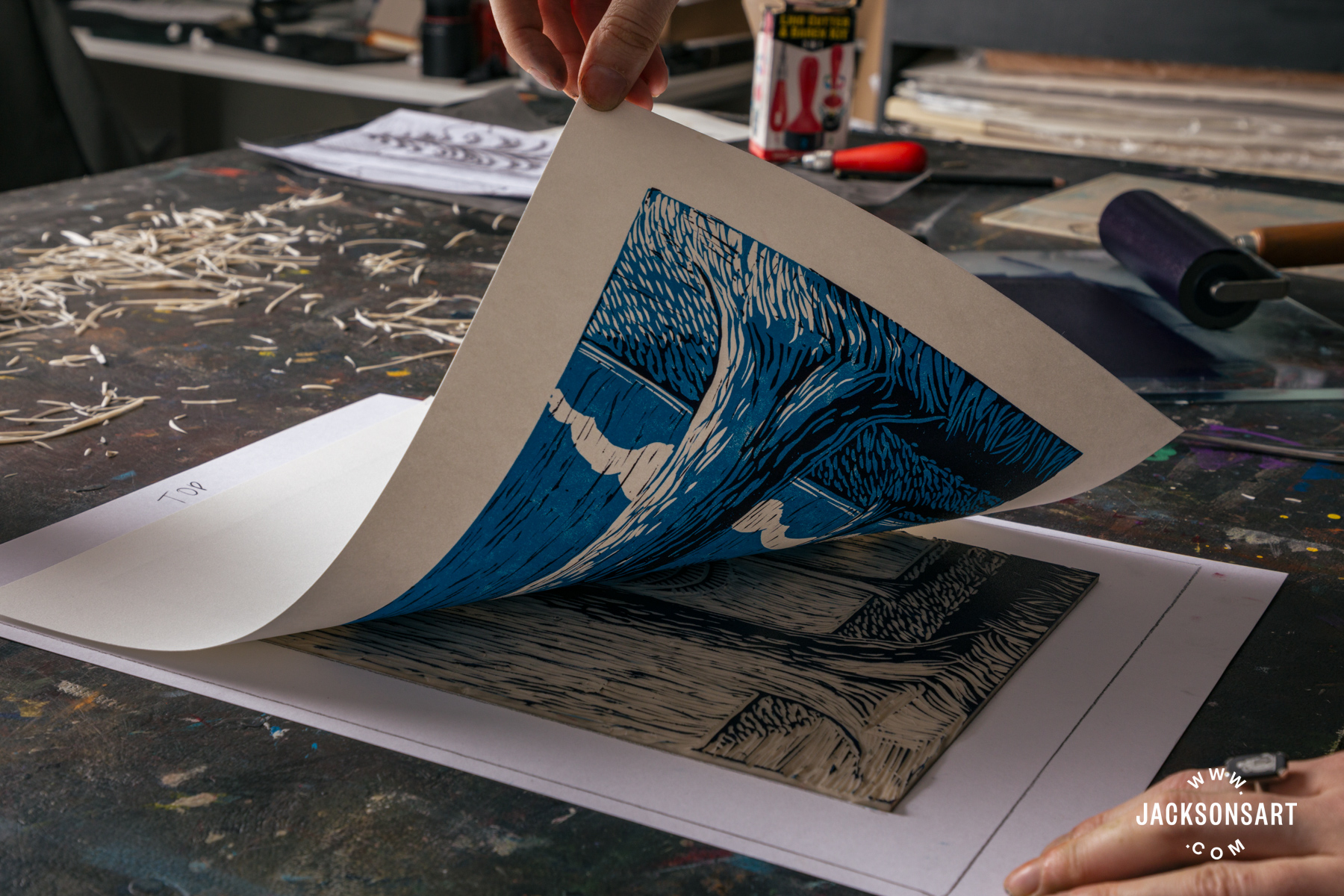
Next, I repeated the process with the ‘outline’ lino sheet on top of the previous print, making sure to line it up carefully. For this layer I used a mix of Speedball Professional Relief Ink in Phthalo Blue and Quinacridone Red.
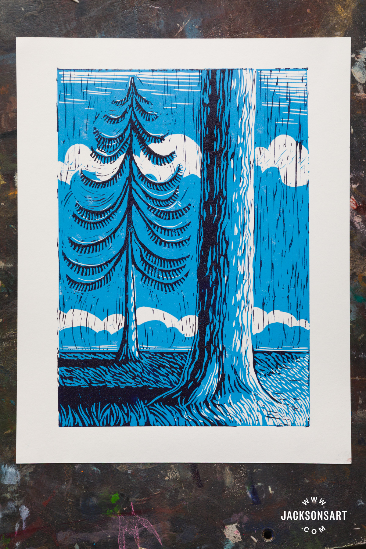
Tips:
If your first print comes out weak – don’t worry! Sometimes it can take a little bit of ink build up to get a stronger print. It’s a good idea to make multiple prints at once so that any mistakes or weak prints aren’t a big deal.
When choosing your design for the lino image, it may be easier to envisage the outcome if you make a preparatory drawing in the same layers as the print. For instance, for this print, I could use a blue coloured pencil to decide on the mid-tone and highlight placement, with a black pen on top to finalise the outline. Once you’ve done this, by taking a photo with your phone and reversing the image you can ensure nothing looks too out of place once it’s flipped by printing.
Further Reading
The Art of Silverpoint Drawing: History, Materials and Techniques
The History of Cast Drawing, And How It Can Help You Draw Form
A Guide to Linocut Printmaking
Shop Art Materials on jacksonsart.com

4 thoughts on “Chiaroscuro Techniques for Painting, Drawing, and Printmaking”
great explanation of Chiaroscuro
Very interesting and clear explanation –
would be nice to read/see more of other
techniques for oil painting.
Hello Katharina and thank you for your feedback. I’m happy to say we will be exploring more painting techniques in this upcoming series.
Lovely to have a good explanation of the
classic techniques as it is still a great
basis for us, now!
Comments are closed.