



Choosing a good selection of colours for your basic palette means that you will be able to mix any colour you need from just 8 to 12 colours. If your watercolour box has room for a few more colours then you might wish to add some extra colours that you mix often but for convenience are premixed, like some greens and browns.

Choosing Colours to Fill Your Watercolour Box
In painting, the word ‘palette’ is used for both the group of colours an artist uses for a painting and the surface upon which you mix your paints. The Jackson’s Empty Watercolour Palette Boxes will hold 12 full pans or 24 half pans or a combination (you can fit two extra full pans of most brands). The frame inside has bendable edges that adjust to fit any make of watercolour as the standard sizes do vary a little bit. You might choose full pans for the colours you use most often, and half pans for those you use less frequently. You can also use a few empty pans filled from tubes — perfect for custom mixes made in advance or for colours only available in tube form that you’d prefer to use as pans. Inside are fold-out palette flaps for mixing paint on. There is also a thumb-ring on the bottom.

With the right eight colours you can mix most other colours. To get the most from a limited palette it is important to choose good mixing colours, this means being sure to choose from the warm and cool ends of each colour section in the spectrum: a warm and cool red, a warm and cool blue, and a warm and cool yellow. For example: a warm yellow is near the red end so when mixed with a warm red (near the yellow end) it makes a vibrant orange which is the colour between them. In addition to the six primaries, you can add Burnt Umber to mix with Ultramarine Blue for a near black; and a bright bluish-green (like Phthalo Green Blue Shade or Viridian) for a pre-mixed green than can be easily altered to provide many shades of green.
Choosing your colours wisely allows you to mix the most vibrant colours if you wish, but you can also mix muted colours by mixing colours that are not near to each other. For example: a cool yellow (a yellow that is a bit green) and a cool red (a red that is a bit violet) will produce a less vibrant orange as there are now small bits of other colours mixed in to muddy it up somewhat.
Many watercolour brands at Jackson’s only come in tubes, but the good news is that if you wish to have a box of pans you can squeeze your tubes into pans. The formula for tubes and pans are different in some brands but most artists find this isn’t a problem. You might also save money by buying tubes while still having the convenience and portability of a watercolour box of pans.

An Eight Colour Palette
This is a good colour selection for a wide range of watercolour painting purposes. You don’t have to choose these brands, you may have a brand whose texture you prefer or a certain pigment you like. You can choose variations of these colours depending on the subject matter or your preferences.
Cool yellow (greenish yellow) – Jackson’s Lemon Yellow
Warm yellow (reddish yellow) – Schmincke Horadam Indian Yellow. Another good warm yellow is Daniel Smith New Gamboge it comes in a tube so for this paint box wouold need to be squeezed into an empty pan.
Warm red (orange-ish red) – Jackson’s Cadmium Red Light
Cool red (blue-ish red) – Schmincke Horadam Permanent Carmine. Crimson also works well.
Warm blue (reddish blue) – Jackson’s Ultramarine Deep
Cool blue (greenish blue) – Jackson’s Phthalocyanine Blue
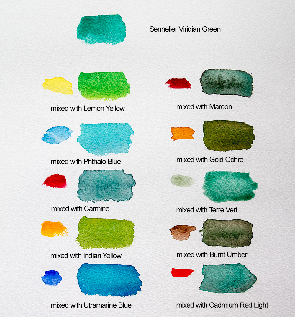
Cool green (blue-ish green) – Sennelier Viridian Green. Phthalo Green blue shade also works well
Neutral brown – Schmincke Horadam Burnt Umber (to mix with Ultramarine Blue for a near black, more blue makes a cool black and more umber makes a warm black)

A Twelve Colour Palette
If you wish to expand your palette to 12 colours then adding these four colours could be helpful:
Sennelier Green Earth (a weak green, but I like it to tone down too red skin tones, if you are painting figures).
Winsor & Newton Perylene Maroon (helps mix darks).
Winsor & Newton Gold Ochre – this great colour does not come in the full pan size (or other earth yellow like Raw Sienna or Yellow Ochre).
Jackson’s Venetian Red (or other earth brown like Burnt Sienna)

Colour Mixing
When colour mixing be aware that each pigment has a different tinting strength. To get a colour that is visually halfway between two colours you will rarely mix half and half. Yellows are often poor tinters so I start with the yellow and add a little of the other colour at a time. To make a vibrant green for instance, you will need about 95% Lemon Yellow and 5% Phthalo Blue. Some brands show the tinting strength of a colour on the label.
Because you are mixing two colours to make a third colour you can alter the third colour by changing the ratio of the two colours. Ultramarine Blue and Burnt Umber make a great black. By changing the ratio you can make a blue black or a brown black, you have control of the variations. Another advantage of mixing colours yourself over readymade is that you can control how well mixed the two colours are. If you mix only slightly there may be a slight separation or even a big separation of the two colours on the paper, giving a pleasing visual texture.
Subtractive Mixing
The basic idea to have in your head when mixing colours is that the more pigments that are added to the mix the darker and duller it becomes because each pigment absorbs light, so what is reflected to our eye becomes less and less. Mixing paint is called ‘subtractive mixing’ for this reason. Green pigment absorbs all colour but green, which it reflects back. Red absorbs all colour but red, which it reflects back. If you mix green and red, the green and red are both absorbed so neither is reflected back and you have a dark neutral colour. You can use this to dull down a colour that is too bright by adding a bit of a complementary colour (opposite on the colour wheel) a little at a time.
To know what colours you are mixing it helps to know what pigments are in your paint. The paint name isn’t enough information. You can find the pigment information on the tube in the format of PB15 for instance, meaning Pigment Blue 15, which is Phthalo Blue. If a tube of colour contains a single pigment and you mix it with another colour of a single pigment then you are only subtracting the reflection of two colours. If you mix a tube that has two or more colours already mixed together with another colour then you are subtracting three or more colours from your mix. So it is good to know what is in your tube of colour.
If you’d like to learn more about pigments and colour mixing I highly recommend the great website Handprint where you can also find what pigment corresponds with the number codes on your paint tubes.


Further Reading
Review of Holbein Artists’ Watercolour Paint Set of 30
In Conversation With David Coles of Langridge Artist Colours
New Schmincke Supergranulation Watercolours: Haze
Colour Mixing: Exploring the Zorn Palette
Shop Watercolour on jacksonsart.com



18 thoughts on “Choosing Colours to Fill Your Watercolour Box”
This is a really great article thank
you. I have bookmarked it and already
visited it many times 🙂
Hi Hilary
Thank you! I’m very glad you found it helpful. I tried to communicate a lot of colour information in as clear and condensed a way as I could.
muito bom, eu adorei!!!
Little more unique palette. i feel if
must develop small palette i choice
few things differently. Terre Verte
is example i dont want it. but this
dark blue recipe i must test it
someday i need only now permanent
carmine.:) (this version and slowly
going use Schmincke more and more)
This is a helpful article, Thank you
Thanks for a really helpful article. I’m just starting to use
watercolour, so this cuts out a swathe of time consuming
dead ends.
Fantastic, thanks Kevin. It’s always useful to have a starting point, and then you can adapt as you begin to learn your own preferred working methods.
Many thanks
Lisa
This article is really helpful thanks. I notice
that you are relaxed about mixing colours
from the different brands in the same
palette, and mixing them together. I had
been a bit purist and thought I should stick
to a single brand – but you’ve encouraged me
to use the colours I like from the different
brands. Thank you.
Hi Jane,
Thanks for your comment. Oh yes, use what you like! Pigments used in colours are worth looking at when choosing what to buy, brands much less so.
Many thanks
Lisa
Thanks for the fantastic post, I have
been coming back to this article for
years & have finally just overhauled my
palette with the suggested paints
above.
That’s great to hear! I hope your painting is going well!
A very interesting article, I’m a fan of
watercolour and still feel you can not learn
enough about colour and mixing to get the
right blend, but this is the fun of painting.
Thank you so much for this great article which explains succinctly
color mixing. I always look forward to Jackson’s education
Glad you found it helpful Maryann!
Hi Julie, as a complete beginner, is it
worth just using cheap tubes until I have
developed some skills, or will the result
be disappointing and off putting? I’ve no
idea what difference good paint will
make? Thank you
Hi Christine
This is a good question that gets discussed quite often.
There are 4 levels of materials: children, student, artist and professional.
Children-quality art materials will be very frustrating. The paint won’t flow and will be very weak, the coloured pencil will be hard and weak, it will be very off-putting. So I would not go super-cheap or you may give up painting.
There are 2 main differences between the student range and the artist range made by the same paint manufacturer. The main one is the pigment in the paint. The amount of pigment is different in student paints, they are weaker. The types of pigment are also different as the student ranges use the less expensive pigments to approximate the more expensive ones. Student paints also have more mixed colours in their ranges, for convenience but if you then mix that colour with another colour you can get mud because now you have mixed 4 to 6 pigments. Artist-quality paint has more single pigment colours. The second thing is that some makers add other things to their student-quality paints that may interfere with the longevity of the painting, which may not be a concern for early learning work. Professional paints are just the high end of artist-quality paints, often made in small batches with no additives and special pigments.
Most artists looking back to their early days give the same advice – buy the best materials that you can afford. This includes brushes and paper. Some watercolour artists say that brushes and paper are more important than the paint for giving you the chance to make the best work.
I hope that helps. Painting is wonderful, I hope you love it!
I love this. This is just what I was looking for. I’ll be coming back to this article as I learn more and desire adding more to my palette.
Hi CoCo.
I’m very glad you found it useful!
Comments are closed.