Jackson’s Professional Oil Paints are luminous, vibrant, and full of character. Made in the UK by skilled artisans using only the finest grade pigments and the purest refined oils, this range rivals leading oil colour brands but at a fraction of the price. These gorgeous paints are made without extenders, fillers, or drying modifiers. The intense colour saturation and purity of the professional colours is achieved by high pigment loading coupled with our traditional production process. Each pigment is treated individually according to its own properties. Each absorbs a different amount of oil and some pigments like Ultramarine Blue only need gentle milling, whereas coarser earth pigments must undergo a lengthier process on the mill to achieve optimum dispersion of the pigment in the oil.
We occasionally expand the colours in the range when we think a colour would be really useful. We’ve recently added four new colours: three convenience mixes and a single pigment colour that is a particularly good mixer. All four new colours are available in 40ml or 225ml tubes.
(CLICK THE IMAGES TO ZOOM IN)
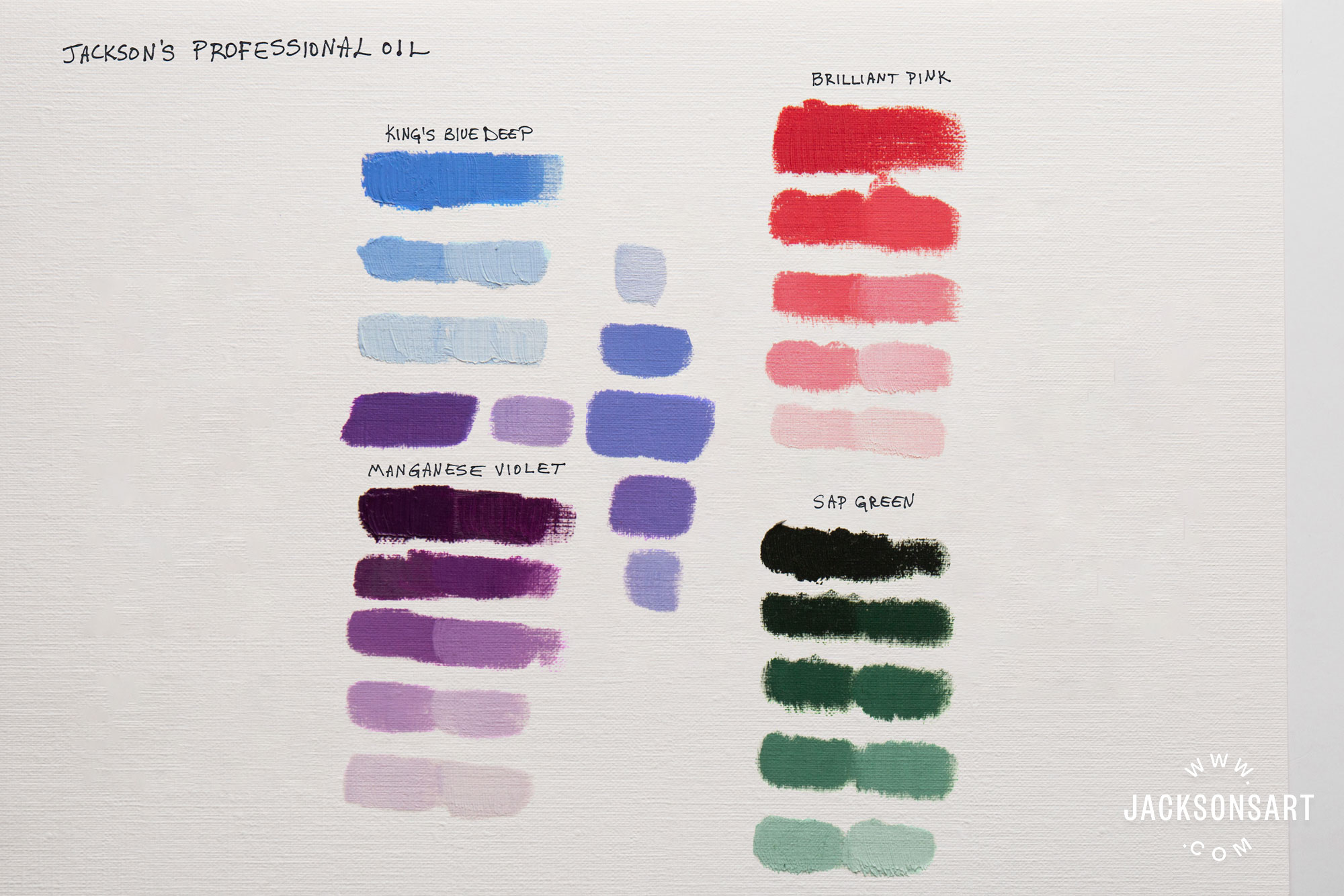
Brilliant Pink
Pigments: PW4 PW6 PR188 PR209
A mixture of transparent white and opaque white with the orange-red Naphthol Scarlet and the intense, slightly cool, middle red Quinacridone Red. This creates a warm, intense orangey-pink perfect for catching the eye or for bright underpainting. A warm, clean, opaque colour with lots of zing. It has an average drying time and tinting strength and excellent lightfastness. It has a lot of white in it so using a small amount in a mix is useful for lightening and warming the mixture.

The Manganese Violet and Sap Green in differing ratios make some useful dull darks. Some white was added to see the colour better.
Sap Green
Pigments: PG7 PBr7
A mixture of transparent, bright Phthalo Green and natural Iron Oxide. A classic warm, dark, mossy green capable of a wide range of tones, from a yellow green in a thin layer to a rich near-black when applied thickly. It has an average drying time and tinting strength and excellent lightfastness. It is semi-opaque.

King’s Blue Deep
Pigments: PB29 PW6 PW4
A mixture of transparent white and opaque white with Ultramarine Blue. Designed as a deeper replacement for the historic pigment Smalt. It has an average drying time, is opaque and has excellent lightfastness. It has a lot of white in it so using a small amount in a mix is useful for lightening and cooling the mixture. Also a good base to start mixing sky colours. Adding a little Sap Green makes a dull, light blue-green, useful for sea colours. Adding a small amount of the other three new colours easily makes a series of useful warm and cool greys.


Manganese Violet
Pigments: PV16
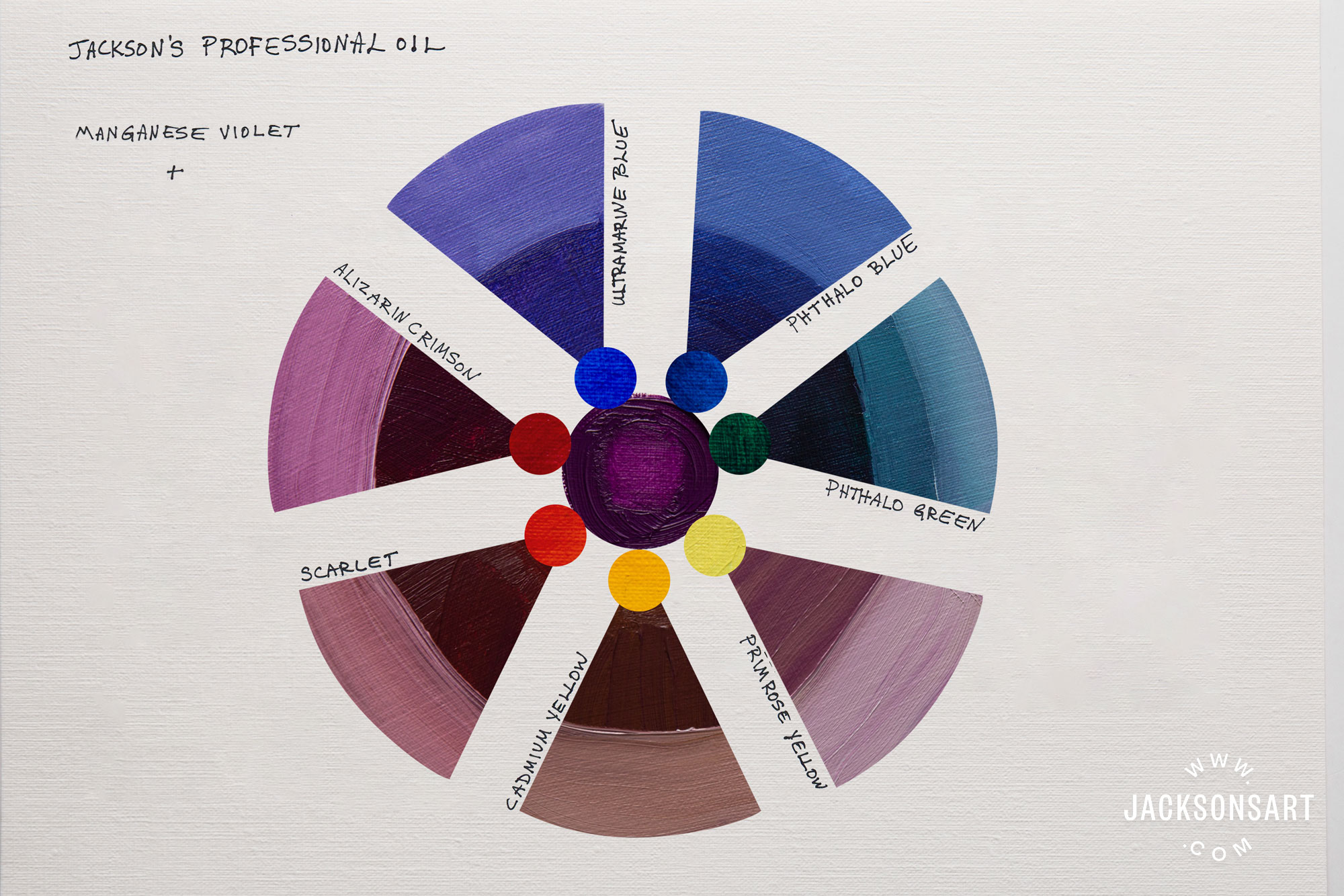
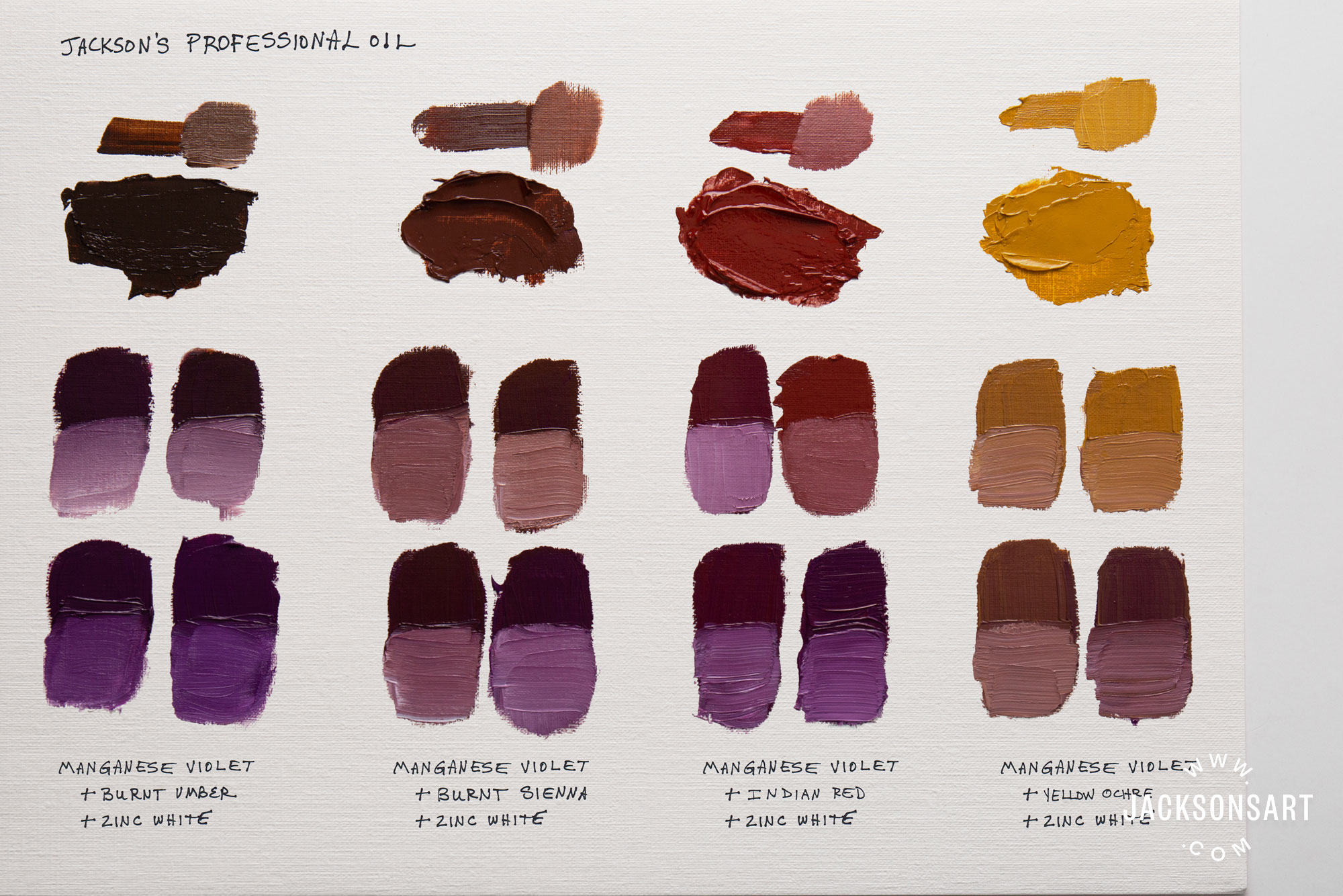
A deep, reddish violet with a balanced neutral temperature. It has an average drying time and tinting strength and excellent lightfastness. It is semi-opaque. It is great for shadow mixtures and for darkening colours. Mixed with Alizarin Crimson it creates a rich maroon colour. Mixed with Sap Green it creates a dark blue-grey similar to indigo.

Brilliant Pink and Manganese Violet mix to a cool magenta.

Read our earlier articles about Jackson’s Professional and Artist Oil Colours
- The Secrets of Making Jackson’s Professional Oil Paint
- Thomas Golunski Reviews Jackson’s Artist Oil Paints
- Plein Air Landscape Painting with Jackson’s Artist Oil Paints
- Paul Bell Paints with Jackson’s Artist Oil Colour
Jackson’s Oil Colours on jacksonsart.com
Postage on orders shipped standard to mainland UK addresses is free for orders of £39.