There’s plenty of variety within the 41 colours that comprise the range of Jackson’s Artist Acrylics, including the five yellow colours. Restricting your palette allows you to keep colour mixing simple and helps to avoid the risk of mixing mud when you want your colours to sing and harmonise. This article looks at the characteristics of these yellows and offers suggestions of what restricted palettes you might include them in.

Limited Yellow Palettes
The Basic Principle of Working With A Restricted Palette
A good way to start thinking about restricted palettes is to select one or two colours to represent each primary colour group, and then allow yourself black, white and maybe an earth colour such as Raw Umber. So you’ll have red, yellow, blue, black, raw umber and white. If you want more than these six, it’s advised to select a warm and cool version of each colour, so you have the potential for a good variety in your colour mixes.
For example:
Two yellows – one with a shade of green such as Lemon Yellow and one with a shade of red/orange such as Cadmium Yellow Medium
Two blues – one with a shade of red such as French Ultramarine and one with a shade of green such as Cerulean Blue
Two reds – one with a shade of blue such as Alizarin Crimson and one with a shade of orange such as Vermilion
It’s possible of course to restrict your palette in other ways – taking out a primary group altogether (one famous example of this is the Zorn palette for portraiture, which has no blues and consists simply of Yellow Ochre, Ivory Black, Vermilion and Titanium White, with the Black offering an alternative to the missing Blue). However, the palettes I suggest here each have a primary represented and are sufficiently versatile for most subject matter.
I wanted to examine the Yellows in the Artist Acrylic range in order for the appearance of the hue to determine the colour choices I made for the rest of my restricted palette, and see what mixes I could achieve with the limited five or six colours I allowed myself.
Primrose Yellow

Pigment: PY53 Nickle Titanate Yellow
Primrose Yellow is a very light-in-tone, semi-opaque creamy colour.
When squeezed from the tube as is, it has the appearance of a very light Naples Yellow. As I added water and spread the colour out, I was surprised at how strong the colour was… when diluted with a bit of water it started to have the colour of butter.
I then wanted to see what happened when I mixed it with white. I put roughly a third of a teaspoon of white with the same amount of yellow and mixed with a brush. The strength of the colour was confirmed as the mix produced a yellow, very slightly grey, creamy hue. I then tried mixing more and more white and got some beautiful soft, creamy hues which I imagine could be useful when painting light reflecting from a surface in landscape, still life or portraiture.

I wanted to spend a bit of time mixing the Primrose Yellow with some earthy colours, to give an indication of where this colour could come into its own.
My chosen palette:


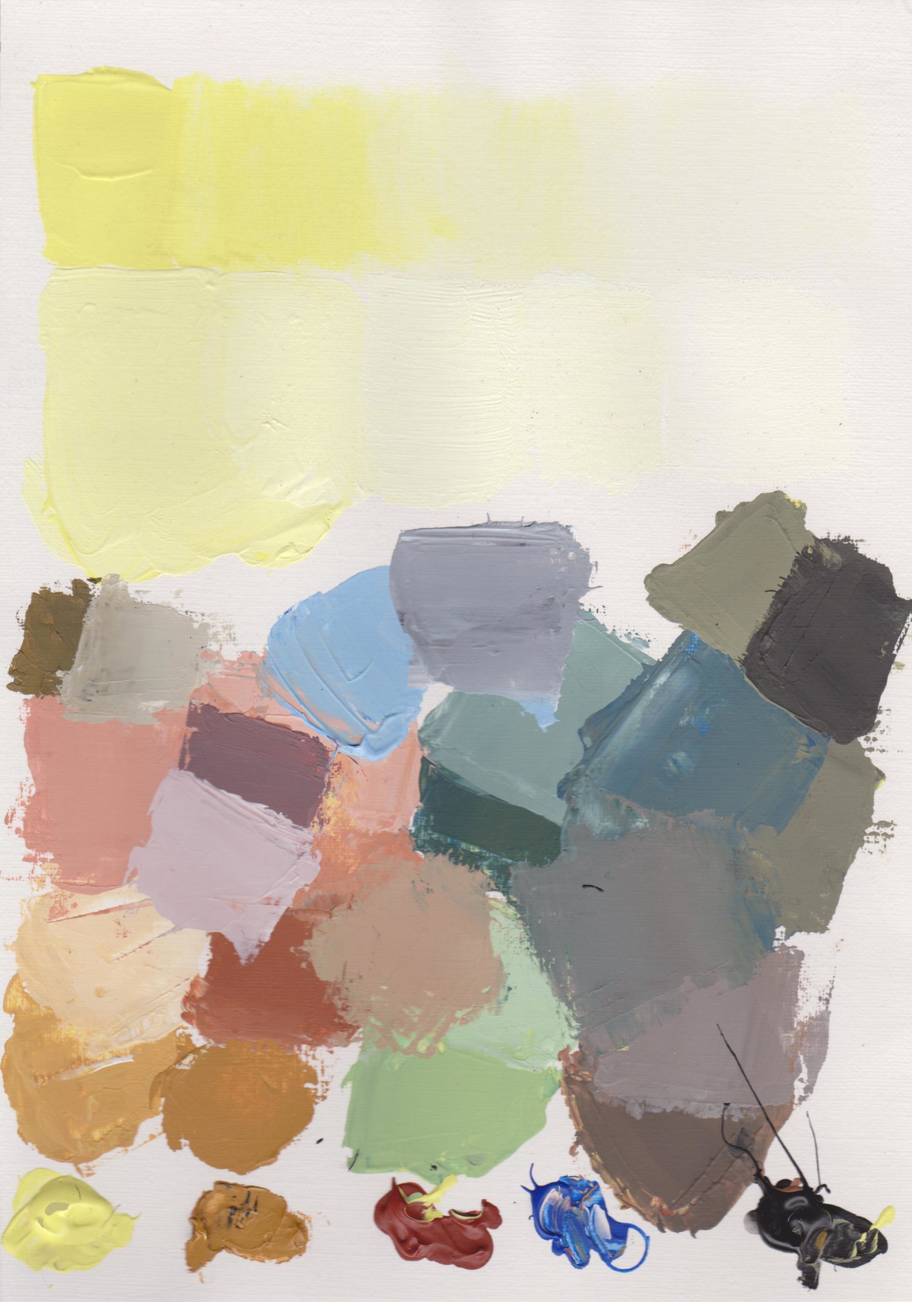
Results of the Primrose Yellow Tests
The colour mixes I achieved with this palette are definitely earthy, but that’s not to say dull! I love the soft dusty ochre mixes and blue-greys in particular. Because I had a presence of all the primaries (albeit in quite earthy versions, apart from the blue) this palette has a lot of potential and versatility, and I could imagine it being used for any subject matter – portraits, landscapes or still life, although perhaps landscape is the most obvious possibility. The freshness of the green achieved by mixing Cobalt Blue with Primrose Yellow, contrasting with the earthier greens made with Black and Primrose Yellow, give a lot of tonal variation within the palette which could be useful when painting a hilly landscape under afternoon sunlight, where there are lots of shadows.
Lemon Yellow

Pigment: PY3 Arylide Yellow 10G
On jacksonsart.com Lemon Yellow is described as ‘always valuable when painting, whether in natural landscapes and flowers or man-made objects. It is also important for mixing light lime greens and greenish yellows.’
It is a semi-transparent, moderately staining, very light valued, intense green yellow pigment.
On Handprint.com it says that Lemon Yellow ‘creates brilliant yellow greens when mixed with the green Phthalos, and interesting tan oranges, close to Burnt Sienna, when mixed with Quinacridone Rose, PV19’
When squeezed from the tube, the colour was a really bright, pure, acidic primary yellow with the slightest hint of green. When I tried brushing it out with a wet brush the colour was really strong – in its slightly dilute state it is the absolute dead ringer for the skin of an actual lemon (it might be a little dark in its pure state). When I tried to mix with the white the strength of the yellow shone through; the acidity and brightness of the yellow still there when mixed with an equal amount of white and then gradually fading out to a yellow cream as more white is added.

The far left shows equal amounts of white and Lemon Yellow mixed, and then gradually more and more white as you move across to the right. The strip at the top shows pure Lemon Yellow gradually being thinned with water from left to right.
I wanted to try out the suggestion on Handprint.com so for my colour mixing session with Lemon Yellow I chose the following colours:


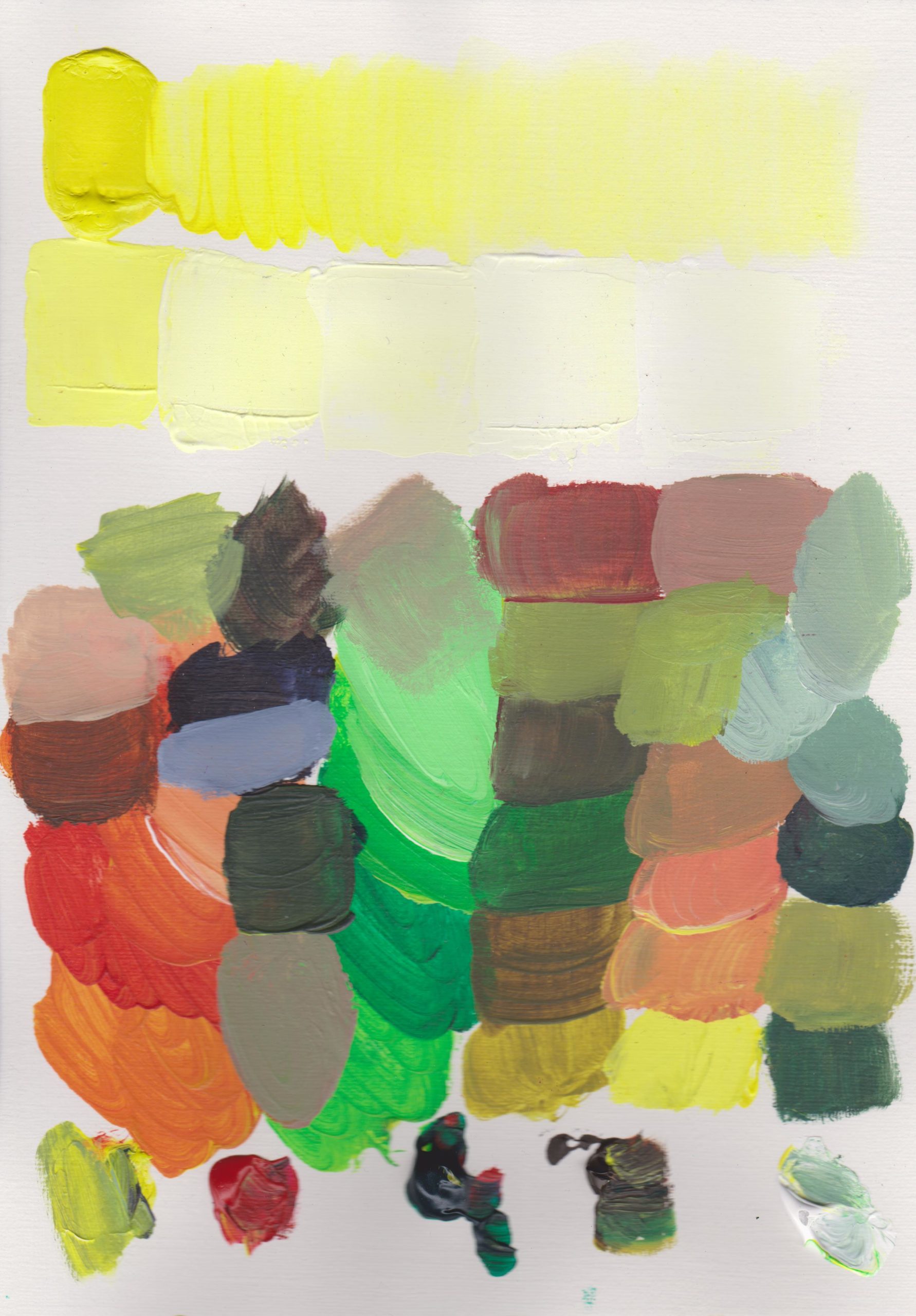
Results of the Lemon Yellow Tests
Wow! I was not expecting the Rose and Lemon yellow mix to be so zingy! A really saturated bright orange, and when more Rose was added a fiery, transparent orange-red was made. When White is added these mixes calm down to a earthy orange. Similarly – pow! The Lemon Yellow and Phthalo Green mix packs a real punch – a completely synthetic looking, intensely bright green. After mixing these very bright colours I wanted to try and mix some more subtle hues to balance them out. I was glad to have the Raw Umber in my palette, which I mixed with all the other colours to create an array of beautiful, rich earthy hues. Finally I played around with mixing Phthalo Green, Raw Umber and Yellow on the far right of the paper, adding white as well, to make some green-greys. This palette reminds me of perhaps a Matisse interior, or a Fauvist landscape…and would be a really exciting palette of colours to use for a colourist, or abstract painting. However you could mix skin colours of all ethnicities with this palette too.
Cadmium Yellow Medium Hue

Pigment: PY73 Arylide Yellow GX
From Jacksonsart.com, ‘Cadmium Yellow Medium Hue is a semi-opaque, stunning colour on its own and is also useful for mixing with reds to make a beautiful range of oranges.’
As I squeezed the colour from the tube I encountered a much much warmer, darker in tone yellow than the Primrose and Lemon Yellows. This yellow is moving more towards orange/red than green/blue.
The colour significantly lightened when diluted to make a very bright, cooler yellow. When mixing with white the yellow wasn’t as strong as I expected and made lovely creamy hues.

The far left shows equal amounts of white and Cadmium Yellow Medium Hue mixed, and then gradually more and more white as you move across to the right. The strip at the top shows pure Cadmium Yellow Medium Hue gradually being thinned with water from left to right.
There wasn’t a whole lot of information online about using this Arylide Yellow (also known as Monoazo Yellow) as part of a palette, so I decided to trust my instinct on colour selection.
As this is a warm, darker, more saturated yellow, I thought I would go for a warmer palette in general. These are the colours I mixed with:


Results of the Cadmium Yellow Medium Hue Tests
The presence of the Phthalo Blue Red Shade added a lot of power to this palette, giving saturated powerful greens, that are more naturalistic than the greens mixed in the lemon yellow palette. Added to this some beautiful oranges mixing Orange Red with Yellow and mustards mixing the yellow with the Raw Sienna. When playing around with the black and white I got some earthier greens, as well as pale blue greys and green greys, and a gorgeous mushroom hue when mixing Orange Red with Phthalo blue and white. This is a bright palette that would work well in exotic landscape painting…a half way between the earth palette and the Lemon yellow/rose/green palette.
Cadmium Yellow Genuine

Pigment: PY35 Cadmium Zinc Sulfide
An opaque, bright, mid-light tone yellow, on Jacksonsart.com it is described as being ‘beautifully clear and strong. Excellent for landscape artists.’ On Handprint.com it is mentioned that Cadmium Yellow is ‘especially affected by Phthalos’ and ‘creates velvety blends that some dislike.’
When thinning the yellow out with water it seems to keep a lot of its colour intensity to begin with and was noticeably stronger than Cadmium Yellow Medium Hue. Similarly when adding white I was surprised at how strong the yellow was in a 50/50 mix with white (see bottom left of image below) and as more white was added the mix became a creamy magnolia-type hue.

The far left shows equal amounts of white and Cadmium Yellow Genuine mixed, and then gradually more and more white as you move across to the right. The strip at the top shows pure Cadmium Yellow Genuine gradually being thinned with water from left to right.
As I had already done a bit of mixing with Phthalo Green and Phthalo Blue, I decided to include non-Phthalos in this palette. The colours I chose were:


For this palette I chose cool colours to contrast the warmth of the yellow; the yellow is closer to orange/red than green, and the red is cool with a hint of blue, the blue relatively cool, and the Paynes Grey is essentially a black with a hint of violet.
This palette is a real symphony of delicious colour mixes. The yellow and Alizarin Crimson mix to make sumptuous bright oranges that still feel naturalistic and not too hot. The greens made with the yellow and blue and the yellow and Paynes Grey are also pretty true to ‘natural’ greens. The soft pinks, grey, green-greys and blue-greys made by adding colours to white soften the palette of colours. This 5 colour palette would be equally useful in painting figures and portraits, landscape or still life – I really believe that if you have these 5 colours you don’t really need any others.

Cadmium Yellow Deep Genuine
Pigment: PY35 Cadmium Zinc Sulfide
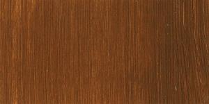
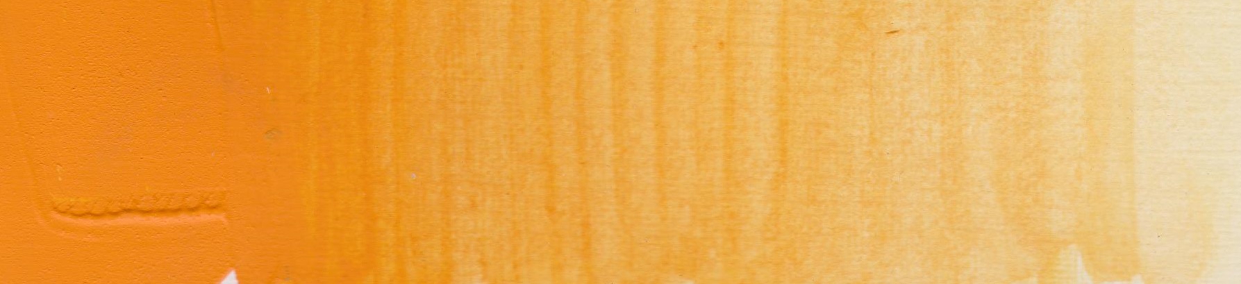
This deep yellow has the appearance of very concentrated custard! A very deep, warm, yellow-orange. Because it is opaque it maintains its vibrancy when thinned out with a little water, and as more and more water is added the hue gradually fades out…but it is noticeably stronger than the other yellows in the range.
When I tried added an equal amount of white the colour did not become significantly lighter as was the case with the other yellows…which demonstrated how strong a yellow this is. As more and more white is added the mix becomes a soft orangey-pink, which I imagine could be very useful in portrait or landscape highlights.

The far left shows equal amounts of white and Cadmium Yellow Deep Genuine mixed, and then gradually more and more white as you move across to the right. The strip at the top shows pure Cadmium Yellow Deep Genuine gradually being thinned with water from left to right.
My chosen palette:


Results of the Cadmium Yellow Deep Genuine Tests
This palette produced some earthy oranges and terracottas, naturalistic greens and bluey and greeny-greys. I loved the soft dusty pinks made when adding white to Burnt Sienna and a touch of Cadmium Yellow Deep. As it is this would make for a great landscape palette and maybe a portrait/figure palette too but I did feel a bit of an urge to add a brighter red into the mix – maybe Rose Madder would be good alongside or in place of the Burnt Sienna.
It pays to know your pigments – to be familiar with how they look and behave. Spending time mixing different colour combinations can really help to further your knowledge and understanding. Additionally, working with a limited palette helps to achieve colour harmony and vibrancy in your work. Within the Jackson’s Artist Acrylics range there are 5 yellows that have such versatility within them – the palettes I have demonstrated here are merely suggestions. You can either choose to be led by subject matter or by the colours that you like. If you wish to work with a largely cool or warm palette, or wish to work with a lot of one particular colour within your painting, think about what palette will enable you to achieve the results you are seeking. If your subject is leading your path, really stop and look and identify what colours you see, and how you might achieve them on your canvas.
Further Reading
Colour Mixing: Eight Blues in Eight Limited Palettes
Recreating the Colour Palette of Paula Rego
Pigment Colour Index: Yellow Pigments
Shop Jackson’s Artist Acrylics on jacksonsart.com


44 thoughts on “Colour Mixing: Limited Yellow Palettes”
Thanks for all the effort you put into these
little experiments with yellows etc. I
suppose we all know how mixing different
paints can achieve varying tones and results
but it’s certainly enlightening to see them
laid out like this next to each other. I’m not
that practiced in this field of exploration but
am always happy to learn and see the
difference so thanks. I think I’ll take your
conclusions on board which ring home for
me. I could never commit all that knowledge
to my old brain of course but I get the drift
and with 3 watercolour palettes all acquired
with various pre loaded colours I have
noticed how differently they react to each
other and enjoy the journey. I might just
think about aquiring a couple of particular
colours that you’ve tested that appeal to me
though! Thanks again.
That’s great, thank you!
Yes, the aim with this post was really to show the potential of these colours within a limited palette. You definitely don’t need to memorise the knowledge! Information about the colours you like to paint with tends to stick the more you paint, in my experience!
Best wishes
Lisa
Love your posts, really interesting and
informative! Love your Jacksons products,
and service second to none. Thank you!
My website is on Instagram
@eleanor_campbell_art
I love using a limited palette and this article
is really interesting! Thank you!
That’s great, thank you. Just found you on Instagram, beautiful work!
Best wishes
Lisa
That’s very kind, thank you!
Really interesting and inspiring. I’ve
not painted for a while and looking
forward to using a more considered
palette. I usually work more
intuitively which although usually
successful can end up quite muddy.
Thanks for the ideas.
Thank you!
Really interesting & useful article.
Thanks
Thank you
Very good – interesting and useful job –
thank you
Thank you!
Hello would appreciate similar article on oil paints;
rarely use Acrylics at moment.
Thank you. Sylvia Kingsley….
Thanks for your suggestion Sylvia, it would be great to have an oil version of this post and I’ll add it to our list! However I will say that the colours will behave similarly in acrylic as they do in oil so you will be able to pick up some ideas here for your oil painting.
Many thanks
Lisa
Terrific article and demonstration. Thank
you! Yellow and the mixes have always been
a subject close to my pallet.
Thank you!
Hi Lisa,
I love experimenting wiht my colours and
getting to know them more so was
interested in your article. What would hve
been useful is to put a blank table in there
showing what colour you mixed with what
colour to get your mixes above your core
range. Just for quick reference. I could not
figure out the logic quickly. any hints?
Thanks for your comment and suggestion. I’ll be doing more of these and will bear your suggestion in mind.
With each of the charts, the mixes are in columns, so I start with the blob of colour at the bottom and mix it with the yellow in the palette, and then each of the other colours in the palette. Some of the mixes are with white and some are without… and then as you move to the top of the colour mixes you’ll find combinations of 3 colours, or more. This is because I think paintings benefit from a balance of bright, saturated colours, and muddier mixes that can ground the brighter colours.
I did think about putting these mixes in a grid, but decided against it as I thought it might be limiting, because to fit every combination of 2/3/4/5 colours would have made for an incredibly big grid!
Ultimately I really just wanted to suggest the potential each of the palettes have, and the kind of colour they have within them. But I’ll try a grid next time and see how it goes.
Many thanks
Lisa
fabulous and useful demo, thank you, will
pass on on my students
That’s great! Thank you!
Best wishes
Lisa
Really useful information and well
presented. Thank you.
Thank you!
Absolutely loved this article.
As a relative beginner it was most helpful
and the suggestions re colour palette
excellent. I will be saving it as a reference
guide – thank you
Thank you Diane! That’s great as I’ll be writing more soon.
Best wishes
Lisa
This was such an interesting and
insightful article. I’m still very new to
mixing and found your observations
valuable. I am going to spend more time
mixing and learning how my palette can
affect my work – and my mood! Thank you
for your time Lisa.
Thank you so much!
One to bookmark for future reference. I paint the landscape in what is an almost exclusively agricultural area, so I find Naples Yellow an essential. Especially around this time as the crops are ripening an changing colour quite quickly.
Thank you, and absolutely, Naples Yellow is such a useful mixing colour.
Best wishes
Lisa
Great stuff — Thanks!
This is really useful – I use oils, but can translate your colours across. Please could you do the same exercises with reds and blues? Really, really helpful!
Hello, thank you so much for your comments! Yes absolutely, working on some more posts with other colour groups. So pleased you found this useful.
Best wishes
Lisa
Thank you for this. I have been looking to
simplify my palette and have been trying out
a few (including Zorn – I wasn’t sure given so
few colours to work with) so this came at the
perfect time. So helpful .I post my new work
on instagram Nina_stallwood_art so my
website not as up to date as insta atm.
Thanks again.
Thanks so much!
Brilliant article Lisa – could we have more colour blending advice
like this?
Thank you and yes, I’ll be working on more very soon!
Many thanks
Lisa
Brilliant, had not realised how much can be achieved from
the 5 yellow!!
Off to try it out .
Thanks for the tips .
Thank you!
I really enjoyed reading this and appreciate all your colour mixing to put it together. I particularly like the primrose yellow for the soft subtle hues and the cad. yellow deep with the beautiful pinks and terracottas. I’m looking forward to trying out these mixtures.
Many thanks Lisa!
Thank you!
Hey , Your post is so nice. It is very
knowledgeable. I really like it.
This was absolutely great !!! I loved how you
showed the mixed palettes!! I really feel
people can understand more information
with a visual picture !! Lisa thanks so much
!!Please do more !!! Thank You!!
Thank you so much!
This is really excellent, well illustrated
and clearly explained. I wish they taught
this sort of thing in art classes which
mostly seem to ignore the subtleties of
creating a well balanced pallette. Please
put it together in a book.
Thank you so much. A book would be fantastic! The idea will be floated…
Many thanks
Lisa
Comments are closed.