



A chromatic black is a dark value made using a mixture of colours. They make great alternatives to pure black pigments, bringing more nuance to the darkest areas of your painting. In this article, I explore how the French Impressionists used chromatic black, and compare six different chromatic black mixtures.

Chromatic Black: Mixing Nuanced Dark Values
Black Pigments
We perceive an object or a surface as black when it absorbs every colour in the visible light spectrum, and little to no light is reflected. Black pigments made from charcoal or charred bones were among the first colours ever used by artists, and there’s no denying the central role they have played throughout art history. Think of the Lamp Black used to make traditional Chinese ink, the deep Bone Black background behind Rembrandt’s portraits, and Kazamir Malevich’s Black Square.
How the Impressionists Used Chromatic Black
The French Impressionist Movement of the 19th century was characterised by a shimmering use of colour. Artists took advantage of the new pigments produced through advances in chemistry, and their palettes were kaleidoscopes of violet, yellow, orange, blue, green, and red. Many Impressionist artists kept black to a minimum in their palettes or eliminated it completely. Instead, they created dark values by mixing several coloured pigments together to make chromatic blacks. They were spurred on by new developments in colour theory, and the optics of light and shadow.

Georges Seurat
Oil on canvas, 207.5 × 308.1 cm | 81 3/4 × 121 1/4 in
Art Institute of Chicago
Georges Seurat (1859–1891) was inspired by these new theories, and he rarely used black pigments in his highly methodical paintings. In A Sunday on La Grande Jatte, he used dots of colour, including Ultramarine Blue and Red Lake, for the black areas of the painting. From afar they appear black, but when you look up close you can see that they are alive with colour.

Claude Monet (1840-1926), one of the founding artists of the Impressionist movement, is another brilliant example of using chromatic dark values. In Bordighera, the dark shadows are made up of deep shades of blue, green, and red. As a result, the vegetation in shadow appears alive and as full of colour as the sunlit foliage.

Claude Monet
Oil on canvas, 65 × 80.8 cm | 25 5/8 × 31 13/16 in
Art Institute of Chicago
Chromatic Black Mixtures
When mixing two or more colours to make chromatic black, there are two considerations to take into account; the first is value (how dark the colours are), and the second is how they relate on the colour wheel. When complementary colours are combined, i.e. blue and orange, or magenta and green, they neutralise each other to make something approaching a neutral tint. When those complementary colours are very dark in value, they make a near-black.

Alizarin Crimson (PR83) and Viridian (PG18)
Prussian Blue (PB27) and Transparent Oxide Red (PR101)
The following are chromatic black mixtures with oil and watercolour. Each one has been tinted incrementally with white to reveal its undertone and explore the kinds of greys they make.
Viridian (PG18) and Alizarin Crimson (PR83)
These two pigments were developed in the 19th century and were used by the Impressionists. It is a classic combination that is often cited as a way to mix black. Both pigments have a blue bias, so together they make a cool black that makes soft and muted blue-greys when tinted with white. Alizarin Crimson has a higher tinting strength than Viridian, so when making this mixture it’s a good idea to start with the Viridian and add just a touch of Alizarin Crimson. Otherwise, you may end up needing to use palette knife-fulls of Viridian to neutralise the red!
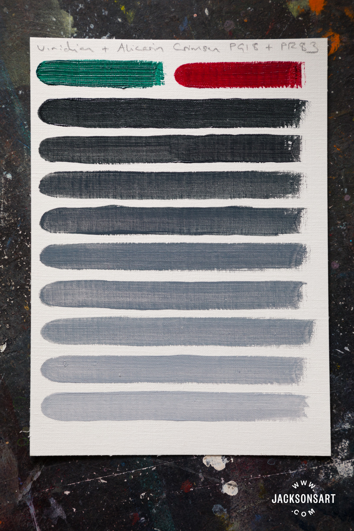
Tinted with Jackson’s Mixing White Artist Oil (PW6, PW4)
Quinacridone Magenta (PR122) and Phthalo Green Yellow Shade (PG36)
Phthalo Green Yellow Shade is a variation of regular Phthalo Green made by treating copper phthalocyanine with bromine. It has more yellow undertone, but still leans slightly towards blue. Phthalo Green and Quinacridone Magenta have very similar tinting strengths, so the mixture is very easy to adjust and control. The black they make is extremely deep, and as velvety as any pure black pigment. In tints, it tends towards a duck egg blue, although more Magenta could be added to produce pastel purples.
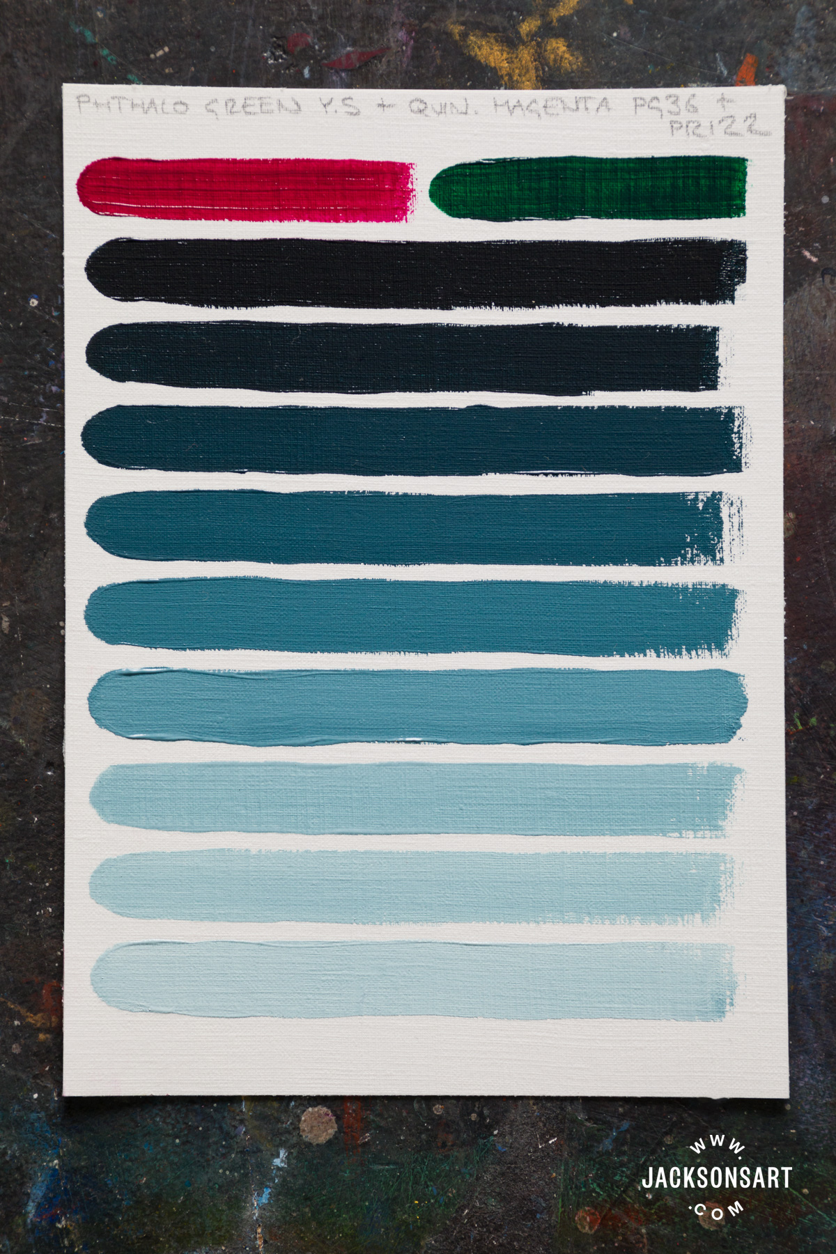
Tinted with Jackson’s Mixing White Artist Oil (PW6, PW4)
Quinacridone Maroon (PR206) and Phthalo Turquoise (PB16)
The green bias of Phthalo Turquoise is cut by the orange undertone of Quinacridone Maroon, making them near perfect complementaries. Together they make a wonderfully sooty-looking black, that could have a warm or cool bias depending on the proportions used. The below mixtures have a cool undertone similar to Carbon Black.

Tinted with Winsor and Newton Permanent White Designer Gouache
Transparent Oxide Red (PR101) and Prussian Blue (PB27)
Prussian Blue is a great starting point for making chromatic black because it is almost black in masstone already! This is a very interesting chromatic black that is completely black in masstone, but when tinted with white it reveals some enigmatic sage green undertones.
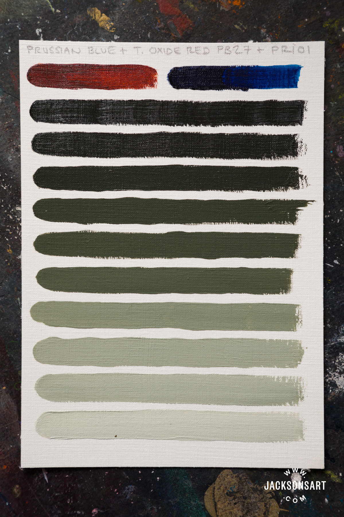
Tinted with Jackson’s Mixing White Artist Oil (PW6, PW4)
Dioxazine Violet (PV23) and Green Gold (PY129)
Yellow pigments don’t usually feature in chromatic black mixtures because most yellow pigments are light in value, but Green Gold is an exception. It is an Azomethine Copper pigment that appears green in masstone, but is technically classified as a yellow. With Dioxazine Violet it neutralises the purple to make a dark jet black. Rather surprisingly, the undertone is an earthy pink.
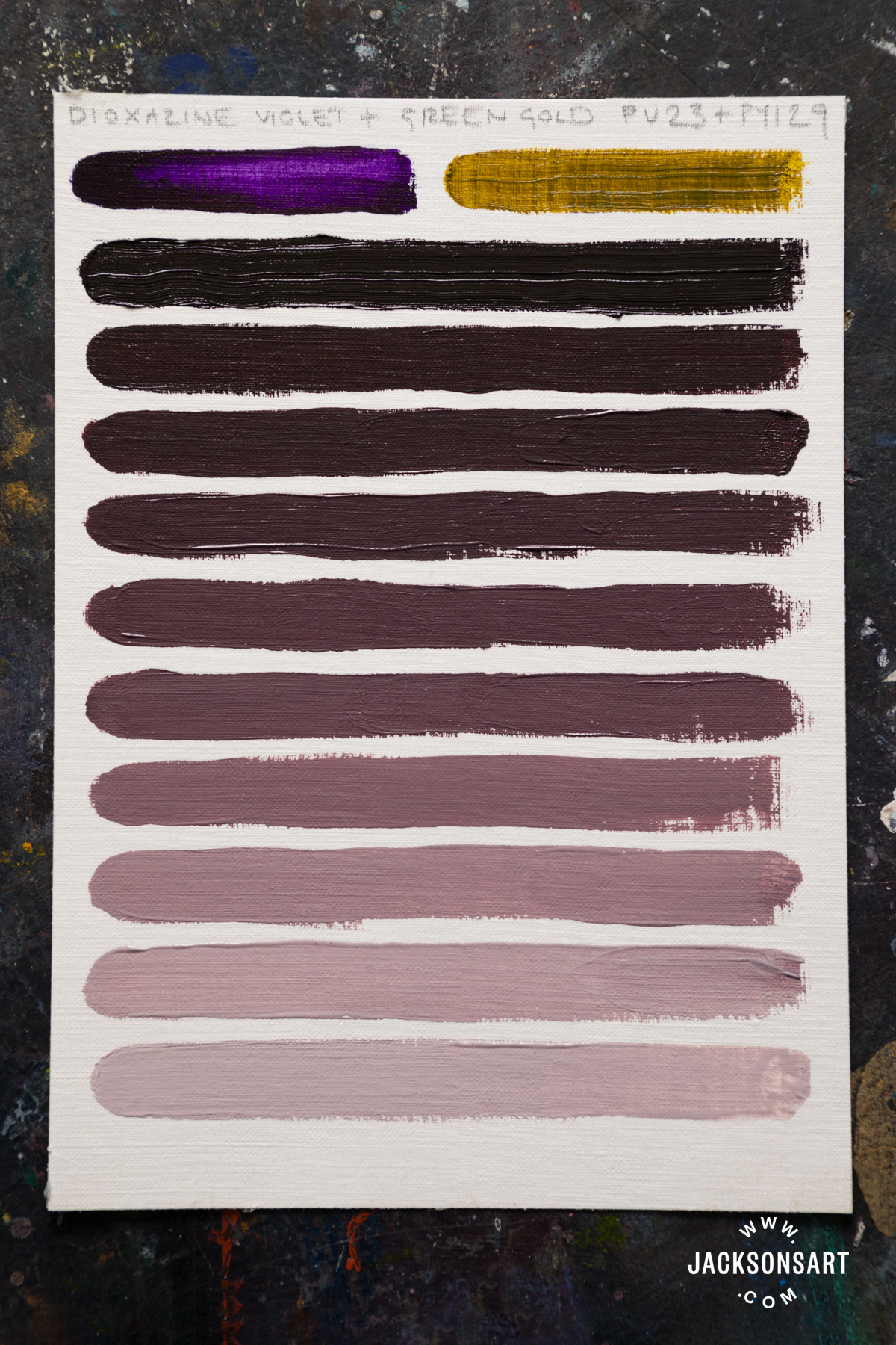
Tinted with Jackson’s Mixing White Artist Oil (PW6, PW4)
Burnt Sienna (PBr7) and Ultramarine Blue (PB29)
These two pigments aren’t as dark-valued or highly tinting as the others, and they make more of a dark grey than a deep black, but it is still worth including here because it is a popular combination for making neutral shades for painting shadows. It is highly versatile – in the mixture below the greys are soft and warm, like an Ivory Black. This would make a great alternative for artists who prefer to avoid the animal-derived pigments in their palettes but want to use a warm black in their painting. Equally, with more Ultramarine Blue the greys would become cool.
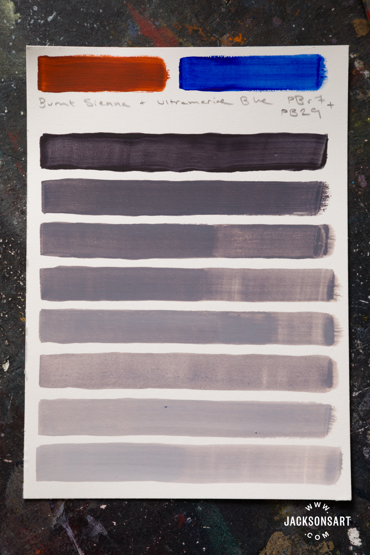
Tinted with Winsor and Newton Permanent White Designer Gouache
One of the greatest advantages of mixing chromatic dark values over pure black pigments is that you are able to control their temperature in a very precise way, by adjusting the proportions of each colour to make it cool or warm. Then, by tinting the chromatic black with white, you can make a range of nuanced greys. Additionally, by making black out of the colours you are already using on your palette, your dark values will be in harmony with the rest of the painting.

Further Reading
Making Your Own Oil Paint with Jackson’s Pigments
Introducing Jackson’s Artist Pigment Sets
Colour Mixing: Two Palettes Without Primaries
Pigment Stories: Viridian Green
Shop Colour on jacksonsart.com


7 thoughts on “Chromatic Black: Mixing Nuanced Dark Values”
Evie, I so love your colour theory and
history articles. They’re really helped me
to refine my colour choices. Thank you!
You should write a book, a great big
tome with heaps of illustrations, like a
colour theorists manual
So glad you enjoy these articles! Thank you Christine
Fascinating especially the final few…a
reminder that messing about with mixtures
is essential I enjoy all your articles.
Thanks Rose!
Ultramarine and burnt umber there. Mix to
the right lightness there. Dry brush there
over a finished painting there.
I love this! But are you sure you were
using PG36 instead of PG7? I practiced
mixing the above — with acrylics. What I
found is that when I mixed PG36 and
PR122 I got a beautiful deep black, but
increasingly tinting that black led to a
lovely gray rather than the duck-egg blue I
was hoping for. Just for grins, I tried
mixing PG7 with PR122 and not only did I
get an equally exquisite black, I got the
blue I was hoping for!
Hi Cathy! I just double-checked and yes, I used PG36. Perhaps I used a higher proportion of PR122 than you did. Or it’s possible that Langridge’s version is a more blue-leaning example of the pigment, as I find it still has a slight blue edge to it. PG7 and PR122 is a lovely way to mix blue- you also get gorgeous violets if you add a bit more PR122. Happy mixing!
Comments are closed.