



The story of the Fratelli Maimeri company began in Italy in 1923. Painter Gianni Maimeri was unsatisfied with the oil colours available on the market and, with the help of his brother Carlo Maimeri, they produced a range of fine art oil paints that were based on oil and pigment, without any added fillers.

Copyright Fondazione Maimeri, All Rights Reserved.
Over the last century, the Maimeri range has expanded to offer other fine art materials, including MaimeriBlu watercolours. The MaimeriBlu range is formulated to professional standards, with a rigorous level of testing. Pigments are processed in refining machines, whose settings are fine-tuned to achieve the right pigment particle size, and each batch is tested for optimum lightfastness, viscosity, and stability over time.
As a watercolourist, I enjoy discovering the differences between artist watercolours, and I was excited to give Maimeri’s watercolours a go.

For this article I tried a metal box set of 36 half pans and five individual 12ml tubes. When trying a watercolour range for the first time, I like to look at the pigments they contain, how well the paint rewets, and the qualities of the individual colours themselves.
Use of Single Pigments
I’m struck by the fact that all of the MaimeriBlu watercolours are made with a single pigment – something I’ve never seen in any other watercolour range.
Single pigment colours contain only one pigment, indicated by the pigment index number which identifies the chemical composition of the pigment (Ultramarine Blue, for example, has a pigment index number of PB29). While all watercolour ranges contain a selection of single pigment colours, most ranges also include colours that contain a blend of pigments. For example, a single pigment Cobalt Blue (considered to be ‘genuine’ Cobalt Blue) is PB28, while some paint makers will use a blend of pigments to match the colour of the genuine pigment. E.g. Cobalt Blue made with a mixture of PB29 (Ultramarine Blue), PB15 (Phthalo Blue), PW6 (Titanium White). There are many reasons why paint makers will use a mixture of pigments instead of just one. Some pigments are very expensive, and they might choose to use a mixture of less expensive pigments to keep the price down for the artist. Historical colours, like Indigo, were originally made using pigments that were fugitive (not lightfast), so modern versions of the colour are created with other pigments. Sometimes it’s the case that a pigment simply isn’t suitable for a particular medium, which is why you won’t find a genuine Prussian Blue (PB27) in acrylics.
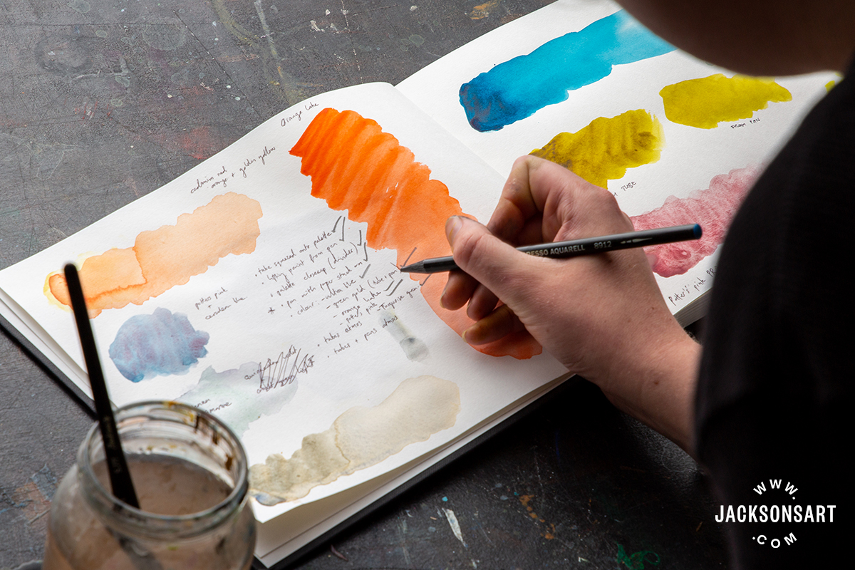
Single pigments can play a particular role in colour mixing. As a general rule, the more pigments there are in a mixture, the muddier the colour will be. For this reason, some artists prefer to use single pigment colours in their palette because they are generally best for clean, glowing colour mixtures, and they allow you to experience the unadulterated properties of each pigment. It seems that the MaimeriBlu range is ideal for artists who value single pigments.
Swatching the Colours
I tend to prefer tubes of watercolour rather than pans, so I started by trying the 12ml tubes of Ultramarine Blue, Green Gold, Turquoise Green, Permanent Madder Deep, and Neutral Tint. The tube colours have a creamy consistency, without the stickiness of some watercolours (particularly those that contain honey). On the paper, the colours are rich and smooth. Two of my favourites are Ultramarine Blue (PB29) which is jewel-like and characteristically granulating, with a particularly reddish undertone, and Turquoise Green (PB16) – a deep greenish-blue when applied heavily and bright blue-green when diluted. It would make some very atmospheric greys if mixed with orange and used transparently.

The 36 half pans in the set are housed in a sturdy metal palette with two mixing surfaces. The pans are standard half-pan size, so they will fit any watercolour tin, though I like the design of the metal tin they came in, which feels robust and well-made. Removable dividers hold the pans in place, ensuring they don’t slip.
When I was unwrapping the pans, I found that some of the paper wrapping stuck to the surface of a few of the colours which I had to rub off with water. This was inconvenient and meant that I wasted a small amount of the paint. Once I started using the pans, I found that they rewet nicely and it was easy to get a good colour load on the brush.

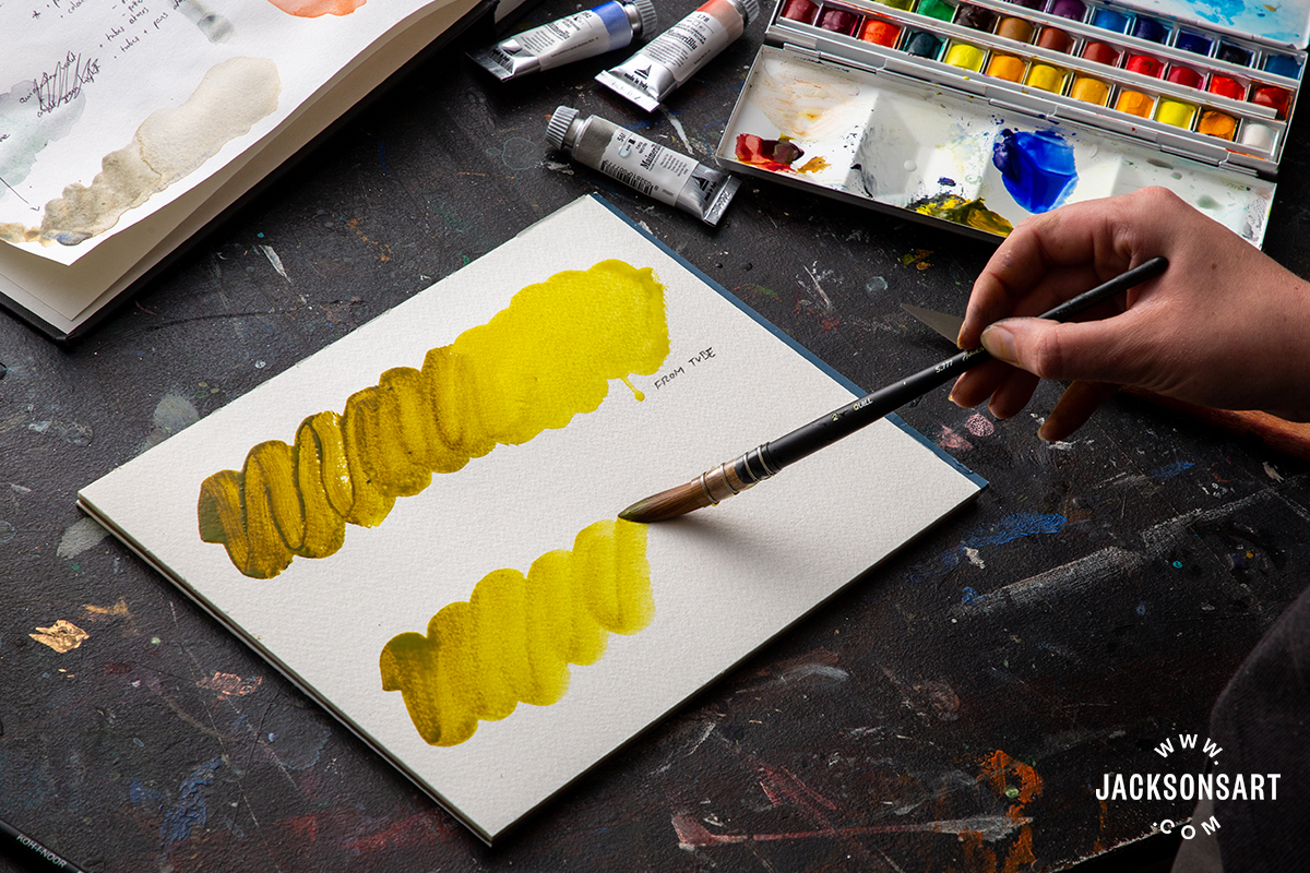
It’s true for all watercolour ranges that it’s easier to get a strong colour load when using watercolour straight from the tube, because you can dilute it minimally with water and really saturate the brush. Below I compared Green Gold (PY129) from the tube (top) to Green Gold from the pan (bottom). While the masstone was deepest in the tubed colour, I think that the intensity of colour from the pan compared well. Green Gold is a great colour for mixing, particularly for landscape painting – it makes rich, earthy oranges when mixed with magenta.
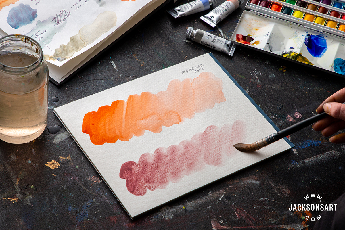
One of my favourite colours in the range is Orange Lake (PO43), which is part of the 36 half pan set. It is a particularly vibrant and opaque red-orange that reveals a peachy undertone when diluted.

The great thing about painting with single pigment colours is that you can work with the individual properties of the pigments themselves, from the vibrant and non-granulating Orange Lake, to the gentle and highly granulating Potters Pink (PR233).
While single pigment colours are certainly not unusual, Maimeri’s commitment to only using single pigments sets them apart from other watercolour ranges. I would recommend them to artists who value single pigments, as well as those who want to explore colour mixing with watercolour and achieve the best results.
If you’d like to try the MaimeriBlu watercolours for yourself, you can receive a free Maimeri 6 colour Dot Card with any purchase of watercolour paint on jacksonsart.com. This offer is available in the UK only and is limited to 1 per order. Available while stocks last.

13 thoughts on “What Makes MaimeriBlu Watercolours Unique?”
These watercolours work well when mixed to
make sedimentary washes where heavier
pigment settles into declivities on the paper
and the lighter sits on top eg cobalt and raw
umber or french ultra and raw umber. This
mix can then be coloured with stain
pigments eg pthalo blue or aliz crimson
Mimeriblu are the best pigments to achieve
this because of their purity
These colors indeed seem wonderful. I
also found that the wrapping paper was
sticking to the paint; it’s inconvenient and
not in line with premium image target. I
just tried a few colours in red-violet
ranges. They look very gorgeous but I
noticed that the permanent red deep ref
253 was using a non-permanent pigment
PR177.
Nice, but I think you missed the biggest
advantage of single pigment colours,
which is that you can spread the pure
paint with as much water as you like and
not getting any pigment separation due to
the chromatography effect.
Yes you’re right, Thanks Ryan!
Thank you so much for your review on
Maimeri! I love their watercolors and
hadn’t thought to compare the pan color
against the tube; appreciate that visual. I
have been waiting to replenish my Maimeri
pan paints, but after reading your
thoughts, I am now leaning towards
grabbing tubes for my next set. Such a
well-written review, it reminds me of why I
love painting again. Aloha, Mika Harmony
So glad you enjoyed it, Thank you Mika!
Very helpful to have this kind of objective &
detailed expert assessment, thanks.
Nothing special on these watercolors that will justify their price !…in any case I will prefer W & N, Daniel Smith or even Roman Szmal. Roman Szmal has has wide variety of tones, a lot of them single pigment and the most competitive price of all
I have used MaimeriBlu since 1998 and I am
still impressed with these colours. Thanks
for a very informative article, Evie.
Thanks Rene, much appreciated
Has Maimeriblu issued a new range?
Hi Elizabeth, this is an exciting range – I just had never tried them before!
I like these MaimeriBlu (MB) paints, having tried 9, *6 of which from the dot card, I already use their primary magenta and cyan which I think are excellent. They are generally finely milled so mostly transparent and minimal granulation, rewet and disperse easily, and have high chroma for their pigment.
*PO71 Pyrrol Orange, a bright mid orange, noticably less red than the Daniel Smith version.
PR149 Crimson Lake, very similar to PR254.
*PV19 Quin Lake, very purple for its pigment, close in hue to PV16 but transparent, useful for florals.
*PB29 Ultramarine Deep, minimal granulation, no obvious advantage over Jacksons own brand (or Daniel Smith’s for an intense variant), if you want a strongly granulating version try Ken Bromley’s.
PB74 Cobalt Blue Deep, this does granulate, very close in hue to the above PB29.
*PB28 Cobalt Turquoise, semi-opaque, bright, nice, about mid way between Turners’ (slightly bluer) and Lukas’ (slightly greener).
PB15:4 Phthalo Turquoise, this is interesting, similar to the Horadam PB16 Helio Turquoise but greener!
*PBk26 Paynes Grey, a deep midnight blue grey, notable for being single pigment, nice.
*PY129 Green Gold, a very good version, very slightly brighter and more transparent than the good Van Gogh variant.
Overall I’d say they’re a match for any of the leading brand suspects but, as with any single brand, it’s worth picking and choosing the ones that suit your palette. Well done MB on making the whole range single pigment.
Comments are closed.