



Sap Green is a strong yellow-green colour that is found in most watercolour, oil, and acrylic paint ranges. Today it is made using a mixture of pigments, but its origins go back to a dye used during the ancient Roman period. This article examines the history behind the colour, and how it can be used in an artist’s palette today.

The History of Sap Green
This particular shade of yellow-green has a complex history that is quite difficult to pin down. It can be traced back to a dye extracted from the berries of Buckthorn trees, a genus native to east-Asia and north-Africa. Buckthorn berries were certainly used to dye textiles in the Ancient Roman period (roughly 27 BCE to the 5th century AD), but plant-dyes of many types had already been used for thousands of years so it’s likely that its origins go back much further. The sticky purple juice pressed from the berries was mixed with lime or vinegar to make dyes that could range from brownish-yellow to green. There were various ways to adjust the colour: unripe buckthorn berries produced green shades, while ripe ones produced yellow.
The dye could be laked, a process during which an insoluble dye is precipitated onto an inert metallic salt to make an insoluble pigment. The lake pigment was then suitable for grinding into a binder for painting. The yellow variety of Buckthorn lake was known later as Stil de Grain or Pink (before the 17th century the word ‘pink’ commonly referred to a yellow-brown instead of a pale red).
Both yellow and green buckthorn berry-derived dyes and pigments were used in the illumination of medieval manuscripts. De Arte Illuminandi, a 14th-century Italian treatise on manuscript production, recommended mixing it with Azurite (a blue mineral pigment similar to natural Ultramarine Blue) to make a rich, deep green. It also appears that varieties of Sap Green were made from a combination of other yellow and blue vegetable dyes, rather than from a single source. Well known examples of historical Sap Green in medieval illumination include the 9th-century Book of Kells and the luxurious 15th-century Book of Hours of Isabella Stuart.
The pigment became very popular among European landscape watercolourists in the 17th and 18th centuries, and it is first recorded as being called ‘Sap Green’ in 1758. This is possibly a reference to the fact that the pigment was mixed with gum arabic and sold as a sticky syrup inside a dried pig’s bladder rather than as a dry pigment powder, a fact that also earned it the name ‘Bladder Green’.
Unfortunately, like most other historical lake pigments genuine Sap Green has very poor lightfastness. With the advent of commercially produced paints in the 19th century, paint makers were able to sell more permanent alternatives to the fugitive colour which were made up of a mixture of a blue (usually Prussian Blue) and yellow pigments.
Modern-day Sap Green
It is rare to come across genuine Sap Green paints today, but they do exist. A. Gallo make a genuine Buckthorn Berry Green watercolour, for example. However the vast majority of Sap Green paints today are hues- a mixture of pigments blended together to recreate a single pigment colour. While they were an improvement on the historical pigment, the first Sap Green hues made in the 19th century were made using yellow pigments with poor lightfastness. Today, however, paint manufacturers have access to a much wider array of lightfast pigments which means that Sap Green is now a colour that artists can rely on. It remains a popular colour in watercolour, oil, and acrylic ranges.
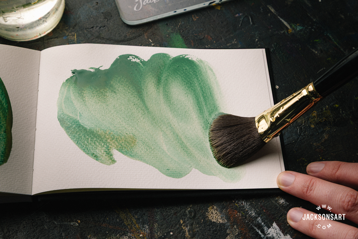
Modern Sap Green varies wildly between brands because each one uses a different mixture of two or more pigments to recreate the historical colour. The following are just a few examples of modern-day Sap Greens. Here I am comparing watercolours and one acrylic paint, but among oil paint ranges you will also find an assortment of different hues of Sap Green:

The difference between these colours is significant. Some are muted and mossy, others more vibrant, and one (Michael Harding’s watercolour at the centre of the left-hand page) is extremely dark and much bluer than the rest. Looking at the pigments each one contains, it’s clear why there is so much variation:
Left-hand page, from top:
Jackson’s Sap Green Permanent watercolour – PB29 (Ultramarine Blue) and PY154 (Benzimidazolone Yellow)
Michael Harding Sap Green watercolour– PG7 (Phthalo Green) and PBr6 (Synthetic Brown Iron Oxide)
Golden Sap Green Hue acrylic – PBk7 (Carbon Black), PG36 (Phthalo Green Yellow Shade), PR101 (Synthetic Red Iron Oxide), and PY150 (Nickel Azo Yellow)
Right-hand page, from top:
Old Holland Sap Green Lake Extra watercolour – PBk7 (Carbon Black), PG7 (Phthalo Green), PY151 (Benzimidazolone Yellow), PY153 (Nickel Dioxine Yellow), and PY42 (Yellow Iron Oxide)
Daniel Smith Sap Green watercolour – PO48 (Quinacridone Orange), PY150 (Nickel Azo Yellow), PG7 (Phthalo Green)
The pigments that each one contains makes all the difference when painting. Some artists prefer to use paints with fewer pigments in them because they find them better to mix with, while for others it is more important to have a ready-made colour available without mixing it.
Mixing With Sap Green
Giving general advice about mixing with Sap Green is made complicated by the fact that each example is so different, and a beautiful mixture with one might look muddy with another. The Old Holland watercolour above, for example, contains five pigments already. Adding more new pigments into this already crowded mixture could quickly make the colour lose its clarity. While there is nothing wrong with ‘muddy’ mixtures, it can be frustrating if that isn’t your intention!
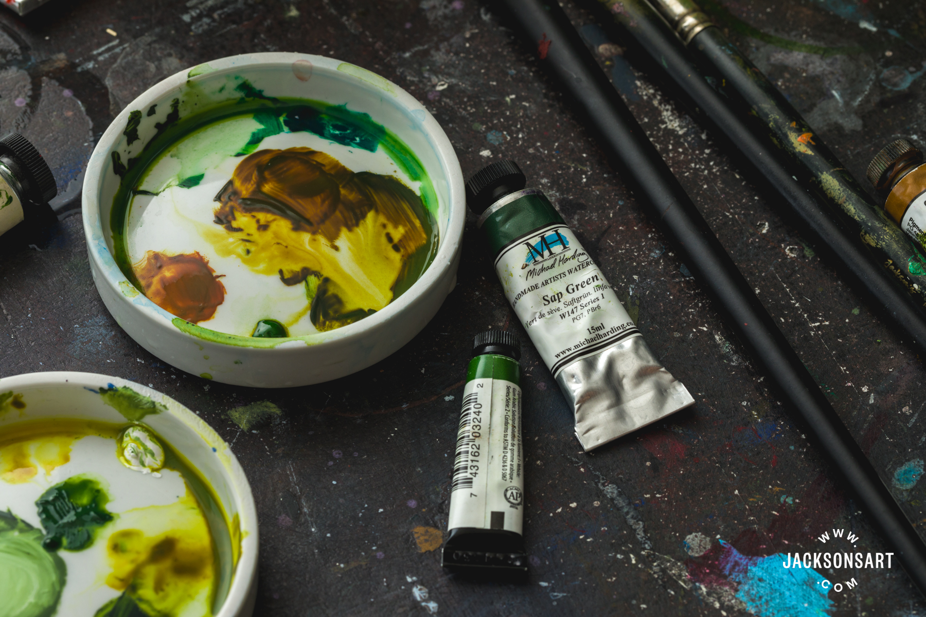
To make the most of this colour in your palette, it’s helpful to become familiar with the pigments it contains (these are useful listed on the side of the tube). Once you have identified the ‘anatomy’ of the colour, you will have a guide to which pigments will most seamlessly mix with it. For example, if you use Daniel Smith’s Sap Green watercolour, which contains Quinacridone Orange (PO48), Nickel Azo Yellow (PY150) and Phthalo Green (PG7), adding more of those individual pigments will elegantly adjust the colour:

The inclusion of Quinacridone Gold and Nickel Azo Yellow (a very warm yellow) means that this particular Sap Green is naturally suited to reaching the most autumnal shades of green. In another example, Jackson’s Sap Green professional oil paint contains Hansa Yellow Light (PY3), a brown iron-oxide pigment (PBr7), and Phthalo Green (PG7). Breaking this colour down, it becomes clear that it is better for making more acidic greens by adding more Hansa Yellow Light (a cool, zesty yellow). Because PBr7 is a broad pigment category that covers many shades of natural earth pigments, I chose Raw Sienna as it seemed to be the most compatible:

As an aside, it’s interesting to compare how each of the above examples look in tints with white. The Jackson’s oil paint is much cooler, almost blue, when mixed with Titanium White, while the Daniel Smith watercolour has more olive undertones.
Dissecting a colour like this is a really useful exercise that can be used when working with any paint that contains a mixture of pigments, and it can help you make very precise, clean mixtures. As Sap Green is a popular landscape painting colour, it could be particularly good for nudging the colour in various directions and capturing the effect of light and shade on greens.

This isn’t to say that introducing different pigments to a Sap Green is a bad thing- mixtures containing multiple pigments can be just as beautiful as those containing very few. But this exercise will help you make informed decisions about your mixtures, and can lead to surprising discoveries of what your Sap Green is capable of.
Further Reading
Colour Mixing: Two Palettes Without Primaries
Pigment Colour Index: Green Pigments
Inside the Pages of a Medieval Sketchbook
A Closer Look at Unique Pigments from A. Gallo Watercolours
Shop Sap Green on jacksonsart.com

15 thoughts on “Sap Green: From Dye to Mixed Pigment”
A Gallo watercolours make a buckthorn
green from the berries
You’re right, thank you for pointing that out! I’ll add it to the article
Thanks for this interesting and
helpful analysis!
Hello again Evie,
Another excellent technical article, thank
you. I was interested in the ‘charts’ which
started from Sap Green and progressed
through to Phthalo Green, two colours
which I find incompatible, but that’s just
me.
My question is that, being a little
consumed with Teal (which I appreciate is
indefinable), I can mix the exact same
shade of teal by using a) just Phithalo
Green and black (with mixing white) or b)
various quantities of olive green, oxide of
chromium, Payne’s Grey and cobalt blue
(with mixing white)
How does that work?
Rob
Thanks for reading, Rob! Yes, I found it surprising how many Sap Greens contain Phthalo Green- almost every one does. Those teal mixtures you mention sound so interesting and I’ll try them out. I suppose the defining characteristic of Teal is that it hovers on the edge of blue and green, and both of those mixtures are going in that direction but in different ways. I love the sound of that first mixture of Phthalo Green and black- black can sometimes act like a blue in certain mixtures and I wonder if it’s doing that there, and making the Phthalo Green even cooler. The second mixture is much more complex, but if you break it down you have a mixture of green, blue, and black (in the Payne’s Grey) pigments represented there, so it’s working towards a similar end. I’ll give both of these a go!
Thanks Evie,
I love your turn of phrase in that Teal
‘hovers on the edge of blue and
green’. It certainly does; in fact I
have had the comments ‘I love the
blue background’ and ‘I love the green
background’ to the same painting!
Those ‘in-between’ colours like Teal are so interesting, because they can be one or the other (or both!) depending on how they are contextualised
Exactly. I have a series I
call ‘Orange on Teal’ which
might sound ghastly to
some, but the shade of
orange, the shade of teal,
the hue of cadmium yellow
can each change the whole
context and perception.
That sounds like a wonderful exploration of colour
Have you tried M Graham sap green?
It’s lovely and made with only two
pigments so it is easy to adjust to match
a green color by adding only one other
pigment.
No I haven’t tried the M. Graham version yet! I’ll give it a go, thanks for the recommendation
Thank you for your article. As many do I
struggle to get the exact colour green I
want, so found your observations about
adding more of the constituent pigments
to push the paint in various directions
very helpful. Obvious when you point it
out. But then obvious often eludes me!
So glad you found it helpful! It’s a useful approach for any mixed-pigment colour
Thank you for that wonderful and very
comprehensive description of the colour sap
green (which just happens to be my favourite
colour). It is my go-to (oil paint) green for
the colours of nature, alongside the vibrant
‘Constable green’, which the great landscape
painter made from a mix of lamp black and
lemon yellow. I tried a number of ready-
mixed sap greens before settling on the
exquisite version made by Old Holland. Their
sap green lake extra is perfection. The one
sold by Michael Harding is far too blueish in
hue to be considered a true sap green. Thank
you.
I agree, black and yellow make some gorgeous Constable-esque greens- much more enigmatic than most blue and yellow mixtures.
Comments are closed.