



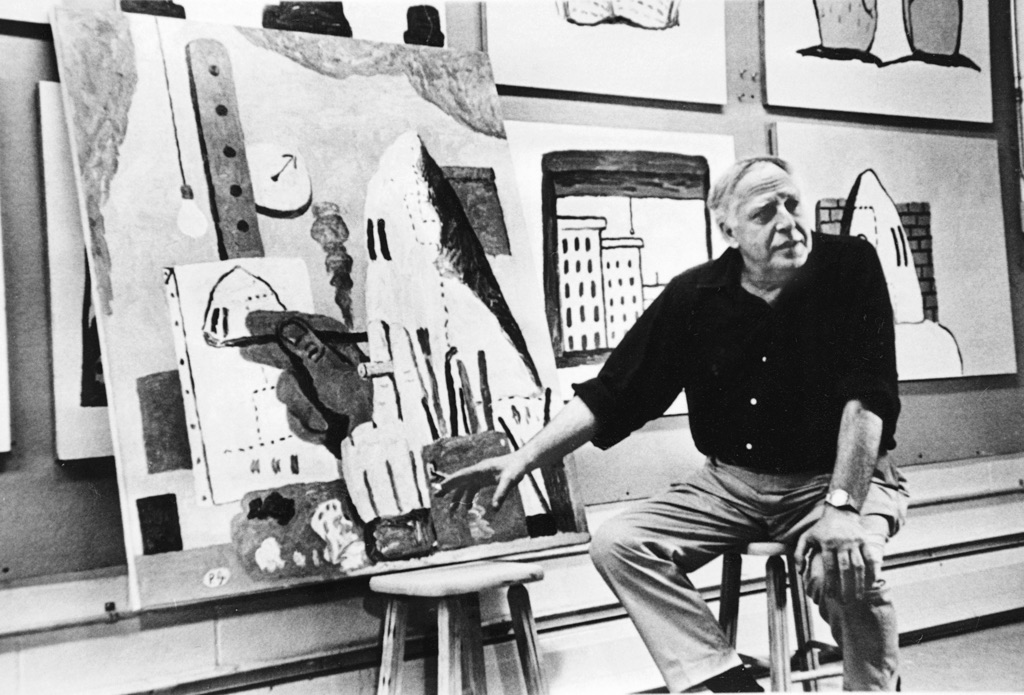
Philip Guston (1913-1980) merged together the horrors of the contemporary world with the mundane and personal, to create some of the most poignant paintings of the late 20th Century. Guston painted and drew relentlessly, and shifted aesthetically several times in his career. In his early work he was heavily influenced by the figuration of the Renaissance and politicism of the Mexican muralists. He then became a key member of the Abstract Expressionism movement in New York through the 50’s alongside his childhood friend Jackson Pollock. He moved on to completely reject abstraction in the 60’s and left New York to shift towards the iconic, bombastic, cartoonish, fleshy and political work he is best remembered for. This article will explore the palette of these later works, and hone in on the specificity of the colours he favoured.
Guston’s Personal History and the Context of 60’s America
To understand and contextualise Guston’s work from the 60’s onward, it’s important to know his personal background. He was born in Canada to Jewish immigrant parents who had escaped the pogroms in Russia, and grew up in the US at a time of great social unrest and racial injustice. Symbolism from images related to the horrors of the Holocaust recur in his work, specifically contortions of legs and shoes referring to images that were circulating of piles of bodies, and shoes taken from Jewish prisoners when they entered concentration camps.
“The war, what was happening to America, the brutality of the world. What kind of man am I, sitting at home, reading magazines, going into frustrated fury about everything—and then going into my studio to adjust a red to a blue?”

Philip Guston
Oil on canvas, 190 x 294 cm | 75 x 116 in
Australian National Gallery, Canberra
He also made a number of paintings which refer to members of the KKK which he called “hoods”. He was horrified by their nativist ideologies and extreme violence against black people in America, himself being a member of a group they also targeted. This sparked a fascination in him with the prospect of how someone becomes an evil person, and the possibility that this capacity could be found within each of us. Through this Guston forces us to stare in the face of evil. Identifying injustice runs through all of his work, but with a twisted sense of humour. In many of these works, the hooded figures appear droopy, crudely stitched together, with huge clown-like hands, packed into vehicles, smoking and even painting, he makes them banal. He commented,
“What do (Klansmen) do afterwards? Or before? Smoke, drink, sit around their rooms … patrol empty streets; dumb, melancholy, guilty, fearful, remorseful, reassuring one another?”
He chose to leave questions about much of his work open – where are these figures going? What do these objects mean? The viewer is left to have their own reaction. His daughter Musa Mayer said in reference to his work, “To ask for meaning is to misunderstand his process.”
Guston’s Restricted Palette
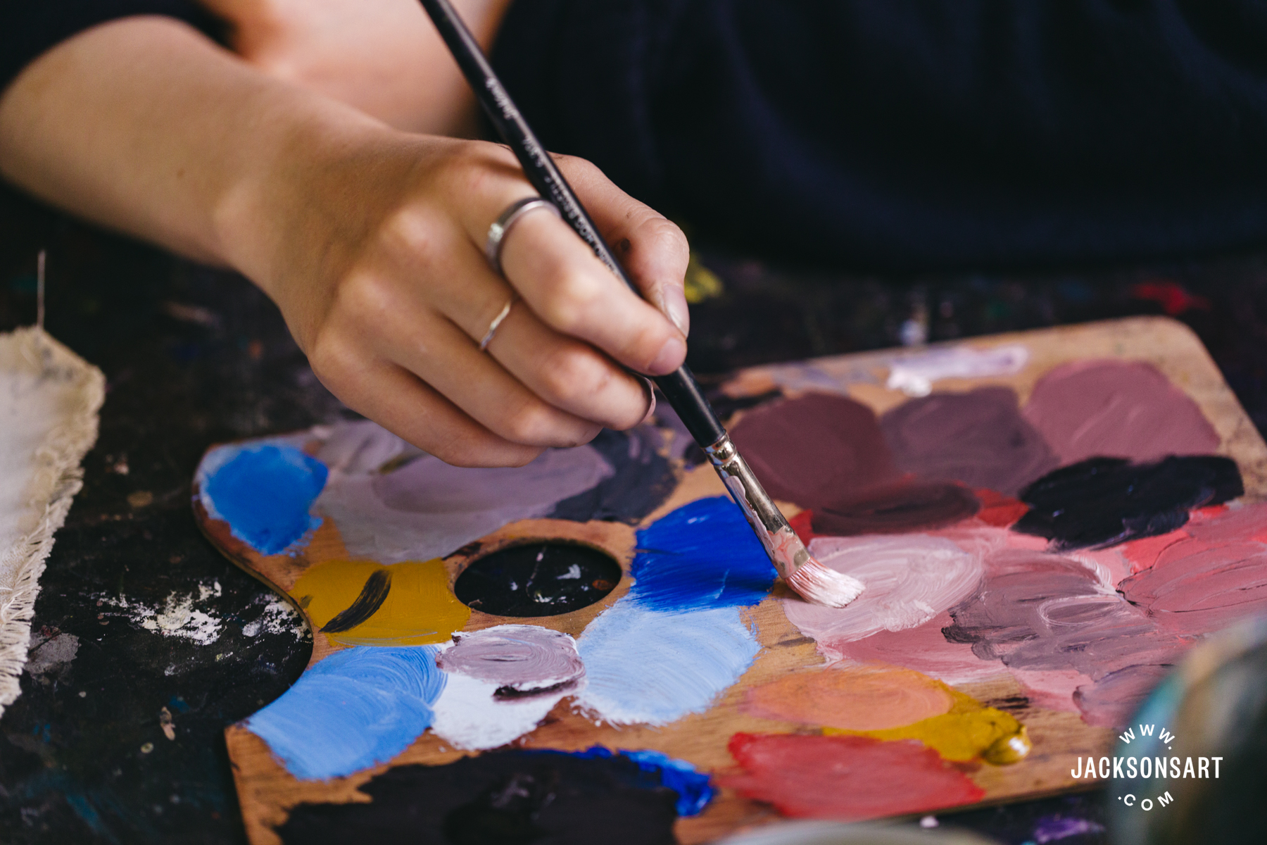
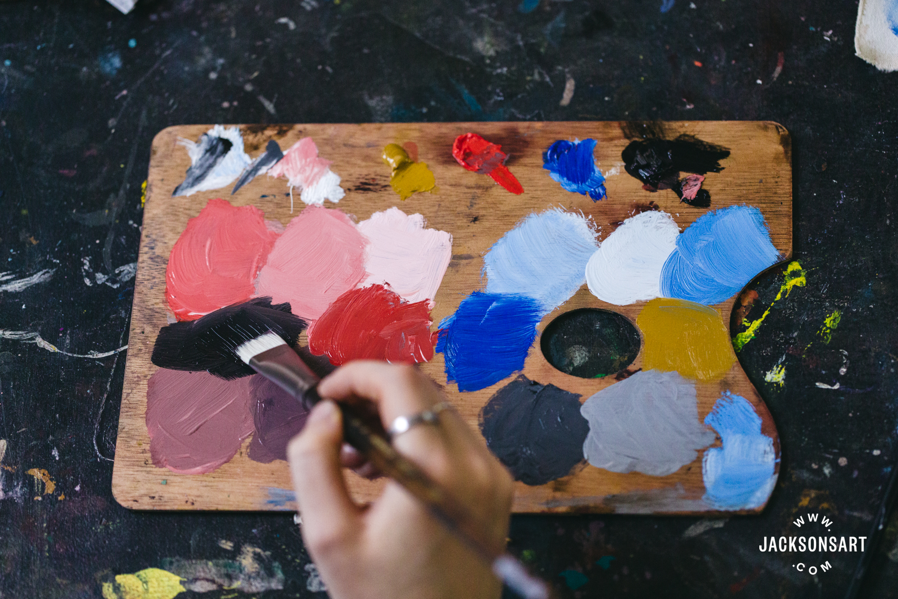
Once Guston returned to figuration in the 60’s, his palette became extremely limited. The colours he used almost exclusively were Cadmium Red Medium, Mars Black, Titanium White, Cobalt Blue Light and Yellow Ochre. His paintings are immediately recognised as extremely pink, with huge amounts of Cadmium Red Medium mixed with Titanium White, with chunky black outlines. Using such a restrictive palette for any artist immediately demands greater invention in terms of imagery. From a practical perspective, many of his paintings are of huge scale, so having a few core colours must have also made organising the making of these works easier.
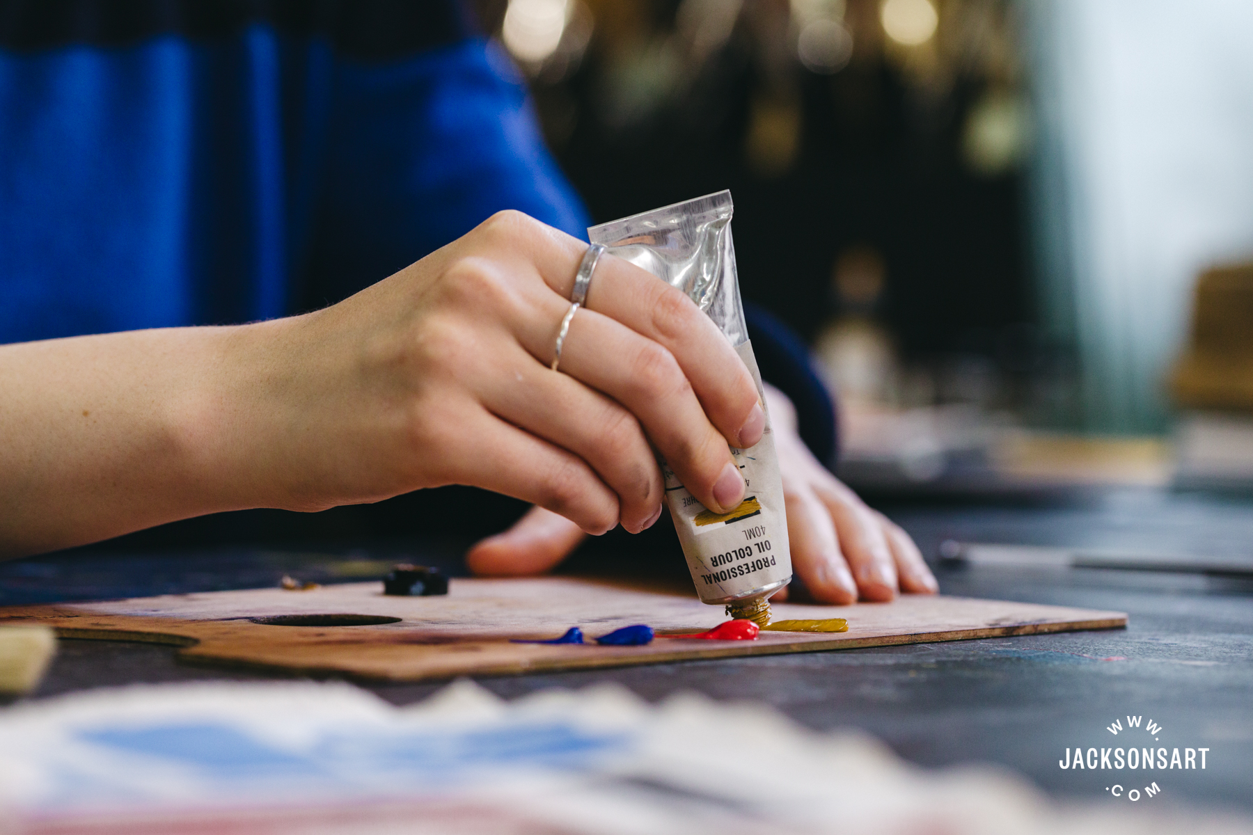
He mostly painted straight out of the tube, apart from these tints with white or black, and barely, if ever, combined the red, yellow, and blue together. The resulting palette is fleshy, gummy, and grimy. It’s sickly sweet but thick with seams of coal. There’s a wonderful tension between the flesh-like, scrubbed on streaky pinks humming with life, and the cold blacks and greys that run through them.
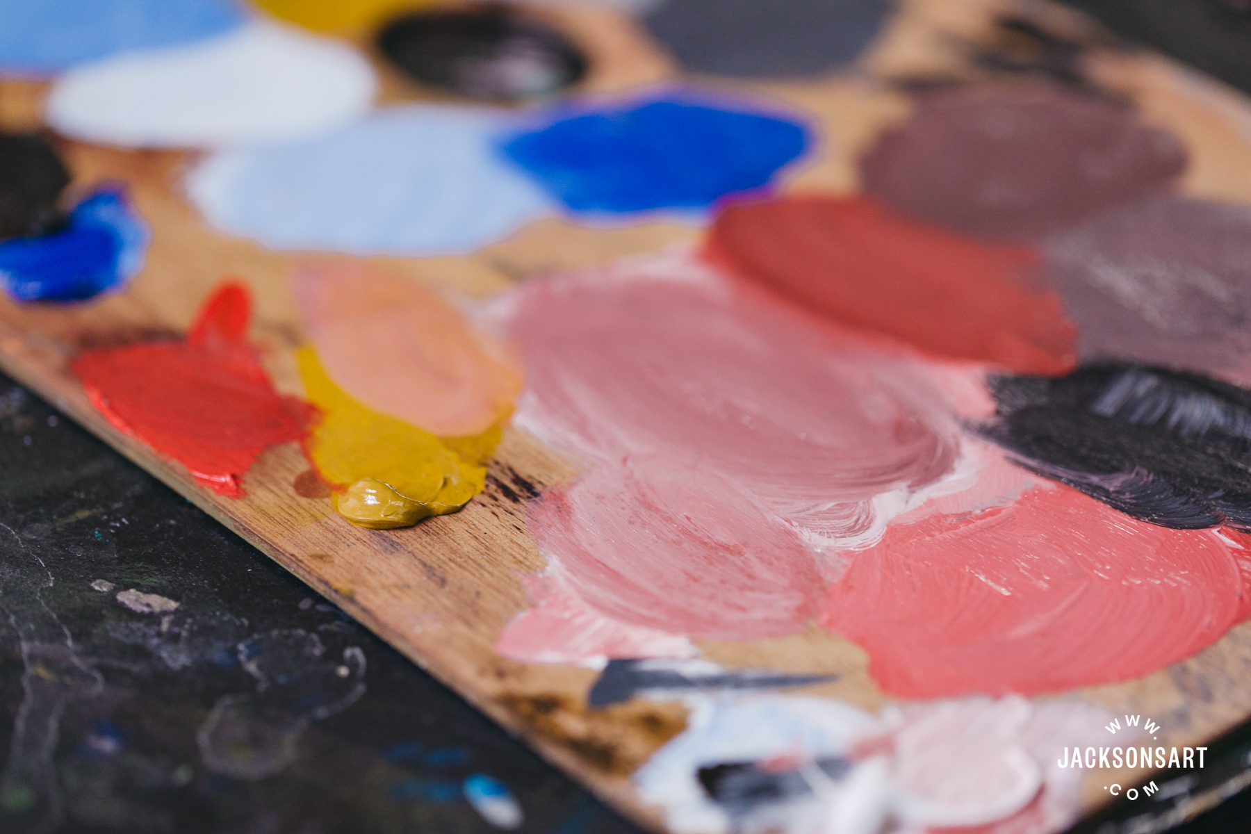
For works often addressing human suffering and violence, the blood stained palette is key to this understanding. The outlines often grip these straight out the tube strong colours, and restrain them. Here, I’ve painted some swatches of these five essential colours, and the mixes Guston would often make with them.
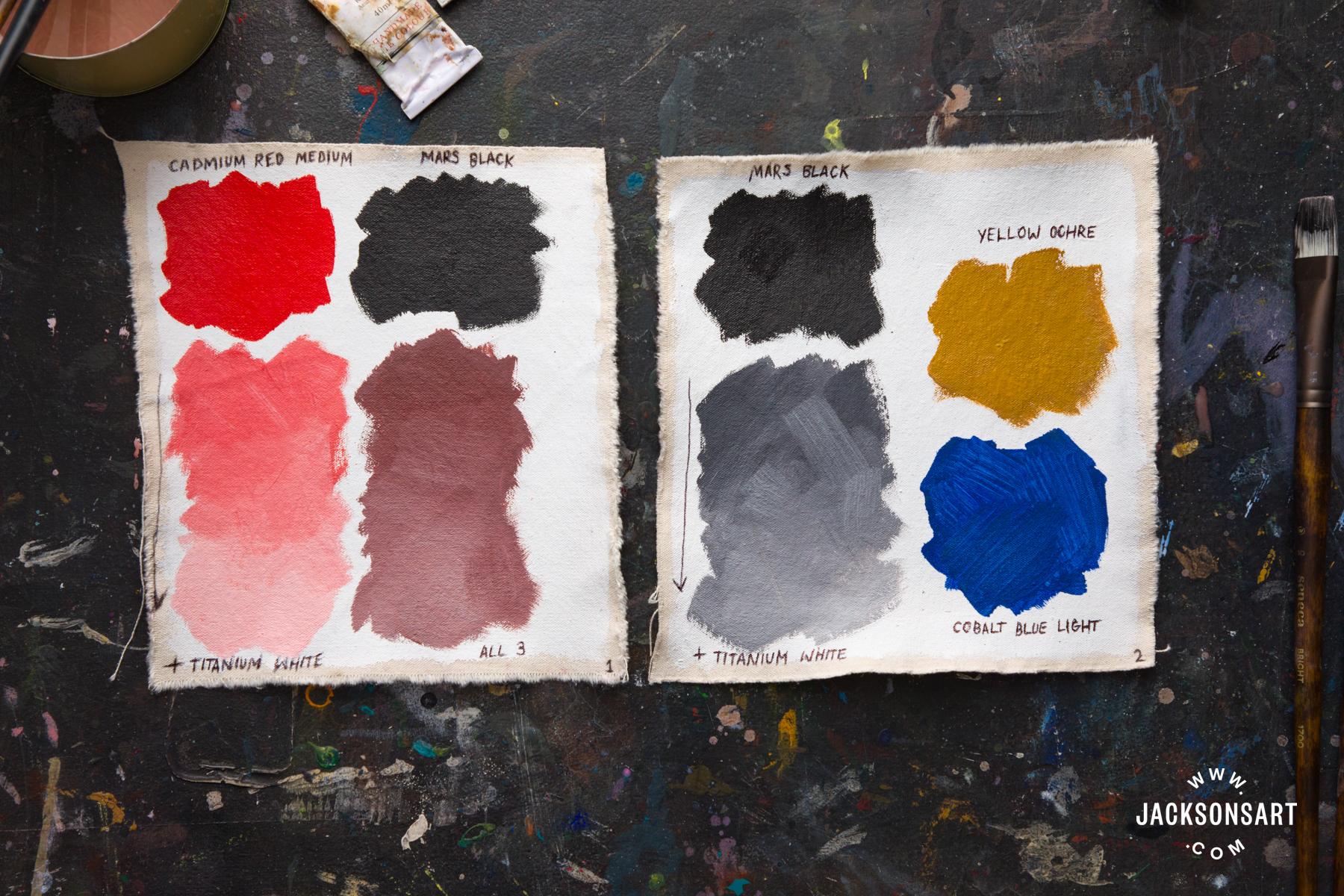
Colour Palette One
Cadmium Red Medium, Titanium White, Mars Black & Cobalt Blue Light
The first painting I looked at for my palette research is The Line (1978). I love the ‘Creator’ like hand reaching from the clouds, drawing a bold line in charcoal, a medium he also used frequently.
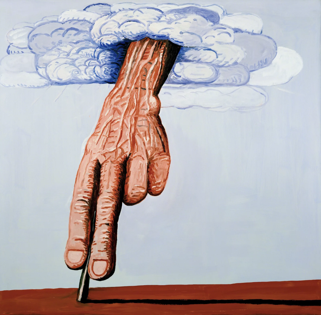
Philip Guston
Oil on canvas, 180.3 × 186.1 cm | 71 × 73 in
Louisiana Museum of Modern Art, Humlebaek
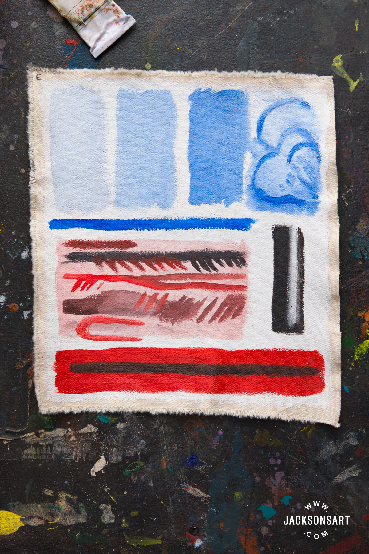
For these swatches I tested out mixing the tints of blue we can see in the clouds, alongside the straight out of the tube linework. His work was often painted wet-on-wet in single, or very few, sittings. Inevitably blending occurs on the surface of the canvas just by the nature of applying layers of wet paint.
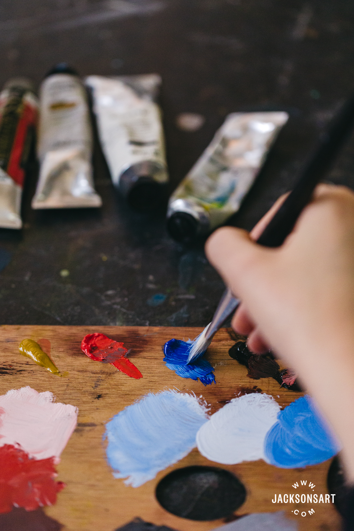
I found this most when I painted a small patch referring to the veins on the hand, finding that the pink below affected the top colour quickly so I had to add these textures almost straight out of the tube. The charcoal line itself is pure Mars Black on Cadmium Red Medium.
Colour Palette Two
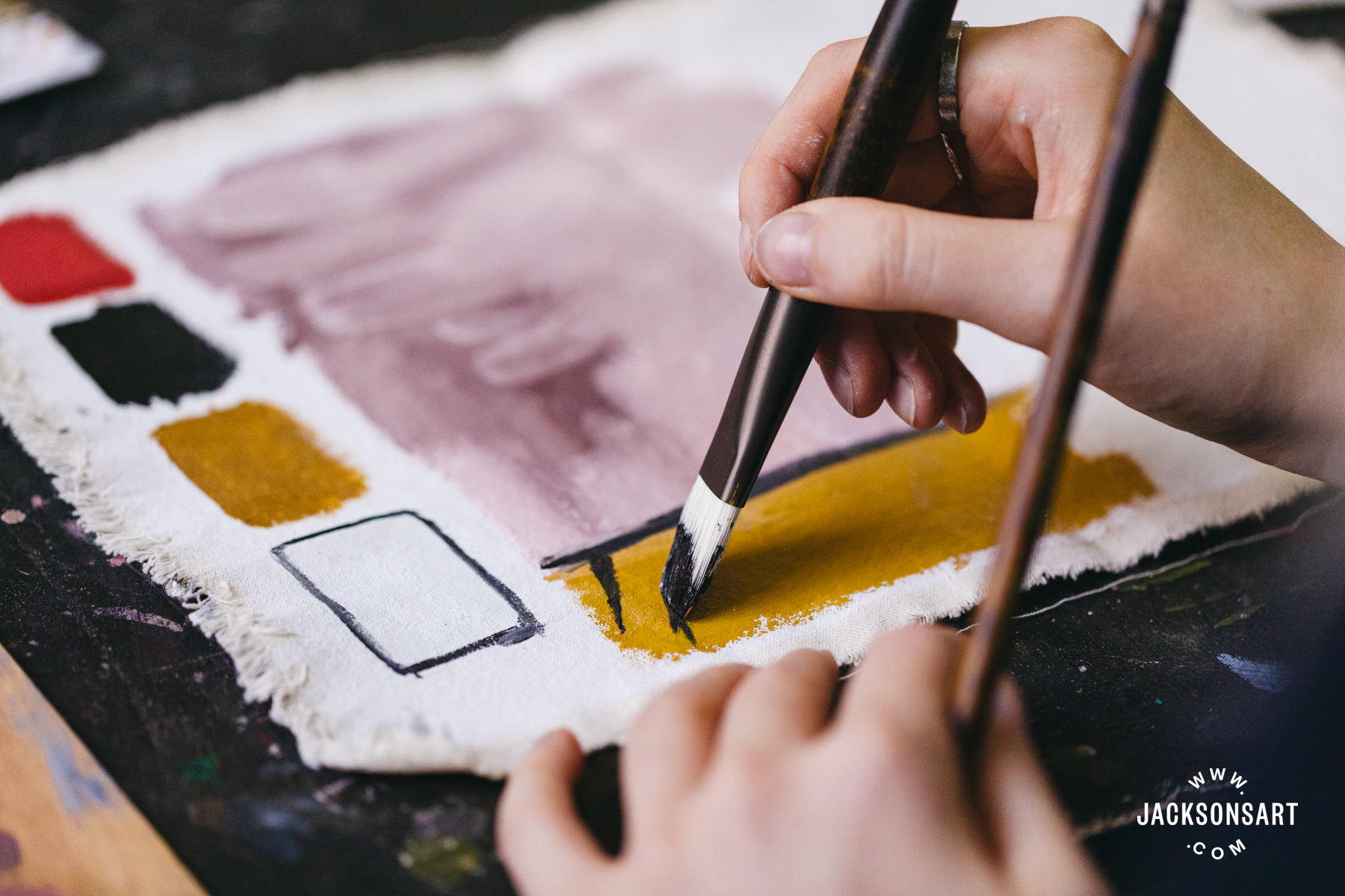
Cadmium Red Medium, Titanium White, Mars Black & Yellow Ochre
This next painting Painting, Smoking, Eating (1973) is a self portrait of the artist lying in bed smoking, eating a plate of chips, with a contortion of his characteristic shoes beside him. This feels like his thoughts weighing on him – his tragic subject matter living alongside him mentally in his personal rest space. The work in a way suggests concerns over health, with the cigarette and pile of food. Overall the work is anxious, painting himself with his single eye wide open, aware of it all at once.
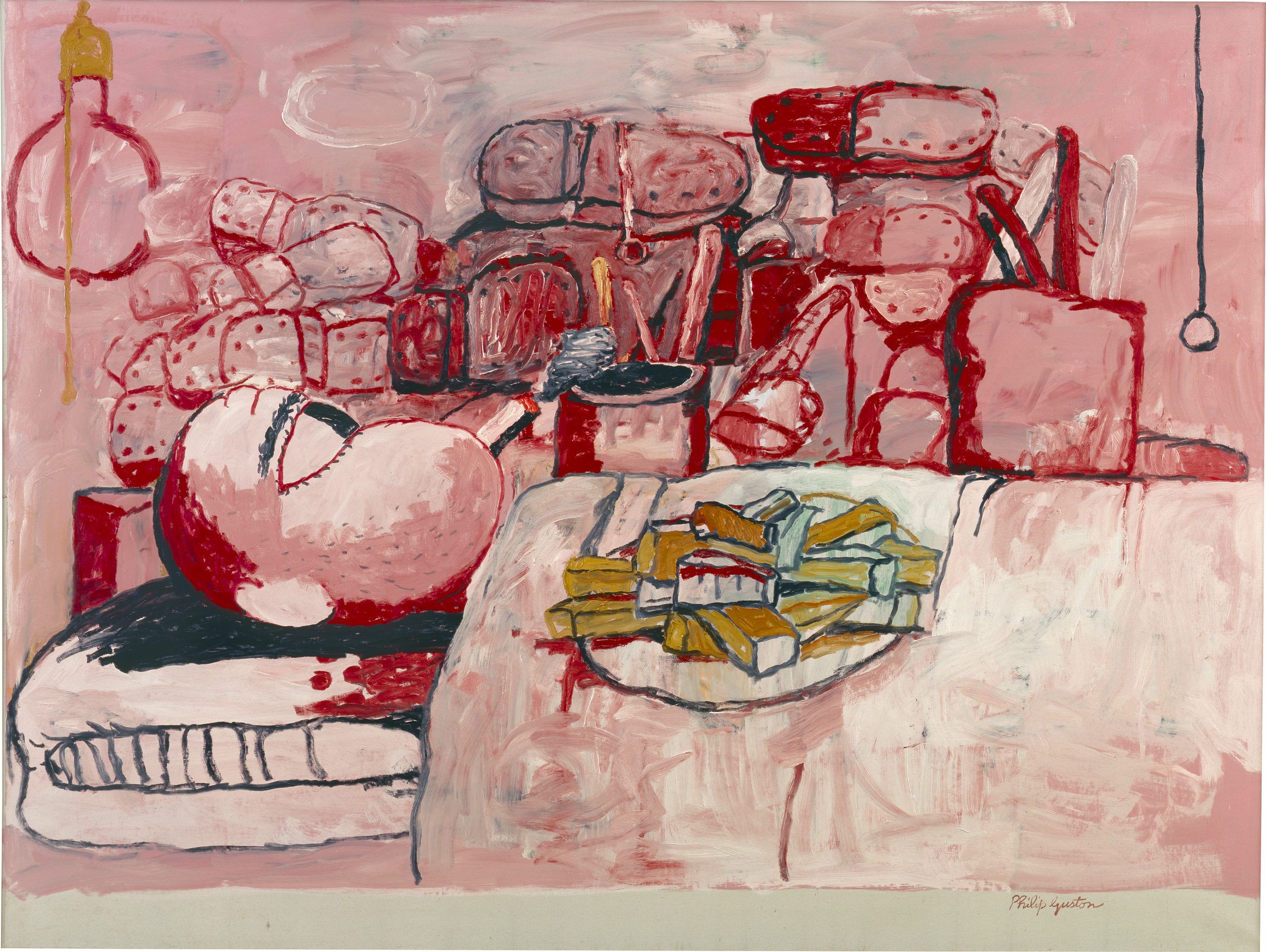
Philip Guston
Oil on canvas, 196.8 x 262.89 cm | 77.5 x 103.5 in
Stedelijk Museum, Amsterdam
For my swatches I began by laying down a pale pink layer all over the surface, and painted thickly on top of it. There is a scrubbing, smearing, quality to the brushwork which I think can only be achieved with a generous amount of paint.
Colour Palette Three
Cadmium Red Medium, Titanium White & Mars Black
This palette is the most limited yet, with only three colours. City Limits (1969) is one of his Klansmen paintings, depicting them packed into a toy-like car, smoking, blood splattered, in a grim grey-red cityscape. The deliberate meatiness of this finish of this painting is disturbing, an unnerving mirror of the vile people in the vehicle.
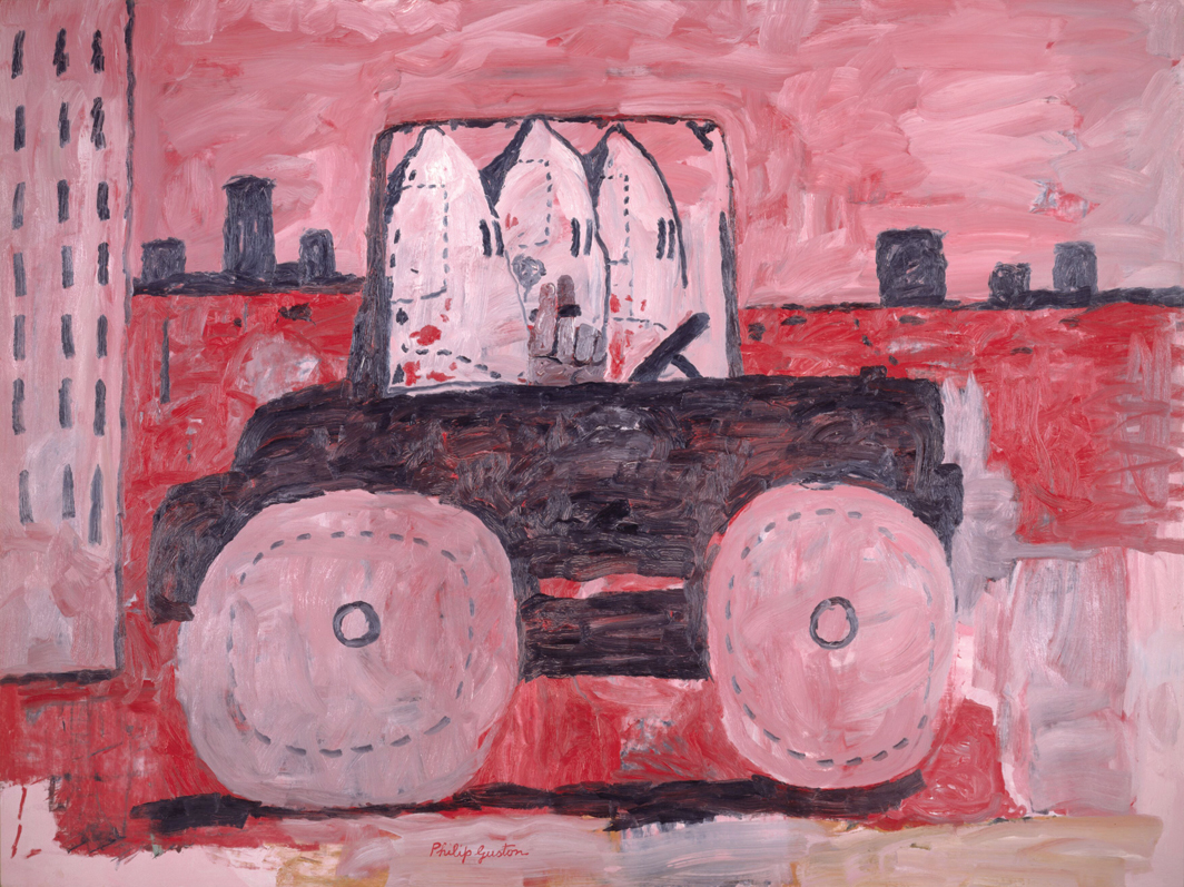
Philip Guston
Oil on canvas, 195.6 x 262.2 cm | 77 x 103 in
The Museum of Modern Art, New York
For this swatch I spent some time scrubbing together the black and red with white layered in. The palette for this work is repulsive, and I feel that’s the point.
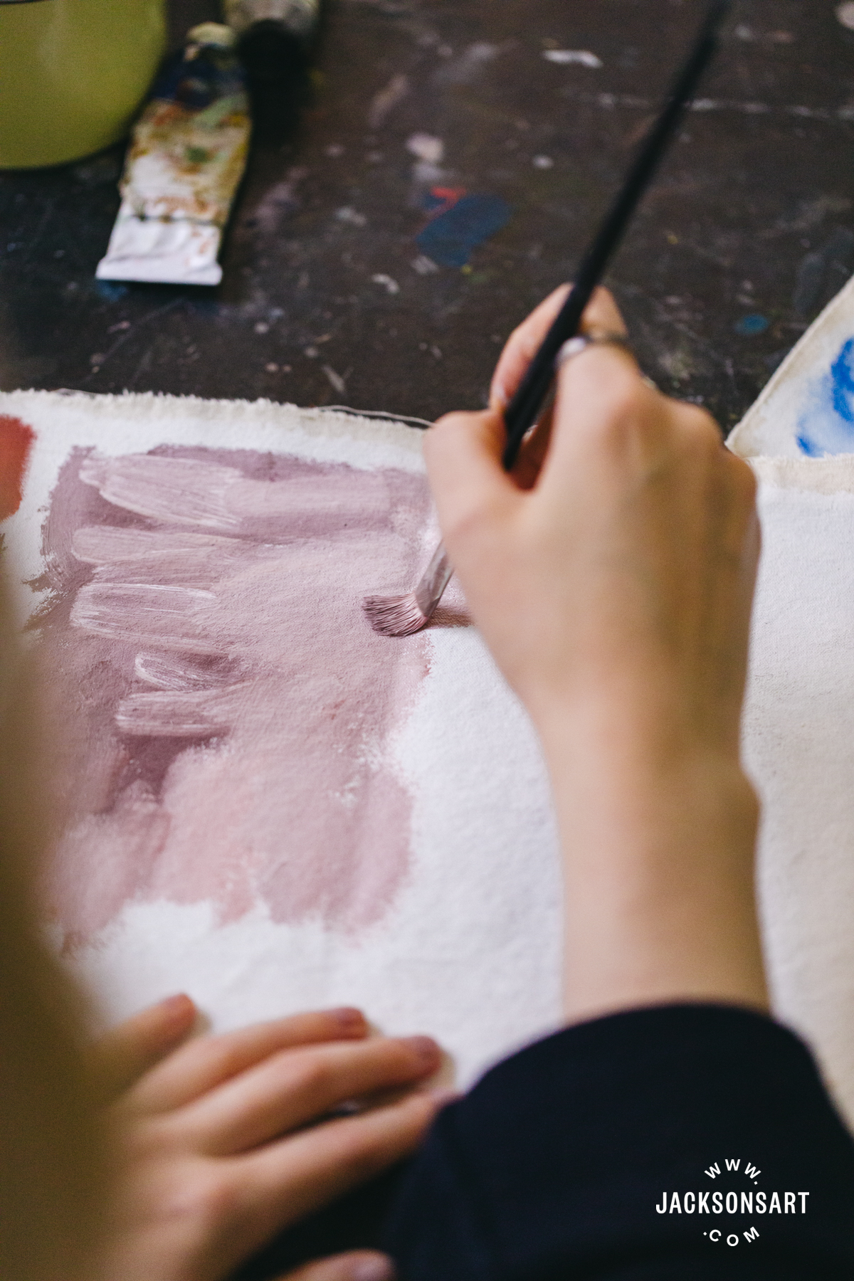
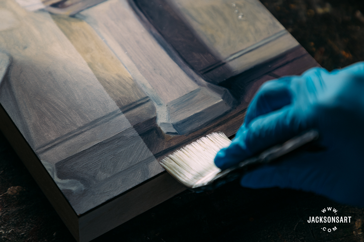
To conclude my study of Guston’s palette from the 60’s onward, I painted a study from a section of his painting Floor (1976), to test his palette in action. My example is quite small which made replicating the expansive brushwork difficult, but I hope it shows how accessible his colours are to anyone keen on trying them.
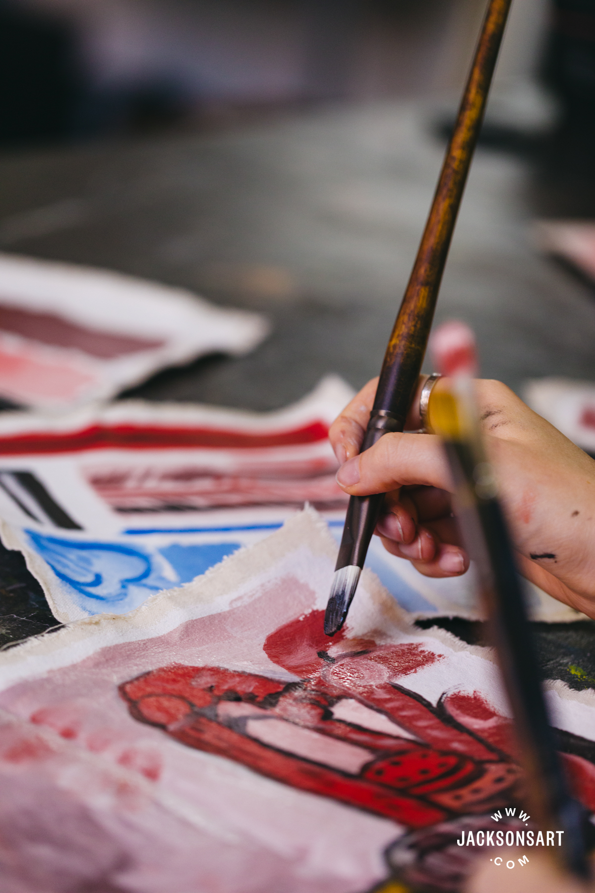
Philip Guston’s work continues to provoke controversy, conversation and intrigue over his fearless engagement with ongoing horrors to this day. Love or hate the work, he is a cornerstone of American history painting. Thinking so much in terms of Guston’s palette left me with the core question: how could I personally better use my palette to enforce the outward interpretation of my work?
Further Reading
Colour Mixing: Colourist Painting With Three Colour Palettes
Recreating the Colour Palette of Helen Frankenthaler
Pigment Colour Index: Red Pigments
Shop Oil Paint on jacksonsart.com

2 thoughts on “Recreating Philip Guston’s Grimy Pink Palette”
Wow!
Thank you for writing this article
on Philip Guston and forwarding your
insight on him as an artist.., I saw Philip
Guston a retrospective in London, UK
with my sister and fell in love with the
artist (from a viewer perspective).
It didn’t even occur to me that he has
used such a limited pallet in his
figurative works… the scale of his
paintings was also breathtaking in
themselves, and after seeing the
retrospective of his work, despite the
subject matter, I came out of the space
feeling exhilarated and awe struck by his
works.
Thank you for your insight on him as an
artist:)
Wonderful that Phiip Guston is
remembered. I got his book recently
thank you Louise.
Comments are closed.