



Gamblin colour changes were announced towards the end of 2023, with changes being made to Alizarin Crimson in their 1980 range, and Indanthrone Blue in their Artist Oil Paint range. Read on to find out what the changes are, why they have made the changes, and how you can expect these changes to impact your oil painting palette.

A Closer Look At Gamblin Colour Changes
What Is Alizarin Crimson and What Colour Changes Have Gamblin Made?
In a nutshell, Alizarin Crimson is a transparent, deep, cool red pigment that tends towards purple. It appears deep burgundy from the tube but is capable of sugary pinks when mixed with white, and often features in a standard palette selection as a cool red (alongside a warmer red, such as Vermillion). Its popularity in artists’ paints has endured for centuries, even though it is known to fade with exposure to UV light. And it is for this reason that Gamblin has decided to make changes. A more in-depth look at Alizarin Crimson can be viewed here.
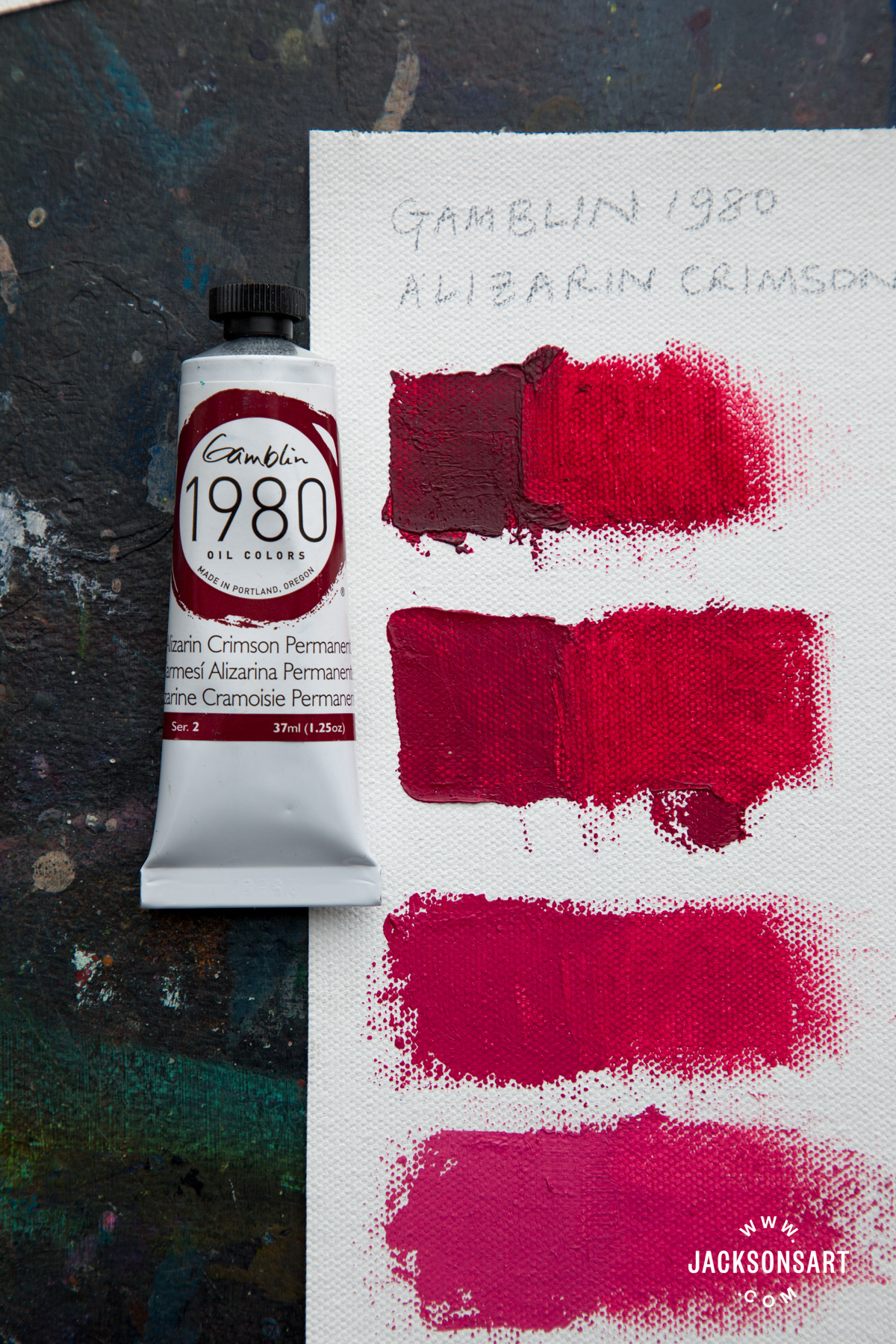
The 1980 range is Gamblin’s intermediate range of colours, made with pure pigment, the finest grade linseed oil, and calcium carbonate (in the form of marble dust), to help keep colours at a lower price point than their artist range. Gamblin has replaced Alizarin Crimson in their 1980 range with Alizarin Crimson Permanent (PR177); their artist range for now continues to include both Alizarin Crimson and Alizarin Permanent (now called Alizarin Crimson Permanent).
Robert Gamblin formulated a permanent version of Alizarin Crimson over twenty years ago, in an attempt to offer artists a more lightfast Crimson with the same working properties as the more fugitive, yet popular Alizarin Crimson. Although the two Alizarin Crimsons are similar, there are noticeable differences that it’s worth being aware of.
Mass Tone and Under Tone
Mass tone is the appearance of a colour as it is squeezed from a tube, in its purest, thickest, undiluted state. Alizarin Crimson Permanent is noticeably lighter, brighter, and warmer than regular Alizarin Crimson. On this piece of canvas, I painted three horizontal stripes of Daler Rowney System 3 Process Black and allowed them to dry. I then applied a swatch of the regular Alizarin Crimson in a vertical stripe on the left-hand side, and a swatch of Alizarin Crimson Permanent in a vertical stripe on the right-hand side. With both swatches I applied a thick impasto layer at the top and gradually thinned the paint out, with the very bottom of each stripe being a trace of the paint, thinned out with a very small amount of Gamsol and lifted with a rag. By doing this I was able to also look at the undertone; the appearance of the colour when it is thinned out. As the colour thins out the differences become less visible between the two colours, but there is a slight difference all the same; Alizarin Crimson Permanent is a fraction warmer. It looks more sugary-pink and doesn’t have the deep, almost brown tint to it, that the original Alizarin Crimson possesses. That said, it must be emphasised that the changes are slight, but not imperceptible!

Tinting Strength
Tinting strength is the measure of how much impact a colour maintains in mixes and is most easily measured by comparing the two colours when mixed with white. I tried mixing both versions of Alizarin Crimson with increasing quantities of Titanium White; I was most interested to see how the lightest pinks compared in their appearance. What my chart doesn’t show (you’ll have to take mine and Gamblin’s word for it!) is that the Alizarin Crimson Permanent has a higher tinting strength than Alizarin Crimson, meaning I needed to add more white to the Permanent version to create as close a pink as I could to the lightest pink made with the old Alizarin Crimson.

I would say that the differences between the two colours when white is mixed in are next to non-existent – the two lightest pinks are pretty much identical in terms of their temperature and hue. The only difference is the amount of white required to make the same light pink. The only noticeable differences are found higher up the chart when less white is mixed with the Alizarin Crimson pigments, and just like the previous swatches, the Alizarin Crimson Permanent appears less brown, less earthy and less cool than the original Alizarin Crimson.
Gamblin Colour Changes: Artist Oil Indanthrone Blue
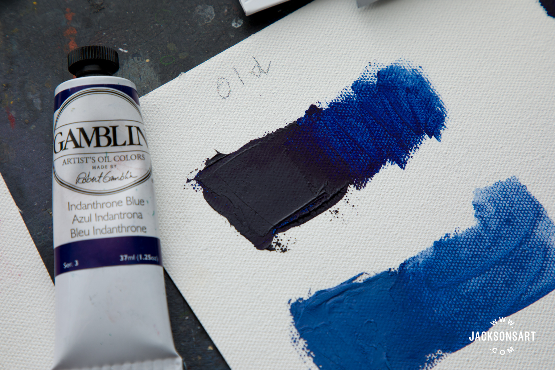
Indanthrone Blue is made with the PB60 pigment. In Gamblin’s email newsletter, they stated the following:
“Often considered our true ‘Indigo’, Indanthrone Blue is an excellent all-purpose blue with a distinct advantage for glazing techniques due to its beautiful transparency.
Don’t worry, it’s not going away! We have pivoted to a new pigment that we’re really happy with. To clarify, the pigment is still PB60, just a new variation. There is an almost imperceptible difference in mass tone and a slight difference in transparency and tint. In colorspace, Indanthrone Blue now leans more towards green in temperature as compared to violet with the previous pigment we were working with.
To check to see if your Indanthrone Blue is the updated version, look at the production date on the crimp of your tube. The starting date for this change occurred in June of 2023 (070623).”
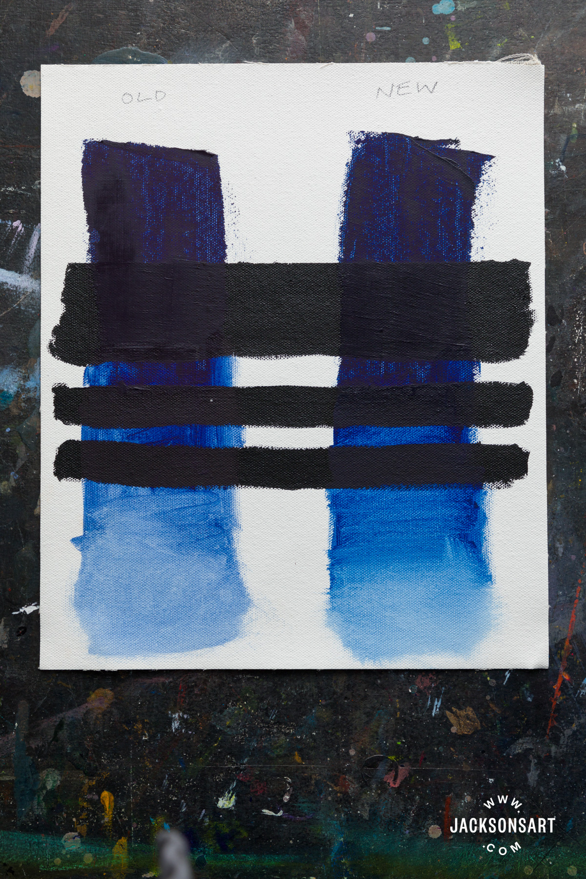
Mass Tone and Under Tone Comparison of the New and Old Indanthrone Blue
I was keen to see this change for myself and see if I agreed with the statement put out by Gamblin. And yes, on the whole, I do agree. As with the Alizarin Crimson, I applied both the new and old Indanthrone Blues thickly, using a palette knife, onto to primed canvas which I had previously painted stripes of Daler Rowney System 3 Process Black, to show the transparency of the colour. I then thinned the colour out as I took the stripe of blue further down the page. In its thick, undiluted state, the new blue appears less muted and grey, and slightly lighter in tone. As the colour thins out, the differences do become more noticeable, with the old blue appearing warmer with a stronger red bias, and the new blue looking a little cooler, with a greater bias towards green. In their thinnest state, they are quite different blues, and if you are a frequent user of this colour, the change may require a little getting used to.
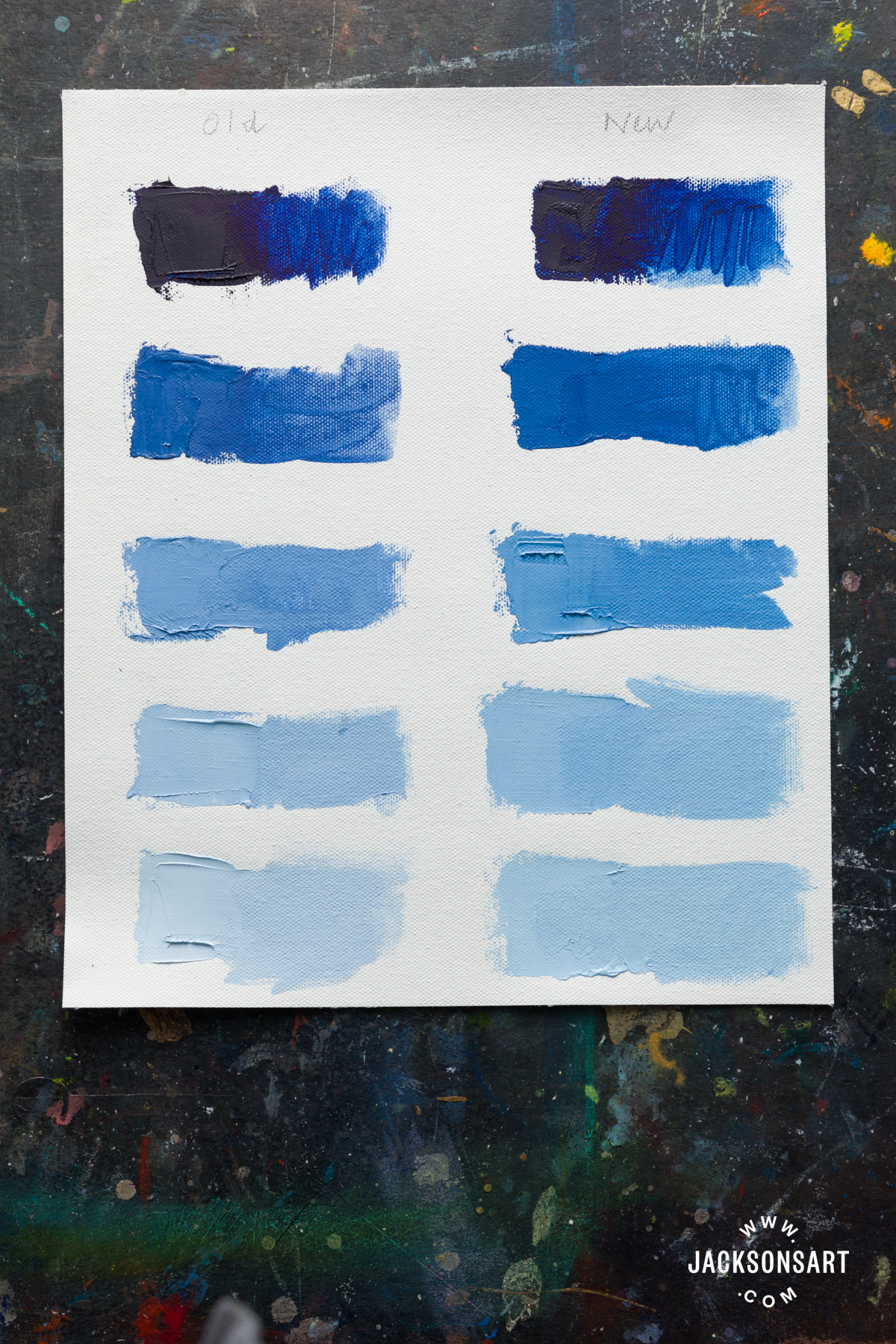
Similarly, when the two Indanthrone Blues are mixed with white, there is a noticeable difference. The old Indanthrone Blue has a slightly more violet-grey appearance, especially in the mid-tone swatches I mixed. Meanwhile, the new version of Indanthrone Blue gives a more primary blue when mixed with white, with the green bias noticed in the first chart still apparent. It had a slightly stronger tinting strength as well.
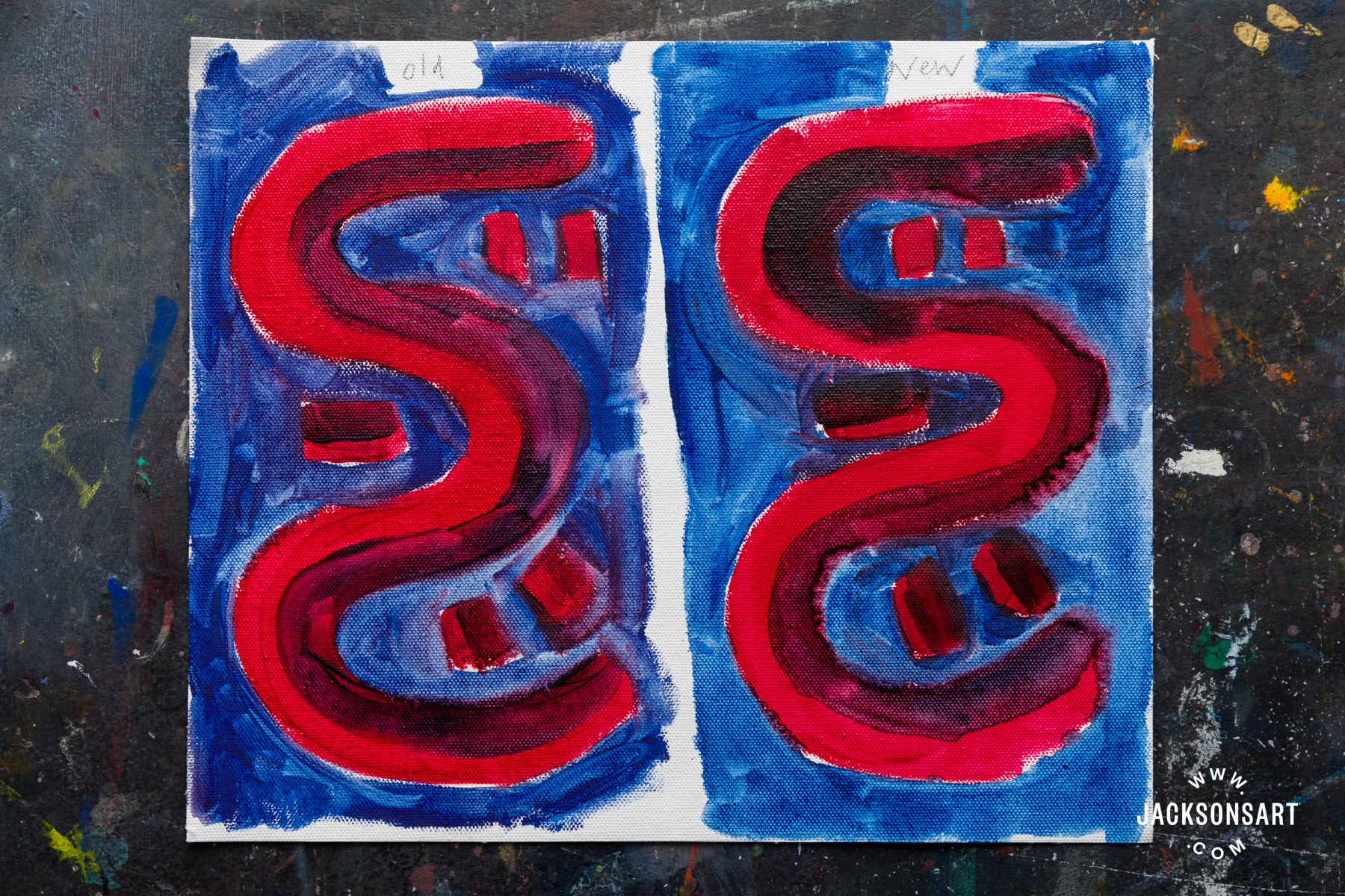
Painting With Old and New Versions of Both Colours After Gamblin Colour Changes
Lastly, for a little bit of fun, I tried painting two versions of the same abstract pattern. The one on the left is painted with the old Alizarin Crimson and the old Indanthrone Blue, while the one on the right is painted with the new Alizarin Crimson Permanent and the new Indanthrone Blue. The thinned-out unmixed Indanthrone Blue from the older batch is noticeably more red-tinted, and deeper, and the violet made by mixing it with the old Alizarin Crimson is pinker. There’s very little perceptible difference between the two Alizarin Crimsons in their unmixed state. By comparison, the new abstract pattern study shows a more green-tinted Indanthrone Blue around the curvy shape, and the mixed violet appears earthier, and more brown.
As you might expect, the colour changes with both colours are very slight, but if you need to accurately colour match then you are likely to notice differences in appearance and behaviour. For those of you unfamiliar with working with Gamblin Oil Colours, I heartily recommend you try them out as they are intensely saturated, and a real pleasure to work with.
Further Reading
Colour Mixing: Eight Reds in Six Restricted Palettes
Holbein Artists’ Gouache Irodori Autumn Palette Review
Pigment Stories: The Enduring Appeal of Alizarin Crimson
Pigment Colour Index: Red Pigments
Shop Gamblin Artist Oil Paint on jacksonsart.com
Shop Gamblin 1980 Oil Paint on jacksonsart.com


6 thoughts on “A Closer Look At Gamblin Colour Changes”
I use watercolour and acrylic but will still
happily read anything about pigments!
This was a great article, thank you. I love
seeing the subtle differences like this, and
the Alizarin Crimson versions are so
interesting. They seem to switch between
warm and cool as they are more diluted
with the Permanent version becoming
suddenly the cooler one at their most
thinned or tinted. I’d be curious what
pigment(s) are used in the Permanent
version. Both versions are lovely.
Honestly, on the other hand, I think Gamblin’s new
PB60 is a crime against pigments!
Indanthrone Blues should just not lean
green. They can be nearly neutral warm or
warm but cool is just … wrong.
Hi Lori,
Thank you for your comment. That’s really observant of you, and brilliantly put – the temperature does fluctuate at different thicnesses of the paint layer with the Alizarin Crimsons. Permanent Alizarin Crimson is made with Anthraquinone Red PR177 (I’ll add this into the article, an oversight on my part!)
As for the Indanthrone Blue – it is an unusual to have Indanthrone tend toward green, but I can see how it could be a useful colour to have in ones armoury.
With all good wishes
Lisa
Hi Lisa,
I enjoyed reading this article about the
Gamblin colour changes. As one who uses
Indanthrone and particularly love the “old”
red leaning version, I’m not so keen on the
new version. I’m wondering if you could do a
comparison of various brands of
Indanthrone? I’m interested in finding one
that is more red-leaning.
Thanks,
Anne
Hi Anne
Thanks so much for your comment. The new Gamblin Indanthrone Blue is a bit of an anomaly with its green-leaning qualities, but rest assured all other Indanthrone and Indanthrene Blue oil colour that we sell in other brands are the usual red-leaning hue that is synonymous with the name.
All good wishes
Lisa
I love to paint. Am not an artist tho. Just for
fun. Loved the article. Thank you. Heading
out to buy more paint. Paint Poor Sandy.
Thanks Sandy! Anyone who paints is an artist in my opinion. Hope you are paint rich Sandy now.
Comments are closed.