



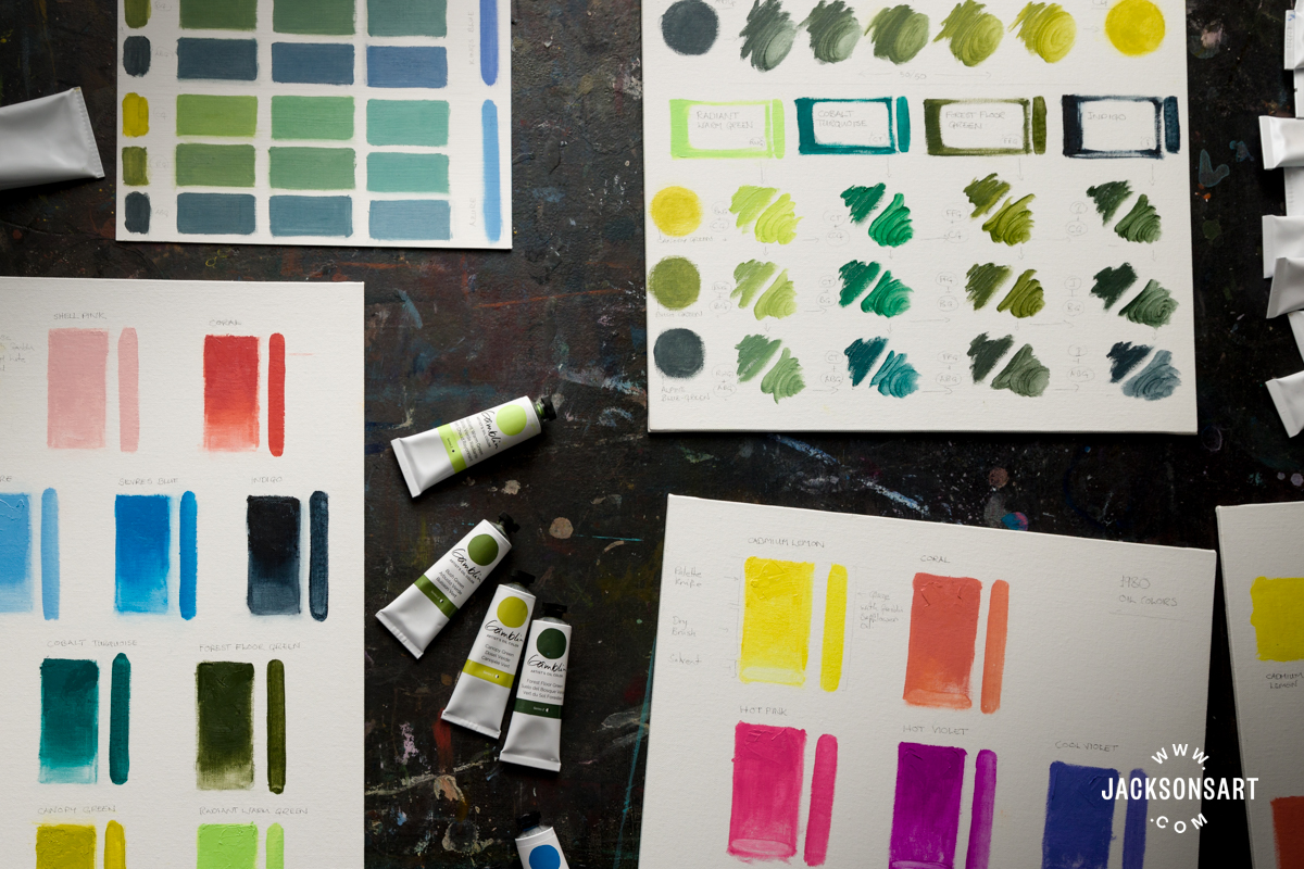
Gamblin began 2026 with the release of 24 new colours across the Artist’s Oil Colour and intermediate 1980 Oil Colour ranges. In their introduction to the launch, they note that the human eye can discern around five million shades of colour – no wonder new colours continue to pique artists’ interest. At a glance, the new Artist’s Oil Colours suggest great mixing potential for oil painting, with endless possibilities for lush greenery and atmospheric skies. Meanwhile, the high-impact colours joining the 1980 Oil Colours are tempting to use straight from the tube. I’ll take a closer look at the new Gamblin Oil Colours, exploring how they might be used, and test some colour mixing possibilities.
Introducing 24 Innovative Oil Colours From Gamblin
A Closer Look At The New Gamblin Oil Colours
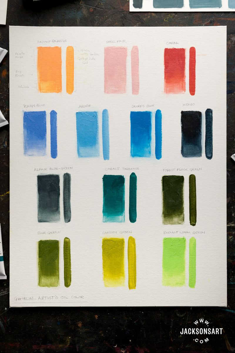
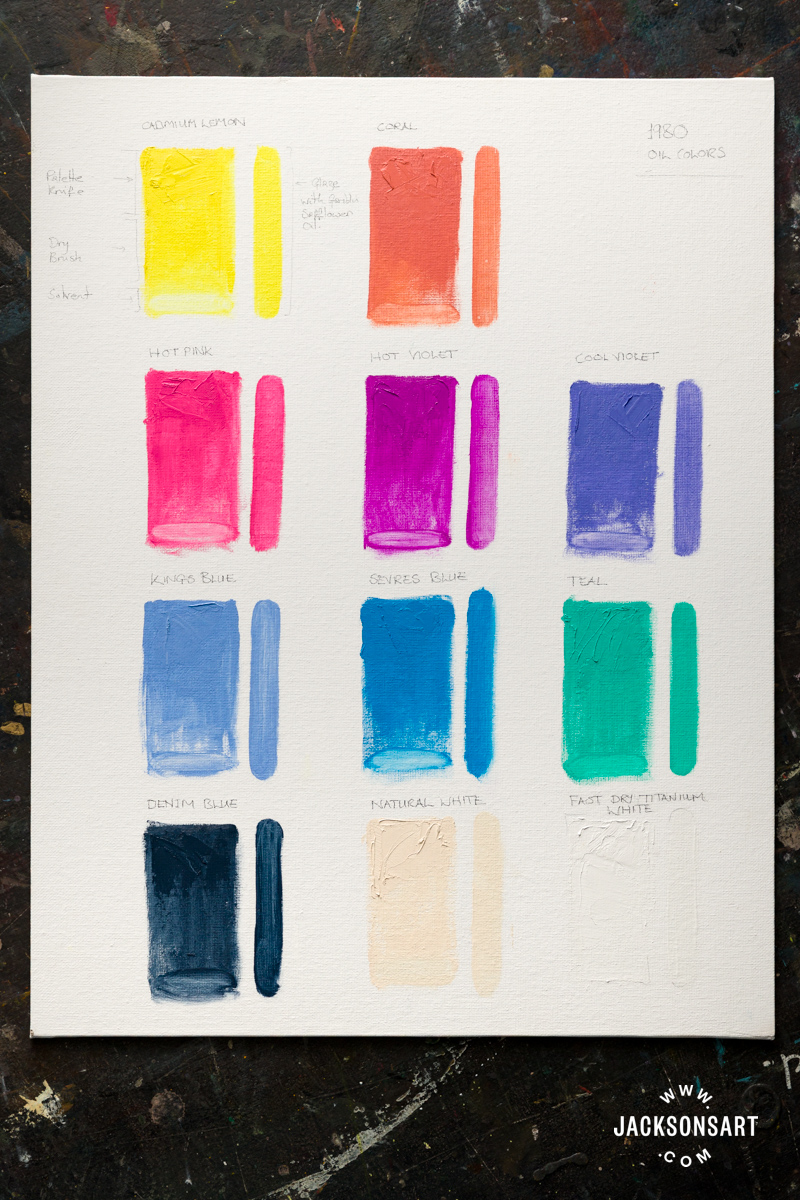
To begin with, I swatched each of the new colours on Jackson’s Canvas Boards, applying each neat with a palette knife at the top of the swatch, brushing through the centre, and thinning at the base. On the right, I used Gamblin’s Galkyd Lite Gel for an even, translucent glaze.
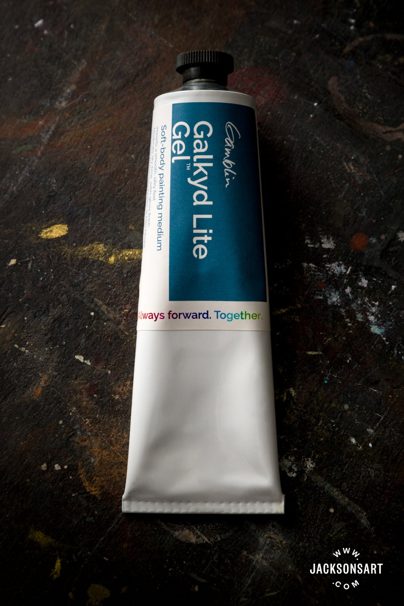
There are 13 new Artist’s Oil Colours and 11 new 1980 Oil Colours.
In the artist-grade, Artist’s Oil Colours, there are three warm colours: Radiant Orange, Shell Pink, and Coral.
There are four blues: Kings Blue, Azure, Sevres Blue, and a deep, dark Indigo.
Finally, there are six greens: Radiant Warm Green, Canopy Green, Bush Green, Forest Floor Green, Alpine Blue-Green, and Cobalt Turquoise, which are two very different blueish greens.
The 1980 Oil Colours are Cadmium Lemon, Coral, Hot Pink, Hot Violet, Cool Violet, Kings Blue, Sevres Blue, Teal, and Denim Blue, as well as two whites, Natural White and Fast Dry Titanium White.
Three colours appear in both ranges, and fewer than 20 traditional pigments make up this broad range of colours. Additionally, there are two fluorescent pigments.
Returning to Gamblin’s introduction, they poetically note that available pigments are ‘scattered unevenly through colour space like constellations’. With established colour systems for oil painting already in place throughout Gamblin’s ranges, these colours are designed to bridge such gaps, helping artists reach even more precise hues with ease.
The Colours Shared By Both Ranges
In creating the more affordable 1980 range, Gamblin does not compromise on quality or their carefully selected pigments. This range is made with the same pigments used in the Artist’s Oil Colours, but at a slightly lower concentration, and with the addition of marble dust – a traditional, inert material that adds body. The result is a paint with true, reliable colour with a slightly softer intensity than the artist-grade counterpart.
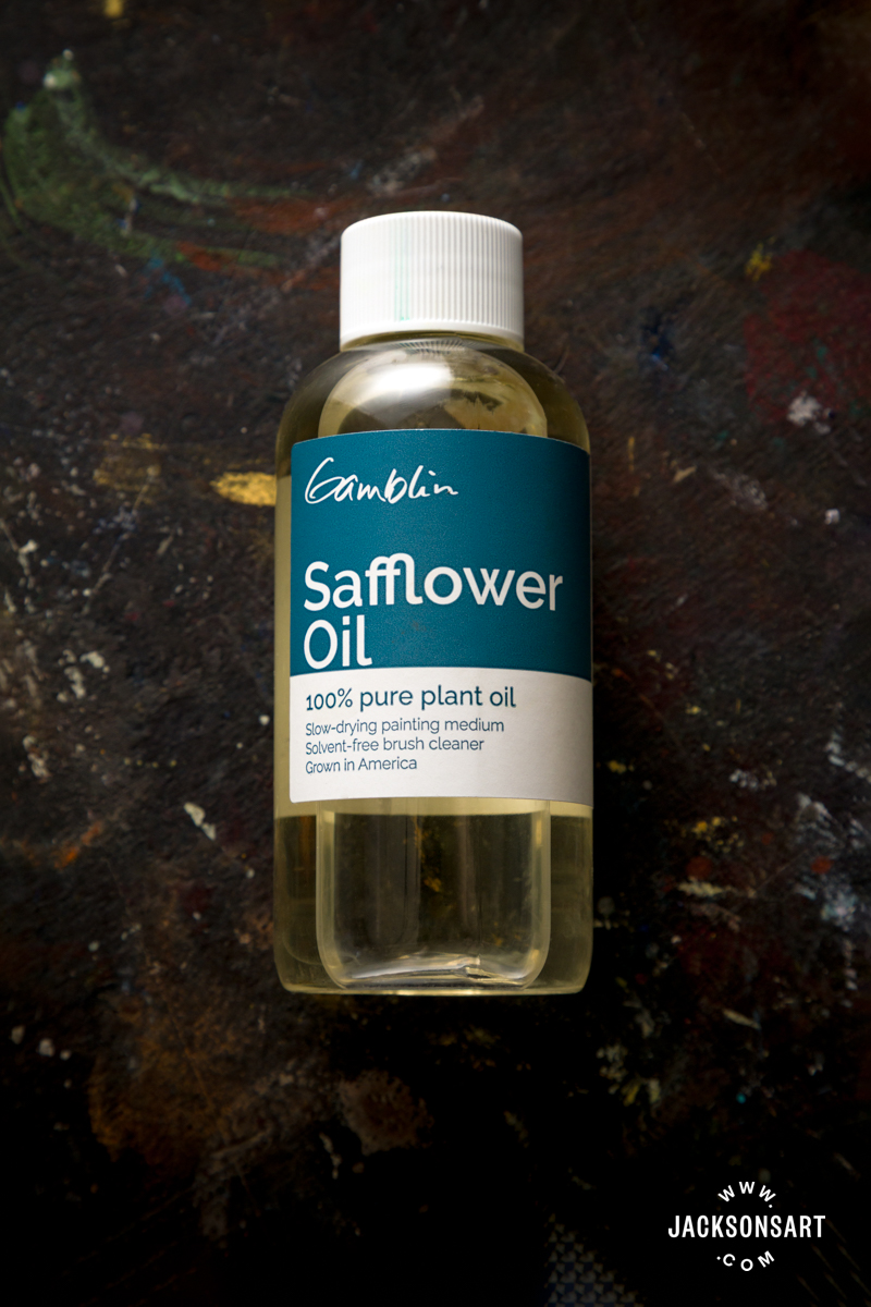
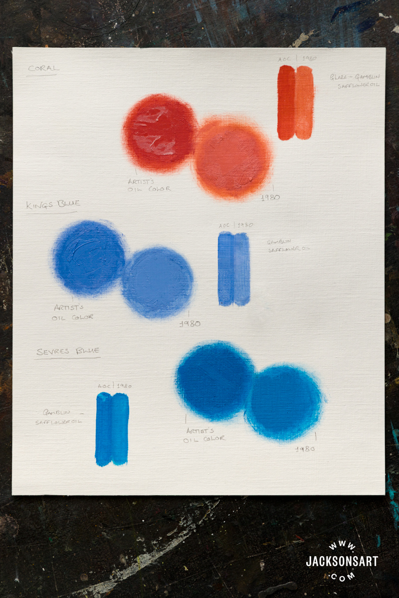
Side by side on Jackson’s Oil Paper, both neat and with Gamblin Safflower Oil, the correlation in hue and difference in intensity in Coral, Kings Blue, and Sevres Blue are visible.
Coral fills a gap felt by many painters as an opaque, orange-leaning red. Permanent (Benzimidazolone) Orange and Naphthol Red remain bold even blended with Titanium White, as both iterations are. Orange-biased tints yield beautiful pinks, as evidenced in the 1980 version of Coral.
Kings Blue is warm, verging on violet. Composed of Ultramarine Blue and Titanium White, it’s highly valued in painting skies; the softer 1980 version could be used directly for a late evening sky.
Sevres Blue is a well-balanced combination of Red Shade and Green Shade Phthalo Blue pigments with Titanium White. It is on the cooler side, reminiscent of Manganese Blue but more intense in a tint (colour mixed with white). Inspired by 18th-century Sèvres Porcelain, it resembles the glaze known as ‘Bleu Céleste’. The Artist’s Oil Colour version appears warmer, likely due to less cooling white.
Interestingly, the historical cobalt-based Kings Blue was also used as a porcelain glaze in 18th-century England.
New Blue Tints with the 1980 Whites
The two new 1980 white additions could easily be overlooked, but choosing the right white can add both subtlety and dynamism to an oil painting. Natural White is Titanium White with Natural Brown Iron Oxide. Relative to the cooler bias of Titanium White, this could be perceived as a warm white; in fact, Gamblin intended to create something close to neutral white.
Gamblin Oil Colours already feature a Fast Dry Titanium White in the Artist’s Oil Colours; this new 1980 Oil Colours equivalent has a drying time of approximately 24 – 48 hours. Fast-drying white is useful for building layers quickly or creating a grisaille (tonal grey) underpainting.
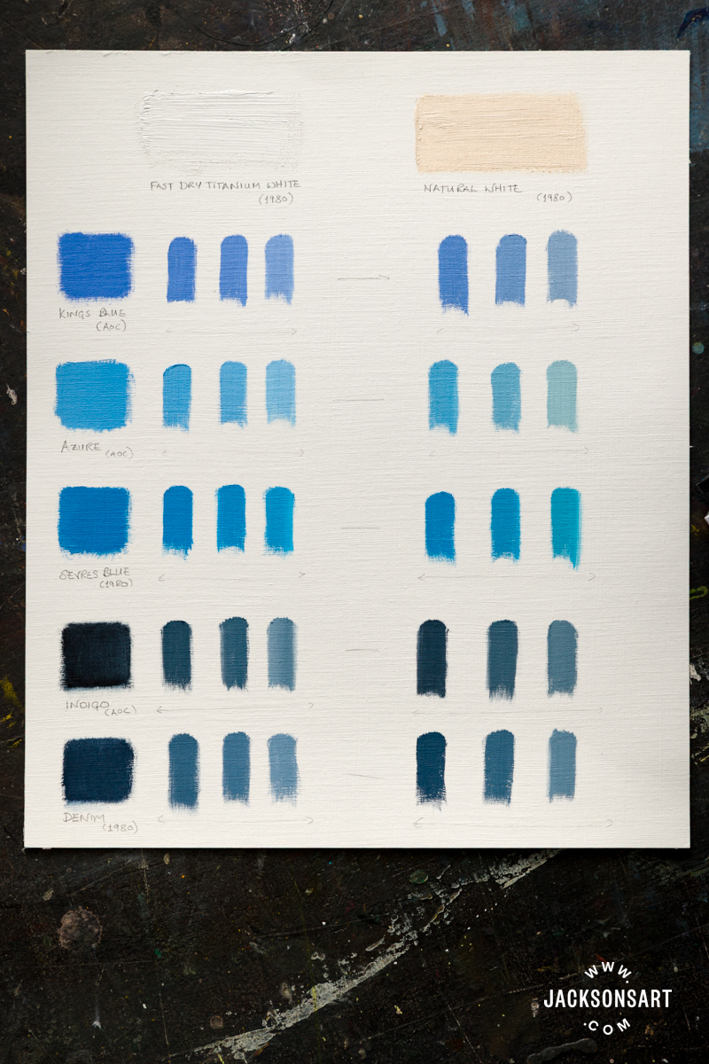
On Jackson’s Oil Paper, I assessed the range of tints using these whites with Kings Blue, Azure, and Indigo from the Artist’s Oil Colours, and Sevres Blue and Denim from the 1980 range.
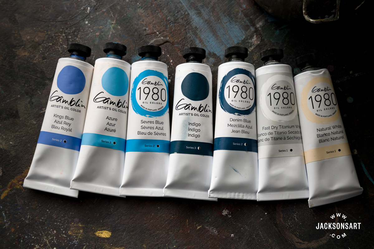
In addition to the colours shared across both ranges I mentioned, Indigo and Denim are close relatives; Gamblin were so taken with one of Indigo’s tints they developed this lighter version for the 1980 range. This choice demonstrates the value of premade admixtures for consistency. I could theoretically have mixed Denim using Indigo and White, but 25% white is too high here. For a small daub of paint, accuracy and uniformity can be tricky.
Fast Dry Titanium White creates crisp, bright tints while Natural White creates subtle variations according to the pigments at play. In mixtures with Azure, the Iron Oxide interplays with the cool blue and creates greenish hues, approaching a delicate duck-egg blue. Kings Blue yields a subtler grey-blue. These blues do appear more neutral – and natural – when mixed with Natural White, adding to the versatility of these intense colours.
High Intensity 1980 Colours
On the subject of intense colours, Hot Pink and Hot Violet are eye-catching. They exemplify the ‘loud’ colours and pop culture of the ‘80s that inspired this collection.
Fluorescents are seldom found in oil paint ranges. The pigments required to produce their luminous colours are naturally translucent and tend to have low lightfastness. While their archival qualities have limitations, many artists embrace fluorescents for their immediate visual impact – prioritising this over permanence. Many artists throughout history have done the same by using fugitive pigments.
Gamblin has achieved buildable fluorescents with enough body to retain brushmarks and hold shape, and which are almost fully opaque. This reportedly required maximum pigment load, matching that of the Artist Grade colours; however, these colours are exclusive to the 1980 range.
On Jackson’s Canvas Board, I mixed the boldest 1980 colours to see how the fluorescence performs in admixtures and to compare the intensity of the other colours.
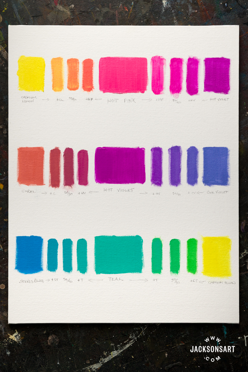
The Hot Pink holds strongly in mixtures with Cadmium Lemon. The Cadmium Lemon produces bright greens when mixed with Teal, a blend of Phthalo Greens, Yellow and Blue Shade, and Titanium White. Cool Violet (Dioxazine Violet, Ultramarine Blue, and Titanium White) creates a spectrum of vivid violets with the Fluorescents. Not at all muted, though slightly less intense, are the shades of rosy pink created with Hot Violet and Coral, and the blue-greens of Sevres Blue and Teal.
This is a bold, stand-alone palette, but there are opportunities for nuance among these colours. They may be used together to produce a high-octane painting, selectively as accent colours in a more muted palette, or combined with the white of your choice to create refined pastel shades.
The risk of fading can be mitigated by avoiding direct sunlight, using UV-protective varnish or framing behind museum glass.
New Radiant Artist’s Oil Colours
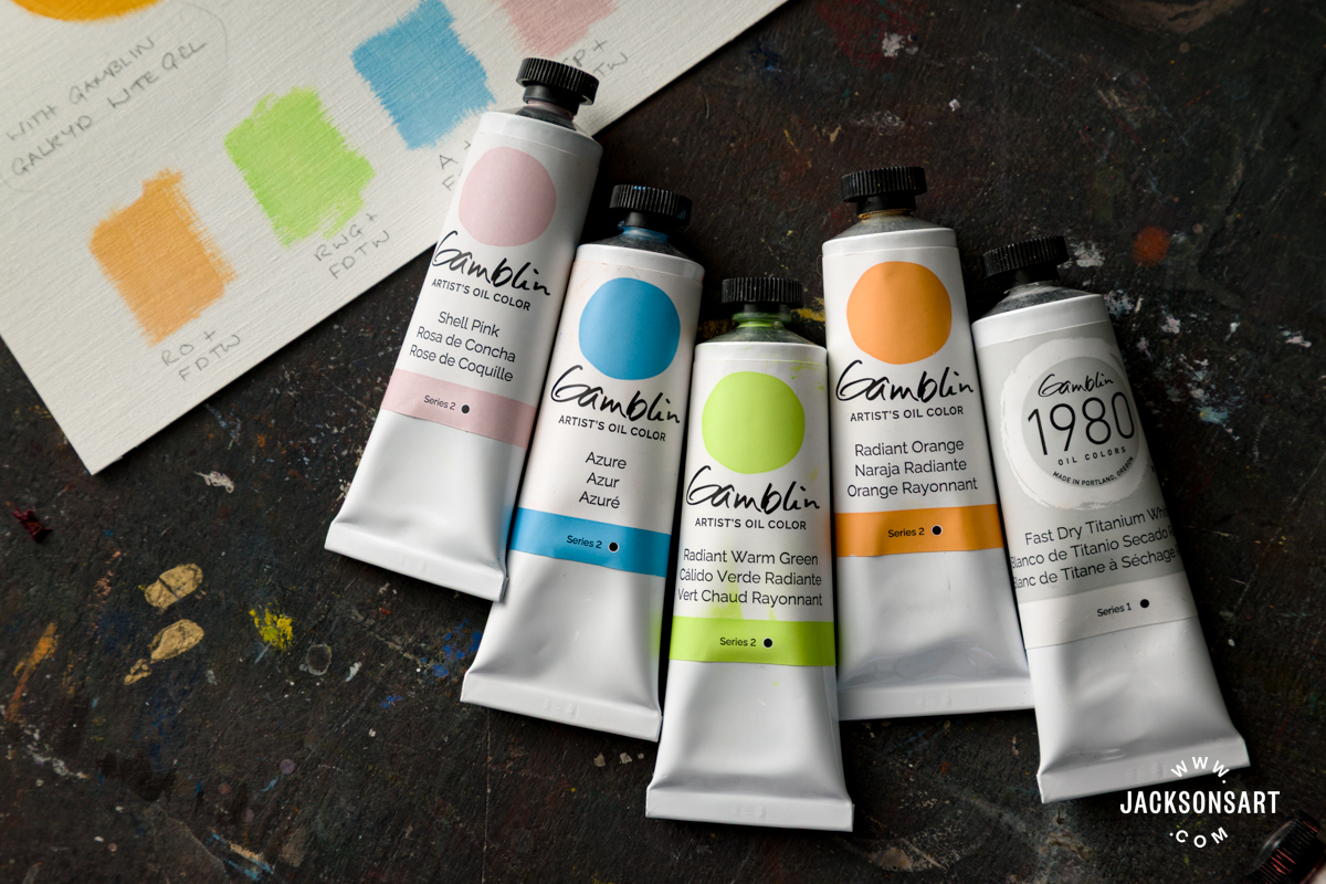
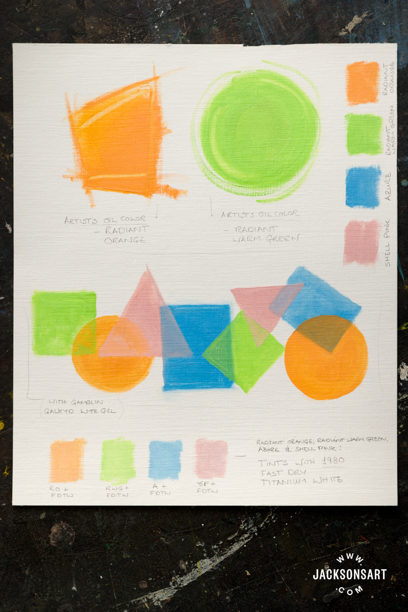
While not fluorescent, Gamblin’s Radiant colours are certainly luminous. Pigments are mixed to maximum intensity with white while maintaining a consistent tonal value (7 on the Munsell Scale, with 0 being black and 10 being white). They may be used directly, glazed, or mixed with other colours without over-darkening. Radiant Orange and Radiant Warm Green join eight other Radiants in the Artist’s Oil Colour range.
Shell Pink and Azure are not in the Radiant family but have been made using the same principles. Both are lighter in value than the Radiants.
These colours are high coverage, but for this test, I experimented with translucency. For the first shapes, I used a dry brush to ‘scumble’ the green and pink over the orange, distributing neat colours unevenly. Working wet-on-wet, using Gamblin’s Safflower Oil, I was able to limit mixing on the surface with careful control.
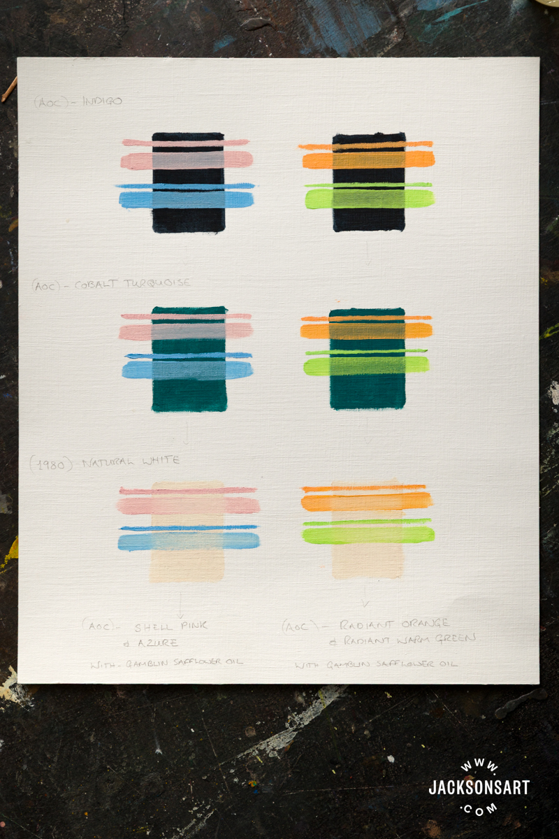
For my next test, I tried glazing over dry colours – Indigo, Cobalt Turquoise, and Natural White. I brushed a thin line of each colour straight from the tube to compare their default opacity, and below this, I brushed a wider line, which is a translucent mixture of the paint combined with Gamblin Safflower Oil. Each colour in their glaze retains its character uniformly while allowing the colour below to suggest a shadow or highlight. This technique achieves subtle colour shifts as an alternative to mixing on the palette.
The Mixing Potential of Gamblin’s ‘Useful Greens’
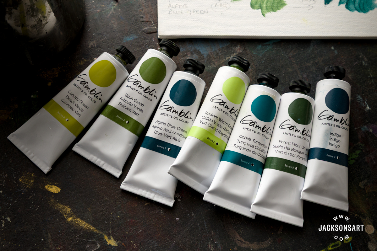
Nearly half of the 13 new Artist’s Oil Colours fall within the green family. For many painters, this will be as exciting as Hot Pink. Four are described by Gamblin as ‘Useful Greens’.
Canopy Green is the lightest, Bush Green is the middle, then Forest Floor Green, and finally Alpine Blue-Green, the deepest of the Useful Greens. Together, they form a system for mixing a wide range of greens. Canopy Green and Bush Green are both formulated with Cadmium Yellow and Ultramarine. They differ in their secondary yellow pigment – Natural Yellow Iron Oxide lends Bush Green a more earthy tone, while Diarylide Yellow enhances the bright intensity of Canopy Green. Bush Green and Alpine Blue-Green have Natural Brown Oxide in their make-up, with the latter blended with Cobalt Blue Light.
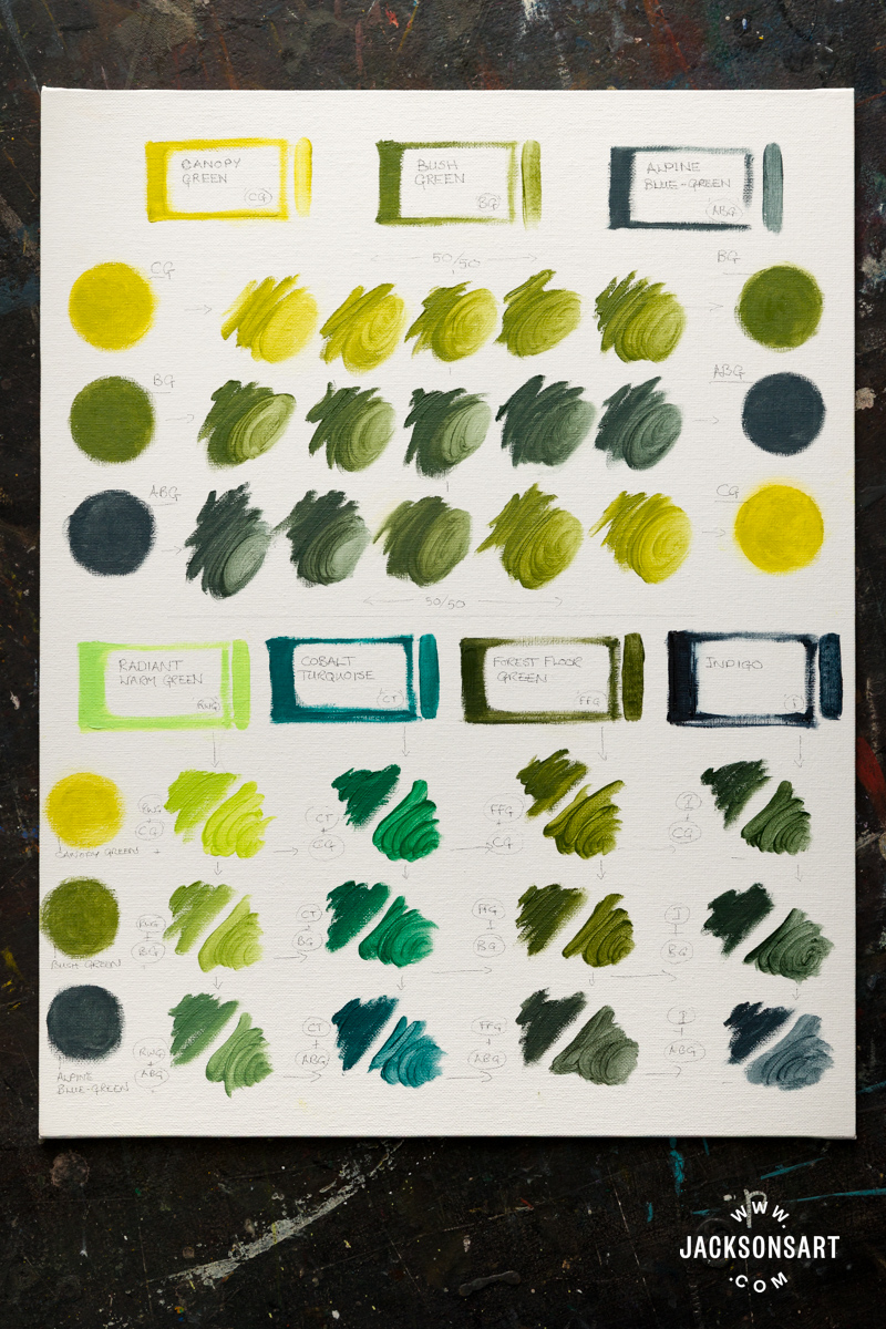
I tested mixtures between Canopy Green, Bush Green, and Alpine Blue-Green and then extended this to include Radiant Warm Green, Cobalt Turquoise and Forest Floor Green, as well as Indigo to achieve the deepest greens possible within this range.
Working on Jackson’s Canvas Board, each mixture is painted neat on the left-hand side and extended with Gamblin Galkyd Lite Gel on the right.
The Useful Greens sit comfortably together, and their shared pigments allow for harmonious admixtures. The second set of mixtures demonstrates that this can be extended to include other greens when a different hue is required. With Cobalt Turquoise – an elegant single pigment colour from the Artist’s Oil Colour range – the mixtures have produced a range of emerald greens which relate as consistently as the Useful Greens alone.
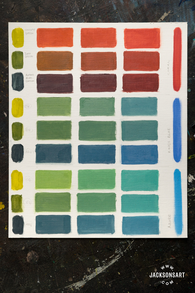
The system extends further. Coral mixtures produce browns ranging from burnt orange to a deep maroon, and blue mixtures provide a spectrum of teal and lichen green, as shown in these mixing tests painted on Jackson’s Oil Paper.
At face value, the new colours are exciting. Gamblin has delivered luminous tints, rich greens and deep turquoise, alongside bold fluorescents. These additions acknowledge the appeal of immediacy and impact in oil painting.
A closer look reveals that this expansion strengthens the colour systems already in place throughout Gamblin’s oil painting range. Additions to the value-controlled Radiants, the practicality of the 1980 Whites, and the interrelated Useful Greens facilitate precision and predictable mixtures when needed.
The coherence throughout these Gamblin Oil Colours makes navigating colour space towards specific hues more accessible for careful planners and intuitive painters alike. We may not have reached five million colours, but Gamblin says they have more on the way.

Further Reading
Underpainting in Oil and Acrylic
Gamblin Oil Colour: Choosing From Their Many Whites
Review of Gamblin’s Set of Three Grey Colour Mixing Oil Paints
In Conversation with Pete Cole of Gamblin
Shop Gamblin on jacksonsart.com



1 thought on “Introducing 24 Innovative Oil Colours From Gamblin”
LOVE all the new colours and the fab range
of mixes! Thanks Louise for a very thorough
test of the new Gamblin oil colours 🙂
Comments are closed.