



Based in Leeds, Robert Dutton is a contemporary mixed media fine artist with a career spanning 30 years in the creative industry. Along with being an ambassador for Canson and tutoring/hosting artist holidays, his expressive mixed media practice focuses on delicate, fragile landscapes that are a balance of spontaneity, calculation and control.
Christine: Where and when did you learn to paint?
Robert: I studied ‘proper‘ art I would say realistically from the age of 16 when at county secondary school in Lancashire under a great teacher called Mr Gibson who ran the art department at Burscough County Secondary School. The extra lessons I took instigated great success with a new ‘O’ level exam at the time, ‘The 16+’. I gained one of the top marks in Lancashire and with several other promising young artists my work was exhibited in Preston.
The next stage of my creative development continued when I went to Skelmersdale Sixth Form College and the art department was run by two great artists who allowed an amazing diversity of creative freedom despite the constraints of an ‘A’ Level’ examination dictate. Their combined inspiration once again helped me to get another top mark with my art – ‘A-Level’ A+, which made me think that perhaps a career in art might be a good direction. The next step in my early creative training would decide that for sure!
I was accepted at ‘St. Helens School of Art’ in St.Helens, Merseyside which was fantastic as it was really the one I wanted. The tutors and principal were once again amazing. They pushed the students and got the best from them – including me. Lots of art disciplines were covered from sculpture, ceramics, life drawing, printmaking, painting skills and of course, Graphic Design and Illustration.
For those who wanted to continue with a fine art inspired career or commercial art career, as Polytechnic (now all converted to Universities) interviews started to loom, decisions had to be made big time for what we were about to undertake for the next three years ahead – plunging us into the realms of really ‘serious’ art training. I chose a combined Degree Course (with Honours) at Hull College of Art and Design embarking upon the first big steps in a career as a Graphic Designer and Illustrator. After a 27 year career as a commercial artist, I took the plunge to become a full-time fine artist once the demands for my work and style had increased sufficiently for me to do so. Now a new age of learning has begun both about myself and what I regularly successfully achieve (to include several fine art awards) with every day being an adventurous, satisfying and creative discovery – all of which I pass on generously to my students.

Christine: What inspires you to paint landscapes, is there a specific part of the world you love capturing the most?
Robert: Over the years my subject matter and chosen locations for painting have changed. Almost 20 years ago ‘flavour of the month’ was bright colourful Impressionistic Mediterranean views. That market demand suited me perfectly as at the time those subjects and style was what I wanted to paint too – especially with pastels.

Over the years, as my reputation grew and demand for my work increased I’ve been able to paint other subjects too with equal success with a looser impressionistic style. My beloved northern landscapes, particularly the South Pennines and The Lake District, are the areas I like to paint most. I often choose to paint with mixed media which gives added depth and expression to my work to include my coastal paintings too.
The wilder and sometimes remote parts of the East Coast of Yorkshire and moors are also inspiration painting locations. There is always something new to see and paint throughout the year but it is the colours of Winter, Autumn and Spring I like to paint the most.

Summer is too ‘blowsy’ – the landscape colours are too saturated in greens of a similar tonal value and it’s a real struggle to be inspired by such depressing monotony so I head for the coast and paint Norfolk – another recent favourite painting haunt we have been visiting for over a decade now. Early sunrise or late evening light during the Summer months are something to behold and well worth getting the brushes out for setting the alarm early for!
Christine: The colours you use within your work are often bold and vibrant – is there a particular reason for this?
Robert: Not all the paintings I create are bold in colour. I’ve created a whole series of mixed media paintings simply based on black and white stripping out the colour. When using colour, it is the tone of it that is the most important part of its use in my work. I teach my students that colour is something not to be afraid of – it should be celebrated, not feared. Confidence with colour handling comes with confidence in delivery – how you paint in other words. I’m more an expressive tonal painter of light realistically. My paintings have strong passages of light within them offset by areas of deep intriguing dark shadows. Placing dark against brighter areas emphasises the colours in the light – hence the reason why the colours look so bright, strong and bold in my work I suppose. It’s just an observation of keen contrasts of tone in essence, that’s all.
Christine: Within your work you use a range of mediums, have you got a favourite and why?
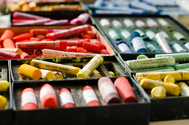
Robert: Having worked with different media over the years and gained an intimate and technical knowledge when using them, I find it really exciting now to combine several together in my modern, expressive and contemporary paintings to both draw and paint at the same time. Pastels are my number one ‘go to first’ medium since they allow me to paint and draw with them directly and immediately in a painting at the same time. The versatility of the medium I believe is unparalleled with any other and many students appreciate their forgiving nature, ease of use and the skills they learn from me for both painting and drawing at the same time to create paintings they are really proud of.
However, a recent discovery has been Royal Talens ‘Amsterdam Acrylic spray paints (used together with both their ‘Standard’ and ‘Expert’ series paints), which are really exciting to use and have pushed my paintings into new areas of creative discovery I thought previously possible. Most definitely a painting media of the modern age especially the spray paints!
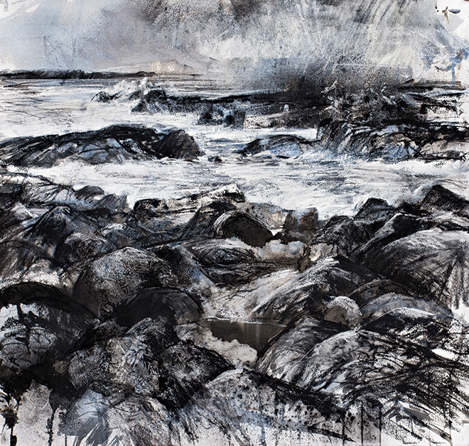
Several all of my black and white expressive mixed media paintings combine different media during the creative process too. Greater depth is created in the paintings as a result. Top quality Nitram Charcoal from Canada in essence is what I use together with Derwent XL Blocks (both Graphite and Charcoal), with the addition of black and white acrylic inks and the all important ‘Quink’ Ink made by Parker. Adding water to this ink helps create beautiful subtle tones of brown or blues on the painted support which are unpredictable in many respects which I really like. The last thing I want is for any my paintings to look predictable!
Christine: How do you know when a painting is complete?
Robert: That’s a tough one! In essence, I know a painting is complete when it tells me so. How does it do that? After a studio session, all the paintings I have been working on are allowed a period of ‘rest’. That is to say, they are ignored, put to one side and left for quite a while. With several themed paintings on the go at any one time, a constant cycle of painting is underway. When I do decide to return to a particular theme of paintings I can immediately see what needs to be done with them to complete them. I have a set standard frame made at different sizes I am working too so it really helps to drop the painting into the frame as well. That makes all the difference and often it’s then just a wrap! I have learnt by experience not to get to impatient with my work over the years. Letting the work evolve naturally is far better than working to much on any one painting in a prolonged sitting and overworking it and ruining it.
Christine: You teach art holidays and workshops, what do you find you get out of teaching and how do you feel it informs your practice?
Robert: I have been tutoring several popular art holidays with leading establishments in the UK and abroad in Spain now for a number of years. All art holidays for students of mixed levels of ability have important creative and balanced creative experiences between outdoor and indoor studio activities covering lots of different subjects and endorse what I do.
My short courses and weekend workshops for a number of established art centres and art societies throughout the UK are rewarding in so many different ways too. Teaching really has had a good input to my work for a number of reasons – the core being that through engagement and articulation with my students the creative discoveries I make in my own studio, personally clarify for me my own artistic direction which inspires increased confidence in what I’m creatively doing in my own studio. When I advise about loosening up, looking for wider source material, experimenting with different media, it’s good to know that this is just not rhetoric – I’m doing this too.

Christine: What does your studio look like, do you prefer working outdoors in the elements?
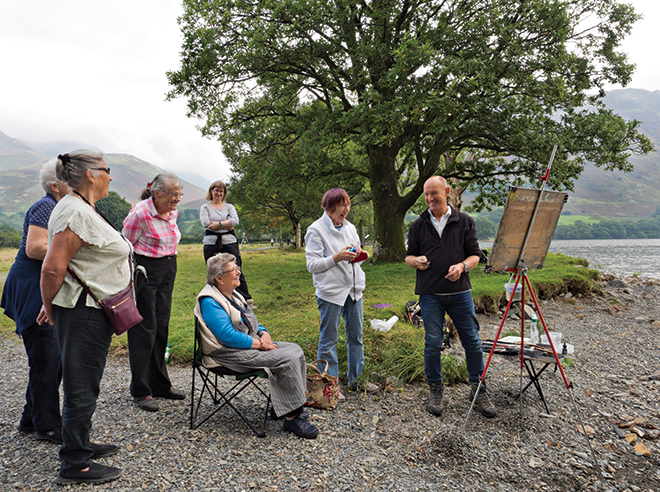
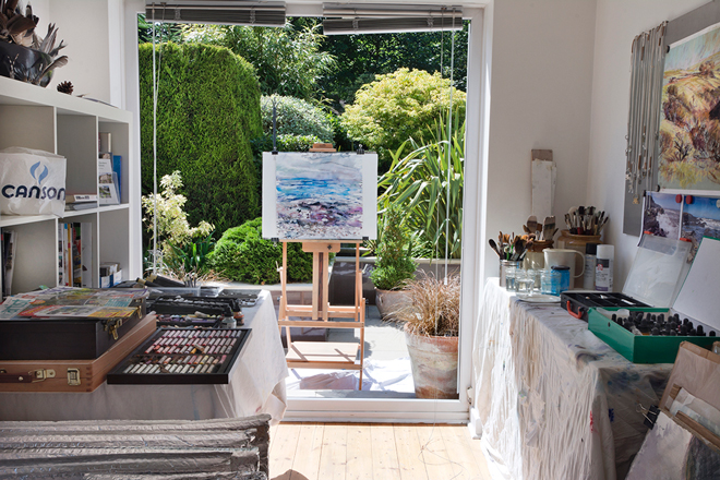
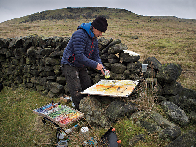
Robert: When painting I much prefer being outdoors as much as possible. Basically this is my open air studio! Being ‘Out there amongst it’ in all seasons painting, drawing and creatively visually documenting my environment, the direct contact with my landscape yields the greatest results than say working from photographs alone ever can. By immersing myself directly in the landscape means that I’m really engaging with my subject. Being in tune with my environment helps me to produce better work because I know it, feel it, understand it and above all respect it. When in the studio at home I always have a plan, everything is in its place and it is a well organised creative space. I just hate working in a mess! It’s OK to let go and be a bit energetic when painting but after a series of studies, the studio just gets blitzed after a series of paintings have been done with an extensive clean up to create a ‘clean slate’ if you like. The studio is realistically the same square footage as a single garage. It’s south-facing near enough so my workplace gets plenty of natural light throughout the day so I can work all day in there if I want too.
Christine: Have you got a favourite artist or style of work?
Robert: Over the years my style of work has evolved. In doing so the artists I admired and respected become superseded by those I find more exciting – more relevant even. During my student days I was inspired by the work of Glen Scouller and David Gentleman amongst others. Dan Fern I found to be a very exciting illustrator (abstract even) and the work of Ralph Steadman and Ronald Searle also were an inspiration – I just loved all that dynamic line and scratchy pen work! I was continually encouraged to look and be aware of many different types of artists by my tutors on foundation course and Degree Course as I was training. That is exactly what I encourage my students to do now to help them develop individually as artists. No one can work in a vacuum. One of the greatest ways to discover creative things is obviously through practice but visiting exhibitions really helps too. There is something about being directly in front of the work – physically seeing it makes all the difference, more than print or sat at home in front of a computer looking at it ever can. Amongst my contemporaries, I find the work of watercolourist David Parfitt, mixed media painting Kurt Jackson, expressive artist Lewis Noble and American artist Elizabeth Allison from New York to be very exciting. All these artists are really pushing the boundaries and breaking the mould with what we could ever think of being the ‘traditions’ of painting. I have a deep respect for the work of Turner – particularly his later work and paintings of skies created in his sketchbooks. Amazingly free and expressive.
Figurative tonal painters I admire include the great masters such as Pierre Bonnard and the dazzling rendition of atmospheric light seen in superb paintings of Camille Pissarro and Alfred Sisley. I must mention the work of the ‘Pitman painters’ with particular reference to Norman Cornish – a real ambassador of ‘The North’ as far as I’m concerned. Kyffin Williams from Wales I’ve always admired the work of. An absolute joy to see so many of his paintings and drawings together in ‘Oriel Ynys Môn’ Gallery on Anglesey on a recent painting trip staying on the island.
In the past it was an absolute honour and privilege to have painted with a well respected and world-class artist – David Blackburn from Huddersfield who has now died sadly. Over the years, particularly during the Summer months when I was a student on degree course I would paint and draw with David in his favourite places in the valleys and moors surrounding his home town of Huddersfield. David’s landscape vision was unparalleled by any other artist then or now recognised by many collectors to include Sir Kenneth Clark. The mentoring David generously gave me has had a lasting positive effect on my work today. I see the terrain then and now we both respected surrounding his home in the south Pennines in a different light because of his influence.
Christine: What are you working on at the moment?
Robert: Presently I’m working on a number of mixed media ‘tonal’ paintings utilising all sorts of black and white media with an introduction of just one or two select colours – a little like the hand-tinted photographs if you like. I’ve always had an interest and active involvement in photography and most certainly see it as an art form. The camera being a tool to celebrate and utilise light, not a device to merely record.

Canson’s top-quality watercolour and other unique papers are like no other and perfect for my adventurous and expressive style. Working with the papers such as Canson ‘Moulin du Roy’ 100% cotton watercolour paper in ‘Hot Pressed’, ‘Not’ and ‘Rough’ surfaces in weights 300gsm (140lb) and also 640gsm (300lb) allow me to have so much creative freedom as the papers are so versatile.
The heavier weight paper 640gsm (300lb) is chosen for its amazing strength for more robust heavily layered work I do on the paper to include lots of mixed media painting techniques. Royal Talens acrylic paint auxiliaries such as gesso, pumice, modelling paste and other texture gels in their versatile range are used quite often to build up an almost sculpted surface expression in very exciting ways before I even begin to paint – artworks in their own right in many respects!
As I work I will now often physically tear huge chunks from the surface of this thicker Canson paper and reglue it back into different places on the sheet. In doing so these new pieces will often overlap the governing rectangle shape or size of the paper to break the predetermined format of the rectangle. Despite working often to full sheet size I find the manufactured shape restrictive somehow. By creating my own dimensions with collage – pasting, tearing, re-glueing and gessoing again select areas, this continual process creates more of a sculptural undertaking as well, not just pure painting. This constructed and Marsden Mill, Autumn light Pastel on Canson Mi-Teintes ‘Touch’ 350gsm pastel paper ‘white’. Studio pastel painting created from many outdoor sketches and painted studies created on location over a number of weeks from frequent visits. The finished pastel painting is a culmination of gaining an intimate knowledge of the subject, all the stronger because of it. ‘Ancient Pennine boundary stones’ (detail) Mixed black and white media with acrylic ink and collage on Canson Moulin du Roy 640gsm (300lb) ‘rough’ 22 x 30 inches (56 x 76cm) reconstructed process with multi-layering can continue over several weeks until I feel this new work ‘feels right’. It’s more physical and expressive than any of my previous work has been – a new personal development with my art and all thanks to the great art materials I have discovered and use.
I’m also working on a series of expressive landscape paintings of The lake district mountains using Amsterdam acrylic ‘Standard’ and ‘Expert’ series paints together with Amsterdam Acrylic paint auxiliaries. The paints begin with very fluid paint and acrylic ink on different prepared surfaces to include board, canvas and paper. The paint is thinned and glazed or worked thickly in multiple layers using a palette knife and brush as well as poured, dripped, splattered and sprayed on the supports. All very exciting and a great move in the right direction for me. The galleries and their customers are liking it too!

Christine: Where can we see more of your work?
Robert: As a regular contributor to ‘The Artist’ magazine my work is featured in this great art magazine throughout the year. My articles cover a broad range of painting subjects and creative techniques using lots of different and exciting media. I’m often asked to trial different creative products by leading brands which keeps me on my toes but also keeps my work fresh and moving in the right creative direction.
Presently my paintings are represented by ‘The Headrow Gallery’ in Leeds – a leading West Yorkshire commercial gallery with whom I’ve had a successful and professional working relationship for a number of years now. Over the years I’ve had excellent working relationships with lots of different galleries selling my work but it is the Headrow Gallery with proprietor Maxwell Roberts whose support I value immensely. The open art competitions are a thrill to enter and over the years I’ve had my paintings accepted in several shows which is always an honour – especially when I win awards!
Lots of my paintings can be seen on my website www.rdcreative.co.uk of course by visiting the portfolio section – there is always something new to see. On my website there is also a link to my youtube channel where you can see me painting in the great outdoors and in the studio too. Plenty to learn and be entertained by when watching and it’s all for free!
Outdoors is where I like to be most especially working directly in front of my subject, whatever the weather – as you’ll see from the films. Painting outdoors gives me the greatest thrill, being the most exhilarating creative experience. The best results just seem to happen right there ‘amongst it’! If you spot an artist frenetically throwing paint about on his canvas or paper in the Pennines or Lakeland mountains, on a rocky shoreline in Anglesey, Norfolk or the East Coast of Yorkshire that’s bound to be me. Do say hello!
For more information about Roberts work visit www.rdcreative.co.uk
To learn more about his creative art holidays in the UK and spain visit http://rdcreative.co.uk/art-holidays
2 thoughts on “A balance of spontaneity and control: Expressive mixed media landscapes by Robert Dutton”
Hi I hope my comments will be taken in the
helpful spirit I intend. I am returning to
pastels after many years and found this
article about Robert very interesting. Sadly
the quality of it is let down by frequent
glaring errors, some of which I could
decipher, other I’ve no clue what was meant.
A thorough proof read would sort this out
and the interview would be up to the
standard that was intended and that is
evident as the Jacksons ethos. Cheers J
Good afternoon William,
Thank you for this. As it was written quite a while ago it’s always nice to hear that artists are still reading the articles and picking up things which we may have missed. We have edited the article now and tidied up the errors, hopefully now it makes for a more enjoyable read.
Thanks again for spotting it, all the best,
Christine
Comments are closed.