



For the past couple of months I have been drawing with Faber-Castell Pitt Pens and have loved their versatility and transparency. In this review I explore what you can and can’t do with your Faber-Castell Pitt Pens, and suggest ways of getting the best out of them.
Above image: Drawn by Lisa Takahashi using Faber-Castell Pitt Pens and a 3B pencil

The Importance of Drawing
In my art practice I regularly paint in watercolours, oils and make linocut prints, but irrespective of the medium I intend to work with; I always start every creative idea with a drawing. Drawing is looking. It is an opportunity to capture and explore what interests you. Unlike the split-second capture of a photograph, a drawing needs time, and by using hand-eye co-ordination to put down what you see, you inevitably create a unique, personal vision. It is quite common to feel frustrated when a drawing doesn’t look how you want it to, but personally, I feel I make my best drawings – the ones that have potential to lead me somewhere – when I surrender control and expectation as much as possible in order to let surprises happen.
My default drawing material of choice is a trusty 3B pencil, but at the end of 2019 I decided I would delve into the world of drawing with colour. I have been working with Faber-Castell Pitt artist pens exclusively since.
Liberate Yourself From Control
The transition to working with Pitt Pens has helped me to surrender some of that control and expectation that I mentioned. They are permanent and waterproof and cannot be erased. Therefore you make your mark and you go with it. For a drawer who likes to work and rework drawings in charcoal or graphite, picking up an Indian ink pen such as these can be hard to get used to, but I realised quickly that the unforgiving nature of the medium was actually doing me a lot of favours – forcing me to make decisions quickly and not labouring over a drawing. As a result, the drawings had a vibrancy that excited me.

Sunset drawing with 3B pencil
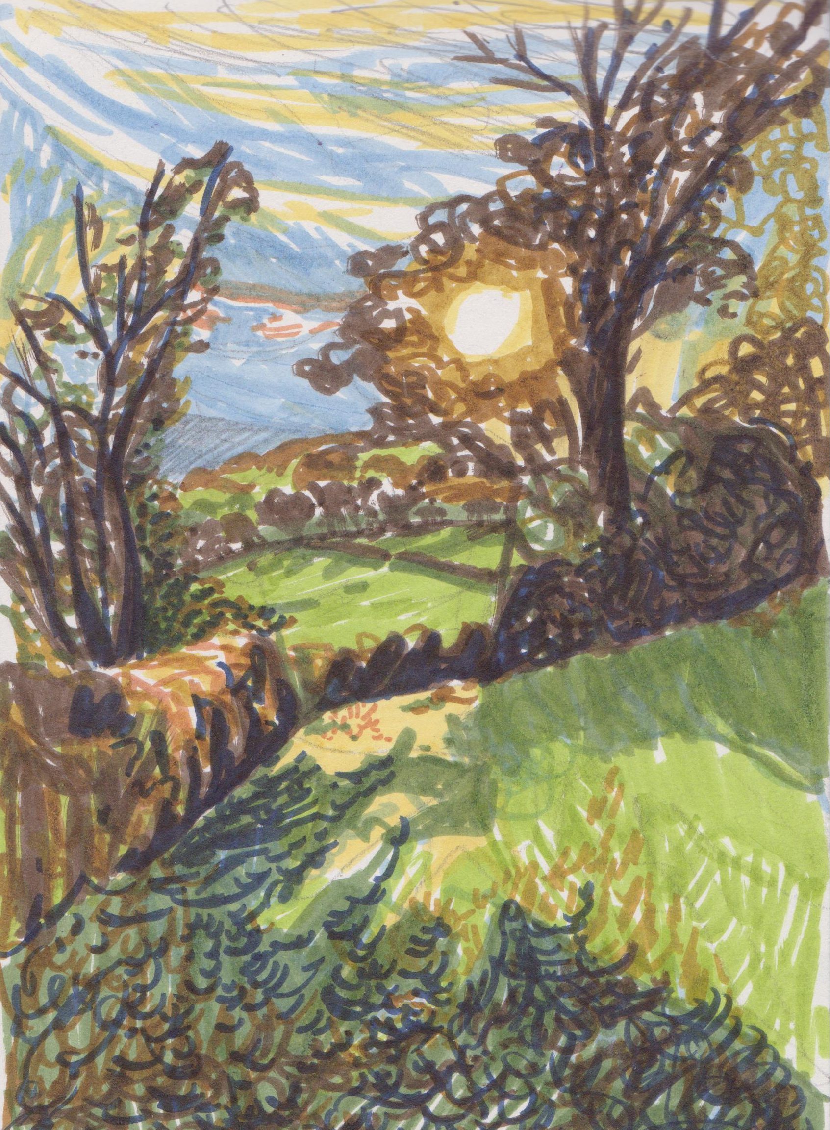
The same subject rendered in Faber-Castell Pitt Pens
Which Pens Did I Get?
As I am primarily concerned with rural landscape within my practice, I decided to buy the Landscape and Terra pen sets of 6. I couldn’t quite bring myself to only buy the Landscape set – I felt the jumps between the colours would be too great and I felt some of the earthier colours in the Terra set would stop my drawings from becoming too bright and artificial looking. Having worked with the sets for a couple of months now, I’ve realised I’ve never used India Red in the landscape set (that colour hasn’t appeared in the North-English landscape yet!), and I’ve not picked up Terracotta or Caput Mortuum much from the Terra set. However I do work very quickly and I think if I had been more aware that they were there when I was drawing I may have picked them up!

Colours in the Landscape and Terra Sets – with each colour I have applied an area with one layer, and next to it an area with 5 layers of the colour to indicate how much darker you can get the colours to appear.
For rural landscape, the only colour I wish I had was a mid-tone blue and I’ll certainly be adding an Ultramarine to my next order. In the meantime, I have been adding graphite marks in places to add another tonal value, and quite like the combination of the two media. It’s worth noting that you cannot really make colours look lighter, only darker, by going over them multiple times.

Big sky drawing where I have felt the need to add a slightly darker tone to the Sky Blue marks in the sky, so I have added pencil.
The Quality of Line, Versatility of Mark-making
The brush nib is essentially a more refined, longer version of a standard felt tip nib – but that is no bad thing! It has a sufficiently fine tip to achieve fine lines a fraction of a millimetre wide, and when more pressure is applied and if the pen is held at an angle, 5mm wide strokes can be made. When making quick strokes the marks have a fluidity to their character that resembles traditional pen and ink. When drawing a continuous line scribble, the colour appears darker when you go over the same lines and so a tonal variation can be achieved. Additionally, when you use the pen at an angle and work quickly, the edges of the line break up to make a more textured mark, which contrasts with the more refined lines beautifully.
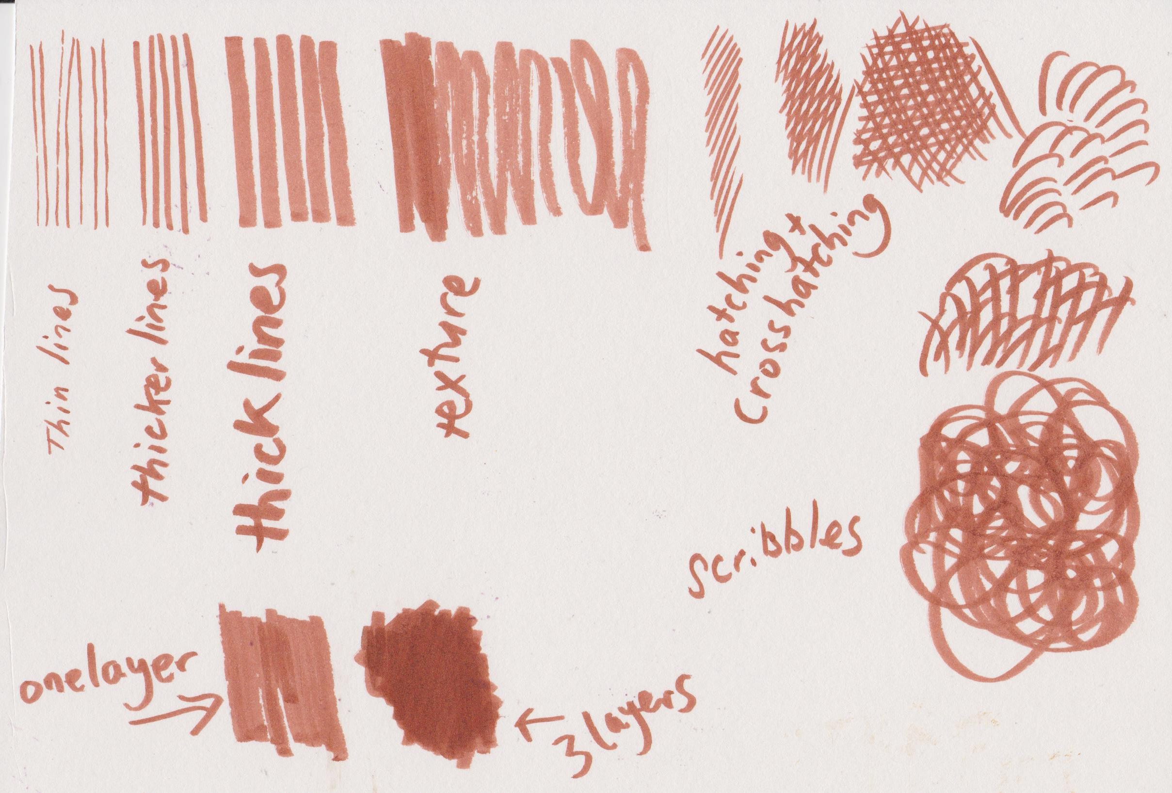
A variety of marks from one India Red Pitt pen
A Note About Surfaces
The pens work best on smooth drawing paper. I made a large drawing with them on Arches Hot Press watercolour paper and they did not get on at all, with some of the nibs starting to fray and fuzz up. I suspect it was to do with the sizing in the watercolour paper. So if you want to ensure your Pitt Pens last as long as possible, I recommend using smooth cartridge paper or Bristol board.
Transparency and Layering
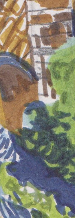
My favourite characteristic of Pitt Pens is their semi-transparency and how different colours look when they are put on top of one another. Because they dry within seconds, by the time you have reached for your next colour the first will have dried. I love to apply a different kind of mark with each colour as I think it adds a real vibrancy to the drawing. For this reason, it’s been an exciting new way to plan multi-block linocut prints as I can clearly see what each colour could do in a potential print.
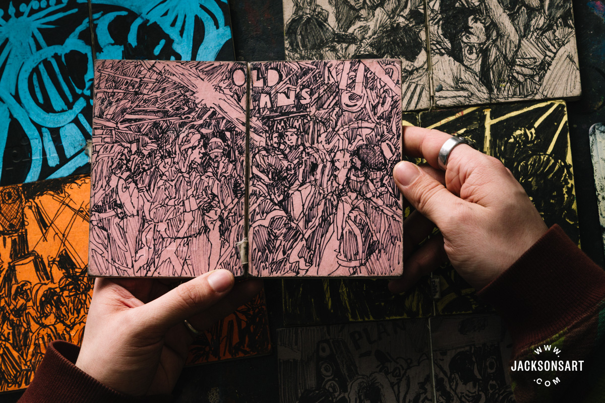
Here Are Some Details From My Drawings:


Conclusion
I am a fan of Pitt Pens for their versatility, semi-transparency and colour range. They’re a fantastic medium with which to make quick sketches as well as for planning works in other media. I’m looking forward to trying to make the colours darker by layering them up and adding a richness to my work, as so far I’ve just made drawings that focused on energy and speed – and they’ve looked lighter as a result. I wish the nibs were a little more hard wearing but I will treat them more kindly than I have done and stick to smooth cartridge paper as a surface!
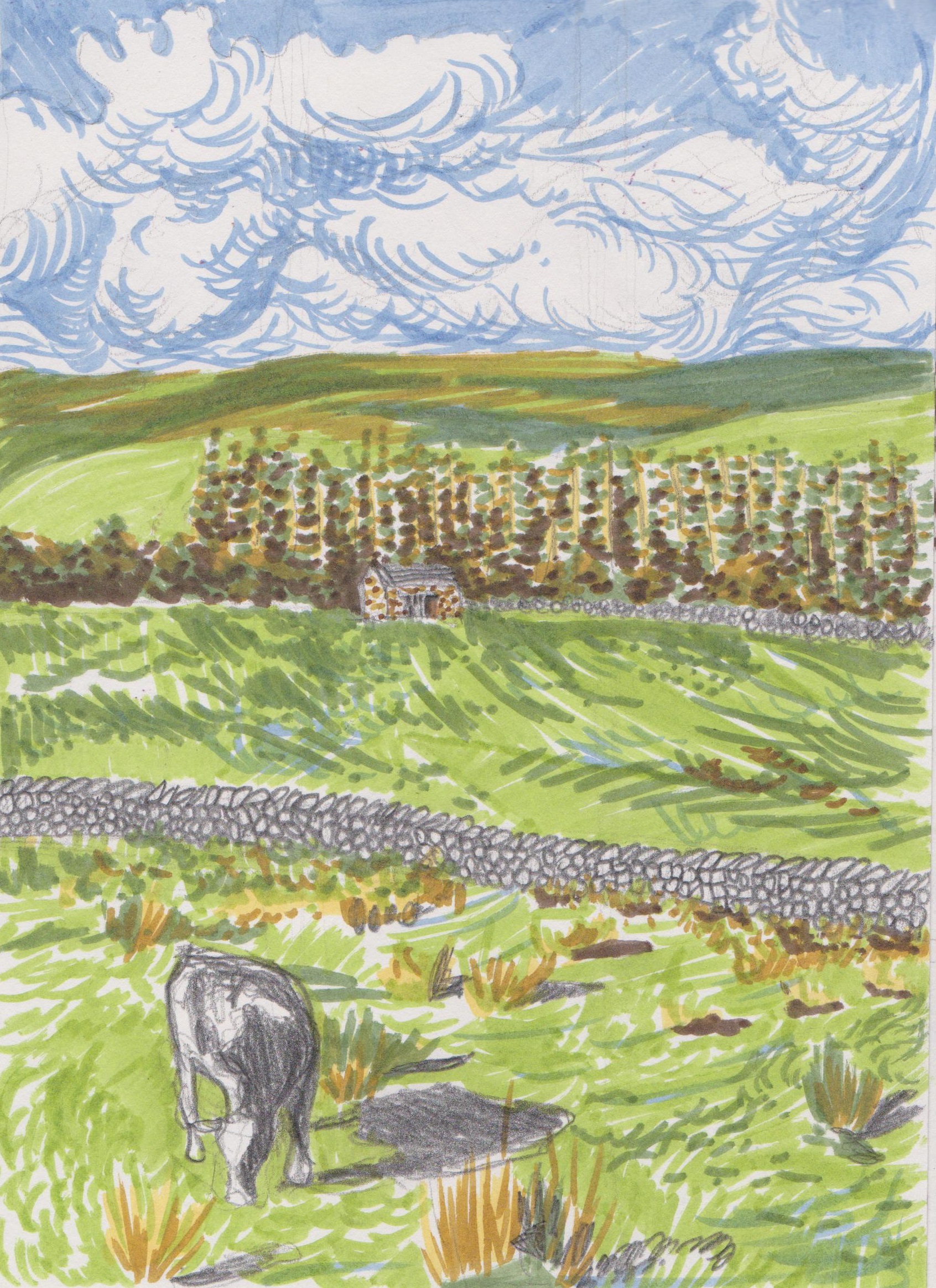
Drawing by Lisa Takahashi using Faber-Castell Pitt Pens and a 3B pencil
Further Reading
Posca Pens Are Perfect for Painting
Drawing Pens and Papers Compared
Indigo: The Story of Blue Gold
Shop Faber-Castell Pitt Pens on jacksonsart.com


5 thoughts on “Colour, Texture, Layers: Faber-Castell Pitt Pens Review”
Thank you for this,very helpful.
Is there anything that dissolves Faber
Castell India Ink pens on paper,so that
we can use them like watercolors?
Hi Pamela, thanks for reading. It might be possible to thin with rubbing alcohol, although I haven’t tried this, and may affect the permanency afterwards…
Many thanks
Lisa
Working with markers gives me unnecessary
anxiety that the tip is drying, I am working
too slow, I waste too much expensive ink.
Other media is much relaxing (and cheap)
Thank you for this. I’ve had a small selection of FC Pitt brush pens for a long time, and I recently decided to add a few more. I prefer dry media for sketching and drawing, but I decided it was high time I lost my fear of pens and permanent ink marks. I use fude fountain pens (containing permanent R&K SketchINK) alongside them, and actually find the fude nibs a little more responsive than the brush pens.
Unlike you, I find the red earths very useful in my area of northern England, where there are red/purple moorland grasses in winter, and red soils in some areas further west. I agree nib wear seems to be a problem and smooth papers are best. The colours can sink, becoming less vibrant on many papers, but Hahnemuehle Nostalgie paper (sheets and books) seems to suit them well.
I will have to try the Nostalgie!
Thanks for your comments and for reading my post Helen.
Best wishes
Lisa
Comments are closed.