



Paul Lewis is a watercolour painter known for his colourful, exotic and loose landscapes. In this article Paul shares his thoughts on colour and how he goes about selecting his palette.
Thoughts on Watercolour Landscape Palettes by Paul Lewis
I am grateful for the opportunity to contribute to this blog… it has caused me to think about some things which have become an almost automatic, subconscious process.
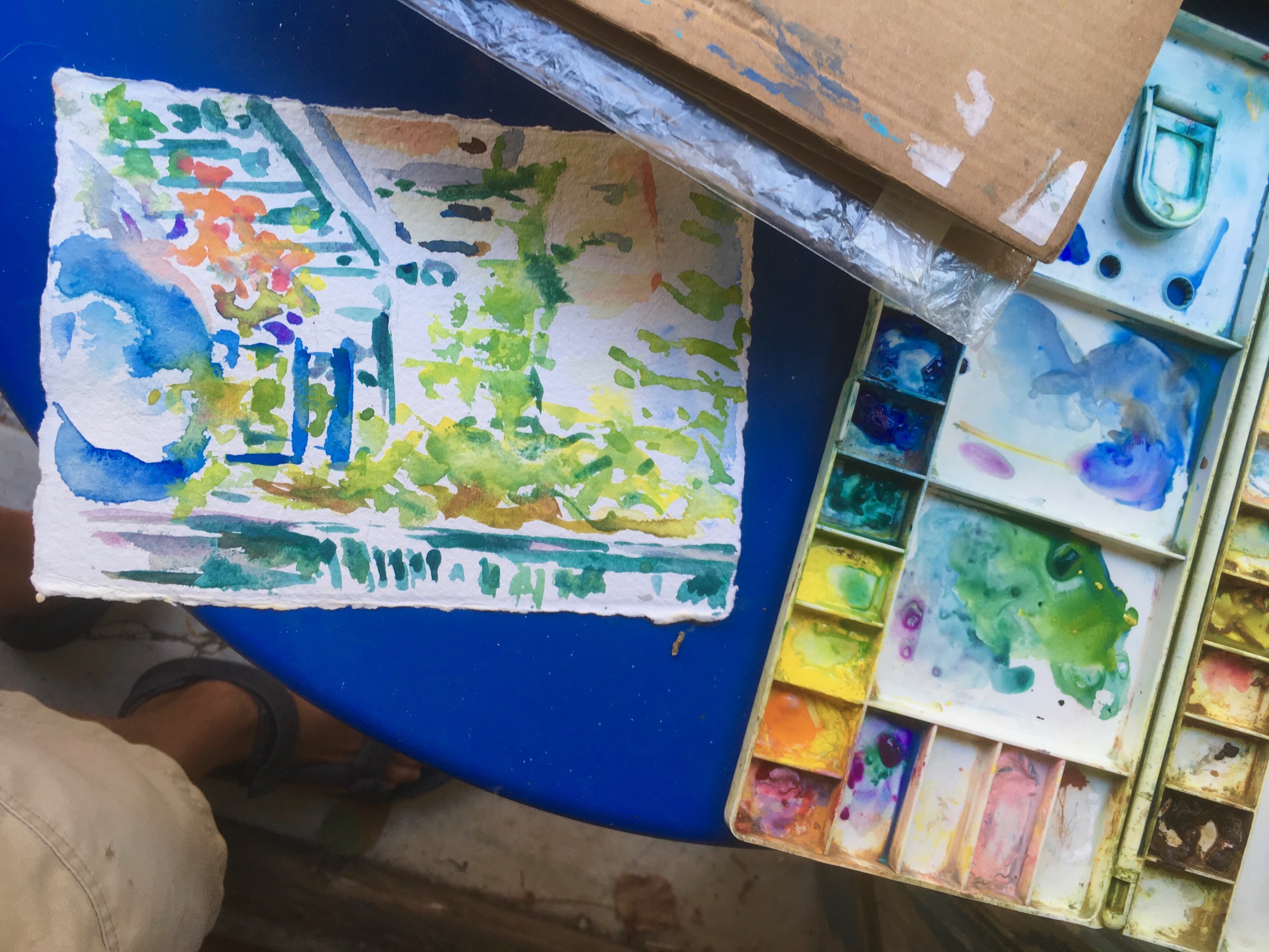
Athens Balcony, 2019
Paul Lewis
Watercolour on 150 gsm medium Khadi paper, 21 x 15 cm
Familiarity with Pigments
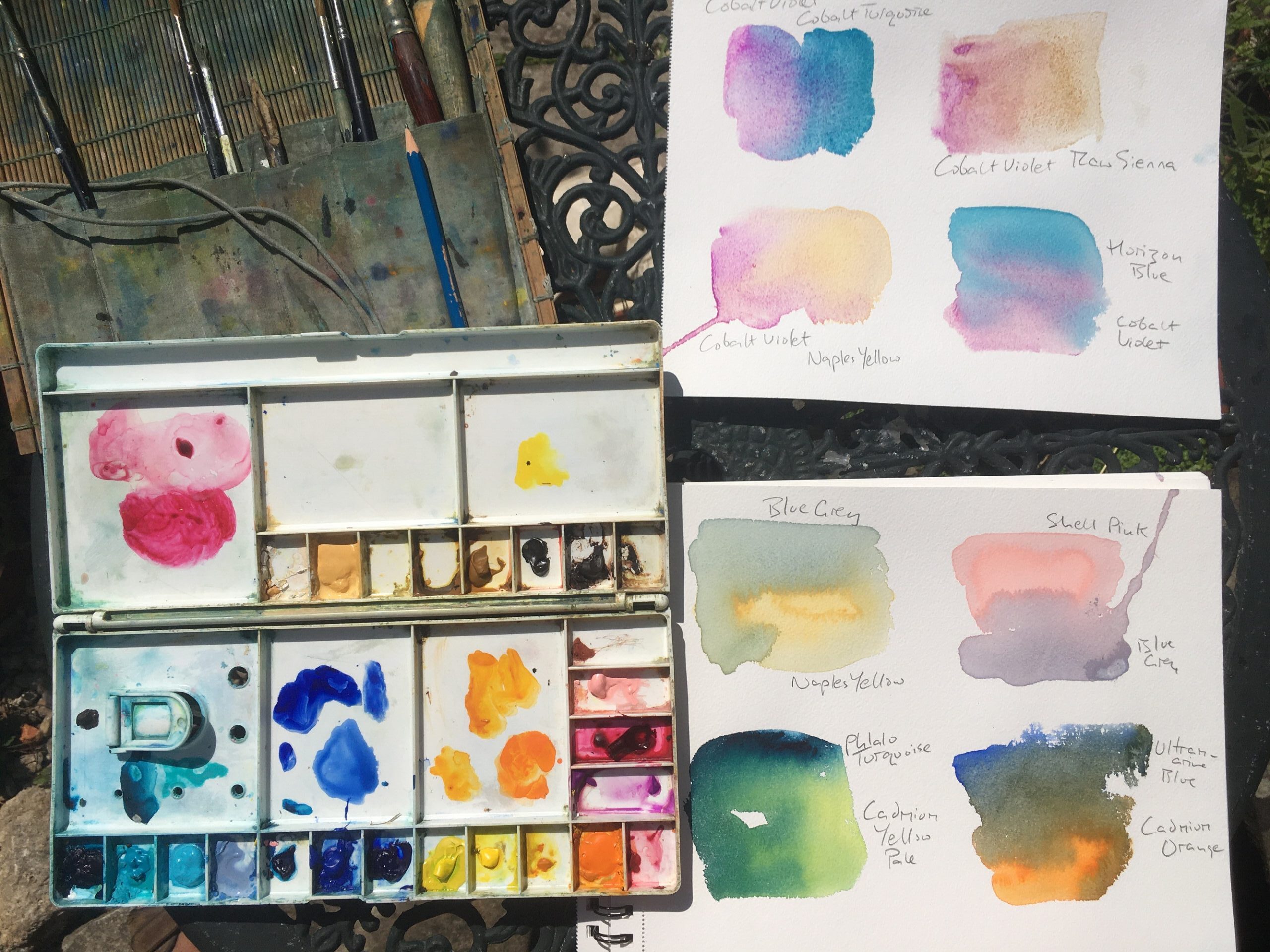
When I began painting with watercolour, having been through no formal training, one of the most important things I did was to paint hundreds of ‘boxes’; empty rectangles I drew out on watercolour paper, and fill them with various colour mixes. I was so excited at the time to see all these possibilities and started to feel the emotional power of colours and their juxtapositions.
Less is More
I quickly became aware of the danger of watercolour sets containing too many colours…jangly disharmony is easy to create. It may be a cliché but it is so true: quality over quantity.
The Value of Genuine Pigments
On that note I am not too keen on ‘hues’, preferring genuine pigments which all have their own qualities and different properties. I love granulation where pigments separate and often mix my colours on the paper with as little fiddling as possible so that if you look carefully you can see traces of each colour in its pure state.
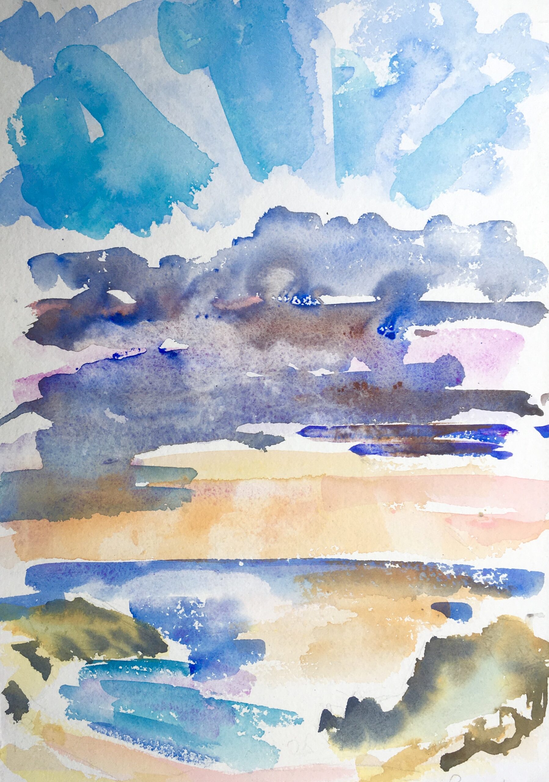
Storm Passing Nas’ Ikaria Island, 2018
Paul Lewis
Watercolour on 320gsm rough Khadi paper, 30 x 42 cm
Process
Often I begin a painting by laying areas out with light washes in two colours, for example Cobalt Violet and Raw Sienna.
Usually then comes a big sky wash, using that to create the ‘negative space’ for the landscape or seascape.
Blue skies I often underlay especially towards the horizon with Cobalt Violet, or a pink such as Rose Doré. I have become fond of Horizon Blue, which I tend to use more now than Cerulean Blue. I sometimes use Cobalt Turquoise, especially in evening skies and then usually Cobalt Blue, sometimes Ultramarine Blue.
Clouds often have an underbelly of pink and shadows of Burnt Umber and Cobalt Blue.
In sunset scenes there will usually be Cadmium Orange, Cadmium Yellow, Alizarin Crimson… Cobalt Turquoise and Cobalt Violet in the sky.
I am very conscious of leaving space and need to form negative shapes as I build up a painting. The ‘gap’ is so important… creating light and mystery and facilitating a dynamic relationship between viewer and artwork…. perhaps the most important colour is no colour!
That’s particularly true for rough seas where I used to use masking fluid to leave the white for waves and sea foam. Now I prefer to do it with light brushwork on dry paper.

Water and Colour (into the light), Ikaria Island, 2019
Paul Lewis
Watercolour on 320gsm rough Khadi paper, 30 x 42 cm
Mixing Greens
For a long time now there is rarely green in my palette, although there is a lot of green in my paintings (I love painting trees for example)… if the greens are formed with yellows and blues present elsewhere in the painting the consequence is greater harmony.
Lemon Yellow, Cadmium Yellow Pale and occasionally Aureolin as the yellows, with Cobalt Blue, Cerulean or Horizon Blue, sometimes Phthalo Blue. Another mix I love for deep dark greens is Cadmium Orange with Ultramarine.

Midsummer Painting, Ikaria Island, 2018
Paul Lewis
Watercolour on 200gsm extra rough Jackson’s Eco handmade paper, 28 x 38 cm
Favourite Pigment
My most favourite pigment is Cobalt Violet, I often paint in places where I can’t easily replenish supplies and this one is one I’m unhappy to see running out. If I’m painting a seascape and there is Violet in the sky it will also be present in the sea and usually in the rocks or beach.
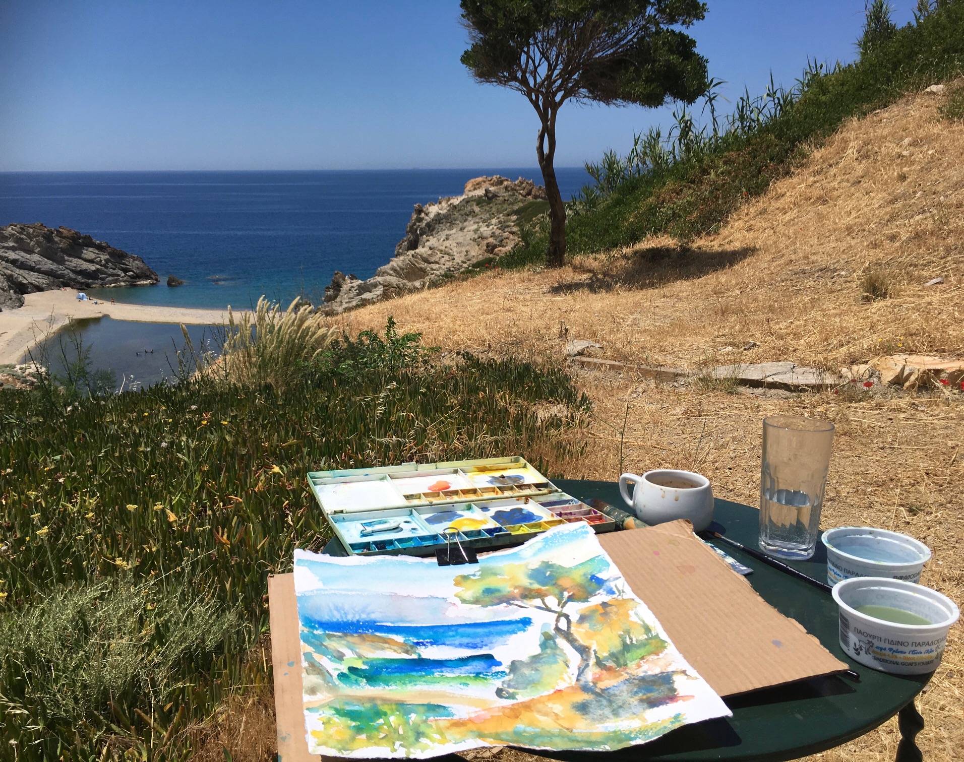
The Tree, Ikaria Island, 2019
Paul Lewis
Watercolour on 320gsm rough Khadi paper, 30 x 30 cm
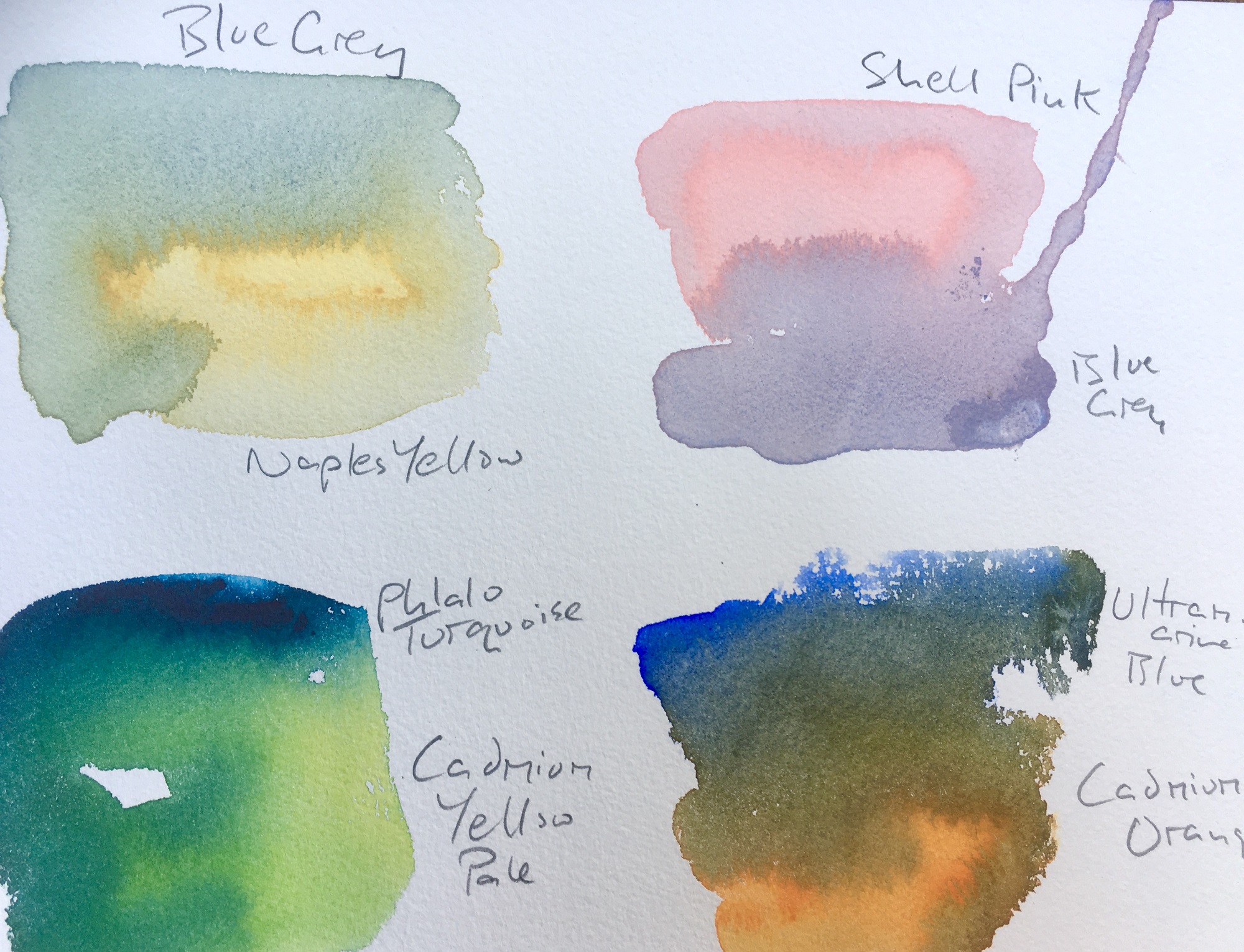
When painting beach scenes I throw a handful of sand onto the wet paper before lightly dropping heavily pigmented colours… Raw Umber, Raw Sienna, Naples Yellow, Cobalt Violet, Shell Pink, Blue Grey… and allowing them to dry undisturbed until the sand dries and (mostly) falls off.
If there is a figure or figures in the sea or on the beach I usually use the same pigments, having made sure the light ‘space’ is there first.
I also love Cobalt Turquoise and sometimes use the more intense Phthalo Turquoise.
Dark Mixes
Darks I often mix with Ultramarine and Burnt Sienna. Rarely I use Indigo… and I used to love Viridian and Alizarin Crimson for the almost-black that they make. I sometimes finish off a watercolour with some lines made with a bamboo pen and sepia ink.
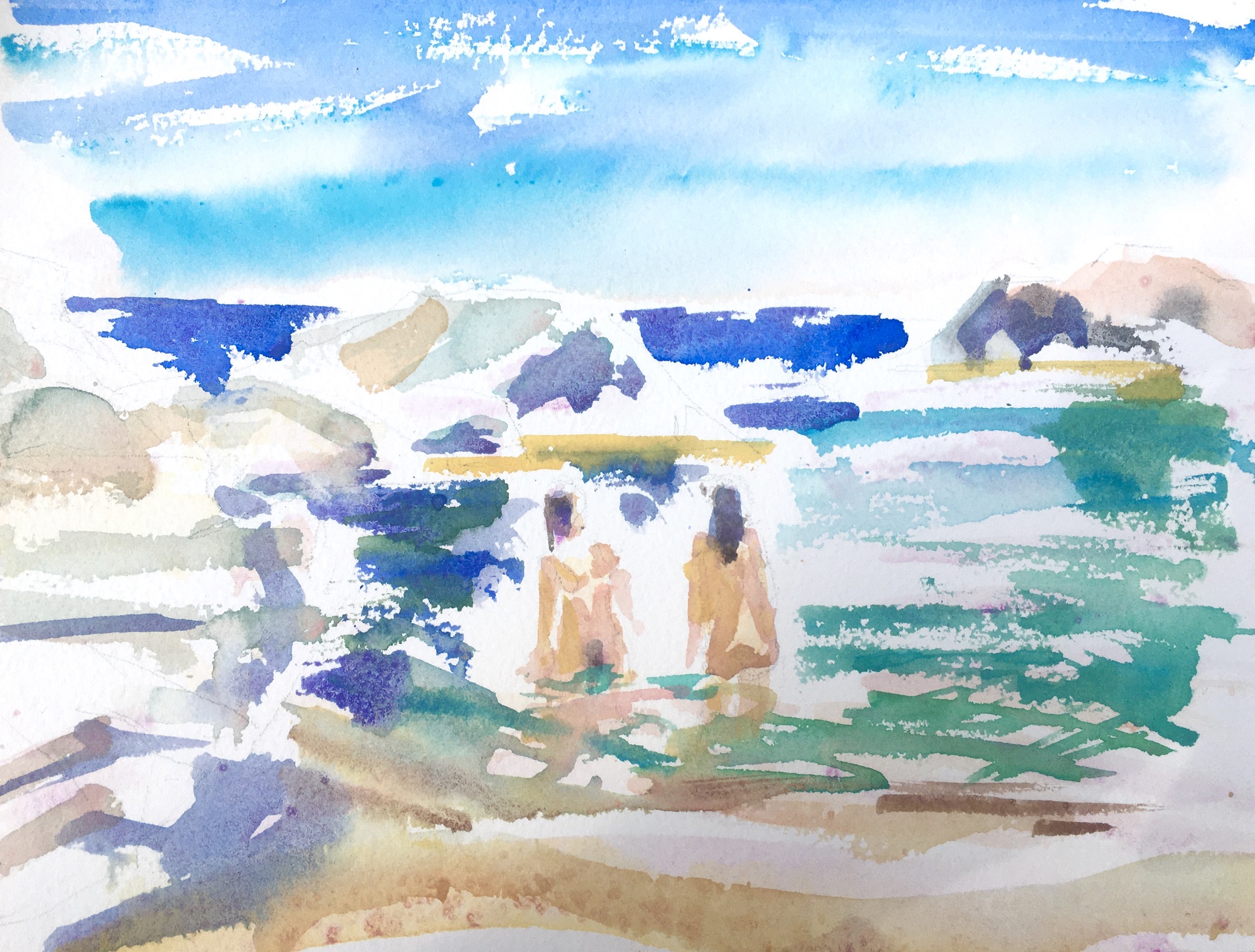
Conversation, Ikaria Island, 2019
Paul Lewis
Watercolour on rough 300gsm Arches paper, 23 x 32
White
I don’t use white though I do use colours containing white: Naples Yellow which I love, particularly softened with Cobalt Violet or Shell Pink (also containing white) and Blue Grey… these last two together I love for the gentle grey of rocks… tinted sometimes with Raw Sienna… ah I could go on…!
Since we’re (technically) in summer and for several years I’ve been painting at this time of year on the beautiful Aegean island of Ikaria, I’ve presented some work from the last couple of years from there. Additionally some works from Westonbirt Arboretum, another favourite spot in recent years.
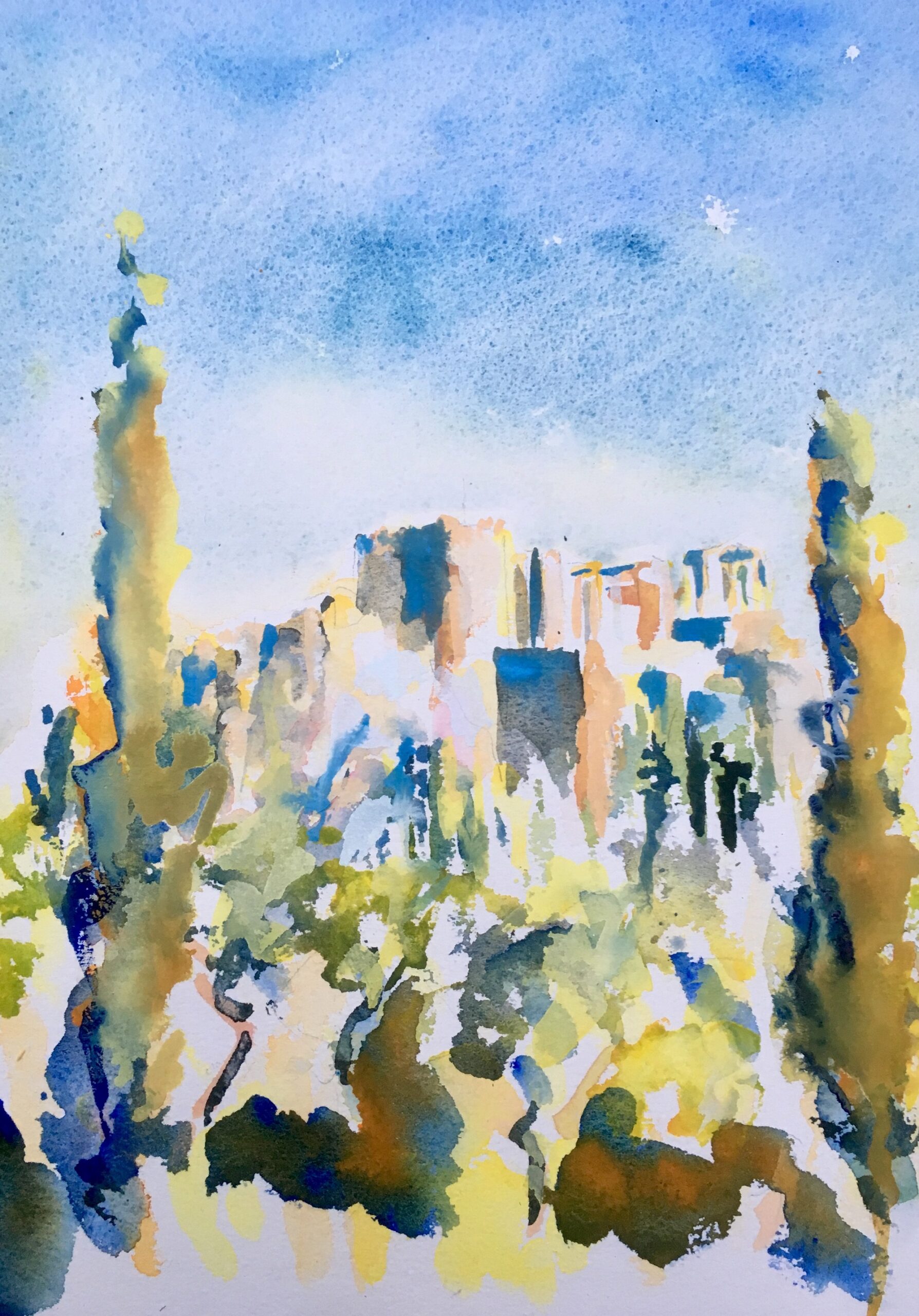
Acropolis, Athens, 2019
Paul Lewis
Watercolour on 300 gsm rough Arches paper, 36 x 26 cm
Notes on Paints and Paper
For many years I only used Winsor and Newton Artists watercolour paints although more recently I have added Schmincke, Holbein, Old Holland and Jackson’s Artist Watercolour. I do like to experiment and explore.
My favourite paper has always been Arches, although I have also enjoyed Saunders Waterford and recently a lot of my watercolours have been on Khadi handmade paper which I love.

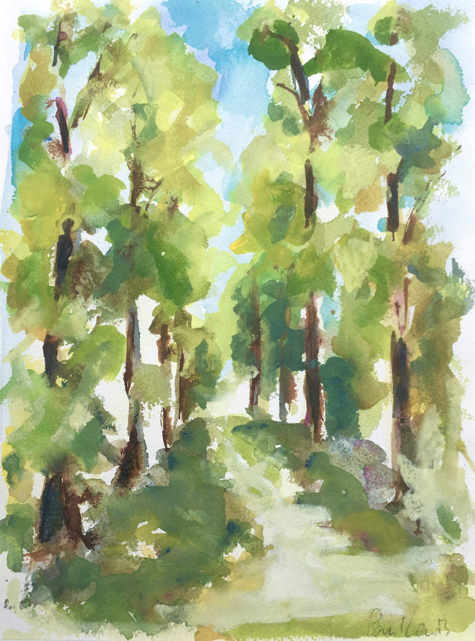
Lime Avenue, Westonbirt 2017
Paul Lewis
Watercolour on 300gsm rough Arches paper, 38 x 28cm
Materials
Winsor and Newton Professional Watercolour
Further Reading
Which Colours Are on Your Palette? Five Watercolour Landscape Painters Respond
Is Watercolour Better in Pans or Tubes?
Preparing a Watercolour Gouache Palette for Painting on Location


23 thoughts on “Paul Lewis On Watercolour Landscape Palettes”
Valuable informationfor beginers and
learners.Colour combinations described
in beautiful detail.Thanks for sharing
Thanks Anita
His style and choice of colours don’t work for me . I prefer more
realism,
I appreciate the different sides to watercolor.
I’ve seen many realistic paintings so it’s
quite fascinating to see an artist with a
different approach to watercolour and how
he uses it. It’s interesting to see how loose
he paints but still conveys a feeling, a mood
an atmosphere. Most watercolor paintings I
see don’t have a lot of colour so it’s nice to
see this.
Inspired by the lovely fresh look and
feel. So important for this time of dark
atmosphere. Really enjoyed reading this
piece.
Thank you Anne!
A new friend on instagram, thanks Lisa !
Beautiful vibrant paintings to lift the heart
Yes, welcome in all this stormy weather we’re having in the UK! Many thanks
As a raw beginner, I love reading about
how other artists interpret their craft.
This was a joy to read! Thankyou!
Love this loose style of painting and
interesting colour blends!
Lovely that the most important colour is no colour- just like
with writing-the power of suggestion – the unsaid. Thank
you x Katherine
Love you palette and light in your paintings
Love your palette and the light in your
paintings. They are so fresh.
I’m 55 and quite new to watercolour
having been trained in mainly oils. I am
learning new things everyday. I really
enjoyed reading this.
Thank you for reading, Alice!
Love his colors and his dinamic simplicity.
Thank you for sharing this!
Really enjoyed your comments on paint
colors and combinations. Tanks for sharing!!
Thanks for your comment Elsie!
I read some interview this morning but
had to stop for Dr. appointment . When I
back to article for watercolor flowers
painting artist name is first/ last name
start with K ( long name) he painted
cactus, some flower with bird “ Robin” “
dropping fragrance, something like that .
Very bright color realistic style . Do you
know him ? He paint most on large
paper 36cmx 48cm
Hi! I think you might mean the interview with Krysztof Kowalski, here – https://www.jacksonsart.com/blog/2020/07/21/krzysztof-kowalski-artist-interview/
Best wishes
Lisa
I enjoyed this post so much I returned back
to it. Lewis’s watercolors are so succinct–
but very powerful. I really enjoyed hearing
about his process and his color use.
That’s so great to know, thank you Deborah!
Comments are closed.