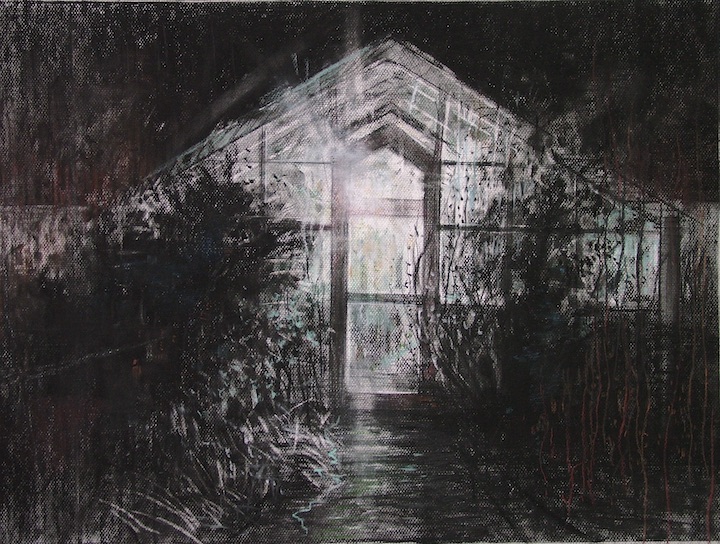
New York based artist and author Bill Murphy talks through how he developed new ways of approaching drawing over his 50 year practice. Here, the printmaker, painter, drawer and educator, shares how he reinvigorated his drawing practice by removing the boundaries between materials, and welcoming a new experience of working.
Above image: Demonstration for a figure drawing class: Jesse, 2018, Bill Murphy, Soft Vine charcoal and red conte crayon on Strathmore Ingres paper, 46 x 61 cm
Combining Materials to Reinvigorate Your Drawing Practice
by Bill Murphy
Drawing has been a second language to me for most of my life. In fact, my mother used to say that I drew before I began to talk. I have always loved drawing for its directness, its powerful expressiveness, and its technical simplicity. But somewhere well into my artistic career I began to experience a loss of interest in the drawing mediums themselves. Like often in life, the more familiar we become with some things the less we appreciate or even notice them. When I became aware of this artistic ennui, I knew I would have to find some method to throw myself a “few curveballs”, in an attempt to reinvigorate my interest in art making. I needed to make drawing interesting again.
For me the solution was found in the mediums themselves. I discovered that I didn’t have to reinvent the wheel; just minor changes, small additions, could be sufficient to reignite the excitement of drawing. The first of the changes I made in my drawing practice was to introduce colour pastel into the charcoal drawings. Up to the time of my making the drawing Winter Solstice, there were very definite boundaries between each medium I used. My charcoal drawings were just that and that alone – utilising vine, compressed charcoal and charcoal pencil (for detail).
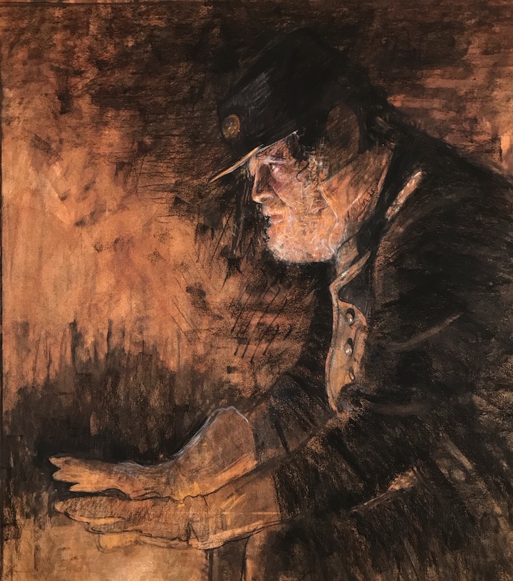
Bill Murphy
Charcoal and pastel on Strathmore Ingres paper, 46 x 61 cm
In the early stages of Winter Solstice I sensed an incompleteness in the drawing in its monochromatic state. By manipulating the digital reference photos I was using, I found I could exaggerate the colour saturation of the photograph; this allowed me to imagine and even see more colour in the night landscape. That colour sensing allowed me to lay in small batches of contrasting brown-reds and aqua-greens. As the drawing progressed, I realised the drawing would have been quite incomplete without this additional colour. It seemed to move the work closer to the place I had envisioned it when I first conceived it.
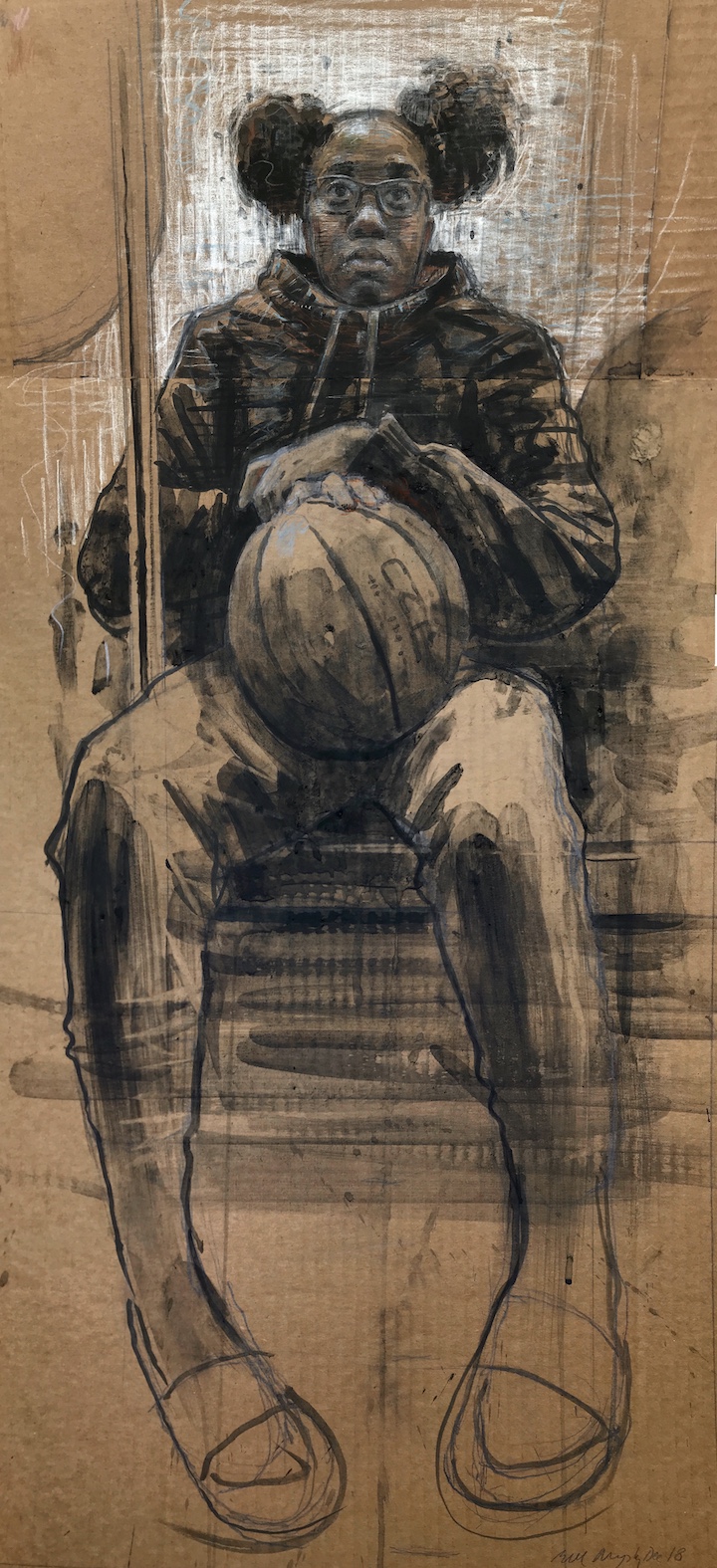
Over the next few years I continued this introduction of colour into the work. But as if it could be predicted, eventually this addition, too, began to have a “rote” feeling about. It was at this point of my career, about two years ago, that I decided to stir things up again by further breaking down the barriers between the mediums by bringing them together. A good example of this use of multiple mediums in a single drawing would be my drawing Girl on the E Train.
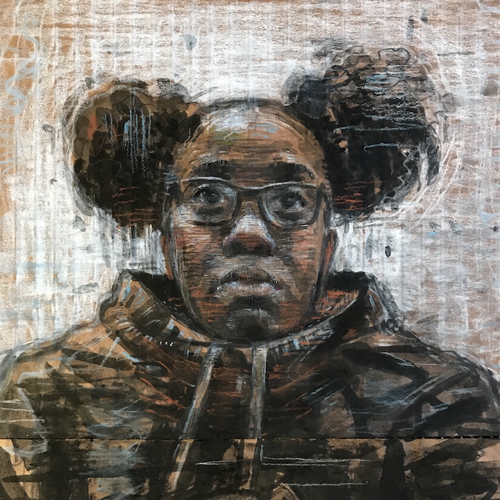
Wanting a look somehow akin to the funkiness of a NYC subway ride, I decided to make this drawing of a young woman’s face on a scrap of corrugated cardboard. (There are more archival alternatives, and more on that in a moment). I started the outline of the face in soft Ebony pencil; then worked into the surrounding background with soft white pastel. To increase the contrast, I worked back over the head with, first, a charcoal wash and then an India ink wash for the darks, as well as a Faber Castell brush pen for detail of the face. To give some small “temperature changes” to the overall feel, I used Burnt Sienna and Cobalt Blue Nupastels in the shadows and lights. (I’m getting dizzy now as I recall the multitude of mediums used)
The next morning in my studio I looked at the work from the night before and was no less excited by the results. So much so that I decide to continue the drawing, completing the rest of the figure, on another piece of board. The bulk of the figure is blocked in with charcoal wash (a mix of charcoal powder and water), and without quite the array of materials I threw at the drawing of the head (this was intentional, to keep the head as the point of focus).

As much as I love the colour and the surface texture of corrugated cardboard, it’s not the ideal drawing surface. To equate the same value of the cardboard, I eventually began to experiment with alternative grounds to draw on. My favourite way of working currently is using Fabriano Artistico hot press watercolour paper, (I buy it in a roll), grounded with a thin acrylic wash. I change this ground colour from image to image, applying a colour that will set a mood in league with the spirit of the drawing.
Bill Murphy
Graphite, charcoal, charcoal wash, pastel, and ink on cardboard, 101 x 56 cm
One drawing that I think illustrates the importance of the colour of the ground is my Civil War drawing Shiloh. In the photo of the early state, I think the variegated visual texture is evident. This was created simply by applying the acrylic pigment with a bristle brush, and a lot of water. Of course, it’s important to staple, tape or tack down the Fabriano paper, so as not to buckle the paper when applying water mediums like watercolour, charcoal wash or ink.

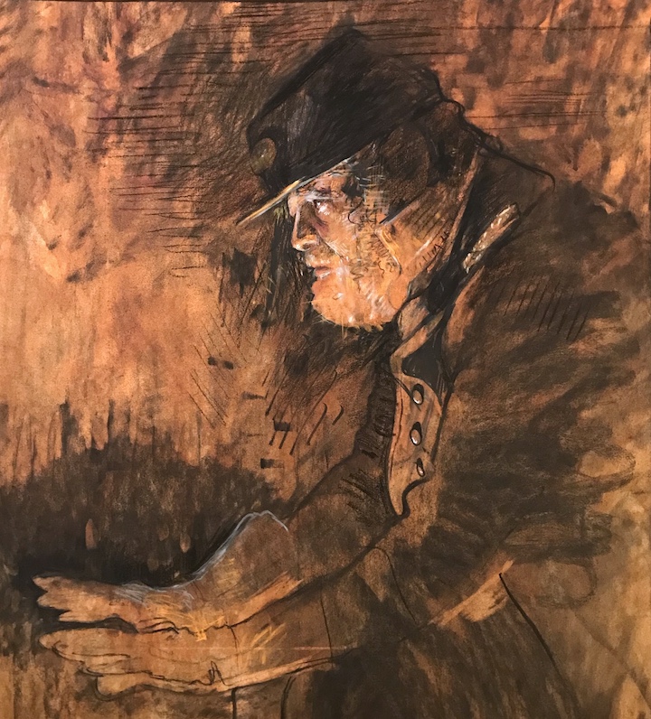
Over the initial pencil drawing and charcoal wash, I again turned to a dark wash of Pelikan India ink to strengthen the darks, and then laid in the highest value of highlights in white chalk. I added a tint of blue to the uniform lightly, drawn in with soft pastel. This serves to contrast the figure against the warm sepia background. My plan was to allow the warm sepia colour of the ground to bleed through in many areas, to give an overall warm feeling, akin to the flame that could be providing heat.
Bill Murphy
Ink, charcoal, charcoal wash, pastel on Fabrianno Artistico paper, 24 x 28 cm
If you would rather shortcut the labor and time need to prepare paper with a coloured ground, there are a multitude of toned drawing papers available on the market today. Two that I use are Canson Mi Tients paper and Strathmore Ingres Charcoal Paper. Ingres paper is generally thinner and the texture not as pronounced as the Canson. Both are sold in a wide variety of colour and neutral tones. One feature I’ve enjoyed of the Canson paper is that it is sold in roles, thus allowing large scale charcoal and pastel drawings.

Bill Murphy
Charcoal pastel pencil and pastel on white Canson roll paper, 56 x 132 cm
A study of a bed with morning light is an example of drawing on a sheet of Strathmore Ingres Charcoal paper. I think the blue green paper yields a distinctively different mood for the drawing than the warmer umbers. The background forms have a fair number of warm pastel values.
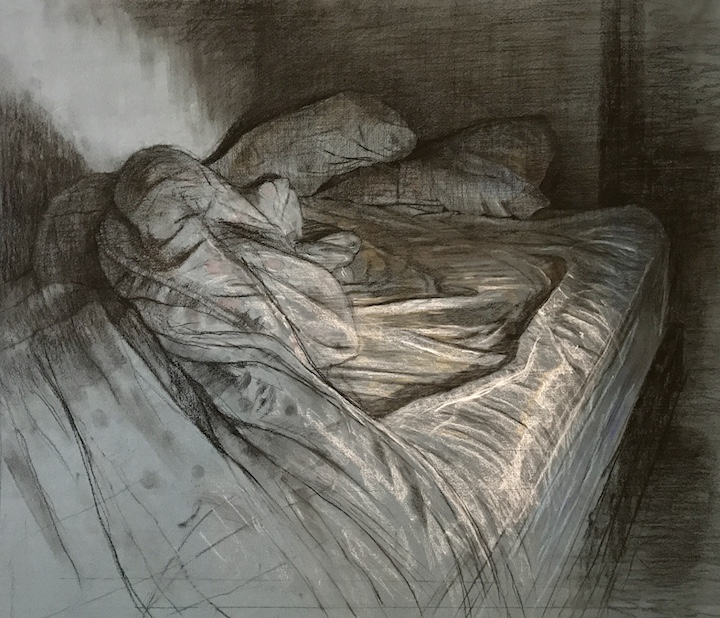
Bill Murphy
Charcoal and pastel on Strathmore Ingres paper, 56 x 66 cm
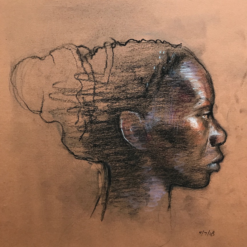
Bill Murphy
Charcoal and pastel pencil on Canson toned paper, 25 x 25 cm
In conclusion, one thing I’ve learnt about maintaining an art practice is that I have to find ways to keep the work I’m making interesting. If I’m not interested in making the work, no one will be interested in seeing it. Changing the way I use mediums that have become maybe too familiar is a good method of reenergising my drawings.
Q & A with Bill Murphy
Clare: What are your most important artist’s tools? Do you have any favourites?
Bill: Because I work in a lot of mediums (I paint in watercolours, and occasionally acrylics, draw in all drawing mediums, and do etchings and lithographs) that’s a tough question. So if I may I’ll discuss a few of the more esoteric tools. One of my most important drawing tools is a sliver of plexiglass about 20 inches long by 3 inches wide. It’s my straight edge. Whenever I’m drawing (or etching or painting) and need a hard edge, or clean straight line, I use it. It’s better than, say, a wooden ruler because being plexiglass, I can see what’s happening under and around it.
Another very important tool I use for all mediums is a small pocket mirror. If I’m drawing in a life class situation and I can’t stand up and look from a distance, I can hold the mirror an arms length back and get not only a distance view, but also a reversal of the drawing. I find this critical, particularly with portraiture. The mirror image allows to me to see it fresh, as if for the first time.

Clare: What advice do you have to anyone wishing to improve their drawing skills?
Bill: I think the biggest detriment to our drawing is we often draw the past. That is to say when looking at a hand for example, we don’t draw the hand that is in front of us, but rather the idea of the hand in front of us that we learnt throughout our life. If we are really looking in the present moment, what we see, everywhere and all the time, are shapes. When we can free our minds from the conditioned past, from what we were told a hand looks like, and simply look, we see a collection of various shapes, that taken together will read as a hand. So, to simplify the answer, we need to see the shape, and draw the shape, not give it a name, and not “think” too much about it.

Bill Murphy
Charcoal and pastel on Canson paper, 20 x 24 cm
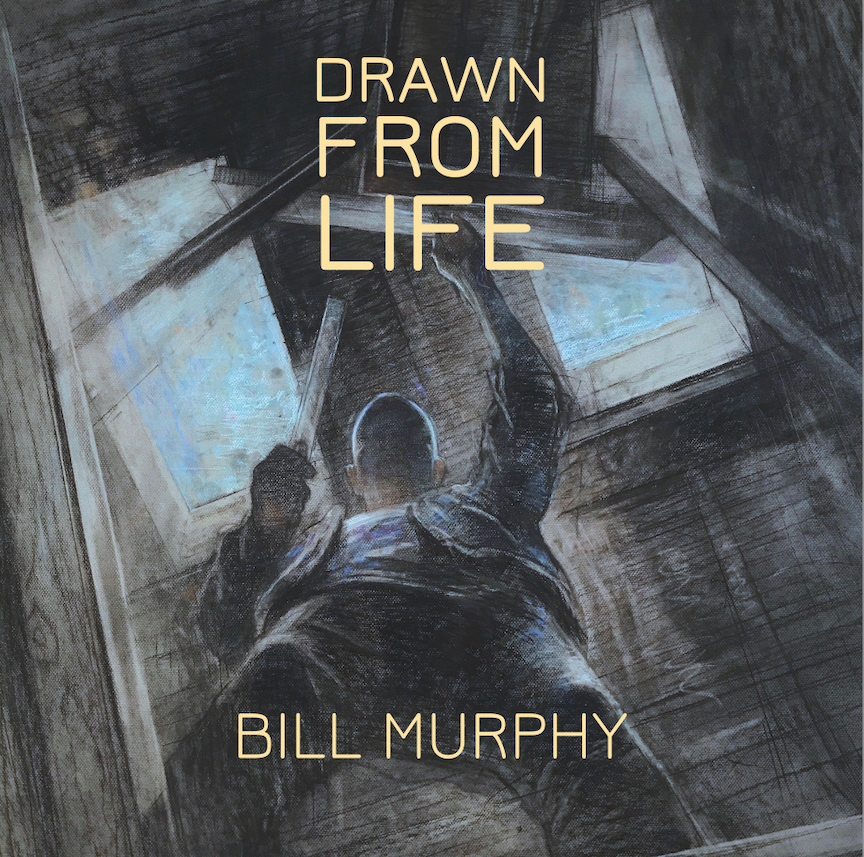
Clare: Can you tell us about your new book Drawn From Life?
Bill: Drawn From Life is a large format “coffee table” sized collection of my work spanning 50 years, from my first years in art school, until today. It was my pandemic project. Unable to really move about freely during the lockdown, unable to hire models and draw at life classes as I had been doing, I decided to finally put a collection of my work together. The book has three chapters; one each for drawing, painting and printmaking. About 200 reproductions in all – most full page sized (12 x 12″) The process of curating what work would be included was sort of revelatory – having to view just about everything you’ve ever done as an artist is going to leave an imprint with you for a while. The point of the book was to bring a lot of the work together, and to take advantage of the amazing reproduction quality that exists now, due to digital technology. The printer, Blurb, did an amazing job I think, in the accuracy of the reproduction.

About Bill Murphy
Bill Murphy was born on Staten Island, New York, in 1952. He received a BFA from The School of Visual Arts, also in New York City, in 1975, majoring in illustration. In 1996 Murphy received his MFA from Vermont College, and has also studied at the Art Students League and the Blackburn Printmaking Workshop. He taught at Wagner College for 26 years, retiring in 2020. From 1998 through 2003 he was the Chairperson of the Art Dept. He has also taught at the Art Students League of New York. His work has been exhibited in over 100 group, juried, and one person exhibitions throughout the world. In New York City his work is represented by the Old Print Shop Contemporary Gallery.
Materials Used
Strathmore Ingres Charcoal Paper
Canson Mi Tientes Coloured Paper
Further Reading
The Art of Drawing and Observation by Jarvis Brookfield
Exploring the Place Where Painting and Drawing Meet with Nitram Liquid Charcoal
A Hundred Times Looking – Observational Drawing as Meditation
The Difference Between Graphite and Charcoal Explained
Shop Drawing at jacksonsart.com


1 thought on “Combining Materials to Reinvigorate Your Drawing Practice”
What a great article! But then, I expect
noting less from the ultimate Master!!
Comments are closed.