



A six colour primary palette comprising two reds, two yellows and two blues is capable of offering mixes of colour that span the colour spectrum – including an array of greens, violets, oranges, browns and blacks. Here’s an explanation of how careful consideration of colour temperature can help you to select the best six colour palette for your painting.

Colour Mixing: The Versatility of a Six Colour Primary Palette
The three primaries of yellow, red and blue can be mixed to produce any colour of the rainbow. You may have been taught this at school, but the theory doesn’t quite apply perfectly to colour mixing with fine art paints. This is because the colours of your paintbox are determined by pigments, either extracted from the earth or synthetically constructed in a laboratory. In painting, technically speaking, there is no such thing as a pure primary colour. Colours are determined by the conditions in which pigments were developed, and the aim of paint makers is to achieve the purest colour possible with the ingredients that they work with.
If you’re asked to imagine a red, blue and yellow palette, what your mind’s eye conjures up may be wildly different to what someone else might imagine. Here’s a red, blue and yellow that I have selected and mixed together:

Generally, yellow red and orange are thought to be warm colours, while blue, violet and green are cool colours. In this example of a three colour primary palette I have chosen two rather orange shades – Orange/Red and Cadmium Yellow Deep Genuine. Phthalo Blue is a deep, transparent blue with a slightly red undertone, so all in all this could be considered a warm primary palette.
The warmth in these colours impacts upon the resulting colour mixes. While you might usually expect red and blue to create violet (a cool colour), in this palette you get shades of brown and burnt orange. The mixed greens are warm, moving towards yellow-green rather than blue-green (and have a warm earthiness as a result). The similarity in appearance between the yellow and red mean that the mixes in between are very similar to the colours from the tube, an array of bright, warm yellows and oranges. If you were to also mix lighter colours by adding white to this warm earthy palette, you could very easily use it for a landscape painting without need for any other colours.
Adding a Complementary to a Three Colour Primary Palette
You might feel that this warm palette, with a notable absence of any violets in its colour mixes, could do with an additional colour to balance it out. By adding a violet you add another cool colour to the palette, and as this chart below illustrates, add a sense of temperature balance as well as scope for mixing many more colours.
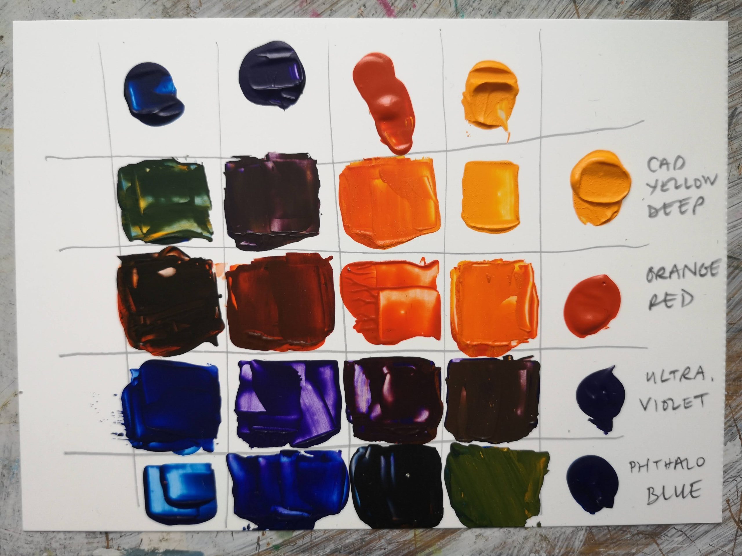
You might feel that there’s a little too much orange in this primary palette, so what happens if you swap the Orange/Red for a red that feels cooler? Here’s the same palette, but with Orange/Red exchanged for Alizarin Crimson – a burgundy red with a bluish undertone:

As you can see, the bluish tint of Alizarin Crimson facilitates the mixing of a rich violet when combined with Phthalo Blue. The orange mixes are less bright and more complex than in the previous palette, taking on a burnt quality – this is because the bluish undertone of the red dulls the mix. You could take from this a colour mixing tip – that a mix of two primaries can be dulled with a hint of the third primary. The greens of course remain the same, as the yellow and blue are unchanged from the previous palette.

A Cooler Primary Palette
Swapping Cadmium Yellow Deep Genuine for a much cooler, acidic Lemon Yellow and replacing Phthalo Blue with a cooler Turquoise will give you this cooler primary palette. Remembering that cooler colours comprise blue, green and violet, you’ll see that the mixes you can achieve display a bias towards these hues. Turquoise and Alizarin make shades of blue-violet, the shades of green achieved are much brighter and without any of the warmth of the previous palette, while the oranges are duller.
These charts illustrate that depending on the characteristics of the pigments, red and blue can make brown as well as violet, that yellow and red can make orange as well as red-browns, and that yellow and blue can make shades of olive as well as emerald. The variety is all thanks to the varying colour temperatures of the three primaries you might use. Here’s what happens when you include a cool and warm version of each of the primaries in a single, six colour palette:

This diagram shows what mixes are possible when combining two colours from the palette. The patches of colour are placed along drawn lines which indicate the tubes combined to create each mix. This initial investigation into this palette demonstrates the greens, browns, blacks, oranges and violets possible, and this is before white is added to the palette. There’s little need to add a tube of black to this palette (but you could if you wanted to). This is a palette that could be used for landscapes, portraits, still life or abstract painting, and with so many possible colours you can create work with a strong colour theme or temperature, or use the palette to describe the literal colours you see in your subject. What’s more, this palette is merely an example of a six colour primary – there are other cool and warm reds, yellows and blues waiting to be combined in order to form a six colour primary palette.

Here’s one final three colour primary palette, comprising Cadmium Yellow Pale, French Ultramarine and Cadmium Red Genuine. These three colours were selected in an attempt to use the ‘most primary’ colours I could find in the range of Jackson’s Artist Acrylics. You might have expected bright secondary colours as a result – uncomplicated violets, greens and oranges. While the oranges and greens did not disappoint, the mixes of red and blue created brown. I was not expecting this, and it just goes to show that the red is more orange than I realised – if I had used a shade of red with a touch more bias toward blue then I may have got the colour mixes I was expecting.
While three colour primary palettes can really enforce a rigid structure within which to explore colour mixing, and are a great introduction to working with a limited palette, a six colour primary palette is the perfect palette selection for keeping your colour options more open while avoiding muddy mixes. You’ll be able to mix almost any colour you desire, but the discipline of limiting to six tubes will also help you to revel in sumptuous colour harmonies.
Further Reading
Review of Holbein Artists Gouache Irodori Spring Palette
Colour Mixing: Exploring the Zorn Palette
Ginny Elston on Curating the Unison Colour Versatility Soft Pastel Set
Two Painters Try Jackson’s Artist Acrylic Paint
Shop Jackson’s Artist Acrylic Paints on jacksonsart.com


20 thoughts on “Colour Mixing: The Versatility of a Six Colour Primary Palette”
Lovely post and colours, Lisa, thank you!
So many beautiful shades..! (I’m drawn to the burnt orange-browns in your 6 colour palette).
I’m surprised you didn’t mention Magenta at all, which can open up a whole lot of possibilities.
Hi Tulla,
Yes good spot! I love Magenta and agree it’s so versatile…or Rose Madder which I always think of as the gentler cousin of Magenta! I was going for the colours that I felt were clear examples of ‘a bluey red’ or an ‘orangey red’ and I felt Alizarin was just that touch cooler than Magenta and illustrated the point more clearly. But yes, Magenta would be a great alternative for Alizarin in a palette like this.
Best wishes
Lisa
Great article, will try these altered palettes!
Thanks Teri!
Not sure about the turquoise choice. The
better pair with pthalo would be Sennelier
Azure blue as it retains colour better when
mixed. Turquoise is already a mixed colour
so will tend to mud when mixed further.
Hi Nicholas,
Yes you’re absolutely right, although I believe Azure Blue is also made of multiple pigments. That said these blended colours in my experience are still very capable of mixing useful earthy, maybe less vibrant colours, that play an important supporting role to the single pigment colours. For this article I was sticking with Jackson’s colours but there is no reason not to incorporate colours from other brands. Plus it is quite tricky to find a turquoise colour that is single pigment, unless you start looking into more expensive cobalt based turquoises!
Best wishes
Lisa
Brilliant article and explanation.
Thank you so much Kiki!
I love these colour mixing posts. Makes me
want to get to the studio ASAP. I don’t know
if you’ve done it before, but I’d love to see a
post using the true primaries; cyan,
magenta, yellow.
Oh that’s interesting! I will need to look into this. Cyan/Magenta/Yellow are the colours used in printing because they are the scientific true primaries, but because fine art paints tend to be led by the pigments used to make them, it’s hard to get true primaries in oil paint ranges…but this is a really interesting thought, and admittedly I need to do some research into this and I think it would be a really interesting topic for a future post! Thank you for your suggestion.
I thought the same thing. I’ve started using
acrylic inks, bought 3 printing
primaries(CMY) but have now added a strong
red and blue
That is interesting!
Thank you for the detailed colour
charts.Very informative since some
pigments are different from 20 years
ago.
Thanks Chris! That’s great that documenting how pigments appear now is useful.
This is a lovely article and well
explained. Thank you.
Thank you, Sue.
Inspired by your layout in a circle with lines
for the mixes as I’ve always made grids and
not thought outside this box. Excellent
article. I wish manufacturers would state or
show where their primary pigments fall
within a spectrum.
Thank you Sue! Yes that could be helpful, but I guess as many pigments are organic they have tendency to vary slightly in their hue from time to time. Generally CMYK is used for printing photographic images and the inks are moreoften dye-based, whereas fine art paints tend not to be used where true and pure primaries are usually sought. Although the comments on this blog article do suggest otherwise! Thanks again for your comment.
I watched a video by painter Scott Naismith
about switching to the cyan magenta yellow
primaries rather than the red green blue
palettes we learn in primary school and it
was revolutionary. No more of those awful
muddy purples that look brown. I think that’s
a key point here!
Hi Jen, this sounds really interesting, I will seek it out. Your comment reminded me of an interview we had with Scott a while ago, still worth a read! https://www.jacksonsart.com/blog/2015/09/24/landscape-painter-scott-naismith-discusses-bright-colours-his-love-for-scotland-and-life-as-an-artist/
Best wishes
Lisa
Comments are closed.