



Most painters are very interested in colour. This means they will want some control over the colour of paint in the tube. They are concerned with both the appearance of the colour right out of the tube and also the way it will mix with other colours to create additional colours in a reliable way. Colour mixing success relies on the pigments in the paints, whether you paint in oils, acrylics, watercolours or other paint media.
When purchasing paints you want to get the colours you need for your palette, but unfortunately, you can’t just go by the colour name to know what the colour will be in the tube. The same pigment can be called different names by different manufacturers and conversely different pigments can be given the same name. Additionally even the same pigment will look different to another because of the variety of that pigment or manufacturing treatment used for their paint.
A variety of names for the same pigment

They look pretty similar.
The same pigment can have different names related to the location it comes from, the language it was named in or the name given to it by a brand.
- Prussian Blue is also known as Berlin Blue, Bronze Blue, Chinese Blue, Iron Blue, Milori Blue, Parisian Blue, Paste Blue, and Steel Blue.
- Phthalocyanine Blue is commonly called Phthalo Blue but can also be called Monastral Blue, Winsor Blue, Thalo Blue and Bocour Blue.
- Red Iron Oxide can be called Venetian Red, Sinopia, Venice Red, Turkey Red, Indian Red, Spanish Red, Pompeian Red, and Persian Red, showing where it was mined, though most Red Iron Oxide colours are now manufactured synthetically.
The same colour name but not the same pigment
The opposite problem – the same name can be different colours; the name Magenta could be PV19 or PR122 or another pigment. This is more troublesome than just having a variety of names for a colour, that is mentioned earlier. This means that when you buy different brands of Magenta you may not be getting the same colour.
Colour Index pigment numbers
Fortunately there is one way to get closer to knowing what is in the tube. Because the name of the colour used isn’t always reliable it is essential to look for the pigment number on the label (also often listed on the website description). It is listed by the Colour Index name, a code for the pigment group plus a number. The Pigment Codes used are: PB Pigment Blue, PBk Pigment Black, PBr Pigment Brown, PG Pigment Green, PM Pigment Metal, PO Pigment Orange, PR Pigment Red, PV Pigment Violet, PW Pigment White, PY Pigment Yellow. For example, if the label says PR122 then the colourant is Quinacridone Magenta (a lightfast, intense, cool red). The many paints containing PR122 are called a variety of names by different paint makers: Verzino Violet, Quinacridone Magenta, Rose Violet, Purple Magenta, Quinacridone Purple, Geranium Lake Bluish, and Old Holland Magenta.
Here is a useful list of the pigment names and numbers.
Single pigment
When you look on a tube of paint for the pigment information you can quickly see if it lists a single pigment or more than one pigment. Artists quality paints usually have more single pigment colours and fewer mixed pigment colours in their range because if the artist then mixes it with another colour on the palette it is like mixing 3 or more colours and it will become muddy more quickly. Student quality colours make colours that look good if used right from the tube but they might not mix well.
Read more about Artist versus Student quality paints in these earlier posts:
Getting Started in Acrylic Painting – Part 1 – student grade vs artists’ grade
Student vs Artists quality colours
Other factors
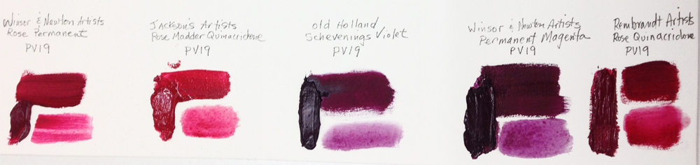
But they look really different.
Unfortunately knowing the pigment in a paint is still not a perfect solution to knowing what the colour will look like or how it will mix. Some paints made with the same pigment look really different to each other. Right now labels on artists paints do not contain all the ingredients in a paint, they show only the pigment used. They do not specify anything particular about the pigment, just the chemical name, there can still be factors that alter that pigment and change the colour, that are not listed. For example: Winsor & Newton Artists Oil Rose Permanent and Permanent Magenta (below) both are coloured with PV19 yet have a very different appearance. I asked Winsor & Newton about this and they answered “This PV 19 quinacridone pigment has many varying hues from deep red to violet. Depending on the hue will depend on whether it is used for Magenta or Perm rose. Many pigments are like this.” Reader JL Farmer left a helpful comment about this: “There are two PV19 pigments – one is PV19 Quinacridone Rose (gamma quinacridone) which includes the rose and red shades of the pigment and the other is PV19 Quinacridone Violet (beta quinacridone) which includes the violet shade and which is also marketed to include the magenta trade names.”
Does anyone know more than I do about this? I’d love to hear from you!




14 thoughts on “Pigments and Colour Names”
Great post and I hope you’ll get a reply from Winsor & Newton.
I always buy single pigmented oils and keep a record for how they look when diluted and mixed with white. And I have noticed as well that the same pigment can be quite different in other brands (warmer or cooler). Moreover, they could be different in transparency.
Vasari Oil Colours, unfortunately, are not even disclosing information on what pigment/s are inside their oils.
Thanks!
Keeping a record for yourself is the best practice for learning about the difference in paint brands.
I will add the W&N info when it comes. I hope it is enlightening.
Yes, Vasari are very proprietary about their pigment information and it puts off a lots of artists, which is a shame because it is an outstanding paint.
Noted thanks –
The Michael Wilcox School of Colour is helpful with this matter.
http://www.schoolofcolour.com
Hi Julie! There are two PV19 pigments – one is PV19 Quinacridone Rose (gamma quinacridone) which includes the rose and red shades of the pigment and the other is PV19 Quinacridone Violet (beta quinacridone) which includes the violet shade and which is also marketed to include the magenta trade names.
Thanks Josie. So there are a number of chemical variations allowed within each Pigment Name. That would explain Ultramarine Blue Light, Ultramarine Blue and Ultramarine Blue Dark, as well as the many other pigment variations.
Very true, Julie. I also remember when I learnt this principle on the same pigment being used for varieties of the same colour; so afterwards I always try to make a point of going for the strongest paint, such as Ultramarine Blue Deep, because that way, I get more pigment for my money and I can always thin-out the colour with more water while doing tints.
Hello Julie,
Like you I like to know what materials I am using. Pigment numbers are a good staring place, but as you say many of them have enormous variations, like PR101 (iron oxide). But different pgiments can also produce the same color, like PR 122 and PV19 can be made into almost the same purple pink color. When I look for a pigment I only want permanent ones. It’s better to mix the hue you want from permanent pigments than buy it made from a less than permanent pigment. Nowadays the Internet gives a wealth of information on paints, pigments and quality, reviews, color examples and manufacturers. What I usually do is get all the information I can, and then buy a small tube. If I like it, I stick to it (and buy more). Always buy artists grade if you can, they will fascinate you, while student grades are in most cases just paint, nothing really exciting.
The industry gives us pretty constant quality and constant color, yet they can also change over the years. So you have to keep checking what they put in their products.
A recent discovery of mine is pyrrol-pigments which make excellent and very lightfast orange and red paints. Numbers are PO73 and PR254/255. They can replace cadmiums, well nearly so. For the crimson-section I would stick to PV19, which is a little more lightfast than PR122 according to handprint.
Good websites to check for information are:
handprint.com (watercolorguide)
artistcreation.com (every pigment you can think of)
wetcanvas.com (become a member!)
jerrysartarama.com (very good color examples)
Of course the best way to judge a color is to go to a good art store and check the tube or look at an example panel of all the colors of one brand.
I can find almost anything I want to know by typing it in google and search the hits. there’s many people out there testing paints and writing about it. It’s a joy to read about there experinces. You would almost forget to go painting yourself!
(Sorry for any typos, English is not my mother tongue.)
Hello.
I agree whole heartedly, artist-quality paints are the way to go in terms of colour quality and the all-important lightfastness.
If I am trying a new colour, before I buy it I check the label for lightfastness first, then single pigment, then opacity or translucency.
I too, like pyrrol pigments but have not found them opaque enough to replace cadmium on my palette.
Yes, Handprint is one of my go-to sources of information.
Thanks for your comment!
What does PB15:3 mean. I understand PB15 stands for
Pigment Blue number 15 but what does :3 mean.
hi Eric,
Great question, thanks for submitting it! PB15 in the pigment code of Phthalocyanine Blue – this colour has a few variations, the main ones being the Red and Green shades. PB15 refers to Phthalo Blue without a Green or Red bias; PB15:1 refers to Phthalo Blue Red Shade and PB15:3 refers to Phthalo Blue Green Shade.
Very best wishes
Lisa
Hello there im used to paint for more over a
decade with Liquitex soft body acrylic, and
now they seem to decide not to do a lot of
the colors that i use anymore.
They send me a list of the pigments they
used to do each color but i just dont
understand the code of pigments.
Can someone help me?
Thanks
Hi Eloisa
The CI numbers (Colour Index) all start with P for pigment and the next letter stands for the hue B=Blue, Br=Brown, Y=Yellow, V=Violet, etc. Then the number tells you the specific pigment.
You don’t need to know the chemical name, the number is enough to compare one paint tube to another. It is the number written on the tube, not the name. For instance PB29 is Ultramarine Blue, no matter what medium or brand. PB15 is Phthalo Blue in oils, acrylics, watercolour, pastels and more. PW4 is Zinc White, you see it in a lot of pre-mixed pastel colours.
So if you are trying to compare what’s in one tube with another tube, check they have the same numbers. (Close numbers doesn’t mean the colours are close, they are randomly numbered.)
If you still want to know the chemical names, this pigment list might be helpful:
http://www.winsornewton.com/uk/discover/resources/composition-permanence/professional-water-colour
If you want to know more about pigments I have a blog article coming out in a couple of days here and Bruce MacEvoy on Handprint covers everything you’d ever want to know – just click on each colour across the top to see the list of names and numbers for each colour family.
Hi, this is a great topic and information, including the comments! Thanks.I found that one link for the Colour Index pigment numbers was out of date. I have this one from Golden Paints. https://www.goldenpaints.com/technicaldata/pigment
Thank you for letting me know, Liz. And for the very helpful link replacement!
Comments are closed.