



Of all the artist colours, black may well have the longest history. Charcoal, soot, and charred animal bones were used in the earliest prehistoric cave paintings. Today, there are a number of black pigments available to artists, and many paint ranges include more than one. In this article, I compare the different properties of the most commonly used black pigments, as well as suggest some ways that black can be used in an artist’s palette.
What Are the Differences Between Black Pigments?
The pigment index number, which indicates the chemical composition of the pigment, can give an indication of the characteristics of the colour.
PBk9 – Ivory Black or Bone Black
PBk9 tends to be semi-opaque to semi-transparent and it is usually lower in tinting strength than the other carbon-based black pigments. For this reason, it is great for mixing This pigment’s uniqueness lies in its warmth – it often has a yellow or brown undertone which can be seen in glazes, and in tints with white. As the name suggests, Ivory Black was originally made by carbonising ivory. While this is no longer the case, any black paint containing the pigment number PBk9 is produced from animal bones, which is something to bear in mind if you wish to avoid animal products.

From left to right: Masstone, 1:1 glaze with a medium, 1:1 tint with Titanium White.
PBk7 – Carbon Black
Today, PBk7 is made today by burning coal or natural gas, but is traditionally derived from carbonising plant matter, like in the production of charcoal. Paints made with PBk7 are usually very opaque and have a high tinting strength thanks to the small, dense pigment particles. PBk7 can range from neutral to cool in temperature.
PBk6 – Lamp Black
Lamp Black used to be made using the sooty residue collected from oil lamps, but today it is made from the burning of gas or oil. It is a semi-opaque to opaque, intense black with a high tinting strength. PBk6 often has a cool undertone, giving a bluish-grey when mixed with white.
Both PBk6 and PBk7 are made with almost pure amorphous carbon and have very similar properties. In fact, many paints that are labelled as Lamp Black are made with PBk7. Below is a comparison of PBk7 (top) and PBk6 (bottom), and you can see the similarity in opacity, tinting strength, and temperature.
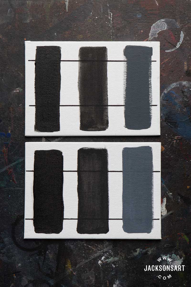
Bottom: Winsor & Newton Artist Oil, Lamp Black.
From left to right: Masstone, 1:1 glaze with a medium, 1:1 tint with Titanium White
PBk11 – Mars Black or Iron Oxide Black
Mars Black is different to all of the previously mentioned black pigments because it is not carbon-based. The Mars family of pigments, which also includes Mars Yellow and Mars Violet, are synthetic iron oxides and were developed in the 20th century as alternatives to natural earth pigments. Mars Black, along with Carbon Black, is one of the most opaque of the black pigments, so it is ideal if you need good coverage. It is often warm in undertone, and in mixtures it has a high tinting strength and can easily overwhelm other colours.
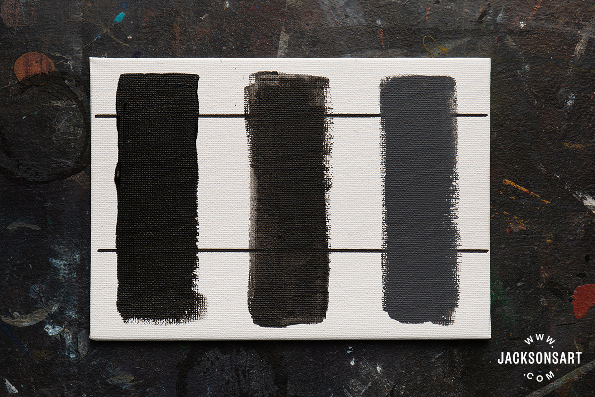
From left to right: Masstone, 1:1 glaze with a medium, 1:1 tint with Titanium White.
Mars Black dries much faster than the carbon-based black pigments, so it is better suited to underpainting than Lamp Black, Carbon Black, and Ivory Black. In watercolour, PBk11 is a very granulating black pigment.

It’s worth remembering that not all black paints will have the corresponding names and pigment numbers. I found, for example, paints named ‘Ivory Black’ with different pigment index numbers (PBk9, PBk6, PBk7, or a mixture). Characteristics like opacity and temperature can vary depending on the binding medium and how the pigment has been processed. If you find that your black paint isn’t as cool or warm as you’d like when used straight from the tube, then you can easily adjust it. If you want your black paint to be cooler, then adding a touch of blue will give it a cold undertone. Likewise, a touch of a warm earth colour, like Raw Umber will warm it up.
How Useful is Black in a Palette?
Whether black is a necessary colour in a palette can be a subject of disagreement among artists. It has a reputation for making ‘muddy’ mixtures and for dominating the other colours in a painting, especially when used neat. Some artists choose to mix chromatic blacks for the very darkest values in their painting (for example, Ultramarine Blue and Burnt Sienna, or Viridian and Quinacridone Magenta make a deep, near-black), instead of using tubed black paints. There is a well-known story about Claude Monet and John Singer Sargent going painting together. Monet recalls in his writings that Sargent needed to borrow his paints, and was horrified by the lack of black in his palette. “I gave him my colours, and he wanted black,” Monet writes, “and I told him ‘but I haven’t any,’ ‘then I can’t paint’ he cried, ‘how do you do it?’”
This story underlines the fact that some artists, like many of the Impressionists, avoided using black in their palettes, while others find it indispensable.
- With white it makes a spectrum of greys that can be adjusted with other colours.
- With Ultramarine Blue it makes Paynes Grey. A cool black, like Carbon Black or Lamp Black, are most commonly used in premixed Payne’s Grey paints.
- With Cadmium Red it makes an earthy maroon.
- With Phthalo Blue Red Shade it makes a deep blue similar to Prussian Blue. This is particularly useful for acrylic painters as a single pigment Prussian Blue is not available in acrylic paint ranges due to stability concerns.
Black is certainly useful for making muted, subdued mixtures like those above, but another one of its strengths is creating surprisingly vibrant greens when mixed with yellow. With a cool yellow, like lemon yellow, it can create acidic, almost fluorescent, greens. With a warmer yellow, like Cadmium Yellow Medium, it makes golden olive greens. An orange-yellow, such as Cadmium Yellow Deep, makes some natural browns. This can make black a surprisingly useful addition to a landscape palette.

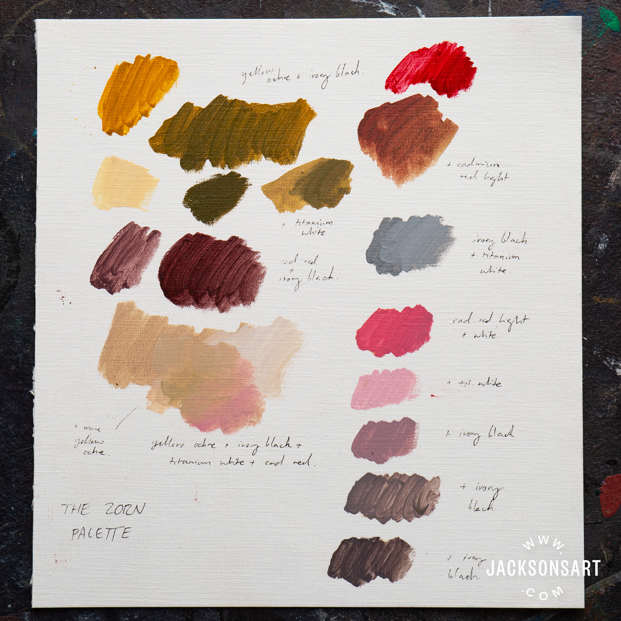
The Zorn palette is a well-known example of black taking a central role in an artist’s palette. Used by Swedish artist Anders Zorn (1860–1920), it consists of only four colours; Ivory Black, Flake White (which can be replaced with Titanium White), Yellow Ochre, and Vermillion (a historical pigment which can be replaced with Cadmium Red Light). Using a limited palette, such as this one, is a way of creating visual harmony throughout a painting. The Zorn palette is unusual because of the absence of a blue pigment, but it’s interesting that within the context of the other colours, the mixture of Ivory Black and Titanium White looks very blue.

Further Reading
The Story of Ultramarine Blue and French Ultramarine
The Enduring Appeal of Alizarin Crimson
Five Yellows and How to Use Them
The Unexpected History of Payne’s Grey
Shop Ivory Black, Carbon Black, Lamp Black, Mars Black, and other colours on jacksonsart.com


45 thoughts on “Getting the Most Out of Using Black Pigments in Your Palette”
Fantastic article – I use a lot of black so
really useful and clear info.
Interesting article, generaly I’m with Monet, I don’t have a black on my watercolour pallette if a concentrated Payne’s grey isn’t enough I’ll mix a black, if I really need a lot of well covering black then I’ll reach for the ink, though as most of my art is ink and watercolour that is an easy option.
An interesting article. I am so pleased
that you are regarding black as a colour
rather than merely something to create
variation in tones. Every colour has its
own unique properties – hue, chroma,
transparency and tonal value. Adding
black or white to change tone without
understanding the effect on other
properties can result in dull muddy
paintings rather than ones that are alive
with light. In landscape painting I
probably use black and yellow mixtures
more than pre mixed greens.
Merci de toutes ces précieuses
informations sur l’ histoire des couleurs
Et en particulier sur le noir dans la
peinture
De rien! Merci pour votre commentaire et nous sommes ravis que vous ayez apprécié la lecture de l’article. Best, Clare
Thank you for publishing this article on
‘blacks.’
I usually avoid using black in my palette,
but now, after reading all the different
types of blacks, I may try some. I like how
the color mixures stay unified with black.
Thank you! I really find the mix of blacks and
yellows very useful.
I use black primarily for making
greens with different yellows. It
also makes a grape color with
alizarin crimson, and I will also
use it to modulate colors, but not
extensively.
I thought I saw an email with a charcoal
putty. Now i can’t find it.
You can find the Viarco Charcoal Drawing Putty on our website here: https://www.jacksonsart.com/viarco-artgraf-drawing-putty-no-1-450g-with-ceramic-jar
This is an extremely informative article
and answers a lot of questions for me.
Thank you.
Thanks Evie, that was useful and interesting!
That was a useful article, I’ll have another
look at my palette now.
Thank you Trevor.
I recall Rowland Hilder, the great English
watercolourist, saying that John Constable
used a mix of lamp black with lemon yellow
to emulate the beautiful greens of nature:
hues that are impossible to obtain using a
blue. He dubbed this mixture “Constable
green”.
Hi Alan,
This is really interesting, thank you for sharing! It’s true, black and yellow create beautiful naturalistic greens, and a touch of black and really help a blue/yellow mix from looking too poster-bright.
Many thanks
Lisa
I am 65 and have painted all my life. Reading
your articles makes me realise….we are
never too old to learn and experiment …
Very true! Thanks, Anne.
No mention of neural tint in this article – is it derived
from black and which one?
Thanks, interesting article all the same.
Hi George, yes I forgot to mention Neutral Tint! It is usually a mixture of pigments, for example – a red, a blue, and any of the black pigments mentioned above, which combine to make a neutral colour.
Hi Evie,
I’m really after neutral black acrylic for
my underpainting. It’s difficult to work
out how to progress when the result is
tinted blue. Have the same problem
with coloured pencils too but at least
with acrylics it’s easier to fix.
Hi John, many black paints tend to lean towards a cooler, bluish hue. Golden Acrylic’s Neutral Grey 2 might help – while it’s not black, it is the darkest neutral grey in their range. Alternatively, you could add a little bit of a warmer colour, like raw sienna, to your black acrylic to nudge it towards a more neutral colour. I hope that helps!
thank you! Very interesting article. I did not
know ultramarine and black make Paynes
grey. As I don’t have Paynes grey and
sometimes require it to make a green this is
very useful along with all the other info.
That’s great, thank you Gabrielle!
Great article. Anyone who does not regard
black as a valid colour or treats black as a
colour that should rarely be used needs to
experience a Pierre Soulages painting in
person.
Thanks John!
Great article- black for me is a colour!
A must have
Thanks Kiki!
Very informative but PBk7 and PBk9 seem to be
reversed according to the information on the
artiscreation website – e.g.
https://www.artiscreation.com/black.html#PBk6
Please will you clarify.
Hi Jonathan, artiscreation is usually my go-to place for pigment info and I noticed that too. However I found that in all other sources PBk6 is lamp black, and PBk7 is carbon black so I decided to go with those names for the article.
Very interesting information. I work in oils
and Tempera and generally avoid using black
although I have a few tubes. I usually
suspect that my highlights are too bright if I
get the feeling I might need black
I’ve spent all of my painting life being told
to avoid black as it isn’t a ‘proper’ colour
and that it kills other colours. But I mixed
a Zorn colour chart just to see what it was
like and discovered a world of lovely soft
blues and greys. If used on its own terms
and not just to darken other colours, black
possesses its own magical qualities. A
real eye opener to me. Thank you!
Thank you – this is a really interesting and
helpful article – after years of avoiding black
and white I have just tried a pastel painting
based on the Zorn palette and I am intrigued
by the results. Keen to try some more now 🙂
That’s great, thanks Brendal!
I am learning color theory for the first time
and found this article very very helpful and
informative. I will be referencing it as I paint!
So good to hear that it’s helpful, thank you!
Are all black colors you tested matte? I am
currently using bone black in my acrylic
landscapes, usually mixing with other
colors. In some areas, when the black
stands alone, it is very matte compared to
other pigments. Thinking of trying Mars
black to see if it is less matte. Thoughts?
Hi Sarah! It depends on the brand of acrylic you use, but all of the Golden black pigments I tried in this post are quite matt. You could add a little bit of gloss medium to your black paint, or finish your paintings with a varnish to unify the sheen of the surface.
Hi. Excellent article. I paint miniature figures
(resin or white metal) using oil paints. I have
always had difficulty with black. I think this
will really help me. Many thanks!
So glad you found it helpful! Thank you
This article was really interesting. I was
looking for a particular opaque velvety
black and in the end purchased W337
Holbein Peach Black in watercolour and
W&N Jet Black Designers gouache, I
noticed that they were both PBk1. Is PBk1
not a pigment you’d recommend?
Hi Jo, I should have mentioned PBk1 in this article! It isn’t as lightfast as other black pigments. I’ll be publishing a black pigment index resource in a few weeks, so you might find that helpful!
Don’t forget the all-natural and slightly-blue
PBk8 vine black. The St. Petersburg version
Voronezhskaya Black is great for line and
wash.
Love black with lemon yellow. Makes a
great olive green for landscape painting.
Must try cadmium orange and black
now. Thank you for a very informative
article.
Those sounds great!
Thanks for reading!
Comments are closed.