



Every artist has their own unique requirements for the paper they paint and draw on, from robust handmade sheets for vigorous painting techniques, to smooth paper for fluid washes and intricate detail. To celebrate the release of our Paper Guide, we asked five artists to test Jackson’s paper and report on their observations. Will Assheton, Kate Lehman, Maysaloun Faraj, Frances Hatch, and Jane Northcote selected paper most suited to their practice and working style. Here, they share their thoughts.
Above image: Frances Hatch’s painting in progress, on location using Jackson’s Two Rivers
Will Assheton
I work primarily in black and white ink on card, focusing the majority of my practice towards perspective and architectural structure. Recently though I have been implementing more colour into my work using pro marker pens with satisfactory results, but there is however a lot of room for improvement. Along with a couple of Jackson’s watercolour paper blocks, I tried their watercolour paints which really helped push my style in ways that I hadn’t been brave enough to explore until now.

Will Assheton
Pen and watercolour on watercolour paper, 18 x 25.4 cm, 7 x 10 in.
Through lockdown my ability to draw from life has been somewhat limited, but not at all wasted as I’ve been focusing on ways of expanding my repertoire as an artist and have been able to work through a large back catalogue of previously untouched images and ideas.

Will Assheton
Pen and watercolour on watercolour paper, 18 x 25.4 cm, 7 x 10 in.
As I’ve only recently started painting again after several years focussing on my practice as a draftsman I was naturally quite nervous about the whole process. However, my mind was set at ease by the high quality of the materials. The watercolour block pads are fantastic to work on both in watercolour and ink, the rough pad has a lovely textured surface providing more drama, and the hot pressed is perfect for more intricate line work with its smooth, thick surface.

Will Assheton
Pen and watercolour on watercolour paper, 25.4 x 18 cm, 10 x 7 in.

Will Assheton
Pen and watercolour on watercolour paper, 25.4 x 18 cm, 10 x 7 in.
About Will Assheton
Will studied drawing at Camberwell College of Arts and graduated in 2016. Structure and its aesthetic has always been an interest to him, and his architectural drawings are an exploration of perspective and tone. At the moment he is running live drawing sessions on Instagram, which are an excellent resource for artists of all abilities. In these sessions, he aims to teach a better understanding of perspective and gives tips for improving your overall drawing technique.
Kate Lehman
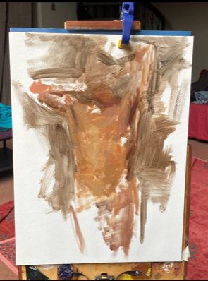
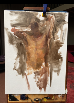
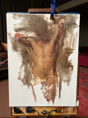
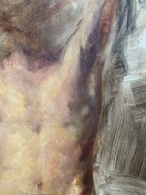
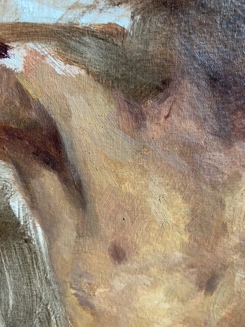
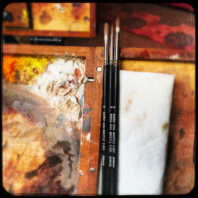
After moving to my new studio and getting setting up the space I was excited to paint. Usually, I paint on copper but recently I have been working more on paper. I tried Jackson’s Watercolour Paper Block 300 gsm Cold Pressed. Since I still wanted to use oil paints it was important to find something to seal and protect the paper.
I have really enjoyed the texture of the Jackson’s block watercolour paper. It was hard to find a sealant that was not overly absorbent so I was happy to discover the Michael Harding gesso. It sealed the paper nicely but allowed me to work on the drawing and move it around easily.
About Kate Lehman
Kate Lehman was born in London in 1968. She was raised in Paris where her parent’s pursuits exposed her to the world of the arts. Her formal art education began at age of 15 at L’Academie de la grande chaumiere, L’Academie Roederer and ATEP Lecompte. Dissatisfied with her studies she moved to New York where she worked briefly in the film industry. In 1994 she discovered traditional academic training at the Minnesota River School where she met Patrick Devonas, a major influence on who she would become as an artist. Lehman began studying at the Water Street Atelier in Brooklyn under Jacob Collins and Rick Piloco in 1996. Her work has been shown in Galleries and Museums across the country and in Europe. She currently lives in Paris with her husband Travis Schlaht and their two children.
Maysaloun Faraj
When the Jackson’s Art team invited me to try out Jackson’s Paper Blocks, I was only too delighted, particularly as I purchase all my art supplies from Jackson’s! I was generously provided with the requested Jackson’s 12”x16” Acrylic Block, as well as an assortment of Posca Acrylic Pens and gesso primer. On receipt, I wasn’t certain how to separate the pages as they seemed bound tightly together from all sides. When I referred back to Jackson’s they kindly advised that ‘it is a gummed block so designed to be painted onto and then peeled away. One corner or edge should be loose so one can put a blunt knife or a scalpel under it and loosen the paper away from the block.’ With this I got going, first with my usual application of black paint to prime the entire surface of the first page of the block. This caused some warping with the paper, which I left to dry overnight. The next morning, I was pleasantly surprised to find that the paper had returned to its original flat state, having been securely gummed/pulled in place. I started to sketch my still life subject in pencil. Once I was satisfied with the overall composition, I re-did the pencil drawing with white Posca acrylic pen (fine tip), working various details as need be.


I then used a selection of Posca colours of various tips sizes, in multiple layers to achieve the required finished affect… and voila!


About Maysaloun Faraj
Maysaloun Faraj is London-based artist: painter, ceramist and sculptor. Growing up between the USA where she was born (1955), Baghdad where she studied Architecture (1970s) and London where she lives (since 1982) with intermittent bouts in Paris, contributed to shaping Faraj’s creative output and artistic accomplishment. She received a BSc in Architecture from the University of Baghdad (1978) and studied ceramic sculpture at Putney School of Art and Design. Faraj was resident artist at the Cité Internationale des Arts, Paris (2015/17/18). In her work, Faraj contemplates the intersection of place and identity and explores the dynamics between overarching societal concerns and the highly personal.

Her visual vocabulary is colour and basic geometric forms; an ideal realm for hope, harmony and order. Amid an aesthetic informed by architectural discipline is a complex web of references bridging East and West, ancient and contemporary, often pondering on ‘spirituality’ and the transience of human existence. Maysaloun Faraj has been living and working in London since 1982.
Frances Hatch
I’ve come to the waters edge in Portland Harbour in Dorset to try out a selection of Jackson’s materials that I hope might be useful to me; Jackson’s Two Rivers, Jackson’s Icon Quill brush size 6 (synthetic Sable), Jackson’s watercolours (Lemon Yellow, Phthalo Blue, Quinacridone Purple and French Vermillion), and Jackson’s acrylic gel medium

I asked to try the heaviest weight of Jackson’s Two Rivers (640gsm) because I ask a lot of my paper. I’m a site-responsive painter using water-based media. I integrate site earths, coarse and raw, with pure watercolour and gouache washes. I’m therefore looking for an ease and receptivity to watercolour accompanied by sturdiness to withstand lumps of earth material being dragged across the surface. I need to be able to batter as well as stroke!


I’m also trying out a new synthetic sable quill brush. I rarely buy a new brush. It’s springy, points beautifully and hold loads of paint. I admit that earlier on in my career I wasn’t awake to the implications of buying sable and I thoroughly recommend this full-bellied fine-pointed brush. I recommend treating yourself to a new brush – this one brought a real spring into the work. I tried it out first with a double-page spread in my sketchbook using Quinacridone Purple (not a pigment I’m familiar with) with a touch of Lemon Yellow and Phthalo Blue:

I’m accustomed to using Khadi paper– a handmade made cotton rag paper which serves me well. An important consideration for me here is that Two Rivers is made in the UK. I went to visit the mill in Somerset on a college trip many years ago… I remember the roar of falling water- the mossy valley and vats of white flocked pulp. Looking at the recent visit the Jackson’s team made it looks exactly the same.

With 640 gsm paper I don’t need to stretch it on a board. I can work right to the deckled edges. I’ve scored and trimmed down the sheet to make a thin landscape format. The paper eased as I split the sheet and so I maintained the appearance of a deckle. The paper takes the paint beautifully. After a brief baptism in sea or rain it is even more pliable and receptive. The Jacksons acrylic gel medium is a little glossy when neat, but it is easy to dilute. It dries matt when extended and holds the sand and grit well. The painting being developed here was made using the four Jackson’s watercolours mentioned at the beginning of this article. So many possibilities are available within a limited palette.


About Frances Hatch
Frances was born in the Isle of Ely, Cambridgeshire. She lives in Weymouth, Dorset, and her home is a short walk from the Jurassic Coast. Direct work en plein air is central to Frances’ site-responsive practice. She studied at Aberystwyth University College of Wales (BA) and Wimbledon College of Art (MA) and Goldsmiths College (ATC). She is a senior tutor at West Dean College.
Jane Northcote
Mostly I draw in sketchbooks, because that keeps my work in order, and because I draw on location, standing up, and so I need to keep the work small. I have also used paper blocks for on-location drawings, especially when someone has commissioned a piece of work.

The Jackson’s 10” x 12” (cold pressed) loose sheets were therefore a new departure for me. I taped them to a sheet of corrugated cardboard from a delivery box, using low-tack masking tape. This has the benefit that it creates a white frame round the picture when the tape is removed.

It takes the watercolour well, and colours can be layered. The colour adheres well, and the paper does not crumble.

It’s possible to erase pencil without damaging the surface of the paper. Although the cold-pressed surface has some texture, it takes pen very well. I use fountain pen. The nib didn’t skip or clog. I really enjoyed using ink on this paper.
I found that, for wet washes, the paper undulated and bent. This was a bit of a nuisance, as the colour then drained towards the gulley. The paper straightened out again as it dried though. Another problem was that the low-tack masking tape pulled the surface of the paper off in places. I am using the lowest tack of masking tape, the least sticky. The picture below shows use of masking tape to get a straight edge. The masking tape ripped a bit of colour off the sky, together with a fragment of paper.


It was possible to use the scratch technique to remove paint from a wet wash.

It’s important to be quick, as the colour sinks into the absorbent paper. It was also possible to lift colour off the paper when wet.

The paper is more absorbent than the Arches Aquarelle paper I’ve been using recently and less absorbent than Saunders Waterford. The colour sinks in. This means that it takes a bit longer to dry than the Arches paper, and some of the granulation effects are different. The Arches paper is also stiffer, which makes it easier to handle.
Overall I enjoyed using the paper. Thank you to Jackson’s for sending me the pack to try. I think if I were to use it on location I’d use blocks rather than loose sheets. I’ve also used Jackson’s paper in the form of sketchbooks and I wrote reviews on my website.
About Jane Northcote
Jane says: “I draw pictures, mostly pen and wash, mostly of buildings. The reason I draw is to make me see. When I look carefully at a building to draw it, I appreciate the effort the builder has put in, and I witness the modifications and adjustments made by people who live and work there. I see how the window sills line up, or don’t line up. I notice how the guttering has been re-routed, ventilators have been added on, or stucco has fallen off. Local buildings have many occupants, now and in the past. The place becomes adapted, and made individual. It decays, or is renovated. Original ideas of the architect or builder are re-interpreted, shifted, and altered to accommodate purposes unimagined when the building was constructed. It becomes the improvised work of a community, past and present. So the building in front of me represents a moment in time, and holds a story of what’s happened and what’s happening. That is what I like to draw.”

janesketching.com
You can see more of Jane’s sketchbook reviews here
Use or search the Instagram tag #jacksonspaper to see more.



7 thoughts on “Five Artists Experiment With Jackson’s Watercolour Paper”
I found these articles very useful,
and miss being able to pop into
the Gloucester shop. The blocks
sound interesting. At the moment
I am using Hahnamuhle.
Hi Liz, thanks for the feedback. We miss having the shops open too, but were happy to be open online still.
Gloucester are operating a click and collect service if that helps.
Best, Clare
What about hot press for botanical
illustration? the new one was.like blotting
paper, but ok for coloured pencil.
Hi Barbara,
We have a hot press paper in the Jackson’s range. You can see it here.
Thanks, Clare
Great article as always from Jackson’s Art !
Jane – Having used low tack masking tape for years to aid specialist decoration I found that the best was undoubtedly Kleenedge Low Tack.
If you want a crisp line then nothing beats Frog Tape but it only works with water based paint and somewhat unsatisfactory with oil based paint.
Hope this is helpful.
Nick.
Thank you, Clare! Love this article on the
review of paper from 4 incredible, and
incredibly different, artists. So very well
written and unbiased. I have often
wondered what hot press paper would be
like to paint watercolors on, though I tend
to lean more towards the cold press.
Reading this post I am inspired by so
many things: Adding more detail to my
work ala Will Asheton, using the scraping
technique to lift paint from my paintings
ala Jane Northcote, using more black in
my work ala Maysaloun Faraj, and adding
Texture to my paintings ala Frances Hatch.
Finally, I am now working on my wish list
of supplies to order from Jackson Art to
have delivered to me here in sunny (albeit
cold at 6am now) California. Thanks for
sharing all of your wonderful information
and resources. Much Aloha!
Hi Mika,
Thank you for your review. It’s good to
hear you’re inspired to try new things from
each of the artists.
All the very best, Clare
Comments are closed.