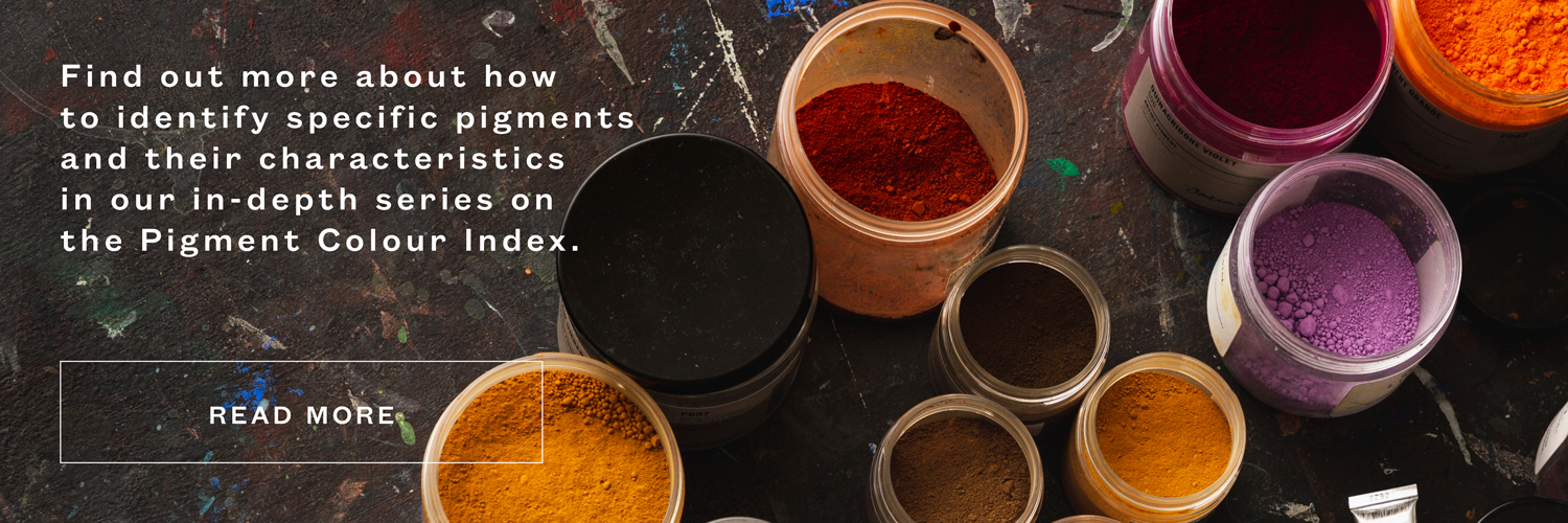
While various oranges can be mixed with yellow and red, a single pigment orange can offer more vibrancy and create cleaner mixtures than any mixed orange. Apart from natural orange ochres, the only orange pigments available to artists of the ancient world were highly toxic. Realgar was an arsenic-based orange pigment used in Ancient Byzantium, and was made extensive use of during the Italian Renaissance, most notably by the Venetian artists like Titian and Veronese. The development of Cadmium colours in the 19th Century brought new options for orange pigments, and by the mid 20th Century the modern synthetic organic pigments, including Benzymidazolone and Pyrrole oranges, expanded the possibilities even further.
Here is a guide to the orange pigments used in artist paints today according to the Pigment Colour Index, identified by the prefix PO. Find out more about the Colour Index and why it is useful to artists in this post.
Each swatch is an example of an artist paint that uses that particular pigment, and the actual colour may vary. You can click on each swatch to go to the paint that is pictured.
PO 5 – Beta Naphthol Scarlet
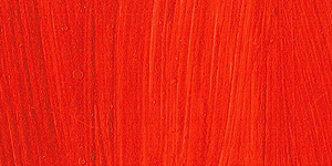
Colour Description: Very red-orange
Transparency/Opacity: Semi-transparent
A very versatile colour for mixing, PO 5 is so red that it can be used instead of a red pigment in a palette. It reveals a pink undertone when diluted or mixed in tints with white. Take a look at PO 5 in mixtures in this post. There is conflicting information around PO 5’s lightfastness, particularly in watercolour or when applied in thin layers. If this is a concern, try Pyrrole Orange (PO 73) or Benzymidazolone Orange (PO 36) instead. In watercolour, PO 5 is very staining.
PO 17 – Monoazo Orange
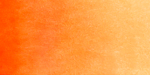
Colour Description: Red-orange
Transparency/Opacity: Transparent
A relative of Beta Naphthol Scarlet PO 5, Monoazo Orange leans slightly more towards yellow. It isn’t considered to be a lightfast pigment. For a lightfast alternative, try Pyrrole Orange (PO 73).
PO 20 – Cadmium Orange
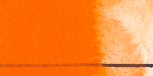
Colour Description: Bright warm orange
Transparency/Opacity: Opaque
Cadmium Orange is made by modifying Cadmium Yellow (PY 35) with Cadmium Selenide. Like other Cadmium pigments, PO 20 is a very dense and dominant colour that is best mixed with other highly tinting colours. Try combining it with Phthalo Green (PG 7) and Titanium White (PW 6) to make subtle greys. Cadmium is a poisonous metal, but the Cadmium used in artist paints cannot be absorbed by the body so the risk to the artist is low. However, special care should be taken to avoid inhaling dry Cadmium pigment. Cadmium Orange’s opacity means that it isn’t best suited for glazing techniques – for a more transparent orange try Benzymidazolone Orange (PO 36 or PO 62) or Pyrrole Orange (PO 72 or PO 73). These alternatives are also higher in chroma than Cadmium Orange.
PO 36 – Benzymidazolone Orange
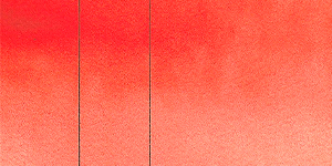
Colour Description: Reddish-orange
Transparency/Opacity: Semi-transparent to semi-opaque
The Benzymidazolone pigments are a group of modern synthetic organic red, yellow, and orange pigments. They are renowned for their vibrancy and excellent lightfastness, making them ideal for artist paints as well as a range of applicants as industrial colourants. PO 36 has a strong red bias, so it can take the place of red in a palette. With a touch of Dioxazine Purple (PV 23) it makes some interesting deep maroons.
PO 43- Perinone Orange
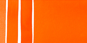
Colour Description: Mid to red-orange
Transparency/Opacity: Semi-opaque to transparent
The Perinone pigments were introduced to artist paints in 1960s. Perinone Orange is less red than Benzymidazolone Orange (PO 36) and Beta Naphthol Scarlet (PO 5), but it still has a slight red bias. Combine with Phthalo Blue (PB 15) to make a neutral grey.
PO 48 – Quinacridone Orange
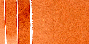
Colour Description: Brown-orange with golden undertones
Transparency/Opacity: Semi-transparent to transparent
An earthy orange pigment, Quinacridone Orange is an interesting alternative to the traditional earth pigments as it offers a vibrancy and high chroma that natural earths often lack. Try mixing it with different blues to make a range of golden greens. There are some sources that say that PO 48 has been discontinued and may not be available for much longer in artist paints, but we can’t find anything to support this.
PO 49 – Quinacridone Gold (discontinued)
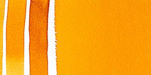
Colour Description: Deep orange, yellow-gold undertones
Transparency/Opacity: Semi-transparent to transparent
When PO 49 was dropped by car manufacturers in 2001, the pigment could no longer be produced for artists and many mourned its loss. It was an excellent glazing colour, with an earthy yellow masstone which became a bright golden yellow when diluted. All Quinacridone Gold paints are now hues (including in the swatch above), using a mixture of transparent yellow and orange pigments.
PO 59 – Nickel Orange
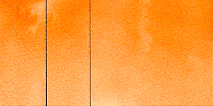
Colour Description: Light, yellow-orange
Transparency/Opacity: Transparent
Made from a nickel azomethine complex, PO 59 is a sunny, transparent orange that is perfect for glazing techniques.
PO 62 – Benzymidazolone Orange
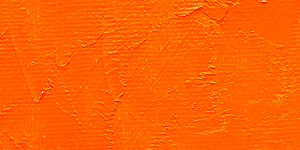
Colour Description: Light red-orange or yellow-orange
Transparency/Opacity: Semi-transparent to semi-opaque
PO 62 tends to lean a little more towards yellow than PO 36, the other Benzymidazolone orange. The Benzymidazolone pigments are a group of modern synthetic organic pigments known for their vibrancy and excellent lightfastness. PO 62 is moderately tinting, so it doesn’t overwhelm mixtures. Combining with Indanthrene Blue (PB 60) to make a dark neutral.
PO 67 – Pyrazoloquinazolone Orange
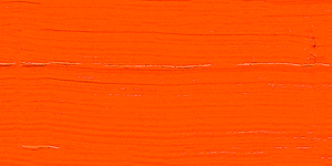
Colour Description: Very vibrant, very red-orange
Transparency/Opacity: Semi-transparent
A strong, red-orange that could be used instead of a red pigment in a palette. Pyrazoloquinazolone Orange has excellent lightfastness.
PO 71 – Pyrrole Orange
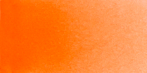
Colour Description: Red-orange
Transparency/Opacity: Transparent
The word Pyrrole derives from the Greek pyrrhos, meaning ‘fiery’, and the Pyrrole family of pigments are a modern group of red and orange colours that live up to their name. Pyrrole Orange was originally developed as a pigment for automotive paint, but for artists it makes a very useful as a transparent alternative to Cadmium Orange (it is better suited for glazing). Mix with Phthalo Blue and white to make a grey-green.
PO 73 – Pyrrole Orange
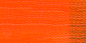
Colour Description: Red-orange
Transparency/Opacity: Semi-transparent to semi-opaque
Another orange Pyrrole pigment, PO 73 usually leans slightly more towards red than PO 71 but is in most ways very similar. It is a highly staining pigment in watercolour, and is difficult to remove from the paper once applied.
This post is part of an ongoing series about the Pigment Colour Index.
- White Pigments (Codes beginning PW)
- Yellow Pigments (codes beginning PY)
- Red Pigments (Codes beginning PR)
- Violet Pigments (Codes beginning PV)
- Blue Pigments (Codes beginning PB)
- Green Pigments (Codes beginning PG)
- Brown Pigments (Code beginning PBr or NBr)
- Black Pigments (Code beginning PBk)
You can also read our Pigment Stories series to find out about the history behind some widely used pigments.
Shop pigments at jacksonsart.com