



In this article, I explore the techniques of the Rococo painters by examining the stylistic choices in their idyllic works. Through the patronage of the French aristocracy, artists like Watteau, Boucher, Fragonard, and Vigée le Brun formed the flamboyant imagery that we know Rococo for today. Then I demonstrate how to create your own Rococo works in painting and drawing media. Articles in the Techniques Series define the meaning and context of art making processes and give practical tutorials on how to work with them.
Rococo Techniques for Painting and Drawing
Definition: Rococo describes the opulent ornamental style of late Baroque art and architecture popularised by the French aristocracy. The word originates from the French for rock or broken shell – ‘rocaille’, referring to artificial shell-covered grottos. In fine art, it appears as a distinctive collection of overwhelmingly sweet aesthetic choices – from pastel blues and pinks to floral flourishes, theatrical costuming, powdery skin, and flirtatious gatherings.
What is the Effect of Rococo?
Rococo didn’t just populate the paintings of its time, but flooded whole rooms, furnishings, and ceilings with swirling patterning. It’s a movement of loud luxury, communicating the wealth and status of those with the means to gild every surface. The overt privilege and direct connection to Royalty by the people who popularised Rococo make the techniques of the movement almost synonymous with the idealism of the out-of-touch. Suffering, poverty, or ugliness never feature in Rococo painting. To others, the fantasy lands that exist within Rococo are appealing for their frivolity and total freedom from reality. Many of the paintings have an asymmetrical composition, with a dusty pink and blue palette, making them appear lighthearted and playful. While the whimsical subjects exist mostly for our visual delight, rejecting deeper meaning.
The History of Rococo
Rococo art evolved through the Baroque painters of the late 17th and early 18th Century France, before spreading across Europe. Jean Antoine Watteau was among the most influential early artists of the movement, who developed a new genre of painting called fête champêtre – painting lavishly dressed figures courting in imaginary landscapes. The people in these scenes are freed from the usual relationship conventions of their time by being in rural settings, which is wonderfully at odds with their extravagant outfits.
In his painting by the same title, Fête Champêtre (Pastoral Landscape), the figures are placed to represent the changing character of love through life, from the innocence of childhood on the left, to courtship and flirting in the middle, to secure couples disappearing into the shadowy trees on the right. Unlike later Rococo artists, Watteau’s works are often tinged with a feeling of sadness, or here an awareness of mortality, with the Autumn leaves changing above the party. The emotive complexity of his work is achieved through his deeper range of tone – closer to the Baroque palette – and moments of narrative subtlety. His work doesn’t have the sugary effect of the later Rococo painters who looked to him for reference.
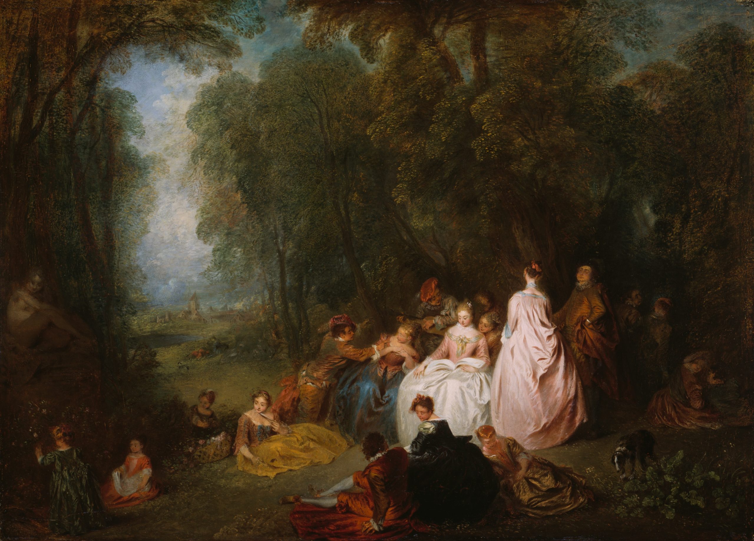
Jean Antoine Watteau
Oil on Panel, 48.6 x 64.5 cm | 19.1 x 25.4 in
Art Institute Chicago
François Boucher was inspired by Watteau and Rubens to conjure up his sensual Baroque paintings. One of his key patrons was Madame de Pompadour, the official mistress of Louis XV of France, who is also known as ‘the godmother of Rococo’ for her patronage. Her support, second only to the King himself, elevated Boucher to become one of the most important painters of the movement. They became close friends, and she favoured him as an artist for his idealised figurative style, and knowledge of the latest fashions, eager to bring her extravagant visions to life. Pompadour was intelligent and politically engaged, and earned herself a highly influential position at the French Court, which she maintained beyond the end of her relationship with the King. She commissioned numerous portraits of herself by Boucher, immortalising her importance and status, and capturing her beauty.

François Boucher
Oil on Canvas, 108.3 x 85.1 cm | 42.6 x 33.5 in
The Metropolitan Museum of Art
Alongside the portraits, he painted numerous mythological and pastoral scenes for her. In his The Toilette of Venus is a luxuriant depiction of the Goddess of Love, lounging in her tumbled riches. By this stage of the Baroque technique, the palette had evolved into its characteristic pale blues and pinks with gold embellishment. The rendering of the figures appears powdery and soft, achieved by careful blending and a narrow tonal range.
To continue the chain of Rococo’s influence, Boucher tutored the most famous artist of the movement, Jean Honoré Fragonard. He elaborated on the work of his predecessors to produce more than 550 paintings, with wondrously idyllic landscapes for his characters to flaunt in, painted rapidly in loose strokes. The masterpiece of the Rococo era is The Swing by Fragonard, where a mistress is propelled into the air by a gentleman receding into the background, whilst her affair partner gazes up at her in admiration, hidden in the bushes below. The erotic undertone and lightheartedness of this painting is typical of Fragonard’s oeuvre, avoiding weighty classical subjects that the Academy valued, in favour of frivolous scenes, fantasy portraits and everyday moments.
Jean Honoré Fragonard
Oil on Canvas, 81.3 x 65.4 cm | 32 x 25.8 in
The Metropolitan Museum of Art
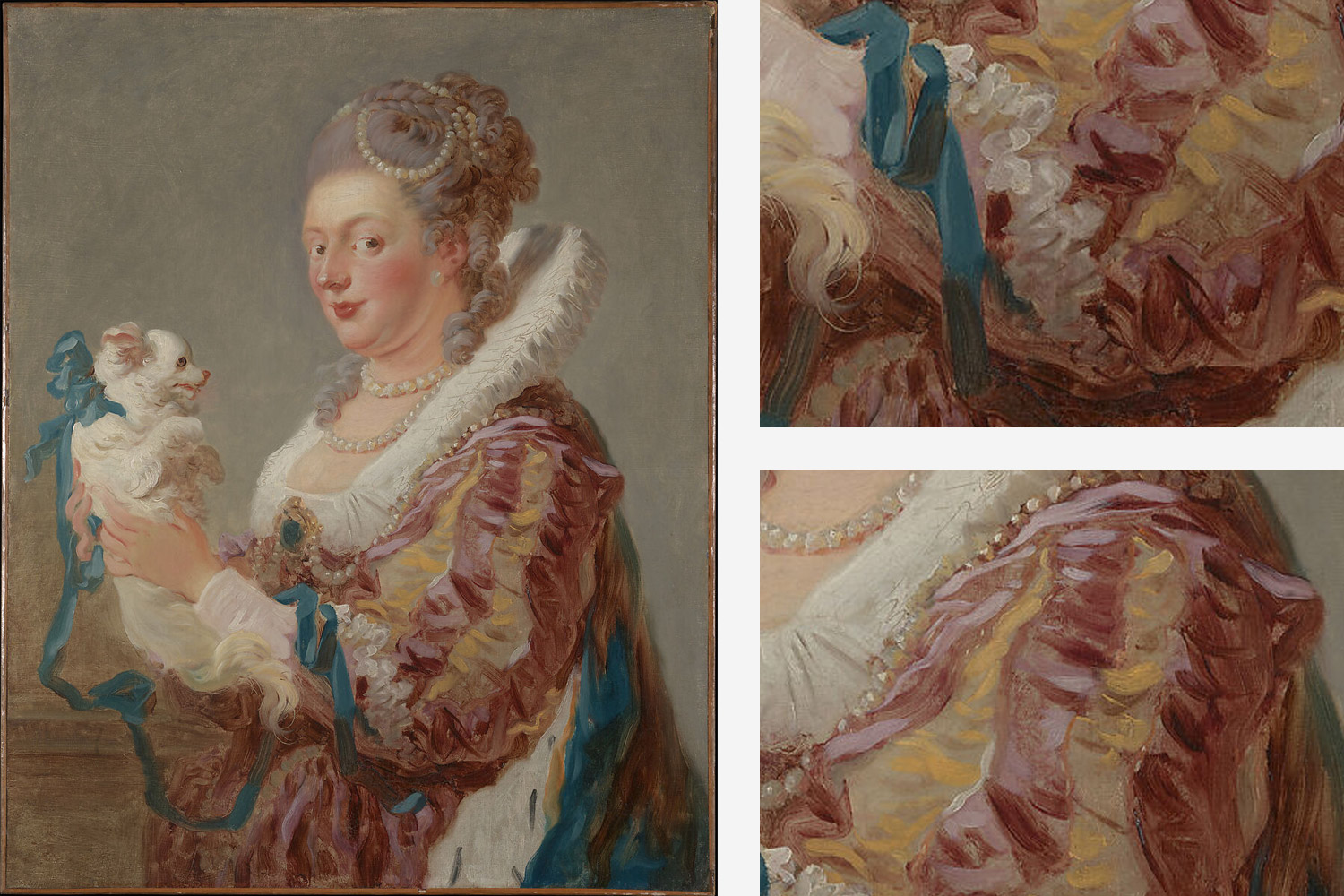
His painting Marie Emilie Coignet de Courson with a Dog sees the subject painted in an extravagant costume with a theatrical ruff – harkening back to the outfits of the previous century – with a tiny dog, adorned with a trailing blue ribbon. At first glance, the soft detail of some areas of the painting tricks the eye into believing it’s all carefully rendered in fine detail – but some passages are incredibly loose and painterly. Fragonard’s interpretation of the Baroque translated the thematic feeling of freedom into the brushwork itself, too.
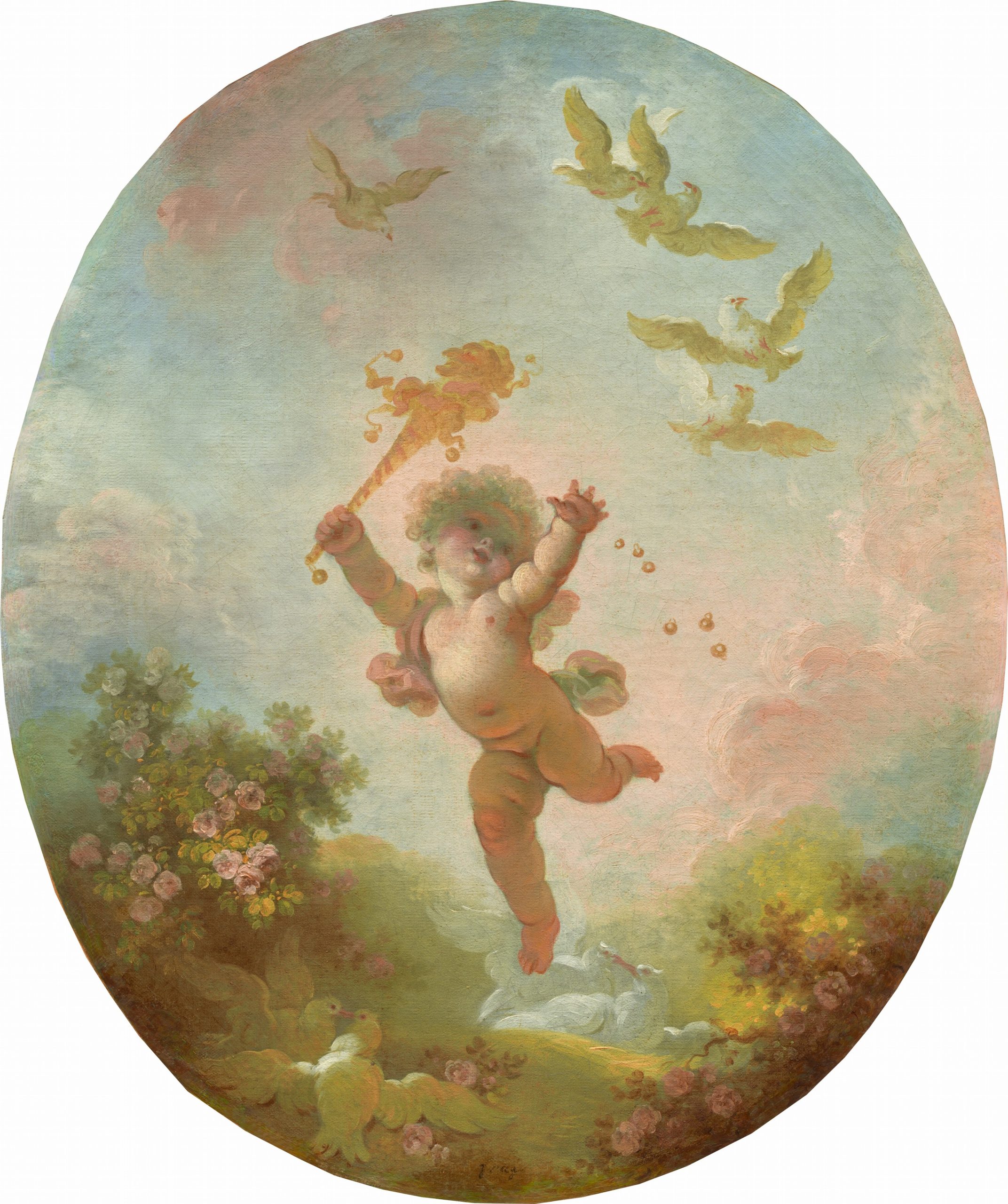
Jean Honoré Fragonard
Oil on canvas, 56.2 x 47.3 cm | 22.1 x 18.6 in
National Gallery of Art
By the time of the French Revolution in 1789, the Rococo aesthetic was abruptly cast aside, since it represented the upper classes in a time of incredible inequality. Although we consider Fragonard as the master of Rococo today – and one of France’s most important painters – he died in obscurity. After the French Revolution, he tried unsuccessfully to adapt his style to the new emergence of Neoclassicism, but ended up working in administrative jobs in the Louvre and stopped painting altogether.
Elisabeth Vigée le Brun was born in 1755, so straddles the genres of Rococo and Neoclassicism that followed. The pastels in her palette and some stylistic choices can be seen as Rococo, whereas her observational rigour is not. Remarkably, by the early age of 15, she was a working portraitist. Marie Antoinette later became her key patron, and in her career, she painted over 30 portraits of the Queen and her family. She was admitted to the Académie Royale in 1783 due to royal intervention on the matter. After the breakdown of her marriage and building a bad reputation due to her association with the executed Queen, she left France and found wide success through painting in the courts around Europe.

Élisabeth-Louise Vigée Le Brun
Black and white chalk on paper, 58.9 x 40.4 cm | 23.2 x 15.9 in
The Metropolitan Museum of Art
In her painting Madame du Barry, we see the influences of Rococo in the pinks of her waist sash and crown of flowers, her pale, smooth skin, the gold ribboned ledge, the feathers, lace, and frills of her outfit, paired with the dusty blue sky. On the whole, the Rococo technique is a collection of aesthetic choices, combined to appeal to the painter’s high society clientele.
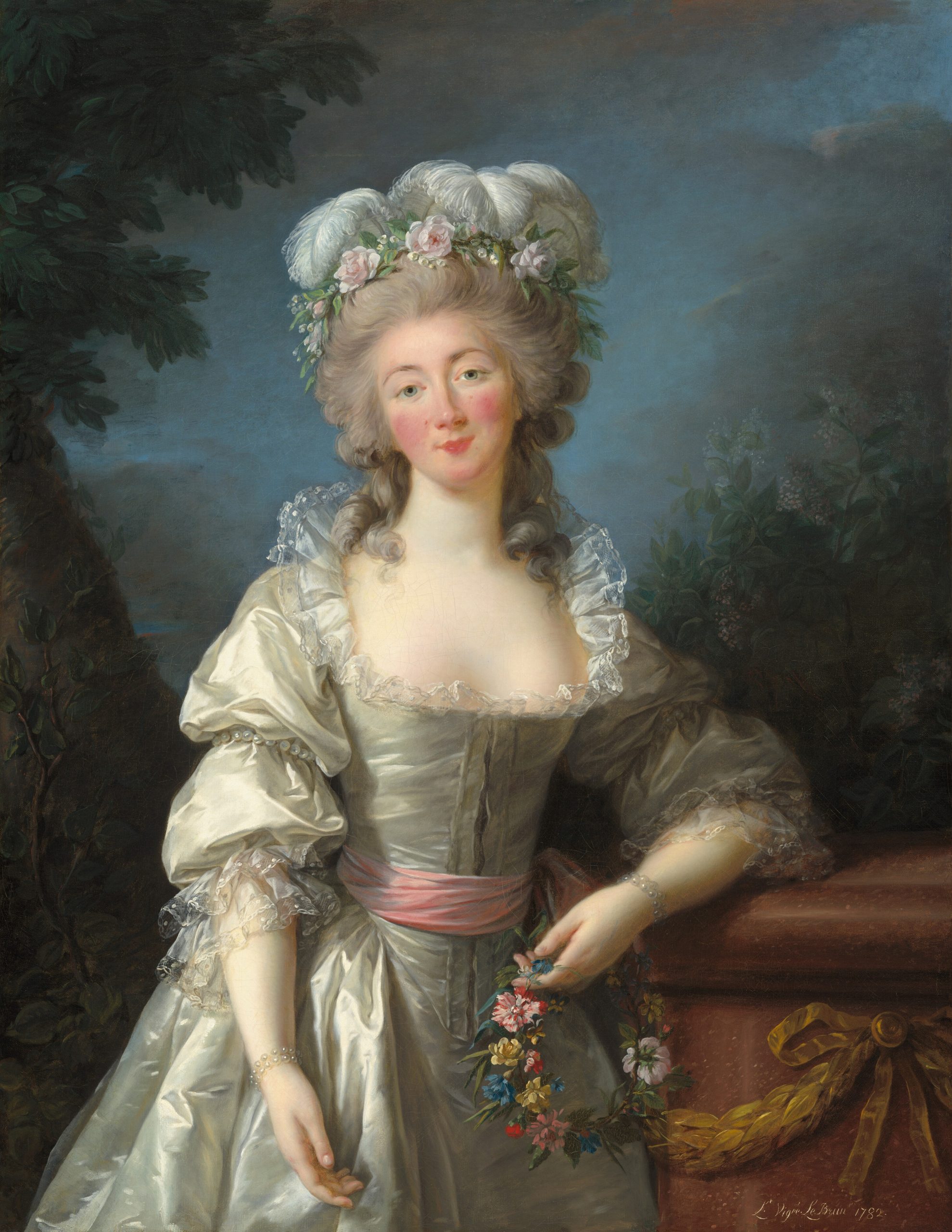
Élisabeth-Louise Vigée Le Brun
Oil on canvas, 114.94 × 89.54 cm | 45.3 x 32.3 in
National Gallery of Art
Demonstration of a Rococo Palette for Painting
To begin my demonstrations, I wanted to create an example palette in colours that the Rococo painters would have been familiar with. Boucher and Fragonard both left behind pigment boxes when they died, labelled for our reference.
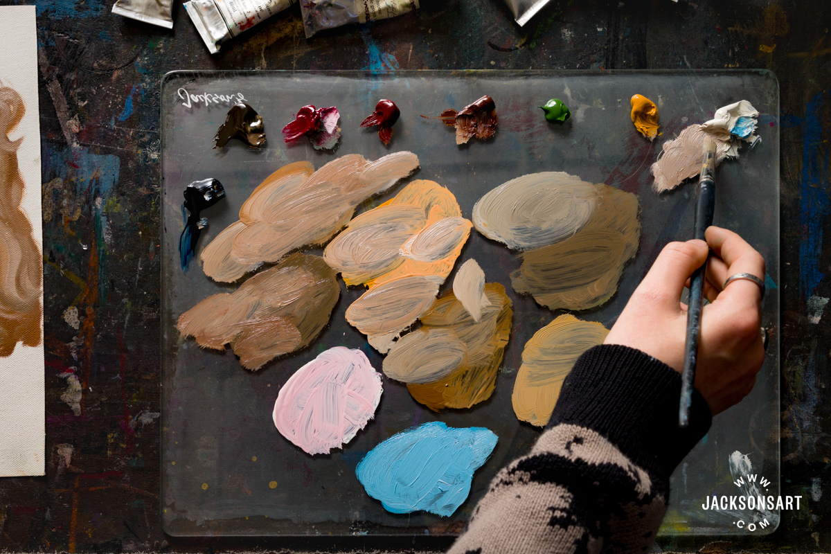
Boucher once wrote, “Nature is too green, and badly lit”, which he swapped in his paintings for another dominant colour – Prussian Blue. After its invention in the early 18th Century, Prussian Blue allowed painters to paint huge blue skies at a relatively low cost compared to other blue pigments. Toxic Lead White allowed them to mix their pastel blues, pinks, and yellows. The boxes also feature Burnt Sienna, Italian Terra, Mummy Brown, Naples Yellow, Carmine, and Lead Tin Yellow – all of which are available today, or have close equivalents.
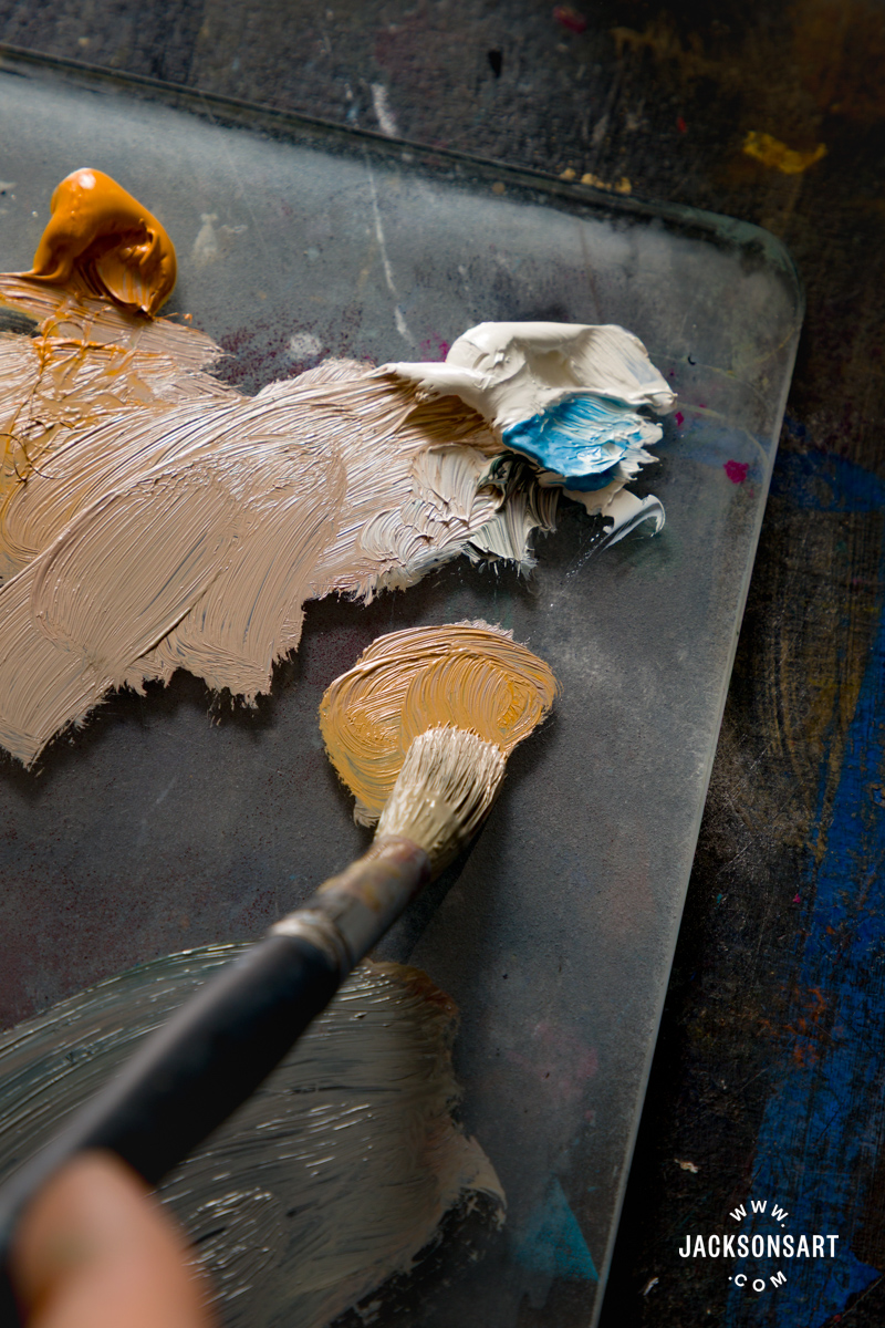
The paints I used for my close alternative palette are:
Isaro Oil Paint Chromium Oxide Green
Old Holland Classic Oil Colours Caput Mortuum Violet (Mars)
Jackson’s Artist Oil Colour Raw Umber
Jackson’s Artist Oil Colour Burnt Sienna
Jackson’s Artist Oil Colour Prussian Blue
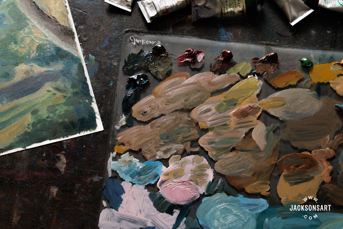
To start, I painted my eight colours down the right-hand side of my Jackson’s Canvas Pad sheet. As you can see, without mixing and tinting the colours, the palette initially appears too dark and strong to resemble a Rococo painting. All of the mixtures of paint I created on the left of the page include Warm White to give the colours their characteristic Rococo pastel tones.
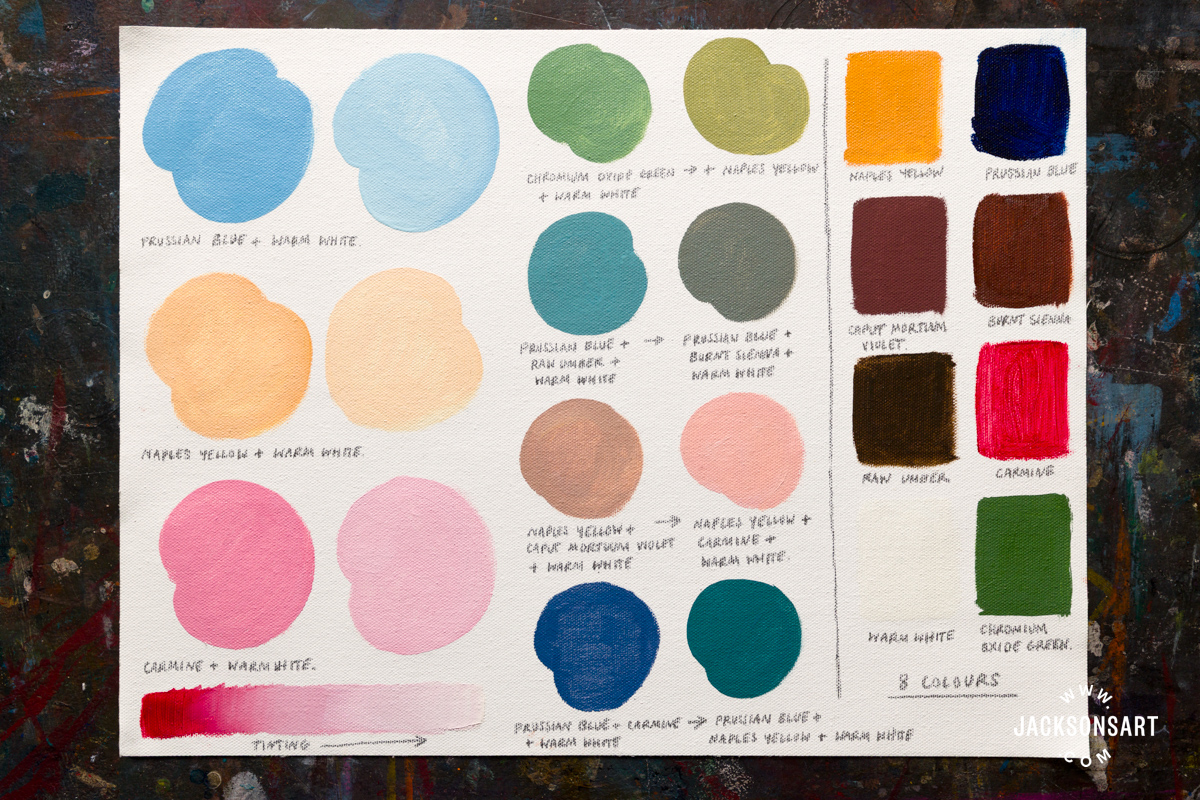
I painted my pastel pink, blue, and yellow, the largest. They were mixed by tinting Prussian Blue, Naples Yellow, and Carmine, since they tend to dominate paintings from the genre. Next, I swatched some more complex colours and noted the colour combinations below each one. My favourites are the dusky violet-blue made by mixing Prussian Blue, Carmine, and Warm White, and the warm yellow-green from mixing Chromium Oxide Green, Naples Yellow, and Warm White.
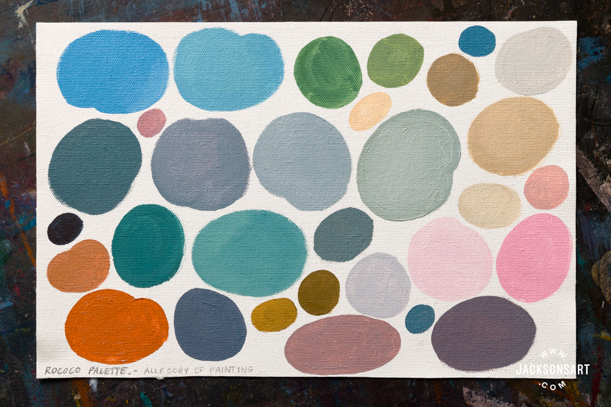
Next, I wanted to use the same colours to recreate the palette of a specific artwork – I chose Allegory of Painting by François Boucher.

François Boucher
Oil on Canvas, 101.5 x 130 cm | 40 x 51.2 in
National Gallery of Art
Using the same eight colours as before, I worked my way around the painting, challenging myself to mix each zone of colour I saw. I love the rich orange of the fabric below the personification of painting, and how it interacts with the sage green of her dress. I mixed it with Carmine and Naples Yellow, and some Warm White. I also enjoyed experimenting with mixing the shadows and greys in this painting – seen in the clouds, a dress panel, and her painting surface. By combining different ratios of my colours, I was able to mix a purple, blue and yellow leaning grey to match each area.
Tips: Since the Rococo painting technique relies on a lot of soft pastel colours, it’s very easy to spoil their brilliance by accidentally mixing in unwanted colours. To avoid this, I’d recommend working with plenty of clean brushes and saving them for the brightest areas to avoid constantly washing your brushes to achieve the butter yellows and sugary pinks.
Demonstration of Rococo Techniques for Figurative Painting
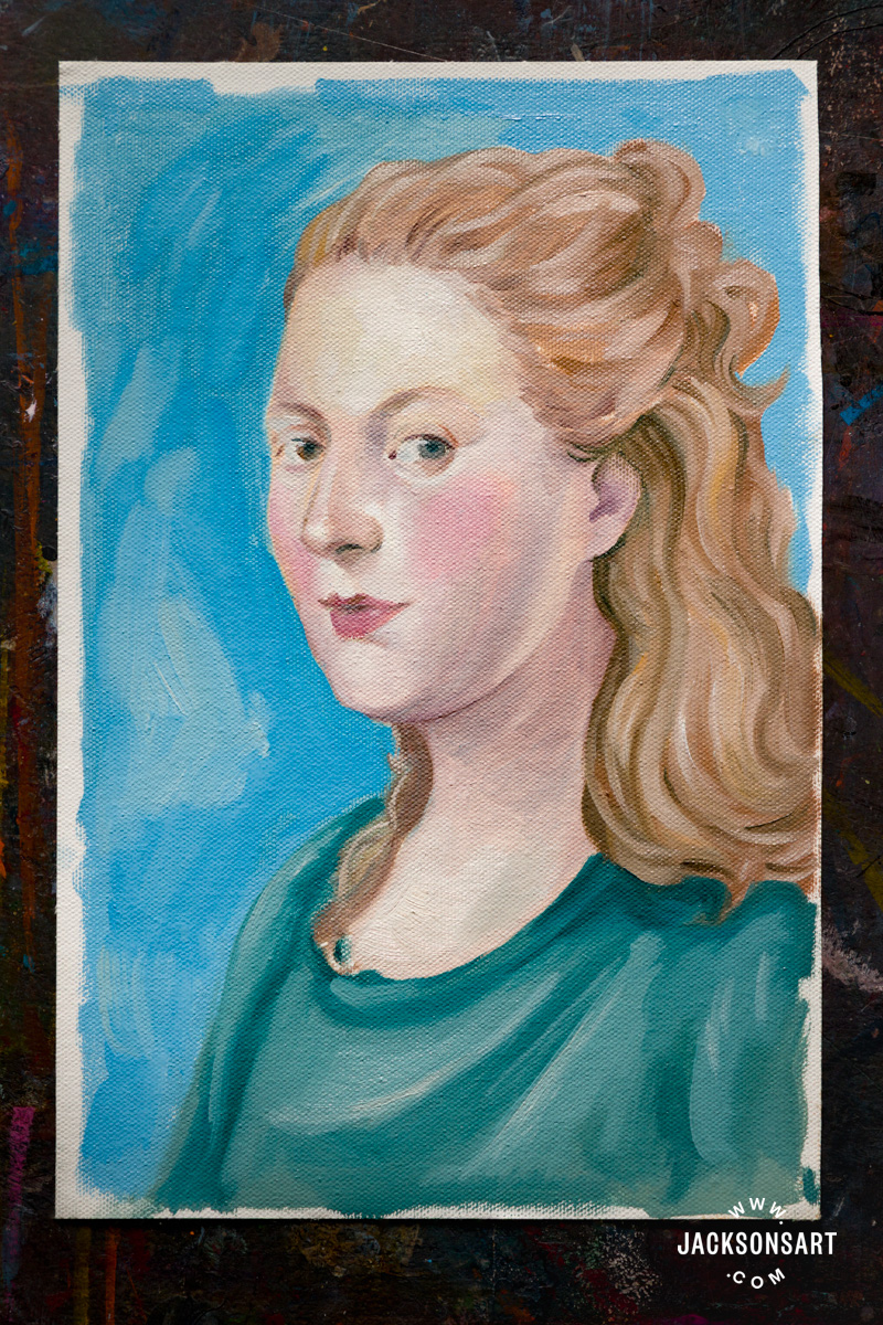
Next, I wanted to make a portrait painting with the Rococo palette, inspired by Fragonard’s technique of combining areas of smooth blending alongside loosely blocked-in brushstrokes. Perhaps the Rococo palette and techniques are more rarely used by contemporary painters because the styling of the characters in them is so rooted to the powdered wigs and gowns of the 18th Century. To remove this context, I decided to paint a portrait using Rococo methods, but the person has contemporary hair and clothing choices. I referenced the face from Marie Emilie Coignet de Courson with a Dog, which I referred to earlier in the article.
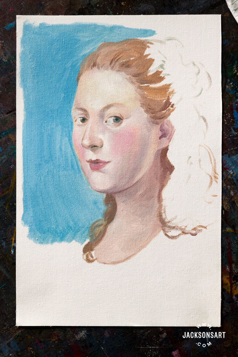
As I worked, it became more apparent to me how subtle the variants of tone and colour are in Rococo portraiture. I found the face to have a brilliant variety of subtle yellow, blues and pinks, with the slightest tones to suggest the lids of the eye and contour of the jaw. I blended my paint as I worked, making the transition between the colours seamless.
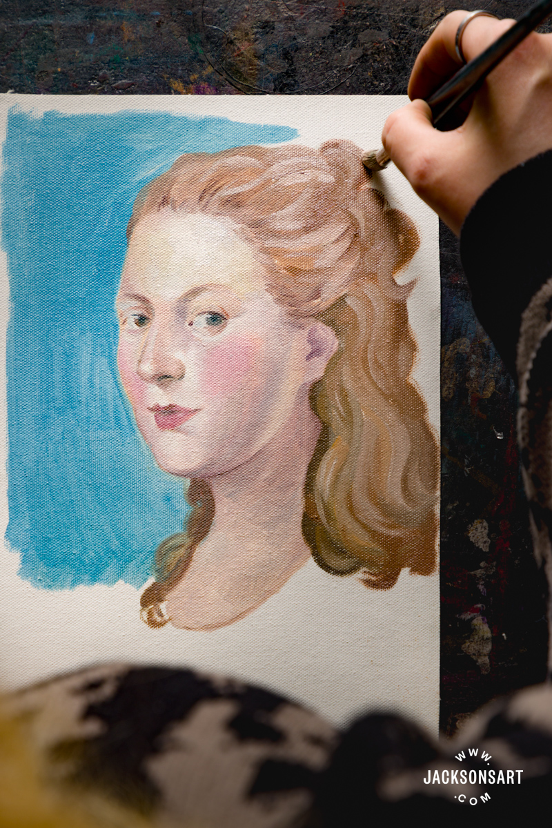
Tips: To help with blending, it’s useful to have separate dry and clean brushes to smooth the paint you’ve already applied, rather than to keep blending the area with paint-covered or freshly washed and wet brushes. These may deposit more colour or medium than you intended.
Demonstration of Rococo Techniques for Landscape Painting
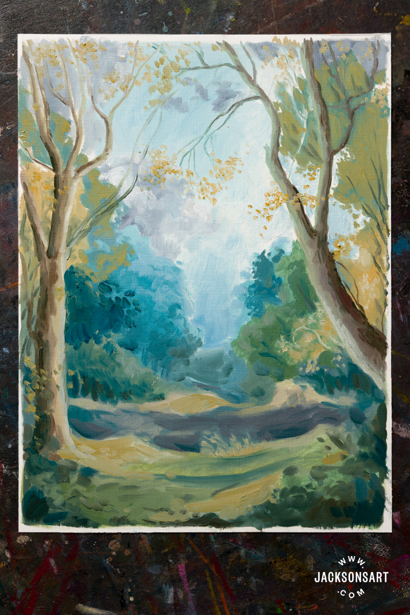
After looking at the Rococo sub-genre of painting fête champêtre, I wanted to create one myself. To begin, I painted an imaginary landscape with the same palette, making sure to emulate the Rococo painters’ choices by painting the trees in the distance blue, and the foliage loosely dabbed on.
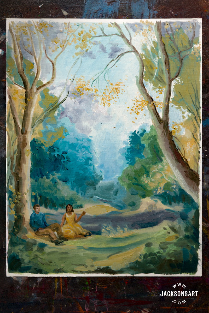
Next, I added two people enjoying the environment from my imagination, regaling in the bright colours.

Tips: When a landscape is loosely painted, it helps to paint the figures within it with the same loose hand, so the finish of the entire image is unified and they don’t appear harshly transplanted into their environment.
Demonstration of Rococo Techniques for Drawing
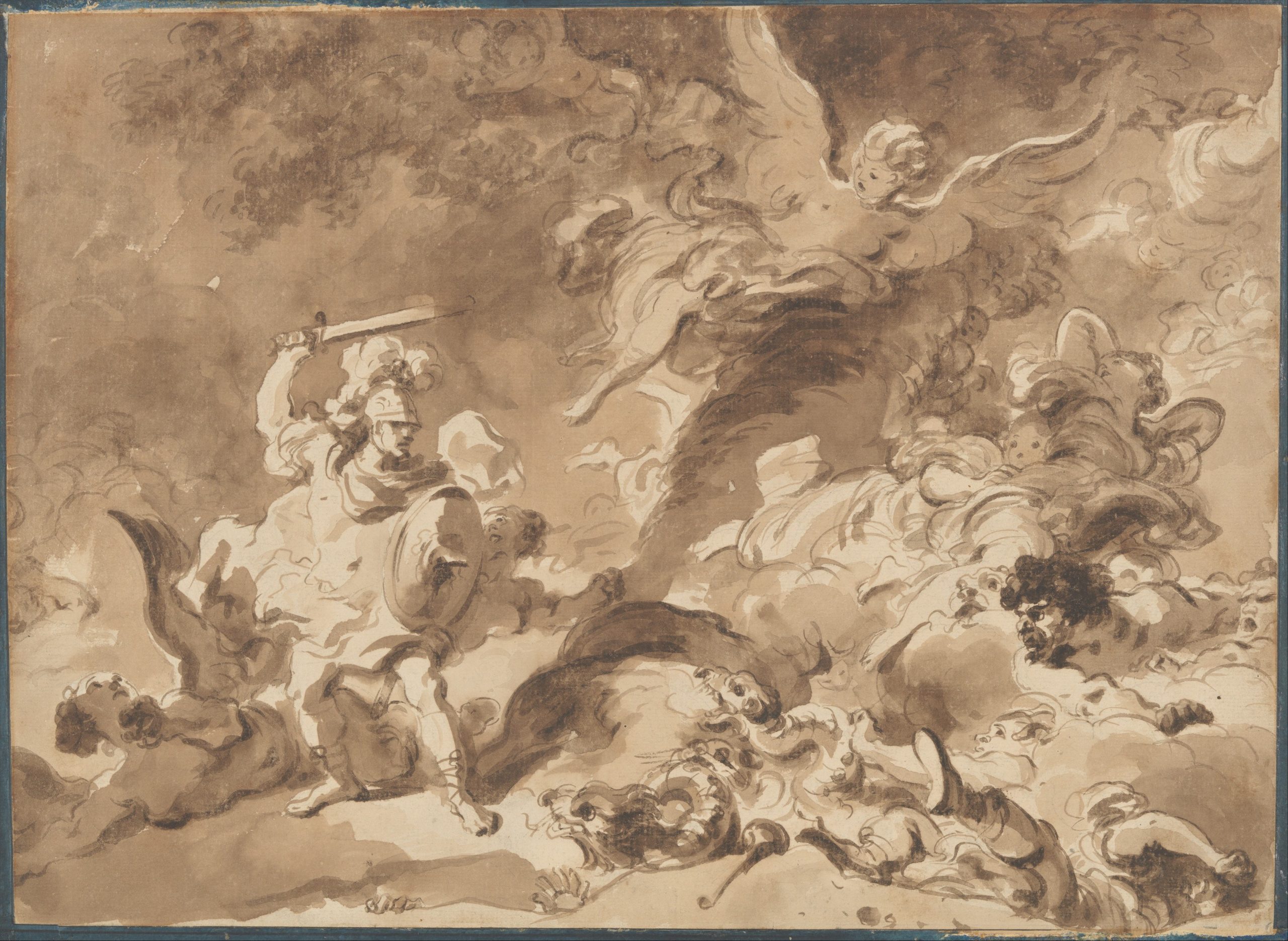
The Rococo painters made drawing studies in preparation for their fantastical works, but some also made painterly drawings to be appreciated on their own. In Rinaldo in the Enchanted Forest by Fragonard, curling movement and texture populate the chalk and wash sheet, reminiscent of the swirling ornamentation of Baroque ceilings.
Jean Honoré Fragonard
Brown wash and black chalk on paper, 33.5 x 45.7 cm | 13.2 x 18 in
The Metropolitan Museum of Art
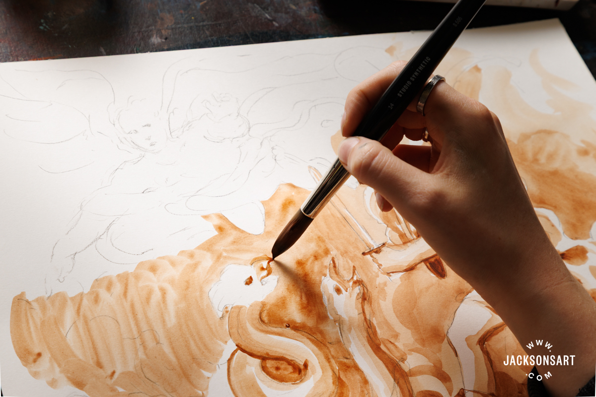
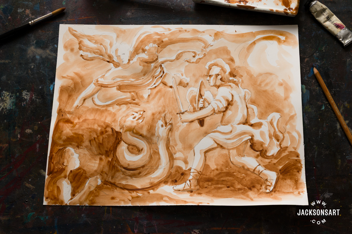
Inspired by Fragonard’s drawing, I made my own version of the same scene and characters, using a Caran d’Ache Soft Charcoal Pencil, and Jackson’s Artist Watercolour in Burnt Umber on a sheet from a Jackson’s Hot Pressed Watercolour Block.
I began by lightly sketching out the characters, keeping my linework very brief to suggest placement without adding tone.
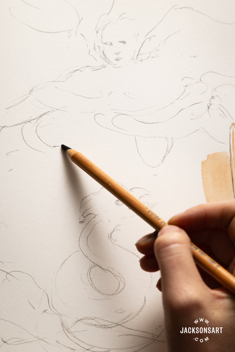
Next, I added my Burnt Umber watercolour in washes to the drawing, quickly blocking in tone and movement without labouring on fine details. I found that the charcoal pencil didn’t shift at all as I worked over it, meaning my light lines remained visible and enhanced the visual structure of the drawing.
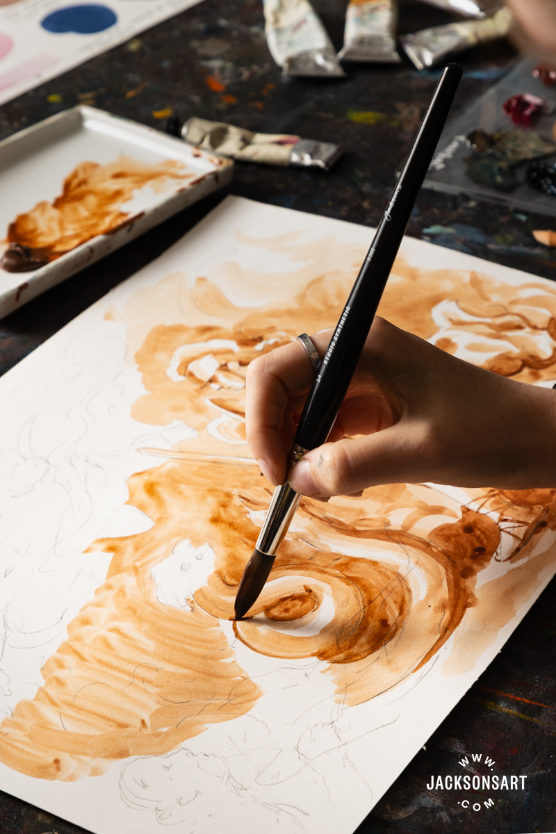
Tips: If you begin with the lightest tone of wash all over the drawing, and build towards the darkest areas, you have more control over how the tone appears across the entire work. This also gives you more freedom to correct any errors in the drawing, since the lightest wash will be more easily lifted.
Further Reading
Tonalism Techniques in Painting and Drawing
Pointillist Techniques for Painting and Drawing
Introducing Jackson’s Artist Pigment Sets
The History of Prussian Blue (And Why You Won’t Find it in Most Acrylic Ranges)
Shop Art Materials on jacksonsart.com

1 thought on “Behind the Movement: Rococo”
Very interesting and beautifully explained and exampled (is that a word?). Thanks!
Comments are closed.