



Jackson’s Artist Watercolours are a range of high quality paints made with pigments that have been carefully selected for their excellence in colour and lightfastness. They match the standards of the best and most popular professional, artist-grade watercolours available on the market today. This range of paints is just as good as any leading watercolour brand, but at a considerably more attractive price. Here, we look at the 11 new colours in the range.

New Colours in Jackson’s Artist Watercolour Range
The process of creating these colours is painstaking and demonstrates a genuine, deep-rooted passion for colour. Large chunks of high quality Sudanese Kordofan gum arabic are slowly dissolved in cold water to create a solution with maximum binding strength. Honey is added as a natural humectant, which also gives the colours added lustre and vivacity. The pigments are then carefully ground and soaked in purified water to allow their colours to develop to maximum luminosity. The two mixtures are combined, blended, and slowly ground into a fine paste, until the pigment particles are evenly dispersed, which is what gives a flawless finish to a watercolour wash. This process produces a range of professional-grade watercolour paints that are intense, luminous, and a joy to use.
Meet the New Colours in the Jackson’s Artist Watercolour Range
With 11 fresh colours joining the range, Jackson’s Artist Watercolours are creamy, vibrant, richly tinted, and a genuine pleasure to paint with. I’ve already had some experience with these paints, with several colours in regular rotation on my personal palette.
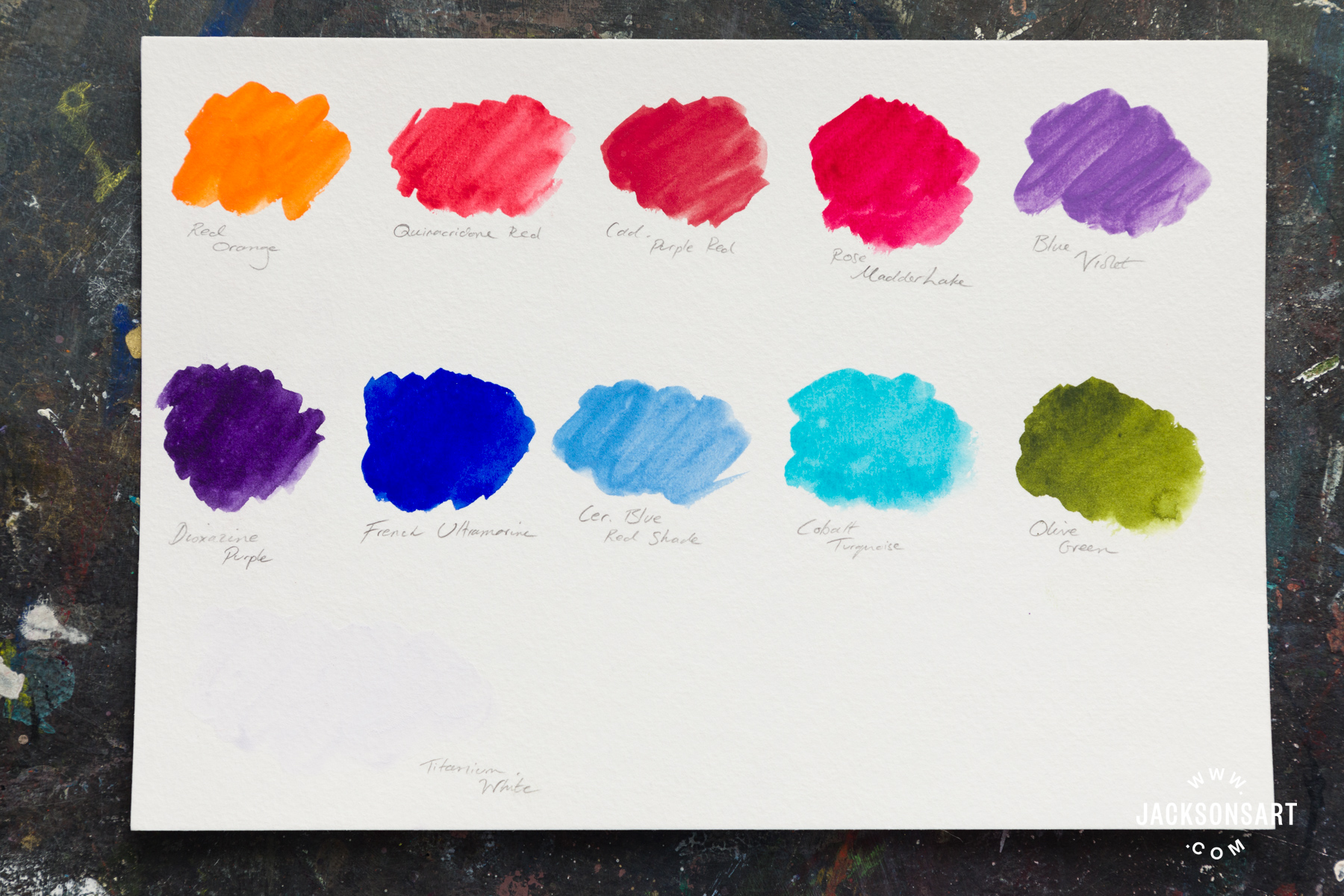
Red Orange, Quinacridone Red, Cadmium Purple Red, Rose Madder Lake, Blue Violet
Dioxazine Purple, French Ultramarine, Cerulean Blue Red Shade, Cobalt Turquoise, and Olive Green
The new colours in the Jackson’s Artist Watercolours selection are: Titanium White, Cerulean Blue Red Shade, French Ultramarine, Cadmium Purple Red, Red Orange, Quinacridone Red, Rose Madder Lake, Olive Green, Cobalt Turquoise, Dioxazine Purple, and Blue Violet. These colours join the already impressive array of paints available on Jackson’s website, in the form of full pans, half pans, and tubes of both 10 ml and 21 ml.

After testing all 11 of these new colours, I selected a few favourites to push a little further. All the colours I tried were intense, luminous, and attractive, and choosing a handful of favourites was a real challenge. I received the paints all in 10 ml tubes, which were smartly labelled with the newly designed labels. They feature a colour swatch at the top, the name of the paint in bold, clear print, and are clearly labelled on the front with the individual colour’s lightfastness rating (all 11 of these are rated Excellent), opacity, granulation rating, and series number, as well as the individual pigment numbers marked in a circle below. I was particularly impressed by this, as it’s always of great interest to me to know exactly which pigments have been combined to make the colours I’m using, as this can wildly affect the way that certain colours mix and harmonise.

Rose Madder Lake: PV19, Transparent with Excellent Lightfastness
As soon as I noticed this particular colour in the selection, I was intrigued. Traditional Rose Madder (pigment number NR9) is harvested from the root of the common madder plant, Rubia Tinctorum; and while it does create an exquisitely soft, granulating rose colour, it’s sadly not lightfast. This colour from Jackson’s, however, offers a modern and lightfast alternative to traditional Rose Madder; and while this paint is non-granulating, I must say that this colour certainly achieves a rose hue of astonishing beauty and clarity. The paint is fully transparent, an intense reddish-pink when taken straight from the tube, softening down to a luminous wash of purest rose. As a single pigment colour it was an excellent mixer, providing some lovely violet shades ranging from soft dusk to vibrant mauve when mixed with Jackson’s selection of blues. I particularly enjoyed combining it with French Ultramarine.


Olive Green: PY150, PG36, PBr23, Transparent with Excellent Lightfastness
Hard as it was to choose, this was my overall favourite colour from the new range. Not only is it an elegant and nuanced green shade that would work excellently for landscape or botanical paintings, but it is also a superb mixer, despite being a blended-pigment colour. When used singly, the Olive Green is rich and intense, carrying cool earth tones, and lightening to a charming citrus colour when diluted to pale wash consistency. It’s another transparent paint, with no granulation, and I enjoyed combining it with a variety of other colours from the Jackson’s Artist Watercolour range. I found that it worked particularly well with Dioxazine Purple to create a wide variety of understated neutral brown and grey tones. I also discovered that it worked surprisingly well when mixed in varying quantities with Red Orange, where I was able to create a variety of charming autumnal hues in shades of moss, mushroom, fern, and bracken. I also found that a little went a long way, as it has a high tinting strength; as did all the colours I tested.


Cobalt Turquoise: PB28, Opaque with Excellent Lightfastness
Cobalt Turquoise is a highly granulating opaque paint, with high tinting strength. The colour itself is vivacious and bright, making it ideal for a variety of vibrant colour mixes. I found that it mixed exceptionally well with most other colours, but I particularly enjoyed the variety of delicate sea-green hues it produced when softened down with a little Olive Green. This paint’s tendency to granulation is another factor that makes it a versatile mixer, as I found that this tendency comes strongly through in colour blends. If, like me, you’re a fan of granulation in watercolour, then this is a huge plus point. Another interesting quality is its opacity; this is a fully opaque watercolour, which gives it the strength to stand up to a variety of other hues and means that it would work well as part of a palette designed to work on alternative surfaces, e.g. toned paper.


French Ultramarine: PB29, PV15, Transparent with Excellent Lightfastness
I already adore French Ultramarine in all its forms, so I was delighted with the opportunity to experiment with this version. Jackson’s French Ultramarine is a bold, faintly reddish-blue, slightly warmer than the relatively cooler Ultramarine Blue, and carries a medium level of granulation. When used richly, the colour is intense and unmistakable, bluer than blue, reminiscent of the ocean’s depths. It’s another wonderfully versatile colour, working well alone or when used mixed with other paints. I particularly enjoyed the bold teal and turquoise tones it offered when mixed with Olive Green, and the variety of dusky purplish hues it produced when mixed with colours on the pink/red side of the spectrum, notably Rose Madder Lake and Cadmium Purple Red.


My expectations for these colours were high, and I’m pleased to say that they did not disappoint. It was a difficult task to pick out only a handful of paints from this selection to focus on; each and every one of them deserves a spotlight, as they all bear their own unique and beautiful qualities. All the paints I tested lifted out with varying degrees of success; except for Dioxazine Purple, which left soft violet staining on both my paper and palette. They all have a delightfully creamy texture and high pigment load, which means that as well as being competitively priced, these paints are also excellent value.

Further Reading
Recreating the Colour Palette of Eric Ravilious
Review of Jackson’s Studio Synthetic Watercolour Brush Series 505
Green Gold and its Colour Mixing Possibilities
Shop Jackson’s Artist Watercolours on jacksonsart.com

2 thoughts on “New Colours Added to Jackson’s Artist Watercolour Range”
I was inspired by the mixing of the new
colours!
Thank you for a thorough and useful
review. The mixing example are
particularly appreciated. And oh my
goodness, that olive + cobalt turquoise
Comments are closed.