



Introduced in the 1970s, Green Gold is an enigmatic, modern metal-complex pigment. It is an unusual shade that encompasses both yellow and green, with an earthy warmth and a glowing amber undertone. This article examines the development of metal-complex pigments, and the colour-mixing possibilities of Green Gold.
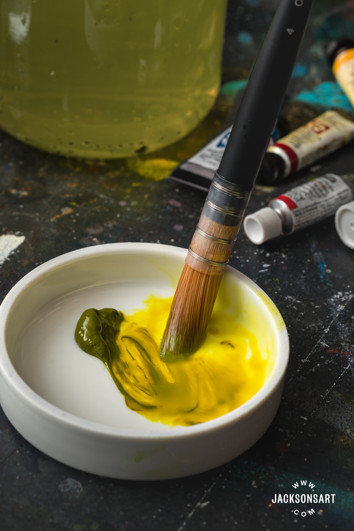
What is Green Gold?
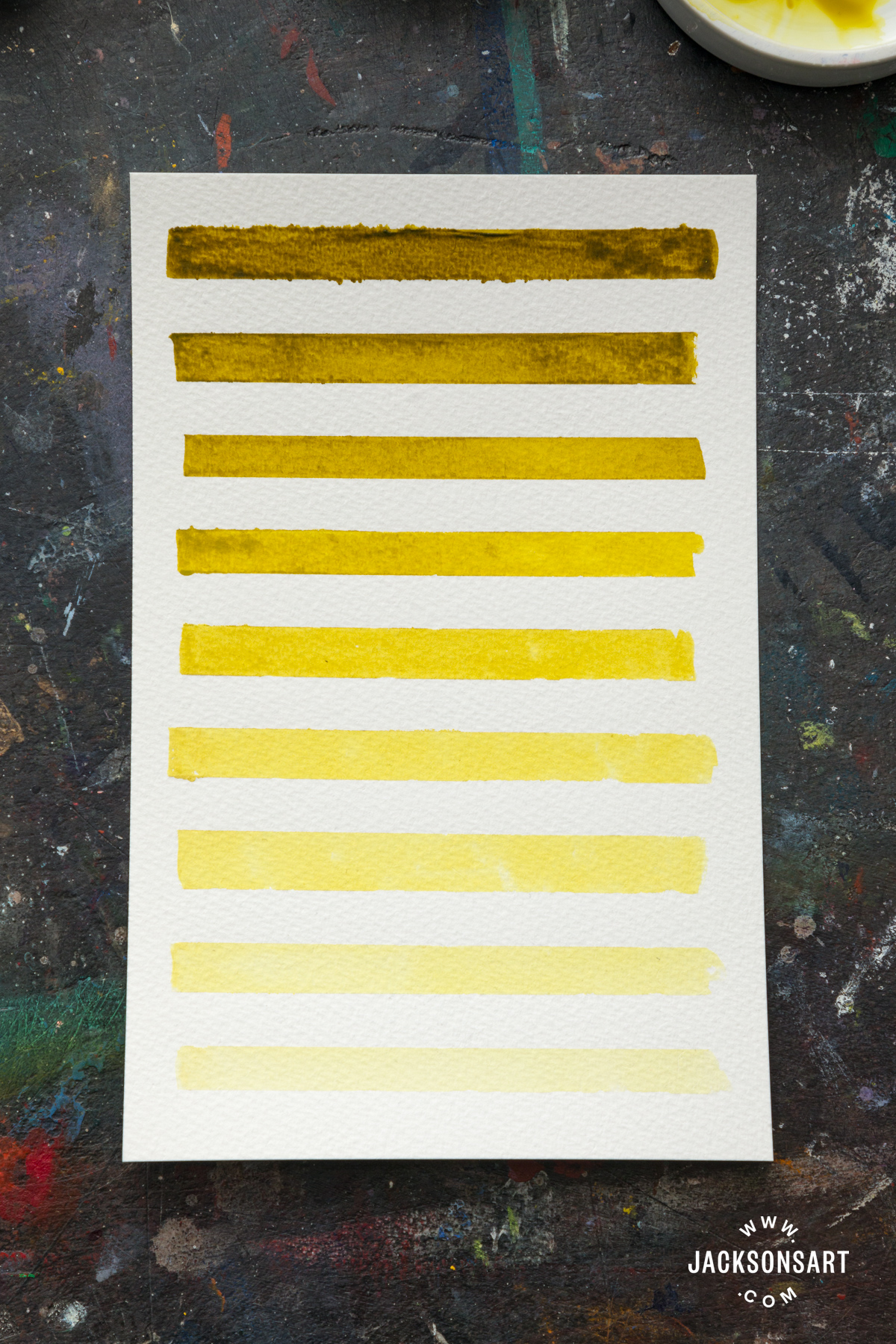
The single-pigment colour that we usually call ‘Green Gold’ is more properly called Copper Azomethine Yellow, and it is a great example of how pigments don’t always fit into hard-and-fast colour categories. Technically, Copper Azomethine is a yellow pigment – it appears in the Pigment Colour Index as Pigment Yellow 129. However, when it is used in masstone (the undiluted colour) it is a mossy brown-green. An amber yellow dimension comes through when the paint is diluted or tinted with white, like in the below swatches:
The History of Metal-Complex Pigments
Metal-complex pigments are made by combining metallic atoms, usually copper or nickel, with an organic compound like azo, isoindoline, or azomethine. The first metal-complex pigment was developed in the 1920s, and throughout the 20th century more were formulated and made commercially available. There was particular interest in them in the 1970s and 1980s, with a view to using them in the automotive industry. It was for this purpose that Copper Azomethine was introduced in 1972, but its unique colour-characteristics and excellent lightfastness meant that it was taken up by artist paint manufacturers in the following decades.
There aren’t many metal-complex pigments in the artist palette today. Many have been discontinued, or are only used within the car industry. The only other metal-complex pigment used by artist today is Nickel Azo Yellow (PY150), a transparent and reliably lightfast yellow.
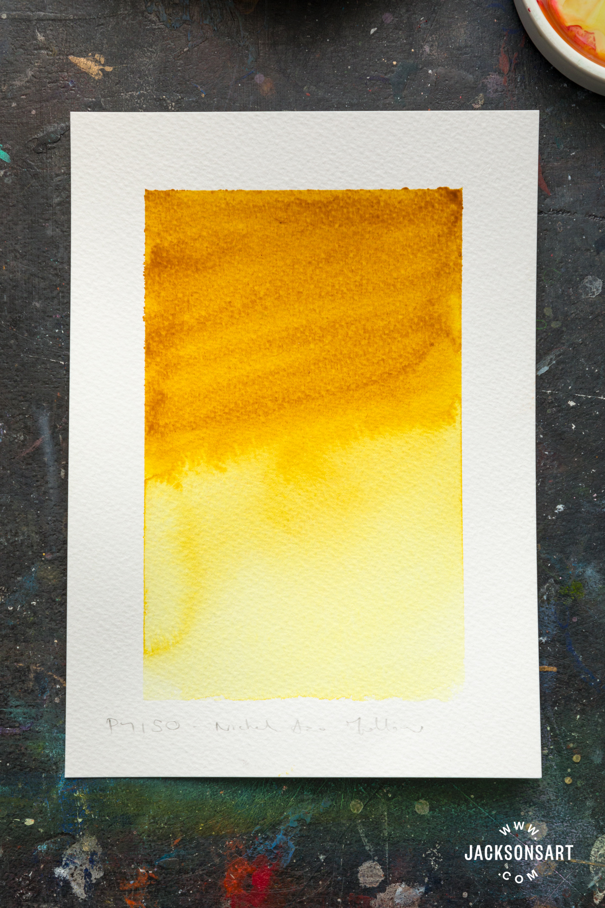
Looking at the above swatch, it’s clear that Nickel Azo Yellow is related to Green Gold, because it has a similar quality of being a different colour in masstone than in dilution. In Nickel Azo Yellow’s case, it is an warm ochre in masstone, but appears cooler and more lemony when it is diluted.
While Nickel Azo Yellow is only sometimes on offer as a single-pigment yellow (most often it is used by paint manufacturers in mixtures with other pigments to formulate specific colours), Green Gold is an increasingly common colour that is included in many professional and artist quality oil, acrylic, and watercolour ranges. It’s worth checking the tube to see if it contains the single-pigment Copper Azomethine pigment (PY129), or if it is a hue made with a blend of different pigments, as this will affect how it performs in mixtures.
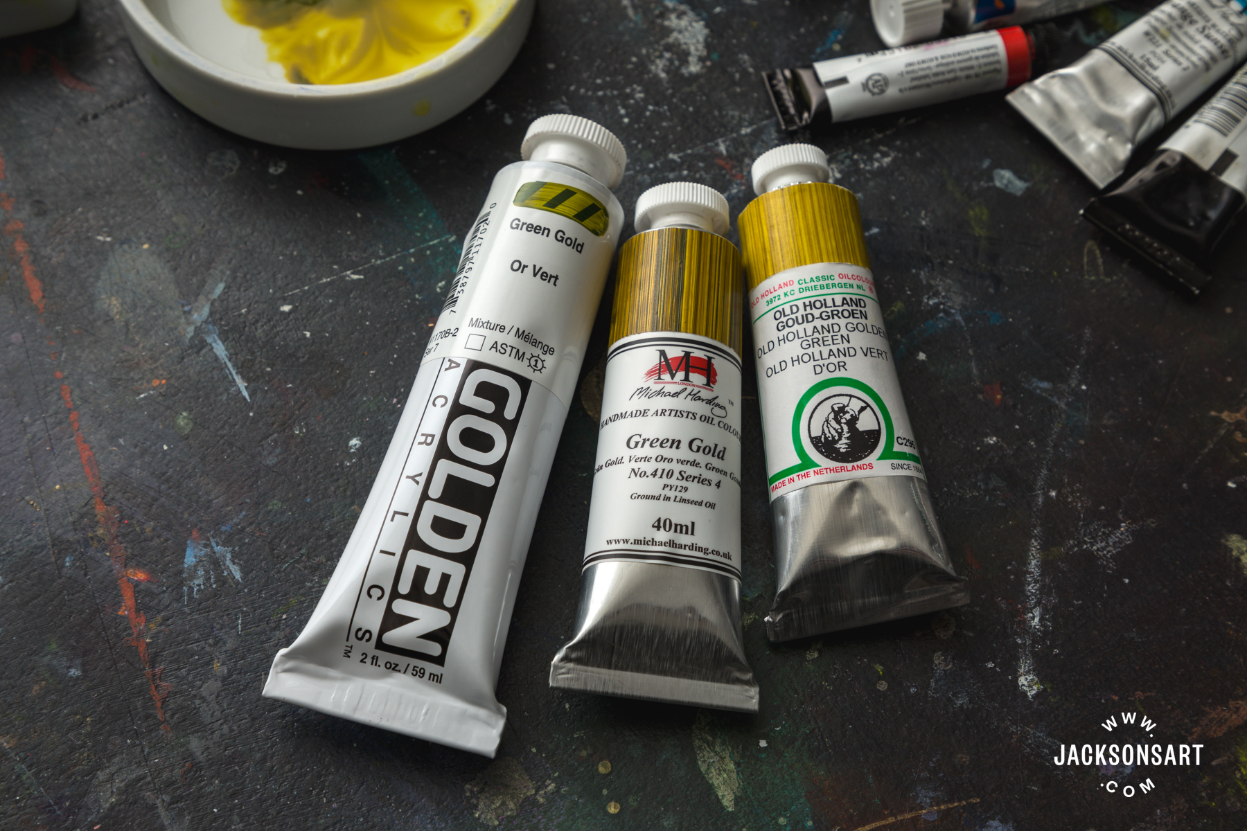
Michael Harding Green Gold Oil Paint (PY129)
Old Holland Green Gold Oil Paint (PY129)
Colour Mixing with Green Gold
For the following mixtures I’ve used watercolour, but the pigments would work in a similar way in oil and acrylic as well.
Mixtures with Blue
Green Gold doesn’t need much blue to become a ‘true’ green, but the temperature and tinting strength of the blue you mix it with make a huge difference in the kind of greens you can make.
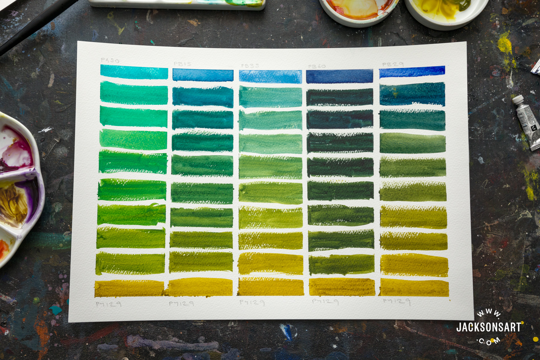
Schmincke Horadam Cobalt Turquoise (PG50)
Jackson’s Phthalocyanine Blue (PB15:3)
Daniel Smith Cerulean Blue (PB35)
Michael Harding Indanthrone Blue (PB60)
Isaro Ultramarine Blue (PB29)
Cobalt Turquoise (PG50, column one in the above chart), which is very cool and high in tinting strength, quickly cuts through the warmth of Green Gold to make some lurid, electric greens. On the other hand, Cerulean Blue (PB35, column three), is warmer than Cobalt Turquoise and has a lower tinting strength, so the greens it makes are more muted, and the golden tones of Green Gold dominate. With the warm blues, like Indanthrone Blue (PB60) and Ultramarine Blue (PB29), Green Gold’s own warmth is intensified. As a result the greens are mossy and earthy. In the case of Indanthrone Blue, an extremely dark-valued blue, the greens are so dark they could be a near-black if the paint is applied thickly. Green Gold makes a great starting point for mixing a wide spectrum of greens, especially greens that are muted and natural-looking. For this reason it could replace yellow, for mixtures with blue, in a landscape or botanical palette.
Many blue pigments, including Ultramarine Blue and Cobalt and Cerulean Blues, granulate in watercolour. While Copper Azomethine is a non-granulating pigment, it makes for some interesting pigment-separation effects when mixed with granulating pigments and applied with plenty of water.

MaimeriBlu Green Gold (PY129) and Isaro Ultramarine Blue (PB29)
Mixtures with Red
Red and yellow are a classic mixing pairing – a gateway to rich oranges. How does Copper Azomethine compare as a replacement for traditional yellow pigments?
This mixing chart begins with a warm orange-red (Napthol Red, column one), and gets cooler as as moves to the right, moving through the pink-reds, (Alizarin Crimson and Quinacridone Magenta, columns three and four), and ends on a purple pigment (Quinacridone Purple PV55, column five). In many ways Green Gold acts very similarly to a yellow in these mixtures, particularly with the warm reds as it makes some fiery, golden oranges. However, as the red gets cooler (i.e. closer to purple) some more muted shades come into play.
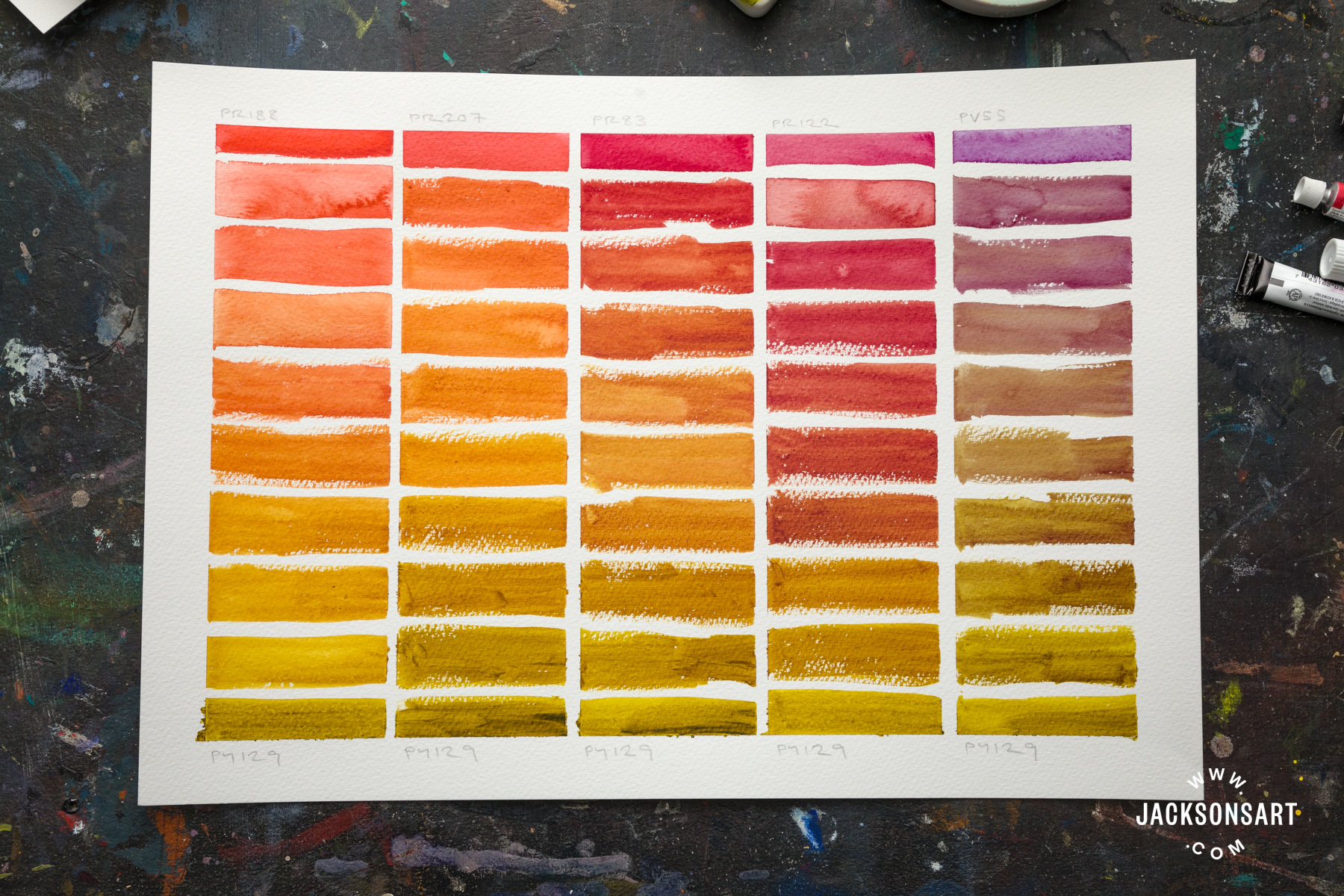
Daniel Smith Organic Vermilion (PR188)
Schmincke Horadam Quinacridone Red Light (PR207)
Daniel Smith Alizarin Crimson (PR83)
Jackson’s Quinacridone Purple (PR122)
Schmincke Horadam Quinacridone Purple (PV55)
Alizarin Crimson is a particularly good mixing partner (column three). Their tinting strengths were perfectly balanced, and they created some beautifully flushed, earthy oranges that could be interesting in a portrait palette (for those concerned about genuine Alizarin Crimson’s lightfastness, a permanent version of Alizarin Crimson would behave similarly). Finally, the purple in the final column makes some extremely strange, shadowy shades of aubergine, like a threatening stormy sky or a bruise. This is possibily one of the weirdest pigment combinations I’ve found in a while, and it could be used to extremely atmospheric affect.
Miscellaneous Mixtures with Green Gold
Finally, I used this final mixing chart to play a bit more with mixing Green Gold with colours from other pigment families. After what it did with Quinacridone Purple, I started by mixing it with Dioxazine Violet (PV23, column one). Dioxazine Violet is much darker and bluer than Quinacridone Purple, so it made mixtures that approached black, and the overall spectrum of mixtures was much cooler. Opera Rose (in column two) has an entirely different energy. Opera Rose is a Quinacridone pigment blended with a fluorescent dye, so it is an extremely vibrant highlighter-shade of pink. It becomes unexpectedly orange when it’s mixed with Green Gold, making some very light and fluffy peach-shades before tipping further towards green.
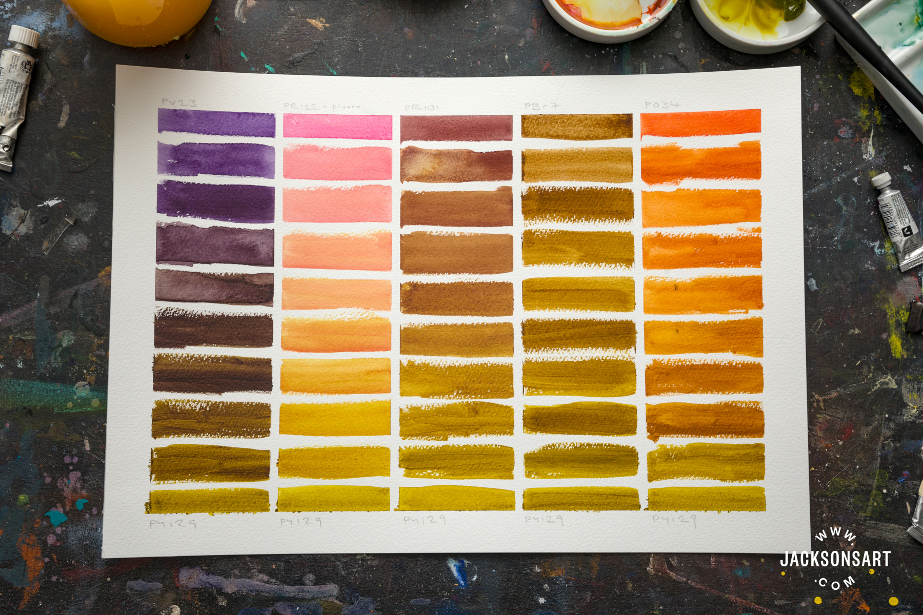
Michael Harding Deep Purple (Dioxazine, PV23)
Jackson’s Opera Rose (PR122, PR81:1)
Daniel Smith Indian Red (PR101)
Jackson’s Raw Umber (PBr7)
Michael Harding Orange Sunset (PO34)
I wanted to see how it interacted with earth colours. I chose Indian Red (PR101, column three) and Raw Umber (PBr7, column four). What these mixtures revealed is that Green Gold is actually quite similar to these earth colours, especially with Raw Umber. While there was certainly a continual change in hue as Green Gold was added to the mixture, the saturation and value of the colour didn’t really change at all. Raw Umber tends to be a green-shade of earth, and the Copper Azomethine merely enhanced its existing greenness.
The fact that Copper Azomethine doesn’t fit squarely into a colour family makes it an exciting proposition for colour mixing! Let us know how you use it in your palette by leaving a comment.
Further Reading
Colour Mixing: Exploring the Zorn Palette
The History of Potter’s Pink (and why it’s a watercolourist’s secret weapon)
In Conversation With David Coles of Langridge Artist Colours
Shop Green Gold on jacksonsart.com

14 thoughts on “Green Gold and its Colour Mixing Possibilities”
Hello!
Green Gold originally was not PY129; it was PG10. PG10, like PY150, is a nickel azomethine pigment.
I have never seen PG10 in real life, only online. It seems to be a somewhat greener version of PY129.
When the production of PG10 stopped, paint manufacturers used PY129 as a replacement.
I thought I’d share this bit of information.
Cheers,
awatercolourist
Thanks for this helpful information! I’ve read about PG10 but like you I’ve never tried it, I think it was discontinued in 2005
Golden-great article! – Thank you
Glad you enjoyed it, thanks Susan!
I have been using green gold PY129 for
mixing greens for about a year and I
love it. I especially like that it looks a bit
green when it’s on my palette so I find it
natural to reach for it. It also means that
I don’t need to make my yellows dirty. I
have used it for mixing oranges lately
and found as you have that it is very
versatile. I really like the look of the
mixes you created with crimson and the
quin purple PV55, I will have to get
some of that☺️
I can’t recommend the mixture with PV55 enough. I recently tried it with Perylene Violet (PV29) and that was also beautiful– lovely smoky brown-purples.
I love Nickel Azo Yellow and have tended to
overlook Green Gold. Your article
definitely inspires me to do a lot more with
Green Gold! It seems to be very versatile
and nearly all the mixes look interesting
and useful. The separating mix with
Ultramarine is beautiful. Thank you for
showing all of these mixes!
It’s so great to know you’ve been inspired. Happy painting!
Green gold (Daniel Smith) is the most
used color in my palette, which I often
mix with many blues. I love the ideas
you have shown of ways to mix my
favorite color with reds and pinks. The
resultant colors are gorgeous. Thank you
so much for taking the time to do this. It
is incredibly helpful.
Thank you Mary, I’m so glad it’s been helpful. I was really surprised by its mixtures with red and pink, it’s just so versatile. I hope you enjoy all of the possibilities!
What a great article. I’m always drawn to
green gold, I love its earthy tones but
having read your article the possibilities
for this colour seem endless. Can’t wait
to get mixing. Thank you for this
inspiring read!
It’s such a strange colour in many ways- it’s hard to put a finger on it! Happy mixing!
Thank you so much for this, Evie! I bought
some MaimeriBlu Green Gold a while back,
but when the novelty wore off, I found it
wasn‘t really my kind of color. Now I see its
versatility in mixes and I‘m excited that I
have it to play with.
I was the same- I had it in my collection for ages but never really reached for it. So glad to hear you enjoyed the article!
Comments are closed.