



We asked two artists, Frances Waite and Ruby Bateman, to test Jackson’s drawing materials in their practice. They chose drawing materials both familiar and new, to experiment and challenge themselves. Here, they have shared their thoughts on using the materials and the work they made in the process.
Frances Waite Reviews Jackson’s Drawing Materials
- Clutch Pencil Leadholder
- 8B Graphite Lead Refill
- 6B Graphite Lead Refill
- 2B Graphite Lead Refill
- Smooth/Medium Eco Paper 200 lb 22 x 30 in
- Two Rivers Watercolour Paper 140 lb 22 x 30 in Not
- Artist Leaning Bridge
- Charcoal Powder
- Graphite Pencil Metal Tin Of 12 Assorted Grades
- Clutch Pencil Leadholder 5.6 mm
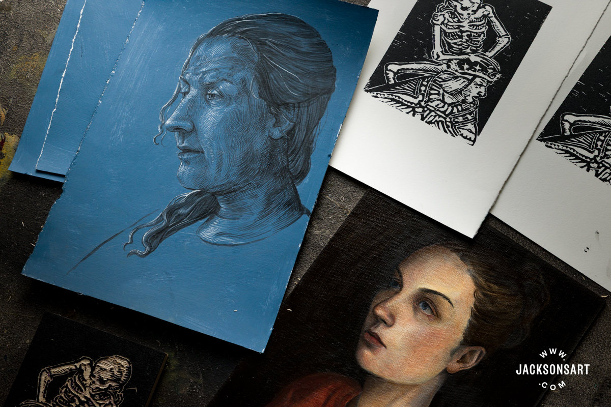
I’ve been working with drawing as my main focus for years now. When I meet new people and they ask what I do, and I say “I’m an artist”, most of the time they will ask “Like painting?” And I say “Drawing!” And they say “Charcoal, graphite?” and I say “Pencil!!”. There are so many things I love about drawing, and one of the biggest is that it is so accessible and so affordable, and so often a welcome exception to the elitism that surrounds art. You really only need a few things to make a drawing.
Last month when Jackson’s reached out to me and offered to send me some of their drawing products to take for a spin and review on Instagram, I said yes, because I love trying new materials and also because I love any chance to make art as accessible as possible.

They sent me some paper, a bunch of different kinds of drawing mediums, and also something I was really curious to try, a transparent drawing bridge – I’ll start with that.
A drawing bridge is something you can rest your hand and arm on while you are working so as to not smear around other parts of the drawing. There are a lot of solutions to this problem, using another piece of paper on top of the drawing, using a mahl stick (a stick with cloth balled up on the end that you hold with your free hand) or using a bridge. I use both, papers for working flat and a mahl stick when working against a wall, but had never tried a bridge. It was an adjustment to get my arm in a position that felt normal but it definitely works. I think this type of barrier works best for more detail focused drawing where the movement is centred more in the fingers and less in the wrist.

On to the paper. This was a bit of a challenge for me because I prefer a really smooth texture on a paper for the type of drawing I like to do. This usually means a hot press heavy weight watercolour paper. But, it was fun to try something new. The paper I tried was the Jackson’s Eco paper. On the website they say this paper is sustainably produced using recycled cotton, which is then sun dried with the water being further used to irrigate surrounding fields. The paper is toothy and a little rougher than I like but has a deceivingly soft feel for how much pressure it can take without surface tears. I like it and will definitely use it in the future when I’m in the mood for something with more texture.

As for the pencils and lead (with the holder) this was the most fun for me. The refillable lead with the holder is much bigger and thicker than I was expecting which was fun, great for a more heavy handed & gestural moment. 2B is my favourite hardness to work with in general and I really liked the Jackson’s version. The individual pencils I also liked, they sharpen really well which is the biggest thing for me. I use drafting lead and lead holders when I’m working so I don’t have to deal with pencils that sharpen poorly but didn’t have that issue at all with this set.

All in all, I was really impressed with Jackson’s drawing materials. The products were all shipped very securely, nothing broken or loose, and the price is very competitive. I feel comfortable recommending all of the products I received.

About Frances Waite
Frances Waite is an American artist whose works on paper have been exhibited throughout the United States and Europe. Her subversive approach to photorealistic graphite drawing has been recognised in notable arts and culture publications, including Vogue Magazine, Playboy Magazine, Fukt Magazine for Contemporary Drawing, and Vice’s The Creators Project. In 2018 Frances was included in Vogue Magazine’s World 100, recognised as one of the most influential creators of the year.

Frances is an alumnus of Pratt Institute in Brooklyn, New York. In 2015 she graduated with a Bachelors of Fine Arts in Drawing. Born in Rochester, New York, she currently lives and works in Los Angeles, California.
Ruby Bateman Reviews Jackson’s Drawing Materials
- Jackson’s Alcohol Inks
Burgundy Red
Primrose Yellow
Light Lilac
Aubergine Purple
Peppermint Green
Toffee Brown
Terracotta Orange
Storm Grey
Grape Green
Pastel Pink
Deep Black
Bright White
Golden Yellow
Tropical Turquoise - Jackson’s Hot Pressed Watercolour Paper 300 gsm 10 x 12 in
When Jackson’s asked me to review some of their materials, I was immediately drawn to their inks – a medium I love, but have only ever worked in monochrome. I felt like this was the perfect opportunity to broaden my repertoire and get inking in colour. My second selection was Jackson’s Watercolour 300 gsm Paper: 10 x 12 inch Hot Pressed loose sheets, hoping that it would be the perfect partner in crime with the ink series. I chose the smooth, 300 gsm sheets as I usually like to use sleek, non porous paper with a robust-ness to it to create my inked works.

My first impressions when opening the 30 ml Jackson’s Alcohol Ink Series were very positive. I loved the clear, sleek branding and was immediately struck by the vibrancy of the ink colours, how almost neon or opaque some of them were. Already I was very excited to open them up and explore the viscosity and unusual-ness of them. The sheets of paper were packaged neatly in brown paper which I appreciated as I hate unwrapping materials covered in layers of single use plastic.

I started testing the ink and paper by creating a single line drawing, to see how the inks ran against the surface. I chose the Grape Green to kick off, and was met with an unexpected drip nozzle. Usually when using Indian Inks, I dip my paintbrush straight into the pot, but I quickly learned that as these were alcohol inks you had to pour into a palette first to prevent evaporation. I was relieved to see that the paper’s texture and thickness held the ink very well, not bleeding through to the next pages with very little drag or resistance from the paintbrush on the surface.

I found the Grape Green to be surprisingly bright and neon-like, despite its darker hue in the bottle and tested it next to the Storm Grey to get a stark contrast, as it looked particularly opaque in the bottle. After a few shakes, I created some block colours next to the fluorescent-looking Grape Green lines. Intrigued by another opaque, neon-looking colour, I added Peppermint into the mix, creating more block tones on the paper.

Looking at this combination of colours on the page, I became aware that I wasn’t seeing ‘me’ in it. I felt that these pop-blue tones weren’t particularly my style so my next experimentation was to see what would happen if I started adding layers of other ink on top. I applied Primrose Yellow (another opaque and viscous one) directly on top of the Peppermint which yielded interesting results. Due to the robustness of the paper and the chalkiness of the ink, I could properly mix the colours on the page. Amazingly, despite the fast drying quality of the alcohol, I was still able to pick the previous ink up on the page and blend. I could lighten my blue tones with the Primrose and create new textures on the page. I was very impressed that the paper allowed me to do this, still not bleeding through.


I felt like I wanted a colour and texture that met in the middle of the Olive Green and Storm Grey extremes, so seeing an opportunity in the palette dish, I decided to start mixing vibrant translucent inks with more muted and opaque ones. This brought out tones which I usually love to work in, more muddy and earthy. The Primrose Yellow was instrumental in this for me, forming the main blending/muting agent.
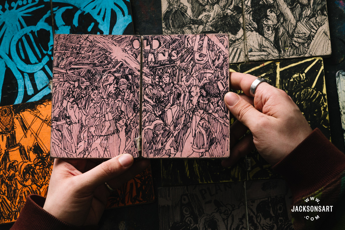
After this mixing revelation, I began to flow into another drawing where I made up a warm-stone colour, a rusty red and a slate blue, applying these as block tones on the page. Satisfied with the composition, I then drew finer details and outlines on top in charcoal, as I would have been unable to achieve such a clear line if I drew ink on top of ink, something I learnt when layering the Primrose Yellow directly on top of the Peppermint.


This was my final draw for the day, one that I felt very satisfied with. I loved the experience of learning about how to bring my style into these new coloured inks, the overall technique resembling something closer to painting rather than drawing. If the alcohol inks had not forced me to use a paint palette, I doubt I would have had the idea to mix the colours together as I did. For me this was the most exciting aspect, creating my bespoke tones and the freedom to be inventive with the materials. The fast drying nature of these alcohol inks produced almost immediate results, omitting the dreaded slow drying process and smudging seen in other inks. This makes the Jackson’s alcohol inks and the 300 gsm Hot Pressed Watercolour paper a fabulous alternative to oil and acrylic painting, as you get the benefits of vibrant colour mixing, blending and fluidity of line without having waterlogged paper or bleed through. At a brilliant price of £3 per 30 ml bottle and £25 for 50 sheets, I highly recommend them and they’ll definitely be a new creative feather to my bow in the future.

About Ruby Bateman
Ruby Bateman is a visual artist, working and living in Hackney, London. Often her work investigates her personal and political identification with ‘the mother’ and (institutionalised) motherhood, which love and loss has led her to desire. Using a richly colourful and symbolic visual language, she references classicism, the spiritual, and her own fiction.

Ruby graduated from the Royal College of Art in 2020 with a Print Master’s, and was awarded a First BA (Hons) degree in Fine Art Printmaking by The University of Brighton in 2017. She has exhibited in shows across the UK and online and worked with social-political arts causes such as Birth Rites Collection, Big Arts Herstory Project (BHAPS) and Energy Garden.
Further Reading
For Those Who Love to Draw: Four Artists Test Our Drawing Materials
Fluid Painting With Jackson’s Alcohol Inks
Developing a Daily Drawing Practice With the Royal Drawing School
Bill Murphy on Combining Materials to Reinvigorate His Drawing Practice
Shop Drawing Materials on jacksonsart.com


2 thoughts on “Two Artists Test Jackson’s Drawing Materials”
Drawing is the basis of all my artwork. I
draw on Perspex, board and also paper. I
use technical drawing pens; Rotring
Isograph and traditional lining pens with
screw adjustment for thickness of line. My
problem comes using fine line ‘nibs’ with
the Rotring. They tend to cut into the
surface of the paper, particularly when I
draw closely spaced lines. Ideally a
surface such as on tracing paper works
best with these pens. Please, can you
suggest a paper that might be resistant to
this cutting?
Hi Steve, I see the dilemma and the first kind of paper that comes to mind is the Yupo range from Stonehenge. See what you think of the product description in the link there. Very best, Clare
Comments are closed.