



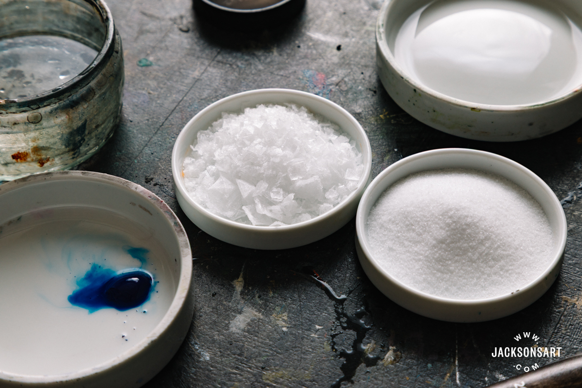
Often, a painting that is boring to look at simply needs more surface variation, and the salt texture technique is an effective way to add interest through texture and mark-making. Adding salt to water-based media generates spontaneous and organic marks in the paintwork as the salt absorbs and pulls at the wet media, shifting the pigment and revealing the paper below. In this article, I explore the history of the salt texture technique by looking at salt-glazed ceramics and discussing its relatively recent emergence in painting before demonstrating how to apply it to watercolour and ink paintings. To test its versatility, I also tried the technique with table salt and sea salt, to show the varied effects they achieve.
Salt Texture Techniques for Watercolour and Wet Media
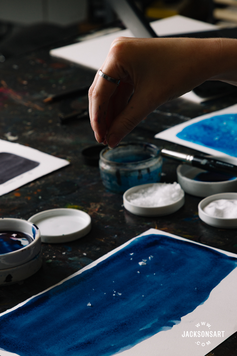
Definition: Salt texture refers to the effect created in water-based media when salt has been sprinkled onto the damp surface of the paint. The salt absorbs and pulls the moisture toward itself, leaving behind light textured shapes in the shifted pigment as it exposes the paper below.
What is the Effect of Salt Texture?
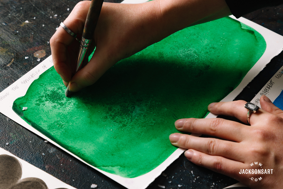
Adding salt texture to a watercolour, gouache, or ink painting may add engaging new textures which would be hard or impossible to replicate by hand. The effect often has a naturalistic feeling, since the salt pulls at the wet pigment to create unpredictable shapes. This can create diffused starbursts, feathery clusters, or delicate lines, and is varied depending on the type of salt and pigments the artist uses. For instance, fine table salt will create small light speckles, whereas sea salt flakes will absorb more water to create more distinctive shapes.
Artists who use salt texture in their paintings have to work quickly since the salt has to be applied while the paint is still damp. So the technique gives the impression that the artist embraces the element of surprise in their works. If an artist were to consistently use salt texture in their works, the symbolism of salt may become part of the conceptual understanding of it. This calls to ideas about preservation, purification, and permanence.
The History of Salt Texture
Prior to artists applying salt to watercolours to create varied visual effects, ceramicists invented salt-glazing to finish their work in 14th-century Germany. Salt-glazing involves adding salt to the kiln at the peak of the firing, which reacts with the silica in the clay to create a glaze of sodium silicate. It’s speculated that the technique may have been discovered by chance, perhaps through burning wood from barrels in the kiln that were previously used to store salt. The visual effect of salt-glazing is varied, from shades of brown to blue and purple, typically creating a surface that is dimpled like an orange peel.
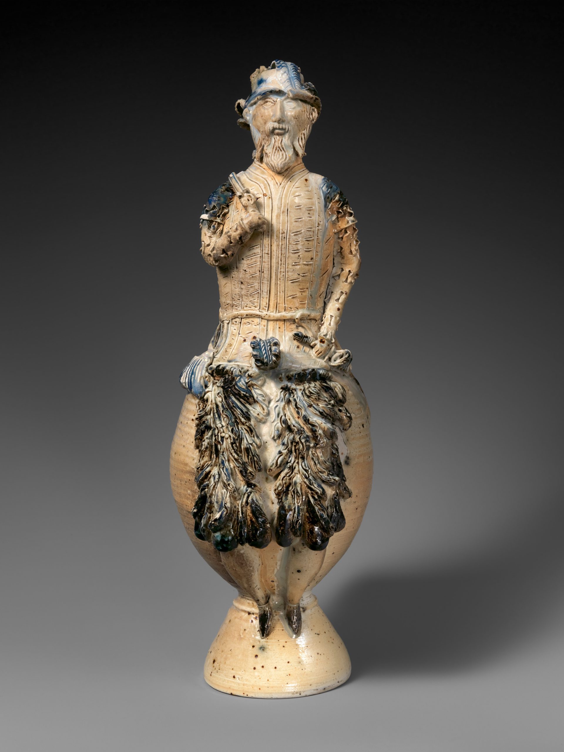
German, Cologne
Salt-glazed stoneware, height 38.3 cm | 15.1 in
The Metropolitan Museum of Art
The salt-glaze was first introduced to Japan in the 1950s by Shōji Hamada, after he spent years working alongside and learning from the English potter Bernard Leach in St Ives. On his return to Japan, he popularised the technique and committed his new studio to using locally sourced resources, including making his own brushes. This established the town where he set up – Mashiko – as a renowned pottery centre to this day.
The salt texture effect is most common in watercolours, although it can also be applied to ink and gouache paintings. It’s difficult to pinpoint exactly when salt was first used to create effects in watercolour paintings, since it likely stems from individual experimentation. Some of the most famous watercolourists in art history – Turner, Schiele, O’Keeffe, and Blake – never used the technique. It’s a more contemporary approach to the medium, which hasn’t been exemplified in art history to a great extent yet. This doesn’t mean that the salt texture technique isn’t valuable or useful – just that no key artists from the narrow canon of art historical fame have championed it yet.
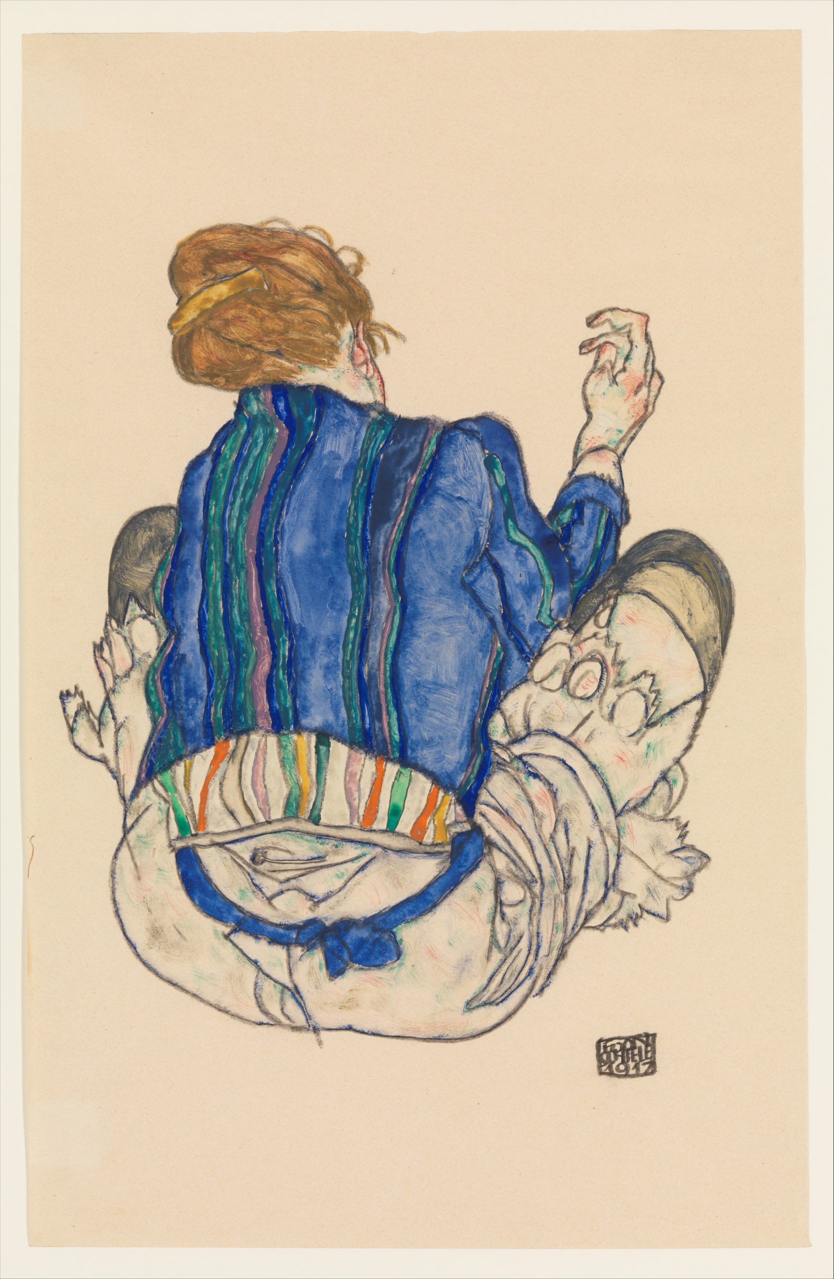
Egon Schiele
Watercolour and graphite on paper, 46.4 x 29.8 cm | 18.2 x 11.7 in
The Metropolitan Museum of Art
Technique developments for watercolours are relatively new in the broader picture. For instance, the invention of liquid latex in the early 1900s allowed for the later development of masking fluid for creating resist effects in watercolours. Salt texture can be seen as a 20th-century development too, and perhaps has a reputation for being a hobbyist or crafty approach to the medium. This is intrinsically linked to the market’s ‘inferiority’ of watercolours and drawings as opposed to the value placed on oil painting. It’s hard to imagine any oil painting techniques being ranked by professionalism. Today, the imbalance of value between mediums is steadily shifting, and there are plenty of standout contemporary artists making watercolours whose work defies this outdated sentiment, like Walton Ford, Chris Ofili, and Hiba Schahbaz.
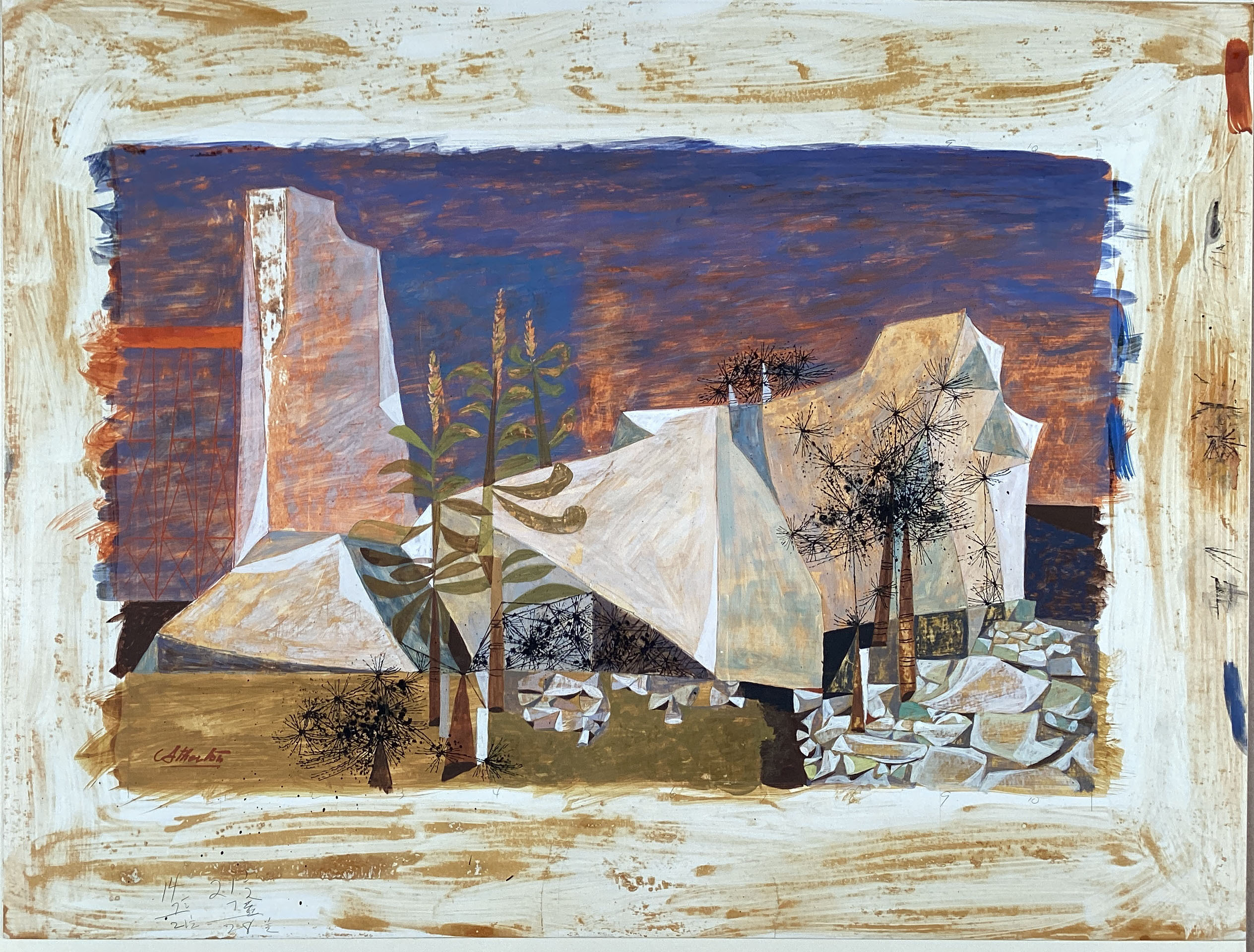
John Atherton
Watercolours and black ink on coated board, 34.9 x 54.6cm | 13.7 x 21.5in
The Metropolitan Museum of Art
Demonstrations of the Salt Texture Technique for Watercolours, Ink, and Gouache Paintings
What Kinds of Watercolour Work Best With Salt Texture?
Not all watercolours behave the same way when salt is applied, since the pigment sizes vary. Although it’s impossible for us to perceive, on a microscopic level, the salt has to be able to pull the pigment in to move it. Paints with a smaller particle size work best with the technique, which tend to be transparent colours, although there are some exceptions. Higher quality watercolours are usually ground more finely, so they also may perform better than budget alternatives of the same colours. The best approach is to test your colours in swatches with salt texture, to see how they react, before applying them to important work.
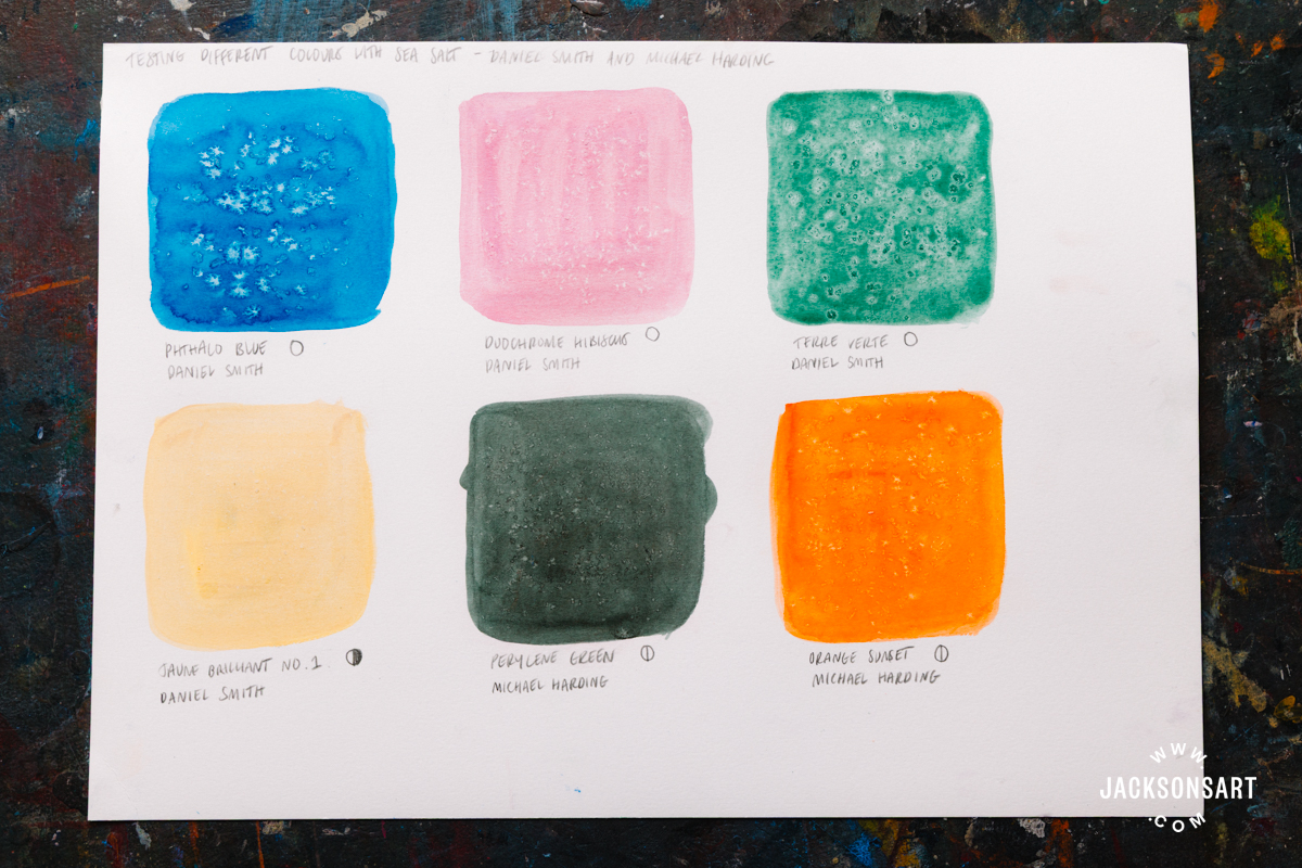
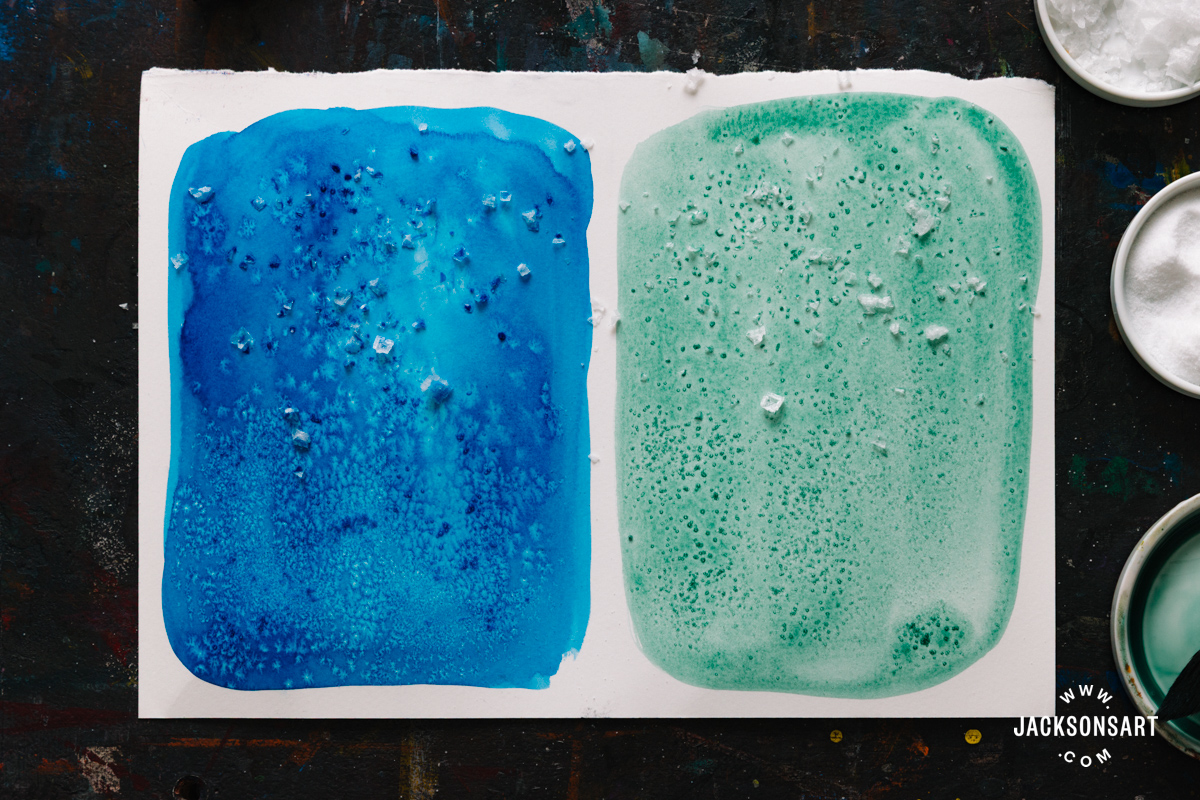
To demonstrate this process, I applied salt texture to six different transparent and semi-transparent colours from the Daniel Smith and Michael Harding ranges. As you can see, the Phthalo Blue and Terre Verte had the strongest effect, although they dried in different patterns. The blue dried in a starburst pattern, whereas the green produced more dappled, round highlights – so even pigments that both work with salt texture may create varied effects. To display how differently these two paints behaved on a larger scale, I repeated the effect separately with a mixture of sea and table salt.
Next, I repeated the experiment with six colours from the Jackson’s Artist Watercolour Paint range. Each of the transparent colours – Blue Violet, French Ultramarine, and Viridian all worked very well. I was surprised that, despite being opaque, Cadmium Yellow Orange also revealed some salt texture highlights, whereas Neutral Tint, which is semi-transparent, hardly moved at all. I suspect this is because Neutral Tint is a multi-pigment colour.
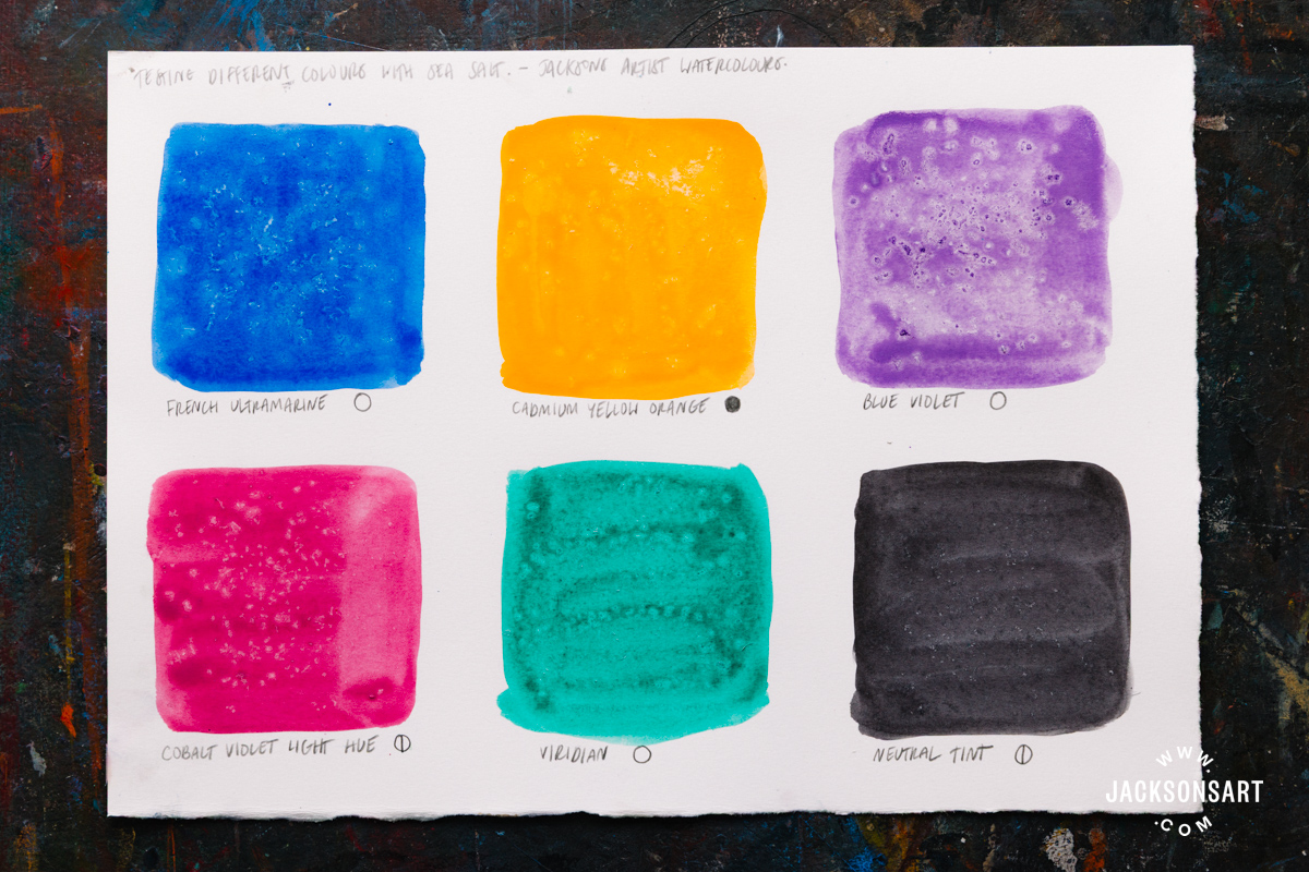
Since particle size determines how well a watercolour works with salt texture, reflective or metallic watercolours that contain mica don’t work with salt texture, since the particle size is too large. Some other iridescent colours do work, such as Duochrome Hibiscus from my example sheet.
Timing the Application of the Salt
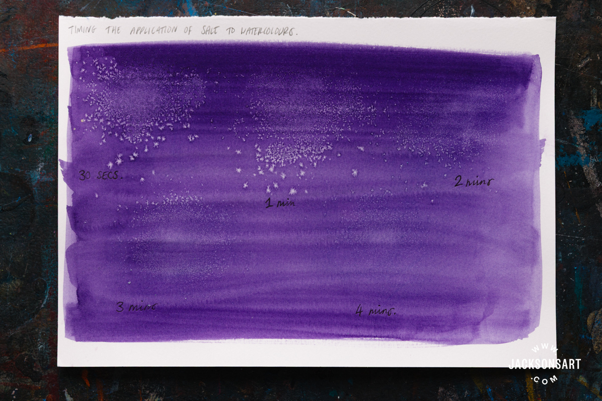
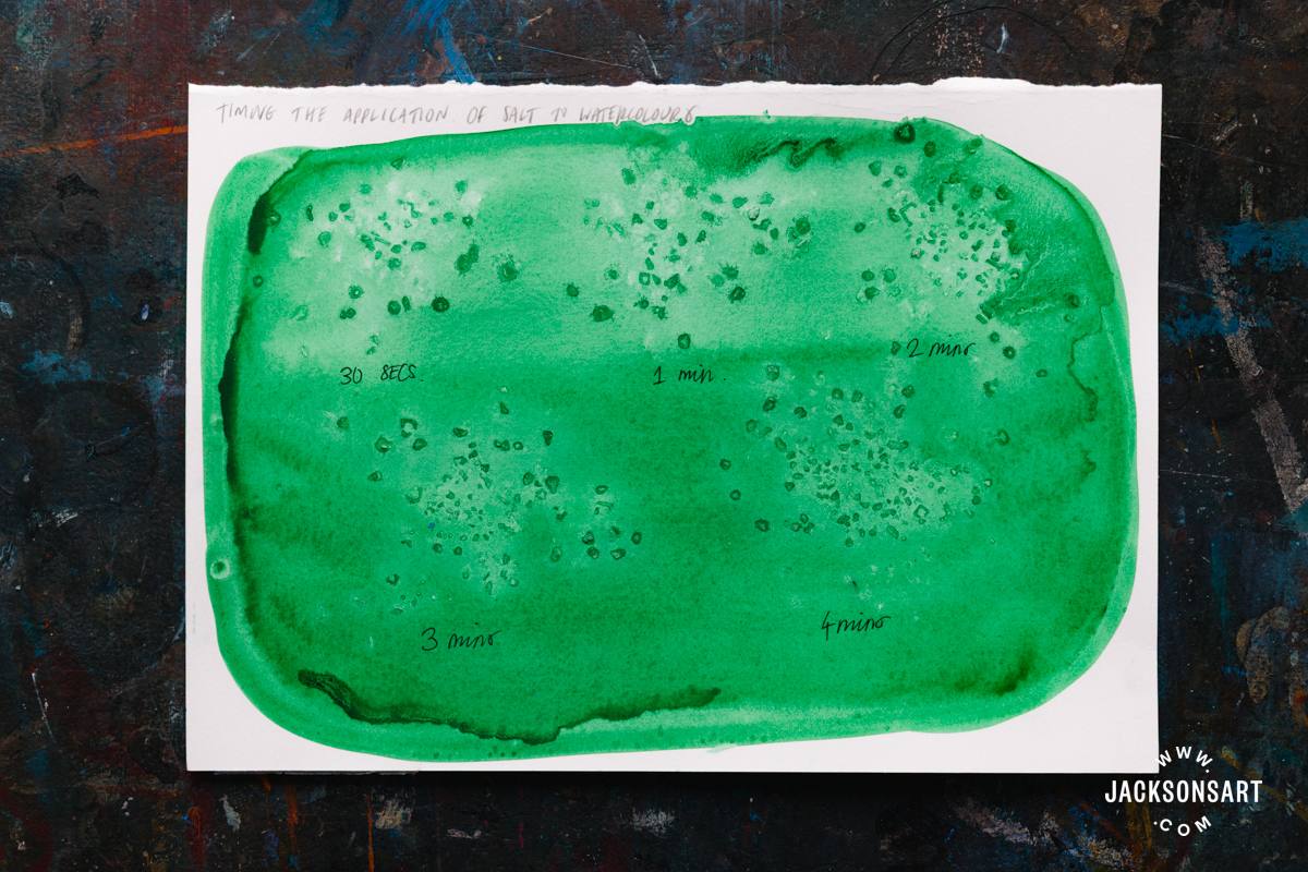
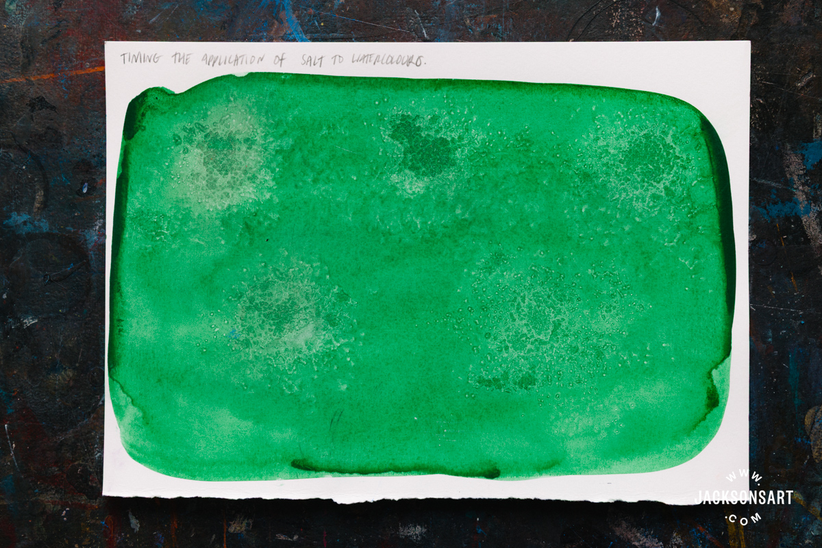
The timing of the application of salt to your paint is essential to the effectiveness of the technique. To demonstrate how it varies, I prepared some timed examples applying table and sea salt to Jackson’s Artist Watercolours on Jackson’s Hot Pressed Watercolour Paper. Table salt creates fine dotted highlights, whereas sea salt pulls the colour in bigger, irregular shapes. From left to right, I timed my application in 30 seconds, 1 minute, 2 minutes, 3 minutes, and 4 minutes.
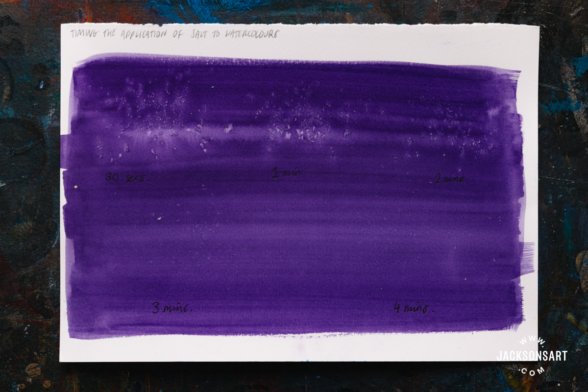
My first example sheets use Dioxazine Purple, which is semi-transparent. With both kinds of salt, application between 30 seconds to 1 minute created the strongest effect. Beyond 2 minutes, their movement was greatly reduced, although still visible as a light texture up close.
Next, I tested the same effect with Hooker’s Green, which is transparent, using the same timed intervals. For this colour, I found that the salt didn’t pull the paint into a highlight, but actually gathered the paint around itself to create some darker marks. The timing didn’t make as big a difference for this colour, with the 4-minute test being almost as effective as the 30-second one. Therefore, you should also test the timing of your application with each colour you want to use, just in case it behaves differently from what you’re envisioning.
Tips: For greater control when applying salt, it’s best not to shake it directly out of the container onto the paper. I added my salt to two small ceramic dishes, so I could easily take a controlled pinch within my 1-minute timeframe with ease.
Removing the Salt
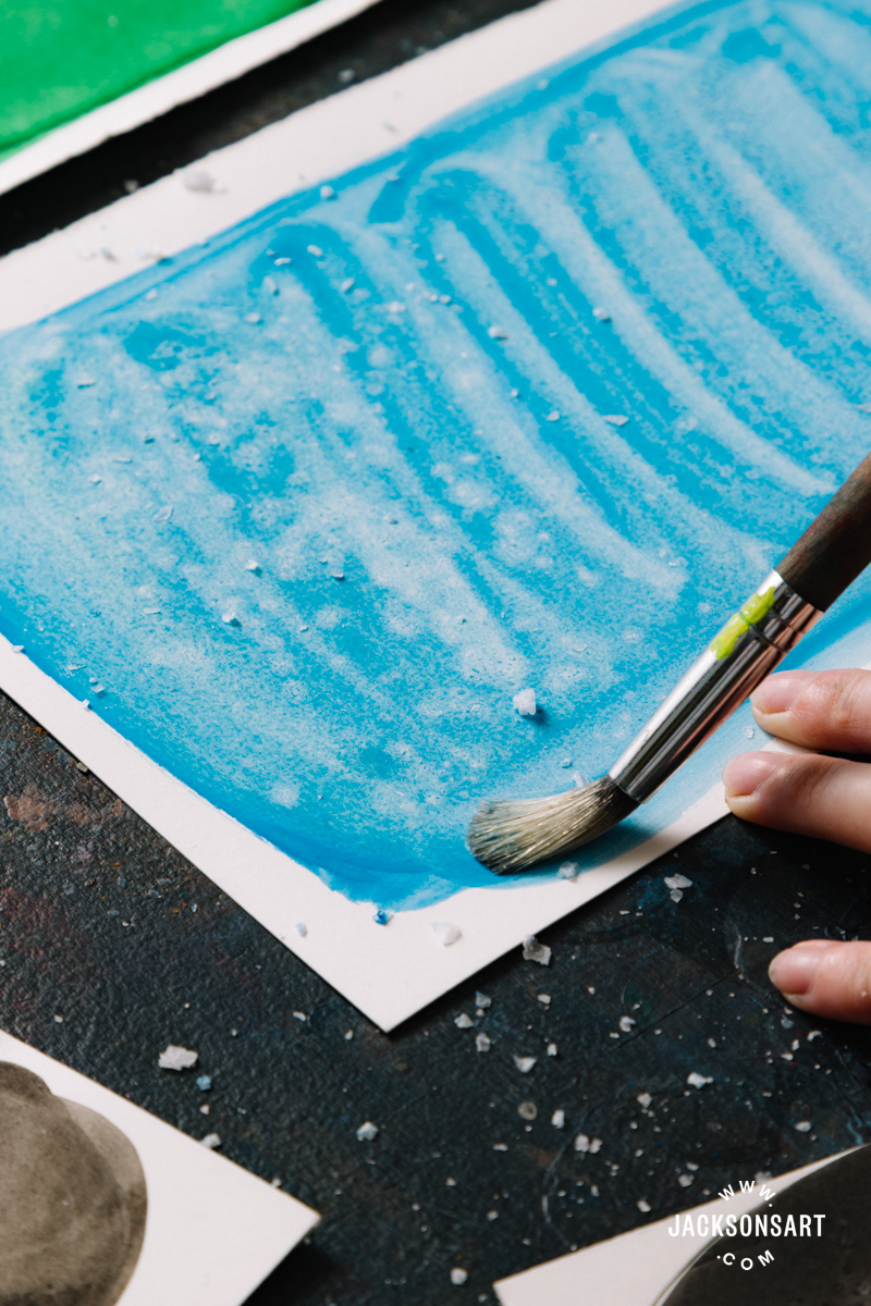
It’s important to wait until the paint is completely dry before removing the salt, so that you don’t disturb the marks it makes or smudge your painting. By using a soft brush or clean cloth, you can gently dust the grains of salt off your paper. If any of them are harder to budge, you may need to move them individually with your finger or a small tool like a toothpick.
Applying Salt Texture to Ink
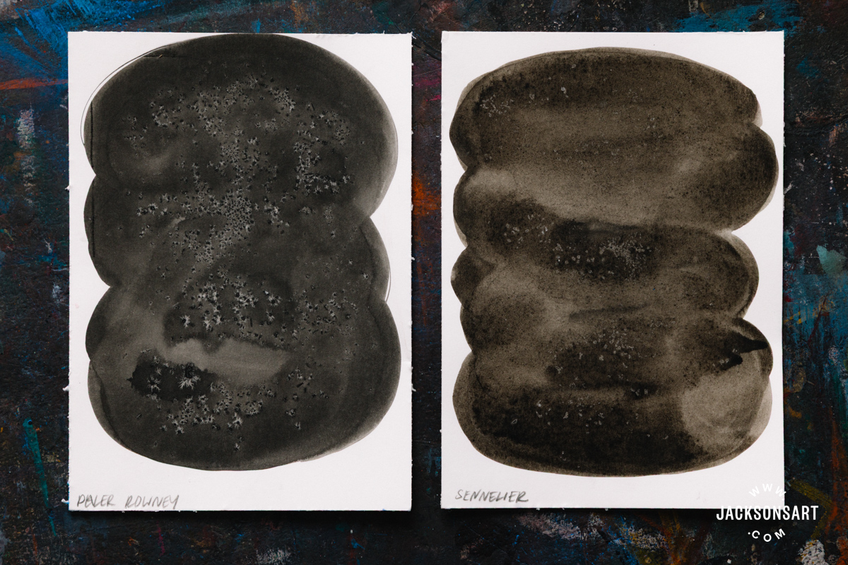
Salt texture may also work well with diluted ink. To demonstrate the effect, I sprinkled some salt onto Sennelier Indian Ink and Daler-Rowney Black India Ink mixed with a bit of water, after 1 minute. As you can see, the Daler-Rowney Ink had a more pronounced effect, with the Sennelier being more subtle.
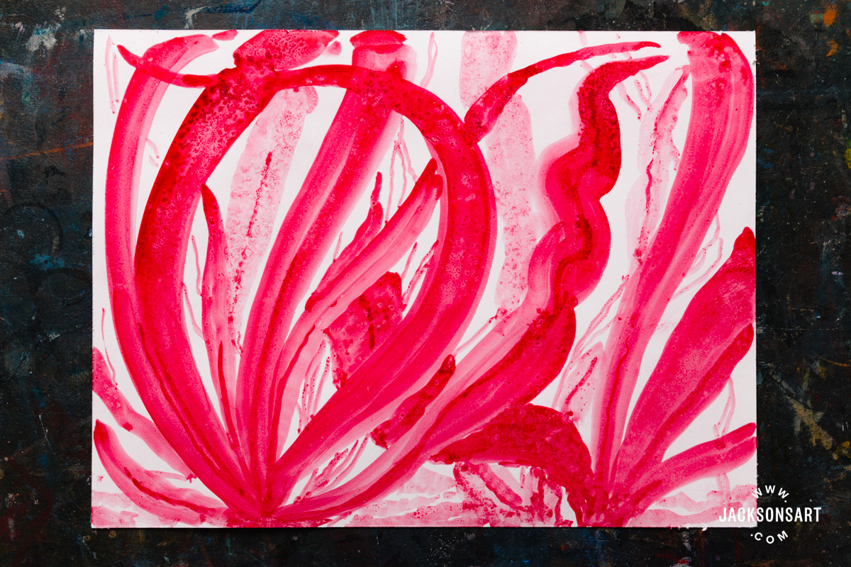
Next, I tested applying salt texture to a Dr. Ph. Martin’s Liquid Watercolour Paint in Alizarin Crimson, which can be applied like ink. I broadly painted curling seaweed shapes, and sprinkled the salt in intervals as I worked. As you can see, the salt created a dappled effect and pulled together some darker areas of pigment.
Applying Salt Texture to Imagery
For my last examples, I wanted to demonstrate the kinds of imagery that the salt texture technique could be used with, to enhance their impact.
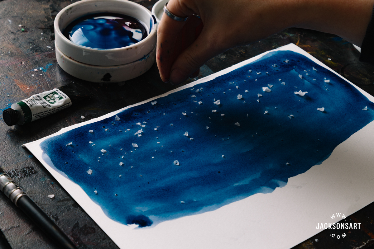
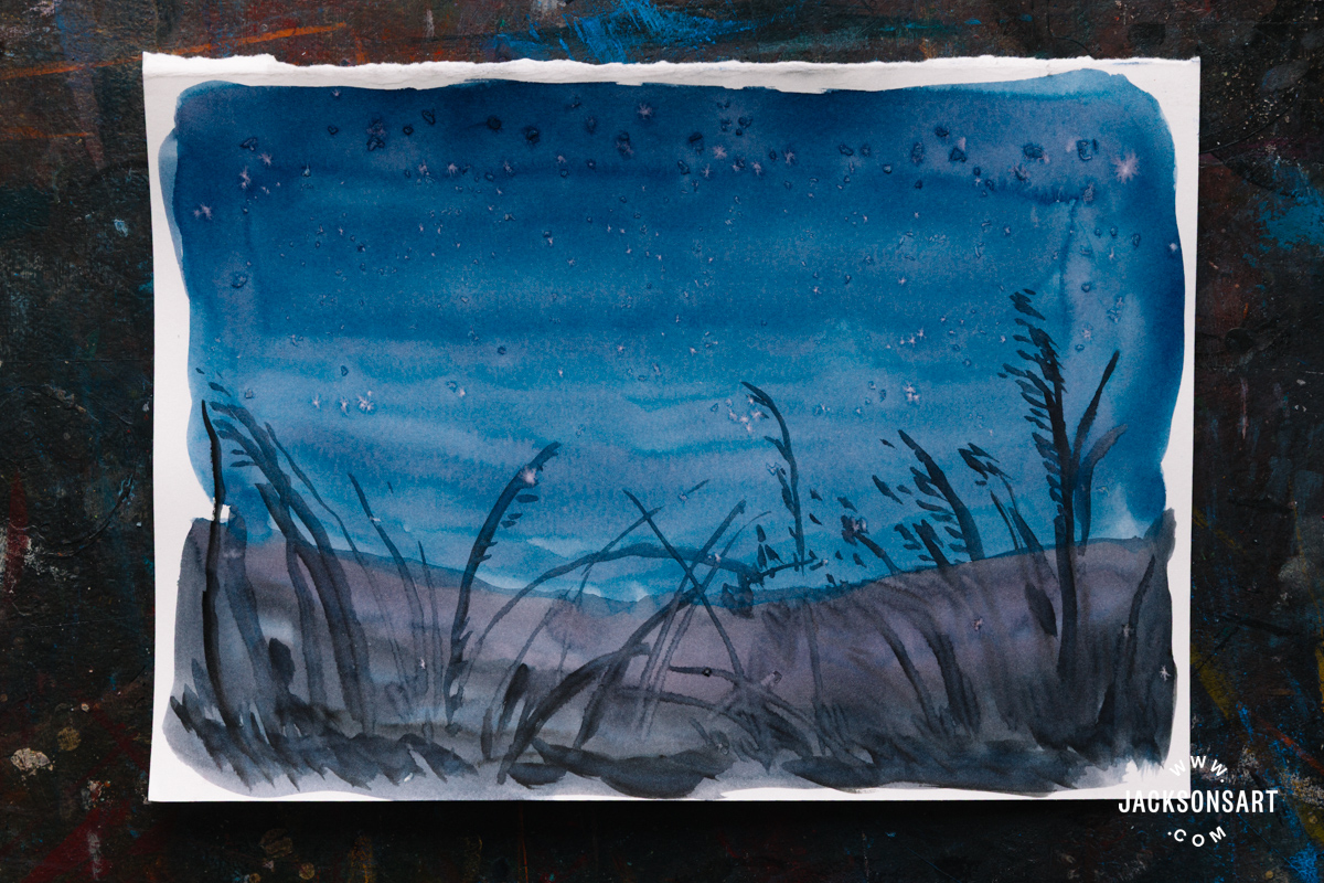
In this first example, I quickly painted a loose nocturnal landscape, wanting to use salt texture to pick out the stars in the sky.
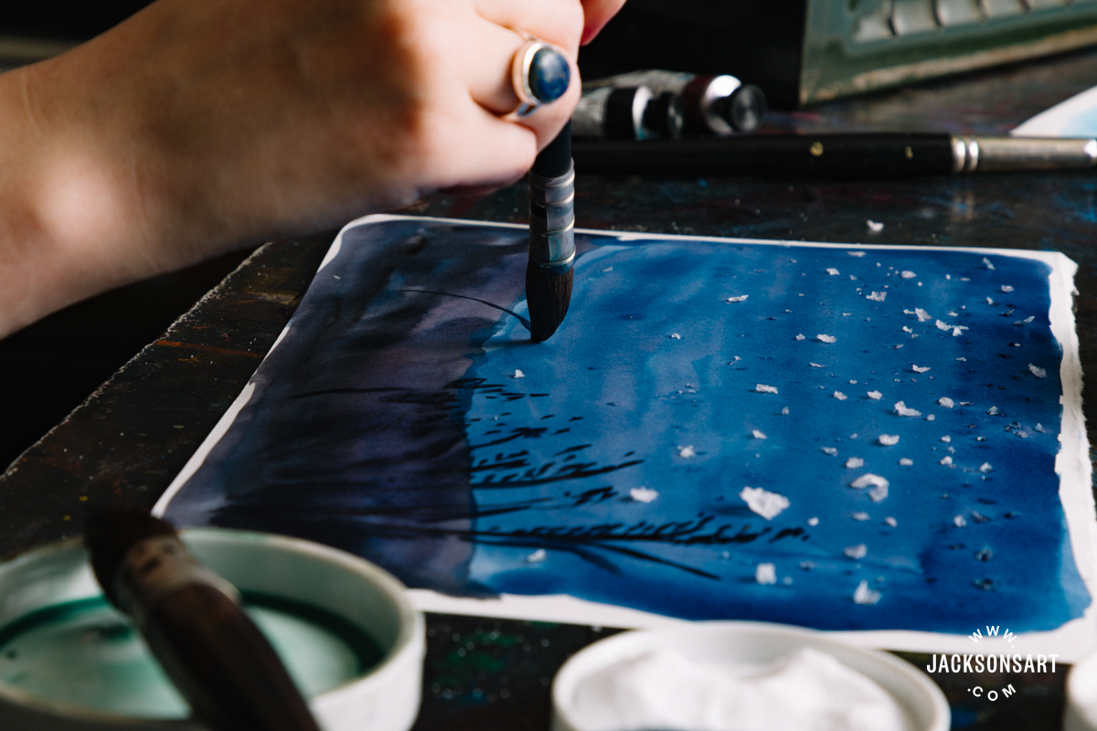
The little white flecks it created gave the sky subtle detail, without the need to apply masking fluid to create the same effect. Sometimes masking fluid can appear too uniform or crisp. Using salt brings a more organic or irregular edge to the highlights.
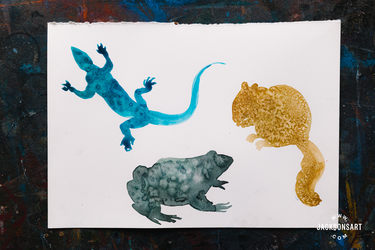
Perhaps one of the most common uses of salt texture is to evoke the fur, scales, or skin of different animals. For my final example, I painted the silhouette of three creatures before sprinkling salt on them after 30 seconds. To complete these paintings, I could add another layer to pick out their features and environment, after the salt was removed.
Tips: Salt texture may appear crafty when used in isolation, but when it’s built in amongst a host of other watercolour techniques, it can take on a professional appeal. Like most paintings, a considered range of mark-making and techniques together appears the most visually engaging.
Further Reading
Your Comprehensive Guide to Watercolour Mediums
Arches Aquarelle: A Traditional Watercolour Paper
New Colours Added to the Jackson’s Artist Watercolour Range
A Guide to Stretching Watercolour Paper
Shop Art Materials on jacksonsart.com


19 thoughts on “Salt Texture Techniques for Watercolour and Wet Media”
Thank you very much for the info!
Thank you so much. You explained it
well and it was useful.
Thank you Solmaz!
Thanks for this interesting article. I find that the degree of water to pigment balance affects the outcome: too much water and the salt becomes too diluted to take effect; and if there is too little water the salt does not react well. It can be spectacular sometimes. Long
drying times…!
Thanks for your comment David – I found this too in my tests – it’s definitely best to experiment with timings until you discover the most effective ones for the particular paints you have
I would like to point out that many artists could be disappointed in their attempts to use salt to create textures if they don’t use table salt that is completely dry. If it has been kept in the kitchen it may be damp from condensation. I recommend keeping the salt in an airing cupboard, or drying it in a cooling oven and then storing in an airtight glass container.
This is great advice – thank you Helen!
Very inspiring and well researched
article on using salt technique: I must
give it a go!
Thanks Judi!
A well thought out piece of research. Having previously tried this technique with mixed results I see the need for a more disciplined approach. For example not simply shaking salt out of a container over the painting! Thank you for providing such inspiration, which adds both fun and enjoyment with this technique to the world of watercolour painting.
Thank you Norman! I hope you enjoy experimenting with the technique
What effect does using salt with watercolour have on the longevity of the painting, both in respect of potentially discolouring the paper or affecting the hue or permanence of the pigments?
Great question – I’ll add a note to the article. Since salt is hygroscopic and corrosive, if it isn’t properly removed it can cause brown staining or damage to the paper over time, especially in humid conditions where moisture from the air will continue to be drawn in. Therefore it’s important to carefully remove all of the salt from your surface once it’s dried. If you want to ensure your work is completely archival then it may be best to avoid this experimental technique for peace of mind
This is such a comprehensive guide to the salt texture technique! I’ve always been curious about how different salt types create varying effects – the comparison between table salt, rock salt, and sea salt is incredibly helpful. The historical context about salt- glazed ceramics adds fascinating depth. I’m excited to try this with my watercolours, especially after seeing how it can create those spontaneous organic marks. Thanks for including the practical tips about timing and moisture levels!
Thank you, I’m glad the article was informative!
I have also used dishwasher salt.
This is a really interesting suggestion – I’ll need to try it out too
Thanks so much for this very informative and helpful article
Glad you found it useful Judy!
Comments are closed.