



By painting a picture with blue, red, and yellow on your palette, you are keeping your options relatively open with regard to the overall colour, temperature, or value of your finished painting. This is because when these three colours are evenly spaced on a colour wheel, the triad offers the ability to mix almost any colour you could wish for. But have you ever tried to create a palette without primaries? Here are two examples of complementary palettes without primaries – that is, a palette comprising green, orange, and violet (and white) – along with a demonstration of why the colour mixing possibilities are just as exciting.

Two Palettes Without Primaries
Orange, green, and violet are known as secondary or complementary colours – the mixes achieved with red and yellow, blue and red, and yellow and blue respectively. However, this is a colour theory observation and not an observation of pigments – it is possible to make single pigment complementary paints because orange, green and violet pigments exist. The good news about this is that your secondary colour palette needn’t be ‘secondary’ in colour vibrancy. If you wish to work with a palette of colours that possess maximum colour vibrancy it is advisable to look for paints made with just one pigment (orange pigments have a code of PO + a number, green pigments have a code of PG + a number and violet pigments have a code of PV + a number, and this information will appear on colour charts and paint tube labels).
The first palette I explored consisted of Phthalo Green, Orange/Red and Ultramarine Violet.


Phthalo Green
PG7, Transparent
Phthalo Green has a cool blue undertone. From the tube it appears very dark, but when thinned with water it turns into a bottle-green hue. It is made from a single highly staining, synthetic pigment (more information can be found in this post). As with all phthalo pigments, it is very powerful and is very influential in mixes, so it is often advisable to use it in small quantities.

Orange/Red
PO5, Transparent
Orange/Red is a fiery orange that is no way near as highly staining as any Phthalo pigment, from the tube it is mid-tone and intensely vibrant, but when diluted washes away into a gentle pinkish hue.
Ultramarine Violet
PB29 PB15:3 PW6, Semi-Transparent
As the pigment codes indicate, this Ultramarine Violet is made from three pigments and is semi-transparent. From the tube it is as dark as Phthalo Green, and is only slightly less transparent. When watered down it bursts into a bright violet, and when more white is added takes on a slightly pink tint.
An Explanation of the Mixes

In the table, I mixed combinations of two colours out of the three in the palette, and also showed in the bottom right-hand corner of each square what happens to the mix when white is added.
Observations
- Phthalo Green becomes more earthy when a small amount of Orange/Red is added to it, and deeper and cooler when mixed with Ultramarine Violet.
- When a touch of Phthalo Green is added to Orange/Red the mix is much cooler than neat Orange/Red, and could be described as a green/brown.
- When a hint of Ultramarine Violet is added to Orange/Red it also becomes more brown, but a much redder brown, which could be described as rust coloured.
- When a touch of Phthalo Green is added to Ultramarine Violet, it almost appears indigo – a very deep blue-violet.
- When a touch of Orange/Red is added to Ultramarine Violet the mix becomes violet-brown.
The table alone only goes some way to showing what colours are possible with these four paints, so I then mixed a group of pale colours, a group of mid-tone colours and a group of dark colours.

Some of the mixes are repeated, but on the whole, I found this exercise so useful for unearthing the potential of this palette, one which I would never instinctively reach for myself. Having explored the possible mixes I feel more inclined to try painting with this palette. The real eye opener is the potential to mix a blue with Violet and Green! Additionally, there are some beautiful warm browns and earthy reds, while the Orange/Red mixes with white to create some beautiful pale peach hues. While the table demonstrated how synthetically bright this palette looks at first glance, further mixing shows its ability to offer naturalistic hues which would be useful for a painting of any subject matter, from seascapes, snowy landscapes, or portraiture.
The second palette I looked at was Oxide of Chromium, Cadmium Orange Genuine, and Ultramarine Violet

Oxide of Chromium
PG17, Opaque
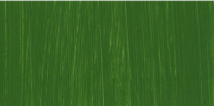
Oxide of Chromium is a very earthy, highly opaque, warm green. It can be a difficult colour to work with as alongside transparent colours it can appear quite lifeless and imposing. It certainly is a bit of a marmite colour!

Cadmium Orange Genuine
PO20, Opaque
Cadmium Orange Genuine is a powerful mid-tone orange. When mixed with white it becomes less pink than the Orange/Red and white mix, and much more peach.

Ultramarine Violet
PB29 PB15:3 PW6, Semi-Transparent
This is the same violet as used in the previous palette.
An Explanation of the Mixes

When mixing combinations of two of the three colours of this limited complementary palette, it’s immediately clear that is a much more naturalistic palette than the previous, thanks to the difference between the earthy Oxide of Chromium and the synthetic Phthalo Green.
Observations
- When Oxide of Chromium is mixed with Cadmium Orange, it creates an even earthier, deeper green, which when mixed with white becomes a green-grey.
- The combination of Oxide of Chromium with Ultramarine Violet makes a sumptuous deep grey than has a degree of warmth.
- When a touch of the green is added to Cadmium Orange, it turns a brown-green that would be useful in woodland paintings.
- The terracotta brown made with Cadmium Orange and a hint of Ultramarine Violet is surprisingly naturalistic, and when more Violet is added it turns to a deep violet-black. When white is added it becomes a greyish violet.
- When a hint of Oxide of Chromium is added to Ultramarine Violet it becomes a violet-grey.
As with the previous palette, I then explored what other mixes could be made by creating a group of pale mixes, a group of mid-tone mixes and a group of dark mixes. The mixes tended to appear warmer than the other palette – leaning towards more browns and less blues and greens, which is a direct consequence of the difference in staining power between the two greens. Comparing the two sets of mixes, I would say that the Oxide of Chromium/Cadmium Orange Gen/Ultramarine Violet palette feels like a more versatile set of colours, as the colours are gentler and perhaps more representative of the colours you are likely to see in the natural world.

If the primary colours are a frequent player on your palette, yet you wish to break out of your comfort zone, I would recommend either of these palettes without primaries, as it is fascinating how close you can get to mixing reds and blues with either – which will help you to feel like you are still working with familiar colours, albeit within a different colour ‘key’. A complementary palette has the potential for creating harmonious paintings with a gentle yet sophisticated colourism. If you grab a set of complementary colours and feel unconvinced by the vibrancy of the green, orange and purple in your hand, mixing them without reference to subject matter can help to prove their capabilities as well as potentially stir your imagination.
Further Reading
Two Painters Try Jackson’s Artist Acrylic Paint
Sap Green: From Dye to Mixed Pigment
Pigment Stories: Viridian Green
Inside the Sketchbook of Bridget Meyne
Shop Jackson’s Artist Acrylic Paints on jacksonsart.com


31 thoughts on “Colour Mixing: Two Palettes Without Primaries”
Interesting !
Might have a go at something like that ….
I need new ideas – thank you.
Glad you found this interesting! Let us know how you get on.
Best wishes
Lisa
Hello Lisa and thanks. I’m writing from Central Victoria, Oz.
The second tonal palette is of particular interest, working as I am
studying in paint and in mixed media a transitory swamp. In the
watery parts very old , huge river gums, with various other
eucalyptus trees, scattered on higher ground. The variety of trunk,
leaf and litter colours & tones is startling, even includes blues. This
seems a somewhat muted, but very apt colour colour set for me to
try. With a bit of maybe mixed black, it could be just the thing.
Thanks for all the other beaut articles on colour mixes, too.
Sounds really interesting Sandra, hope the palette works with your ideas. Absolutely black could be added to any of these palettes, or indeed you could try sparing amounts of a primary colour – these are just a suggested framework. As ever the message is the advantages of sticking with a considered limited palette, rather than grabbing for any tube that feels right without further consideration.
So glad you are enjoying the series!
All the best
Lisa
Interesting and exactly what I was thinking. If you think in terms of lines on the colour circle, there is no reason that any triad separated by a third of the circle should not work… the problem is that we see in terms of Red, Blue and Yellow and are taught that secondaries are mixes of those.
The problem is finding saturated single pigment “secondaries” in the violet part of the spectrum and that, even then, you are not going to get the saturated reds and yellows that the eye expects.
Hi Mark,
It’s true, but in the context of the palette the eye has a habit of seeing absent colours, so violets may start to appear more red and pale greeens more yellow etc…. the structure of the limited colours acts a bit like a ‘key’ in music and is a great way to try reinterpreting the colours you might see in a subject without heading towards muddy mixes and confusion.
Many thanks
Lisa
Always appreciate your posts; this one
especially opens up a lot of possibilities.
Thank you!
Thank you Charlynn!
I think your suggestion is great.
Sometimes I’ll go to the art store and
buy some really nice looking greens or
violets with an idea in mind, but they
never seem to end up on the palette too
often. This is a unique way to try
something different. Thanks for the
idea!
Thank you so much Rudy!
How exciting! Thank you. I have much
to learn about mixing of colors. This
has been extremely helpful!
Glad you have found this of use Carol! Thank you.
Very interesting and useful particularly
liked the orange green and violet colours
will have lots of fun exploring and
developing new areas of colour into my
abstract shapes and designs
That’s great! Thanks Susan
Does it work the same way in oils
Hi Fiona,
Yes, paints using the same pigments in oil will behave similarly to the results displayed here.
Many thanks
Lisa
“It is common knowledge that pure primary colours – blue, red,
and yellow – can be used to mix all the colours of the spectrum.”
You are probably right that it is common knowledge, but
unfortunately it is incorrect knowledge. There are no pure
pigments for a start as spectrometer readings reveal. Blue
pigment is not pure, but contains a lot of green, as does yellow.
The yellow and blue lightwaves cancel each other out, leaving
only the green, i.e. the impurity. Even so, pigments can only mix a
limited range of the spectrum. However, I agree with you that
mixing is key and your ideas are interesting. I will try some!
Thanks Charles, and yes you’re absolutely right and perhaps I should make it clearer that pure primaries do not exist in the world of paint-making, and that pigments do have limitations in terms of being able to create all the colours of the spectrum. But at least they do offer a more than decent selection, I would say!
Many thanks,
Lisa
This has been so insightful. I’m still
trying to find a style I am happy with,
but haven’t quite found it yet. I’ve only
ever mixed the primary colours or used
colours straight from the tube which
doesn’t make for a very tonal outcome.
The prospect of trying out your colour
mixing suggestions is exciting and the
results limitless. Thank you for inspiring
me.
Hi Lyndsey,
So great to read your comment! Thank you – I hope you enjoy exploring these colours.
Best wishes
Lisa
Thank you, Lisa, for yet another stimulating
and interesting article on a subject that is
close to my heart. As a long-term artist who
now prefers the oil medium, I have always
been fascinated by the so-called ‘art
secondaries’ of green, purple and orange. In
fact I have used their juxaposition in many
home furnishings. I have long experimented
with them and I have used two of your
suggestions, Ultramarine Violet (a delicious
purple with a blue bias) and Orange/Red (a
vivid orange with red bias) alongside my
personal favourite choice of green. I prefer a
yellow-biased green to balance the ‘wheel’,
such as Old Holland’s wonderful Sap Green
Lake Extra (available from Jackson’s), which
is probably my favourite hue ever. Having
those three secondaries with a bias towards
each of the primaries gives scope fo
limitless experimentation. Keep up the good
work, Lisa, your articles are always worth
reading.
Thank you Alan!
Hola saludos de gran interés estoy
apenas en estudio… Nuevo en el mundo
de la pintura y cosas como estás me
hacen sumergirme en el mundo de la
ciencia y de las misas…gracias por gran
aportes estaré siguiendo en lo que pueda
esta dirección…
Muchos Gracias Andres!
Weirdly, just before I read this I had started a
picture with pyrrole orange, turquoise and
dithering between magenta and dioxane
violet. The greys are translucent.
Hi Rose,
That’s such a coincidence! Hope you enjoy working with this palette.
Best wishes
Lisa
Thank you, Lisa, for yet another stimulating
and interesting article on a subject that is
close to my heart.
As a long-term artist who now prefers the oil
medium, I have always been fascinated by
the so-called ‘art secondaries’ of green,
purple and orange. In fact I have used their
juxaposition in many home furnishings.
I have long experimented with them and I
have used two of your suggestions,
Ultramarine Violet (a delicious purple with a
blue bias) and Orange/Red (a vivid orange
with red bias) alongside my personal
favourite choice of green.
I prefer a yellow-biased green to balance the
‘wheel’, such as Old Holland’s wonderful Sap
Green Lake Extra (available from Jackson’s),
which is probably my favourite hue ever.
Having those three secondaries with a bias
towards each of the primaries gives scope fo
limitless experimentation.
Keep up the good work, Lisa, your articles
are always worth reading.
Thank you Alan! Really interesting to read about your colour choices!
Sorry about my comment appearing
three times, Lisa. I thought it was my
computer playing up. You may remove
two of them if you wish.
Thanks Alan, I wasn’t sure if it was my computer or yours!
All the best
Lisa
Thank you, Alan.
Comments are closed.