With more black artist’s watercolour paper available than ever before, we decided to compare how four different brands of black paper handle with a variety of water-based mediums, including acrylic, watercolour, gouache and markers in metallic, fluorescent, opaque and transparent colours. We wanted to explore the unique characteristics of each paper and compare the visibility and behaviour of the different mediums and colours on the black surface of the paper.
Black Watercolour Papers
1. Van Gogh Black Watercolour Paper by Royal Talens
- 12 sheets per block
- Available in A3 and A4
- 360gsm
- Cold pressed surface
- Lignin-free
- Not lightfast
Royal Talens was the heaviest weight of the four papers we tested and the second darkest black after Stonehenge. Its texture has fine parallel grooves and it has a slight sheen.

2. Stonehenge Aqua Black by Legion
- 15 sheets per block
- Available in 8 x 10 in, 9 x 12 in, 10 x 14 in, 6.3 x 9.5 cm
- 300gsm
- 100% cotton
- Acid, Chlorine, OBA, Lignin-Free
- Cold pressed.
- Buckle-Resistant, dries flat
- Lightfast
Stonehenge Aqua Black was the third heaviest weight paper and the darkest black of all four papers we tested. Its texture is almost like pressed wool and it has the same surface on both sides.

- Single sheets
- 56 x 76 cm
- 320gsm
- 100% long fibred black cotton rag
- Internally sized with neutral pH size and acid-free
- Not lightfast
More of a dark grey colour than a black, Khadi was the lightest in tone of all the papers we tested. It was the second heaviest in weight with the roughest surface texture.

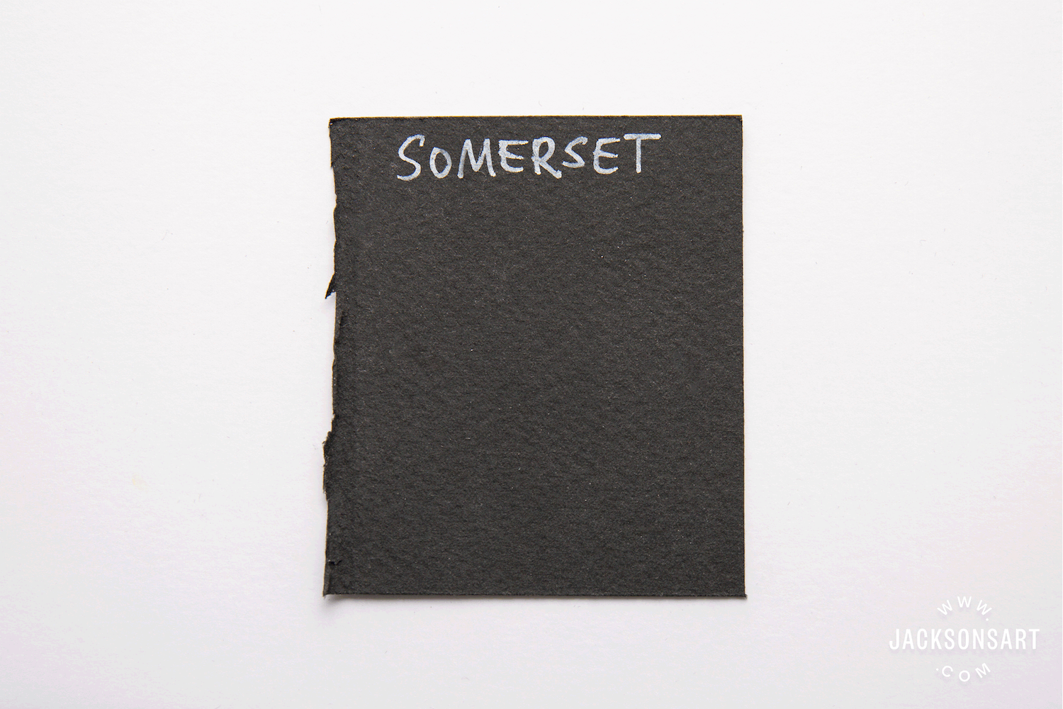
4. Somerset Black Velvet Paper
- Single sheets – minimum order quantity is 5 sheets
- 56 x 76 cm
- 280 gsm
- 100% Cotton
- Acid-free
- Archival – lightfast
This paper has been designed for letterpress, etching, silk screen and other relief printing techniques and has also become popular with pastel artists. We thought it would be interesting to put it to the test as a black paper for water-based mediums too. It has a very smooth, absorbent surface texture. It was the third darkest black and the lightest weight paper in our tests.

Medium Tests
Water-soluble Pencils
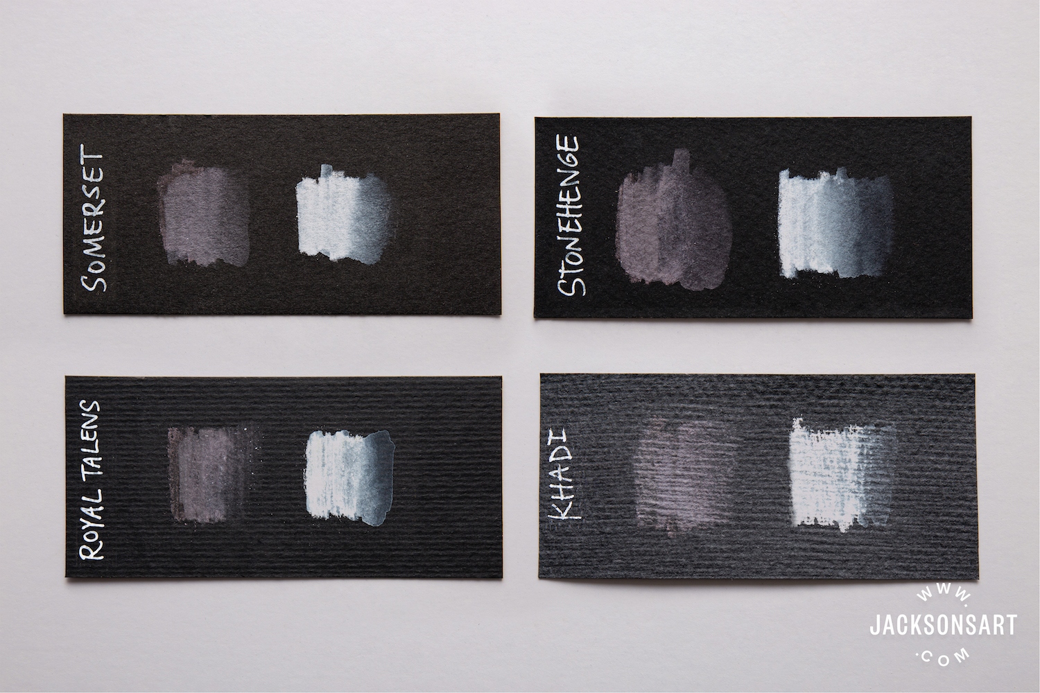
- Derwent Graphitint Water-soluble Pencil Warm Grey 19
- Derwent Graphitint Water-soluble Pencil White 24
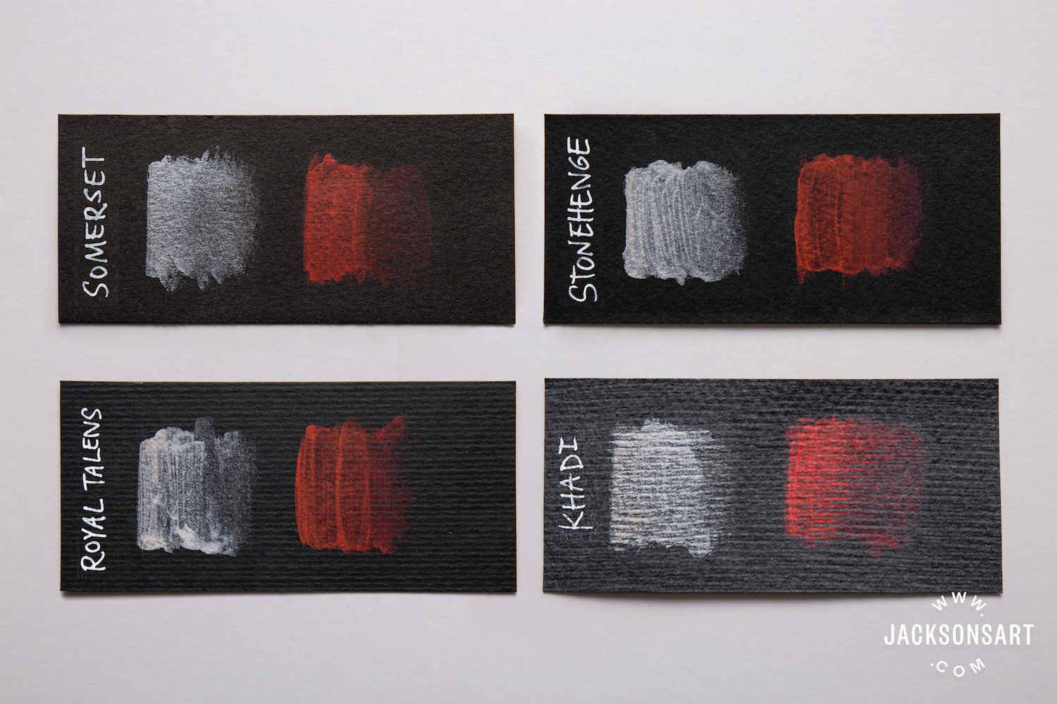
The watercolour pencil application was smooth on both the Somerset and Stonehenge. With the addition of water, both papers produced a very short bleed and the pencil dried to a smooth matt finish with a good amount of surface coverage. On the Royal Talens and the Khadi, the rougher texture of the paper created a more uneven pencil mark, and both papers allowed barely any bleed at all when water was added. On the Royal Talens, the pencil had a slightly shinier finish than the others. Khadi’s grooved surface made the pencil catch a few times, leaving a textured, chalky finish.
Marker Pens
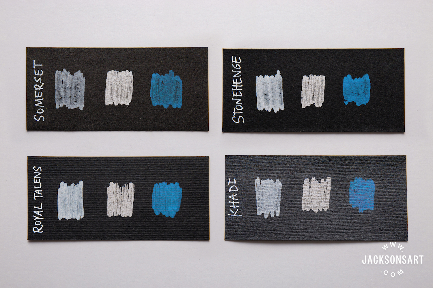
- Uni Posca White Bullet Shaped 0.9 – 1.3 mm
- Molotow Liquid Chrome Pumpmarker 4 mm
- Molotow Shock Blue Acrylic Twin 1.5 – 4 mm
Being the darkest black of the four papers, the colour of the pens stood out the most on the Stonehenge. The pens were very smooth to apply to the Royal Talens, but scrubbed slightly on the other three papers. The pen ink seemed to absorb into the Somerset, Stonehenge and Khadi, while it remained on top of the Royal Talens and created a thicker depth of colour.
Watercolour Paint
The Somerset was very absorbent but had the most even finish after the paint had dried. The Stonehenge had a thick, slightly speckled finish in the more diluted areas of paint, but the thicker areas of painting dried to a very smooth finish. The paint’s bleed was exceptionally short on all four of the papers, but the texture of the Royal Talens encouraged the paint to collect in blots. On the Khadi, the paint dried to a chalky finish, but it was able to take multiple washes to alter the thickness of the paint.
Watercolour: Opaque and Transparent Colours
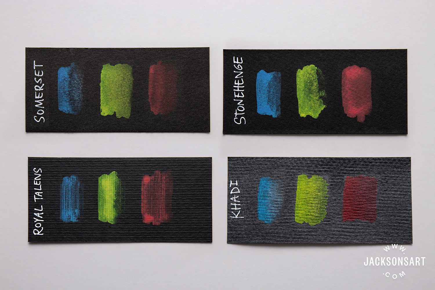
- Jackson’s Artist Watercolour Cerulean Blue 264 – Opaque
- Jackson’s Artist Watercolour Lemon Yellow 103 – Transparent
- Jackson’s Artist Watercolour Carmine 187 – Transparent
While metallics, whites, silvers and golds are always going to stand out on black surfaces more than other colours, there is definitely scope for working with regular watercolour paints on black watercolour paper. Both the opaque and transparent colours used here showed up on each paper much more than I had anticipated. Of course, the more diluted, the less visible they were and the thicker the paint, the more visible the colour. The black surface of the paper gave them each a richer feel, than the way they might appear on white paper.
Gouache

Both Acrylic and traditional gouache were the most compatible mediums to use with all four black watercolour papers. They seemed to bring out the best qualities in each one, mostly due to the even paint coverage, the gouache filling up space in and around the grooves of the more textured Royal Talens and Khadi. The acrylic gouache (white) was unable to be lifted once dry, but the traditional gouache was responsive to water on all four papers, even when re-wetted after having been left to dry for a few days.
Acrylic Paint
I expected the silver acrylic paint to show up well on the black paper but I was intriuged to see how a fluorescent paint would appear. It was equally dull on all four papers, but, the areas where it condensed in the texture of the Khadi would suggest that if applied neat and very thickly, it could still maintain its bright fluorescence when dry. Acrylic paint is very easy to control on watercolour paper of this thickness and it is possible to work paint texture more but keep in mind, that there is no lift at all once it has dried.
Metallic Watercolour: Coliro Pearlcolours
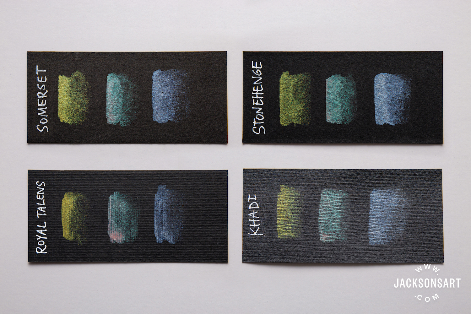
- Coliro Pearlcolours Apple Green M020
- Coliro Pearlcolours Mermaid M023
- Coliro Pearlcolours Sky Blue M017
Metallic watercolour paint, like Coliro, is perfect for black watercolour paper as it is designed to be rich shimmering colour. Whether applied thickly or diluted, it’s iridescence remains. Due to the smoother surface texture of both the Somerset and Stonehenge, it was easy to get a good amount of lift with the Coliro. Khadi, being very absorbent and with a varied, grooved surface texture, made it harder to get a consistent lift. Royal Talens has a more consistent surface texture (parallel grooves) which made it easier to move the paint with water.
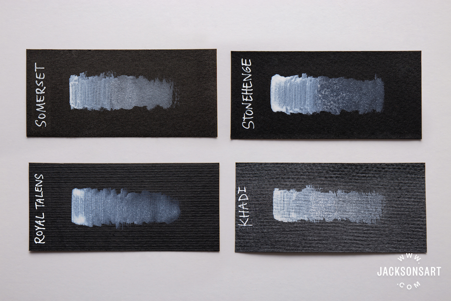
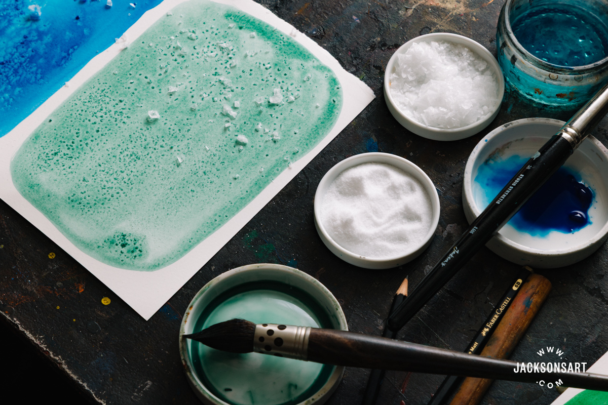
Scrubbing Tests
The scrubbing tests were carried out using a very stiff brush and heavily diluted white watercolour paint. Each paper was vigorously scrubbed (more than would be necessary for any regular watercolour painting) to really test the strength of each paper. See the results below:

Further Reading
Lightfast Black Surface: Stonehenge Aqua Black
Nuanced Sheens: Coliro Pearlescent Paint
Jackson’s Metallic Watercolour Inks on Black Khadi Watercolour Paper
Shop Van Gogh Black Watercolour Paper by Royal Talens
Shop Stonehenge Aqua Black by Legion
Shop Somerset Black Velvet Paper


10 thoughts on “Black Watercolour Paper Comparison”
I would prefer to test free samples of black
Stonehenge aqua paper before buying a
pad. Can this be arranged? I would also like
a copy of your acrylic catalogue.
Hi Bel,
Legion have produced a small sample pad of Stonehenge Aqua Black measuring just
6.3 x 9.5 cm. You can purchase it from our website for just £1.30 if you’d like to give it a try.
You can also order a free copy of our Acrylic Paint Catalogue from the website too. Here is the link: Jackson’s Acrylic Paint Catalogue.
Thanks you Bel, feel free to let me know if I can help with anything else.
All the best,
Clare
Good to see. Know which I will get.
Hi Barbara,
That’s great. I’m glad it was helpful for you.
All the best,
Clare
I’d love to know how calligraphy ink
applied with a dip pen responds to these
papers
Hi Charlotte,
Yes, that sounds interesting. Some of them come in sample sizes, like the Stonehenge Aqua Black. If you do try it out, we’d love to hear about your findings.
Thank you,
Clare
A very interesting survey on the Black
Paper I have used the Van Gogh Black
Watercolour Paper by Royal Talens with
the Van Gogh Metalic paints, with really
superb results, I have not tried with
pastels yet.I also enjoyed the Indian
Yellow article. Thank You Jackson
Hi Barbara
Thank you for your feedback. I’m glad you enjoyed the article.
Kind regards, Clare
Hi. Which one is better for printing with
linocut? I am thinking of printing using gold
and silver metallic inks. What ink would be
recommended to print with gray linoleum on
these papers? Thank you very much.
Hi Javier and thanks for your question. The most suitable black paper for printmaking is the Somerset Black Velvet Paper.
Cranfield include some metallics (Copper, Silver and Gold) in their traditional relief ink range.
I hope you find this helpful and if you have any more questions, please let me know.
Best, Clare
Comments are closed.