



Painters organically become familiar with using washes in their work by diluting their media with water or solvent. But sometimes the most seemingly simple techniques have hidden complexity. In this article, I look to art history for examples of washes, including a broad selection of paintings from Duccio to Angelica Kauffman and John Singer Sargent. Then, I demonstrate how best to apply washes in your own work; in watercolour, watercolour pencil, gouache, ink, acrylic, and oil.
Articles in the Techniques Series define the meaning and context of art making processes and give practical tutorials on how to work with them.
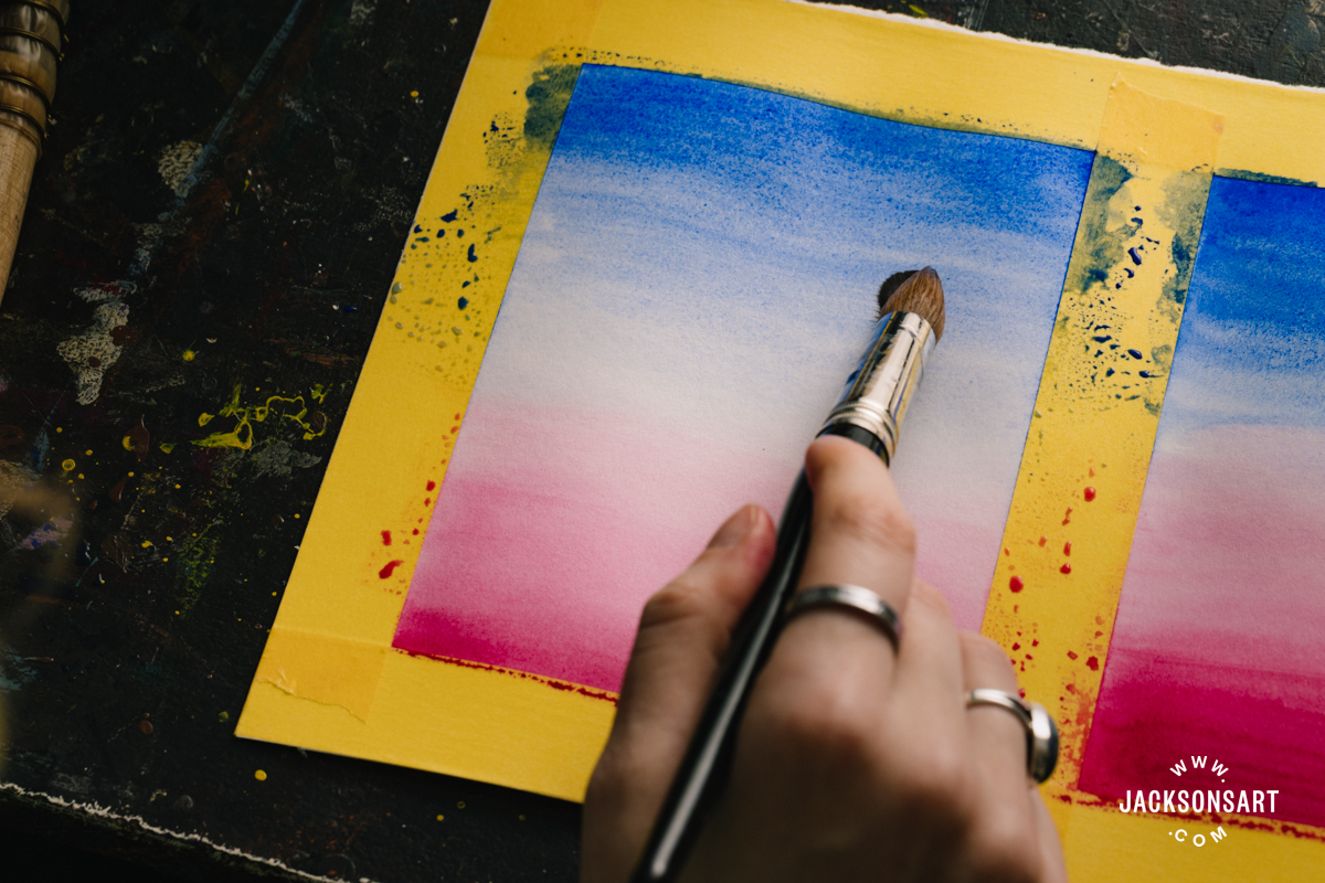
Definition: A wash is a semi-transparent or transparent layer of paint or ink that’s diluted with water or medium, and applied broadly or methodically to a surface. Washes can be flat, graded, variegated, or inconsistent.
Contents
Washes with Watercolour Pencils
Washes in Acrylic, Gouache, Ink, and Oil
What is the Effect of Washes?
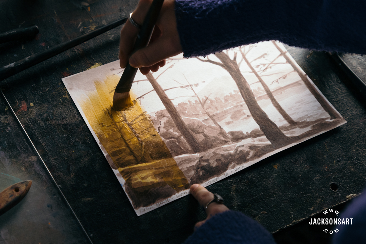
Washes make the best of paints that are transparent or semi-transparent by revealing their ‘thin’ colour. They’re an essential step for painting techniques like glazing, where an underpainting is covered with a thin layer of paint to make the resulting surface colour more complex.
Watercolour painting relies on washes at its core, making wide, bright skies and skin dappled with light possible to distribute before the paint rapidly dries. Oil and acrylic can also be painted in washes, by diluting the paint to apply a broad ground, loosely blocked in, or built up in delicate layers.
Artists may also use washes for practical purposes, like hand colouring an intaglio print, or for quickly sketching en plein air. Seamless washes communicate to the viewer that the artist is careful and methodical, whereas fluid, irregular washes convey spontaneity.
The History of Washes
The history of washes in art is almost as old as the history of painting, permeating more mediums than you might initially assume. For the following historic examples, I describe one artwork from each century from the 1200s to the 1900s that features wash techniques.
This long scroll contains multiple paintings in ink and colour detailing the origin of the Kitano Tenjin shrine, dedicated to the scholar, poet and statesman of the same name. This incredible beast with eight heads and double pairs of eyes breathes fire, bristling with fury, in the landscape. The image is rendered in washes, from the flat washes on the craggy rocks to the light grey of the creature, following the linear details of the drawing.
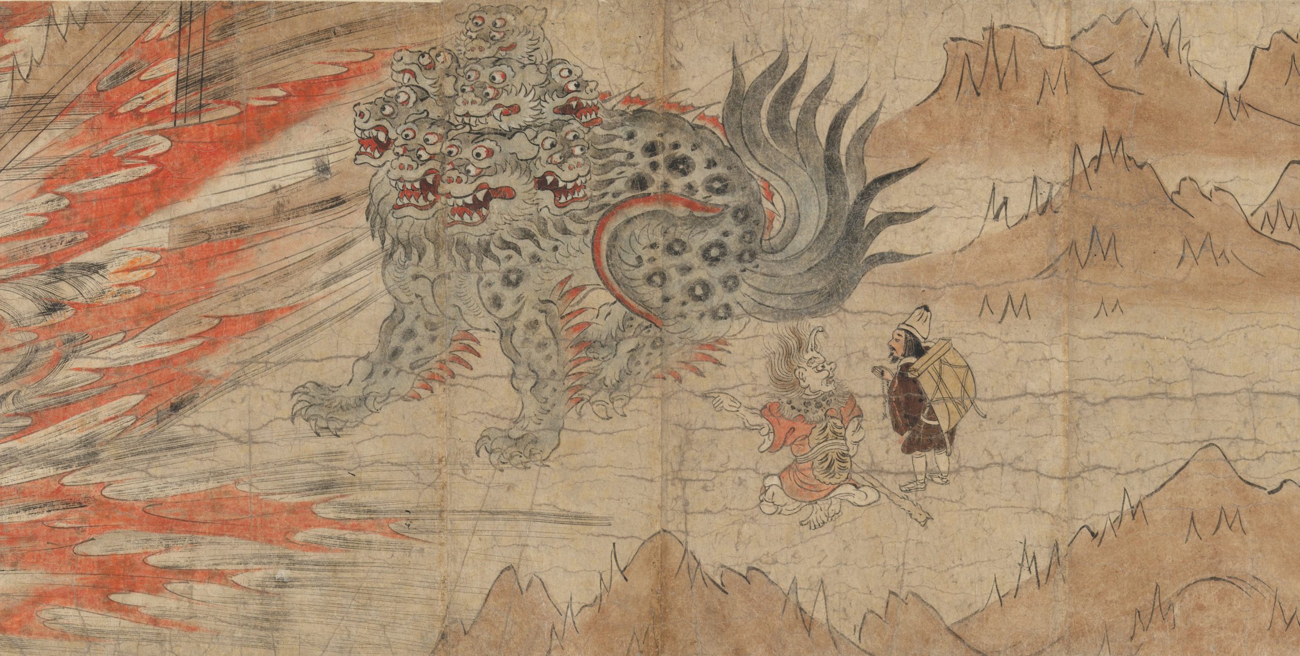
Japan, Kamakura period
Ink, colour, and cut gold leaf (kirikane) on paper, 28.8 × 689.4 cm | 11.3 x 271.4 in
The Metropolitan Museum of Art
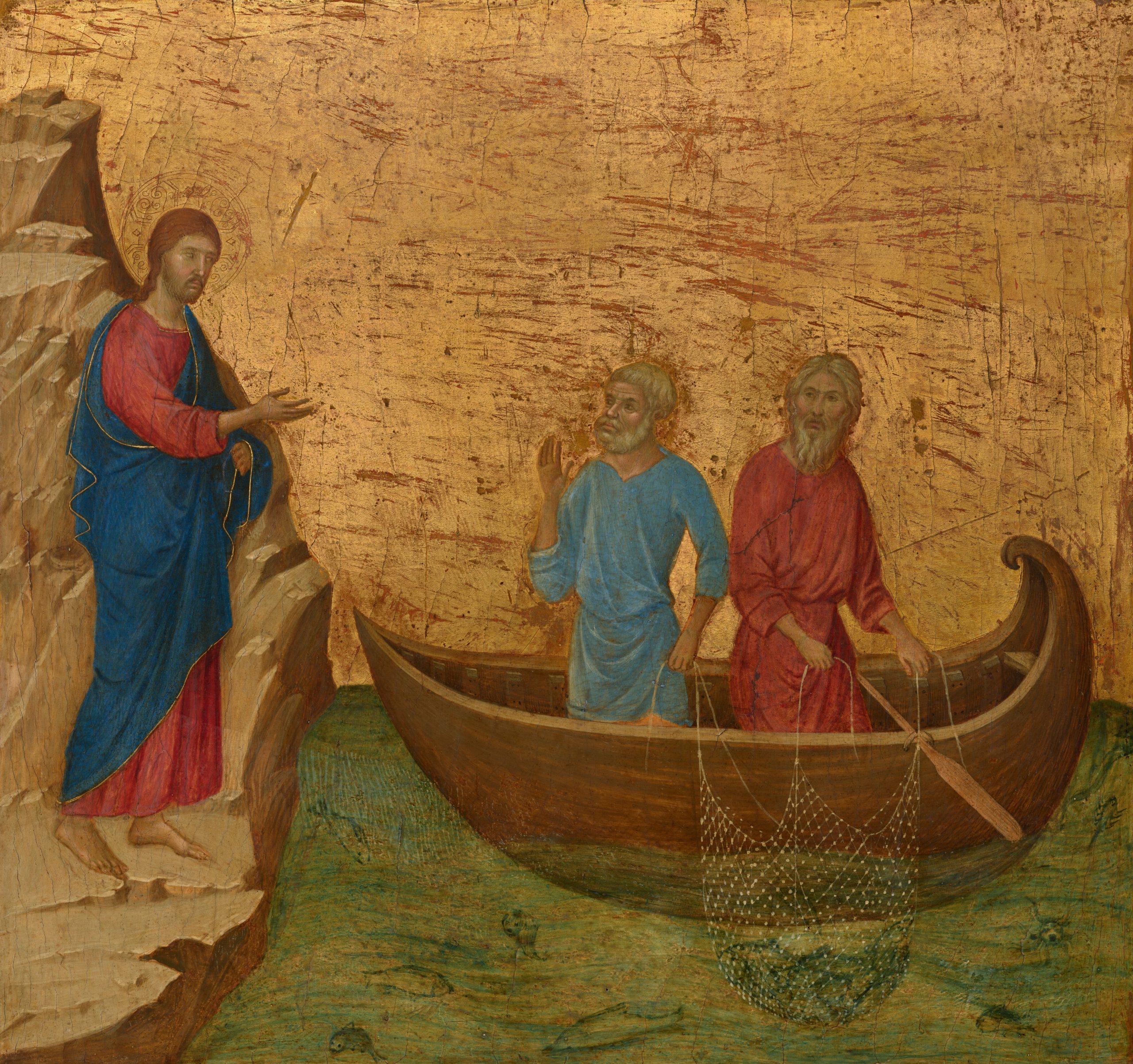
Historic egg tempera paintings may not immediately come to mind when we think of washes, but the colour was often built through glazes of thin colour. The medium dries very quickly, so this kind of ‘wash’ isn’t as fluid as others, but thin colour is still possible to apply at a controlled scale.
Duccio followed this structured process for his paintings by making a tonal underpainting before glazing over in colour. Underneath the skin of his figures, he created a Terre Verte underpainting or verdaccio, before adding pinks and whites on top to form naturalistic skin tones. Some of the figures have a greenish hue today, since the Red Lake pigments that were glazed on top degraded. This particular example also makes use of the transparency of layering a thin wash of tempera where the boat meets the water.
Duccio di Buoninsegna
Tempera on panel, 42.7 × 45.5 cm | 16.8 x 18 in
National Gallery of Art
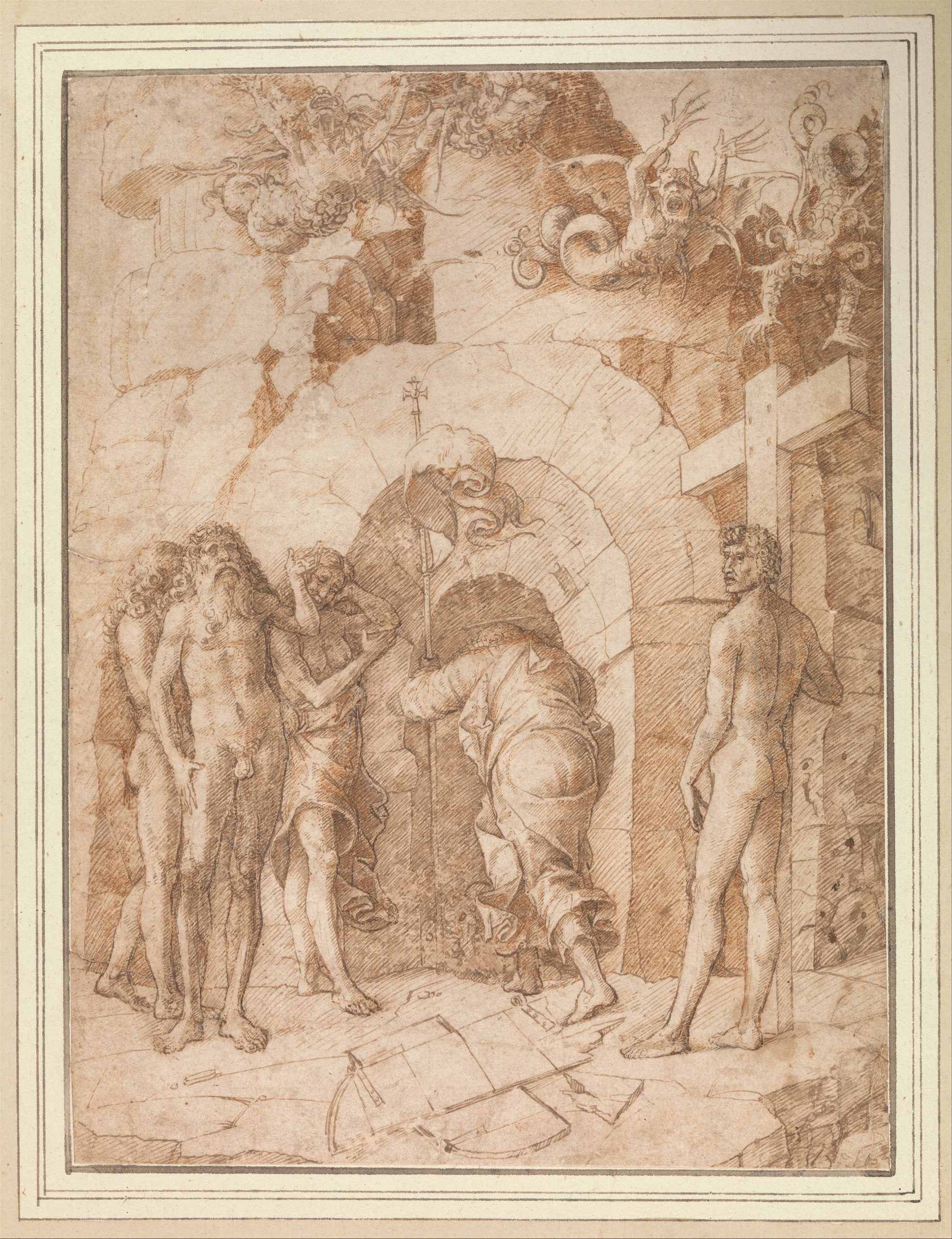
This pen and wash drawing by a follower of Mantegna has an unusual composition for the time period, where Christ has his back turned to us. He walks through the entranceway into ‘Limbo’, which is the level before Hell. This non-Biblical Christian scene was copied from a lost original artwork by either Mantegna or Bellini, whose work can be difficult to distinguish since they exchanged ideas. Preparatory drawings of this period were made with the same approach, where an ink drawing was supplemented with tone by adding washes of carefully placed colour.
Circle of Andrea Mantegna
Pen and brown ink with wash, 26.9 x 20 cm | 10.6 x 7.9 in
The Metropolitan Museum of Art
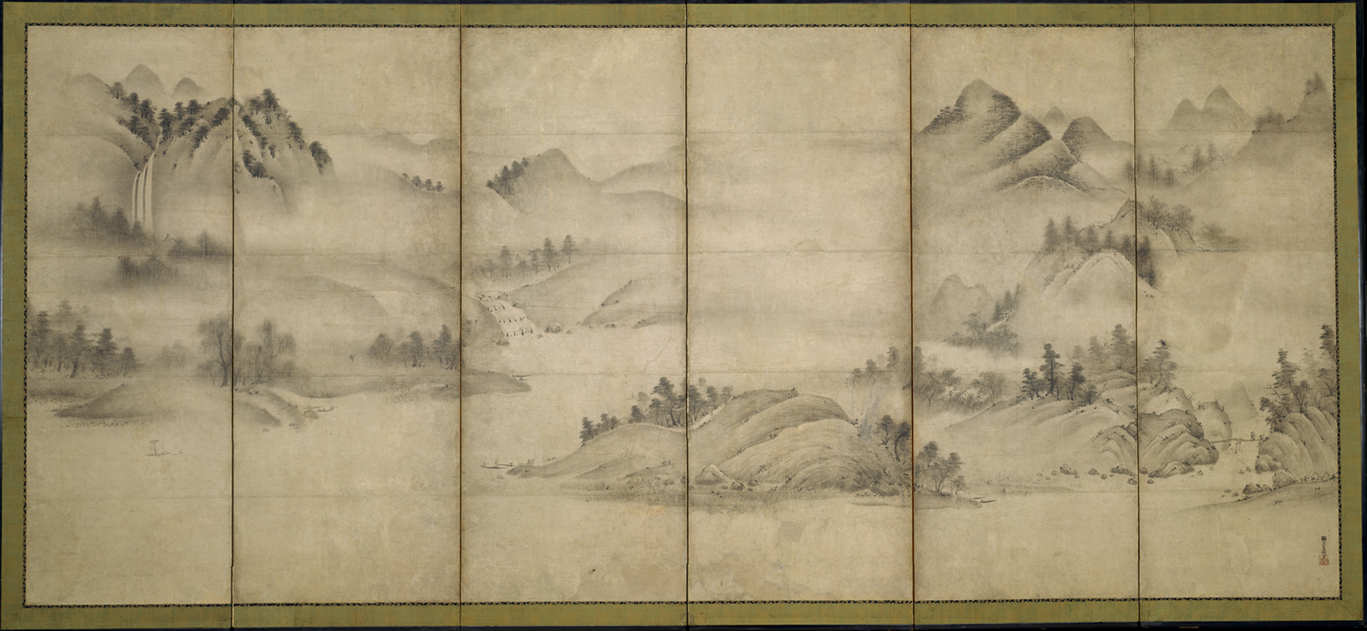
This double-sided ink painting by Sōami on a folding screen is impressive for the flawless soft diffusion of tone on such a large scale. The scenery moves between views of the same rivers in different seasons, rendered in washes of ink. These graded washes give the illusion of the hills being carpeted in mist and cloud, seen through a haze. The soft effect of the tonal washes contrasts beautifully with the dabbing and linear markmaking on the trees that pepper the scenery.
Early 16th Century
Sōami
Pair of six-panel folding screens; ink on paper, 173.4 × 370.8 cm | 68.3 x 146 in
The Metropolitan Museum of Art
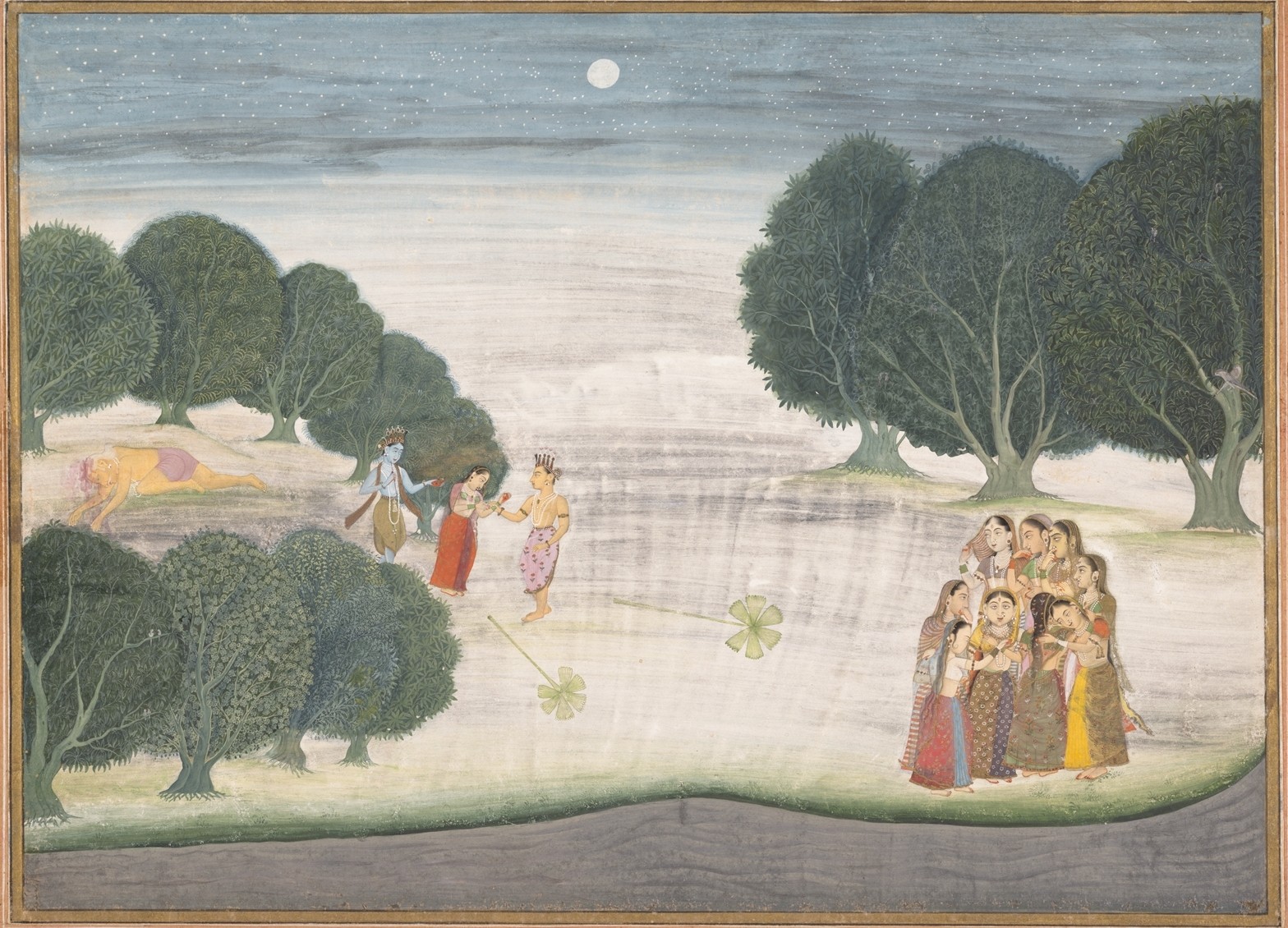
The giant Shankachura has just been slain by Krishna in this wonderful nocturnal scene, with a group of female cowherds or gopis crowded together in relief. There are a few different kinds of wash in use here – with a graded wash on the grass line and night sky, an inconsistent textured wash in the light grey portion of the sky and field, and flat washes to establish the grey river and thick trees before details were applied on top. The variety of mark-making and tonality that each wash brings to the work gives it visual interest, descriptive depth, and texture.
India (Bikaner)
Ink and opaque watercolour on paper, 22.5 x 31.1 cm | 8.9 x 12.2 in
The Metropolitan Museum of Art
Angelica Kauffman was a pioneering history painter and portraitist. She was a founding member of the Royal Academy alongside just one other woman – Mary Moser. She found great success painting in London and Rome, specifically by focusing on the female characters of mythology. Her painting technique created a smooth finish by building form, depth and colour in thin layers. This gives her figures and fabrics a luminous quality. We can also see where she made an irregular wash by thinning her oil paint with medium on the textured cave wall.
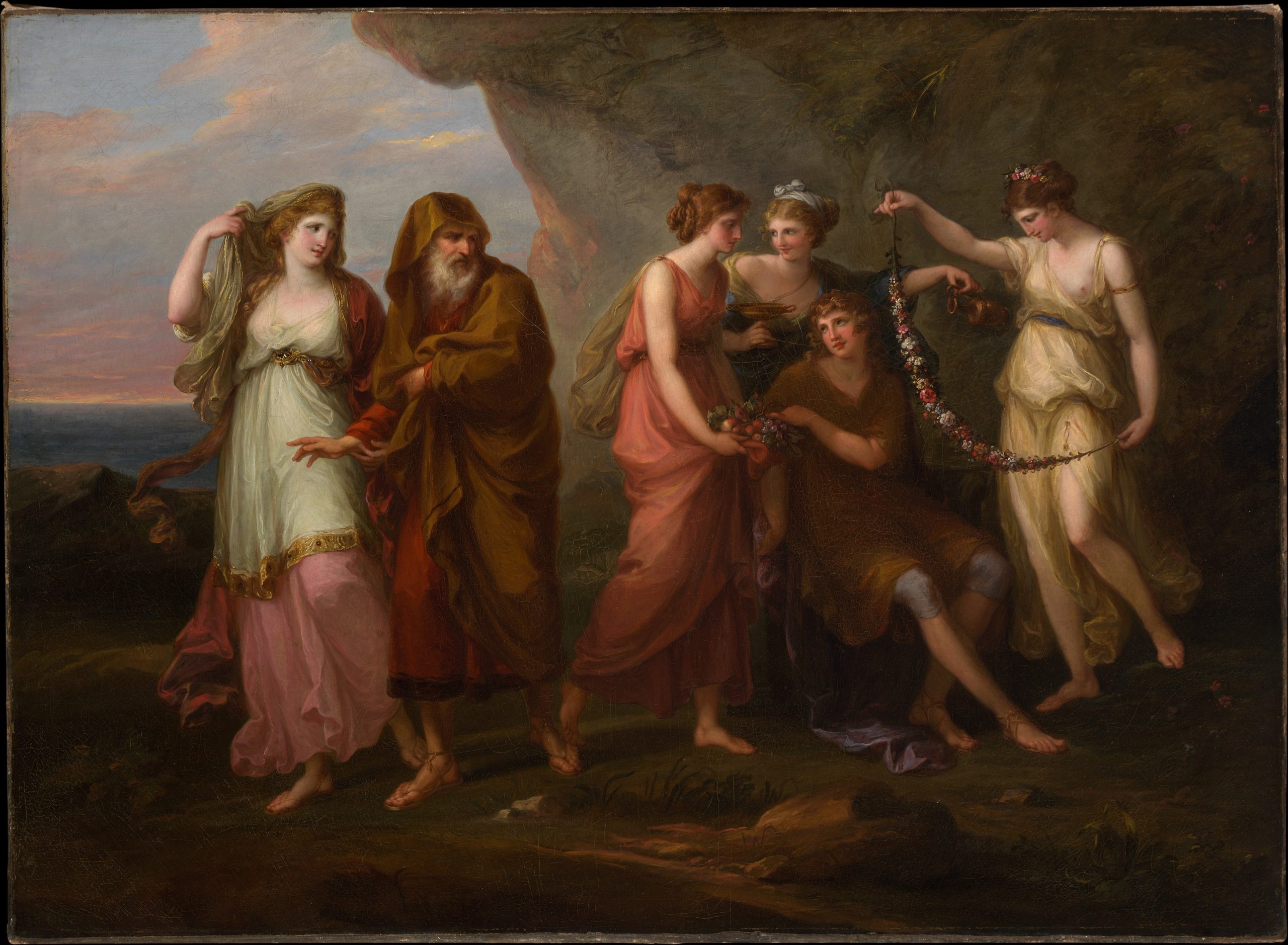
Angelica Kauffman
Oil on canvas, 82.6 x 112.4 cm | 32.5 x 44.3 in
The Metropolitan Museum of Art
This watercolour and gouache painting of a sphinx in her lair, surrounded by victims, by Gustave Moreau, was made over a decade after his seminal painting of Oedipus and the Sphinx. In this revisiting of the myth, the sphinx physically commands the space, in contrast to the relatively miniature figure in his earlier oil painting. She feels much more like a powerful victor here, emphasised by her imposing outstretched wing and composed expression. Her cave is rendered in layered tonal washes that suggest the sunlight around the corner. The skin of the people is also painted in thin washes of flat colour, in contrast with the opacity of the deep blue and red.
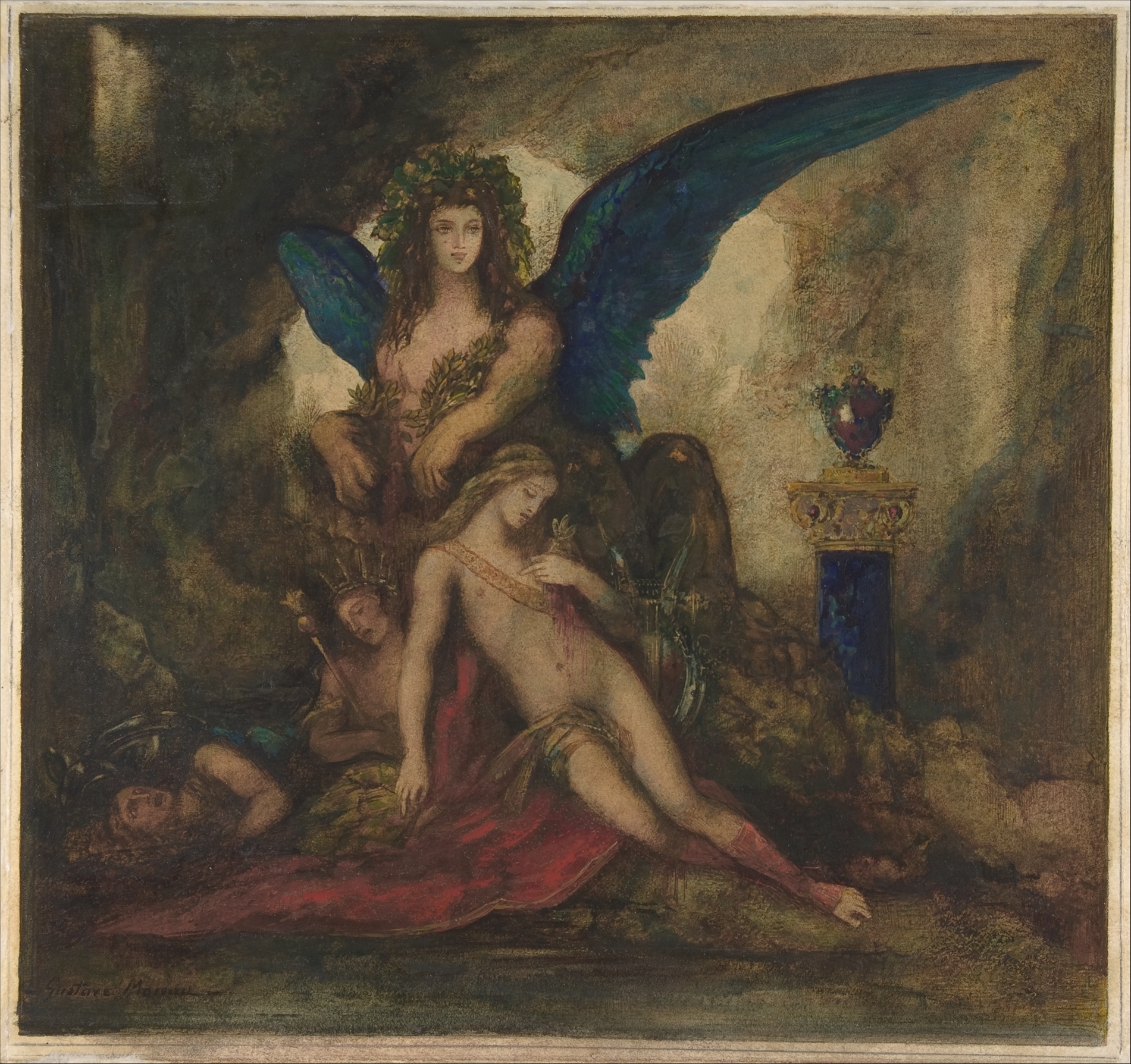
Gustave Moreau
Watercolour and gouache on paper, 31.4 x 41.6 cm | 12.4 x 16.4 in
The Metropolitan Museum of Art
Sargent’s vivid watercolours are much closer to how we tend to think of washes in painting today, by remaining fresh without disguising the process. He made numerous watercolours throughout his career, recording the landscapes and people that compelled him.
This painting of a Rushing Brook has a brilliant, spontaneous quality, where we can imagine him rapidly capturing the scene. The layers of irregular and flat washes are punctuated by the opaque colour and varied brushmarks. I especially love the sense of the water tumbling over the rocks by subtly shifting the tone of the pale blue wash, and the yellow-greens that illuminate the grass and foliage with sunlight.
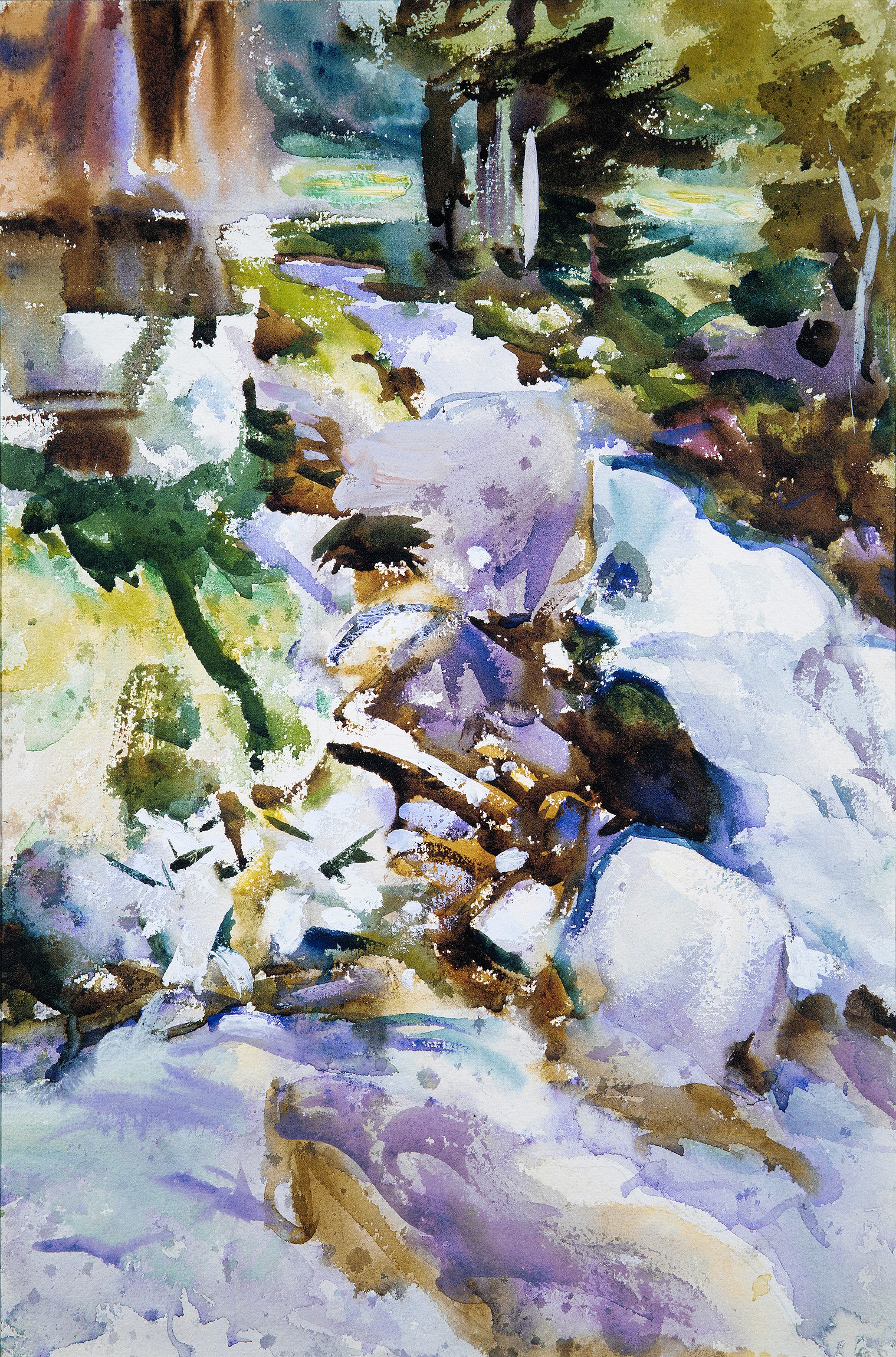
John Singer Sargent
Watercolour, gouache, and graphite on off-white wove paper, 46.8 x 31.4 cm | 18.4 x 12.3 in
The Metropolitan Museum of Art
Demonstrations of Washes
Advice for Making Washes
Before you paint a wash, you should make a generous pool of activated paint in your palette to dip into. Otherwise, intermittently mixing up more colour will waste time, while water-mixable paints or ink rapidly begin to dry. If you’re using oil this is less of a concern, since the paint will remain wet and malleable for much longer. Although mixing a pool of wash colour to dip into is still good practice for efficiency and consistency.
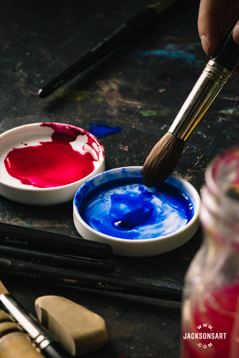
Washes are best painted with larger brushes that can hold a lot of water or medium. For water-based painting media, a fluffy mop or wash brush is preferable for completely diffused or even washes, like the Jackson’s Synthetic Mop Brushes, Jackson’s Pure Squirrel Mop Brushes, or Jackson’s Pure Squirrel Oval Wash Brushes. With oil paint, large brushes shouldn’t be too bristly or stiff if you’d like to achieve a consistent flat or delicate wash effect.
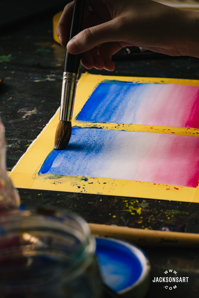
For water-mixable media applied to paper, you can create a wash by painting wet-on-dry or wet-on-wet, as long as your brush holds enough paint to maintain a ‘bead’ as you move across it. The ‘bead’ is a pool of excess paint that sits at the edge of each brushstroke and is pulled across the page.
It’s best to tip your surface at a slight angle toward you as you create any of the ‘even’ washes – flat, graded and variegated – so that the bead always sits alongside the bottom edge of your last stroke. Once you reach the edge of your wash, you may need to pick up any bead that still remains by carefully absorbing it with a dry brush. For an irregular wash, keeping the page flat may be preferable so that the paint doesn’t drip.
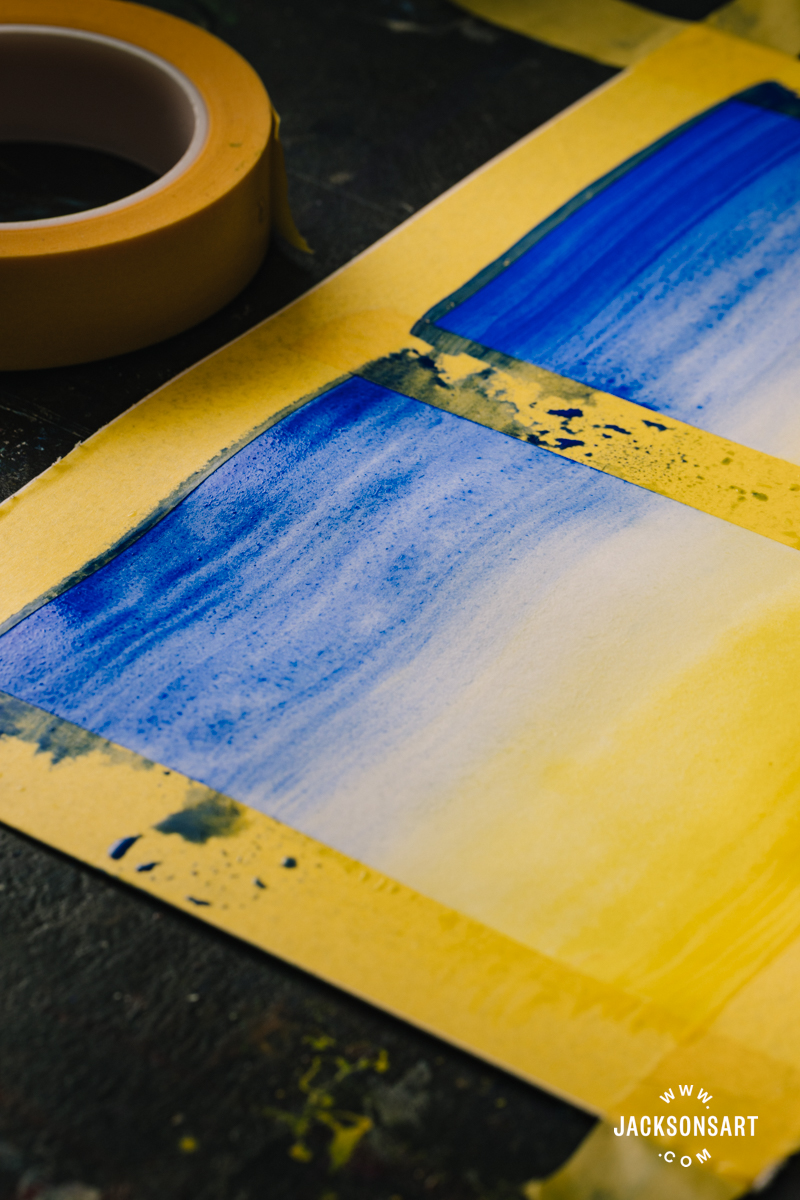
To apply a wash on paper across a large surface or without visible brushmarks, it’s helpful to evenly damp the sheet so that the paint slightly self-levels, and doesn’t dry too quickly as you work to create inconsistent marks. Take care not to leave any puddles or dry spots, since the paint will dry unevenly in these areas. By lightly wiping over the sheet with a damp sponge or broad brush, not one dripping with water, you can evenly dampen your sheet with control.
Washes with Watercolour
Flat Wash
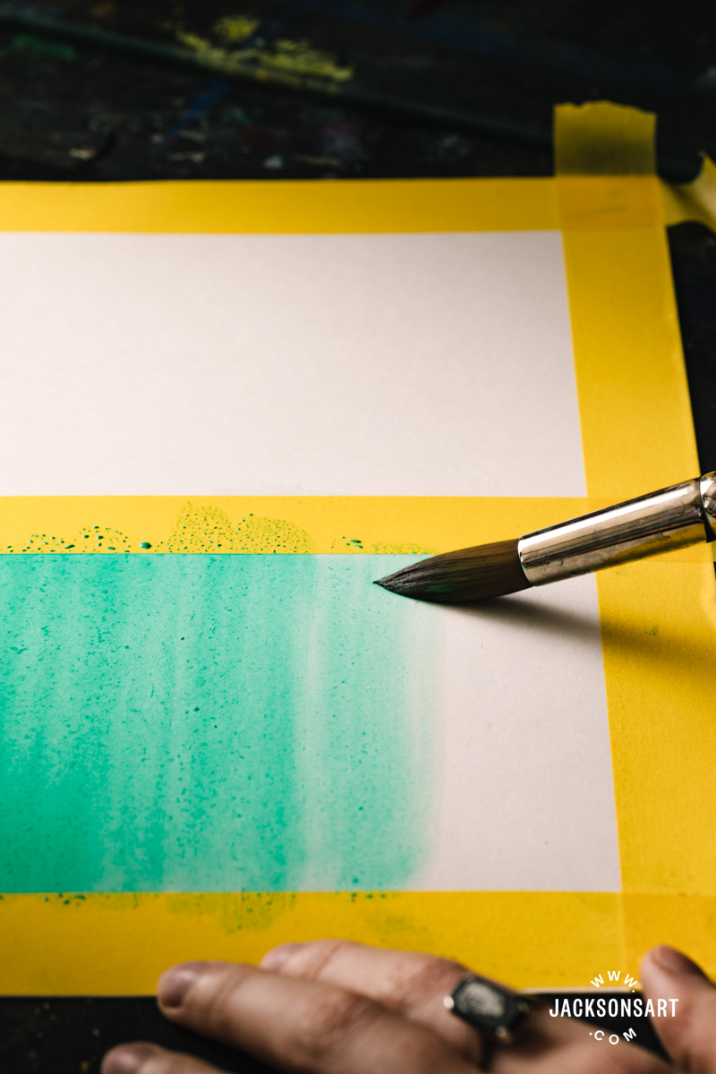
A flat wash is an even layer of colour, created by applying a consistent amount of paint across a sheet or area of a watercolour painting. This is done by maintaining a consistent volume of paint on a wet brush and controlling the ‘bead’ by methodically brushing in even parallel strokes.
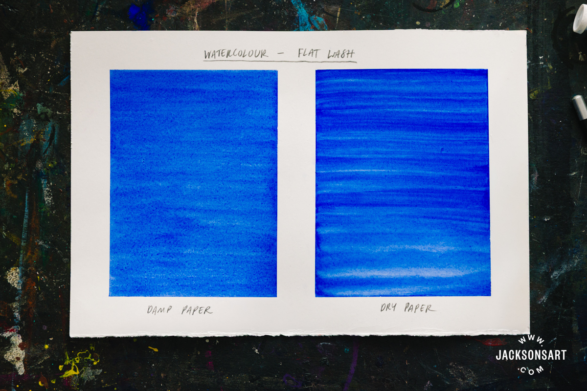
The example above shows the difference between a flat wash applied to damp and dry paper. It’s clear that the damp paper created a much more even finish, whereas the dry paper retained brushstrokes.
Graded Wash
A graded wash describes watercolour that has been applied in a seamless gradient, from strong to diluted light colour. Like a flat wash, this is achieved by working methodically in consistent parallel strokes and maintaining the bead, but by also diluting the paint on the brush as you move down the sheet. The first stroke should be the most pigment dense, with the least water. The next should have slightly more water, and the third much more water; repeated until you reach your desired transparency.
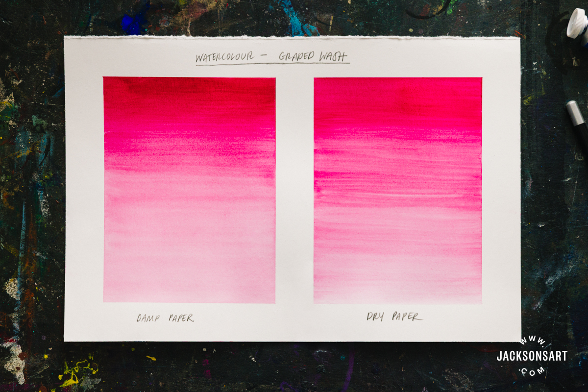
This example sheet shows that painting a graded wash on damp paper is easier to make seamless than on dry paper, since the gradient has a much smoother finish.
Variegated Wash
A variegated wash is a smooth gradient created between two or more different colours. This can be achieved wet-on-dry by blending at the meeting point of the colours, but is much easier wet-on-wet, since the moisture encourages the colours to meld. Again, this is applied in consistent strokes by maintaining a bead of paint. Apply the first colour as you would a graded wash, and then introduce a small amount of the next colour to the bead, before continuing your way down the page. As you go you should continue to incrementally add more of the second colour, until you’re applying it alone.
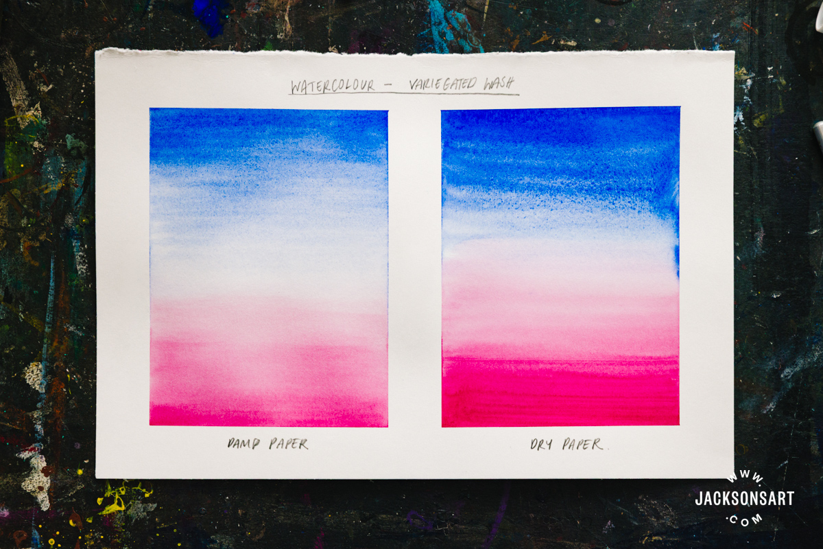
The variegated wash on damp paper was much easier to gradually diffuse and meld the colours together. On the dry sheet, the meeting point was more difficult to blend since the previous colour had already started to dry down.
Irregular Wash
An irregular wash is when colour is applied without the desire for a smooth, blended, or even finish. The paint may retain brushstrokes, pool spontaneously, and be unevenly dispersed. Any paint that has been diluted to make it thin before being applied, which doesn’t look like the previous three definitions, falls into the irregular wash category.
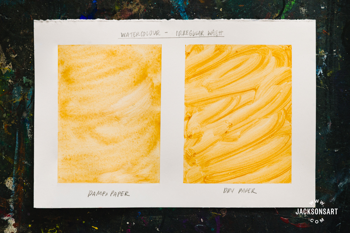
An irregular wash on damp paper will retain less mark-making from the brush, and diffuse into a mottled finish. The more water on the surface, the more pronounced this bleeding effect will be. On dry paper, the diluted watercolour emphasises the expressive strokes made by the wet brush dragging across the surface.
Combining Wash Techniques
Combining wash techniques in one artwork demonstrates that the artist is adept at handling their materials. Especially for watercolourists, their works will often combine different kinds of washes to best describe the different zones or textures of their imagery. The best practice for combining washes on one surface is to allow each one to fully dry down before you apply the next. It’s very easy to accidentally make paints bloom and bleed together when wet areas come into contact with each other. By working methodically from the first wash layer to the ‘top’ one, you’ll avoid this issue.
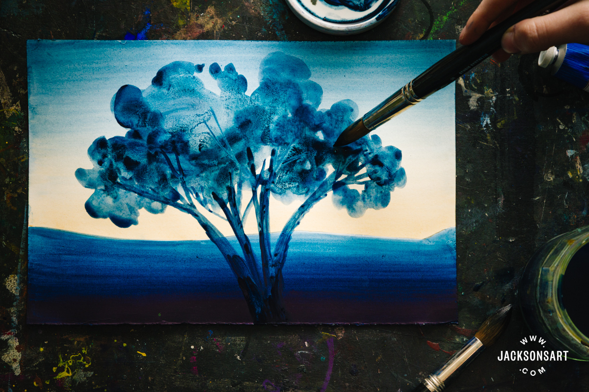
To begin my example painting, I applied a variegated wash for the sky in the background, to give the effect of the sun disappearing into cool night on damp paper.
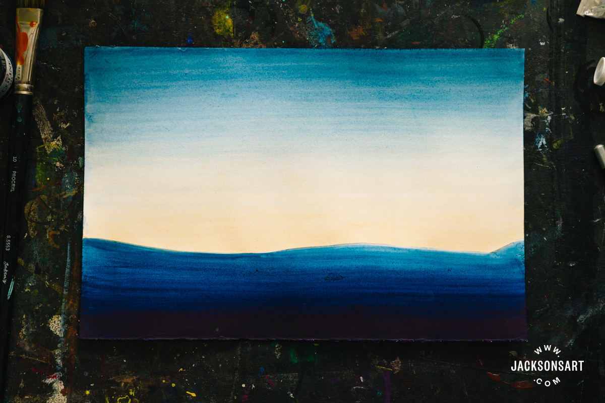
Once this layer dried fully, I applied a graded wash to create the landscape, with the darkest tone along the bottom edge, which steadily diffused into a midtone. I allowed this second layer to dry, before painting on the branches of my tree and bulbous foliage on top of the previous washes using an irregular wash. The irregular wash in the leaves of the tree made use of the granulation of the colour to create appealing texture.
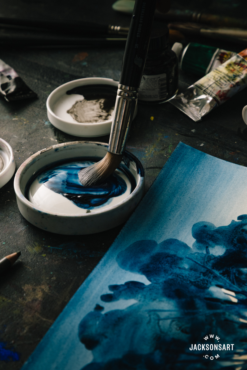
Washes are essential in watercolour, ink, and gouache painting for using masking fluid and creating wax resist drawings. I describe them in detail in the article Resist Techniques. Some watercolourists apply salt to their washes to create speckles of light where the salt draws the moisture and pigment of the paint toward itself. I experimented with different timings and kinds of salt in my article about Salt Texture.
Washes with Watercolour Pencils
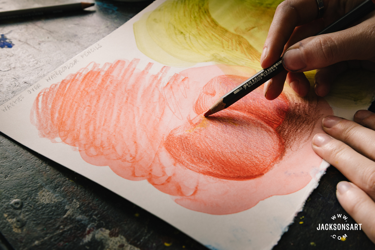
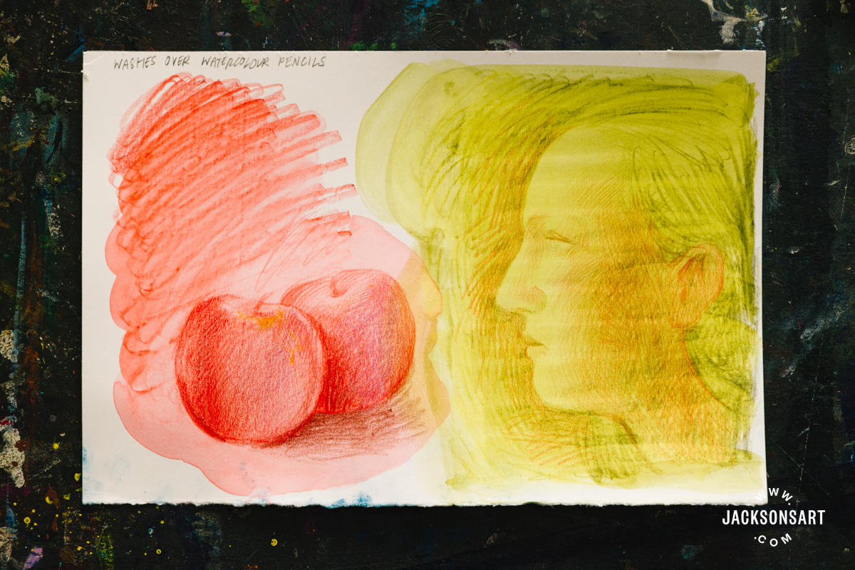
Watercolour pencils are activated with washes of water to create watercolour paint, and can be layered with a couple of different strategies.
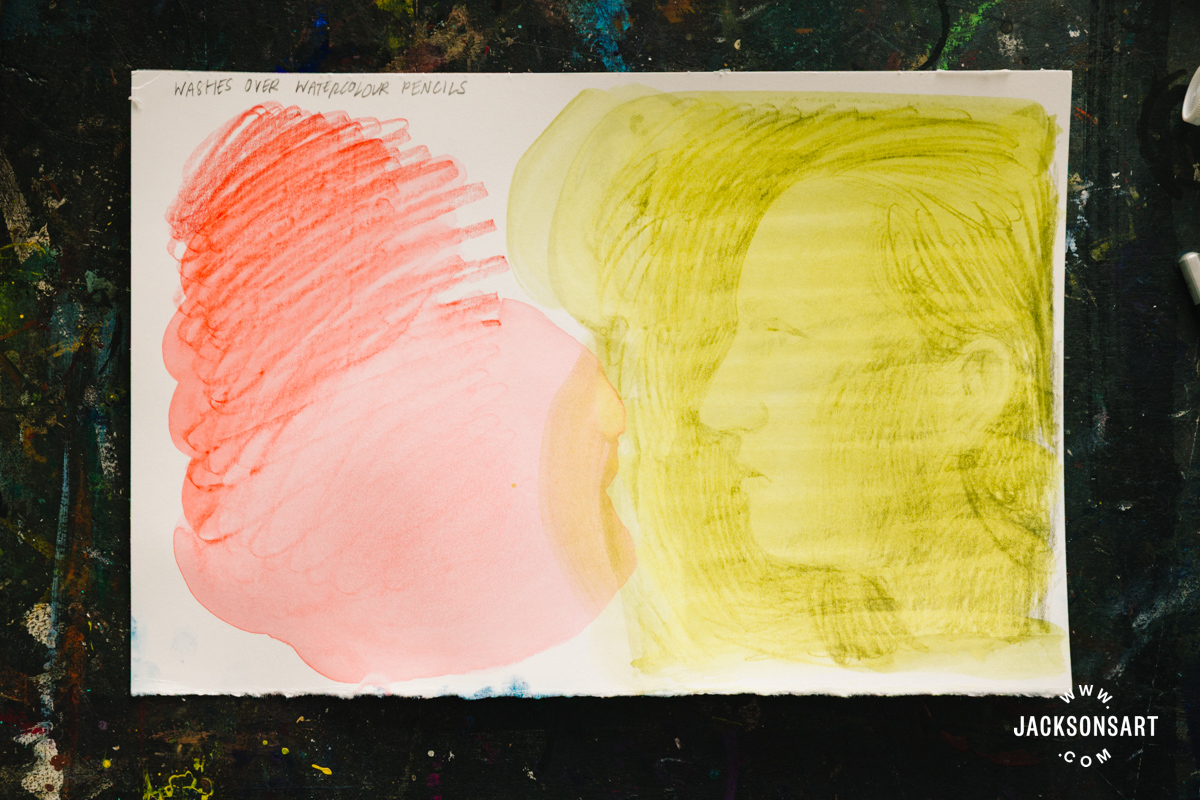
For the work on the left of my sheet, I drew a scribble of pencil that I immediately activated with water, before drawing back on top of it. I could selectively activate the media in this second layer again to build fluid effects.
For the drawing on the right, I worked in the opposite order. First I made a drawing in pencil, before washing over the entire thing in water. This diffused the colour whilst still retaining some of my original linework, before I drew on top of this layer again.
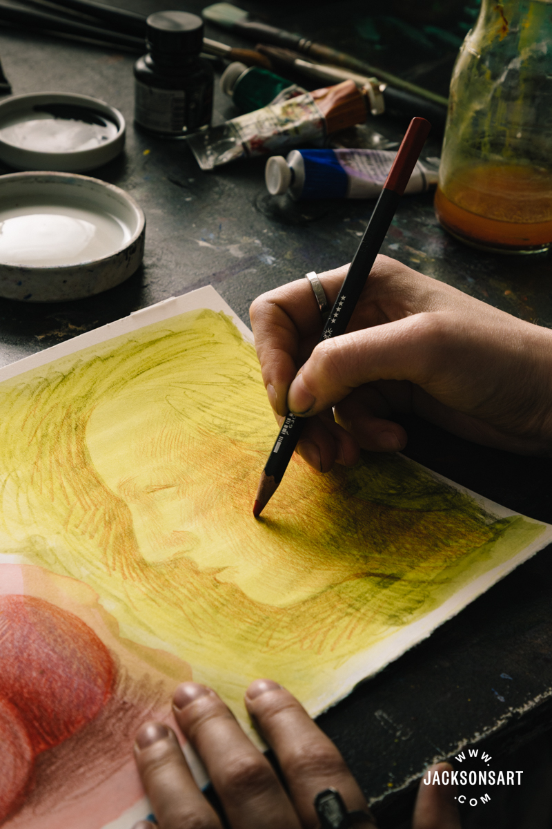
Both of my examples are applied broadly, but washes with watercolour pencil can also be precise and delicate.
Washes in Acrylic, Gouache, Ink, and Oil
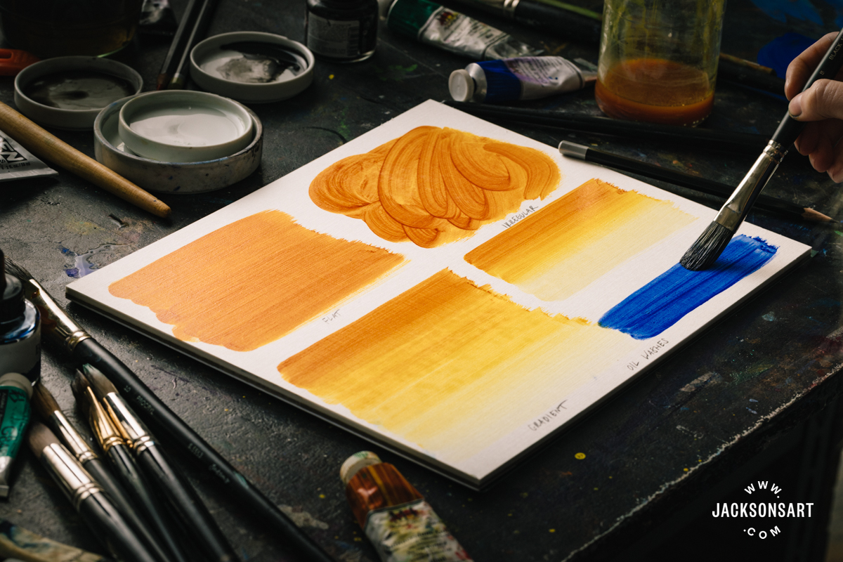
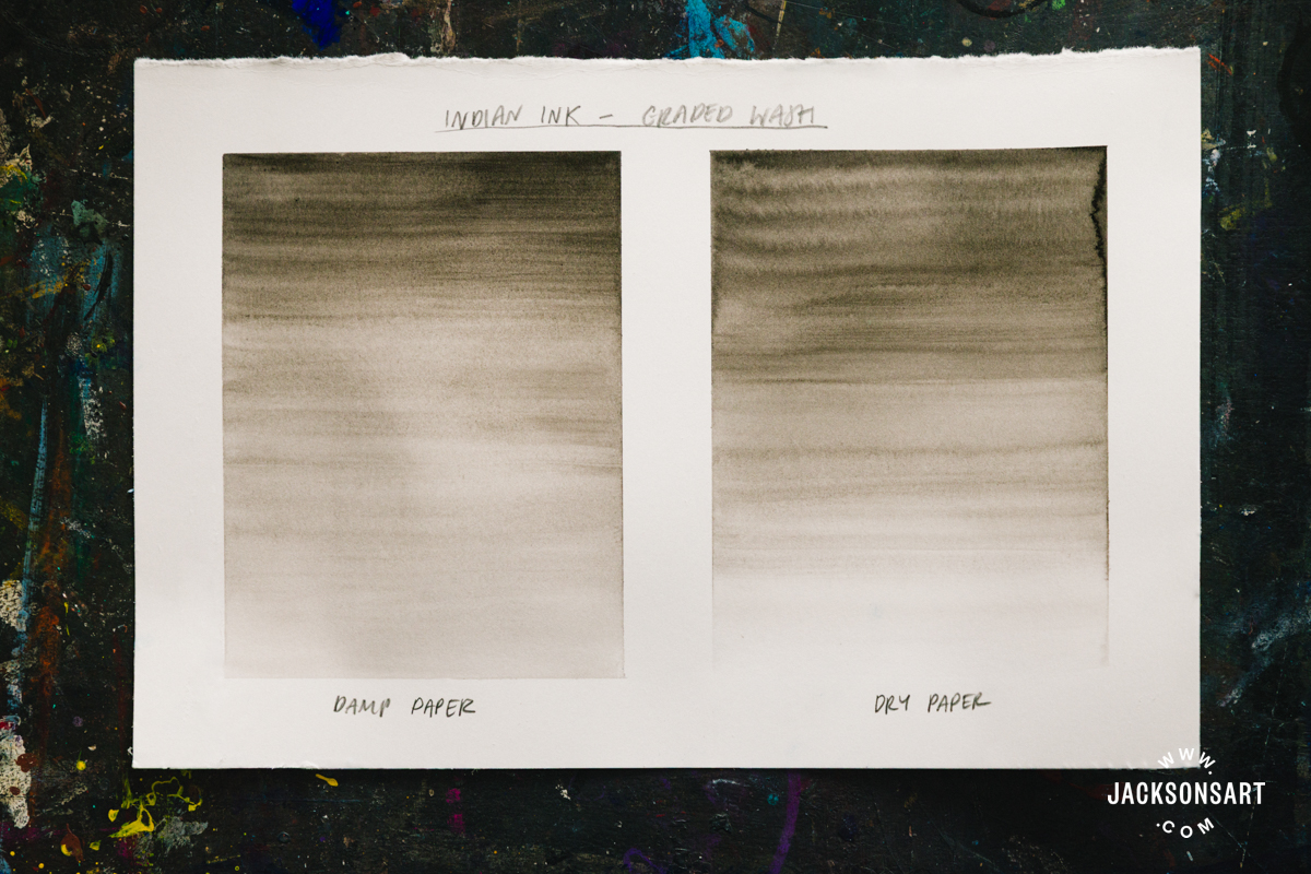
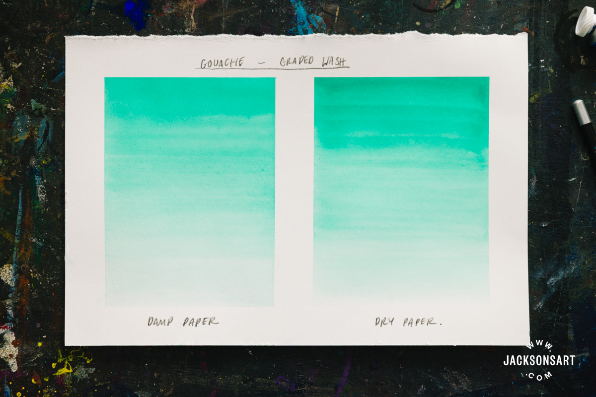
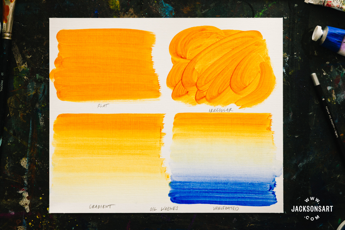
To finish my examples, I painted a wash in acrylic, gouache, ink and oil. My graded washes in Indian Ink and gouache both had less streaks on damp paper, just like the previous watercolour examples.
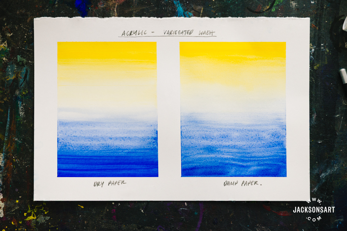
I slightly preferred my variegated acrylic wash on paper, since the concentrated edges of colour dried stronger. Washes in acrylic could be made easier to manipulate by adding an acrylic retarder to extend the drying time.
For my oil wash sheet, I didn’t wet the surface, but instead demonstrated each kind of wash on one sheet. This medium was by far the easiest to work with, by controlling the volume of the medium without worrying about the paint drying too quickly.
Further Reading
Wet-On-Wet Techniques for Watercolour, Gouache and Ink
A Guide to Watercolour Painting
Shop Art Materials on jacksonsart.com

2 thoughts on “Wash Techniques for Painting”
Thank you for the lessons and the history. It is a pleasure to read and try the washes in the age of senseless AI.
Glad you’re enjoying our articles!
Comments are closed.