Named after Hans Holbein, master of the German Renaissance in the 16th century, Holbein is a Japanese brand renowned for manufacturing a wide range of high-quality artists’ materials. Holbein Artists’ Oil Pastels are the result of 75 years of research. A highly pigmented, artist quality range of oil pastels, they are unique for their chalk pastel-like qualities without creating dust. Each colour is controlled to create perfect consistency across the range, and the paraben base prevents cracking over time. In this article, I’ll explore the results of selected colours on a variety of surfaces, and demonstrate their blending and layering abilities.
Review of Holbein Artists’ Oil Pastels
The Physical Characteristics of Holbein Oil Pastels
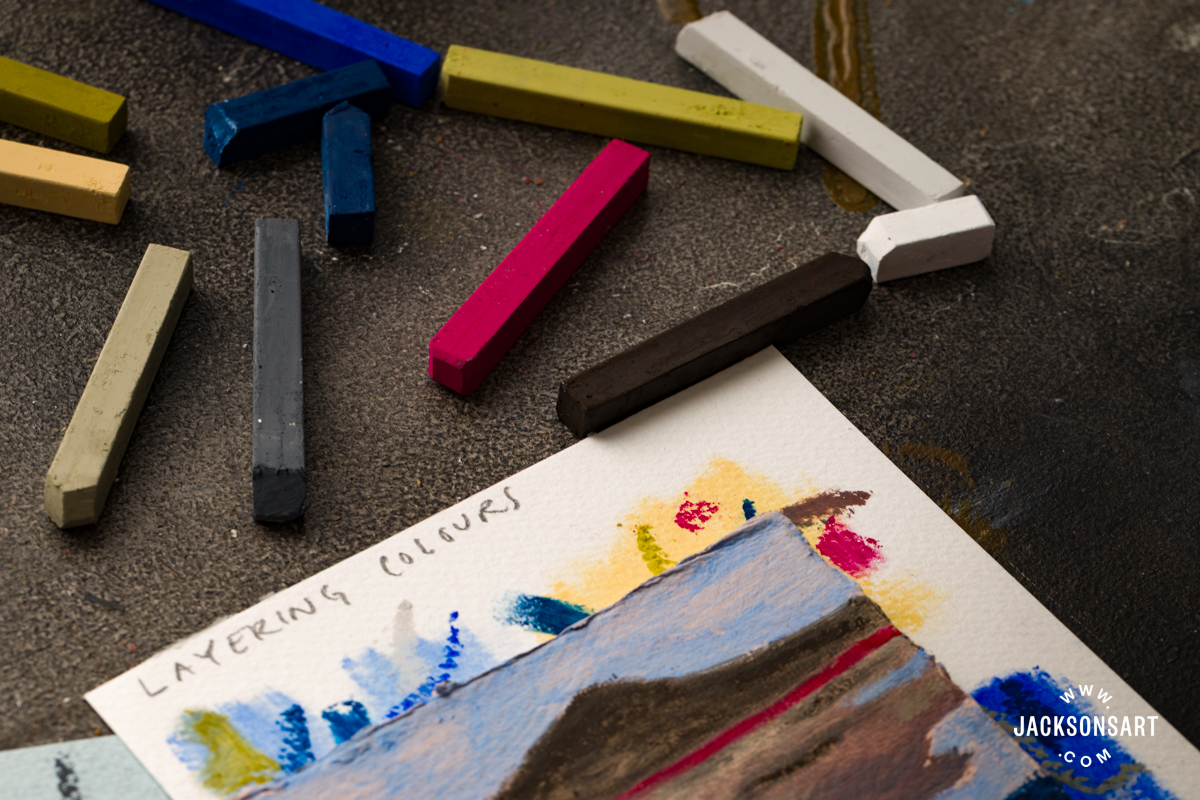
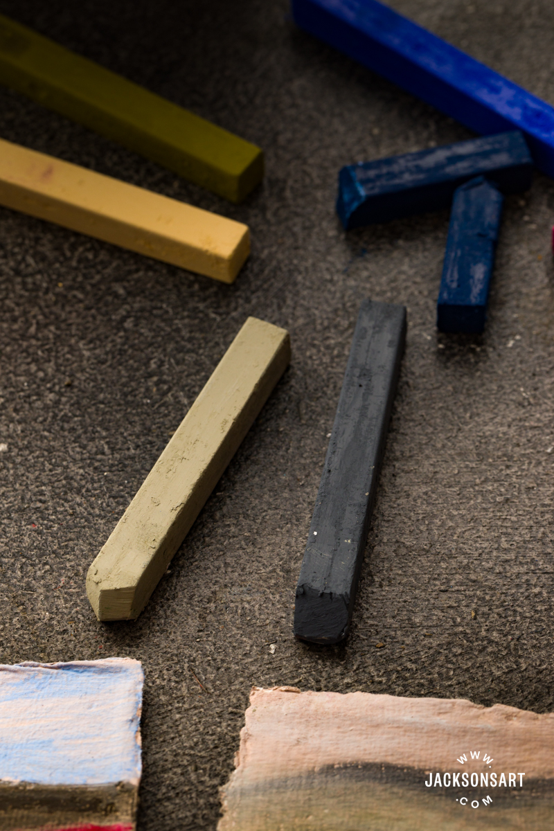
Holbein Oil Pastels are oblong in shape and are about 7 cm long by 1 cm wide. Unlike rounded pastels, their square-edged tips allow for more precision and finer details. They also retain the potential for broader sweeping marks when using the edge of the pastel. Holbein states that these pastels “feel and move like chalk pastels without the dust”. It’s a fairly unexpected texture for an oil pastel – an almost dry, chalky sensation as it glides across the page – yet with the strong coverage expected from oil-based media, even after only one stroke of the pastel. It’s an entirely different feel to the lipstick texture of other oil pastel brands. They are less sticky too, the pastels hold their shape without melting between your fingers, although can snap under a rougher handling.
Each pastel comes in its own individual plastic casing, which, although perhaps not the most eco-friendly option, is convenient for storage and to help identify them. My usual pastel box can get quite messy; often, I don’t know what colour I’m picking up by the time they have all been rattling around together. The plastic sheaths definitely solve this issue and keep things cleaner, especially in hotter, stickier weather.
Swatching Holbein Oil Pastels
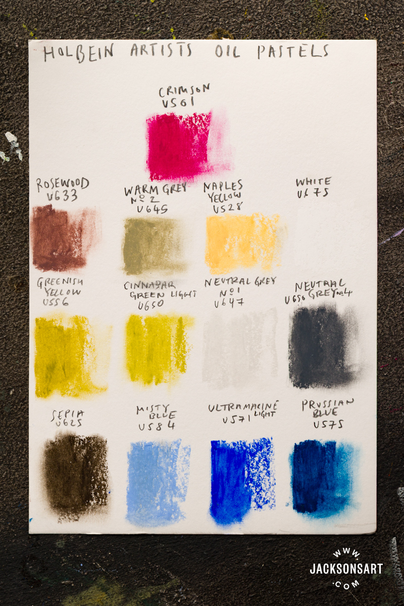
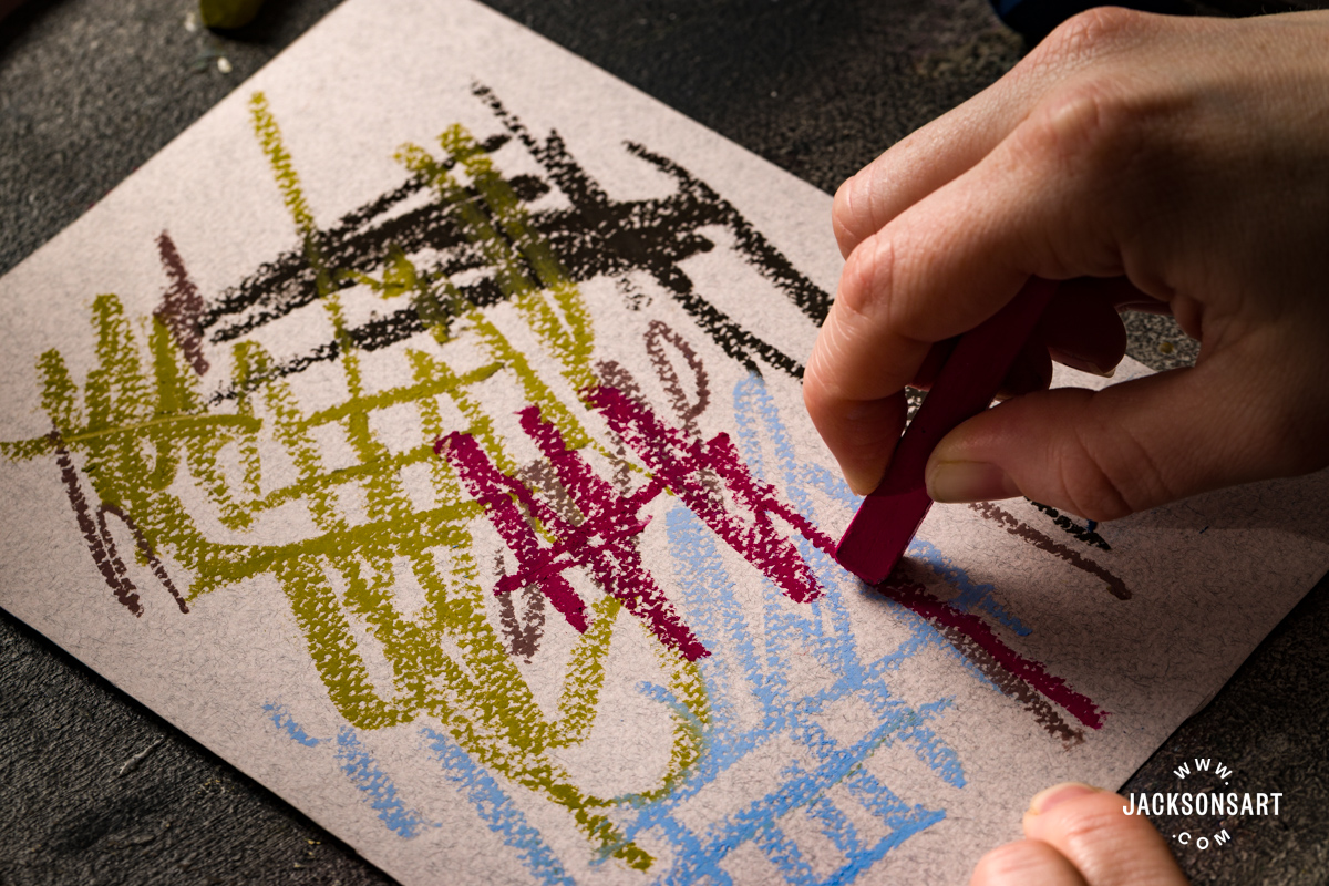
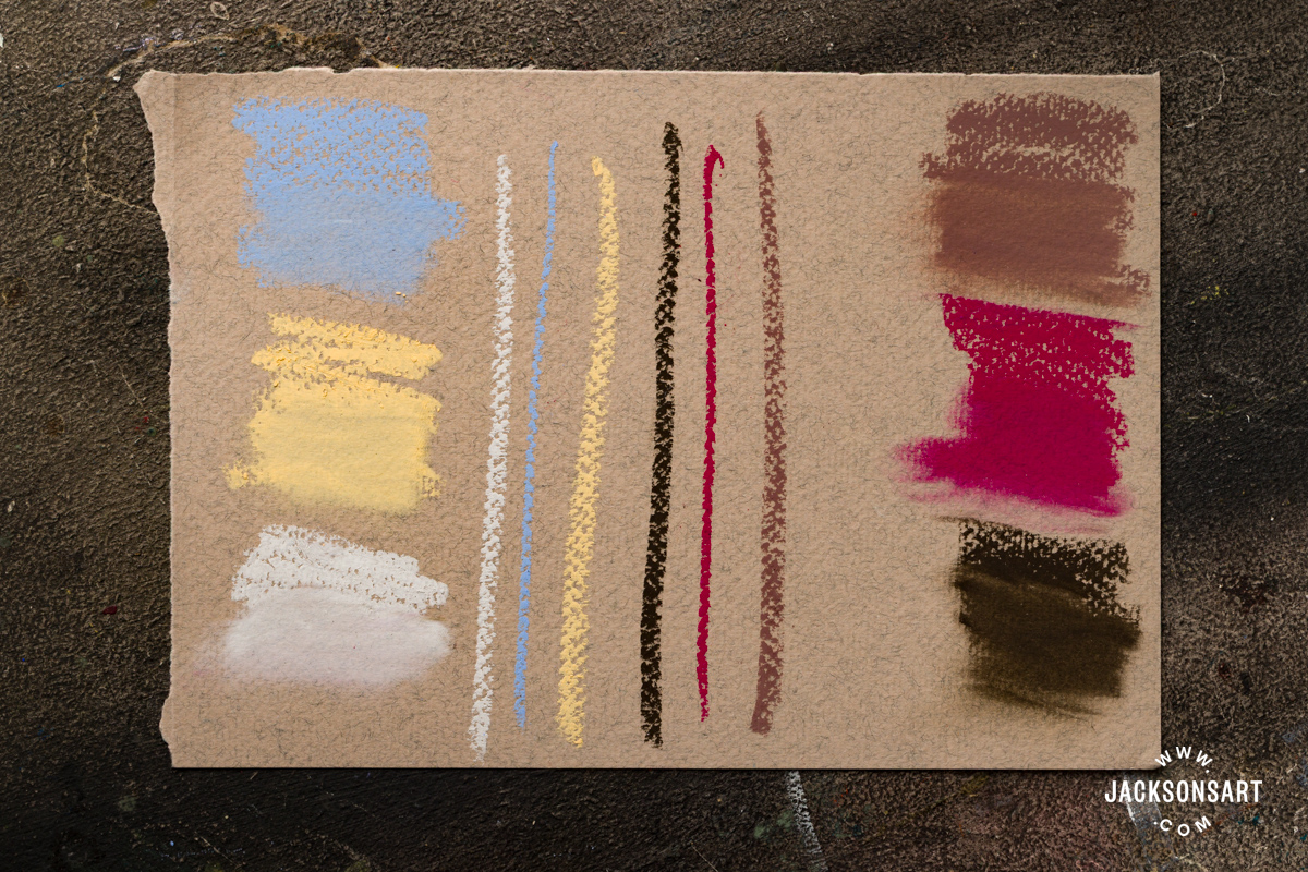
These pastels have quite a seductive colour range, and I wanted to try out some of their unique colours, as well as some staples. I was also keen to test the more subtle variation between similar colours. I was impressed, these pastels do indeed have a beautiful colour range. There is variety, depth, and richness typical of oil paints, as well as gorgeous, subtle colours, and they certainly pack a punch with the vivids too. The colours I chose were: Prussian Blue, Neutral Grey 1, Neutral Grey 4, Ultramarine Light, Misty Blue, Rose Wood, Warm Grey 2, Sepia, Crimson, Cinnabar Green Light, Greenish Yellow, Naples Yellow, and White.
Blending with Holbein Oil Pastel
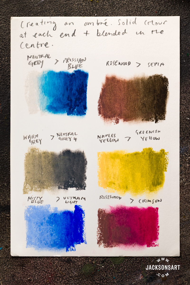
Here, I have explored their blendability. I began with two colours side by side, blending in the centre to create an ombre. As you might expect with any colour mixing, some combinations will create muddier colours, but harmonious colours combine seamlessly. For example, Neutral Grey 1 blended with Prussian Blue created a nicely-balanced light blue-grey. You can see from my experiment notes the specific colours I chose to blend. Initially, they do have a sort of smear or resistance on the surface that oil pastels tend to get when blending, but with a bit of work, they combine evenly, leaving an uninterrupted ombre. I used my finger to blend these. The whole experience is a lot drier and cleaner than other oil pastels on the market, which tend to have a creamier consistency, with a slicker application than Holbein.
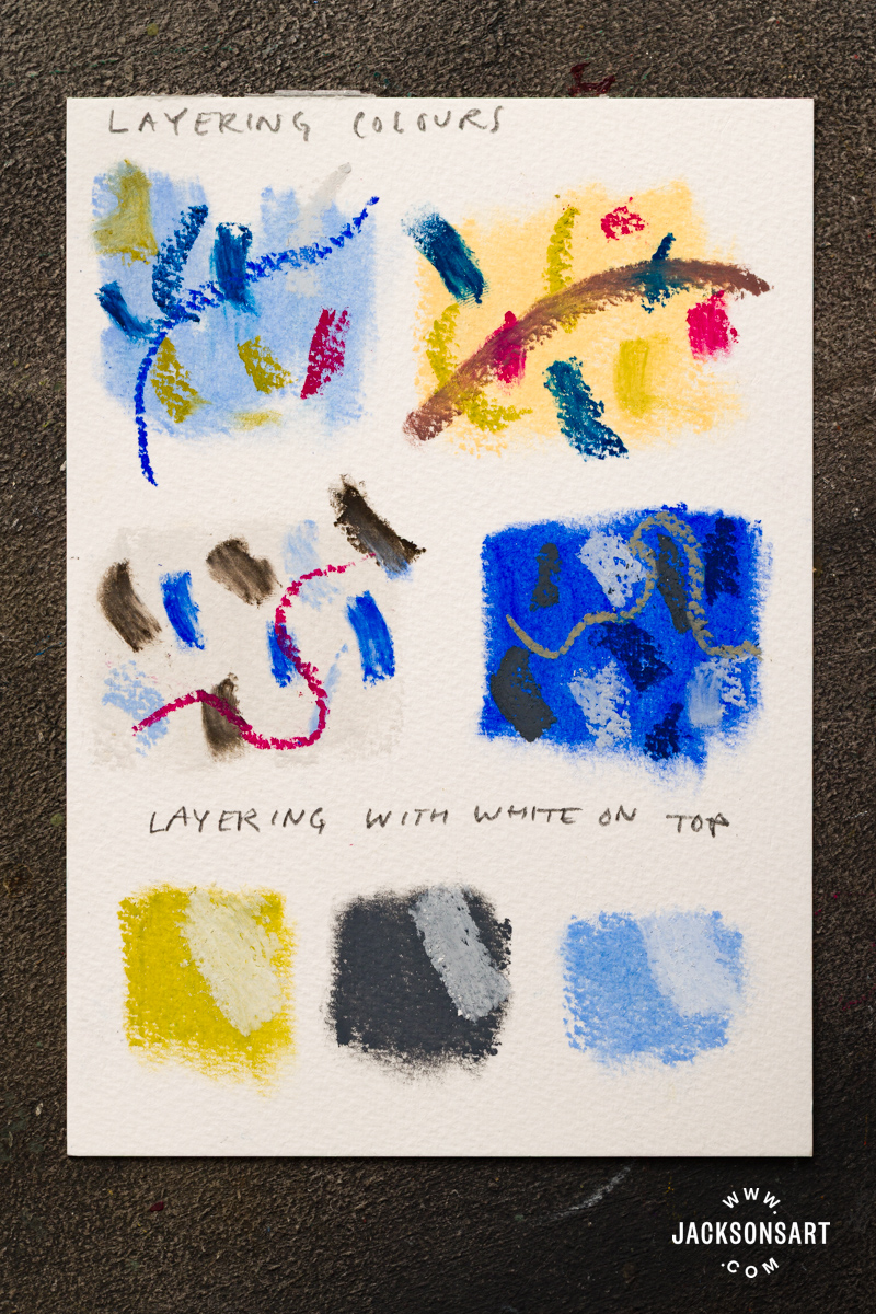
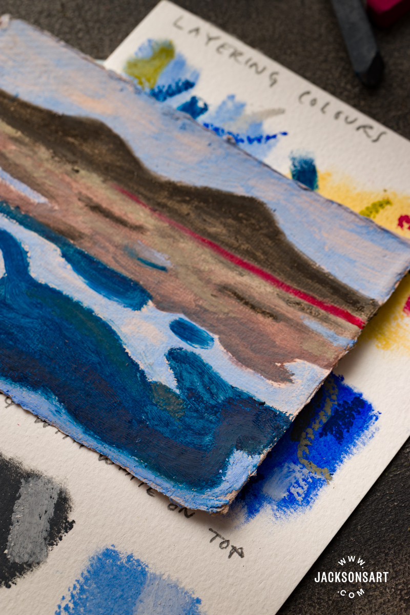
Layering with Holbein Oil Pastels
In terms of layering, the powerful pigmentation of these pastels means they can lay on top of one another with a strong opaque coverage, allowing for a build-up of several layers of colour. As to be expected with various transparencies and colour combinations, some colours are more punchy on top while others might change slightly. For example, Crimson on top of a strong colour such as Ultramarine will become more purple, and on Sepia will become more dull. Whereas on top of grounds with lighter tones like Naples Yellow or Neutral Grey 1, Crimson will retain its richness of colour and intensity. When White is applied over colour, it doesn’t pop as much and tends to appear more grey. However, by carefully smudging with my fingertip, I was able to build up more intense layers of colour – even when using White.
Using Holbein Oil Pastels with Other Oil Pastels
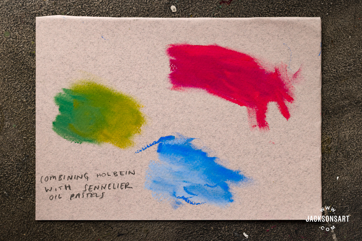
I also tried out the compatibility of the Holbein pastels with Sennelier Oil Pastels. I was interested to see if they would combine, given the noticeable difference in texture; the chalkier-feeling Holbein pastels compared with the more buttery-feeling Sennelier pastels. In my test here, you can see adjacent colours from both brands being combined. They worked into each other without problem, and I discovered no resistance blending them together with my fingertip. It is useful to know that, should you already have a set in one brand, you could combine it with the other.
What Surfaces Can Holbein Oil Pastels Be Used On?
Oil pastels can be used on various types of paper, as well as a wide array of other surfaces, with a certain degree of durability, including canvas, film, metal, glass, wood, and plastic. They can be used on top of fully dried acrylic or oil paintings. It is also possible to paint on top of an oil pastel drawing with oil paint, with the consideration that any solvents used could dissolve the oil pastel. Therefore, it’s safest practice to apply oil paint directly (without thinning) or protect the oil pastel layers with an alcohol-based fixative before adding oil paint layers. Below, I’ve tested the pastels on various papers and canvas board.
Pastel Paper
First, I tested Holbein oil pastels directly on Fabriano Tiziano Pastel Paper – an archival, sized surface designed specifically for pastel work. I selected a range of colours and tones to act as grounds beneath the pastels.
The colour coverage was strong even on top of darker sheets. In these tests, you can see I have explored smudged and also directly drawn marks on the pastel paper. The pastels glide in a flowing motion across the surface, maintaining their vibrancy even on dark grounds. Because the paper has a slight texture, it can show through initial lines, though this disappears once the pastel is smudged.
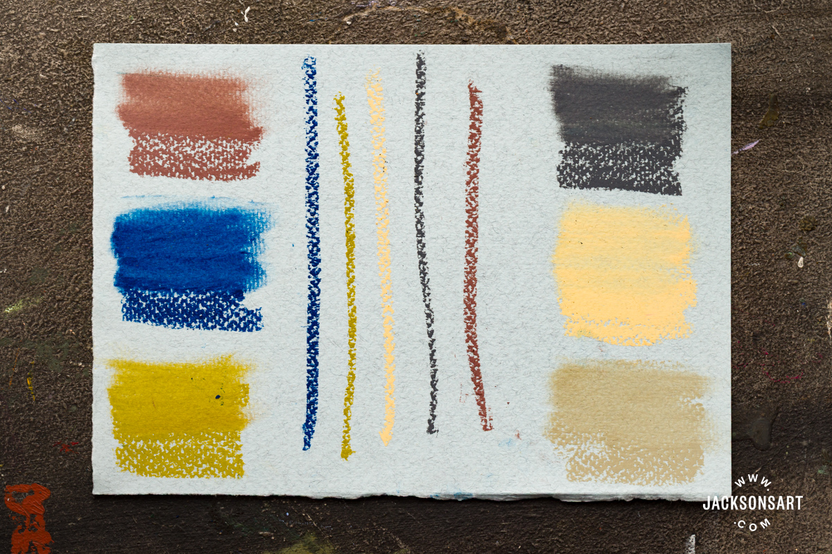
Using coloured paper adds another dimension to the work, influencing how the pastel colours are perceived. For example, darker grounds create a more intense, high-contrast effect, whereas a pale warm grey offers a softer, more atmospheric result. Overall, the pastels are strong and versatile enough to perform well across a range of coloured surfaces.
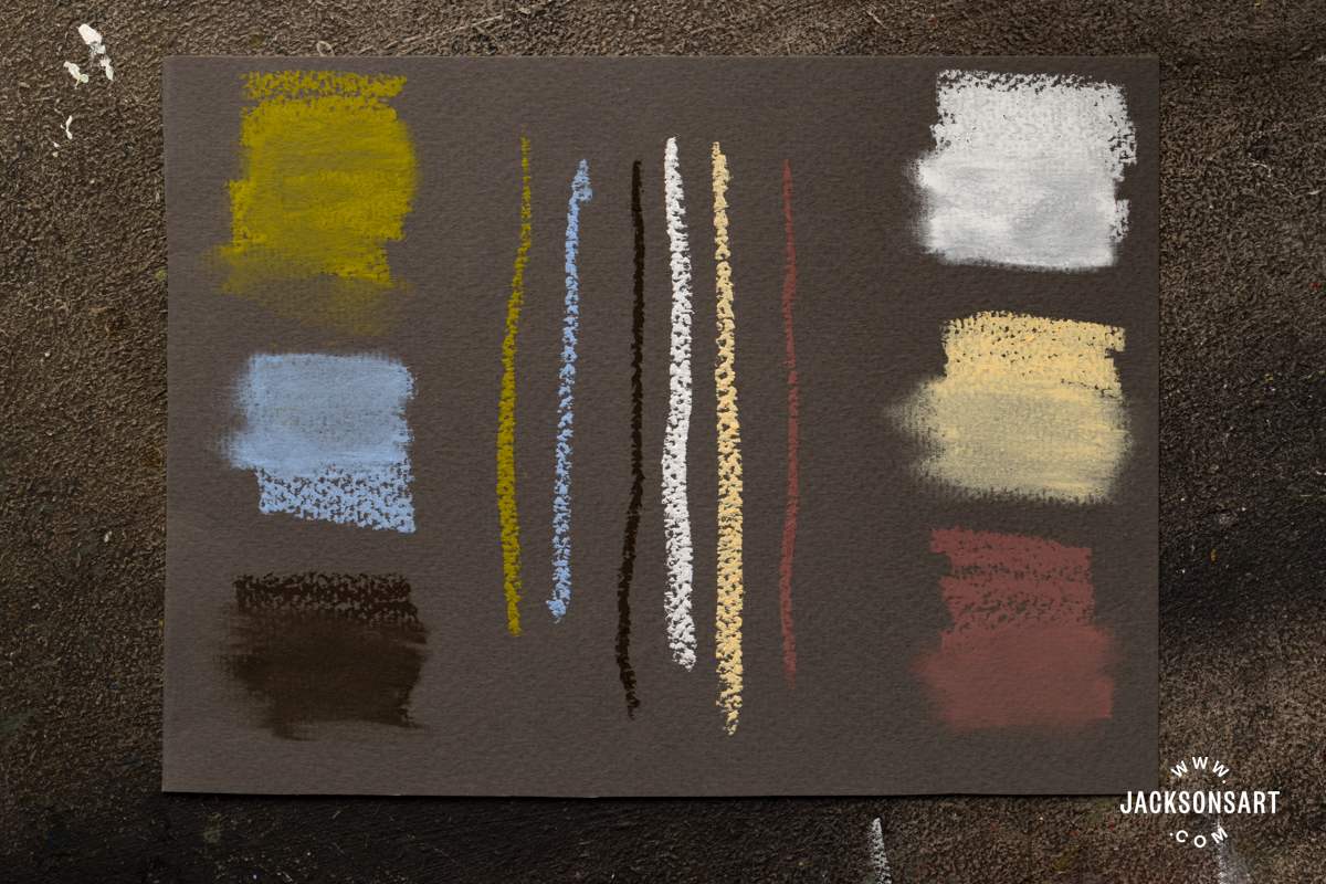
Acrylic Ground
For my next test, I had a go at creating a quick pastel painting onto acrylic-primed and painted paper. I began by brushing Jackson’s Acrylic Primer on top of a sheet of heavyweight Khadi Handmade 100% Rag Watercolour Paper, then applied Jo Sonja Flow Acrylic as a coloured ground.
Working on this prepared surface, I found that the pastel moved easily across the paper and blended particularly smoothly. Acrylic as a base for oil pastel offers scope for underpainting and mixed media approaches. However, it’s important to wait for the acrylic layers to dry fully before applying the pastel. I was also able to scratch back into the layer of pastel painting using a sharp object to bring out details so that the colour ground below was revealed.
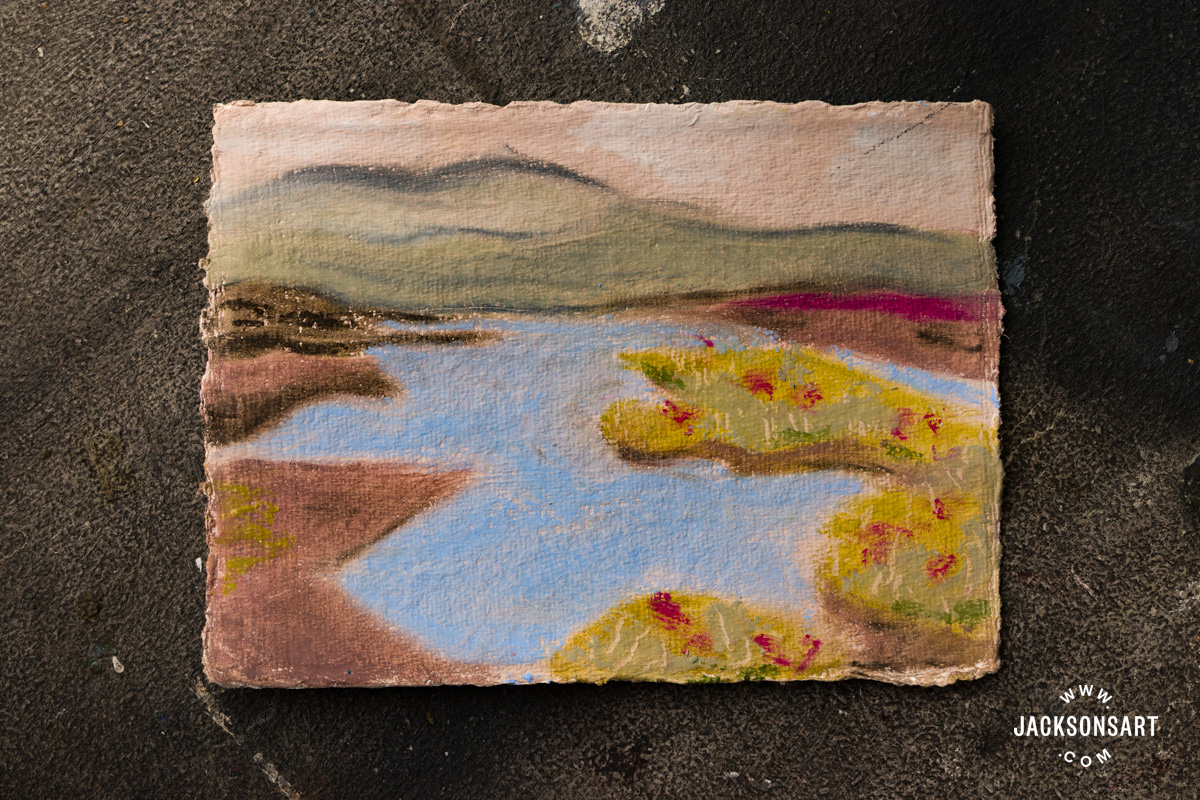
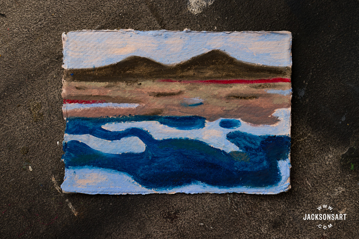
Gesso or primer strengthens the paper and can be sanded for smoother pastel application or even textured with various gritty additives for more disruptive, textured surfaces. Once the surface is primed, there is also potential to use your preferred oil painting solvent (I used Jackson’s Shellsol T Odourless Solvent) with the oil pastels and a brush for a more painterly approach. I have explored this in the second blue sketch below. Once the solvent has dried, it is also possible to go back in with another layer of oil pastel on top, adding elements of drawn or painted marks.
Canvas Panel
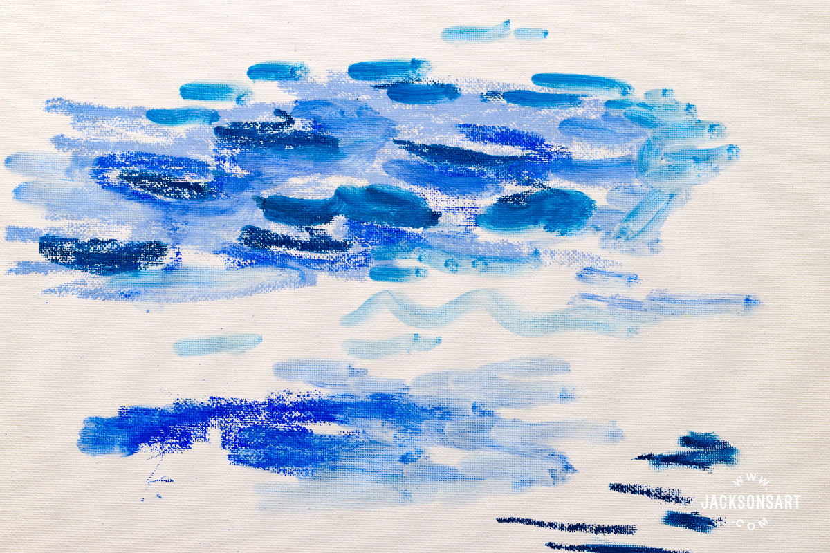
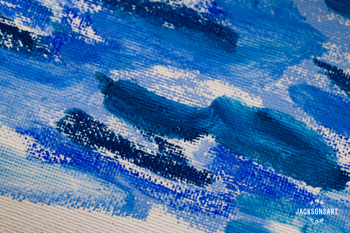
I also explored using Holbein Oil Pastels on top of a Jackson’s Premium Primed Cotton Canvas Art Board. A purely drawn mark catches on the bumpy canvas texture, leaving the white bumps of the canvas showing through. But after smudging with my fingertip, the line covered the canvas with nothing showing through.
I then had a go at using some of Jackson’s Pencil Blend Medium and the effect became much more liquid, offering an exciting new, more watery effect with a brush. This was a much more painterly technique, and capable of washes similar to thinning oil paints with various oils and turps. However, I tried to get a bit more impasto with a thicker, more textured application of the oil pastels and I didn’t feel the Holbein pastels were capable of achieving this type of effect. Perhaps a more malleable, softer oil pastel may be preferred for achieving a thicker impasto approach over the chalkier Holbein oil pastels.
Holbein Oil Pastels have a luxurious feel and a seductive colour range. Their high quality pigmentation offers a richness comparable to oil paint, but they are set apart from other oil pastels by their drier texture. This makes them especially appealing for artists seeking the painting sensation and soft, powdery appearance of soft pastels, but combined with the versatility and durability of oil pastels.
I found handling them clean and hassle-free, which would make them an excellent choice for taking out and about sketching and painting en plein air. They are ideal for drawing and linework, but can also be used for painterly techniques, as they can be easily manipulated with solvents and mediums. Their blendability is exceptional, and I was impressed by their layering ability. Working well on a wide range of surfaces, alongside other oil pastel ranges, and across a multitude of drawing and painting techniques, the versatility of these pastels would make a fantastic choice for all kinds of pastel artists.
Further Reading
Blending Techniques in Oil, Acrylic, Pencil, Pastel, Charcoal, Watercolour, and Ink
Review of Holbein Chromashine and Chroma Pearl Watercolours
Art Terms Explained: Pastel Painting
Everything You Need to Know About Pastel Paper
Shop Art Materials on jacksonsart.com