



Lightfastness is a term used frequently to describe artist colours, but what does it mean in practice, and how concerned should we be about it? This article examines the science of lightfastness, how pigments are tested, and asks whether we can trust the lightfastness ratings given by artist paint manufacturers.

Fugitive Pigments: Why Do They Fade, and Does it Matter?
What is Lightfastness?
Lightfastness is the measure of how effectively a paint resists fading when it is exposed to light. A paint that is resistant to fading is referred to as ‘lightfast’, while a paint that fades is ‘fugitive’. ‘Fugitive’ comes from the Latin word fugere, meaning ‘to flee’ – an evocative way of describing how certain colours appear to run away from view!
Whether a pigment is lightfast or fugitive is a concern not only for practicing artists, but for museums and galleries too. The paintings, drawings, and prints in museum collections are sensitive objects and many colours have shifted or completely disappeared over the years. Vincent van Gogh’s Roses is one example, where the pink flowers have turned completely white.
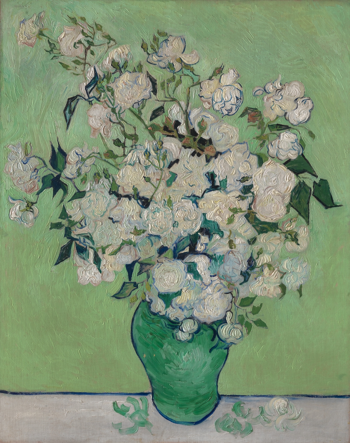
Vincent van Gogh
Oil on canvas, 93 x 74 cm | 36.6 x 29.1 in
Metropolitan Museum of Art, New York
The Science Behind Lightfastness
That dyes and certain pigments fade over time has been known for thousands of years, however it is only in the last couple of centuries that the chemistry behind fugitive colours has been better understood. To understand how light can degrade pigments we have to look at what light is, and how it interacts with pigments.
What is Light?
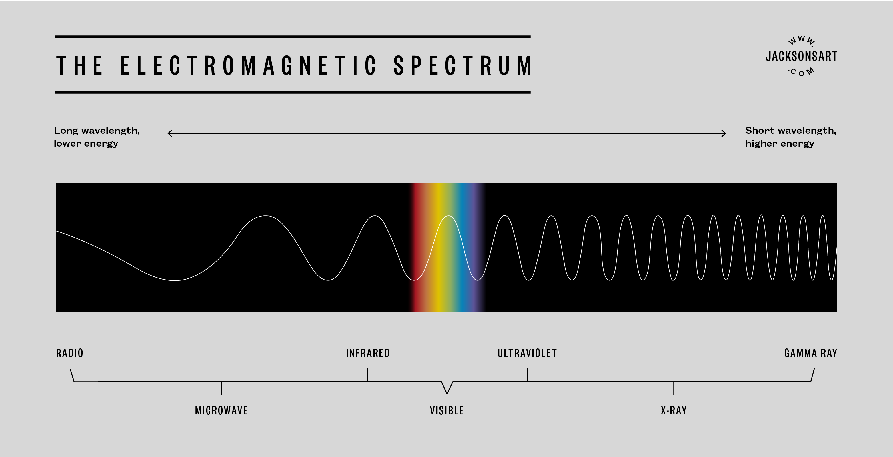
Visible light is electromagnetic radiation, part of a larger electromagnetic spectrum that also includes radio waves, infrared, ultraviolet, and gamma rays. All types of electromagnetic radiation are made up of waves of photons, elementary particles that carry varying amounts of energy depending on where they are on the spectrum. These waves are measured in wavelengths that can vary from 2-3 metres (radio waves) to less than 0.1 nanometres (gamma rays). Our eyes detect wavelengths between around 300 and 750 nanometres (nm), and this is the part of the spectrum that we call visible light.
How do Pigments Interact with Light to Produce Colour?
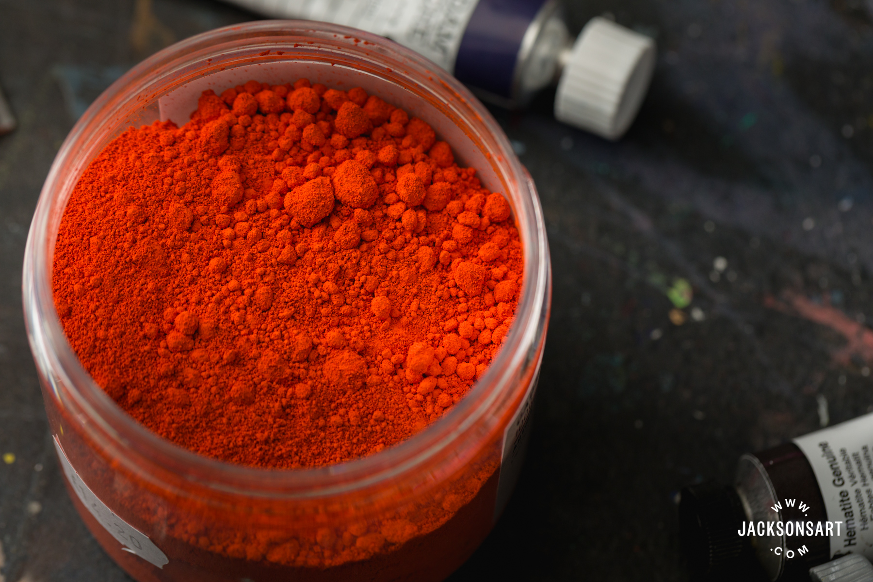
Pigments produce colour by selectively absorbing certain wavelengths of visible light. Red light has the longest wavelength (640-750 nm), while violet has the shortest (380-450 nm). Orange, yellow, green, cyan, and blue fall between these values. What is not absorbed is reflected, and the reflected wavelengths determine the colours we perceive. For example, a pigment we perceive as orange absorbs violet, blue, cyan, and green, but reflects various amounts of red, orange, and yellow (depending on the exact shade of orange).
When a photon is absorbed by a pigment molecule, the energetic value of the photon raises the molecule to an ‘excited’ state. Over time, this may lead to the molecular bonds breaking down, reducing the pigment’s ability to absorb and reflect light. As a result, it appears to lose its colour. Fugitive pigments have poor resistance to this deterioration.
While the entire spectrum of visible light can cause the molecular structure of pigments to break down over time, ultraviolet light is much more damaging. Around 10% of sunlight is in the ultraviolet spectrum, and it has greater energy than that of visible light (with a wavelength of 400-10 nm). This makes UV particularly damaging to colour-producing molecules.
The effects of light-deterioration can be seen clearly when the edges of a painting, print, or drawing have been protected by a mount or a frame. In the drawing below, you can see how the fugitive blue paper has faded to a sandy grey, except where its edges were protected from light.

Anonymous Italian artist
Leadpoint or graphite, brush and grey wash, highlighted with lead white on paper, 23 x 27.7 cm | 9.1 x 10.8 in
Metropolitan Museum of Art, New York
Which Pigments are Fugitive?
Typically, organic pigments are the most prone to fading. Organic pigments are those made up of carbon compounds. Historically these were made using soluble natural dyes like Rose Madder, Carmine, or Indigo which were laked (precipitated onto an insoluble mordant) to make them suitable for artist paints. Historic lake pigments are notoriously fugitive. A dramatic example is Renoir’s Madame Leon Clapisson, where the Carmine pigment in the background has faded from a deep claret to mauve-grey. You can see a thin line of the original colour on the top edge of the canvas, where it was protected by a frame.
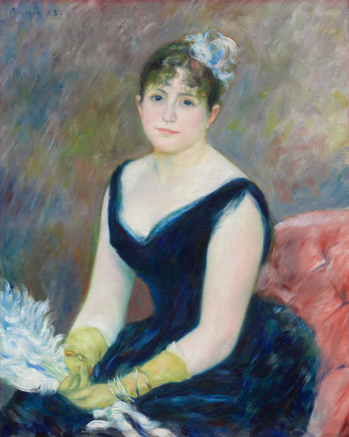
Auguste Renoir
Oil on canvas, 81.2 x 65.3 cm | 32 x 25.7 in
The Art Institute of Chicago, Chicago
Historic lake pigments are rarely used today, with the exception of Alizarin Crimson (PR83). Modern Alizarin Crimson is made using synthetic alizarin (the red compound found naturally in the madder plant). It has better lightfastness than many natural lake pigments (Golden Artist Colours rate it as ASTM III), but it falls short of most modern artist pigments.
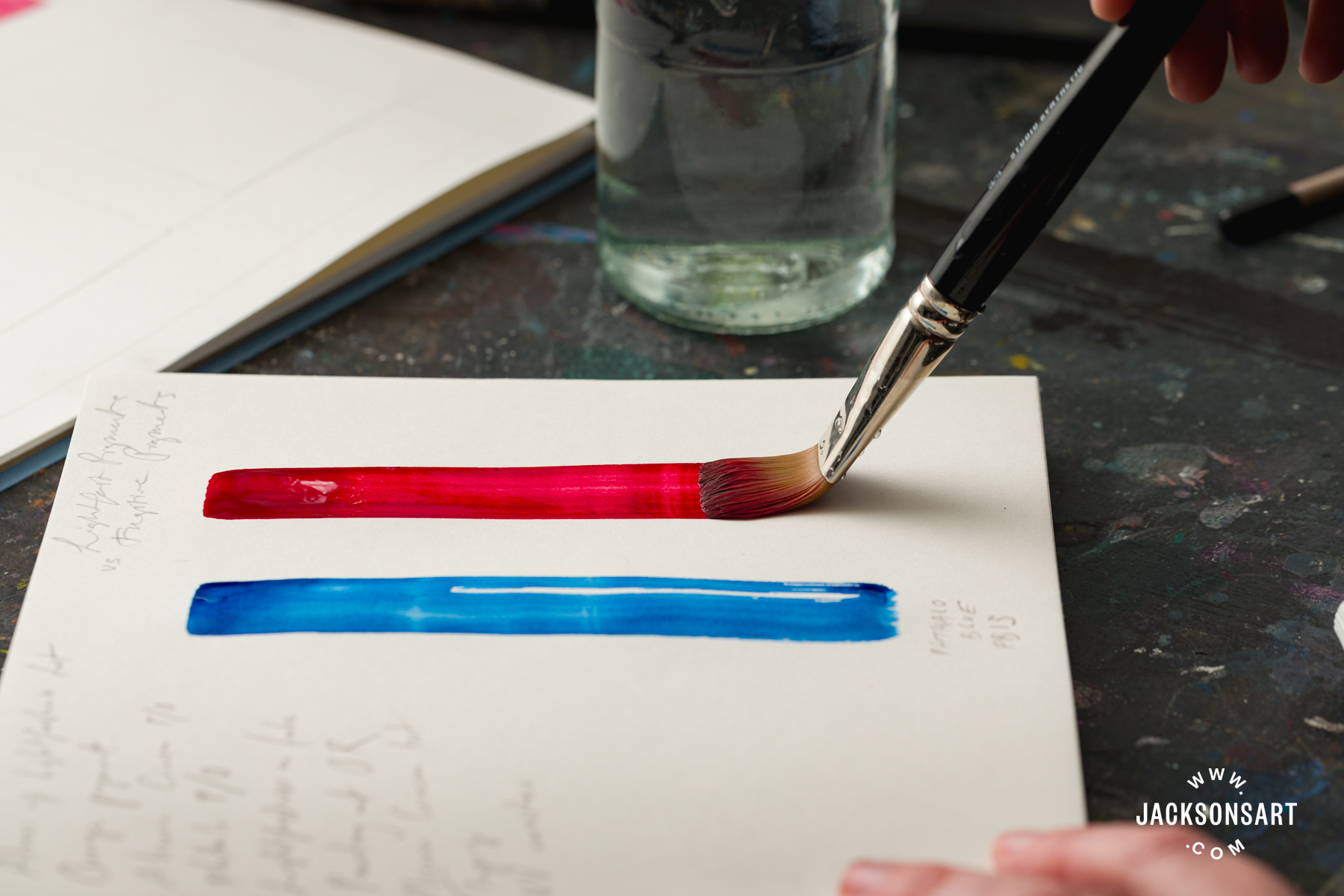
On the other hand, inorganic pigments are made from minerals or metallic compounds. They include earth pigments and the synthetic heavy-metal colours like the Cobalt and Cadmium pigments. As a general rule, inorganic pigments have better lightfastness than organic colours, and many natural and synthetic earth pigments are considered to be almost indestructible. However, it’s worth bearing in mind that some inorganic pigments can be subject to other types of deterioration that can affect their colour, like chemical instability in certain environments.
Most modern synthetic organic pigments are made from petroleum compounds. Most (but not all) are produced as watersoluble dyes which are then laked to produce a pigment. Their lightfastness varies depending on the method of manufacture, particle size, and molecular structure, characteristics that can vary even within the same pigment index number. However, there are many synthetic organic pigments that generally have excellent lightfastness, including Phthalocyanine, Perylene, and Quinacridone pigments.
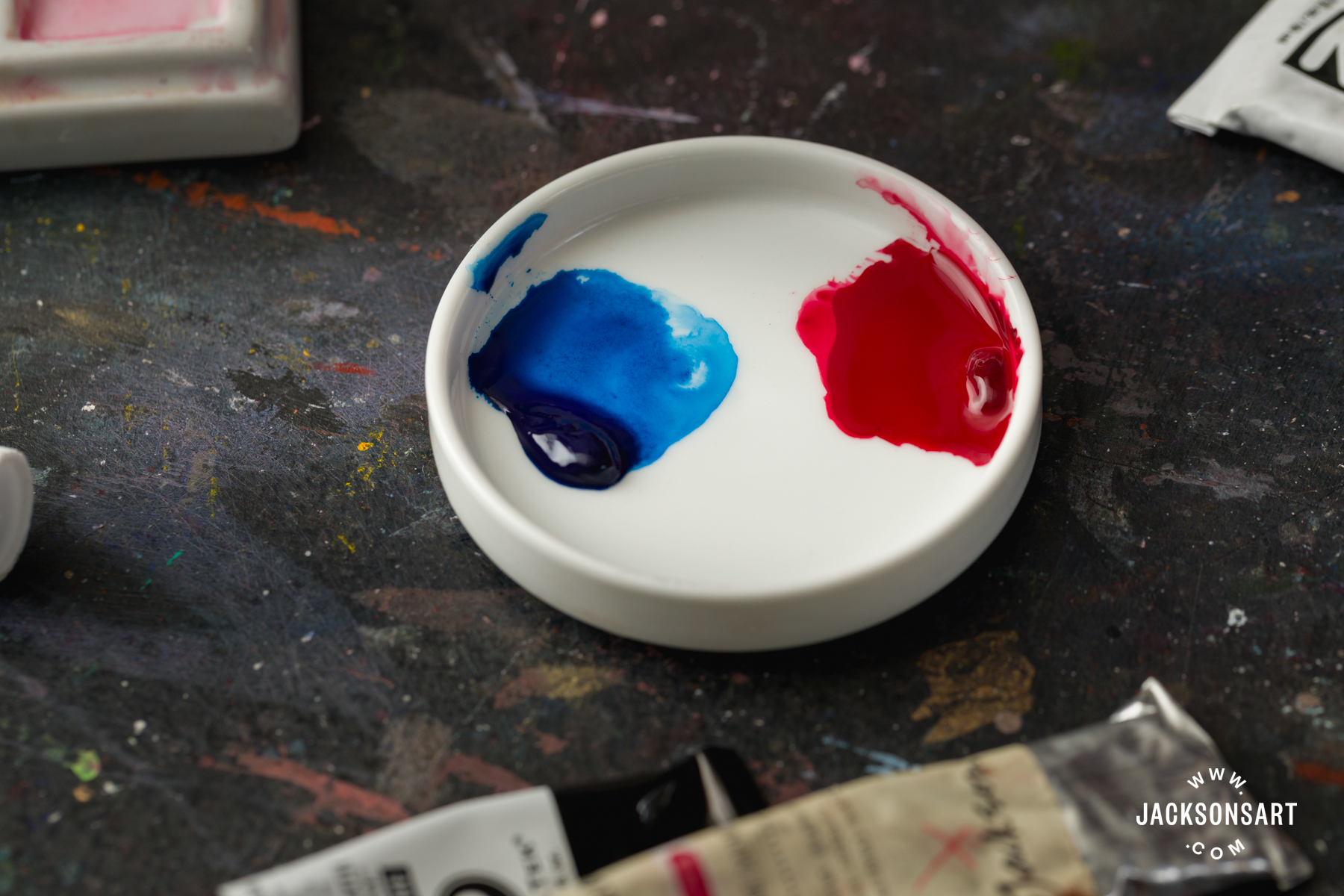
An honourable mention needs be given to Opera Rose, an extremely popular colour among watercolourists. It is a mixture of a magenta pigment, often Quinacridone Magenta, and a fluorescent dye. It is an extremely bright and vibrant colour, but fluorescent dyes are fugitive by their very nature, so its fluorescence will diminish fairly rapidly.
How is Lightfastness Tested by Manufacturers?
There are two main ways in which lightfastness is measured today, and both involve exposing samples of the pigmented paint to light for a set period of time and measuring how much it has changed. Most paintings will rarely, if ever, be displayed in direct sunlight, so a pigment that fades after three months of direct exposure should remain unchanged for 50 years or more in normal indoor conditions.
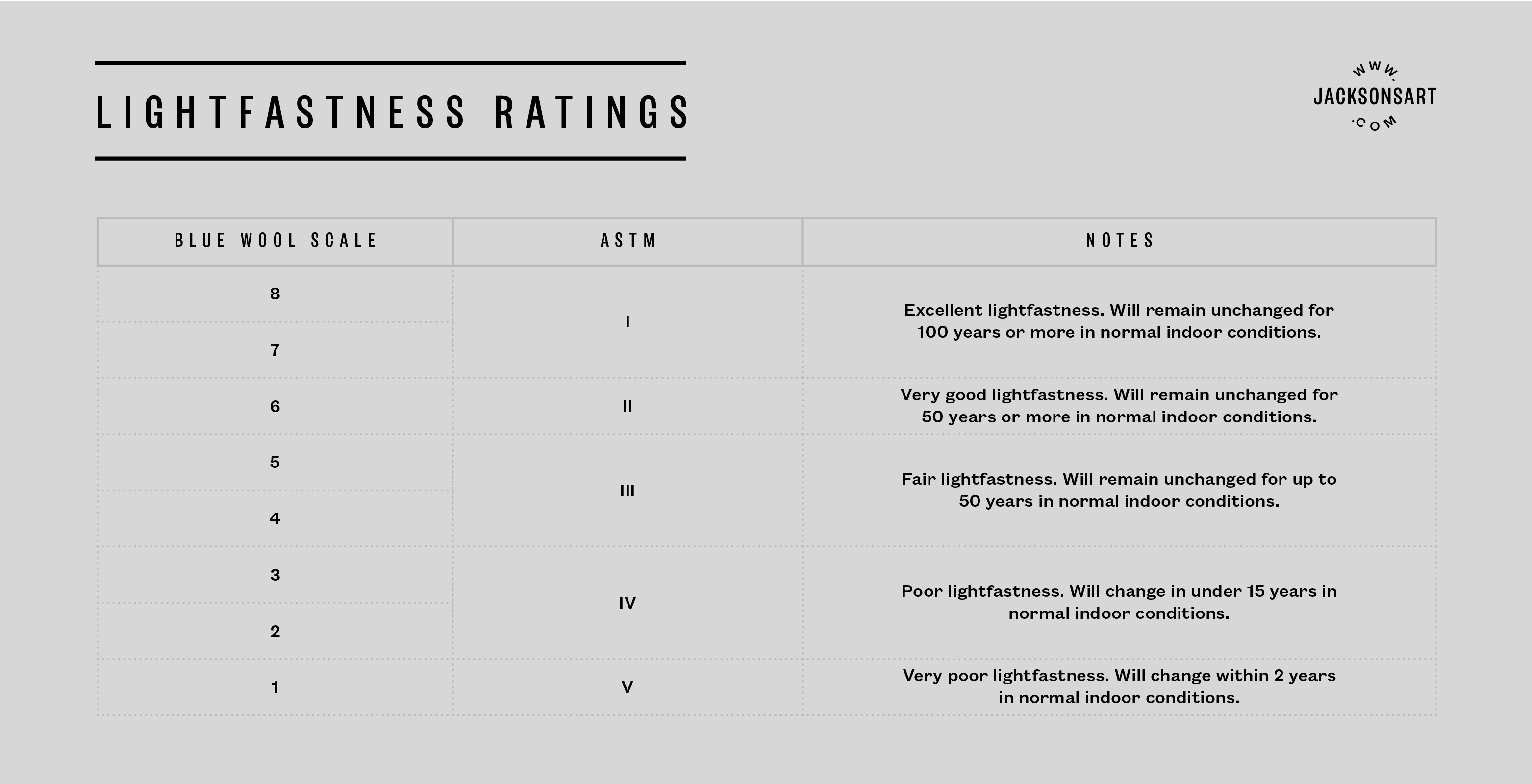
The ASTM (American Society for Testing and Materials) provides an international standard for testing art materials, including their lightfastness. Their lightfastness tests, the guidelines for which are periodically updated, include placing a sample of the paint in a 40% tint with white in direct natural sunlight for several months (often in Florida, where the samples will be exposed to a lot of full-spectrum daylight), as well as using a xenon arc machine to accelerate exposure artificially. A lightfastness rating is then given according to the change in colour that the sample exhibits, which is measured using a spectrophotometer. The results are expressed in roman numerals. ASTM I indicates excellent lightfastness, and ASTM VI is extremely fugitive.
Another scale for rating lightfastness is the Blue Wool Scale. It was originally created for textile dyes, but is now also a standard test for pigmented paints. A sample of the colour is exposed to UV light for three months alongside eight strips of blue wool, which are coloured with dyes that are known to fade at different predictable rates. These are used as a reference and, at the end of the test, the exposed colour is compared with the original and the rate of fading is compared against the control blue wool strips. The Blue Wool Scale rates paints from 1-8, in the reverse order that the ASTM does: 8 is excellent, and 1 is fugitive. The following table combines both the ASTM and the Blue Wool Scale ratings, and what they mean in practice. You can click on the image to enlarge it.
You might see either the Blue Wool Scale or the ASTM referenced by artist paint manufacturers when they are communicating the lightfastness of their paints. Often, the manufacturer uses their own scale such as a star rating, even if they use an industry-standard testing method, which can make deciphering it confusing. If you are unsure, contact the manufacturer for some clarification.
Can We Trust Lightfastness Ratings Given by the Manufacturer?
Many paint making companies conduct their own lightfastness tests internally using industry-standard methods. Of course, there is some confidence required on the part of the artist, who must trust that a manufacturer is using reliably lightfast pigments, testing their paints rigorously, and communicating the results truthfully. The bottom line is that it is in the interest of makers of professional-quality paints to provide the most lightfast and permanent paints. Artists are pretty discerning about their materials, and with so many highly lightfast modern pigments available today, there is little reason for a paint maker to dishonestly use a fugitive pigment when they say they are using a lightfast one.
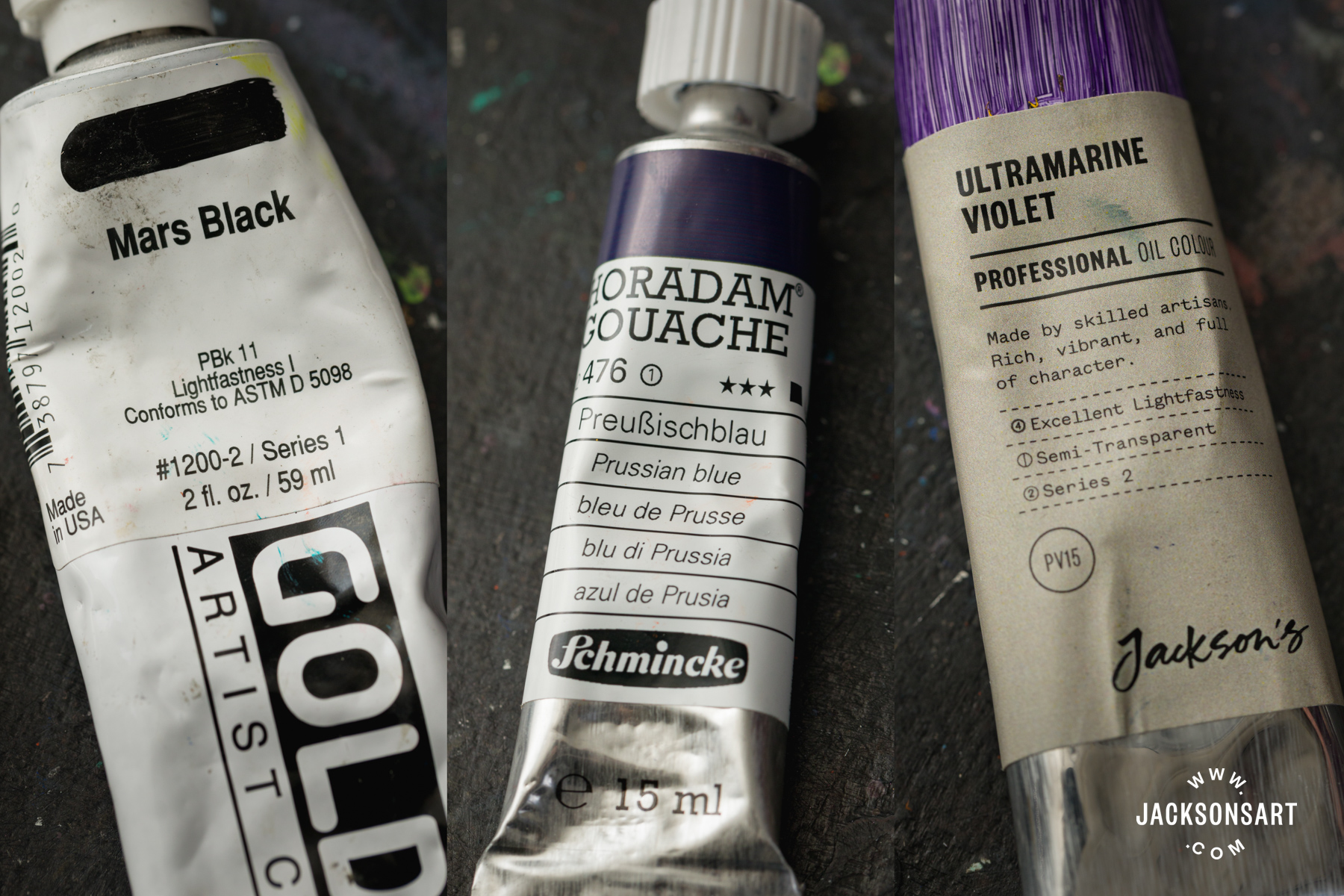
From left: Golden Artist Acrylics use roman numerals aligned with the ASTM.
Schmincke Horadam watercolour use a star rating system from one to five.
Jackson’s Professional Oil colours list it descriptively on the tube, from ‘excellent’ to ‘fair’.
However, it is worth bearing in mind that lightfastness is subject to many complex variables. For example, thick applications of colour are more resistant to fading than thin glazes. This is the case with Alizarin Crimson (PR83). Golden Artist Colours did some testing of the pigment in an acrylic binder and found that when it is at full strength it has good lightfastness (ASTM II). However, when it is applied as a diluted glaze it has fair lightfastness (ASTM III). A high-quality paint maker should test the paint at full strength and in tints. If you are unsure, you can contact the manufacturer to find out what kinds of tests they perform.
Eagle-eyed readers will have noticed that lightfastness ratings, and how long a colour is predicted to last without fading, applies to ‘normal indoor conditions’. This refers to the amount of light a painting might be expected to receive when kept away from a window, only in indirect light. However, an artist can’t always anticipate the environment that their painting will be displayed in. Each location has its own particular environmental conditions with light levels that will vary depending on the time of day, the season, which wall the painting is hanging on, and how the painting is mounted and framed. These are variables that are unique to every single case, and cannot be recreated in a lab setting.

This is not to say that industry-standard lightfastness tests aren’t valuable. On the contrary, they give an extremely good idea of whether a pigment is prone to fading or not. However, artists should be aware that it is a relative, rather than definitive, attribute.
How to Conduct a Lightfastness Test at Home
Some artists choose to test the lightfastness of their paints themselves. Here are some guidelines for carrying out a very simple lightfastness test at home or in the studio. It is suitable for any media, including watercolour, gouache, acrylic, oil paint, inks, coloured pencil, soft pastels, and oil pastels.
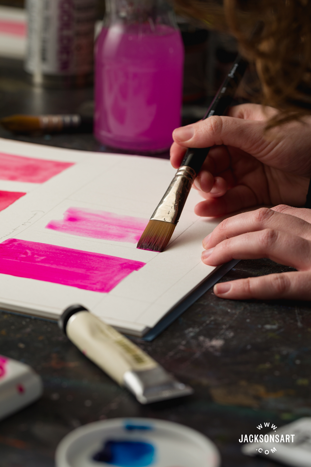
1. Paint or draw out a sample of your colour at full strength, making sure that the pigment concentration is consistent across the sample. The surface should be one that you would regularly use for the medium, whether that is canvas, paper, or primed panel. Half of each tested colour is going to be covered up, so make sure that each sample is large enough and spaced out sufficiently. After swatching the colour at full strength, swatch different applications such as in tints with Titanium White and/or diluted with a medium. This will give you a well-rounded result. For watercolour, it’s important to test the colour in dilute washes with water. Remember to label each sample!
2. Use a control colour alongside the colours you’re testing. Bruce MacAvoy, author of Handprint, recommends one part genuine Alizarin Crimson watercolour (PR83), diluted with 12 parts water and applied as an even wash. Alizarin Crimson is considered to have the lowest lightfastness among modern artist paints (ASTM III), and it fades at a reliable rate.

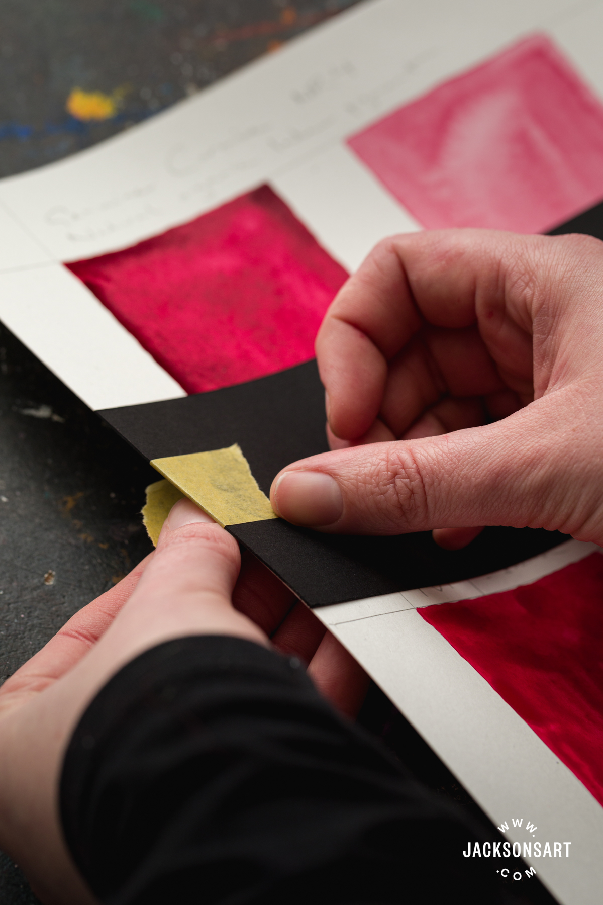
3. Half of each sample needs to be covered with an opaque material that is going to protect it from light. This could be mountboard or thick card. Cut it to size, and then fix it to the surface with tape at the edges. You will need to periodically lift up the covering material to check the sample, so make sure that’s possible.
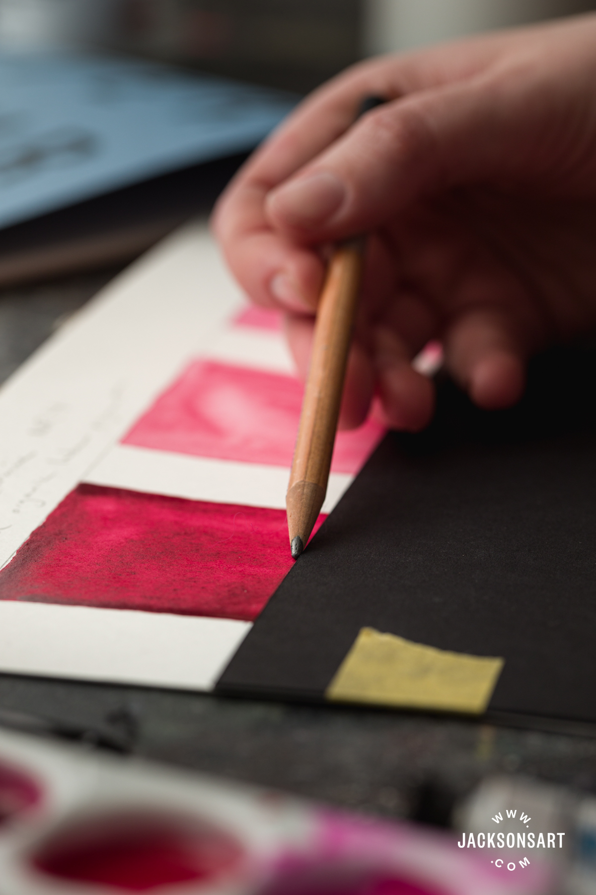
4. Once the opaque material is fixed, use a pencil to mark the boundary between the exposed and unexposed sample.
5. To protect against dirt and humidity, and to keep the opaque covering flat against the test samples, you can put your tests behind glass. Ensure that the glass is not UV-protective. Acrylic glazing can become more UV resistant over time, so real glass is better.
6. If you are in the Northern Hemisphere, put the samples in a south-facing window where they are going to get as much direct sunlight as possible. In the Southern Hemisphere, a north-facing window is best.
7. Check the tests regularly so you can note any changes between the exposed and unexposed areas. Four to six months should give you sufficient results, but some artists let their tests run for a year. The rate of change will vary hugely depending on where you are and the time of year. April to September is the best time to test in the Northern Hemisphere, while October to March is better in the Southern Hemisphere. Make sure to make notes of any changes you observe.

From top: Genuine Carmine watercolour (NR4) in full strength, 1:1 wash with water, and 1:1 wash with Chinese White (PW4).
Jackson’s Carmine watercolour made with a lightfast Quinacridone pigment (PV19) in full strength, 1:1 wash with water, and 1:1 wash with Chinese White (PW4).
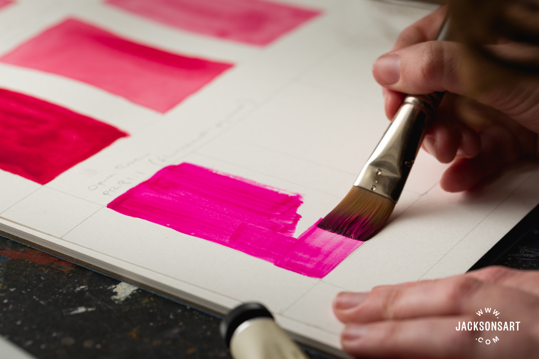
Jackson’s Opera Rose artist watercolour (PR81:1) in full strength, 1:1 wash with water, and 1:1 wash with Chinese White (PW4)
Use the Alizarin Crimson as your benchmark. According to MacEvoy, whose independent watercolour lightfastness tests are well-trusted, a truly lightfast colour should last four times longer than the Alizarin Crimson wash without fading. You will probably notice that some colours hold up well at full strength, but fade dramatically in tints or in dilution. This kind of information can give you a much more nuanced picture than manufacturer lightfastness ratings, which give one single rating. This is a simple test that is easy to do, but if you want to take a more complex, scientific approach, I recommend following Bruce McEvoy’s method. It is geared towards watercolour, but the principle can be followed for all other mediums.
Can You Protect Fugitive Pigments Against Fading?
To a certain extent, yes you can protect a fugitive pigment against fading. Using a varnish that protects against UV or framing a piece with specialist UV glass can slow the deteriorating effects of light on pigments. However, it will not stop fading or colour shifting from happening. Taking UV-protective steps is generally good practice, especially if a work is going to be outside or in a sunny spot, but fugitive pigments cannot be made lightfast.
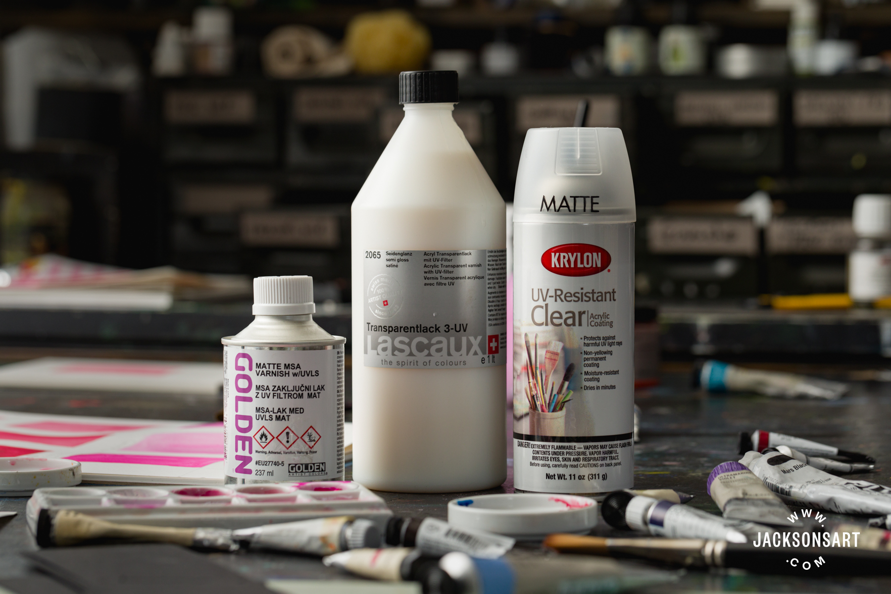
Golden Mineral Spirit Acrylic varnish for oil and acrylic, Lascaux Transparent UV Protect Varnish for acrylic, Krylon UV Resistant Clear Coating for wood, paper, metal, plastic, glass, plaster, and more
Does Lightfastness Matter?
Lightfastness and its implications are crucial for artists to be aware of, particularly if you sell your work. Using lightfast pigments is best for the longevity of the buyer’s investment and for your own peace of mind. If a work contains a pigment that is prone to fading, make sure that the buyer is aware and knows what steps they should take to minimise fading, like using UV-protective glazing. However, it is also worth pointing out to a buyer that no painting should be displayed in direct sunlight for prolonged periods of time, even if it contains only the most lightfast pigments. UV glazing is also good practice for all artworks.
When you’re working in a sketchbook, lightfastness will be much less of a concern because the format naturally protects the pigments (think of how the glowing colours in medieval manuscripts are still vibrant, centuries later). By the same token, if you are an illustrator making work for reproduction, then you may not need to be worried about the original work fading. It entirely depends on your practice.
There are some artists who purposefully disregarded the permanence of their materials. J.M.W Turner (1775-1851) was one of them. He was advised by his colour-supplier that the Red Lake he was using would fade, but he shrugged off the warning. Turner was interested in using the most vibrant pigments available because of the effects they could give him in the moment, and he didn’t give too much mind to how the paintings would look down the line. His sunrises and sunsets, in which he used bright, fugitive reds and yellows, have often faded from their original state.
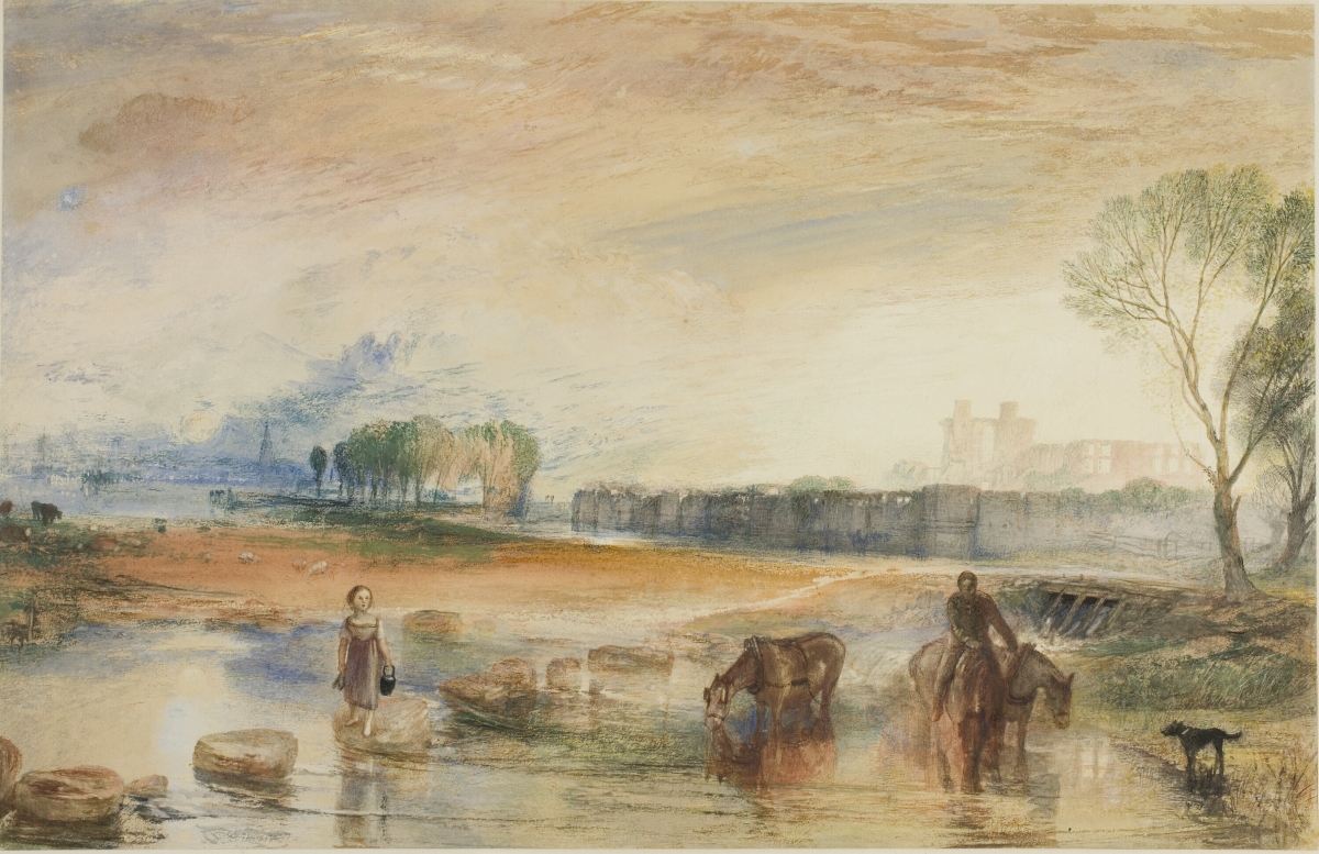
Joseph Mallord William Turner
Watercolour and gouache over traces of graphite on paper, mounted on board
29.4 × 45.5 cm | 11 5/8 × 17 15/16 in
Art Institute Chicago, Chicago
Lightfastness is a complicated subject, and it is only one aspect of pigment permanence. Humidity, environmental pollutants, and certain pigment-binder interactions can all cause artist colours to fade or change over time. Given all of these factors, it is almost guaranteed that your painting will look different in 200 years, in ways that you probably won’t be able to anticipate! However, this does not mean that we should throw caution to the wind. It is empowering to know as much as you can about your materials, including what lightfastness ratings mean and which colours are prone to fading. That way, you can make informed pigment decisions that are the best for your practice.
Further Reading
Impressionist Painting Techniques
Venetian Red: the Red Earth Pigment That Evokes the Italian Renaissance
Daylight Studio Lighting for Accurate Colours in Painting and Drawing
The Best Way to Transfer Images to Lino
Shop Art Materials on jacksonsart.com



6 thoughts on “Fugitive Pigments: Why Do They Fade, and Does it Matter?”
Thanks for another most informative article!
You’re welcome Jos! Thanks for letting us know.
Can you make an article about Nickel Azo
Yellow? Please.
That’s a great suggestion, and it’s one of my favourite modern pigments! If you haven’t read it already, you might enjoy this article about Green Gold, which is a close chemical relative of Nickel Azo Yellow
Every article and video Evie produces is a
must read/see for me. So much information
and delivered in a way that makes it a joy to
interact with. I’d love an article on naphthol
red vs pyrrole red. Thanks Evie for your
wonderful work in bringing the joy of colour
science to the world
Hi Blue, thanks for your comment! We love Evie too
Comments are closed.