



Acrylic paints are wonderfully customisable using the wide variety of acrylic mediums available. By mixing them into paint or applying them directly to the surface, artists can create sculptural texture, tooth, sheen, cracks, and more. In this article, I detail the benefits of using acrylic mediums, for both visual and conceptual effect, before demonstrating techniques to get the best out of each kind of medium. Articles in the Techniques Series define the meaning and context of art making processes and give practical tutorials on how to work with them.
Definition: Acrylic texture mediums are specialist liquids, gels, or pastes that are mixed into, or applied beneath, acrylic paint to create textural effects. They can create results that would be impossible to replicate using acrylic paint alone, including impasto, tooth, sculptural form, and sheen.
What is the Effect of Using Acrylic Texture Mediums?
Using acrylic texture mediums resolves three key issues for impasto painters – weight, cost, and stability. Thick impasto paintings made purely with paint become extremely heavy, but acrylic texture mediums are designed to be lightweight and voluminous. This saves artists money and effort in shipping, handling, and storing their work. Using mediums for thick impasto is also much more cost-effective than piling on pure paint, because mediums are relatively cheaper per volume compared to creating the same thickness of application with acrylic paint alone. Dried acrylic texture mediums are also considered more stable than a thick application of paint, improving the longevity of the work.
Acrylic texture mediums make some painting techniques more pronounced or easier to execute. This is especially true for sgraffito – where the artist scrapes or scratches through the paint to create a drawing in the wet media. Any medium that adds volume to the paint will increase the depth of the sgraffito marks, giving them a sculpted appearance.
Dry brushing and scumbling are easier to execute on rough surfaces, since the tooth catches the paint applied on top. This can be made dramatic with acrylic texture mediums, where the peaks of the surface are highlighted by the paint, leaving the troughs below exposed to create contrast. The opposite approach is also effective – when washes are used to pool paint at the bottom of the troughs of acrylic medium forms, leaving the peaks exposed.
The ability to customise the texture and finish of acrylic paints is an asset of the medium. Oil and watercolour painters have significantly fewer product options that enhance the texture of their works. Therefore, exploring acrylic mediums is a unique facet of acrylic painting that sets it apart. Mediums can also make acrylic paint behave or appear more like other kinds of paint – for example, giving it the body and handling qualities that many oil painters prefer.
Textural elements also carry conceptual weight – with the ability to enhance our experience of the imagery and to better communicate the artist’s ideas or feelings. For instance, gritty surfaces might evoke the harshness of city pavements or rough landscapes, while reflective particles might suggest optimism, wonder, or glistening heat. Scratched or scored surfaces can imply tension or stress, whereas undulating textures may create a sense of calm. Whether the texture is harmonious or at odds with the imagery, it enriches our experience of the work.
What’s the Difference Between Gel and Paste in Acrylic Mediums?
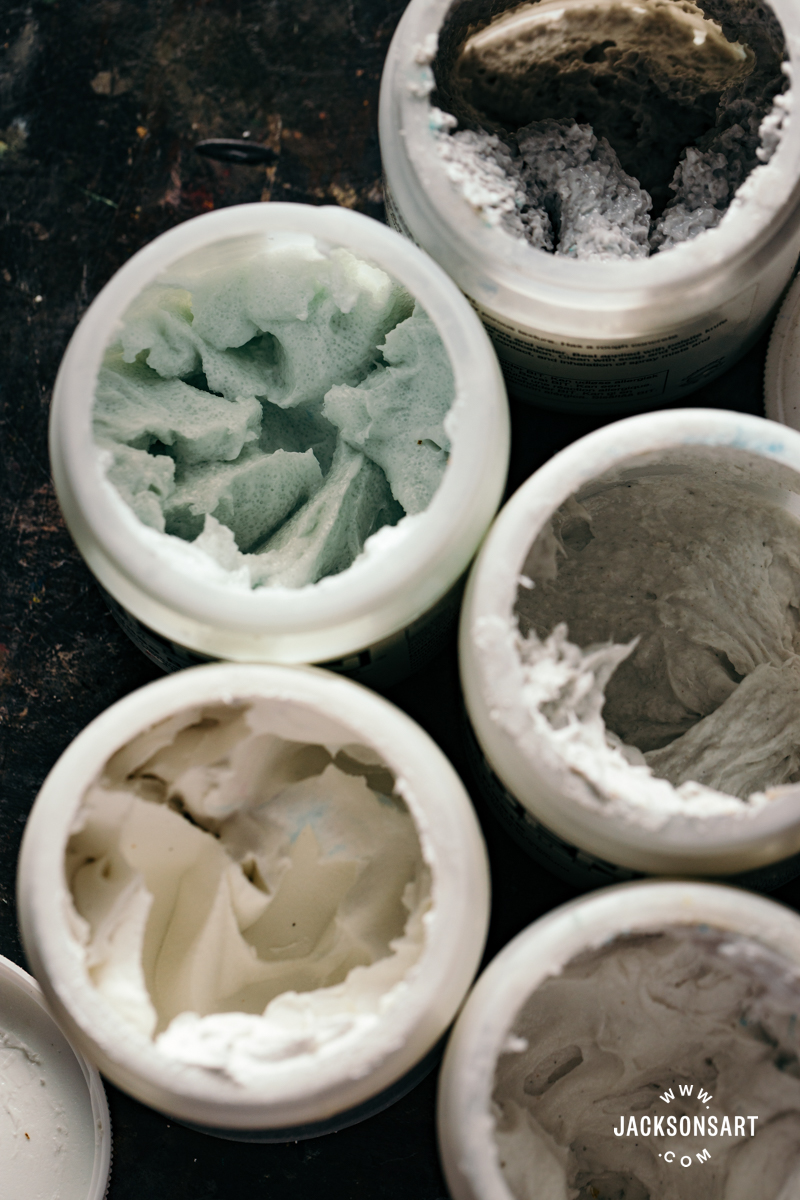
In general, acrylic gels will evaporate or become transparent as they dry, leaving behind the texturising material they contain, or becoming fully clear. Pastes remain close to how they appear when you first apply them, and tend to be more stiff and opaque. If you’re trying out a new acrylic medium, it’s important to differentiate these terms so you can predict how the medium might behave as it dries. I detail the opacity and appearance of each of the gels and pastes I tested in the following writing.
How Long Should you Leave Acrylic Mediums to Dry?
Most acrylic mediums have a recommended drying time and thickness of application on their labels or listed in details online. It’s worth checking before you work with them, so you don’t compromise the stability of your work. In general, to build volume with stability, it’s best practice to apply acrylic texture mediums in gradual layers, allowing the layers to fully dry between each application, rather than creating one extremely thick layer straight away. This could trap moisture in the middle. If you’re unsure how long to leave an acrylic medium to dry, 72 hours is considered a generous time frame in most environments. The climate you’re working in will also affect the drying time, since acrylic mediums are water based like acrylic paint, they rely on evaporation to dry.
You can check if a stiff medium, like hard molding paste, has cured by carefully pressing your nail into it – if it still feels soft even when the surface is touch dry, it will need longer to completely dry. Other mediums dry to a stiff yet malleable finish to retain their flexibility, like fibre paste. Pressing into these mediums isn’t a reliable test of how cured they are. Therefore, the most sensible approach is to simply give each medium a generous amount of time to dry.
What Surfaces Can you Apply Acrylic Texture Mediums to?
Acrylic texture mediums are best applied to rigid surfaces to prevent warping or cracking. Most papers will buckle as heavier mediums dry out. Texture mediums adhere better to surfaces that have a ground applied, like gesso. You can read more about preparing your surface in A Guide to Grounds and How to Paint on Wooden Surfaces.
How do you Wash up Acrylic Texture Mediums?
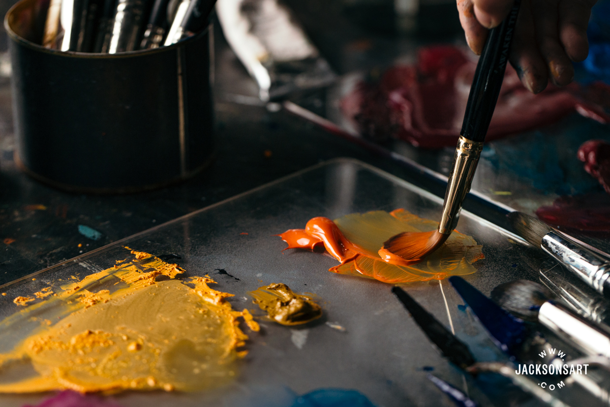
Acrylic texture mediums are water-based just like acrylic paint, so they can be washed up in the same way with soap and water. Mediums should be wiped from your tools or palette as soon as you’re finished painting, so that they don’t cure and become difficult to chip off. Acrylic texture mediums that contain larger texturising materials that don’t dissolve, like pumice or glass, can be salvaged from the used medium by rinsing them off. Any remaining medium could be saved in a clean container for future use, which minimises waste and avoids rinsing solid matter down your sink.
Molding Paste
Molding pastes are thick, opaque to semi-opaque, and used to build structure. They are perfect for creating textural effects where the artist piles, scratches, scrapes, or presses into the wet medium. They can be mixed with acrylic paint before being applied, or painted on top of. Once completely dry, they can also be sanded to refine any edges or create a smooth surface. Molding paste can also be applied to a surface by scraping the medium through a rigid stencil with a palette knife. This creates a uniform shallow three-dimensional pattern to work on top of.
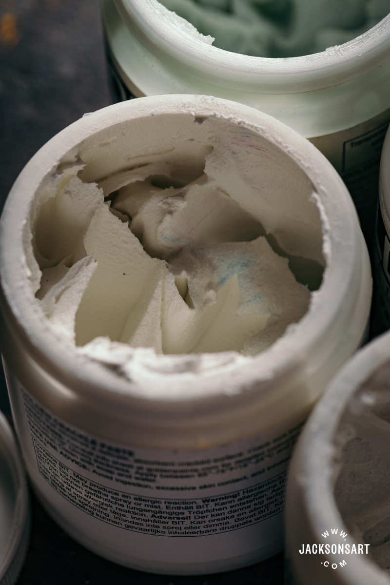
Molding pastes can come in light, heavy, coarse, or hard consistencies. Both light and heavy pastes generally have a smooth foamy texture scooped from the jar, but have a noticeable difference in weight and thickness. Light pastes are ideal for building a lot of texture without adding too much physical weight to paintings, but may not hold peaks and details as well as heavy or extra heavy pastes. Coarse molding pastes have an additional gritty texture so that they dry with extra tooth. Light, heavy, and coarse molding pastes dry stiff but retain some flexibility, whereas hard molding pastes dry completely rigid, making it possible to carve into them with hand or power tools. In general, molding pastes are absorbent, making them easy to layer paint on top of without extra preparation.
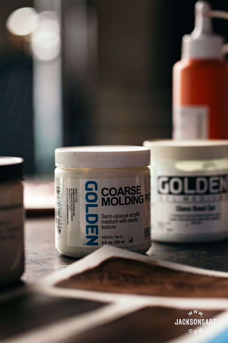
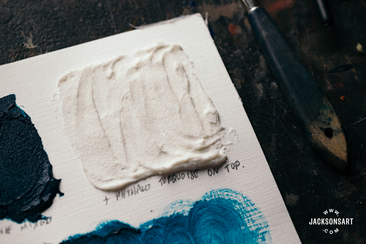
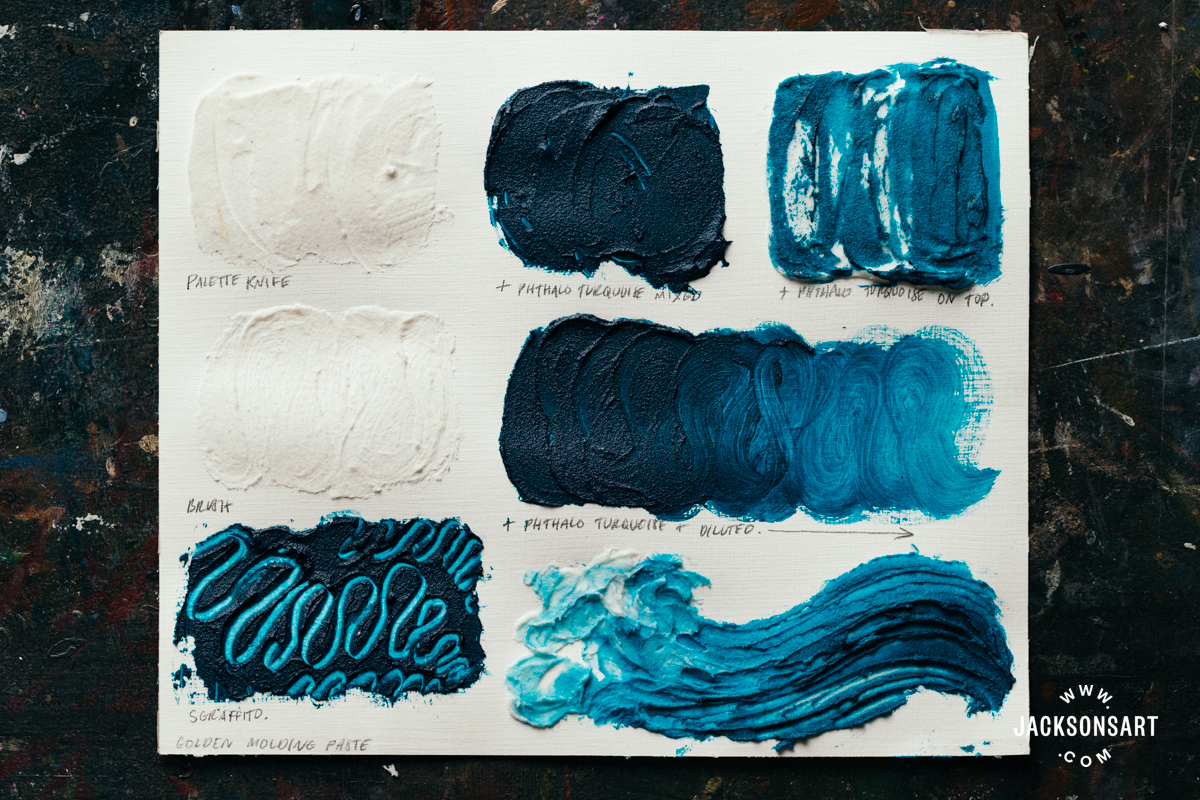
For my technique example sheet, I used Golden Coarse Molding Paste. This molding paste contains calcium carbonate, which gives it a sandy tooth. To begin my test, I applied it with a palette knife and a brush side by side. The palette knife layer is smoother, but with some raised edges from skimming the side of the knife. The brushed layer is thinner, and retains the texture of the brush hairs.
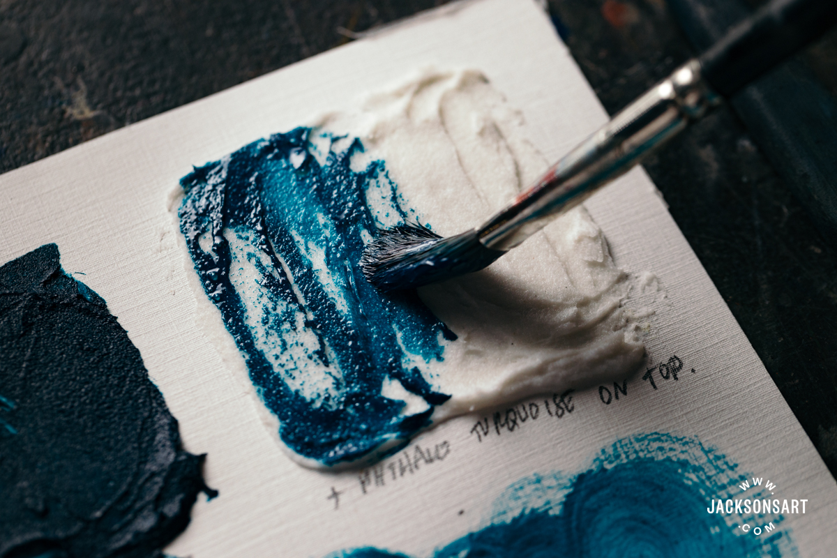
Next, I mixed Phthalo Turquoise acrylic paint into the paste, which readily absorbed the colour without tinting it very much, and applied it to my surface. Beside it, I painted my Phthalo Turquoise over a dried layer of molding paste, allowing my brush to catch and emphasise the texture of the medium below. Below, I tried diluting the paint and medium mixture with water, which dispersed seamlessly by decreasing in physical volume the more water I added.
On the bottom of the sheet, I demonstrated how effective molding paste is for creating sgraffito marks when still wet, by drawing crisp lines into the coloured paste. Finally, I used the molding paste to ‘mold’ a painting by sculpting a wave with my palette knife before applying paint on top. The added colour emphasises the flowing and curling lines of the structure I made.
Glass Bead Gel
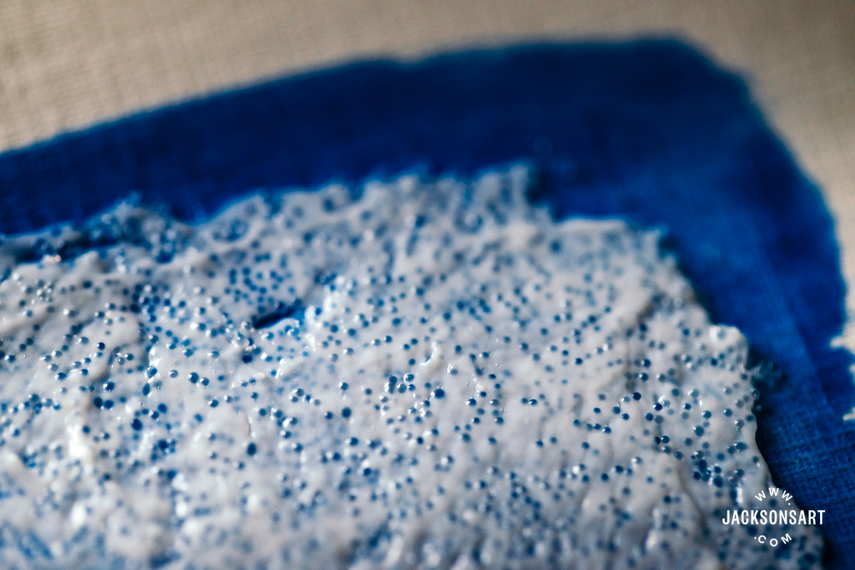
Glass bead gel contains genuine glass beads, which reflect the light when applied on top of a layer of colour, to create a shimmering frosted effect. Since the gel is full of small glass beads, it’s best applied in a thin layer one bead tall, so they will adhere to your surface properly and catch the light without obstruction. Since glass bead gel is made with real glass beads, when you wash your tools or palette, you can rinse off any stray beads and mix them back into the tub to minimise waste.
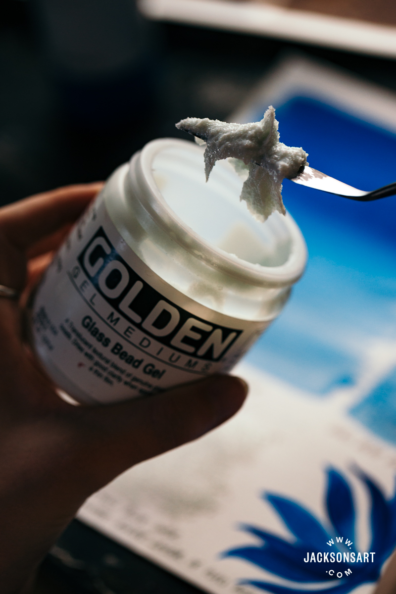
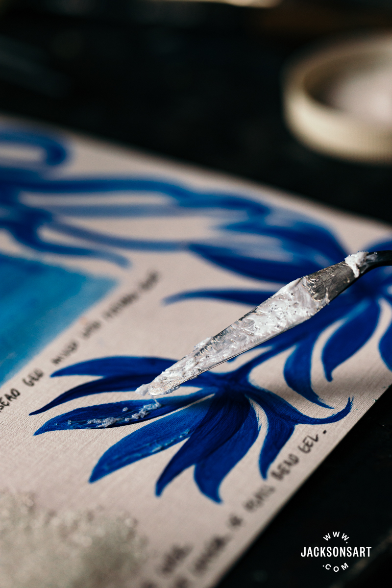
For my technique example, I used Golden Glass Bead Gel. To begin, I painted a layer of Phthalo Blue acrylic paint and allowed it to dry before applying a thin layer of glass bead gel on top with a palette knife. As you apply the gel, you can feel the beads rolling beneath your implement, which may feel unusual for a painting gesture. I wouldn’t recommend trying to apply the gel with a brush, since the beads get caught in the hairs and it would be very difficult to create a uniform application.
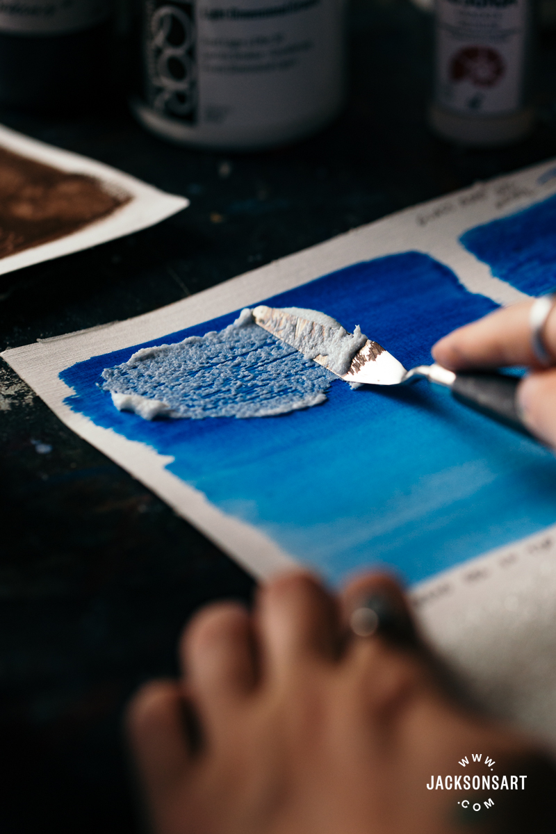
The gel is semi-opaque and white in the tub, but through drying it becomes transparent, which allows the glass to reflect light. Below the Phthalo Blue layer on my sheet, I applied the glass bead gel directly onto my surface with no colour below. As you can see, the shine isn’t as perceptible on white without a colour below to emphasise it.
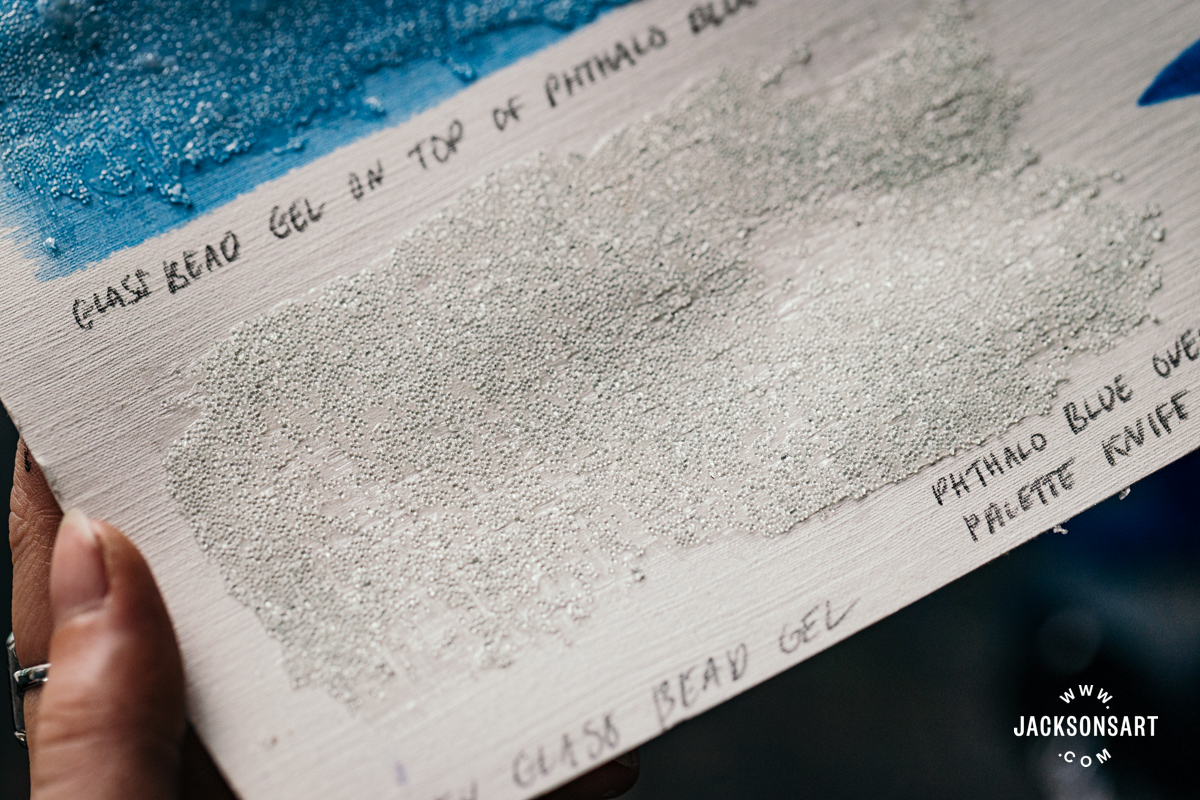
Next, I tried mixing the glass bead gel with the Phthalo Blue acrylic before applying it. Mixing it on the palette feels unusual, since you can feel the hard pieces of glass within the gel. The transparency of the Phthalo Blue allowed the glass to still reflect a little, giving the effect of a mottled pane of glass. Using a semi-opaque or opaque colour instead would make the glass beads into a non-reflective texture medium with even, round pieces. I wouldn’t recommend using it purely for texturing paint, since glass bead gel is relatively expensive, and there are other more affordable texture mediums that could create the same effect, like pumice gel.
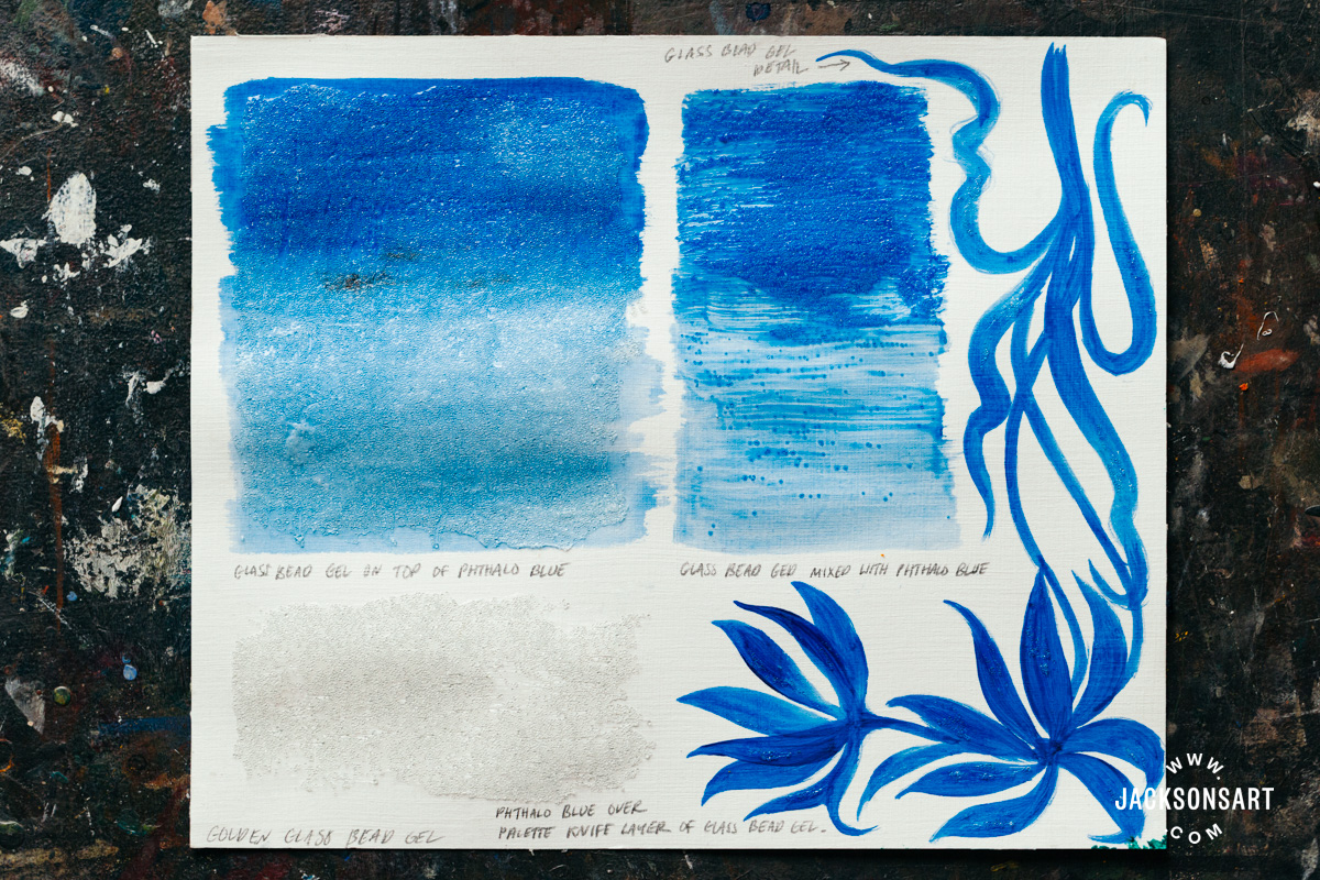
Finally, I used the glass beads for perhaps their most interesting application – adding reflective details to a painting. This could be useful for adding shine to a crashing wave, glistening snow, detailing fabric, or creating rain. For my example, I painted some flowers using Phthalo Blue again, allowed it to dry, and then applied the glass bead gel sparingly on the petals and leaves to suggest dew.
Pumice Gel
Pumice gels contain pumice granules to create rigid textures that range from sand to concrete depending on the size of the particles. They are generally labelled from fine to extra coarse to indicate how large the particles are. These lumpy or grainy textures are incredible for laying down a compelling surface to paint on, or to thicken paint with sculptural material. A layer of fine pumice gel combined with paint or on its own is an interesting ground for drawing, since the texture catches the dry media in its tooth.
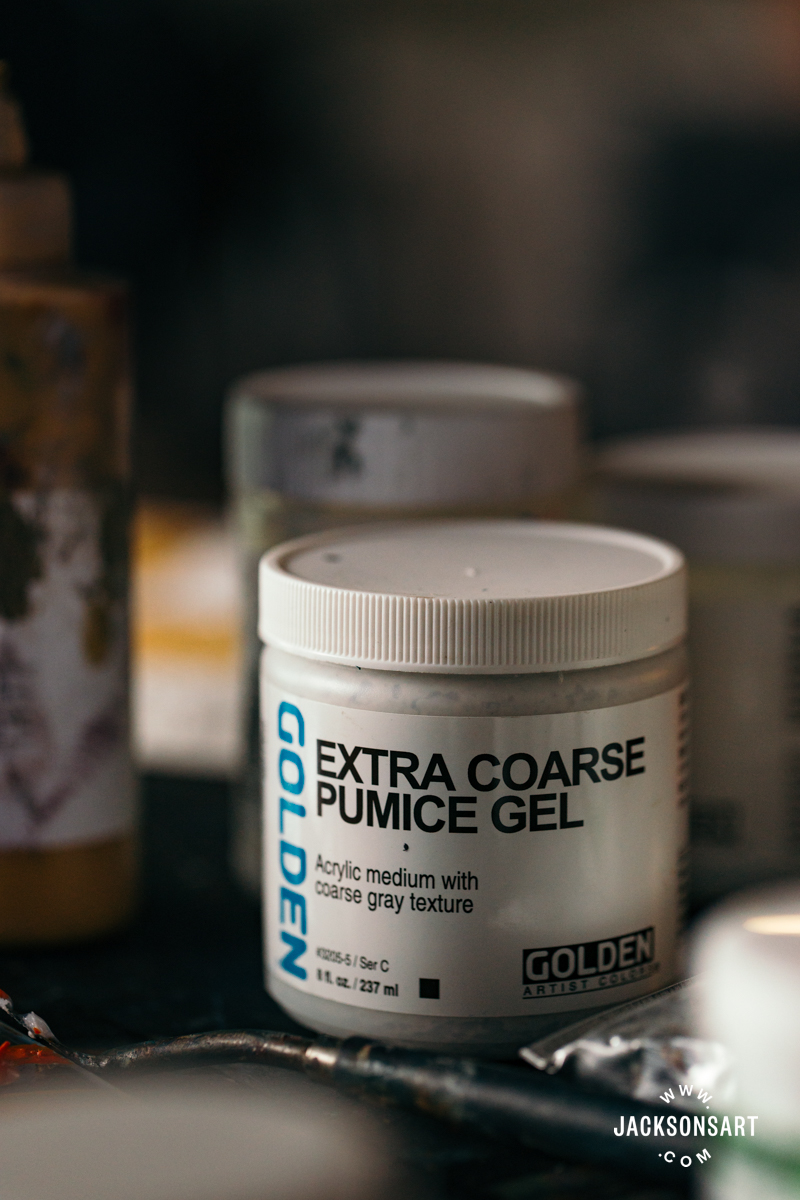
For my technique example, I used Golden Extra Coarse Pumice Gel. It has a grey colour straight from the tub because of the pumice ingredient, so I was curious to see how it appeared when mixed directly with acrylic paint. I combined it with Phthalo Green and found that the grey of the gel did make the green darker. To avoid darkened colours, you can paint a layer of white acrylic paint on top of the dried pumice gel before applying transparent or bright colours on top.
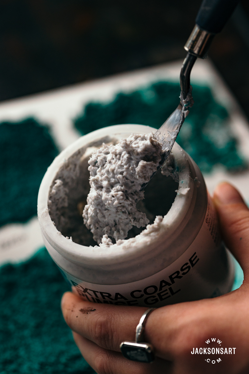
On the top right of my example, you can see how lightly brushing over pumice gel doesn’t easily cover the medium because the rough texture resists dispersion. To completely cover this kind of rough texture medium, you may have to dilute your paint to get it into the crevices, or use a dabbing motion to apply it.
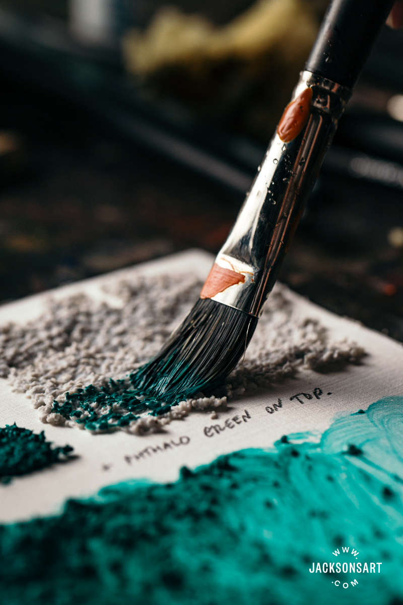
Since the texture of the coarse pumice gel was so rough, I applied the top swatches with a palette knife. On the left, I’ve demonstrated what it looks like when applied with a brush – it is very uneven and difficult to spread. This could be an interesting technique if you’d like to create an organically uneven or worn effect, like a rough stone wall.
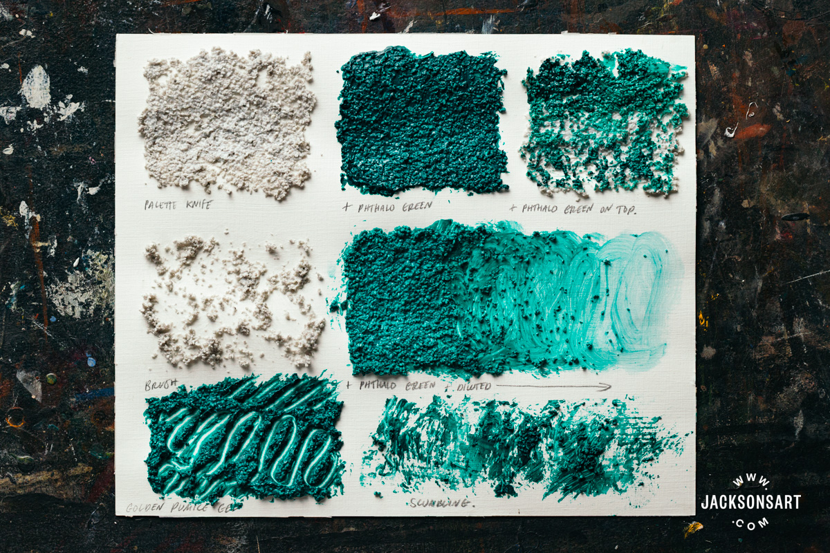
Next, I experimented with diluting the pumice gel, mixed with Phthalo Green using water. As it was so thick, I wasn’t sure whether it would disperse. It actually worked very well, and the medium loosened on contact with the water. As you can see, some of the pumice granules were swept along loosely in the brushstroke.
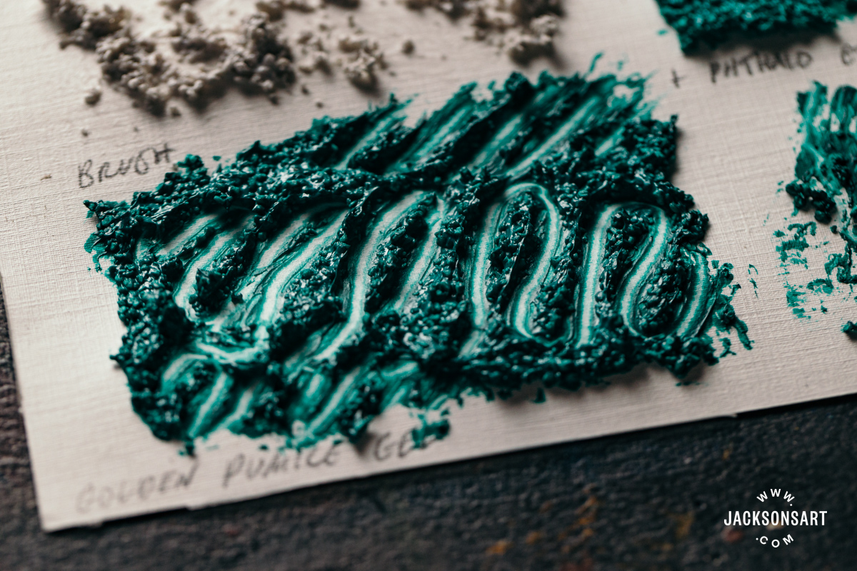
On the bottom left, I demonstrated applying sgraffito to the wet medium. I used a palette knife to lift it off and wiped the removed material back onto my palette. When dried, it retained the crisp lines amongst the strong texture.
Fibre Paste
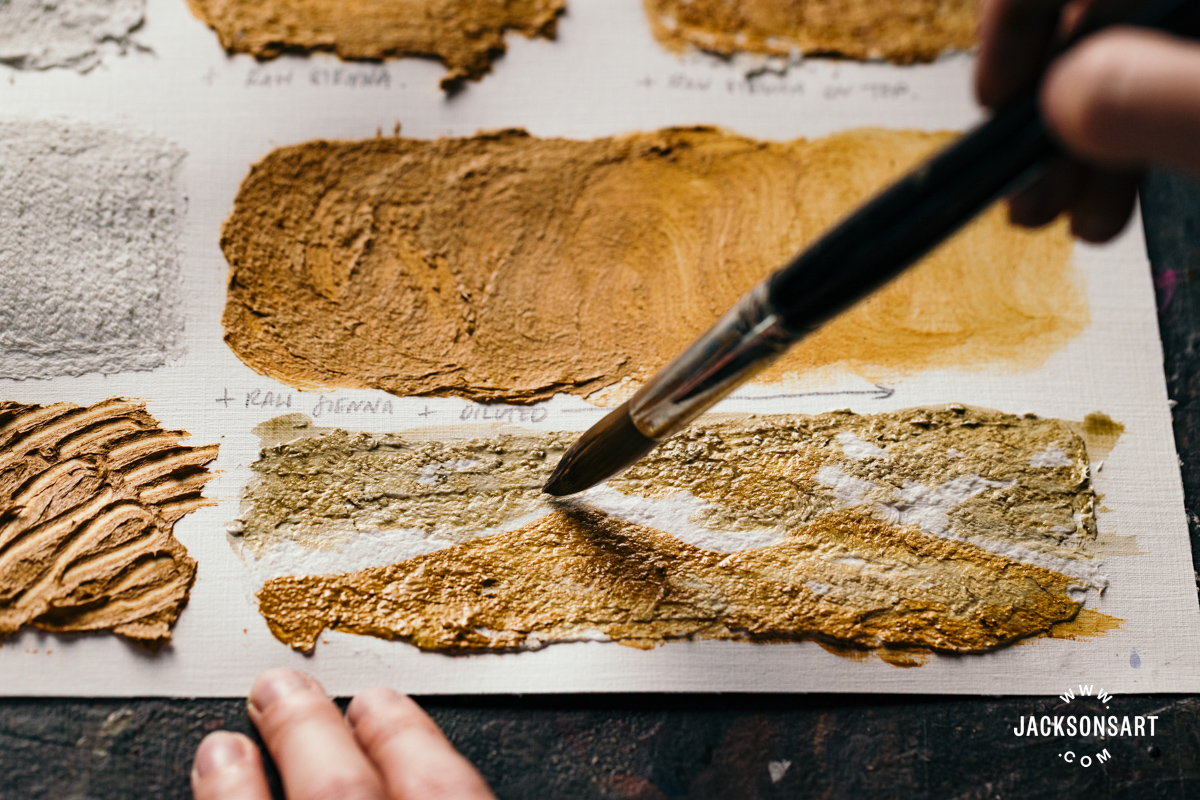
Fibre paste emulates the texture of rough watercolour paper, but can be mixed with acrylic paint to create a coloured ground and painted or drawn on top of. From the jar, it has a consistency like thick whipped cream, and can be applied very evenly with a palette knife or brush. A palette knife layer will generally be thicker and have more random textures than a layer applied with a brush, which I’ve demonstrated on the left of the sheet. By skimming over the wet layer with a clean damp palette knife, you can refine the surface and make it smooth.
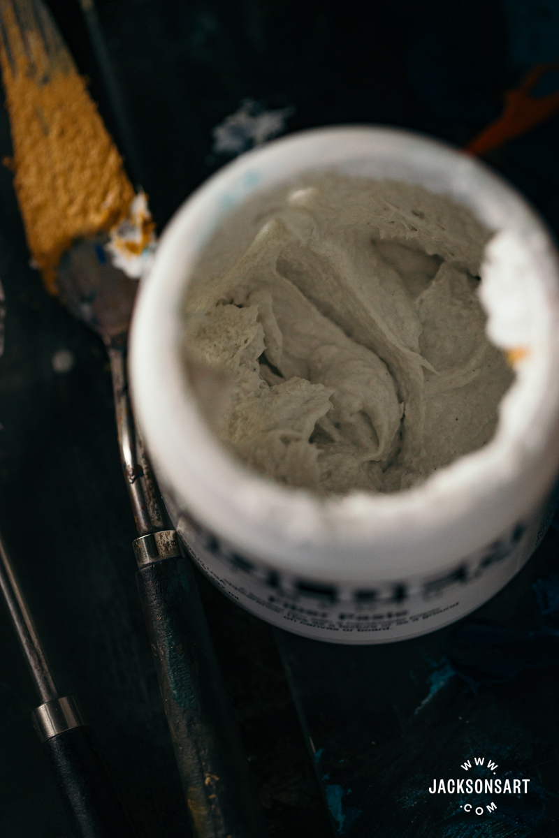
For my technique example, I used Golden Fibre Paste. You might assume it contains paper fibres to create its paper-like finish – but it actually contains mineral fibres. Golden states that this makes the surface more archival than real paper. For my first test, I mixed it with Raw Sienna acrylic paint, and it kept its strong colour without being tinted by the white of the medium. Next, I applied the Raw Sienna acrylic on top of the dried fibre paste, where you can see a few spots where the brush didn’t completely coat the rough texture when applied in broad strokes.
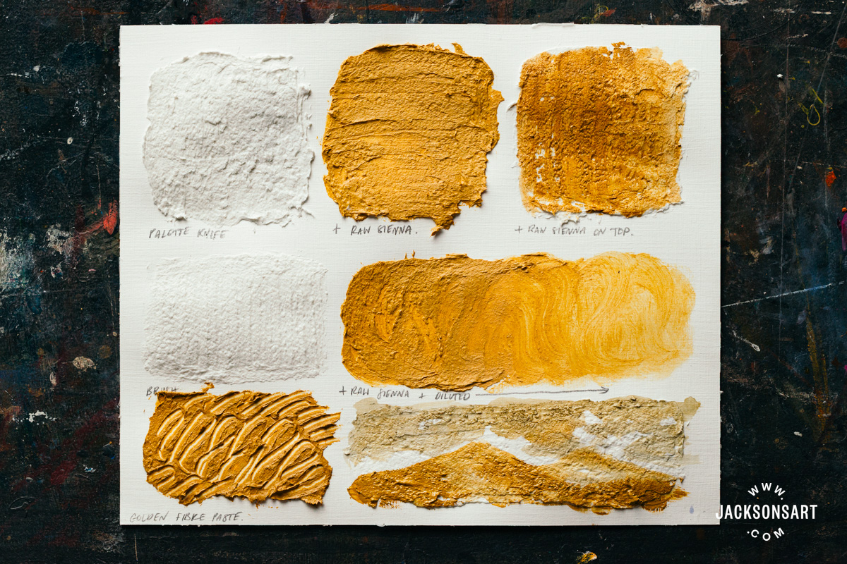
Next, I tested dispersing the fibre paste combined with Raw Sienna with water. It dissolved and spread seamlessly. This could be interesting to create built-up areas of texture in your paintings adjacent to thin ones, all in the same stroke. On the bottom left of my sheet you can see an example of sgraffito – the medium lifted off very easily and held the lines I scratched into it excellently.
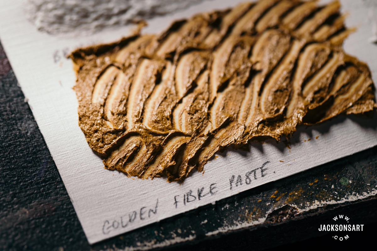
Fibre paste is also brilliant for drawing on top of, painting in watercolour, and also printing on. If you apply Golden Fibre Paste to a flat sheet of clingfilm and allow it to fully dry, you can peel the layer off in one flexible piece. This can then be cut and collaged, or treated like a ‘sheet’, made entirely of the dried medium. This flexibility does mean that the surface can be easily dented, so take care not to press unwanted marks into it.
String and Tar Gel
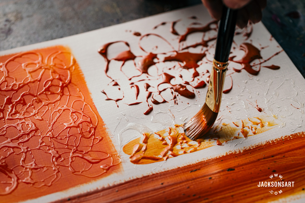
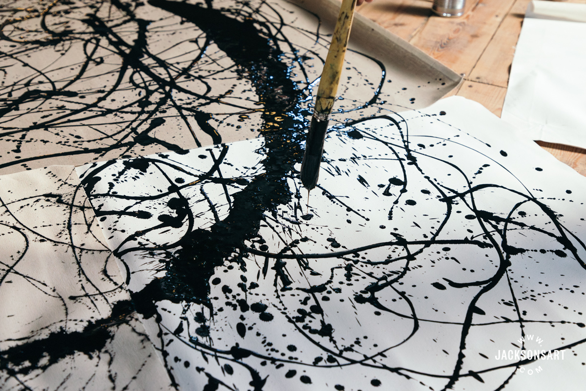
String and tar gels have a consistency like syrup or honey, and are designed to be mixed with acrylic paint or applied on their own by dripping or pouring them onto the surface. They retain the shape they take on as they hit the paper. Straight from the jar, they are semi-opaque and pale white, but dry down completely transparent with a glossy sheen. If you make paintings using a splattering technique, tar and string gel may be interesting for you, since the splattered marks retain their initial gloopy, three-dimensional form, without dispersing into or across the surface.
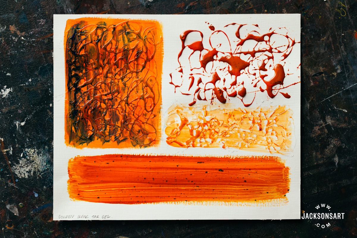
For my example, I tested Liquitex String Gel and Golden Clear Tar Gel. I found that the Liquitex String Gel was on the stickier side, whereas the Golden Clear Tar Gel was thinner – although the effect they created was fairly similar. I began by dripping the gels from a paintbrush by hovering my hand over a dried layer of Alizarin Crimson Hue and Cadmium Orange Hue acrylic paint, respectively. To apply it, I made gestural movements with my hand as the gel fell onto the page. I found that holding the brush pointed vertically downwards allowed me more control of the placement of the gel, as it fell directly below this point.
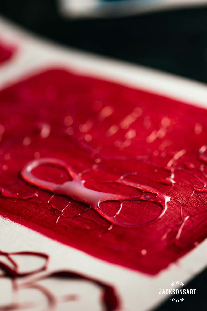
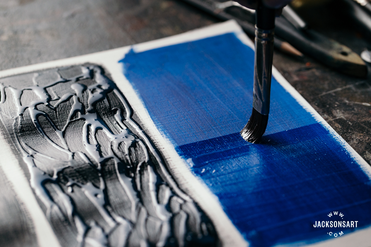
Once this layer was dry, I painted Mars Black acrylic on top of the tar gel to demonstrate how painting on top of the dried medium with colour emphasises the form created by the gel. It would be useful for painting a dense thicket of forest, or a tangle of hair.
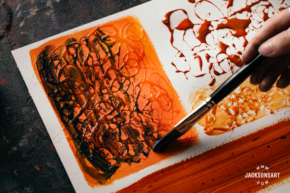
Then, I applied the tar and string gel directly onto the paper, before washing over them with thinned acrylic paint. As you can see, the texture resisted my brush in random places, leaving scattered white paper exposed with compelling texture.
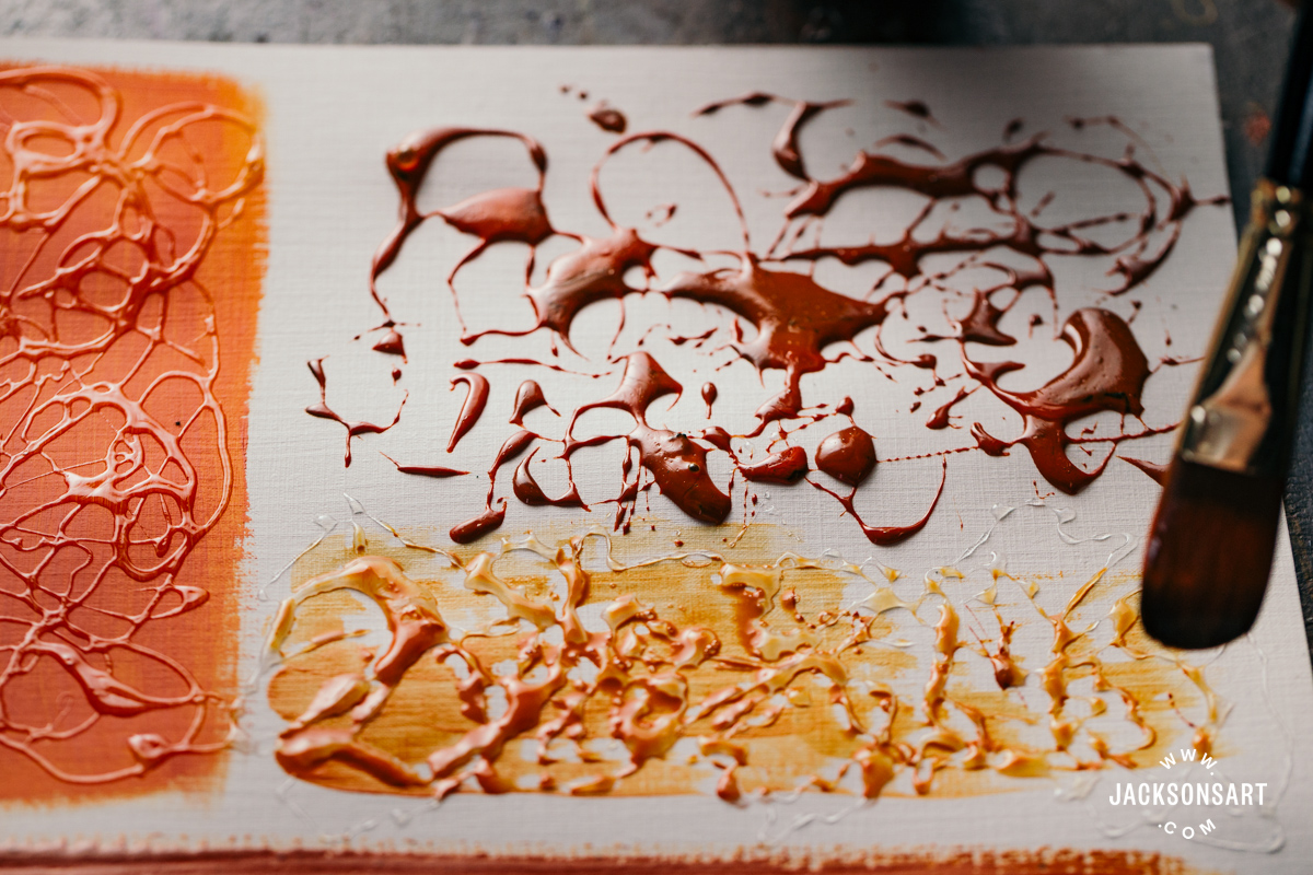
Next, I mixed the tar and string gel with the acrylic paint before dripping it onto the surface. The gels accepted the paint very easily, and it became slightly thicker. The splattered effect here is very graphic but still organic.
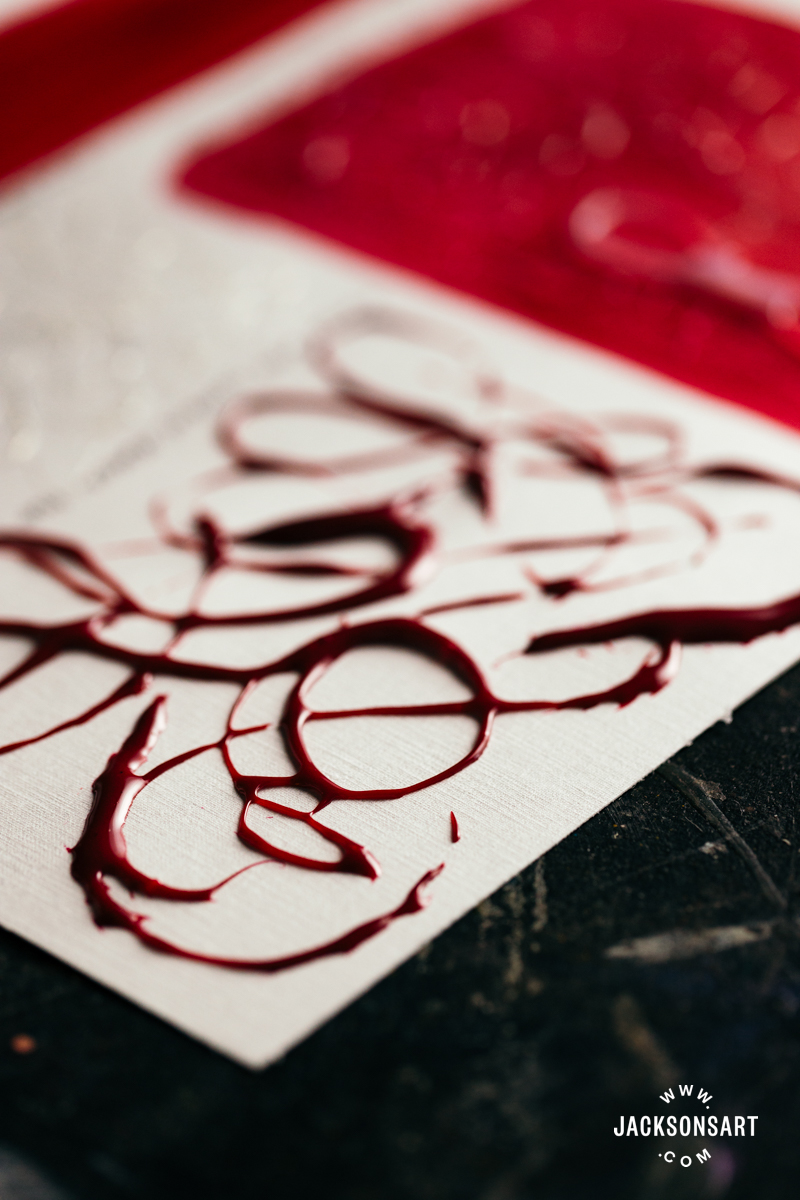
Finally, I tried painting the tar and string gel – mixed with acrylic paint – directly onto the page, without using the intended dripping technique. This produced two very slick, shiny brushmarks, which dried with the same rubbery sheen as the dripped marks.
Crackle Paste
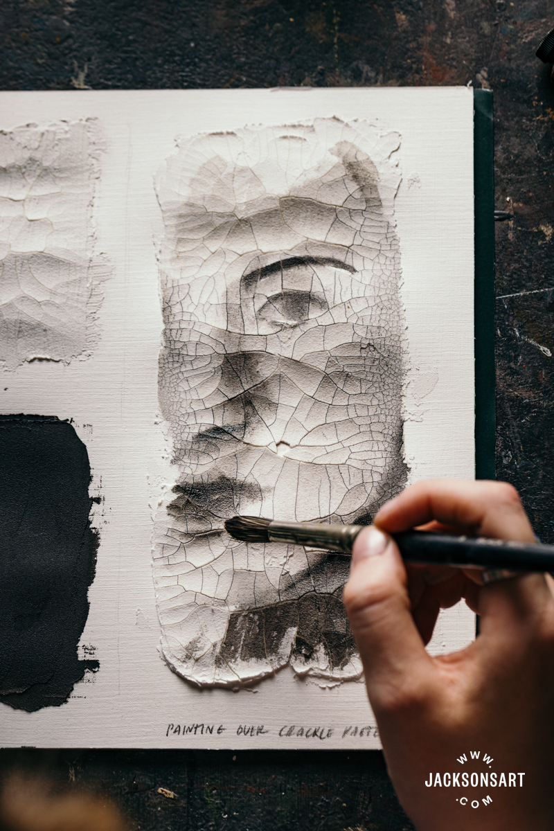
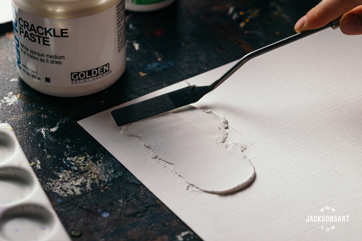
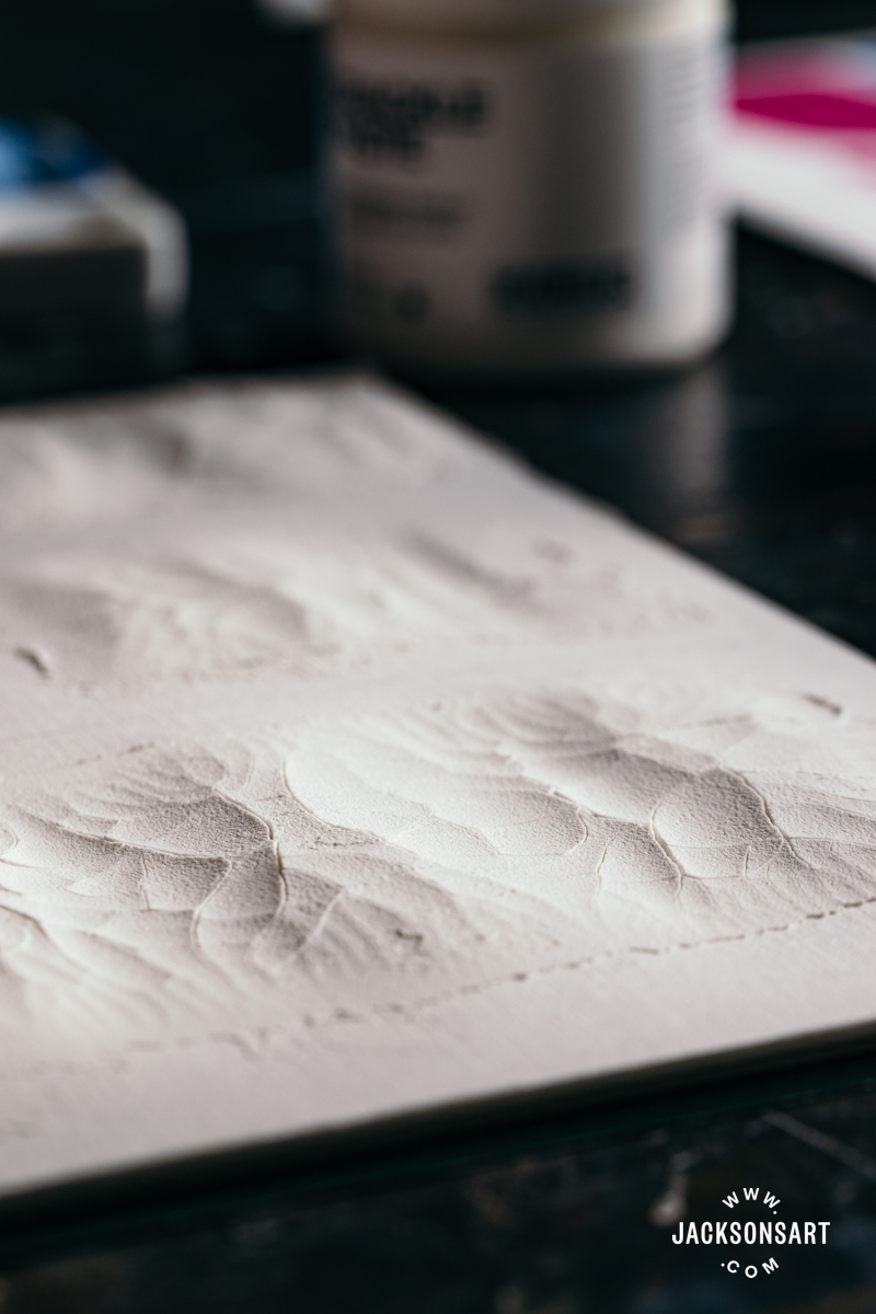
Crackle paste pulls apart and forms deep cracks as it cures, making it perfect for creating aged effects in your work. The dried surface is matt, emulating degraded frescoes or cracked pottery. Since crackle paste dries rigid, it should be applied to a rigid surface to reduce the risk of it flaking off. The size and pattern of the cracks vary depending on the thickness of application, and the temperature and humidity of your environment. This makes the cracking unpredictable to an extent, and the curing time widely variable. It might take several days for the cracks to fully form – so it’s best to be patient with this medium before assessing the results.
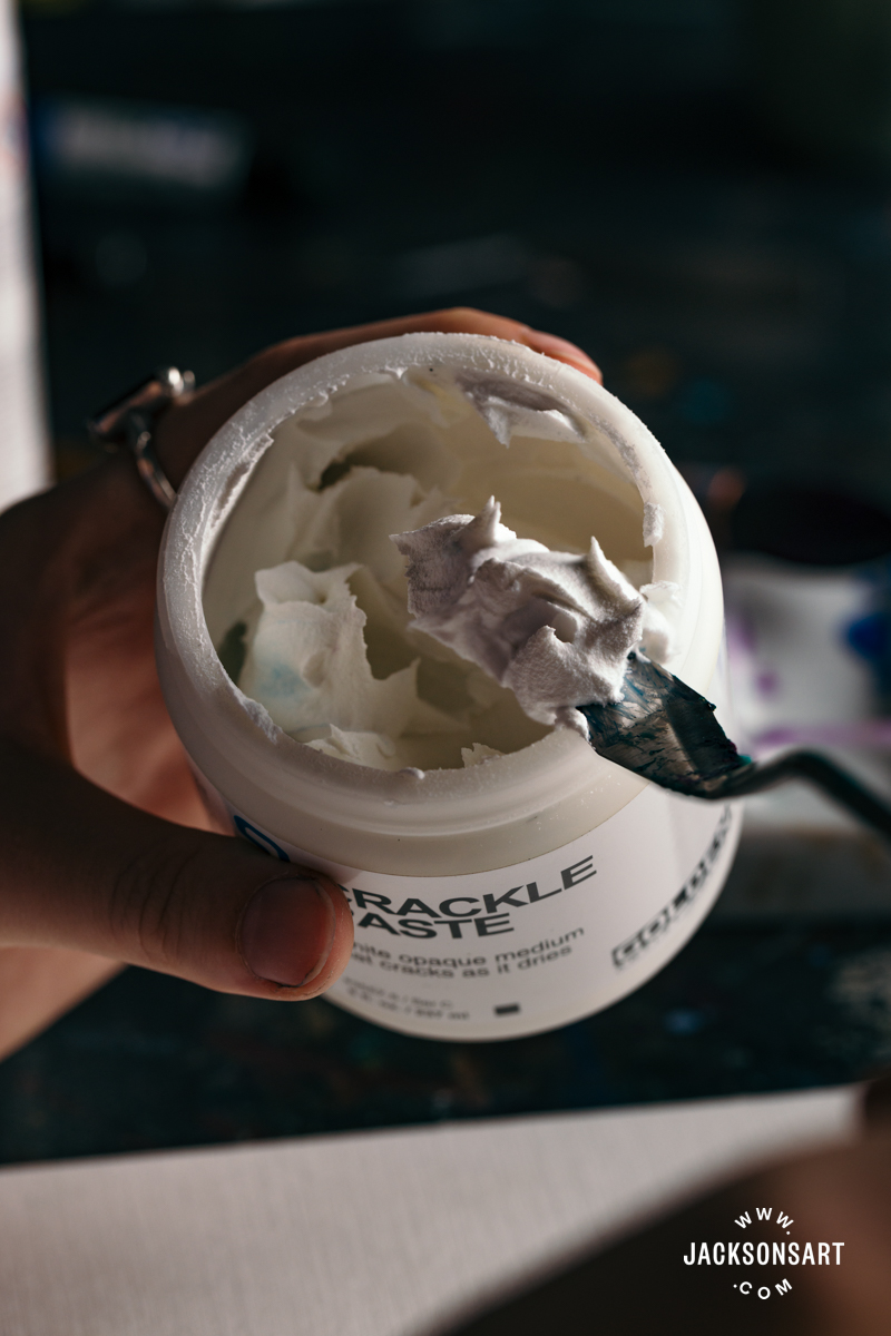
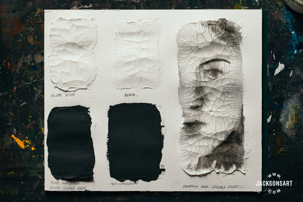
For my technique example, I used Golden Crackle Paste. It has the consistency of thick cake icing out of the tub and can be applied with a palette knife or a brush. I tried applying it with both implements, and as you can see, the palette knife cracks are more distinct because the paste was applied in a thicker, even layer. The brushed layer is thinner and dried with bristle marks, with shallow cracks.
Below these two swatches, I mixed the crackle paste with Mars Black acrylic paint. The white of the paste didn’t tint the paint very much, so it was easy to get a strong colour with a relatively small amount of paint. Unfortunately, both the thick and thin applications of the mixture didn’t crack as they dried. Other colours do crack effectively when mixed with the paste – so it’s best to test a small amount like this first before you commit to a larger surface.
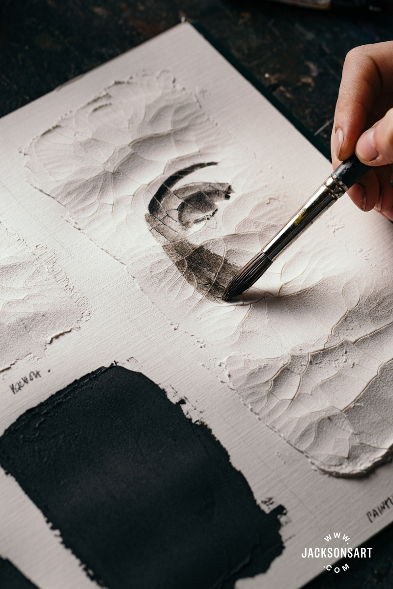
Next, I applied a bigger area of crackle paste with my palette knife and tested painting onto it whilst it was still wet. The paste is very absorbent, and stiff enough to paint on whilst it cures. The resulting effect made the painting look somewhat like a watercolour painting as it settled into the paste. As it dried, the image cracked more, making it appear like an aged fresco. If you wanted to create more contrast with crackle paste, you could also apply a layer of acrylic colour underneath the paste, so that when the cracks appear, they re-expose the colour below.
Further Reading
Sgraffito Techniques for Painting and Drawing
A Modern Medium: A Brief History of Acrylic Paint
Golden Acrylic Gel Mediums Shrinkage Test
Our Acrylic Paint Buying Guide: The Best Acrylics for all Skill Levels and Applications
Shop Art Materials on jacksonsart.com

8 thoughts on “Creating Textural Effects with Acrylic Mediums”
Very interesting! I have used a few of these options in the past. What fun to see what is available to us!
Glad you found it interesting Judith! They are great fun to work with
Very nice reflection
Thanks Subodh!
Guessing, as with acrylic primer, these mediums can be over-painted with oils?
In theory yes, the hard or matte mediums should be alright to paint over with oils, with coats of clear or white gesso to seal them and add necessary tooth. GOLDEN recommend avoiding painting over softer gels and gloss products with oil paint since the risk of cracking is increased by reduced adhesion. Crackle paste is very fragile on it’s own, so it wouldn’t make a stable oil painting surface. I’d love to do some tests of this in the studio to put together a follow up article to give a more detailed answer! Thank you for the question Rose
Hi Louise,
Wow! what an informative and useful article you have shared. Thank you.
I’m curious if these can be used with encaustic wax? I know, the question that gets asked over and over but I can’t help myself. I was surprised to see so much acrylic info on an R&F encaustic page.
Thanks for your time
Lisa bswax
Thanks for the lovely comment Lisa!
It’s not advisable to layer encaustic wax directly over acrylic texture mediums because they are non-porous, meaning the wax won’t adhere properly. Although some acrylic mediums are absorbent, this doesn’t mean they’re porous too. Perhaps it could work if you experimented with coating rigid dried acrylic texture mediums in gesso, to give the wax something to bond to – although I can’t advise how stable this experimental approach would be long term. Our article A Guide To Encaustic Painting and Wax details some other mixed media approaches to Encaustic that you might enjoy
Comments are closed.